How Packaging Affects Product Promotion: Key Role and Importance
 ICU Branding agency
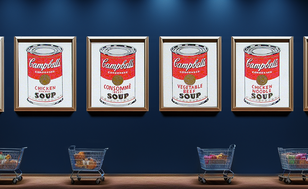
In the 1960s, marketers studied consumer behavior when selecting products. If people blinked more frequently and their heart rates increased, it indicated they were ready to make an impulsive purchase. The research showed that high-quality products in unattractive packaging did not trigger this reaction.
There are entire market segments where a product is deemed a failure if its packaging does not catch the eye. Globally recognized logos on packaging are often a guarantee of successful sales. Tiffany's turquoise box makes women dream about what's inside, regardless of the specific jewelry piece. Similarly, Coca-Cola's glass bottle with distinctive curves can be identified by touch, even in the dark.
Let’s explore what kind of packaging can help your product sell better than the competition.
Packaging as a Marketing Tool

It takes about six seconds to make a purchase decision. Most purchases are impulsive. However, it’s not enough to create convenient and attractive packaging—it’s essential to establish an emotional connection between the packaging and the customer. Therefore, packaging serves the following key marketing functions:
Attracting the customer's attention
Communicating the unique selling proposition (USP)
Encouraging the purchase
In the early 2000s, Heinz launched a line of brightly colored ketchup bottles designed specifically for children. Although the packaging stood out on store shelves, the product was eventually discontinued. The reasons included a complex design, unappealing colors for a food product, and a taste and composition that consumers found too unfamiliar.
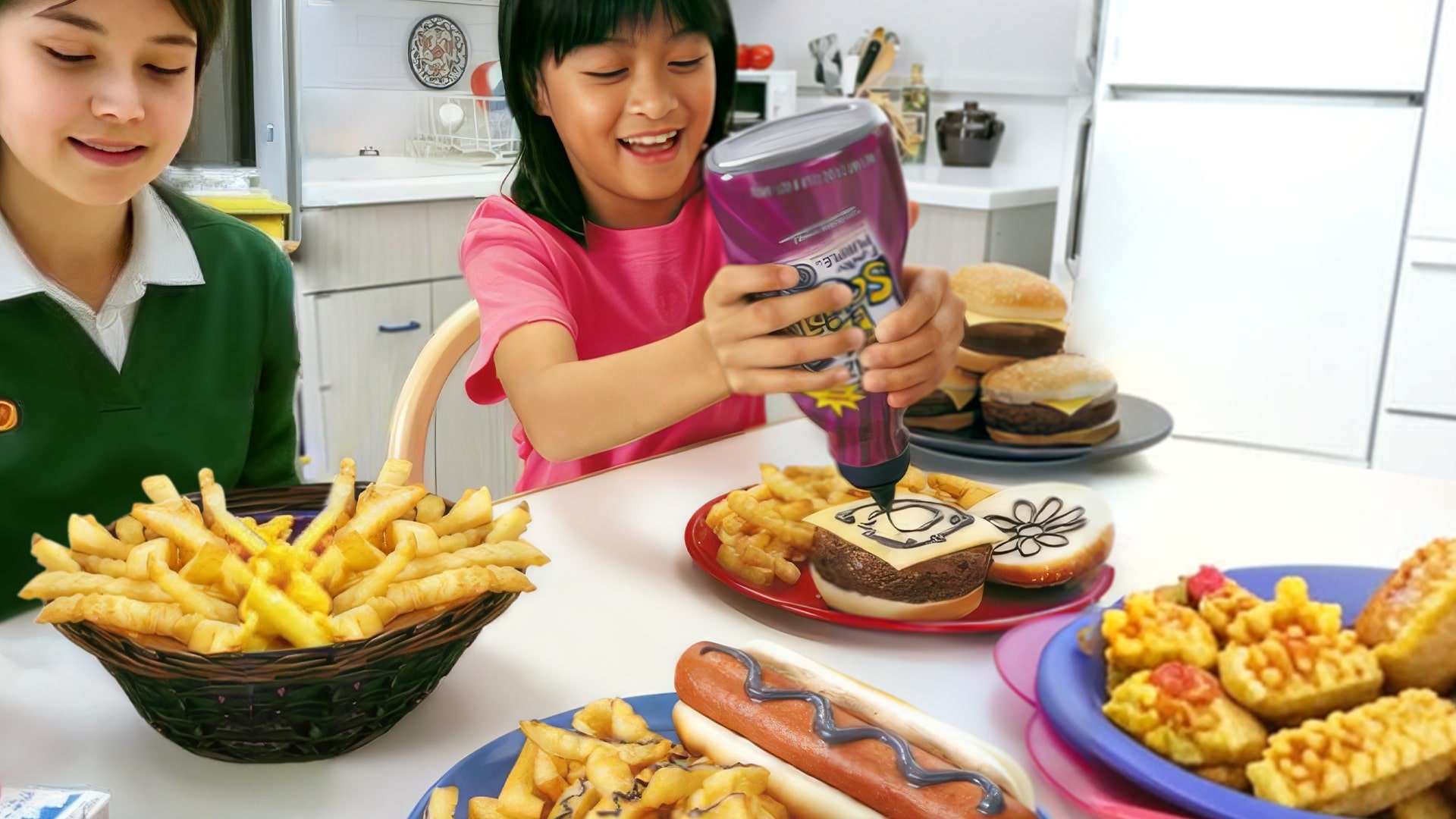
What kind of packaging can attract customers to your brand in just six seconds? Typography, color, and shape are the most important elements in packaging. These components instantly convey a message and create a visual impression. Additionally, sustainability and recyclability have become essential factors, especially for Gen Z and Generation Alpha.
Imagine packaging with legible fonts, a well-chosen color palette, and a convenient design for transportation and unboxing. These fundamentals are the key to creating packaging that sells.
Key Marketing Functions of Packaging
Differentiation from Competitors
Packaging is the first thing customers see when interacting with your brand. If it doesn't clearly communicate why your product is better than competitors’, price will become the main factor in their decision.
Consider apples priced at 20 and 50 rubles that look identical. Without noticeable differences in packaging, the cheaper option will likely win.
Enhancing Brand Recognition
Appealing and functional packaging creates a lasting impression, reinforcing a positive image of your brand and encouraging repeat purchases.
Even if your apples are more expensive, if they come in a stylish, eco-friendly bag, customers are more likely to choose them.
Customer Engagement
Packaging design plays a vital role in communication, often more effectively than the product itself. Including a small thank-you card or a story about how your apples were carefully grown builds customer loyalty. This approach increases Lifetime Value (LTV), which reflects how long a customer stays with your brand.
Four Elements of Packaging That Sells
1. Visual Appeal
Color schemes, typography, and graphics are crucial for capturing attention and reinforcing brand perception.
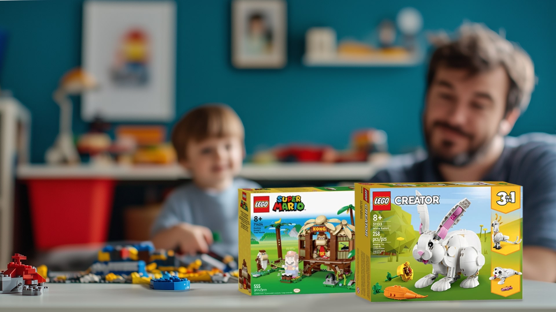
For example, Lego’s bright yellow boxes are instantly associated with play, childhood creativity, and family joy.
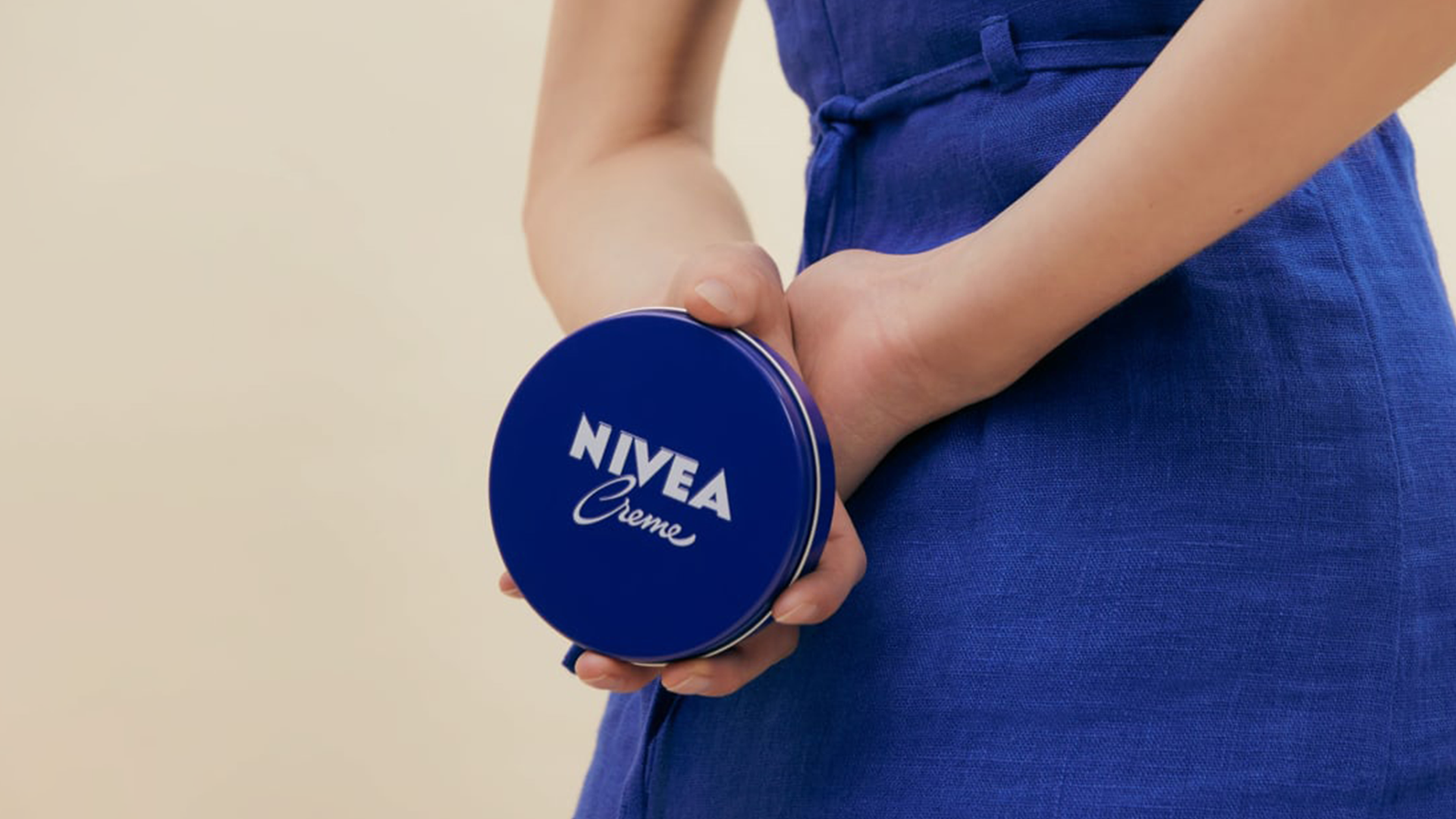
Nivea’s iconic blue tin evokes feelings of care and quality, aligning with the brand’s messaging.
2. Tactile Experience
The texture of packaging adds interactivity, making customers want to touch and feel the material.
Lush, for instance, packages its cosmetics in containers with soft, pleasant surfaces, emphasizing the brand’s care for nature.
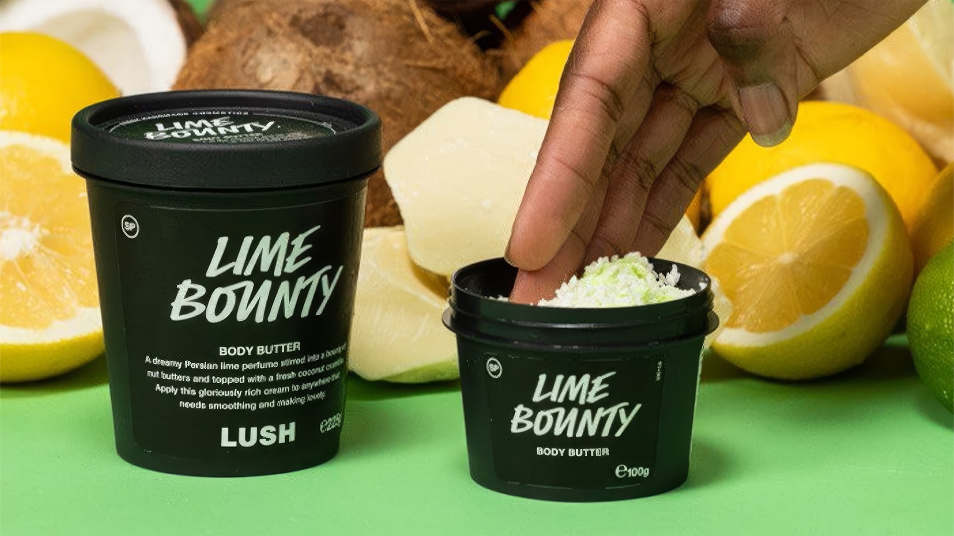
Similarly, Apple uses matte finishes for its gadget packaging, giving customers the sensation of holding an exclusive product.

3. Convenience
Ease of opening, carrying, and storing packaging significantly affects customer satisfaction.
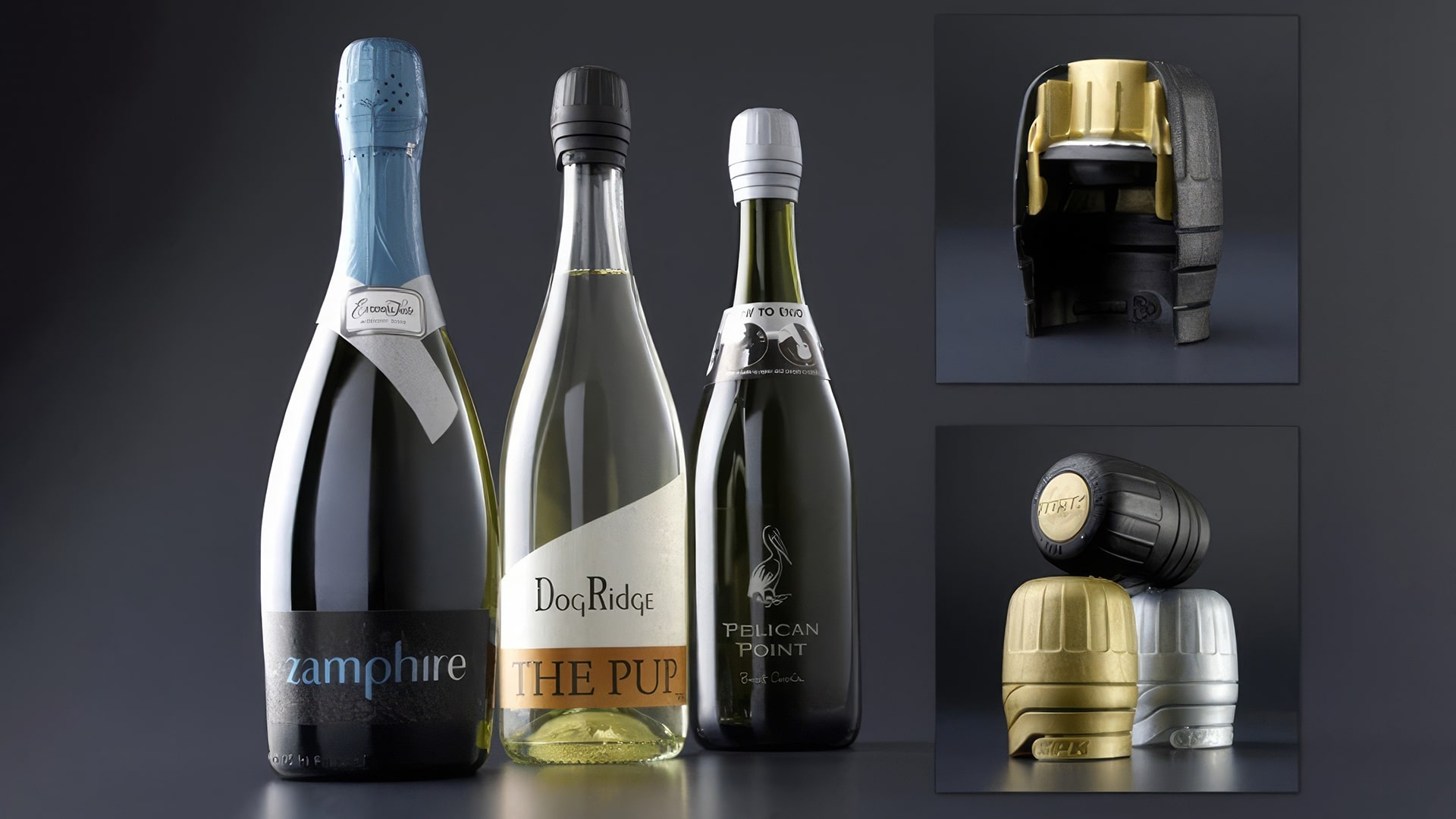
ZORK SPK, for example, developed an airtight cap for sparkling wine that is easy to open and reseal. This innovation keeps the drink fresh and allows the bottle to be reused at home.
4. Sustainability
Sustainability is becoming the norm, with brands increasingly using recyclable and biodegradable materials. Packaging design can also reflect these values.
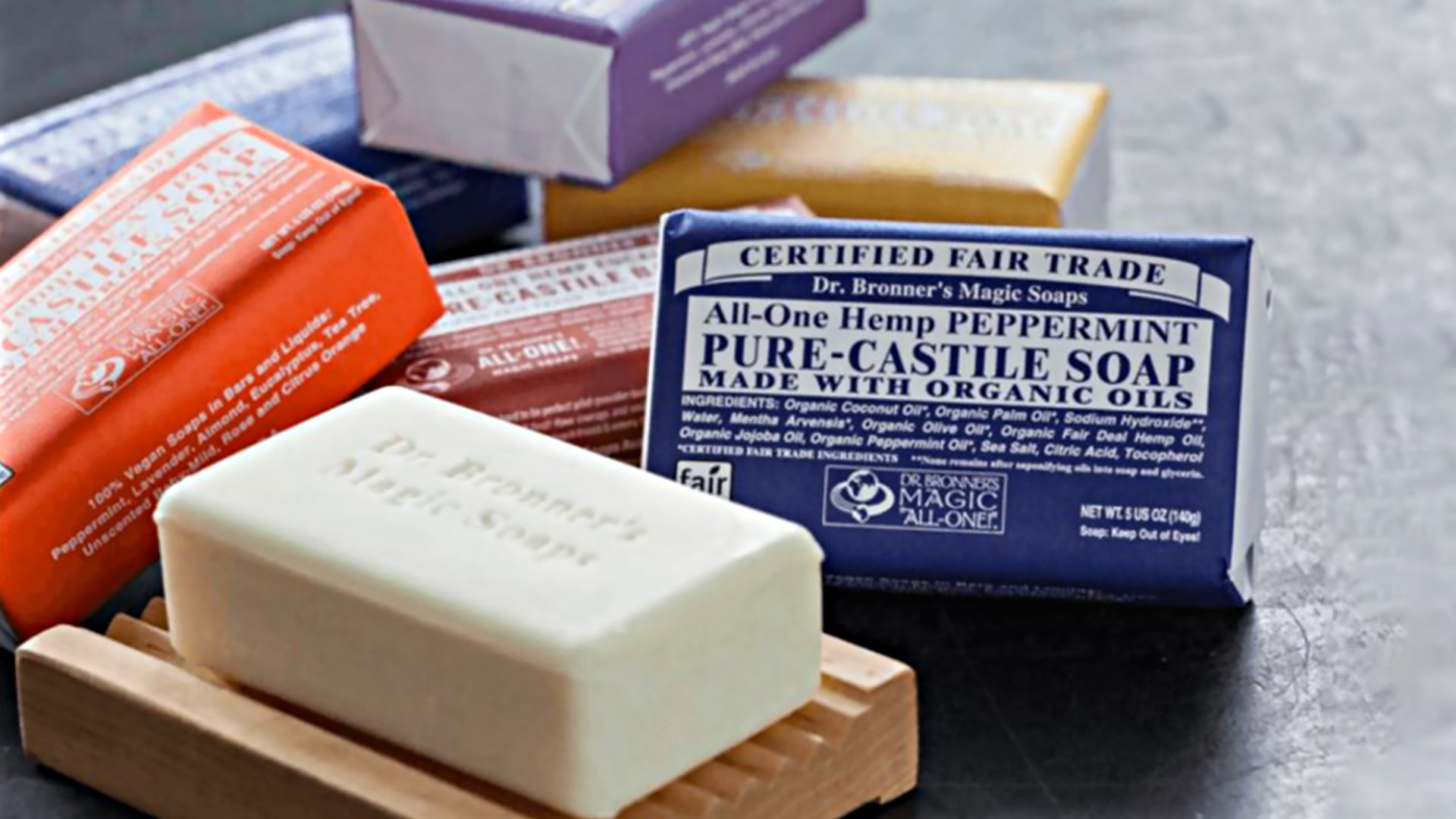
For instance, Dr. Bronner's wraps its soap in kraft paper with a retro design and detailed text, highlighting the product's natural qualities and the brand's social responsibility.
3 Techniques from ICU to Not Just Stand Out but Build Connection with Your Audience Through Packaging
At ICU, we understand that eye-catching design and unique materials are only half the battle. The real power of packaging lies in creating a sense of unity with the customer, making them feel that the product is meant specifically for them. Based on our experience, we recommend three techniques to achieve this connection:
1. Deep Understanding of Your Audience
It’s not enough to define your audience by age or gender — that’s too superficial. A deeper understanding of their interests, fears, inspirations, and motivations is essential to unlock the emotional connection.
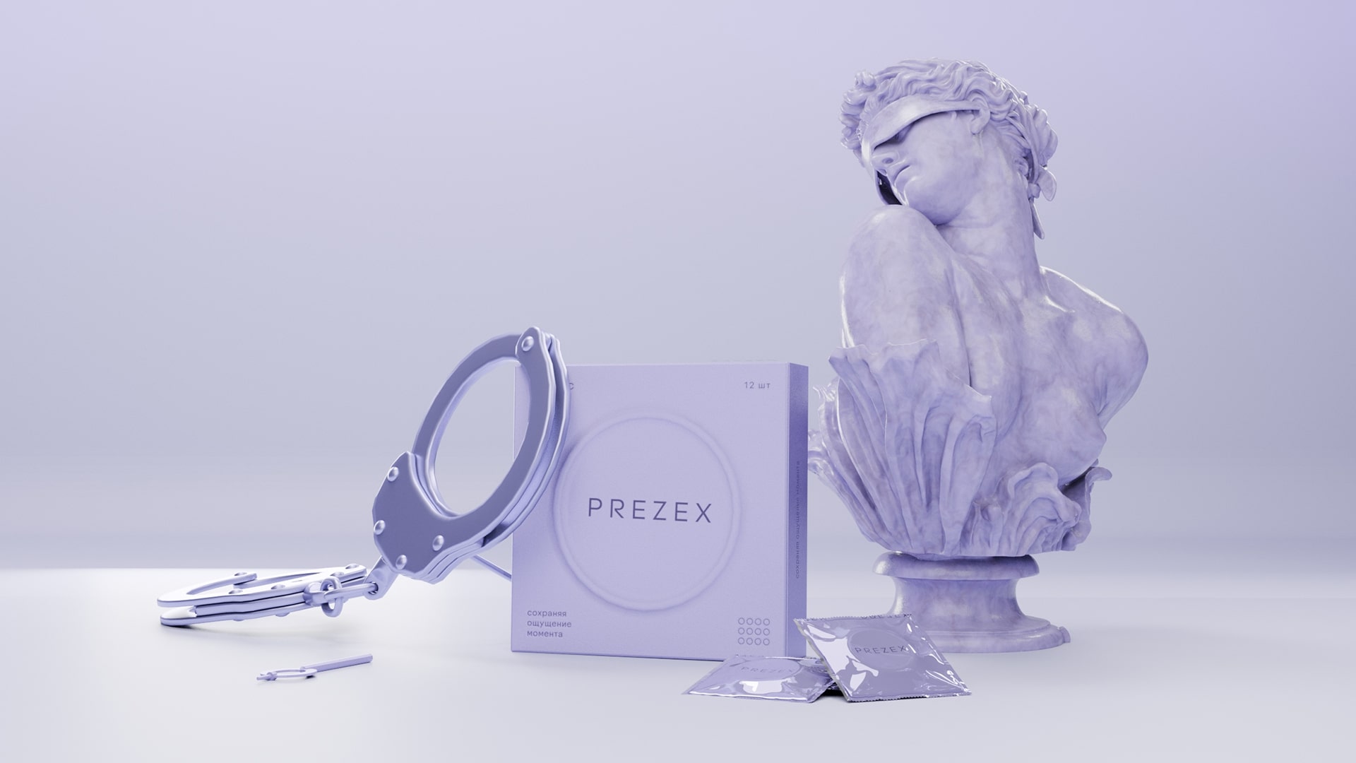
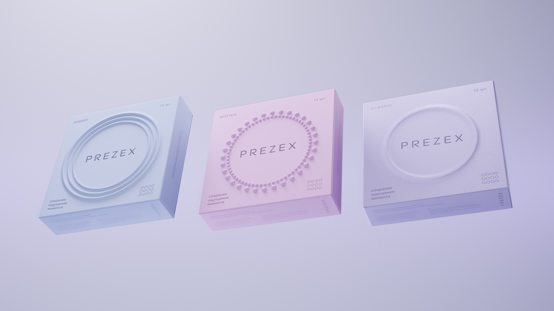
For instance, when working with the condom brand Prezex, we identified two audience segments: thrill-seeking youth and more conservative users who prefer a simple product. We also discovered that tactile packaging elements were an untapped opportunity in the market.
Based on these insights, we developed the “Invisible Partner” concept, avoiding obvious graphics and focusing on tactile sensations. Subtle neomorphic details were embedded into the packaging to reflect different product types, conveying both emotion and simplicity.
2. Standing Out from the Crowd
To grab attention on store shelves, it’s crucial to consider where and how your product will be sold. In a competitive retail environment, even an unconventional color or unusual shape can make a difference.
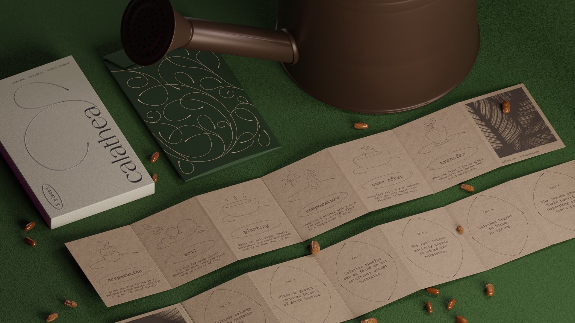
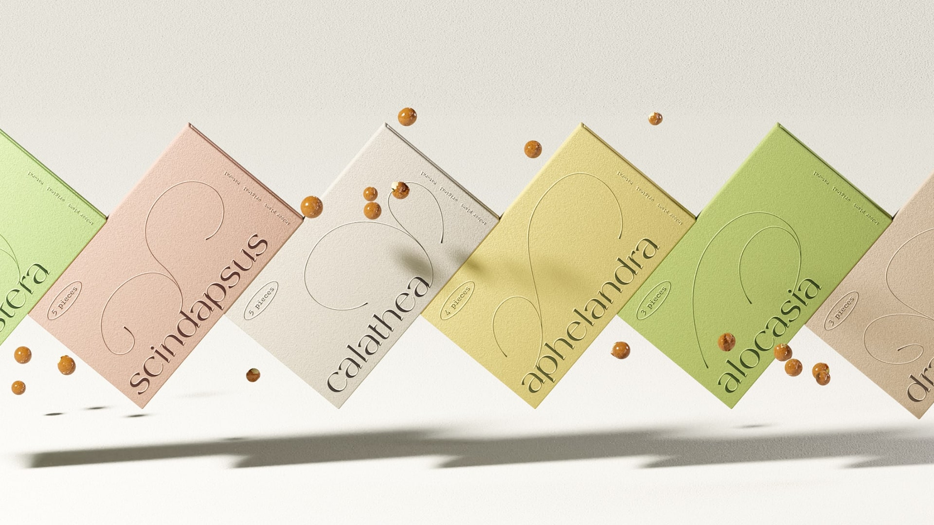
For the Seedline seed brand, we aimed to communicate that gardening is not just a hobby but a form of meditation and a lifestyle. We focused on details, reflecting the art of plant care. The packaging design featured unique fonts, a subtle sprout symbol, and premium materials, emphasizing the depth and mindfulness of the gardening process.
3. Storytelling
In a market saturated with visually appealing products, it’s hard to stand out without an emotional connection. This is where brand storytelling — communicated through packaging — becomes a powerful tool. It conveys the big idea behind the product.
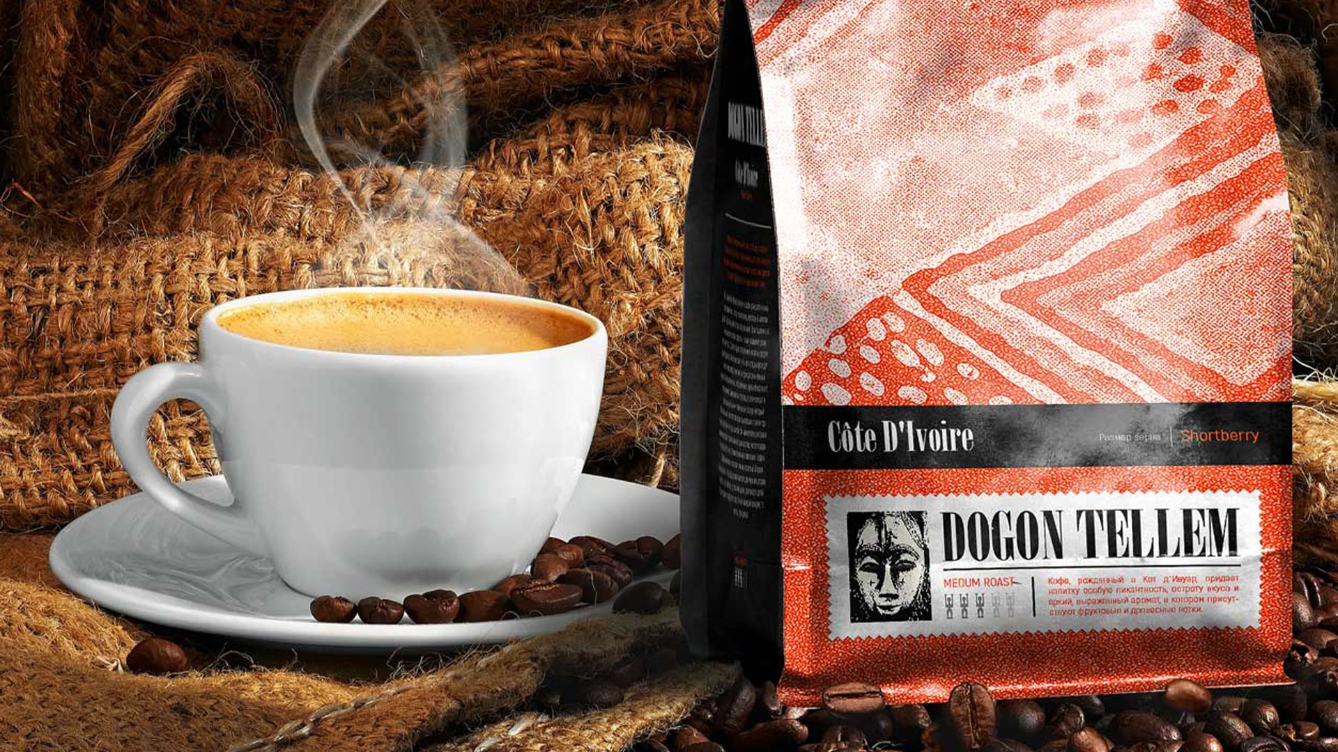
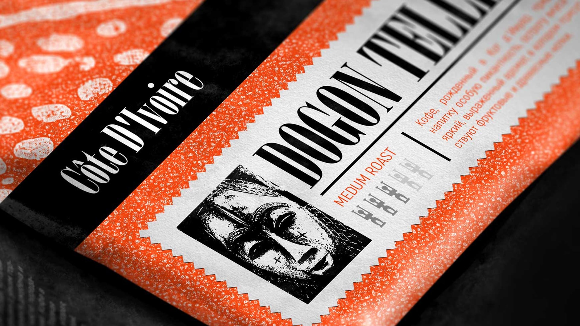
For the Dogon Tellem African coffee brand, we decided to express the continent’s rich culture through packaging. Inspired by traditional African masks and statues, we incorporated these motifs into the design. Mythical figures from ancient tribes not only decorate the packaging but also serve to classify different coffee varieties, offering a story that invites discovery.
In today’s world, where competition for consumers' attention is fierce, every detail of packaging — from tactile elements to visual design — plays a critical role in purchasing decisions. Packaging is more than just wrapping; it’s a powerful tool that tells your brand’s story and influences customer choices.
Subscribe to my newsletter
Read articles from ICU Branding agency directly inside your inbox. Subscribe to the newsletter, and don't miss out.
Written by

ICU Branding agency
ICU Branding agency
Branding agency that creates a connection between business and audience through in-depth research and creative thinking.