The Cost of Simplification
 Mathieu Torchia
Numbers are everywhere. Whether we hear them from U.S. presidential candidates, find them in articles during our searches, or see them in financial reports, they form a significant part of the information we consume. We live in an era where "Big Data" is everywhere, and the only way to make use of it is by simplifying it with data analytics. It’s not just in today’s world; we have always tried to express complex ideas in simpler ways. I’m reminded of the time in high school when we were told
“You cannot take the square root of a negative number!”
Only to find out years later that this was a lie, and that the square root of -1 is equal to the imaginary number “i”. Sometimes, lies like that are needed. If they tried to teach us everything about math during those years, without cutting corners, we would have been completely overwhelmed. However, there are cons when simplifying things. In this article, we'll explore a straightforward example that vividly illustrates how oversimplifying data insights can lead to misleading conclusions.
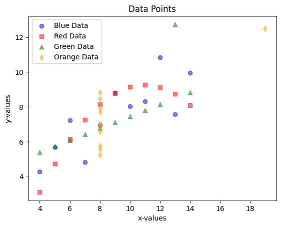
As you know (or, in case you didn’t know), there are many reasons that I started this blog: one being to improve my coding and visualization skills. With that being said, let’s take a look at a seemingly busy (but colourful) scatter plot.

At first glance, this may seem like a random collection of points in a graph. However, after paying attention to each colour, it’s clear that they all follow some sort of pattern:
The blue dots are following an upwards trend
The red squares seem to be forming an arc
The green triangles mostly follow a straight upwards line
The yellow diamonds almost all have the same x value of 8.
Nonetheless, they are all clearly very different from one another.
In practise, there are not many useful data sets out there that only have 44 data points… Data sets can have thousands, millions, and even billions of rows of data, which makes visualizing the data often impossible or extremely difficult to read. Due to this, data analysts will try to simplify the data with measures such as the average, the standard deviation, the coefficient of correlation, etc. But, is there a cost to these simplifications? Let’s dive a bit deeper into the blue dots to help answer that question.

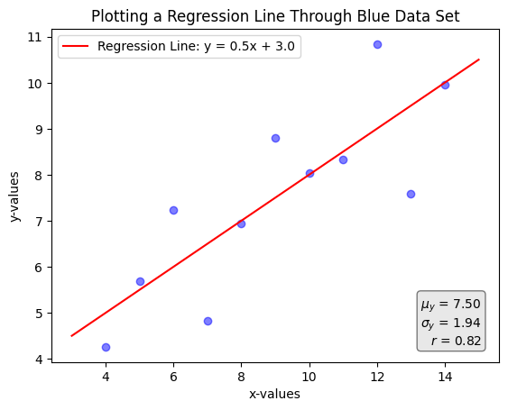
In the graph above, we are plotting only the blue points. Additionally, we added a line that best fits the data (a linear OLS regression), and some common descriptive statistics at the bottom right hand side of the graph. From here, without even plotting the dots, we can get access to a lot of interesting information:
The average y value is 7.50
The standard deviation of the y values is 1.94
x and y have a correlation coefficient of 0.82
The line of best fit follows the following equation:
$$y=0.5x+3.0$$
Great! We've gained a lot of insights from this data by finding key statistics like the average and the correlation coefficient. We can now use these in our discussions or when forming opinions on certain topics, without needing to spend more time exploring the data or checking for anything potentially misleading.
Right?
… Right … ?
Unfortunately, no.
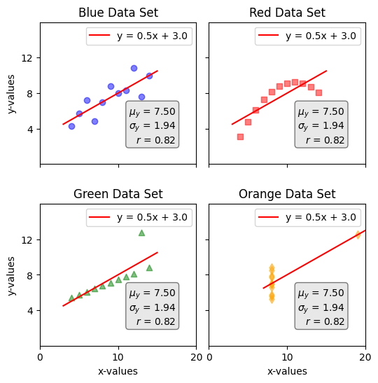
While simplifying data with key statistics like those above is very useful, it's also important to be cautious. These simplifications can sometimes hide important details or lead to incorrect conclusions. To illustrate this point, let's plot the same graph as above, but this time include all the different data points from the first graph.

As shown above, if we draw the line of best fit for each data set, as well as the mean, standard deviation, and coefficient of correlation, we get the exact same result. This is called Anscombe’s quartet, which was constructed in 1973 by Francis Anscombe:
I was amazed by this illustration, and had to post an article about it. It's one of those things that can be understood just by looking at the picture above, without needing many words to explain it.
The key takeaway here is to be careful whenever we attempt to simplify anything. There are benefits to simplification, but to enjoy these advantages, it's important to examine the raw data first to make sure nothing unusual is overlooked. This is more philosophical than mathematical: it’s always better to get information from the source than from a (potentially broken) telephone. If the source is unavailable, then make sure the telephone is a reliable one.
Conclusion
To wrap up, this example resonates beyond mathematics and data analysis; it extends to how we approach real-world issues. I was reminded of this during a talk at the ALLIN AI conference in Montreal last September, where a representative from the "Conseil du statut de la femme" discussed AI's potential risks concerning gender equality. When I asked about her thoughts on mandating companies to hire equal numbers of men and women, she highlighted a critical flaw: while a 50/50 gender ratio may appear balanced on the surface, it may obscure deeper issues—such as women being concentrated in lower-growth roles or positions with limited decision-making power.
The lesson here is clear: simplified metrics can paint an incomplete picture. Whether analyzing data or tackling social challenges, we must look beyond surface-level statistics to ensure we’re not missing important details.
Visit my GitHub page (link) learn more about the python code that made this article possible.
Subscribe to my newsletter
Read articles from Mathieu Torchia directly inside your inbox. Subscribe to the newsletter, and don't miss out.
Written by

Mathieu Torchia
Mathieu Torchia
With a Master's degree in Economics from McGill University, I currently serve as a Business Analyst in the Revenue Management department at Air Canada. I am eager to learn more about answering tough questions with the help of data analysis, data science, and machine learning. I aspire to become an expert in the field and eventually spend the rest of my days teaching others about math, stats, and data science.