Individual Scores in Choice Models, Part 1: Data & Averages
 Chris Chapman
Before jumping into today’s topic, I will highlight the previous post in case you missed it: guest author — and coauthor of the Quant UX book — Kerry Rodden discusses HEART metrics. It updates Kerry’s classic description of HEART with new reflections on how to make UX metrics succeed in practice. Read it here!
Today I begin a series of posts that demonstrate working in R with individual level estimates from choice models such as MaxDiff and Conjoint Analysis. Those are the best estimates of preference for each respondent to a choice survey. I hope they will inspire you both to run choice surveys and to learn more from them!
Background and Assumptions
Assumptions: I assume that you know what a choice model survey is, and — at a high level — what individual scores are. If not, check out this post about MaxDiff surveys. Or take one of the upcoming Choice Modeling Master Classes from the Quant Association! Or for even more, find sections on MaxDiff in the Quant UX book and discussions of Conjoint Analysis in the R book and Python book.
However, to recap briefly, individual scores are the best estimates for each respondent who completed a choice survey. For example, they report each respondents’ interest — as estimated by the model — for every one of the items tested in the survey.
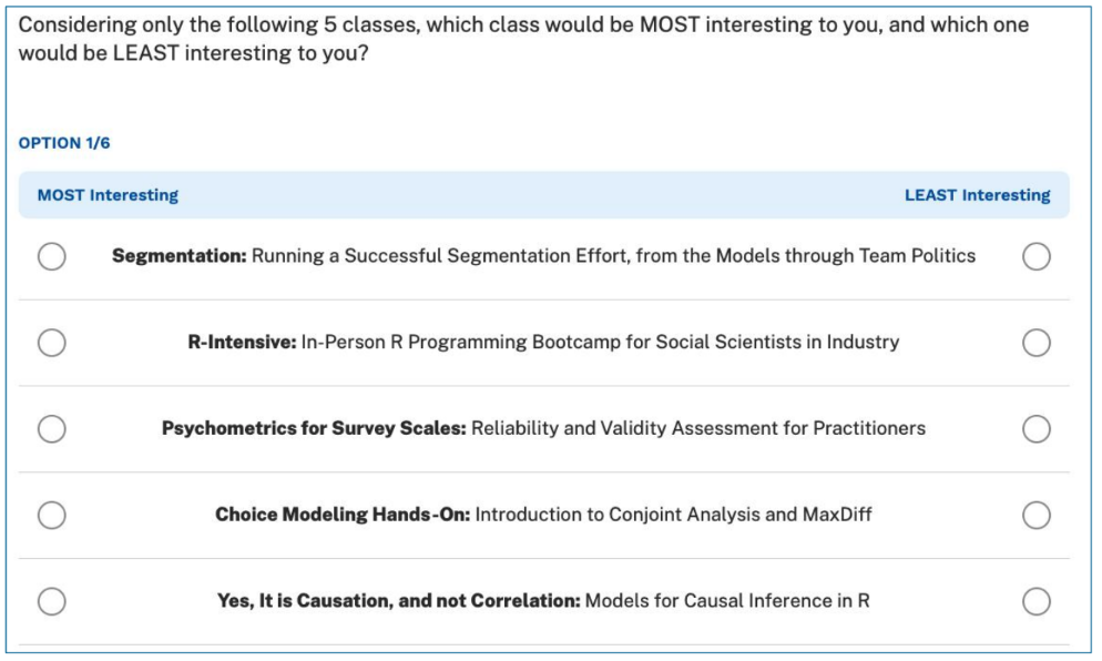
Data. Here I discuss data from N=308 UX Researchers who took a MaxDiff survey about potential classes from the Quant UX Association. As with most Quant Association surveys, the respondents agreed that we could use the (anonymous) data publicly. Yay! It is great to discuss realistic choice model data. The survey included 14 potential classes. Here is an example MaxDiff screen:

Data Format. The estimates here were estimated by Sawtooth Software’s Discover product. The code here begins with an Excel file exactly as exported by Discover. Each row is represents one respondent’s interest in each of the potential classes.
Note: Without going into the details of hierarchical Bayes (HB) models, I’ll note that the HB process gives 1000s of estimates for each respondent. The values here — the ones that most analysts would use — are the mean (average) of those for each person. Although the estimates are somewhat uncertain for one person, the overall set of estimates are an excellent representation for the group.
R code. I assume you can generally follow R. A key goal of this post is to share R code that will help you get accelerate your own work. (More in the R book!)
You should be able to follow along live in R — all of the data and code are shared here. In each block of R code, you can use the copy icon in the upper right to copy the code and paste it into R to follow along. Or see the end of the post for all of the code in one big chunk.
Packages. You may need to install extra R packages along the way. If you get an error running a “library()” command, you probably need to install that package.
Load the Data
Sawtooth Discover exports individual estimates as Excel (.xlsx) files. I’ve uploaded that file, and can download it directly from its URL using the openxlsx package:
# Read Excel data as saved by Sawtooth
library(openxlsx)   # install if needed
# online location (assuming you are able to read it)
md.dat <- read.xlsx("https://quantuxbook.com/misc/QUX%20Survey%202024%20-%20Future%20Classes%20-%20MaxDiff%20Individual%20raw%20scores.xlsx")   #
It’s helpful to do a bit of minor cleanup. First of all, in Anchored MaxDiff, each item is compared to an “anchor” of whether there is positive interest or not. The anchor estimate is always exported as “0”, so we can remove that as non-informative.
Second, the file sets column (variable) names that are the entire text of each item. It’s helpful to replace those with shorter versions that are easy to read.
Those steps are:
# Some minor clean up
# remove the "Anchor" item that is always 0 after individual calibration
md.dat$Anchor <- NULL
# Assign friendly names instead of the long names, so we can plot them better
names(md.dat)[3:16]  # check these to make sure we're renaming correctly
names(md.dat)[3:16] <- c("Choice Models",  "Surveys",       "Log Sequences",    "Psychometrics",
                         "R Programming",  "Pricing",       "UX Metrics",       "Bayes Stats",
                         "Text Analytics", "Causal Models", "Interviewer-ing",  "Advanced Choice",
                         "Segmentation",   "Metrics Sprints")
Next, I use str() and summary() to do some basic data checks:
# Basic data check
str(md.dat)
summary(md.dat)
Finally, I set a variable for the item columns (columns 3:[end]) so I can refer to them easily, without a magic number “3” showing up multiple times later:
# Index the columns for the classes, since we'll use that repeatedly
classCols <- 3:ncol(md.dat)    # generally, Sawtooth exported utilities start in column 3
With those lines, we have data! It’s time to look at the results.
Initial Chart: Overall Estimates
The first thing we might want to know — or that stakeholders will ask — is which classes are most desired. In the spreadsheet world, that might be done by finding the average level of interest and then creating a bar chart. We’ll do the same thing here: find the average interest and then generate a bar chart.
In R, there are many different ways to obtain column averages. I’ll use lapply( , mean) … just because it occurred to me first. I use barplot() to plot them:
# First, get the average values for the classes
mean.dat <- lapply(md.dat[ , classCols], mean)

# Plot a simple bar chart of those averages
# first set the chart borders so everything will fit [this is trial and error]
par(mar = c(3, 8, 2, 2))
# then draw the chart
barplot(height = unlist(mean.dat), names.arg = names(mean.dat),    # column values and labels
        horiz = TRUE, col ="darkblue",                           # make it horizontal and blue
        cex.names = 0.75, las = 1,                                   # shrink the labels and rotate them
        main = "Interest Level by Quant Course")
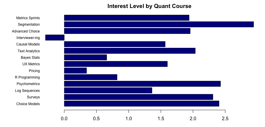
In the plot, I set margins for the graphics window with par(mar=…) to make it fit. That is a trial and error process for base R plots. I set the barplot() to be horiz[ontal] and slightly shrink (cex.names=0.75) and rotate the labels (las=1) to be readable.
Here’s the result:

It is very, well, spreadsheet-ish. We see the winner (segmentation) and loser (interviewer training) … but we can do much better!
Better Chart: Estimates with Error Bars
In the chart above, we can see the averages but have no insight into the distribution. Are the averages strongly different? Or are they very close in comparison to the underlying distributions? Put differently, is the “winner” (segmentation) really much stronger than the next three options (psychometrics, etc.) or is it only slightly better?
A better chart would show error bars for the means, so that we can tell whether differences are — to use the common but somewhat misleading term (for reasons I’ll set aside) — “significant”. We’ll do that by using the geom_errorbar() visualization option in ggplot2.
I do lots of choice models and have to make plots like this all the time. I often make similar plots repeatedly, plotting different subsets of data, different samples, and the like. For that, it is useful to make a function for such plots. I can simply reuse one function and not rely on error-prone copying and repetition of code.
Here’s a relatively basic function to plot average estimates from an anchored MaxDiff with error bars. (For other estimates such as general MaxDiff or conjoint, it will also work; just change the xlab() label, either in the function or by adding it afterward.)
plot.md.mean <- function(dat, itemCols) {
  library(ggplot2)
  library(reshape2)
  # warning, next line assumes we're using Sawtooth formatted data!
  md.m <- melt(dat[ , c(1, itemCols)])   # add column 1 for the respondent ID
  # put them in mean order
  library(forcats)
  md.m$variable <- fct_reorder(md.m$variable, md.m$value, .fun = mean)

  p <- ggplot(data = md.m, aes(x = value, y = variable)) +
    # error bars according to bootstrap estimation ("width" is of the lines, not the CIs)
    geom_errorbar(stat = "summary", fun.data = mean_cl_boot, width = 0.4,) +
    # add points for the mean value estimates
    geom_point(size = 4, stat = "summary", fun = mean, shape = 20) +
    # clean up the chart
    theme_minimal() +
    xlab("Average interest & CI (0=Anchor)") +
    ylab("Quant Course")

  p
}
There’s not a lot to say about this function. First, it melts the data to fit typical ggplot patterns. It adds the identifier column (1) for melt(); that would need adjusting if you have differently formatted data. Then it calls fct_reorder() from the forcats library to put the labels into order — in this case, to order them by the mean value of the grouped data. The error bars are plotted by geom_errorbar(), and that uses the mean_cl_boot option to find the confidence intervals by bootstrapping. (That function is in Hmisc, another potential package to install). Finally, after plotting the error bars, it adds the actual mean points with geom_point().
Now that we have a function, it is a simple command to plot the data:
plot.md.mean(md.dat, classCols)
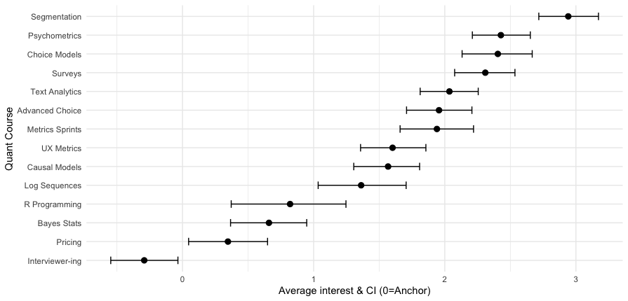
Here’s the result:

Now we can see that the segmentation class is a fairly strong #1, while the next 3 classes (psychometrics, choice, surveys) are essentially tied. Among the 14 classes, 13 have average interest greater than zero — the MaxDiff anchor — while interviewer training falls below the anchor on average.
As a final note, because the function returns a ggplot object “p”, we could add other ggplot2 options. For instance, we might add “+ ggtitle(“My title!”)” to add a title or change the y axis label with “+ ylab(“a different label”)”
The drawback of this plot is the following: it assumes that we want to know how classes compare in average values, according to statistical significance. In actual practice, that is not usually the case.
Why not? We are usually uninterested in averages and their confidence intervals? Because most often, practitioners need to know how many respondents are interested in something, and how many of them are strongly interested or disinterested. We do not reach any “average” customer — we reach individuals.
So although an average chart with error bars is a good high-level view, there is more to learn.That brings us to my favorite chart: individual distributions!
Another Great Chart: Individual Distributions
There is one important question that an average chart — such as the ones above — cannot answer. That question is: “OK, this is the best item on average … but which item has people who are the very most interested in it?”
For that, it is helpful to examine the individual distributions — not only where respondents are on average but whether there are groups who differ strongly in interest above or below the average.
As you probably guessed, I’ll plot it with a reusable function! Here’s the function. It’s long but I’ll break it down below.
cbc.plot <- function(dat, itemCols = 3:ncol(dat),
                     title = "Preference estimates: Overall + Individual level",
                     meanOrder = TRUE) {

    # get the mean points so we can plot those over the density plot
  mean.df <- lapply(dat[ , itemCols], mean)

  # melt the data for ggplot
  library(reshape2)
  #                       vvvv  assumes Sawtooth order;       vvv  (ID in col 1, remove RLH in col 2)
  plot.df <- melt(dat[, c(1, itemCols)], id.vars = names(dat)[1])

  # get the N of respondents so we can set an appropriate level of point transparency
  p.resp  <- length(unique(plot.df[ , 1]))

  # optionally and by default order the results not by column but by mean value
  # because ggplot builds from the bottom, we'll reverse them to put max value at the top
  # we could use fct_reorder but manually setting the order is straightforward in this case
  if (meanOrder) {
    plot.df$variable <- factor(plot.df$variable, levels = rev(names(mean.df)[order(unlist(mean.df))]))
  }

  #### Now : Build the plot
  # set.seed(ran.seed)   # optional; points are jittered; setting a seed would make them exactly reproducible
  library(ggplot2)
  library(ggridges)

  # build the first layer with the individual distributions
  p <- ggplot(data=plot.df, aes(x=value, y=variable, group=variable)) +
    geom_density_ridges(scale=0.9, alpha=0, jittered_points=TRUE,
                        rel_min_height=0.005,
                        position="points_sina",
                        # set individual point alphas in inverse proportion to sample size
                        point_color="blue", point_alpha=1/sqrt(p.resp),
                        point_size=2.5) +
    # reverse y axis to match attribute order from top
    scale_y_discrete(limits=rev) +
    ylab("Level") + xlab("Relative preference (blue=individuals, red=average)") +
    ggtitle(title) +
    theme_minimal()

  # now add second layer to plot with the means of each item distribution
  for (i in 1:length(mean.df)) {
    if (meanOrder) {
      # if we're drawing them in mean order, get the right one same as above
      p <- p + geom_point(x=mean.df[[rev(order(unlist(mean.df)))[i]]],
                          y=length(mean.df)-i+1, colour="tomato",      # adjust y axis because axis is reversed above
                          alpha=0.5, size=2.0, shape=0, inherit.aes=FALSE)

    } else {
      p <- p + geom_point(x=mean.df[[i]],
                          y=length(mean.df)-i+1, colour="tomato",      # adjust y axis because axis is reversed above
                          alpha=0.5, size=2.0, shape=0, inherit.aes=FALSE)
    }
  }
  p
}
In the first couple of lines of the function, it finds the average value for each item using lapply(), the same as we already saw above. That’s so we can add those as a separate layer on the plot later. Then it melts the data, again just like saw above.
Next, it finds the total N of respondents and saves that as p.resp. Why? Because when we plot the individuals, we want to set a transparency alpha value. Setting alpha in inverse proportion to the (square root of the) number of respondents makes those points more legible.
By default, it puts the labels into their mean order, using the averages we calculated instead of fct_reorder() as above (everything in R has multiple good options!)
The next two big chunks build the plot in two states. The first big chunk uses the ggridges package to plot geom_density_ridges() density curves for the individual distributions. I won’t try to explain those; just look at the chart below! Its options add individual points to the curves, and sets a transparency alpha as I described above.
The second big chunk adds points to the chart, overlaying the density ridges with the average values for each item. To do that, it iterates over the items with a for() loop, and then adds the point in the proper place according to whether the items are displayed in sorted order or not.
We call the plot with a simple command, adding a custom y axis label:
cbc.plot(md.dat, itemCols=classCols) + ylab("Quant Course Offering")
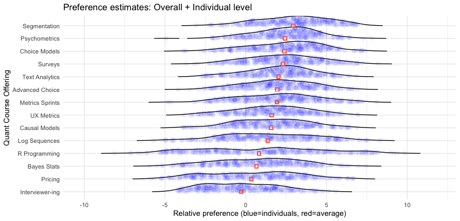
Here’s the result:

Wow! This chart has a lot of great information.
I won’t interpret it in complete detail but will note a couple of interesting features. First, it reinforces that Segmentation is a strong #1 option — not only does it have the highest average, more than 90% of respondents show positive interest greater than the anchor value of 0. We also see at the upper end of interest — the right hand side — that Segmentation has many more respondents with particularly strong interest (greater than a value of 5.0, to choose an arbitrary point) than any other class.
However, we see some other things with subsets of respondents with high interest. For example, although the R Programming course is a weak #11 out of 14 in average interest, it has a small number of respondents showing the strongest interest of anyone in any class.
When we consider that hands-on classes are small, and reach only the people interested in them, these results suggest that an R class could be an good offering, even if the average is lower. We don’t care how people are uninterested — we only care whether we can reach enough people who are interested!
With that, I’ll leave you to inspect the chart and find other interesting ideas.
Coming up in Post 2
In the next post, I’ll go farther with these data and examine:
Correlations among interests: if they like X, what else do they like or dislike?
Finding clusters of classes that go together (item clusters — we’ll look at respondent clusters in post 3)
… and later posts will look at respondent segmentation and (briefly) data quality
Stay tuned for Post #2 in a few days!
Meanwhile, if you’re interested in more about choice models and/or R, check out this post about MaxDiff surveys; and upcoming Choice Modeling Master Classes from the Quant UX Association; and sections on MaxDiff in the Quant UX book and Conjoint Analysis in the R book or Python book. Also, for more experienced choice modelers, I recently shared this post about misunderstandings of Conjoint Analysis.
All the Code
As promised, following is all of the R code from this post. You can use the copy icon in the upper right to grab it all at once, and paste into RStudio or wherever you code.
Cheers!
# blog scripts for analysis of individual level MaxDiff data
# Chris Chapman, October 2024

##### 1. Get individual-level mean beta estimates as exported by Sawtooth Software

# 1a. read Excel data as saved by Sawtooth
library(openxlsx)
# online location (assuming you are able to read it)
md.dat <- read.xlsx("https://quantuxbook.com/misc/QUX%20Survey%202024%20-%20Future%20Classes%20-%20MaxDiff%20Individual%20raw%20scores.xlsx")   #

# 1b. Some minor clean up
# remove the "Anchor" item that is always 0 after individual calibration
md.dat$Anchor <- NULL
# Assign friendly names instead of the long names, so we can plot them better
names(md.dat)[3:16]  # check these to make sure we're renaming correctly
names(md.dat)[3:16] <- c("Choice Models",  "Surveys",       "Log Sequences",    "Psychometrics",
                         "R Programming",  "Pricing",       "UX Metrics",       "Bayes Stats",
                         "Text Analytics", "Causal Models", "Interviewer-ing",  "Advanced Choice",
                         "Segmentation",   "Metrics Sprints")

# 1c. Basic data check
str(md.dat)
summary(md.dat)

# 1d. Index the columns for the classes, since we'll use that repeatedly
classCols <- 3:ncol(md.dat)    # generally, Sawtooth exported utilities start in column 3


##### 2. Plot the overall means

# 2a. The easy way (but not so good)
# First, get the average values for the classes
mean.dat <- lapply(md.dat[ , classCols], mean)

# Plot a simple bar chart of those averages
# first set the chart borders so everything will fit [this is trial and error]
par(mar=c(3, 8, 2, 2))
# then draw the chart
barplot(height=unlist(mean.dat), names.arg = names(mean.dat),    # column values and labels
        horiz = TRUE, col ="darkblue",                           # make it horizontal and blue
        cex.names=0.75, las=1,                                   # shrink the labels and rotate them
        main ="Interest Level by Quant Course")


# 2b. A somewhat more complex (but much better) way
#     we'll make this a function ... it's often good to make anything long into a function :)
plot.md.mean <- function(dat, itemCols) {
  library(ggplot2)
  library(reshape2)
  # warning, next line assumes we're using Sawtooth formatted data!
  md.m <- melt(dat[ , c(1, itemCols)])   # add column 1 for the respondent ID
  # put them in mean order
  library(forcats)
  md.m$variable <- fct_reorder(md.m$variable, md.m$value, .fun=mean)

  p <- ggplot(data=md.m, aes(x=value, y=variable)) +
    # error bars according to bootstrap estimation ("width" is of the lines, not the CIs)
    geom_errorbar(stat = "summary", fun.data = mean_cl_boot, width = 0.4,) +
    # add points for the mean value estimates
    geom_point(size = 4, stat = "summary", fun = mean, shape = 20) +
    # clean up the chart
    theme_minimal() +
    xlab("Average interest & CI (0=Anchor)") +
    ylab("Quant Course")

  p
}
# call our plot
plot.md.mean(md.dat, classCols)


##### 3. Even better: Plot the distributions (individual estimates)

cbc.plot <- function(dat, itemCols=3:ncol(dat),
                     title = "Preference estimates: Overall + Individual level",
                     meanOrder=TRUE) {

    # get the mean points so we can plot those over the density plot
  mean.df <- lapply(dat[ , itemCols], mean)

  # melt the data for ggplot
  library(reshape2)
  #                       vvvv  assumes Sawtooth order;       vvv  (ID in col 1, remove RLH in col 2)
  plot.df <- melt(dat[, c(1, itemCols)], id.vars=names(dat)[1])

  # get the N of respondents so we can set an appropriate level of point transparency
  p.resp  <- length(unique(plot.df[ , 1]))

  # optionally and by default order the results not by column but by mean value
  # because ggplot builds from the bottom, we'll reverse them to put max value at the top
  # we could use fct_reorder but manually setting the order is straightforward in this case
  if (meanOrder) {
    plot.df$variable <- factor(plot.df$variable, levels = rev(names(mean.df)[order(unlist(mean.df))]))
  }

  #### Now : Build the plot
  # set.seed(ran.seed)   # optional; points are jittered; setting a seed would make them exactly reproducible
  library(ggplot2)
  library(ggridges)

  # build the first layer with the individual distributions
  p <- ggplot(data=plot.df, aes(x=value, y=variable, group=variable)) +
    geom_density_ridges(scale=0.9, alpha=0, jittered_points=TRUE,
                        rel_min_height=0.005,
                        position="points_sina",
                        # set individual point alphas in inverse proportion to sample size
                        point_color = "blue", point_alpha=1/sqrt(p.resp),
                        point_size=2.5) +
    # reverse y axis to match attribute order from top
    scale_y_discrete(limits=rev) +
    ylab("Level") + xlab("Relative preference (blue=individuals, red=average)") +
    ggtitle(title) +
    theme_minimal()

  # now add second layer to plot with the means of each item distribution
  for (i in 1:length(mean.df)) {
    if (meanOrder) {
      # if we're drawing them in mean order, get the right one same as above
      p <- p + geom_point(x=mean.df[[rev(order(unlist(mean.df)))[i]]],
                          y=length(mean.df)-i+1, colour="tomato",      # adjust y axis because axis is reversed above
                          alpha=0.5, size=2.0, shape=0, inherit.aes=FALSE)

    } else {
      p <- p + geom_point(x=mean.df[[i]],
                          y=length(mean.df)-i+1, colour="tomato",      # adjust y axis because axis is reversed above
                        alpha=0.5, size=2.0, shape=0, inherit.aes=FALSE)
    }
  }
  p
}

cbc.plot(md.dat, itemCols=classCols) + ylab("Quant Course Offering")
Subscribe to my newsletter
Read articles from Chris Chapman directly inside your inbox. Subscribe to the newsletter, and don't miss out.
Written by

Chris Chapman
Chris Chapman
President + Executive Director, Quant UX Association. Previously: Principal UX Researcher @ Google; Amazon Lab 126; Microsoft. Author of "Quantitative User Experience Research" and "[R | Python] for Marketing Research and Analytics".
