How to Build Your Own Wheel of Names with React and TypeScript
 Mihail Gaberov
A while ago, I stumbled upon a website listing various coding challenges, and I decided to give some a try.
Last week, I came across one that involved building a "Wheel of Names." It reminded me of a similar project I built years ago using Flash and ActionScript 3—technologies that have since fallen out of use. So, I thought it would be fun to recreate the wheel, but this time using a modern tech stack.
In this tutorial, I’ll walk you through how I built it from scratch.
Table of Contents
Project Description
This will be an app that I presume is inspired by the TV show Wheel of Fortune. In the TV show, contestants try to figure out a short phrase by guessing letters. If they guess correctly, the letter will be revealed. They spin the wheel to determine how much money each correct letter is worth.
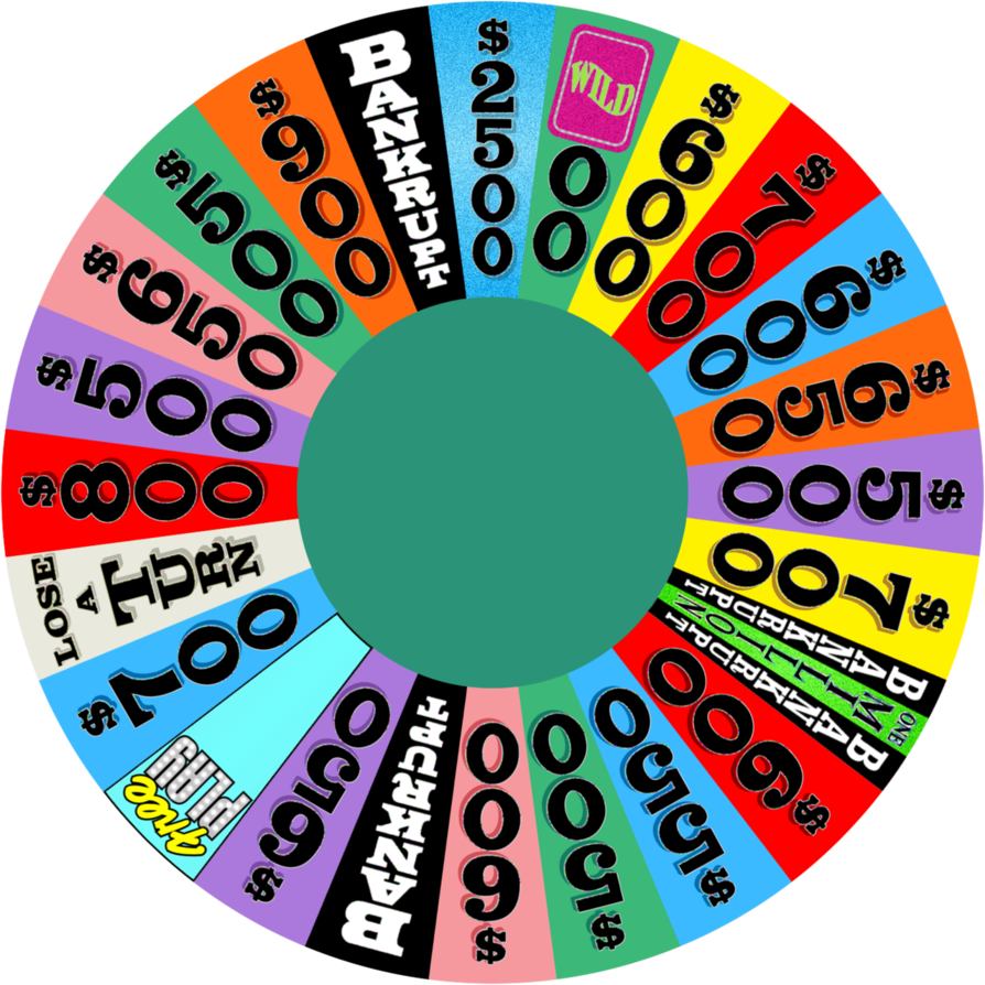
Wheel of Names is similar, but allows us to create a virtual wheel, putting our own names on it. We can then virtually spin it to determine a winner.
GitHub Repo
If you want to skip the reading, here 💁 is the GitHub repository with a detailed README 🙌. Here you can see the live demo.
Why Would I Need a Wheel of Names?
First of all, it’s a lot of fun to build your own! A practical, real-life use case would be for running lottery-style games where you need to pick a random winner.
For example, imagine you’re part of an agile team that holds retrospectives every two weeks, and you need to randomly choose a team member to lead each session. Just add everyone’s name to the participants list, spin the wheel, and let it decide for you! 🎡
The Plan for the App
The app is made up of several components, with the main feature being the spinning wheel. The wheel will have a section for each participant, and each section will be uniquely coloured, with its size proportionally calculated based on the number of participants. Once the spinning animation finishes, the winner will be revealed with a fun, confetti-style popup.
Other parts of the app include a section to enter the question or phrase that the spin is for, as well as controls for adding participant names and displaying them in a neatly organised list.
The list will offer options to sort and shuffle the names. The sorting will arrange the names alphabetically, while the shuffle option will randomise them. You can also delete any previously added participant.
All of these changes are dynamically reflected on the wheel component, ensuring that the wheel stays up-to-date with the latest participant list.
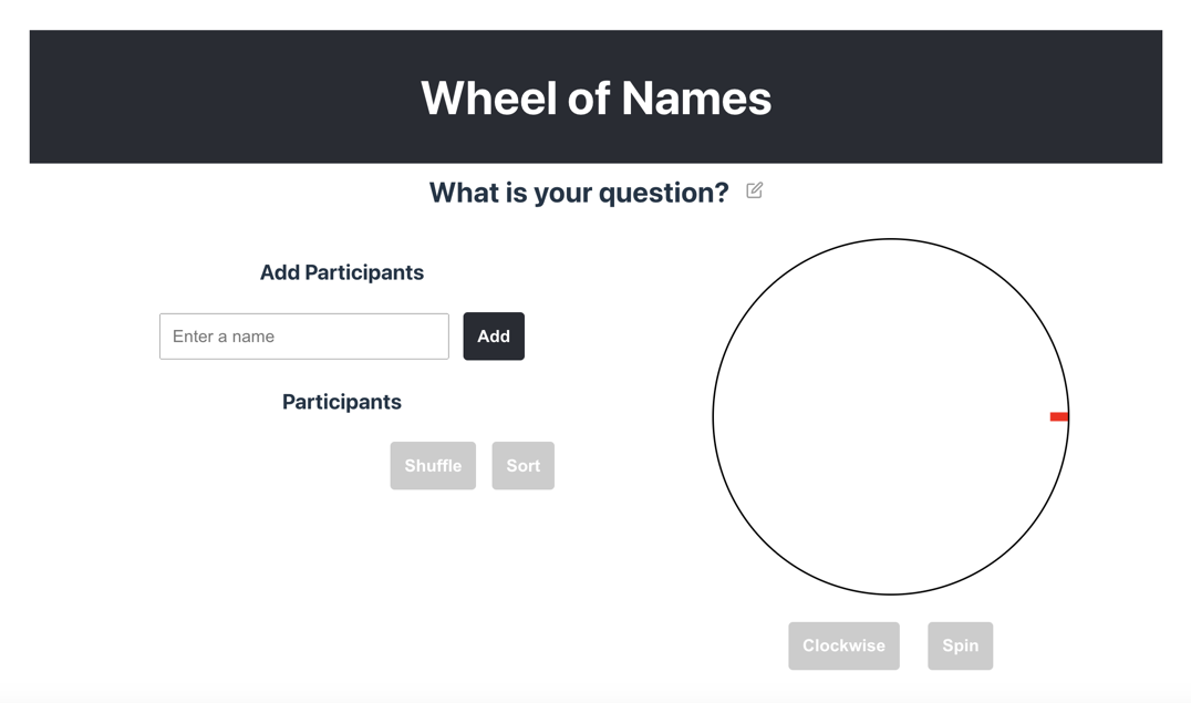
Here are a few screenshots that showcase what the app will look like once it's complete.
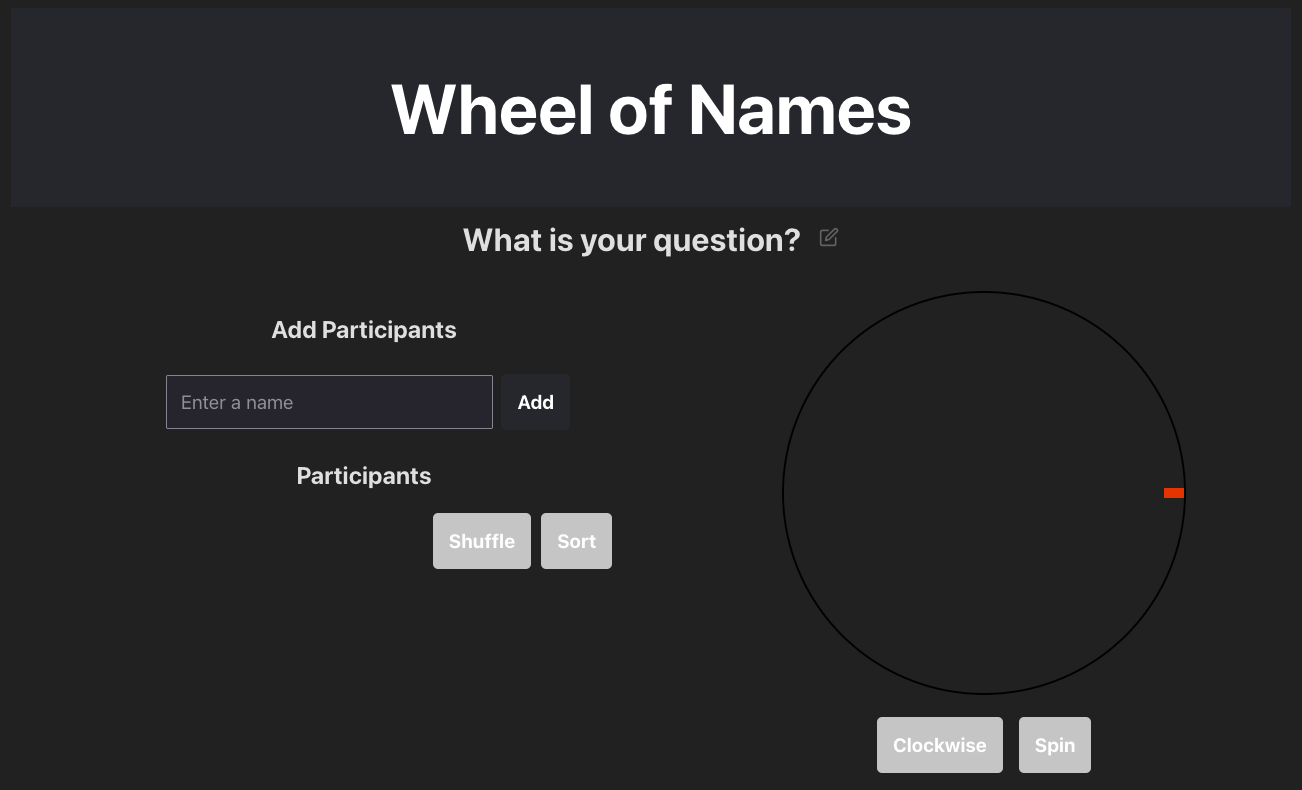
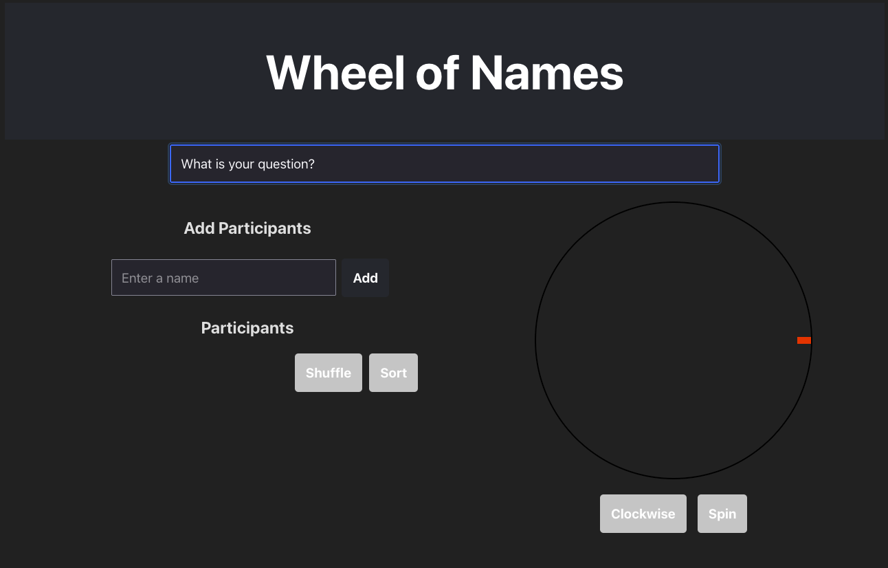
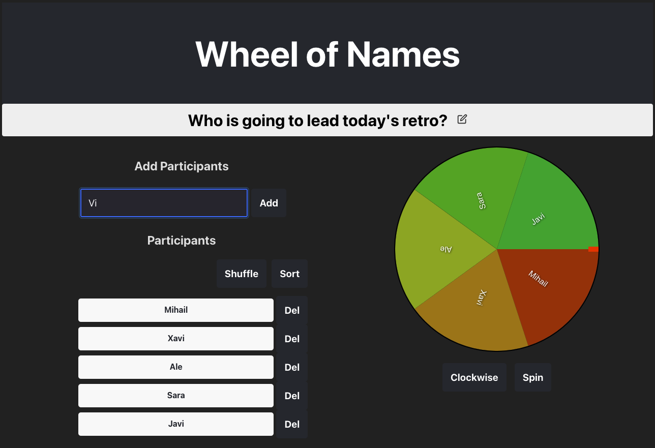
Here are some YouTube videos I recorded after completing the app, showcasing its features in action.
Application features:
I. Question
This is where users can submit a question or phrase that will determine the focus of the spins.
Any changes made in the input field are saved when the user clicks outside of it (on focus out).
II. Wheel
The wheel component spins with an easing animation and determines the winner.
The spin direction can be adjusted using the buttons, for either clockwise or counterclockwise rotation.
Each adjacent sector is uniquely coloured, and their sizes are calculated proportionally to the number of participants.
III. Add Participants
The participant entry area includes an input field for entering a participant's name and an 'ADD' button to add it to the participants list.
To add participants more quickly, the user can press the ENTER key on the keyboard.
IV. Participants List
This section displays all the participants' names.
The list offers options to sort the names alphabetically or shuffle them randomly, with both actions dynamically updating the wheel component.
The Tech Stack
Here’s a list of the main technologies we’ll be using:
Bun – A fast JavaScript bundler and package manager, known for its speed and simplicity.
Vite – A build tool that provides a fast development environment, particularly optimised for modern web projects.
React – A popular JavaScript library for building user interfaces, enabling efficient rendering and state management.
TypeScript – A superset of JavaScript that adds static typing, improving code quality and maintainability.
styled-components – A library for writing CSS-in-JS, allowing styles to be scoped to components and providing a more dynamic approach to styling.
canvas – A powerful HTML element used to draw graphics, animations, and other dynamic content directly on the web page.
canvas-confetti – A JavaScript library for adding fun, celebratory confetti animations to the canvas, perfect for announcing winners.
Let’s Build the App
From this point onward I will guide you through the process I followed when building this app.
Project Structure
The project structure is quite straightforward, thanks to React and styled-components, which make this modular approach easy to implement. You can check out the project structure in my GitHub repo.
Below, I’ll walk you through the reasoning behind the structure and explain the decisions I made for each part.
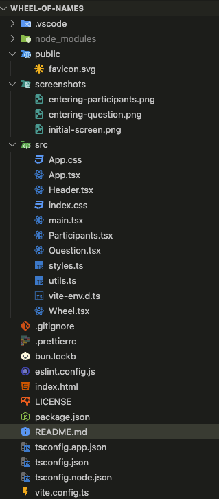
main.tsx: The entry point of the React app created with Vite.
App.tsx: The parent component that includes all other components and handles participant name management (adding, removing, sorting, shuffling).
Header.tsx: Top part of the app, which renders the app title.
Participants.tsx: Renders the controls for adding and displaying participants. It includes a validation function to prevent empty or invalid names.
Question.tsx: Displays the question section, managing state and basic keyboard and click functionality.
Wheel.tsx: The core component containing the animation logic, sector size/colouring, and rendering participant names. It uses the
canvaselement for smooth spinning and integratesconfettito announce the winner.utils.ts: A file with helper functions used across the app.
styles.ts: Contains shared styled components, exported for use throughout the app.
CSS Files and Configs
The remaining files in the project include standard boilerplate CSS styles from the initial Vite setup, along with configuration files for Vite, TypeScript, Prettier, and ESLint. These configurations are commonly used in modern projects and are not specific to this app, so I won't dive into them here. You can easily find documentation for each online.
How to Build the Components
In this section, we will go through the process of building each component of the application, step by step. By the end, you’ll have a fully functional app with modular, self-contained components.
1. App component
The App component serves as the central container for the entire application. It encapsulates all the core building blocks and is responsible for managing the state of the participants' names. Beyond rendering the UI, it handles key application logic, such as adding, removing, sorting, and shuffling participants.
The component uses local state to hold the list of names. This state is updated through callback functions that are triggered by interactions in the child components — specifically, the Participants and Wheel components.
The primary handler functions, handleAddName and handleRemoveName, manage adding and removing names from the list. Additionally, there are two other handlers dedicated to manipulating the order of the names: one for sorting (handleSortNames) and one for shuffling (handleShuffleNames). These handlers provide flexibility in how the list of participants is displayed and interacted with in the app.
const [names, setNames] = useState<string[]>([]);

  const handleAddName = (name: string) => {
    if (names.length < MAX_PARTICIPANTS) {
      setNames([...names, name]);
    }
  };

  const handleRemoveName = (index: number) => {
    setNames(names.filter((_, i) => i !== index));
  };

  const shuffleNames = () => {
    const shuffledNames = [...names].sort(() => Math.random() - 0.5);
    setNames(shuffledNames);
  };

  const sortNames = () => {
    const sortedNames = [...names].sort((a, b) => a.localeCompare(b));
    setNames(sortedNames);
  };
A crucial part of the component is the MAX_PARTICIPANTS constant, which sets a limit on the number of participants allowed. This ensures that the app doesn't exceed a certain number of entries, maintaining performance and usability.
The rendering structure of this component looks as follows:
 return (
    <>
      <Header />
      <Question />
      <Main>
        <Participants
          handleAddName={handleAddName}
          handleRemoveName={handleRemoveName}
          shuffleNames={shuffleNames}
          sortNames={sortNames}
          names={names}
        />
        <Wheel participants={names} />
      </Main>
    </>
  );
2. Header component
The Header component is the simplest part of the application. Its primary role is to display the title at the top of the page. This component is essential for setting the tone and branding of the application. Despite its simplicity, it lays the foundation for structuring the UI and can be easily customised or extended in the future.
Here is how it looks:

3. Question component
The component that displays the input for entering a question or phrase is relatively simple. It renders a text field and utilises a few handler functions to enhance the user experience. These handlers manage focus behaviour: setting focus when the input field is clicked, removing focus when the user clicks outside the field, and allowing the user to use the ENTER or ESCAPE keys to submit or cancel their input, respectively.

4. Participants
In this part of the app, we render the list of all added participants. The component includes a local validation function that runs each time before adding a new participant, ensuring that the input meets the necessary criteria (for example, no duplicates or empty names).
We also leverage built-in HTML attributes to dynamically enable or disable buttons based on the state of the participants list. For example, the "Sort" and "Shuffle" buttons are disabled when the list is empty, while the "Add" button is disabled once the maximum participant limit (MAX_PARTICIPANTS) has been reached. This ensures a smooth and intuitive user experience by preventing invalid actions.
You’ve probably already noticed how we use a utility function from the utils.ts file to capitalise the participant names before displaying them. This ensures that all names are presented in a consistent and user-friendly format.
This happens inside a map() loop, where we iterate over the names data structure and display each participant's name in a separate row within the list component. The utility function is applied during this iteration to ensure that the names are properly capitalised before rendering.
5. Wheel component
This is the largest component in our app. At the top, you'll find the styles required to position the winning popup, which is accompanied by confetti when a winner is selected. Below that, we define an array containing all the possible colours used to color the wheel sectors. Afterward, we move into the component code itself.
The component utilises several states to ensure the spinning animation behaves as expected. Additionally, it manages when to trigger and display the winner popup, with the winner's name shown inside. These states and handlers work together to create a smooth and interactive experience.
 const [spinning, setSpinning] = useState(false);
  const [rotation, setRotation] = useState(0);
  const [spinDirection, setSpinDirection] = useState<
    'clockwise' | 'counterclockwise'
  >('clockwise');
  const [showPopup, setShowPopup] = useState(false);
  const [popupWinner, setPopupWinner] = useState<string | null>(null);
The drawWheel() method is responsible for rendering the wheel with the specified number of sectors on the canvas. This method relies heavily on the canvas element and its associated API to draw each sector and participant's name. We also use our helper function to capitalise the participants' names in the wheel, ensuring consistency with the list component.
When the "Spin" button is clicked, the startSpin() method is triggered. This is where the animation logic is implemented. We generate a random number of rotations, ranging from 5 to 10 full rotations, to make the spin feel unpredictable.
The direction of the spin is determined by the user's selection, allowing the wheel to spin either clockwise or counterclockwise. We also set the spin duration to 6000ms (6 seconds) for a smooth and engaging animation.
To enhance the realism of the animation, we apply an easing function that implements the "Ease-out cubic" effect, which causes the wheel to gradually slow down as it reaches the end of the spin.
 const easing = (t: number) => {
      // Ease-out cubic
      return 1 - Math.pow(1 - t, 3);
    };
The animation is handled by an inner function called animate(), which utilises the requestAnimationFrame API, a feature supported by all modern browsers for smooth, high-performance animations. Inside this function, we calculate the elapsed time and the current rotation, updating the component's state accordingly to ensure the wheel spins smoothly.
During each animation frame, we also invoke the determineWinner() function, which is defined below. This function calculates the winning sector by determining which sector the wheel lands on at the end of the spin. It then updates the popup state to display the winner’s name inside the popup.
const determineWinner = (finalRotation: number) => {
    const sliceAngle = 360 / numSectors;
    const normalizedRotation = ((finalRotation % 360) + 360) % 360;
    const winningSector = Math.floor(normalizedRotation / sliceAngle);

    setPopupWinner(participants[winningSector]);
    setShowPopup(true);
  };
Changing the direction of the spin is straightforward. We simply update the component’s state based on the value of the button’s label, which toggles between "Clockwise" and "Counterclockwise." By setting the state accordingly, we can easily control the spin direction with a single click of the button.
The remaining code before the rendering part of this component includes an effect that controls the visibility of the confetti popup. The startConfetti function is responsible for initiating the confetti animation when a winner is selected. This effect ensures that the confetti animation is triggered and displayed at the right moment, adding a celebratory touch to the experience.
And with all that we are ready to render our Wheel component as it follows:
return (
    <div>
      <canvas
        ref={canvasRef}
        width={400}
        height={400}
        style={{ borderRadius: '50%', border: '2px solid black' }}
      />
      <ButtonsContainer>
        <Button
          onClick={changeSpinDirection}
          disabled={participants.length === 0 || spinning}
        >
          {capitalize(spinDirection)}
        </Button>
        <Button
          onClick={startSpin}
          disabled={participants.length === 0 || spinning}
        >
          Spin
        </Button>
      </ButtonsContainer>
      {showPopup && popupWinner && (
        <Popup>
          <h2>Congratulations!</h2>
          <h3>{capitalize(popupWinner)}</h3>
        </Popup>
      )}
    </div>
How to Deploy the App to Vercel
Finally 🎉 we’re ready to deploy our app.
I used Vercel for this deployment because it offers a fast, free, and easy way to deploy web apps. If you'd like a more detailed guide on how to deploy with Vercel, check out my previous tutorial for step-by-step instructions.
Wrapping Up
I hope you found this process as interesting and enjoyable to follow as it was for me to create!
Now, let’s take a moment to reflect on what we’ve accomplished and highlight a few key takeaways that could prove useful for future projects.
Modular Design: Breaking the app into small, manageable components made it easier to maintain and scale.
React and Styled-Components: These tools streamlined the development, allowing for dynamic styling and efficient UI management.
Canvas for Animations: Leveraging the
canvaselement enabled smooth and visually appealing animations.Vercel Deployment: Vercel's simplicity and speed made it the ideal choice for quickly deploying the app.
This project highlighted the power of modern tools like React, TypeScript, and canvas, all while ensuring the app stayed modular and easy to maintain.
Thanks for reading! 🙏
Subscribe to my newsletter
Read articles from Mihail Gaberov directly inside your inbox. Subscribe to the newsletter, and don't miss out.
Written by
