Stock market forecasting using the ARIMA model
 CodeChef-VIT
The autoregressive integrated moving average (ARIMA) models have been explored for time series prediction for a significant amount of time now, in the scope of this blog, let us see how they can be used for stock market forecasting.

“Stock price prediction is very difficult, especially about the future” is one of the most famous quotes by Neils Bohr, a Danish physicist. This article will revolve around the ARIMA model that can be used for stock price predictions(Time-Series forecasting). In this post, I will cover the popular ARIMA forecasting model to predict returns on a stock and demonstrate a step-by-step process of ARIMA modelling using python programming.
Let’s get started with the code :)
- Importing libraries :
Let’s import all the import libraries that we’ll be using in the project.
- Extracting Data :
For this project, we will use the TSLA stock prices. To obtain the Tesla stock prices, we will use the yfinance API. To access this API, simple pip install command in your Jupyter Notebook should do. To import this library in your jupyter project, you can do it using the following way,
import yfinance as yf
Now, let’s pull the entire daily history of the ticker “TSLA” into a well-defined data frame.
Let’s try to understand some of this code. Our main parameter for this model is the closing price. The object “hist” is a DataFrame, and we send it to CSV to have a local copy. You can run this command every day after the market closes and get the closing price up to date directly stored in the CSV file.
3. Train/Test split :
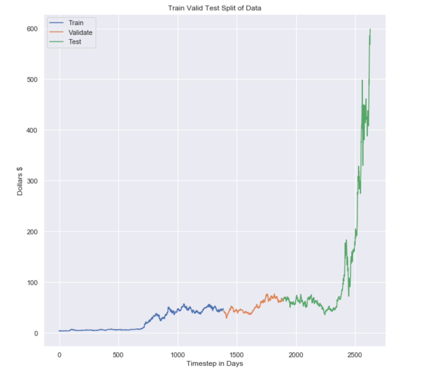
Now we’ll be splitting our data into train and test sets. I have chosen the date, ‘2015–12–31' at random. You can go ahead and pick some other date for different results and kind of play around with it. Although validation set is not required here, we’ll still do it so that we can use this dataset on several other models than ARIMA like Moving averages, or Naive Bayes.
It is important to remember that we pulled the daily data, so each time step is equivalent to 1 day. The data in the plot spans from January 1993 until December 1, 2020. Also to understand this better, I made a plot to visualize it.
4. Is the data stationary?
In most cases, the data is not going to be stationary so we can skip this step but it’s always good to do run the test. The reason for this is because, generally speaking, a stock’s price will increase over time. If you have data that is not stationary, the mean of the data grows over time, which leads to a degradation of our model.
Instead, we should predict the day-to-day return of a stock, or difference, in a stock’s closing price rather than the actual price itself. To test if the data is stationary, we use the Augmented Dickey-Fuller Test.
What is the Augmented Dickey-Fuller Test?
The augmented Dickey-Fuller test (ADF test) is a common statistical test used to test whether a given Time series is stationary or not. It is one of the most commonly used statistical tests when it comes to analyzing the stationary of a series.
ADF using Python: The statsmodel package provides a reliable implementation of the ADF test via the adfuller() function in statsmodels.tsa.stattools.
It returns the following outputs:
a) The p-value
b) The value of the test statistic
c) Number of lags considered for the test
d) The critical value cutoffs.
When the test statistic is lower than the critical value shown, you reject the null hypothesis and infer that the time series is stationary.
When we run the test_stationarity() function on our dataset we obtain the following result.
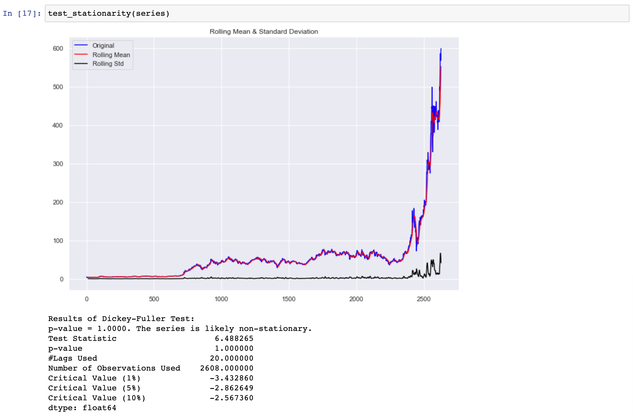
Here we can observe that the obtained p-value for given data is much greater than our cutoff of 0.05, and the ADF test statistic is greater than any of the critical values. Clearly, there is no reason to reject the null hypothesis. So, we can conclude that the time series given is clearly non-stationary.
To make the data stationary, we need to take the first-order difference of the data. Which is just another way of saying, subtract today’s close price from yesterday’s close price. For this, Pandas has a handy function to do this for us.
We can use the series.diff() and obtain the difference of each Adj closing point in the series. For the final result, we can just drop the first table using new_series.dropna(inplace=True)
Now that we have a stationary data series, we can verify the results by passing our new series test_stationary() again.
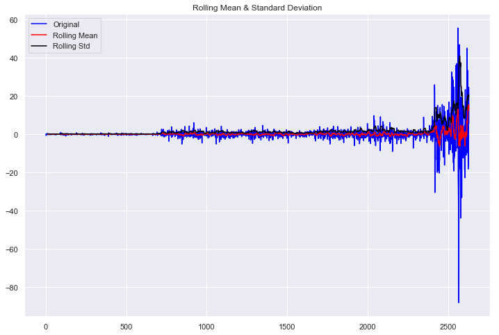
Results of Dickey-Fuller Test:
p-value = 0.0000. The series is likely stationary.
Test Statistic                -9.648313e+00
p-value                        1.457533e-16
#Lags Used                     2.000000e+01
Number of Observations Used    2.607000e+03
Critical Value (1%)           -3.432861e+00
Critical Value (5%)           -2.862649e+00
Critical Value (10%)          -2.567361e+00
dtype: float64
We can derive the following insights from the above data:
The p-value obtained is less than the significance level of 0.05
The ADF statistic is lower than any of the critical values.
We reject the null hypothesis. So, the time series is, in fact, stationary. Finally, our data is stationary, and we can continue. In some instances, you may have to do this test more than once.
5. Autocorrelation: Autocorrelation and partial autocorrelation plots are heavily used in time series analysis and forecasting.
These are plots that graphically summarize the strength of a relationship with observation in a time series with observations at prior time steps. The difference between autocorrelation and partial autocorrelation can be difficult and confusing for beginners to time series forecasting.
Autocorrelation is the correlation between points at time t (Pₜ) and the point at(Pₜ₋₁). Partial autocorrelation is the point at time t (Pₜ) and the point (Pₜ₋ₖ) where k is any number of lags. Partial autocorrelation ignores all of the data in between both points.
So in simple words, Autocorrelation is the relationship between today’s stock price and yesterday’s stock price. Partial autocorrelation is the relationship between today’s stock price and the price which was a week before. So let’s obtain the plots for Autocorrelation and Partial autocorrelation.
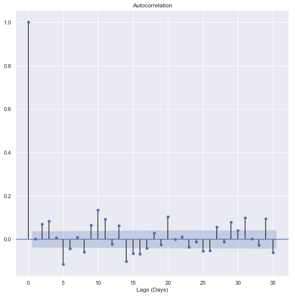
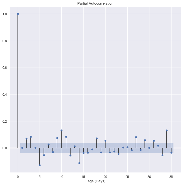
These plots look almost identical, but they’re not. Let’s start with the Autocorrelation plot. The important detail of these plots is the first lag. If the first lag is positive, we use an autoregressive (AR) model, and if the first lag is negative, we use a moving average (MA) plot. Since the first lag is negative, and the 2nd lag is positive, we will use the 1st lag as a moving average point.
6. Testing different ARIMA models: For testing our ARIMA model, I’ll be using order = (4,2,0). Let’s use this model to make predictions on our test data set.
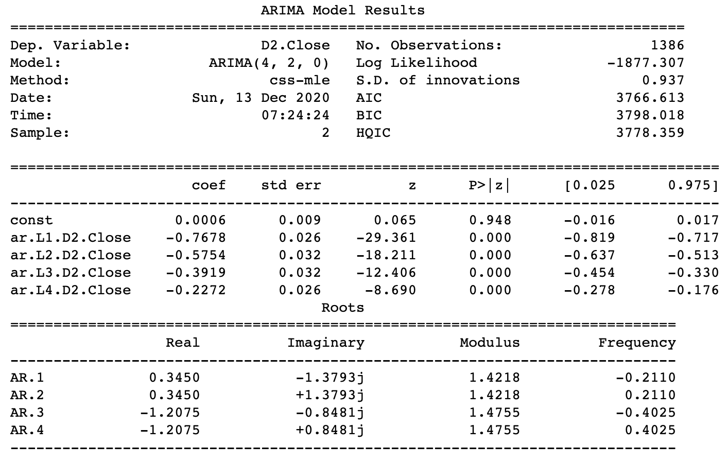
Forecasting the values using the (4,2,0) order and also recording the MSE(Mean Squared Error).
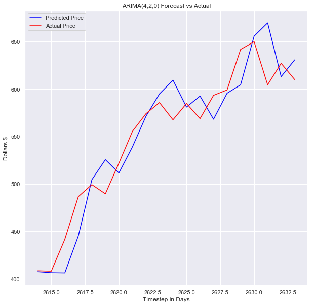
7. Visualizing the ARIMA Model: Let’s see how our model performed by making some plots.
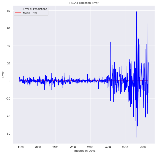
Now, we’ll be obtaining the plot for error in the model.
Thanks for reading through the article. Complete notebooks are available on my GitHub page,
Profile link: https://github.com/Bhard27
Subscribe to my newsletter
Read articles from CodeChef-VIT directly inside your inbox. Subscribe to the newsletter, and don't miss out.
Written by
