Viewport Meta Tag: What It Is and Why You Should Care
 Sunil Khadka
Introduction
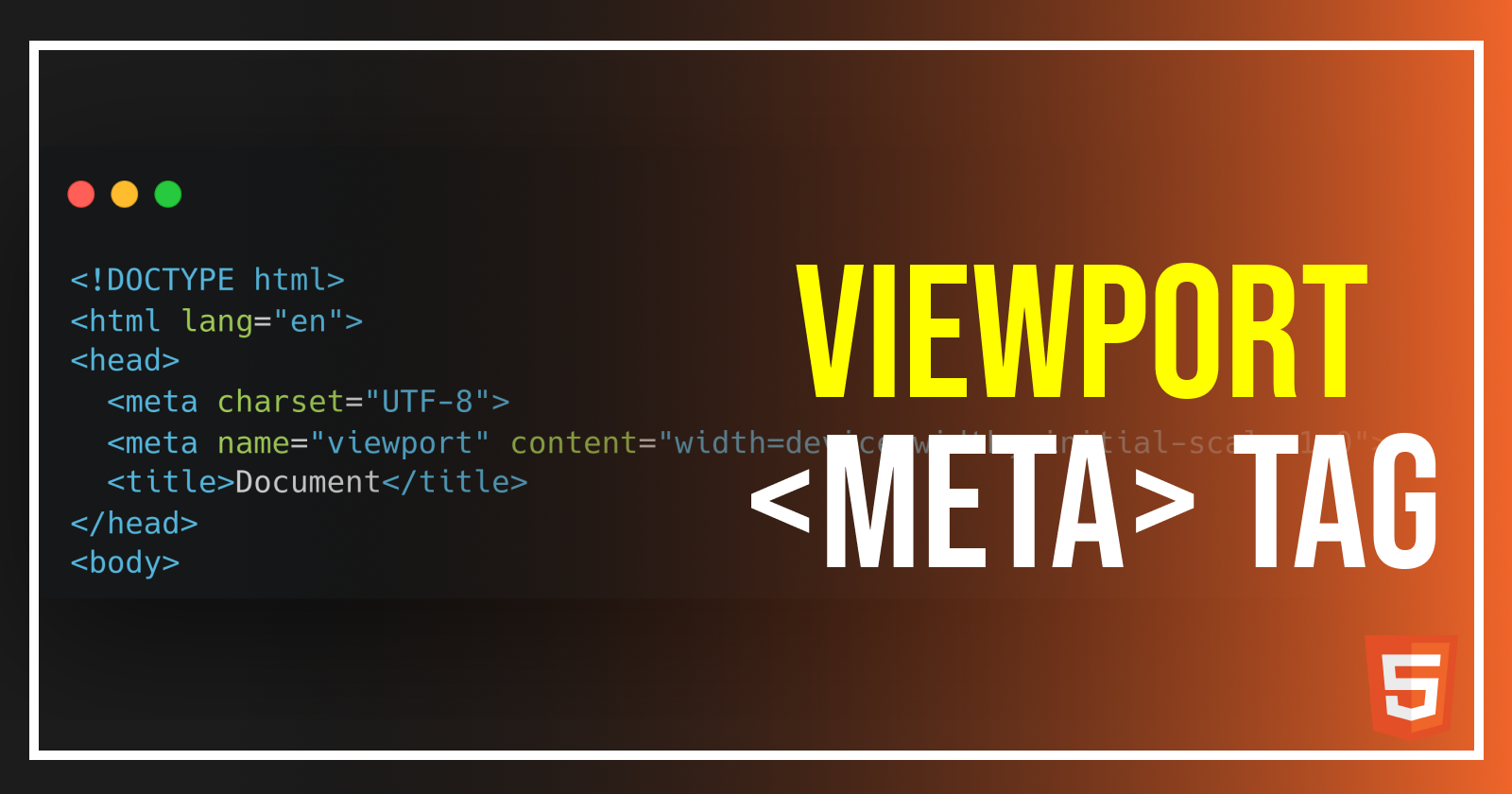
You may have seen this line of code in your html file.
<meta name="viewport" content="width=device-width, initial-scale=1.0" />
This meta tag allows your webpage to adapt to different sizes of viewport.
but what is a viewport?
A viewport is the visible area of a web page that a user can see on their device. The viewport size varies depending upon the device(desktop, tablet, mobile) and determines how much content can be displayed without scrolling.
You may have seen a website squeeze in a mobile device or spread in a desktop device. Well, this viewport meta tag ensures that the webpage adapts and adjusts its size based on the device it’s being loaded on.
Why does it matter?
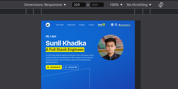
Because without this meta tag, your mobile browsers will render the pages as if they are being displayed in a desktop browser. As a result, the texts and images looks tiny and you will have to manually zoom in to interact or read content, which will negatively impact usability.

This is how the webpage loads when the viewport meta tag is removed.
Viewport attributes and their values
width: This attribute defines the width of the viewport relative to the device size.width=device-width: Matches the width of the viewport to the device’s width, adjusting for orientation changes.Specific width (
width=1024): Sets the viewport width to a fixed value. That means the webpage stops being responsive (adjust scale according to device width) when the width drop below 1024 pixels. Using this is generally discouraged in favor of responsive scaling.
initial-scale: It controls the initial zoom level when the page first loads.initial-scale=1.0: Sets the initial scale to 1:1, meaning there’s no zoom.Higher scale value (
initial-scale=2.0): Zooms in more, so content appears larger initially.Smaller scale value (
initial-scale=0.5): Zooms out initially, making more content visible but smaller.
maximum-scale: Sets the maximum zoom level users can achieve when pinching to zoom.maximum-scale=1.0: Prevents zooming, locking the scale to 1:1.Higher values (
maximum-scale=3.0): Allows users to zoom in further if desired.
minimum-scale: Sets the minimum zoom level, controlling how far users can zoom out.minimum-scale=1.0: Prevents zooming out below the initial scale.Lower values (
minimum-scale=0.5): Allows users to zoom out more, making content smaller.
user-scalable: Allows or restricts the user’s ability to manually zoom in or out.user-scalable=no: Disables manual zooming.user-scalable=yes: Enables manual zooming (default).
How does it help in creating responsive web pages?
The viewport meta tag works best alongside CSS media queries. When you set the width=device-width , the responsive design will be triggered when the desired max-width or min-width is detected by the media queries.
@media (min-width: 768px) {
    // properties triggers after reaching or exceeding 768 px in viewport width
    display: flex;
    flex-direction: column;
    font-size: 14px;
}

@media (min-width: 1024px) {
    font-size: 16px;
}
Subscribe to my newsletter
Read articles from Sunil Khadka directly inside your inbox. Subscribe to the newsletter, and don't miss out.
Written by

Sunil Khadka
Sunil Khadka
I am a Full-Stack Engineer with more than 2 years of experience building complex web applications. I use React.js and Golang for frontend and backend development. There's nothing like one size fits all and I try to learn as many new technologies as possible.