Redesign, Refresh, and Rebranding: Updating Visual Identity and Logos
 ICU Branding agency
Everyone knows the animated film "Hercules" based on Greek myths. Despite its memorable characters, humor, and storyline, it couldn't compete with other Disney movies and flopped at the box office. With a budget of $85 million, "Hercules" grossed only $99.1 million in the U.S. However, this failure doesn't stop directors from retelling the story of life on Olympus.
Producers and directors breathe new life into various works that require a modern approach. For example, the 1959 animated film "Sleeping Beauty" was revived in a new fantasy interpretation, where "Maleficent" is no longer an evil witch but a loving and fierce heroine protecting her people. Brands, too, need updates through rebranding, refreshing, or redesigning.

The Concept of Rebranding
Rebranding is the process of completely or partially changing a brand's image, identity, and how it is perceived by the audience. It goes beyond just altering the logo or color scheme; it involves a comprehensive approach that affects all aspects of the brand, including visual style, positioning, touchpoints, and audience interaction.
Application
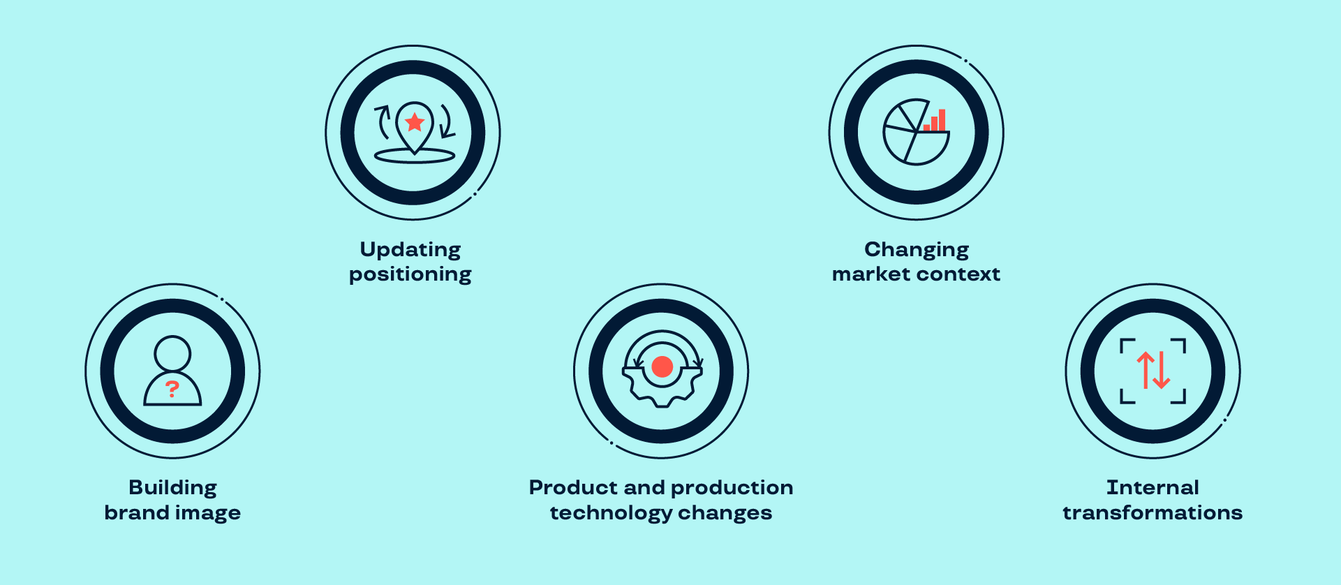
Rebranding is a significant stage in a company’s history, requiring substantial financial, time, and resource investments. There are specific situations when a company should consider undergoing this process:
Market Changes: As consumption trends and product preferences evolve, rebranding becomes necessary to keep up with these changes.
Internal Changes: Rebranding is essential when a company's leadership changes and decides on a new direction for the company's development. This requires rethinking the brand's positioning and corporate culture.
Product Technology Overhaul: Rebranding can communicate changes in the product line or the launch of a new product to the audience.
Positioning Shift: This involves updating the brand and its platform. Through rebranding, a company can maintain its position in the market and stand out among competitors.
Creating a Positive Brand Image: Rebranding helps foster positive associations with the brand, building trust and an emotional connection with the audience.
External factors also influence the decision to rebrand. For instance, after McDonald's exited the Russian market, the company decided to change its image and philosophy. Fans eagerly awaited the menu and design updates for weeks.
The new mission is: “Tasty food and pleasant experiences accessible to everyone.”
Values: The brand emphasizes guest comfort, promotes volunteerism, and encourages entrepreneurial activity.
The company broadened its development horizons by opening a training center offering both in-person and online programs. Its mission is to implement advanced teaching methods and design programs aimed at training skilled professionals.
The new name, “Vkusno i Tochka” (Tasty — Period), is a kind of direct appeal to customers, indicating that despite all the changes, this establishment will remain a popular place where guests can enjoy their favorite meals.
The logo redesign reflects the company’s essence: in a minimalist style, the logo depicts fries and a burger. The green color is associated with safety and calmness, while the contrasting red and orange elements stand out, drawing customers' attention. It was crucial for the company to convey to customers that “Vkusno i Tochka” is better than McDonald's. This idea is reflected in the brand’s visual identity.

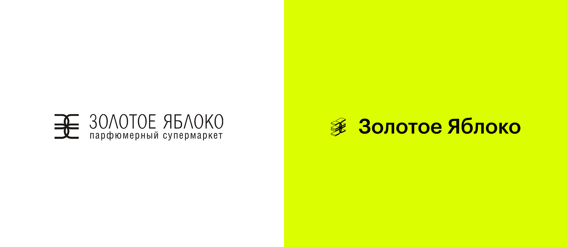
The "Golden Apple" brand has undergone significant changes. The previously muted color palette and refined font have been replaced with bright color schemes and a minimalist logo featuring a 3D effect.
Communication with the audience has become more relaxed and informal. The brand strives to get closer to its customers by showing attentiveness and care.
Rebranding of Metoplax
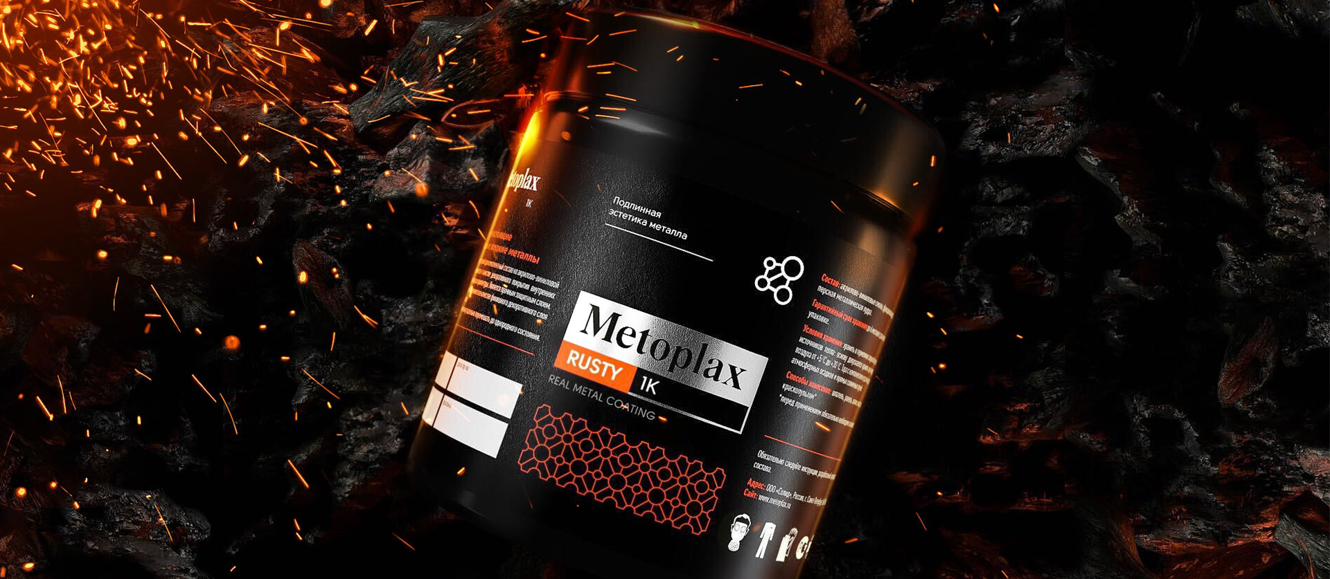
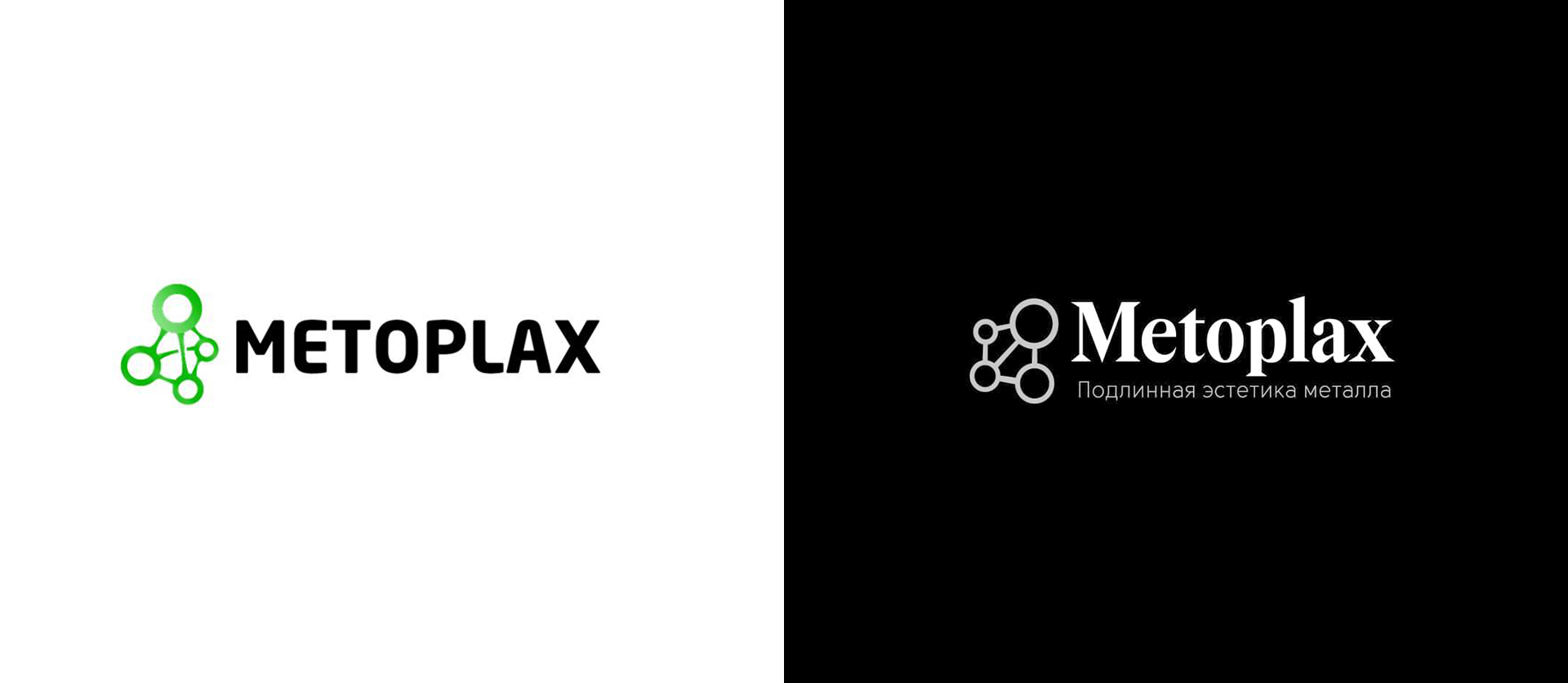
Metoplax, a company specializing in decorative metal coatings, found through research that its "industrial" style did not align with the expectations of its target audience—decorators and artists.
The new vision for Metoplax is based on the concept of contrasting elegance and technology. Metoplax states that art requires modern and fast solutions. The company's value lies in its special attention to clients and its collaborative approach, making the brand more approachable and understandable to consumers.
When creating the brand identity, particular attention was given to visual elements that reflect the product's innovation and uniqueness. The logo incorporates molecular symbols, while the printed materials are made from glossy, reflective materials that mimic the look of metal.
The serif font, reminiscent of fashion magazine headlines, gives the product a contemporary feel. The elegant geometric pattern fits perfectly with the aesthetic of the target audience.
The packaging design combines minimalism with Scandinavian aesthetics. A black-and-white color scheme, accented with bold colors and metallic details, seamlessly integrates into the overall concept, creating a cohesive image.
The Concept of Refresh
A refresh is a brand update that retains its recognizability. This approach is used by companies that want to make changes while maintaining continuity in meaning and visuals.
Application
This is a less extensive process but is used in specific situations, such as when:
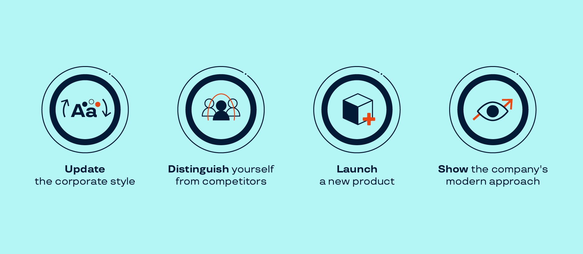
Launching a new product: As companies expand their range, it's important to update the design to avoid confusion among consumers.
Emphasizing the company's modernity: Brands update their identity to demonstrate a contemporary approach to product creation.
Updating the brand's identity: New trends in design regularly emerge, which should be incorporated into the brand's design concept.
Standing out among competitors: If competitors have strengthened their position through marketing strategies, new communication channels, and customer engagement, one way to differentiate is through a visual refresh.
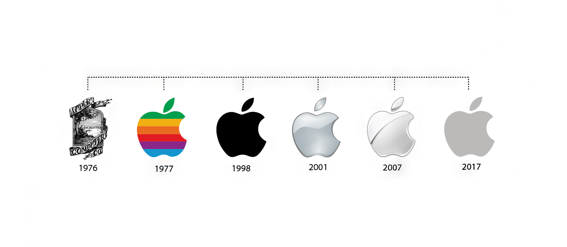
For example, Apple has a rich history of evolving its brand identity. The company has always been focused on innovation and paid close attention to user experience. Although its core ideology has remained the same, its visual concept has constantly been refreshed to reflect a modern approach.
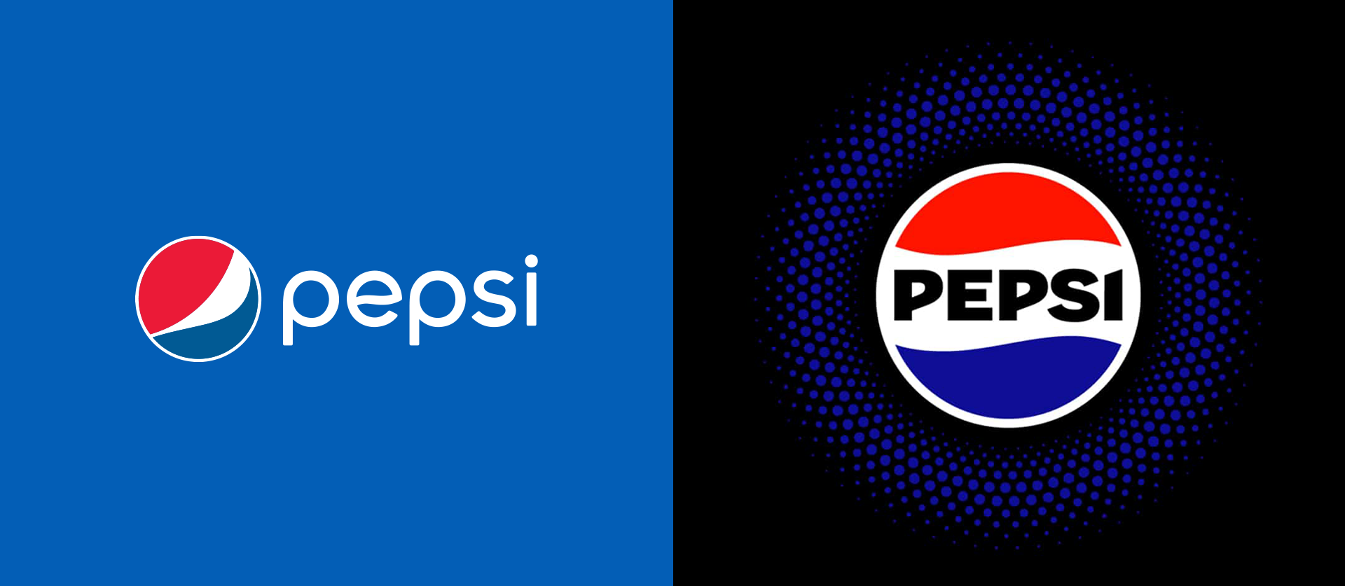
The popular soda brand Pepsi also underwent a refresh: its simple logo with minimal details was replaced with a bold and textured design. The brand added new shades to its color scheme—electric blue and accent black. Now, the can stands out on the shelf among competitors. The large logo is rendered in a font with sharp corners, giving the packaging a daring edge.
Redesign Concept
Redesign is the process of modifying an existing design to improve its functionality, aesthetics, relevance, and alignment with new goals. It can involve aspects such as visual style, functionality (e.g., improving user experience), as well as content and format.
Application
Redesign is applied to improve specific brand elements in the following cases:
— Logo update: Making it more readable and adaptable to various formats.
— New services: In the era of rapidly evolving information technologies, companies increasingly rely on diverse applications to engage with customers. Redesign helps adapt brand elements to new services.
— Increasing brand recognition: To stand out in a highly competitive market.
— Slogan change: It's important to review the relevance of a slogan. It may need to be revised due to new market trends or changes in consumer behavior, values, and preferences.
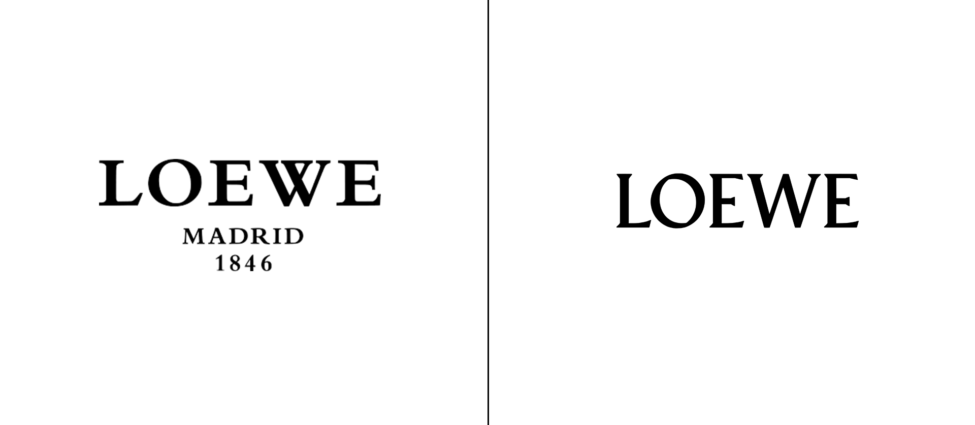
The Spanish fashion house LOEWE modernized its logo without affecting the brand’s deeper meanings—its positioning, mission, and values.
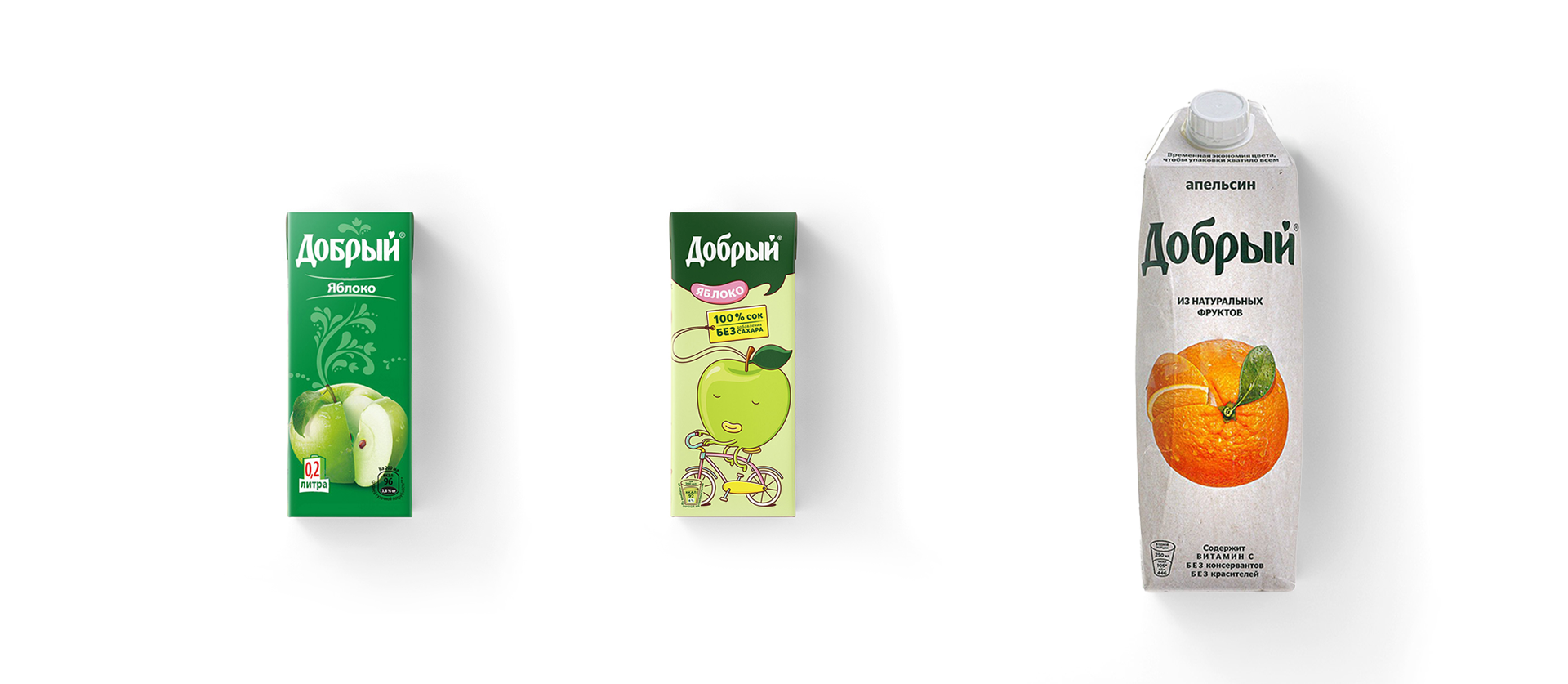
The brand Dobry has repeatedly changed its packaging design. In stores, you could find anything from plain white boxes with fruit images to bright packaging with cute characters.
What’s the difference between rebranding, refresh, and redesign?
All these processes aim to modernize companies, though the scale of each differs. The result of rebranding is to create a new positive brand image and establish it in the minds of the audience.

— Rebranding is a fundamental transformation of a brand, affecting both its meanings and visual components.
— Refresh updates and revitalizes the brand’s identity.
— Redesign is applied to specific elements that no longer serve their purpose.
It’s important to note that rebranding and refresh are independent processes, while redesign can be part of rebranding.
Rebranding, refresh, and redesign are not magic solutions that solve all business problems. However, every company, at some stage of its development, requires new vision and rethinking of its brand.
Subscribe to my newsletter
Read articles from ICU Branding agency directly inside your inbox. Subscribe to the newsletter, and don't miss out.
Written by

ICU Branding agency
ICU Branding agency
Branding agency that creates a connection between business and audience through in-depth research and creative thinking.