Individual Scores in Choice Models, Part 2: Correlations among Items
 Chris Chapman
Today’s post continues my examination of working with individual-level scores from choice modeling surveys, such as MaxDiff and Conjoint Analysis surveys.
In this post, we’ll examine and visualize correlation patterns among the items. This also sets up another opportunity (as if I needed one!) to discuss why “statistical significance” in such data is usually unimportant. We can ignore “significance” with the data and yet still learn much from them.
If you haven’t seen it, you could review Part 1 of this series. It describes the data and presents basic data visualization code. Here I pick up where that post ended and discuss additional analyses. As usual, I share and discuss R code along the way; and compile all the code at the end.
First: Get the Data
If you ran the code in Part 1 then you may have the data. You can refer there for explanation; meanwhile, the following code obtains the data needed for this post.
Briefly, this code downloads MaxDiff scores in Excel format from a URL, and does minor clean up. This real data set estimates N=308 individuals’ interest in taking various Quant UX classes, such classes on R, Choice Models, and Segmentation.
# get the data; repeating here for blog post 2, see post 1 for details
library(openxlsx)
md.dat <- read.xlsx("https://quantuxbook.com/misc/QUX%20Survey%202024%20-%20Future%20Classes%20-%20MaxDiff%20Individual%20raw%20scores.xlsx")   #
md.dat$Anchor <- NULL          # remove the anchor item that is a fixed value of 0
names(md.dat)[3:16] <- c("Choice Models",  "Surveys",       "Log Sequences",    "Psychometrics",
                         "R Programming",  "Pricing",       "UX Metrics",       "Bayes Stats",
                         "Text Analytics", "Causal Models", "Interviewer-ing",  "Advanced Choice",
                         "Segmentation",   "Metrics Sprints")
classCols <- 3:ncol(md.dat)    # generally, Sawtooth exported utilities start in column 3
Correlation Analysis: Basic
After reviewing and comparing the preferences for each class, as we did in the previous Post 1, a next question might be whether there are patterns among the potential class offerings.
Specifically, when respondents are interested in one class, what does that say about their interest in other classes? Are there combinations of classes that are associated with one another?
There are several ways to examine such patterns (see, for example, Chapters 4, 11, and 12 in the R book; or Chapters 4, 9, and 10 in the Python book). Here I’ll demonstrate visualization of a Pearson’s r correlation matrix.
Background: In a nutshell, Pearson’s r varies between -1.0 and +1.0. A value of 0.0 indicates no relationship between a pair of variables — in this case, it would mean there is no relation between interest in one class and interest in another. As r approaches +1.0 there is a stronger and stronger pattern of interest in the same direction for both classes together. As r approaches -1.0, it means that interest in one class is increasingly associated with disinterest in the other class.
The R code to visualize a general correlation matrix is not complex. First, we calculate the correlation matrix using cor(). Then we plot it with the corrplot library:
md.cor <- cor(md.dat[ , classCols])

# basic plot
library(corrplot)
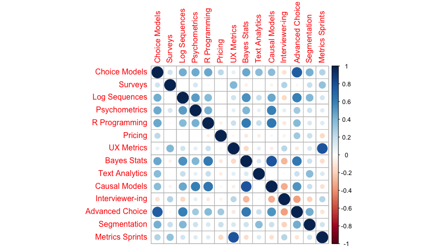
corrplot(md.cor)
Here’s the result:

Wow! That’s a great chart for 3 lines of code. We immediately see some interesting combinations. For example, interest in Choice Models and Advanced Choice Models go together; as does interest in UX Metrics and Metrics Sprints. On the other hand, interest in Choice Models is negatively associated with Quant Interviewer training.
If you’ve read any of my R posts before, you know what’s next: we can do better!
Correlation Analysis: Improving the Visualization
One problem with the correlation plot above is that it is unordered with respect to the estimates themselves; items are given merely in the order as listed in the data.
A more useful correlation plot reorders the items in terms of similarity (i.e., clustering). Then we can see whether there are groups of items with similar patterns. Even better, we might draw boxes around those groups to highlight them.
That’s also straightforward in corrplot. Here’s the code:
# correlations with clustering
corrplot(md.cor, method = "ellipse",
         order = "hclust", addrect = 4)
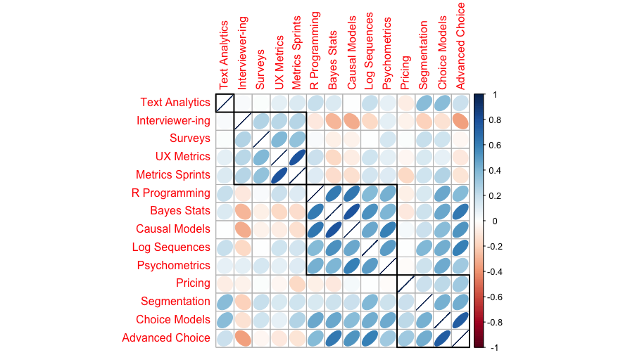
To explain the options, method=”ellipse” converts the circles into ellipses that indicate strength of association (by narrowness) and direction (by slope). By using order=”hclust”, we ask corrplot to cluster the items for similarity. The addrect=4 option draws 4 boxes to highlight the clusters. Generally you pick that number according to what makes sense with some trial and error (but see below for more discussion of finding a “good” number of clusters!)
Here’s the result:

In this chart we see 4 groups of classes: Text Analytics, which is relatively unrelated to interest in any other particular class; a group for “core UX” topics (metrics, surveys, and interviewing); a group for “statistics” (R, Bayes, etc.); and a group for more “marketing” type classes (pricing, choice models, segmentation).
All of that makes complete sense!
I use clustered correlation plots routinely. They are extremely helpful and are a fast way to identify patterns of interest. I often add the correlation coefficients (but rarely show those to stakeholders!) corrplot can do that:
corrplot.mixed(md.cor, upper = "ellipse",
               order = "hclust",
               tl.pos = "lt", number.cex = 0.75)
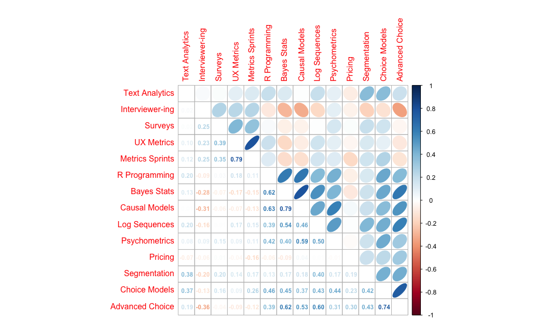
This uses the corrplot.mixed() function to visualize the correlations as ellipses and also show their values. The final options tell it put labels on the left and top (tl.pos=”lt”) and shrink the coefficient text to fit better (number.cex=0.75).
Here’s the result:

Statistically Significant? Don’t Ask!
Because the chart above shows correlation coefficients (Pearson’s r coefficient, as noted above), you might wonder, “are they statistically significant?”
My recommendation is to avoid the questions of “significance”. We might discuss that theoretically, which is a long discussion — see the topic as discussed in any of my books listed above. However, I will give a few short answers here … plus a visual demonstration.
First, the correlations here are post-hoc examinations of many coefficients. They do not come from any specific hypothesis test, and thus the usual assumptions of significance testing do not apply. Second, in practice we care much more about the absolute strength of association rather than the binary question of “significance”. Third, with enough sample, almost everything will be “significant” … and that doesn’t help us decide anything. I’ll say more about that in a moment.
Fourth, and most importantly, significance testing compares associations in the data to a null hypothesis of “no association” … and the idea of “no association” is a completely unreasonable hypothesis for such data. How could we possibly think — or be interested to test — that interest in one class by default is completely unrelated to interest in another class? That notion is easily dispelled simply by talking with people who take classes … or, as we’ll see in moment, by data!
You might be thinking, “show me the code!” Well, here it is!
We can test the association between a single pair of items with the cor.test() function. For example, the association between Text Analytics and Metrics Sprints is one of the smaller r values in the chart above. We can test it with:
# correlation testing (not recommended in this case, just demonstrating)
cor.test(md.dat[, "Text Analytics"],
         md.dat[, "Metrics Sprints"])
R tells us that the Pearson’s r value is 0.1234 with a CI of (0.0119, 0.2320) … which is “significant” under classical assumptions (or mis-assumptions, as I mention above).
That’s just one pair of items, among the 14 * 13 / 2 = 91 total pairs. How many of those 91 are significant? We do a pairwise test for all pairs with cor.mtest() (“m” for “matrix” or “multiple” as you prefer). Then we compare the p-value to the alpha level of interest — let’s say 0.05 — and find the proportion (using mean() on the boolean comparison) that are “significant”. That’s easier than it might sound:
# first get the CIs for each pair
ptest = cor.mtest(md.dat[ , classCols], conf.level = 0.95)

# what proportion of those are "significant" ?
mean(ptest$p[upper.tri(ptest$p)] < 0.05)
Code details. The second line there should be unpacked slightly. First, we want to compare the p-values (saved in the object ptest as ptest$p) to a threshold value for “significance”, in this case 0.05. After making those comparisons, we take the mean() in order to find often that comparison is TRUE. However, the ptest object includes all pairs of comparisons, including comparison of each item with itself, which always has correlation of r\=1.0. In order to exclude those comparison, we select only the “upper triangle” of the matrix of comparisons, indexing the results with upper.tri().
The answer: 71% of all the associations in these data are significant.
One might think, “wow, that’s great!” … but it’s not. First of all, it merely says that people who are interested in some classes tend to be systematically interested or disinterested in other, related classes. That is not much of a discovery!
Second, it’s not great because — when treated as a binary, “significant” or not — it makes the situation less actionable in practice, rather than more actionable.
To see why the binary question of significance leads to less actionable insight, we can visualize what’s happening. That’s next.
Visualizing the Number of “Significant” Pairs
With corrplot, we can add annotation to charts based on on statistical significance (or, in fact, any matrix that has the same dimensions as the correlation matrix). The steps to do that are (1) to get a matrix with the p-values, as we already did above (ptest), and (2) add that to the correlation plot, indicating how to annotate it.
Given that we already have the matrix ptest with results of significance testing, we can annotate the correlation plot like this:
corrplot(md.cor, method = 'ellipse',
         order = "hclust", addrect = 4,
         p.mat = ptest$p,
         sig.level = c(0.001, 0.01, 0.05), pch.cex = 0.8,
         insig = "label_sig")
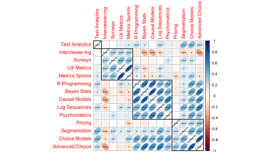
The last 3 lines are new here. First, we use p.mat=ptest$p to point to the p-values of interest. Next we set cutoff points for annotating the p-values, where sig.level=c(0.001, 0.01, 0.05) says to use 3 asterisks for p<.001, 2 asterisks for p<.01, and 1 asterisk for p<.05. You could change those cutoffs. pch.cex=0.8 shrinks the asterisks to fit better in the cells. Finally insig="label_sig" plots increasing levels (as set by sig.level), as opposed to a single binary flag for significance.
Here’s the result:

The key takeaway of this chart — compared to the ones above — is that almost everything is “significant” (under the [mis-]conception of significance discussed above). There are a few exceptions, especially for the Pricing class, but the general pattern is this: if we know that someone is interested or disinterested in one class, we can make pretty good guesses about what other classes might interest them.
But that is not a surprise! Of course we expect people to share interest — and knowing that their interests go together “significantly” adds nothing actionable to our understanding.
Put differently, when more than 70% of the boxes on the chart are “significant", there’s nothing in particular we can do with that information.
Instead of “Significance”
So what should we do instead?
First, if a stakeholder answers whether your results are statistically significant, the answer is NOT to dive into any discussion, and certainly not into any coefficients, p-values, or charts with asterisks. Here’s how I recommend to answer:
Q: Is this statistically significant?
A: Yes! And the actions we should take are …
How do we arrive at the actions to take? Consider evidence such as:
What are the overall patterns? You might, for example, consider the clusters of classes that we saw above.
How strong are the patterns? We could consider the strength of association — not just whether it is “significant” but how strong it is. Any association above r=0.5 or thereabouts is a strong relationship! (For more, try a search for “cohen correlation analysis pearson r strength”. Or see “Learning More” below.)
Are they actionable? This relates to our business goal. For example, consider in the results here, that Segmentation is closely associated with both Text Analytics and Logs Analysis. Now, suppose we’re going to teach segmentation — because it was the #1 ask as we saw in the previous blog post #1 — and that it will be offered as a half day class. The results suggest that we might add Text Analytics or Logs Analysis as a second half day, in order to maximize appeal to the students taking Segmentation. Or instead — depending on our strategy — it might suggest not teaching one of those, if we want to reach different sets of students between the two half-day sessions.
The key point is this: is you have enough data to feel good about your sample, and it is quality data, then you generally should not worry about “significance”. Worry instead about how to make strategic recommendations and how to help your stakeholders focus on those!
Final Note: More on the Item Clusters
There is one thing I should emphasize about the clusters here. They are clusters of items — which classes go together in their patterns of interest. They are not clusters of respondents!
Thus, for example, although the patterns clearly identify a “core UX” group of classes (among others), it doesn’t tell us how many people would be interested in that group, nor how strongly they would be interested (or disinterested).
To examine whether there are groups of people who share interest patterns, we need to look at clustering (segmenting) the respondents. That will be the topic of Post #3 in this series — stay tuned!
Learning More
As mentioned, stay tuned for Post #3 that will examine clusters of people (i.e., segmentation). That’s a different question than the clusters of items that we considered here.
To learn more about correlation analysis and related methods, check out Chapters 4, 11, and 12 in the R book, and Chapters 4, 9, and 10 in the Python book. A canonical, classic text for such analyses is Cohen, et al, Applied Multiple Regression / Correlation Analysis for the Behavioral Sciences (link).
And if you’d like to develop hands-on skills in Quant methods — including choice modeling surveys like the one that yielded today’s data — check out the classes from the Quant UX Association (full disclosure, I teach some of them but there are several other instructors lined up, too!)
All the R Code
As always, I compile the complete R code in one place. Here it is:
# get the data; repeating here for blog post 2, see post 1 for details
library(openxlsx)
md.dat <- read.xlsx("https://quantuxbook.com/misc/QUX%20Survey%202024%20-%20Future%20Classes%20-%20MaxDiff%20Individual%20raw%20scores.xlsx")   #
md.dat$Anchor <- NULL
names(md.dat)[3:16] <- c("Choice Models",  "Surveys",       "Log Sequences",    "Psychometrics",
                         "R Programming",  "Pricing",       "UX Metrics",       "Bayes Stats",
                         "Text Analytics", "Causal Models", "Interviewer-ing",  "Advanced Choice",
                         "Segmentation",   "Metrics Sprints")
classCols <- 3:ncol(md.dat)    # generally, Sawtooth exported utilities start in column 3

##### 4. Correlation
md.cor <- cor(md.dat[ , classCols])

# basic plot
library(corrplot)
corrplot(md.cor)

# correlations with clustering
corrplot(md.cor, method = "ellipse",
         order = "hclust", addrect = 4)

# add correlation coefficients
corrplot.mixed(md.cor, upper = "ellipse",
               order = "hclust",
               tl.pos = "lt", number.cex = 0.75)

# correlation testing (not recommended in this case, just demonstrating)
cor.test(md.dat[, "Text Analytics"],
         md.dat[, "Metrics Sprints"])

# plot with significance highlighted
# first get the CIs for each pair
ptest = cor.mtest(md.dat[ , classCols], conf.level = 0.95)

# what proportion of those are "significant" ?
mean(ptest$p < 0.05)

# add asterisks to the plot for "significant" at p=0.05 level
corrplot(md.cor, method = 'ellipse',
         order = "hclust", addrect = 4,
         p.mat = ptest$p,
         sig.level = c(0.001, 0.01, 0.05), pch.cex = 0.8,
         insig = "label_sig")
Subscribe to my newsletter
Read articles from Chris Chapman directly inside your inbox. Subscribe to the newsletter, and don't miss out.
Written by

Chris Chapman
Chris Chapman
President + Executive Director, Quant UX Association. Previously: Principal UX Researcher @ Google; Amazon Lab 126; Microsoft. Author of "Quantitative User Experience Research" and "[R | Python] for Marketing Research and Analytics".
