CSS can be fun!
 Dana Ciocan
I love Halloween, so we’re about to get into the spirit and make some themed CSS art! If you’ve never made CSS art before, this will be a nice little introduction and I’m hoping you’ll get just as addicted as I got when I followed my first CSS art tutorial.
Soon afterwards, I started doing CSS art with my mentees to get them into CSS and learning all the different flexbox and grid attributes and they got into it too! I really recommend it as a teaching tool if you want a fun way to get to grips with CSS and all its intricacies. There’s no better way to see z-index in action for example than grappling with ordering in a lovely drawing you are trying to create.
Okay, that’s enough preamble, let’s get going!
Where to start?
CSS art can seem extremely daunting when you haven’t done it before. It’s actually a case of breaking down your artwork into various shapes and sticking them together - once you know that, it’s really not as difficult as you’d expect.
For example, a very simple tree (as drawn by a small child perhaps) is a green circle on top of a thin and long brown rectangle. Hopefully you get the idea.
Today I’m going to walk you through how I created this very simple jack-o-lantern:
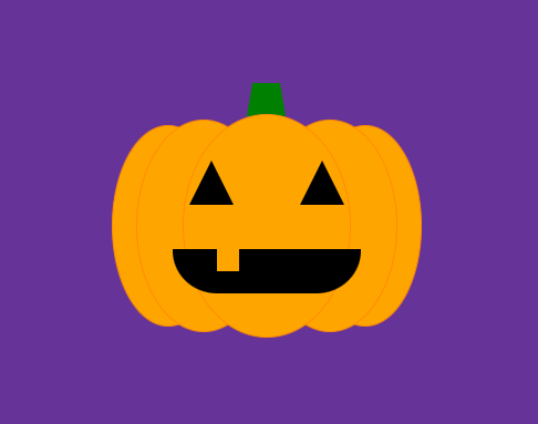
See https://codepen.io/dana-ciocan/pen/mdaZzjJ for the code. It even has a little animated surprise if you hover your mouse over its cute face!
Set up your HTML
The foundation of any CSS art will be the HTML - it sounds a bit counter-intuitive because there is no HTML in “CSS art”, but it makes sense, we need something to apply our CSS to, right?
Codepen (my favourite CSS art tool) has Emmett built into it so it’s relatively easy to create multiple <div>s by typing things like:
div.pumpkin>div.stalk>div.segments>div.segment*5
Typing this into the editor will give you a preview of the elements that will be generated:
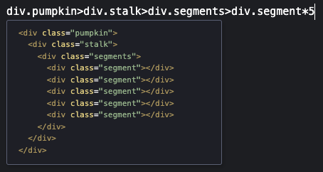
Just hit tab and Emmett will create all these div elements for you.
The above was just an example - what we actually want to create for the jack-o-lantern is the following:
<div class="pumpkin">
  <div class="stalk"></div>
  <div class="segments">
    <div class="segment left-2"></div>
    <div class="segment left-1"></div>
    <div class="segment centre"></div>
    <div class="segment right-1"></div>
    <div class="segment right-2"></div>
  </div>

  <div class="eyes">
    <div class="eye left-eye"></div>
    <div class="eye right-eye"></div>
  </div>

  <div class="mouth"></div>
</div>
Whenever I start some CSS art I start with the HTML structure and it’s a good idea to keep things well-named so that you know what each <div> is referring to - the structure can get long and complicated and it’s easy to lose track of what’s what.
In this case, you can see we have a main container with a class of pumpkin which contains a stalk, some segments (five of them in fact!), eyes and a mouth.
Now that the HTML is set up, let’s have a look at some CSS.
Preparing the canvas
I always tend to start by setting up my “canvas”, which is generally the body tag in Codepen:
body {
  display: flex;
  align-items: center;
  justify-content: center;
  background-color: rebeccapurple;
  height: 100vh;
}
Here we’re setting the display mode to flex to enable flexbox on the body tag - something I didn’t know was possible until I started making CSS art! Then we’re setting align-items and justify-content to center, which achieves something that was impossible in CSS for a long time - horizontal and vertical centring!
We’re also setting the background-color property to a lovely purple called rebeccapurple (named after Rebecca Alison Meyer) and making sure the “canvas” spans the whole of the preview window by setting the height to 100vh, which stands for “100% of the viewport height”.
Of course you can use whatever background colour you like, don’t feel you have to copy my penchant for purple!
Jack-o-lantern layout
A jack-o-lantern is a carved pumpkin and as such, consists of a stalk and the pumpkin’s body below it. To get this laid out nicely, we need to apply some more flexbox (CSS art tends to be flexbox all the way down!) to our parent pumpkin div:
<div class="pumpkin"></div>
.pumpkin {
  display: flex;
  flex-direction: column;
  align-items: center;
}
Setting the display mode to flex and using flex-direction: column; means all the children we add to this <div> will stack on top of one another, like in a column. Setting align-items: center; means everything will automatically centre, which is what we want as the stalk should sit on top of the middle of the pumpkin’s head.
After this step, we’ll still see a purple background and no art as yet - that’s coming next!
Creating a stalk
A stalk can be as simple as a little rectangle, but to add a little bit of flare, I used a neat trick to create some slanted sides, making it a kind of trapezoid shape.
.stalk {
  border-bottom: 30px solid green;
  border-left: 5px solid transparent;
  border-right: 5px solid transparent;
  height: 0;
  width: 25px;
  position: relative;
  top: 2px;
}
This is a very neat little trick that essentially works because CSS borders meet each other at angles. If you set the height of the box to 0 and the width to 25px, then set the left and right borders to be transparent, you get this fun shape.
This image may make it a little clearer:
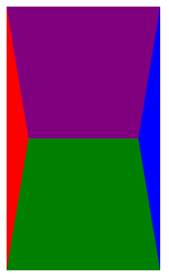
Here I have set the bottom border colour to green, left is red and right is blue. I have added a top border that’s purple, just to show how the borders would look if they were all there. By omitting the top border and setting the left and right borders to be transparent, we’re left with the green “stalk” bit. Pretty clever! I have to say that I didn’t come up with it myself - there are many places where you can get CSS shapes like CSS tricks and I even made my own shapes Codepen to collate them.
Okay, on to the body of our jack-o-lantern!
Making pumpkin segments
If you’ve ever examined a drawing of a pumpkin, you’ll have noticed that it is often composed of several ovals superimposed on one another (google “pumpkin drawing” and you’ll see what I mean), like this:
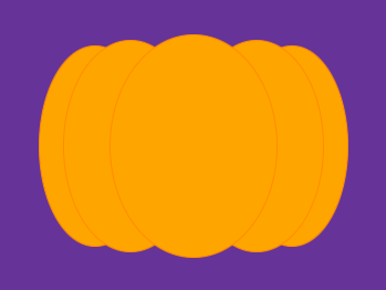
This is what we’ll be creating next.
We’re going to be styling this part of our HTML:
  <div class="segments">
    <div class="segment left-2"></div>
    <div class="segment left-1"></div>
    <div class="segment centre"></div>
    <div class="segment right-1"></div>
    <div class="segment right-2"></div>
  </div>
First of all, we need to do some more layout stuff using flexbox:
.segments {
  display: flex;
  align-items: center;
}
This makes it so our segments sit next to each other, all in a row (otherwise they’d stack on top of each other and that does not a pumpkin make!).
Let’s “colour in” our “segments” as we’ve named them (for better or worse - naming is hard!):
.segment {
  background-color: orange;
  border-radius: 50%;
  top: 0;
  border: 1px solid darkorange;
}
Here we’ve set the background colour to CSS’ lovely “orange” - I often use named colours over hex values just because it reads nicer and I instantly know what colour something is meant to be. It’s also nice to see the list of named colours on MDN and just pick the one that matches most closely to what I want, rather than trying to figure out what that would be in hex. You can probably get more interesting colours using hex, but I am usually looking for a quick colour to use while I’m still inspired, so I do it this way.
Setting border-radius to 50% is just about the oldest CSS art trick in the book - on a square, it makes a circle, whereas on a rectangle like this, we get a very nice oval. I added a border to each segment so that when they overlap, you can tell where one segment ends and another one starts.
Right, at this point, we have our “segments” all in a row:

Let’s stack them!
Making our pumpkin “3D”
You may have noticed that our segments all have individual classes attached to them in the HTML:
<div class="segment left-2"></div>
<div class="segment left-1"></div>
<div class="segment centre"></div>
<div class="segment right-1"></div>
<div class="segment right-2"></div>
See left-2, left-1, centre (sorry, I live in England), right-1 and right-2? This is because we want to apply slightly different styles depending on which segment we’re dealing with.
We know we want the centre segment to sit on top of everything else and be slightly bigger than the other segments, so the first thing to do is set a z-index and a width and `height:
.centre {
  z-index: 2;
  width: 150px;
  height: 200px;
}
The z-index can be any value, as long as it’s higher than the z-index of any of the other segments. I just decided to be sensible and not use 1000.
The height of 200px and width of 150px were literally just figured out by playing around with the heights and widths and seeing what looked good, CSS art involves a fair bit of trial and error too!
The segments just to the right and left of the centre one will have the same sort of treatment applied to them, so we can give them the same CSS:
.left-1, .right-1 {
  z-index: 1;
  width: 120px;
  height: 190px;
  margin: 0 -80px;
}
Here the z-index makes sure that these slide underneath the centre segment, while the width and height are ever so slightly smaller than the centre segment, so that the pumpkin appears to recede into the distance - like a fake 3D effect.
Adding a margin of 0 -80px means that these segments will pull the surrounding segments in by 80px so everything will overlap nicely.
Now we just have the outer segments left:
.left-2, .right-2 {
  z-index: 0;
  width: 100px;
  height: 180px;
}
Again, the z-index is reduced by one so that these sit behind all the other segments. The width and height are reduced some more for that sweet 3D.
And our jack-o-lantern’s body is done!
Adding some eyes
The eyes in a jack-o-lantern are just triangles, no big deal - we can use the same trick we used for the trapezoid here. They usually have a fair bit of space between them, which suggests to me that we should use the space-between property that flexbox so generously provides for us. Let’s get started!
Here’s the HTML we’ll be styling next:
<div class="eyes">
  <div class="eye left-eye"></div>
  <div class="eye right-eye"></div>
</div>
You may be wondering why we need the outer <div> - this is for that lovely flexbox property, space-between. We can only set that property on a parent <div> that contains some children, so it’s a bit of a necessarily evil.
Here’s the CSS for a single eye:
.eye {
  height: 0;
  width: 0;
  border-left: 20px solid transparent;
  border-right: 20px solid transparent;
  border-bottom: 40px solid black;
  border-top: 0px solid transparent;
}
This uses the same trick as for our trapezoid, but this time we’ve set three of the borders to be transparent instead of just two, which results in a triangle.
Now that we’ve added this CSS, we’ve got the following:
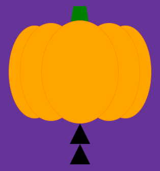
Everything’s going a bit pear-shaped! Now you can see why we need that outer <div> with the eyes class - here’s the CSS for that:
.eyes {
  display: flex;
  justify-content: space-between;
  width: 140px;
  position: relative;
  bottom: 160px;
  z-index: 3;
}
Adding display: flex enables flexbox again (told you it was flexbox all the way down!) and setting justify-content: space-between will send each child into the far corners of the parent element. Setting width: 140px gives us the effect we’re looking for, where each little triangle will zoom to opposite ends of the parent <div>.
Using position: relative is just a trick to allow us to more easily position the eyes within the pumpkin body. And z-index: 3 makes sure that the eyes sit on top of the pumpkin instead of floating somewhere behind it.
Our jack-o-lantern is starting to look a bit better:
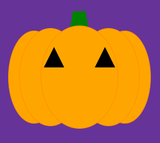
All that’s left is a mouth.
Let’s make it smile
The mouth is actually a lot easier to create than it looks - it’s simply a rectangle with rounded bottom corners and a “tooth” (rectangle) positioned inside it using the ::before pseudo element. Here’s the CSS for the main bit of the mouth:
.mouth {
  width: 170px;
  height: 40px;
  background-color: black;
  position: relative;
  bottom: 120px;
  z-index: 3;
  border-radius: 0 0 45px 45px;
}
Hopefully you’re starting to get used to how this works now - this is just another rectangle that we’ve given a black background colour and positioned it near the bottom of the jack-o-lantern. The z-index makes this float on top of the jack-o-lantern so we can see it. Adding the border-radius rounds the bottom of the mouth, like so:
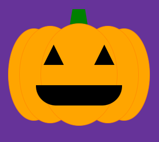
We could leave it there, but jack-o-lanterns usually have some teeth of some description, so I thought I’d add a little one:
.mouth::before {
  content: '';
  background-color: orange;
  position: relative;
  width: 20px;
  height: 20px;
  left: 40px;
  z-index: 3;
  display: block;
}
The ::before pseudo element is a really neat way to create a fake element that belongs to the parent to which it is attached. You always have to set content: ‘‘ to get it to appear (and I always forget about this and spent five minutes scratching my head before I remember). We’ve just used some creative positioning to make the tooth appear at the top of the mouth, like so:
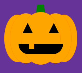
And our jack-o-lantern is finished! Though keep reading if you want to add a candle to its belly…
Make it light up!
This is so much easier than you’d think - CSS has a :hover state built into it, right? And we can just change the background colour of various elements we want to “light up” using that:
.pumpkin:hover .segment {
  background-color: darkorange;
  border: 1px solid orange;
}

.pumpkin:hover .eye {
  border-bottom: 40px solid yellow;
}

.pumpkin:hover .stalk {
  border-bottom: 30px solid darkgreen;
}

.pumpkin:hover .mouth {
  background-color: yellow;
}

.pumpkin:hover .mouth:before {
  background-color: darkorange;
}
I also darkened the segments and stalk because often when you light a candle inside a jack-o-lantern, the outside seems darker and this made it just look nicer.
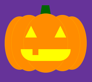
Pretty neat!
Happy halloween and I hope you have lots of fun creating your own works of art :D
Subscribe to my newsletter
Read articles from Dana Ciocan directly inside your inbox. Subscribe to the newsletter, and don't miss out.
Written by

Dana Ciocan
Dana Ciocan
I'm a Staff Engineer working at The Economist. I love diving deep into big problems and surfacing with a workable solution. I also love making my own garments, cooking, crafting and gardening.