Understanding the Accessibility Tree to Enhance Website Inclusivity
 Tshepiso
Hey digital Pals ⚡️
Hi, I am Tshepiso. This post is my newsletter EverydayDev .
Each issue contains a summary of a talk I have watched from a tech conference.
It is possible to commit no mistakes and still lose. That is not a weakness, that is life.
-Captain Picard
The DOM is one of those things you need to wrap your head around as a developer. And to be honest while I know what it is, I also feel like I don’t really. Why am I mentioning it here? As I watched this talk I learnt that there is another aspect in the DOM I wasn’t aware of- the accessibility tree. Understanding it unlocks a deeper understanding of web accessibility and how you can achieve it.
Today’s talk summary is Demystifying accessibility in React by Kateryna Porshnieva.
Web accessibility is about removing barriers to use the web. There are a lot of barriers in existing web technologies that make it challenging for assistive technologies to be effective for users.
Introduction to web accessibility
Kateryna provides an introduction to web accessibility. I think it is one of the best I have seen.
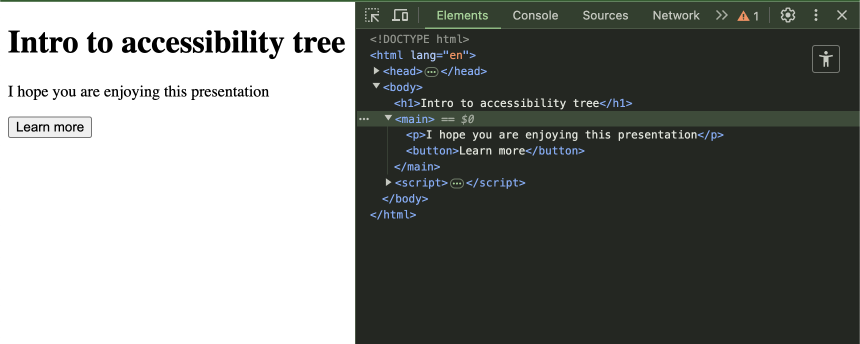
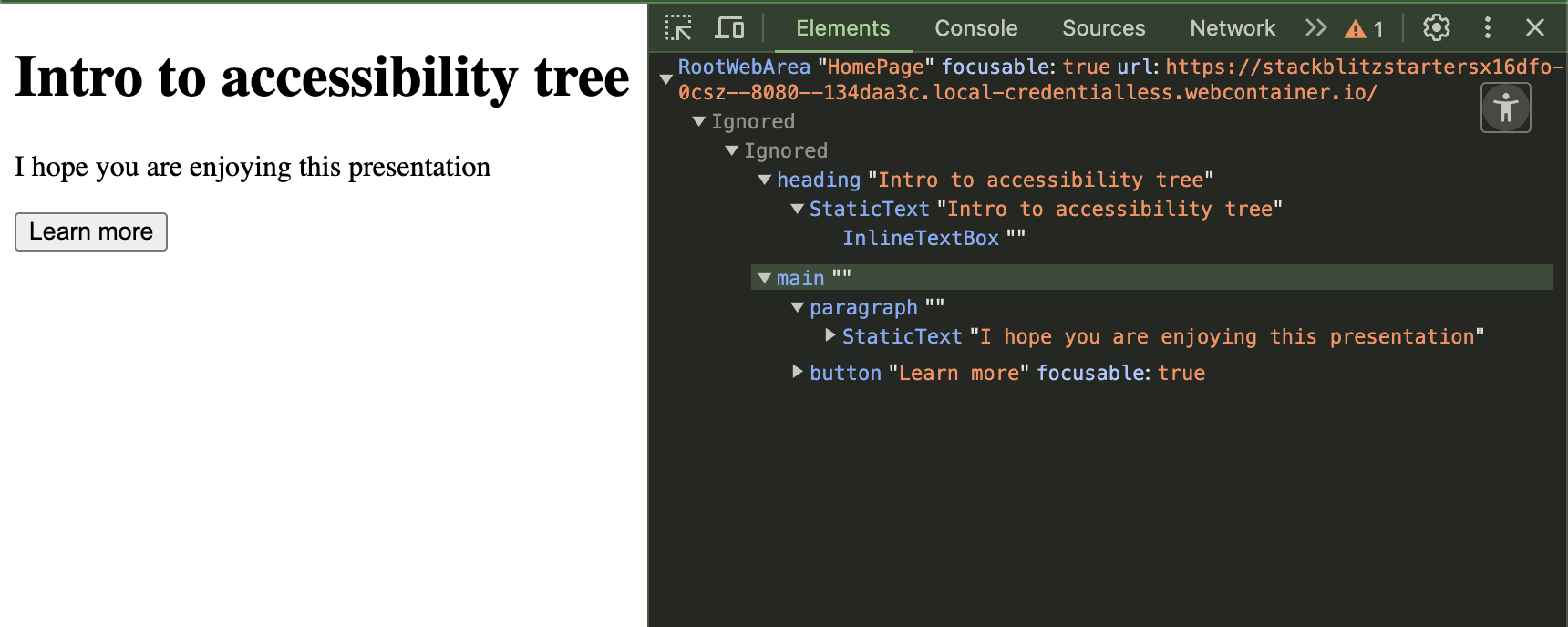
- When html is rendered a DOM tree is created. From that we get a visual UI and an accessibility tree(contains accessibility information about elements on the page.) this Accessibility tree is then exposed to assistive technology which helps to navigate the page. You can toggle accessibility tree in the dev tools.
- Accessibility information that elements will have are the role, name and other attributes to describe it further or communicate it’s current state.
DOM tree
Accessibility tree
Because the API used by assistive technologies relies on semantic declarations and not visual output, it is important to use HTML elements as they can convey meaning. There are over 100 HTML elements with built in semantic meanings and behaviour.
We can’t talk about HTML elements and accessibility without talking about Aria.
ARIA is Accessible Rich Internet Applications. These are set of HTML attributes that give developers granular control over the accessibility tree when native HTML is not enough to meet modern UI goals. What is important to note with Aria is that they provide semantic meaning but do not modify appearance or behaviour of the element.
Below is the result when you set a div role to button .
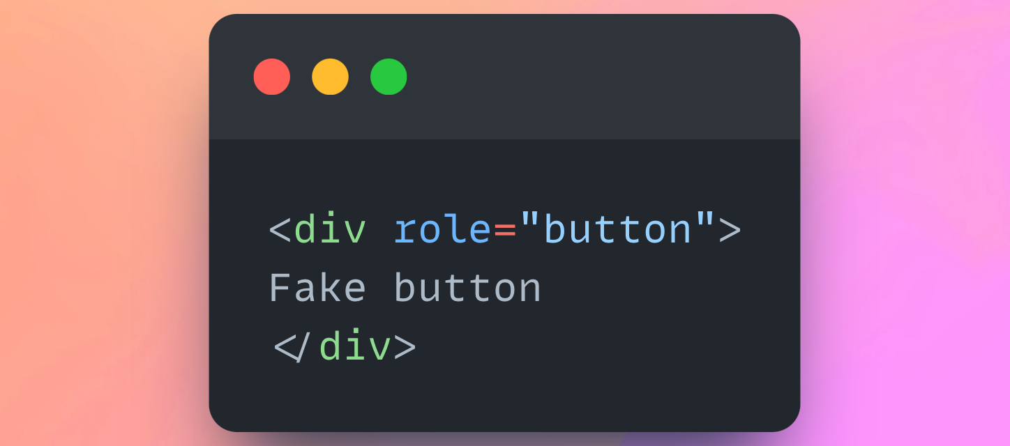
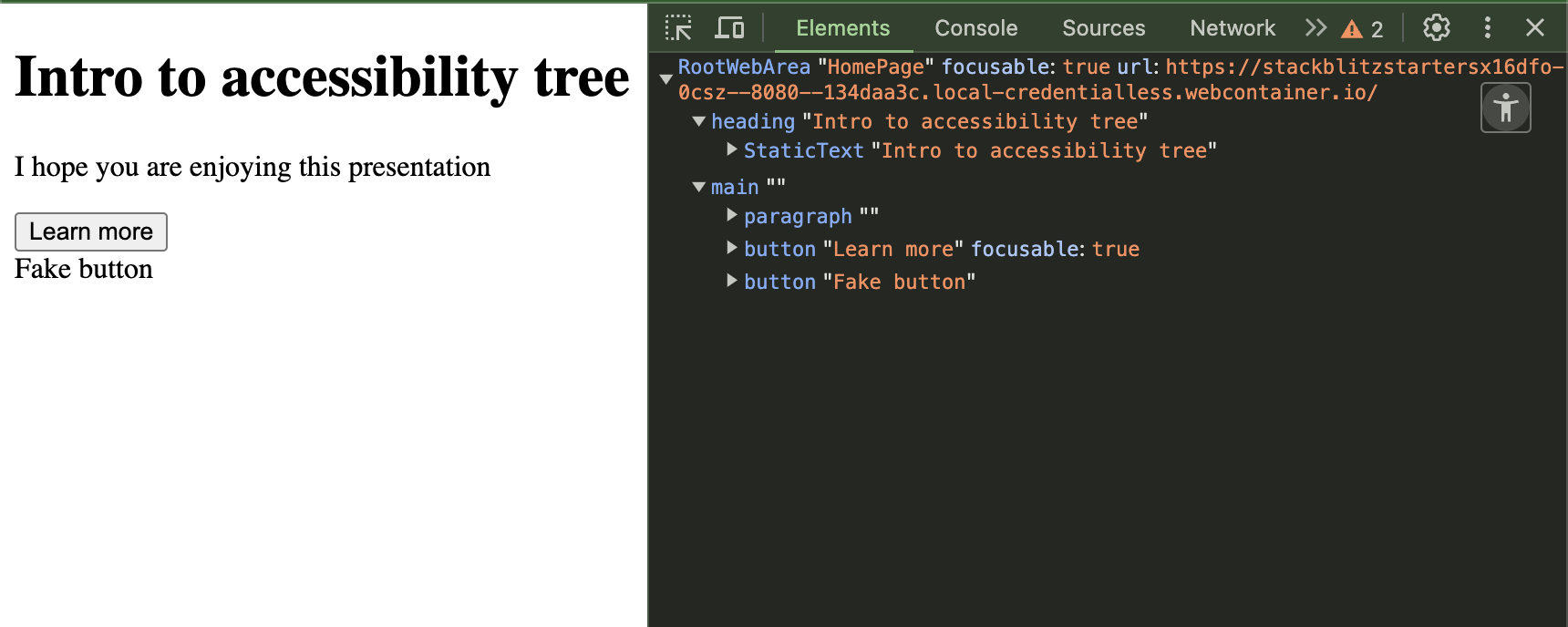
Our div is communicated as a button but it does not become a focusable, clickable element by default. If you want to turn it into a button you will have to implement JS and CSS to it. Why go through that trouble when you have an HTML element for it?
First rule of Aria. Don’t use Aria.
- w3.org
Research shows that pages that use ARIA have 34% more accessibility errors than pages without. (webaim.org)
Demo Time
Icon buttons
When you have buttons with icons and text, the icons usually serve purely for decorative purpose. If this is the case, the icon will get announced even if it has no practical value for the user.
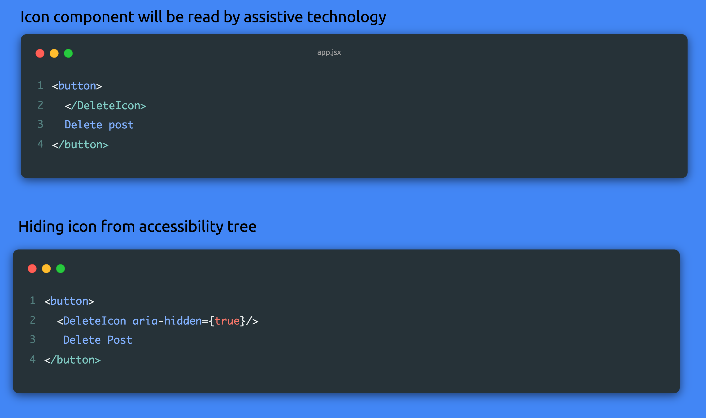
By hiding it from the accessibility tree , the icon won’t get announced to the user.
In modern UI , the label of the button is often left out and we just have to icons to visually provide the functionality. In this case there isn’t a name for the assistive technology to refer to, it will just tell the user that it is a button.
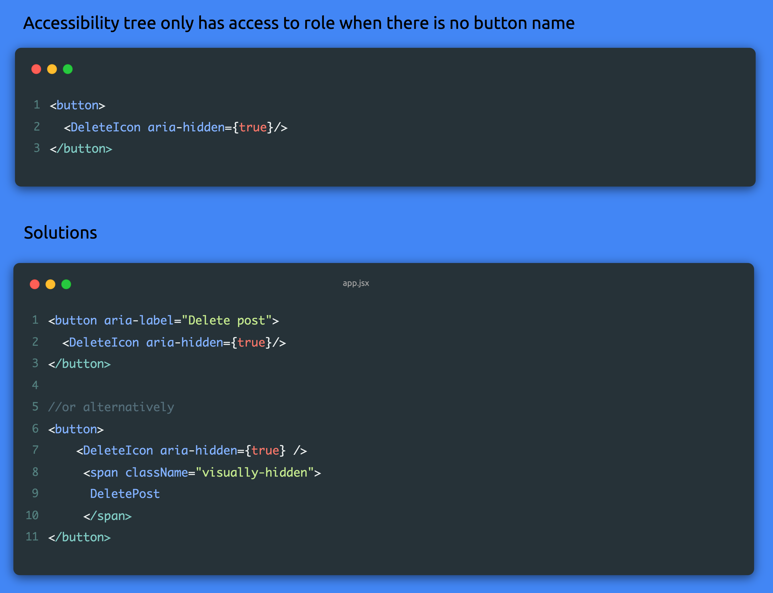
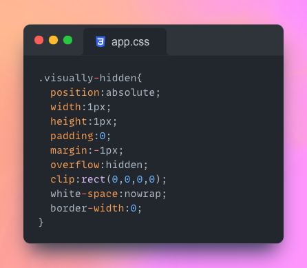
With the solution at line 6 we avoid using Aria on the button. The button will have a name read by assistive technology but it will be hidden in the UI. We want to avoid using display=”none” on our span because this will exclude the element from the accessibility tree as well. Using the visually-hidden classname technique displays the content to screen readers only by shrinking the element and hiding it out of view.
Here is the code snippet for your reference.
Text input
Input’s need labels. When the label for the input is not linked to the input element, screen readers doesn’t have a name to refer to for the input.
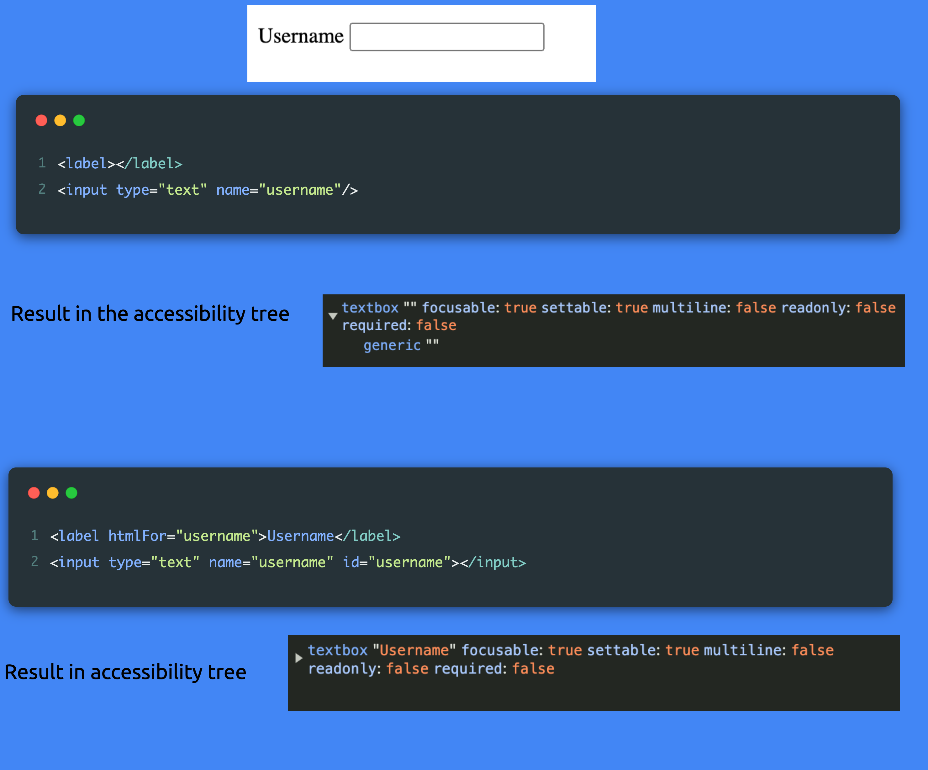
To link the textbox to the label name, use the id attribute to connect the two. The textbox will have a name property in the accessibility tree.
When we don’t want to have a label and perhaps want to context around input to indicate the purpose, we should use VisuallyHidden to still link label to the textbox. Polymorphism is used to make the VisuallyHidden component more flexible, the component can be rendered as a label.
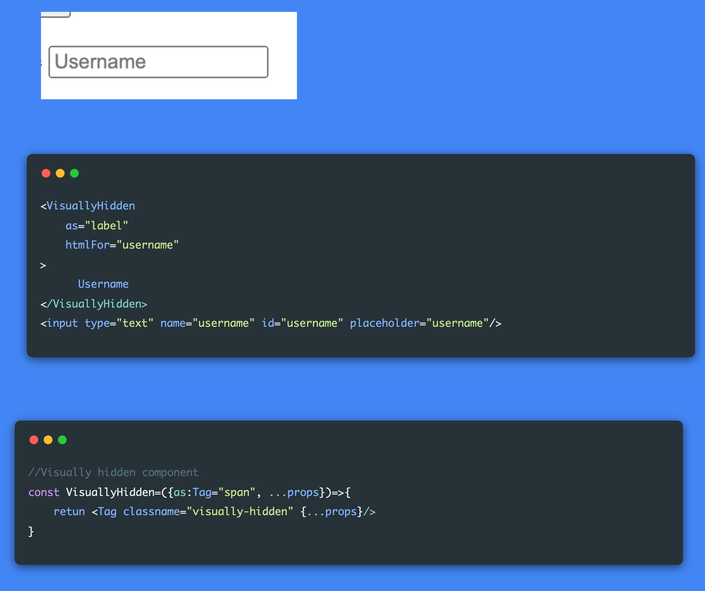
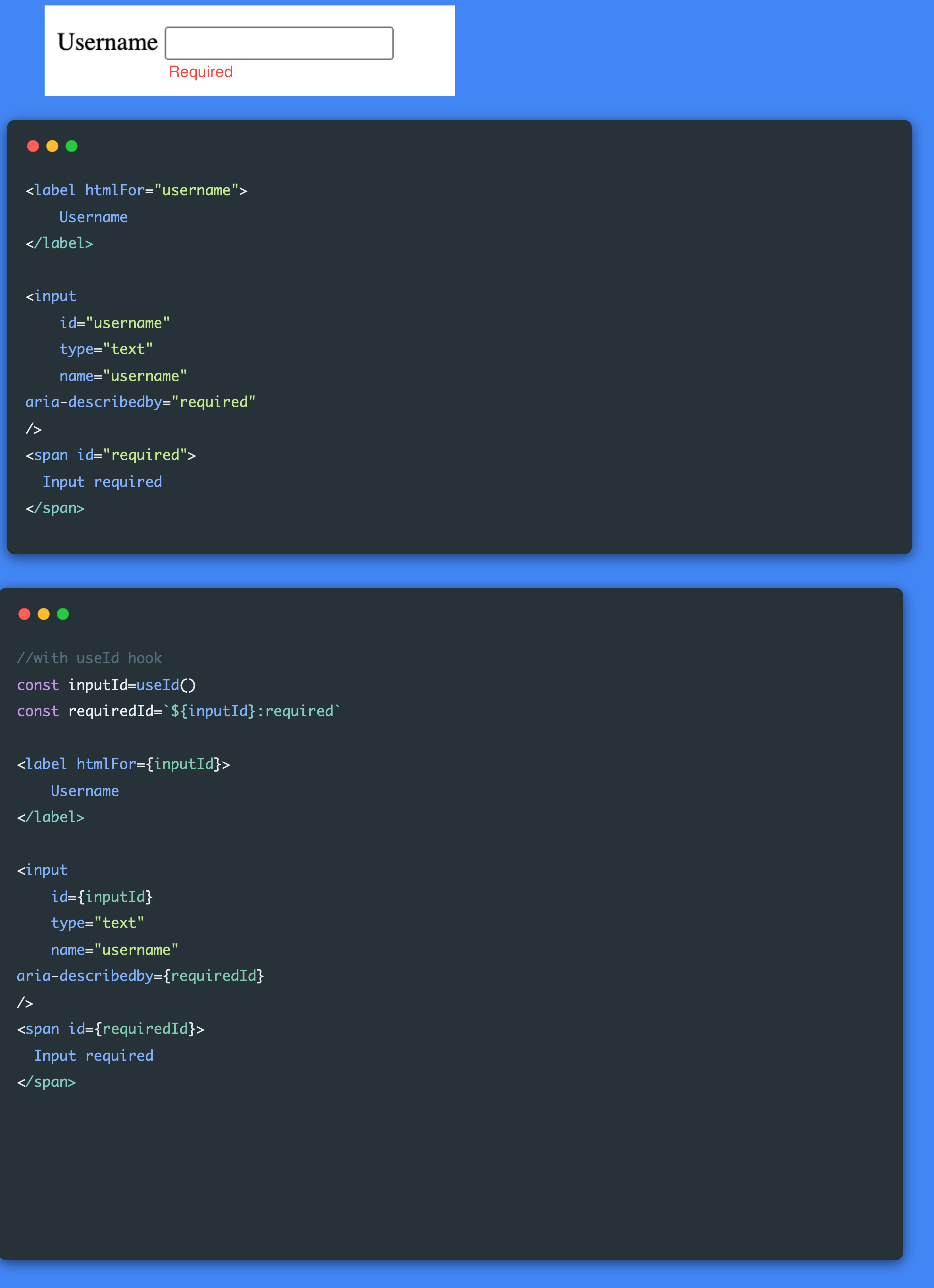
id seems to be quite important to link elements together for accessibility. They have to be unique and we all know one of the greatest challenges in coding is coming up with names. React has a hook useId that you can use to generate unique ids and link our elements.
In the example below we need two ids. One to link the input to the label and another to link the input to the span which will provide a description for the screen reader for the input by using aria-labaledby attribute.
My thoughts:
To date, this is one of the best technical accessibility talks I have seen. Even if you don’t use React, the principles apply. The biggest takeaway for me is to use the accessibility tree in the dev tools. Your first point of action is to make sure that your elements have roles and names. Kateryna has a follow up talk just on forms that you can watch here. Building accessible forms in React
Subscribe to my newsletter
Read articles from Tshepiso directly inside your inbox. Subscribe to the newsletter, and don't miss out.
Written by
