Demystifying flex: 1 in Flexbox
 Lucy Macartney
Flexbox is a powerful layout mode in CSS that gives web developers an efficient way to arrange elements within a container. Its flexibility and simplicity have made it a go-to tool for creating responsive layouts.
One property you might often reach for is flex: 1, a shorthand that helps flex items expand and take up equal space within their container. But do you fully understand what’s happening behind the scenes?
In this post, we’ll demystify flex: 1 by breaking down how it works and exploring how flex items grow and shrink within Flexbox. By understanding all the moving parts, you’ll gain more control when building responsive layouts.
Recap of terms
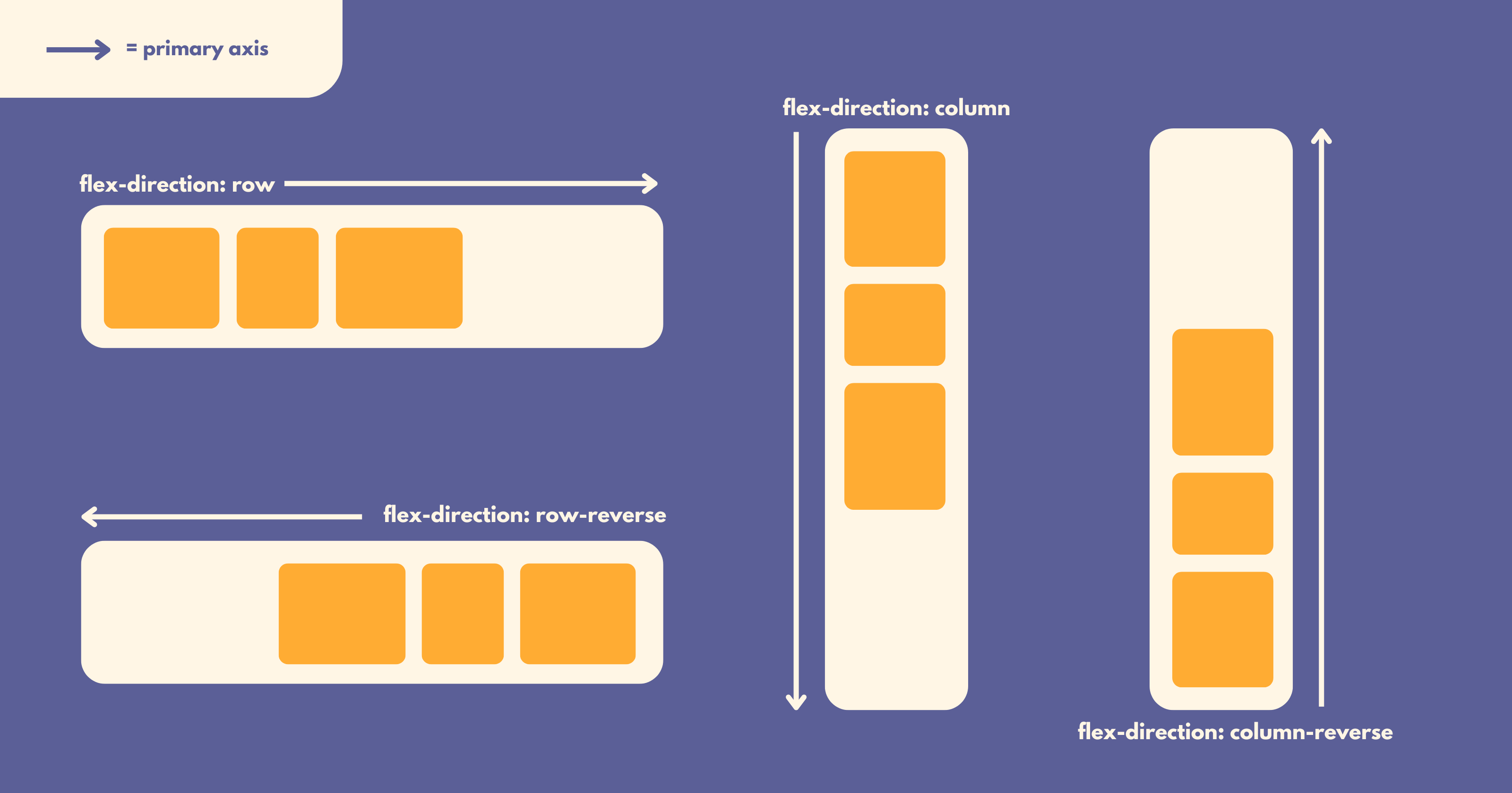
In Flexbox, the primary axis refers to the main direction in which flex items are laid out:
Setting
flex-directiontoroworrow-reversemakes the primary axis horizontal.Setting
flex-directiontocolumnorcolumn-reversemakes the primary axis vertical.

Breaking down flex: 1
To understand flex: 1, we need to break down its components: flex-grow, flex-shrink and flex-basis:
flex-grow
flex-grow determines how much a flex item grows when there is extra space along the primary axis within the flex container. The default value is 0, which is why flex items often leave extra space at the end of the container.
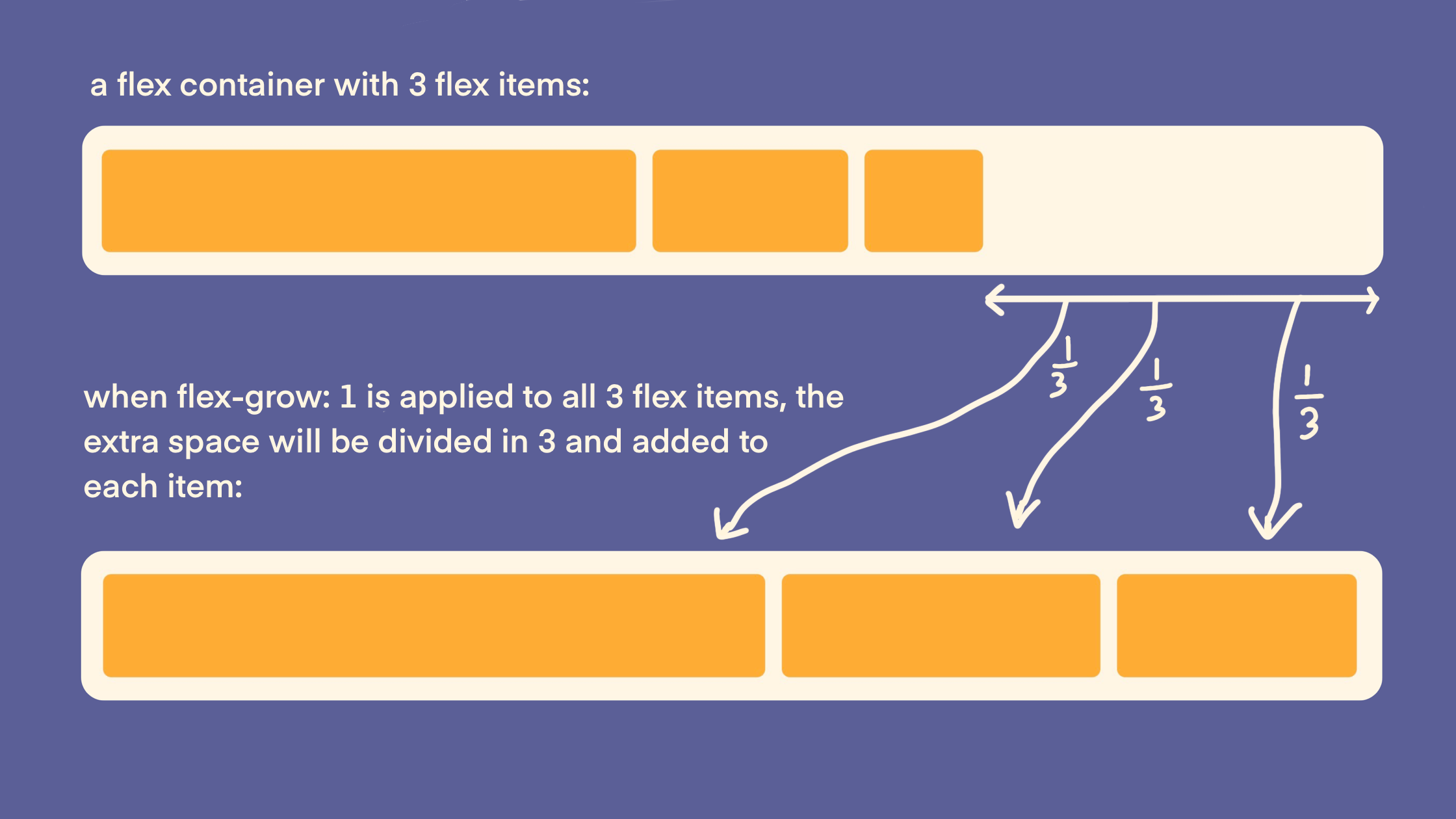
Setting flex-grow: 1 tells the element to expand and take up a share of the remaining available space. If multiple children have flex-grow set, the extra space is divided among them based on their flex-grow value.
Here’s a diagram explaining how space distribution works with flex-grow:

flex-grow values of the children add up to less than 1, there will still be available space in the flex container.flex-shrink
flex-shrink controls how much an item will shrink when there’s limited space in the container. The default value is 1, meaning that items shrink equally.
If one item has a higher flex-shrink value, it will become smaller more quickly than the other items. For example, if you set flex-shrink: 8 on a flex item, it will shrink eight times faster than the other flex items.
flex-basis
Until recently, I didn’t fully understand flex-basis or understand its role in the Flexbox algorithm. It’s often overlooked, but understanding it reveals a lot about how Flexbox distributes space in layouts.
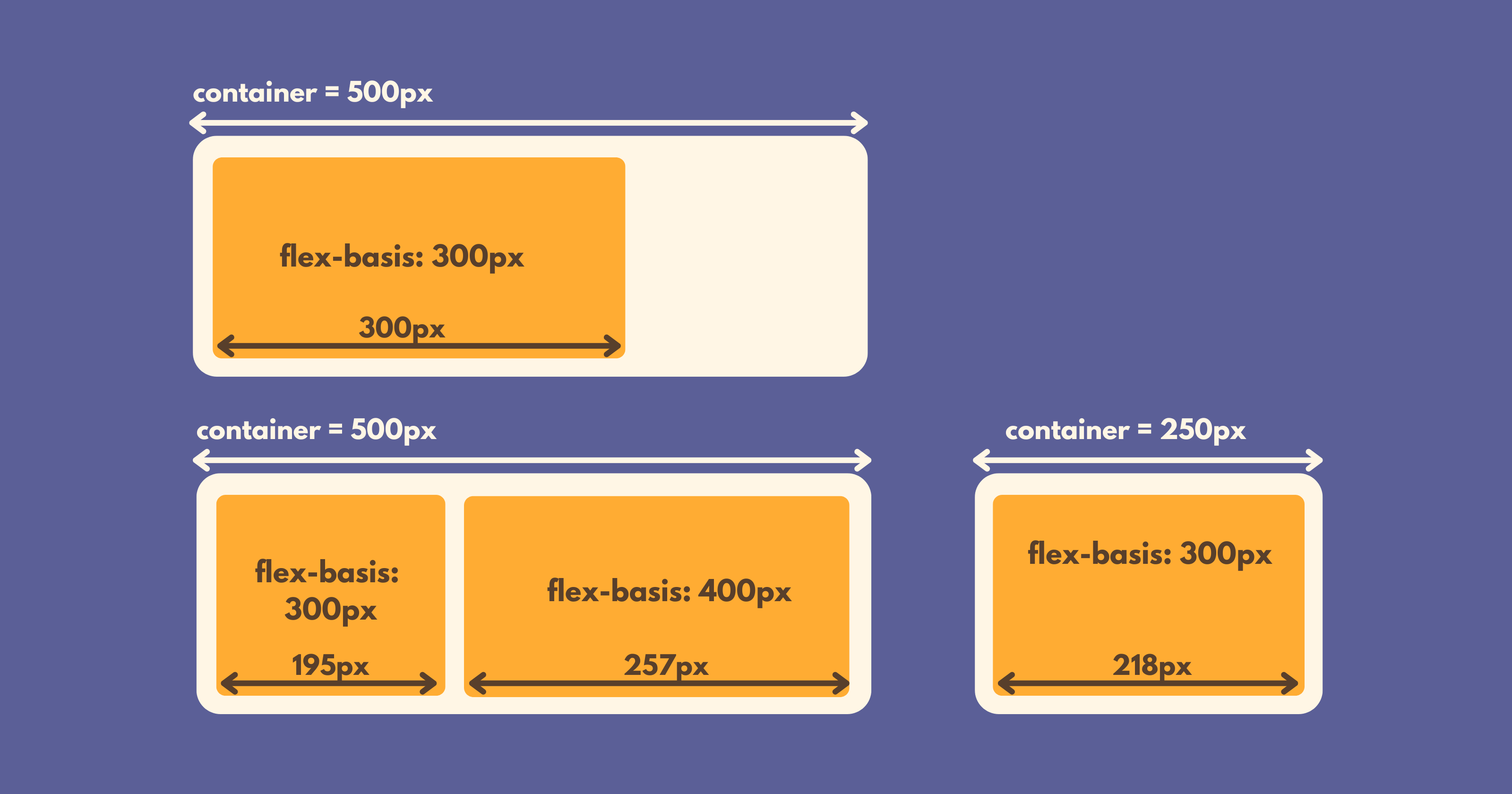
When you set flex-basis, you’re defining the “hypothetical size” of a flexbox item – the size the item would ideally have if it weren’t limited by its container. It’s the equivalent of setting an item’s width (if the primary axis is horizontal) or height (if the primary axis is vertical).
For example, setting flex-basis: 300px means the item is ideally 300 pixels wide (or tall, depending on the flex direction). However, this size is only achieved if the container has enough room. If the container is smaller, or if multiple items are competing for space, flex-shrink adjusts each item proportionally. Remember, by default, flex-shrink is set to 1, which means all flex items reduce their size proportionally to fit.

You can play with the examples in the above diagram in this codepen.
Therefore, properties like flex-basis, width and height in a flex container act as starting points rather than strict rules. They guide the layout, but the actual size of each item depends on the container’s constraints and how other flex properties interact.
The default value for flex-basis is auto, which makes the algorithm check for a width (when the primary axis is horizontal) or height (when the primary axis is vertical). If that property isn’t set, the item’s size is determined by its content.
It’s important to note that if you set a specific flex-basis value, it will override width (when the primary axis is horizontal) or height (when the primary axis is vertical). flex-basis is the primary guide for sizing flex items, while width and height are secondary in flex containers (depending on the flex direction).
Putting it all together: flex: 1
The flex property is shorthand for three key properties: flex-grow, flex-shrink and flex-basis.
When you apply flex: 1 to a flex item, it’s equivalent to setting these values:
flex-grow: 1flex-shrink: 1flex-basis: 0
When you set flex: 1 on all items within a flex container, each item takes up the same amount of space. This means that they grow and shrink equally to fill the container:

But why does this work? The key part here is flex-basis: 0. This means that each flex item is given a hypothetical size, or starting size, of 0px. This tells the Flexbox algorithm to ignore each item’s natural size (like width or height) and instead start sizing from zero. From there:
The algorithm checks available space in the container and calculates how much room needs to be distributed among the items
Because
flex-growis set to 1, each item then grows equally to fit the containerEach item ends up with the same final size in the container, regardless of their content.
This behaviour can be helpful for creating uniform layouts where all items appear consistent in size, no matter their content.
A word of warning about wrapping with flex: 1
flex: 1 can be a powerful tool, but it can create issues if your flex items wrap onto new lines. If you’re looking to keep items the same size across multiple rows or columns, CSS Grid is likely the better choice here. Diving into this topic goes beyond the scope of this article, but keep it in mind when building those trickier layouts.
Continue learning
This blog post is a result of an “a-ha moment” while going through Josh Comeau’s CSS for JavaScript Developers course. If you have the budget, I really recommend it. Josh’s main philosophy for this course is to help you understand the different layout modes of CSS and how their algorithms change CSS properties.
For a free, in-depth and interactive dive into the mechanics of Flexbox, I also recommend Josh’s excellent article: An Interactive Guide to Flexbox.
Subscribe to my newsletter
Read articles from Lucy Macartney directly inside your inbox. Subscribe to the newsletter, and don't miss out.
Written by

Lucy Macartney
Lucy Macartney
I'm a software developer and technical writer from London UK, living in Cali Colombia.