Customizing Row and Column Headers in Power BI Matrix
 Santhiya
Power BI matrix visuals are a powerful tool for data analysis, enabling users to organize and display complex datasets effectively. While Power BI offers extensive features, currently, there is no built-in option to display row and column headers separately in matrix visuals. However, with some creativity and clever adjustments, you can overcome these functionality-level limitations and deliver insightful and easy reports for your audience to understand.
Consider the below sample use case,
Example: Exploring Registered City vs. Purchase City
Scenario: A retailer wants to analyze where customers register (Registered City) versus where they purchase (Purchase City).
Insight:
Same City: Customers registered in and purchasing from the same city (e.g., both in New York) show strong local retention.
Different Cities: Customers registered in one city (e.g., Los Angeles) but purchasing in another (e.g., San Francisco) suggest customer mobility, indicating opportunities for targeted marketing or new store locations.
This analysis helps businesses understand customer behavior, guide marketing strategies, and optimize store placement.
Solution: Header Customization
To address this, you can use these strategies:
- Slash Technique for Differentiating Row and Column Headers
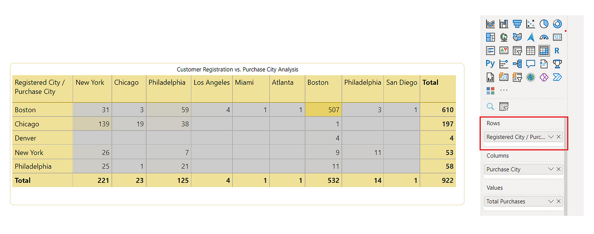
A simple yet effective solution is to use slashes (“/”) in row headers to represent the relationship between dimensions.

Matrix with slashes for row & column headers
However using slash with same dimenstion might cause confusion because the dimensions are closely related and might even share the same values where solution 2 will help.
2 . Adding text Box and tex indicator
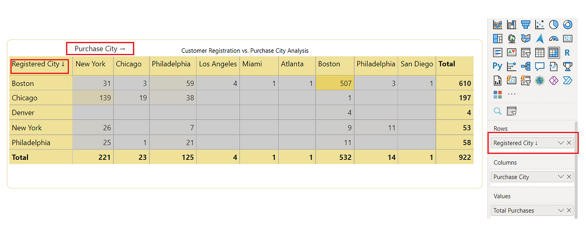
To address this, you can add a text indicator to the row header, such as “Registered City ↓” (with a down arrow), to distinguish it from the column dimension. Additionally, you can place a text box above the matrix that clearly labels the column dimension as “Purchase City.”
Note: You can adjust the padding of the visual to align with the text box and font size

Matrix with text box and text indicators for row & column headers
This approach not only resolves the potential confusion but also enhances the report’s readability by providing clear visual cues that separate the two dimensions.
These small tweaks can significantly improve the usability of your Power BI reports, making them more accessible and easier to understand. Whether you’re dealing with complex data relationships or just want to make sure your report’s layout is as clear as possible, these solutions can help you deliver insights more effectively.
Subscribe to my newsletter
Read articles from Santhiya directly inside your inbox. Subscribe to the newsletter, and don't miss out.
Written by

Santhiya
Santhiya
Hi, I am Santhiya, a dedicated Data Analyst with a strong focus on Power BI development. As a seasoned Power BI Developer with a robust background in architecting Power BI solutions tailored to project requirements, I excel in crafting effective, performance-optimized data models, dashboards, and reports. My journey began with gaining foundational skills in Python, which have greatly supported my data analysis endeavors. This experience enables me to leverage Python for essential data processing, integration, and automation tasks, enhancing the overall effectiveness of my Power BI solutions. With a keen eye for detail and a commitment to delivering high-quality insights, I am dedicated to transforming data into actionable intelligence and driving informed decision-making and business growth.