How to Create Clickable Tabs
 Jacqueline Trapp
In this post, we will go over the process to create and manage tabs in HTML, using CSS and JavaScript. Specifically, we will discuss how to:
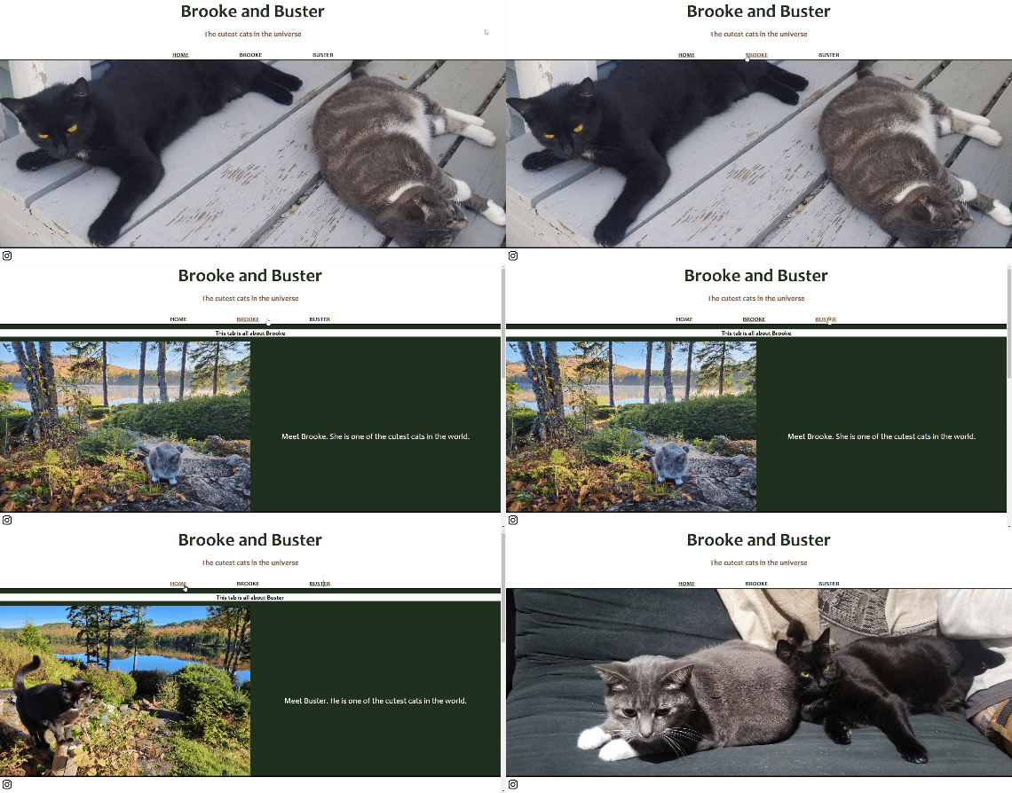
Select a tab to change page contents
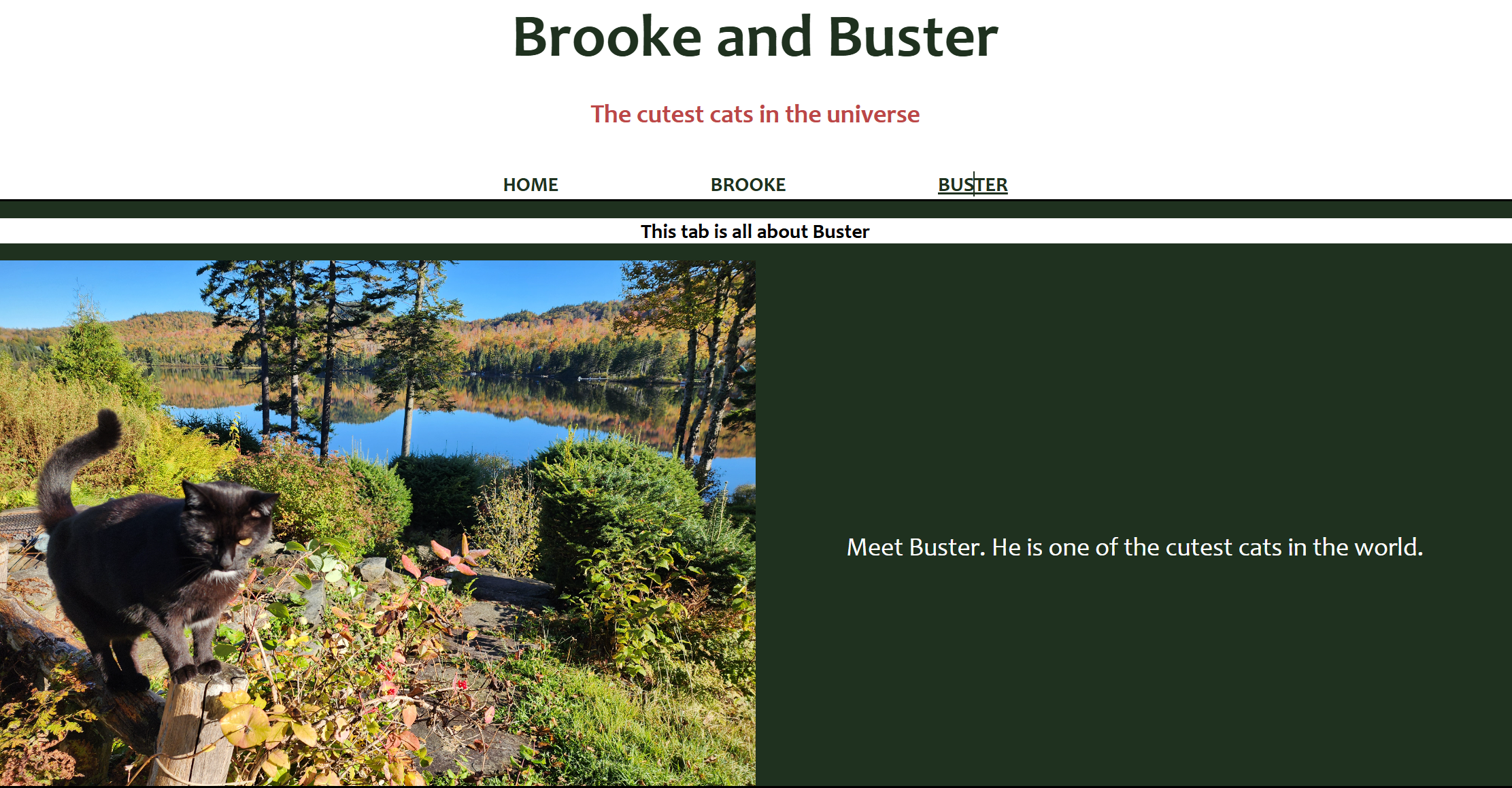
Change format of active tab name
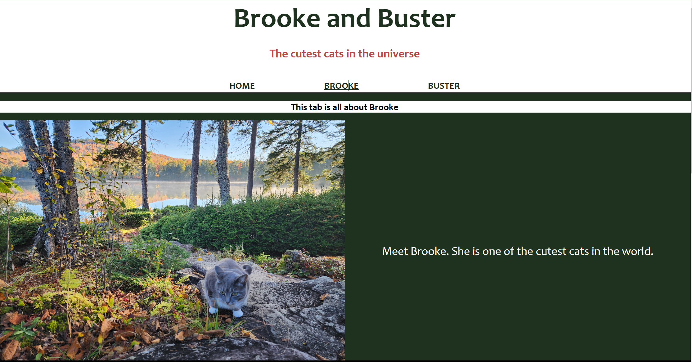
Change format of tab name upon hover
The full code used for this example can be found in this repository.
HTML
Include the following in the body:
Tab names:
A <div> tag with a class=”tab-names” can be used to store tab names
- Note that in this example, this can be located within the header
Any <h> tag can be used to store the individual tab names (in this example, we use <h2>)
Tab content:
A <div> tag can be used to create individual tabs
Each tab should have a unique ID that aligns with the tab names
Each tab should include the same class name (in this example, “tab-content”)
The default tab should also include a class to indicate it is active (in this example, “active-tab”)
    <body>
        <header>
            <div class="minimized-content">
                <h1 class="minimized">Brooke and Buster</h1>
                <h3 class="minimized">The cutest cats in the universe</h3>
            </div>
            <div class="tab-names">
                <h2 class="active-tab">HOME</h2>
                <h2>BROOKE</h2>
                <h2>BUSTER</h2>
            </div>
        </header>
        <div id="home" class="tab-content active-tab">
            /* add tab content here */
        </div>
        <div id="brooke" class="tab-content">
            <div><h2>This tab is all about Brooke</h2></div>
            /* add tab content here */
        </div>
        <div id="buster" class="tab-content">
            <div><h2>This tab is all about Buster</h2></div>
            /* add tab content here */
        </div>
    </body>
CSS
Include the following styles:
For tab names:
Setting the display to ‘flex’ for the tab name container will allow tabs to be displayed side-by-side
Formatting for individual tab names can be handled using .tab-names h2
Default: set formatting rules that should be applied for all tab names
Active Tab: set formatting rules to apply to the active tab only
Hover: set formatting rules to apply to tabs during mouse-over
For tab content:
Display should be set to ‘none’ to hide tab content
For the active tab, display should be set to ‘block’ or ‘flex’
.tab-names {
  display: flex;
  justify-content: center;
}
.tab-names h2 {
  padding-left: 5%;
  padding-right: 5%;
  padding-bottom: 0px;
  margin-bottom: 0px;
  cursor: pointer;
  text-decoration: none;
}
.tab-names h2.active-tab {
  text-decoration: underline;
  color: rgb(31, 49, 31);
}
.tab-names h2:hover {
  text-decoration: underline;
  color: rgb(188, 71, 71);
}
.tab-content {
  display: none;
}
.tab-content.active-tab {
  display: block;
}
JavaScript
Add a “click” event listener to each tab name, which performs the following actions:
Adds the “active-tab” class to the selected tab name and content
Removes the “active-tab” class to the selected tab name and content
function changeActiveTab() {
    const tabs = document.querySelectorAll('.tab-names h2');

    // Loop through each <h2> element and attach an event listener
    tabs.forEach(tab => {
        tab.addEventListener("click", function() {

            tabs.forEach(t => {
                // select content based on ID that matches tab name
                const tabName = t.textContent;
                const tabContent = document.querySelector(`#${tabName.toLowerCase()}`);

                if (t===tab) {
                    // add active-tab class to selected tab name and content
                    t.classList.add('active-tab');
                    tabContent.classList.add('active-tab');
                }
                else {
                    // remove active-tab class to all other tab names and contents
                    t.classList.remove('active-tab');
                    tabContent.classList.remove('active-tab');
                }})
        });
    });
}

changeActiveTab();
Result
After the modifications, you should now be able to select different tabs to update the content!


Subscribe to my newsletter
Read articles from Jacqueline Trapp directly inside your inbox. Subscribe to the newsletter, and don't miss out.
Written by
