Proactive Manufacturing with Data Visualisation
 KAPUPA HAAMBAYI
As a data engineer, I see data visualisation not as a stand-alone solution but as a vital part of data engineering, where raw data is transformed into actionable insights. This is especially true in manufacturing, where efficiency, speed, and accuracy are crucial, and data visualisation elevates data into a strategic asset. Having witnessed the evolution of data-driven decision-making firsthand, I’ve seen how visualisation supports a culture of continuous improvement. When I began as a data analyst, reports were mostly confined to Excel dashboards shared via email or WhatsApp. Today, they’ve evolved into real-time, automated reports powered by tools like Power BI.
My Journey: From Excel to Data Engineering
Starting as a data analyst, Excel was my primary tool, and mastering its complex formulae, pivot tables, and visualisation capabilities was a challenge. Yet, Excel was invaluable for creating dashboards and distributing insights to stakeholders. I remember spending hours manually refreshing data, formatting tables, and double-checking numbers before sending out reports. Without using Macros, this process was especially labour-intensive.
As datasets grew, Excel’s limitations became clear. Reports slowed, dashboards required constant manual updates, and extracting data from SQL databases into Excel was time-consuming. To increase efficiency and speed, I began learning SQL, enabling me to query databases directly. SQL unlocked new possibilities, allowing me to filter, join, and summarise datasets with precision.
My journey continued with Salesforce, which gave me a better understanding of CRM data, and later, Python, which streamlined workflows through automation. What once felt intimidating became routine, and CRM data became a valuable asset in cross-departmental decision-making.
The Shift from Static to Real-Time Reporting
Initially, reporting was static—data was extracted from SQL, formatted in Excel, and sent via email. Any update required rerunning, refreshing, and resending reports. This process was serviceable but not sustainable in a fast-paced manufacturing environment.
With digital transformation, Power BI emerged as a game-changer. It enabled a shift to real-time insights accessible to everyone, eliminating delays and making information available on demand. As I delved deeper into data engineering, I also explored tools beyond Power BI, such as Azure Streaming Analytics, which provides real-time metrics crucial for operational areas like supply chain and production. Power BI’s strength in aggregating data from various sources into a cohesive view makes it invaluable for strategic decision-making across manufacturing support functions, like finance, sales, and procurement.
Power BI’s Role in Supporting Manufacturing Functions
In manufacturing, support functions often require an aggregated view of data for timely, informed decisions. Power BI offers several advantages that make it ideal for manufacturing:
Accessibility: Power BI democratises data access, allowing teams to self-serve. Instead of waiting for an analyst to prepare a report, team members can access real-time dashboards, reducing delays and boosting productivity.
Real-Time Insights: Manufacturing demands real-time data, and Power BI delivers. With up-to-date information, support teams can respond proactively to changes, helping prevent both shortages and excess.
Integration and Usability: Power BI integrates with SQL Server, Azure, and Excel, creating a familiar interface for varied technical backgrounds. This usability is invaluable in manufacturing, where team members across departments can interpret visualisations with minimal training.
Automated Insights: Power BI’s AI-driven insights, such as anomaly detection and trend forecasting, allow proactive measures, especially in dynamic environments where early detection can lead to significant cost savings.
Building a Data-Driven Culture in Manufacturing Through Visualisation
Establishing a data-driven culture is essential in modern manufacturing, and data visualisation plays a pivotal role. Effective visualisation makes complex data accessible, empowering stakeholders to make faster, more accurate decisions. Visualisations facilitate clear communication across departments, providing shared references in meetings and enabling data-backed decisions.
Visualisation also supports continuous improvement. Tracking metrics over time helps teams identify patterns and act quickly. This transparency empowers departments, fostering accountability and aligning them with organisational goals. In manufacturing, where departments rely on each other’s data, accessible visualisation builds trust, creating a common language that strengthens cross-functional collaboration.
Scaling Power BI for Manufacturing: Best Practices for Managing Large Datasets
As manufacturing scales, so does the data volume. Power BI’s scalability is essential, but managing large datasets efficiently requires strategic practices:
Data Storage Options: Power BI offers Import and Direct Query modes. Import mode is ideal for historical analysis, while Direct Query connects to live data for real-time insights, keeping reports responsive.
Aggregations and Dataflows: Aggregations pre-summarise data, reducing report load, while dataflows allow for reusable datasets, streamlining report creation as data volumes increase.
Incremental Refresh: This feature allows Power BI to refresh only new or changed data, saving processing time. In manufacturing dashboards, incremental refresh keeps data up-to-date without slowing down the system.
Row-Level Security: As datasets grow, security is paramount. Power BI’s row-level security restricts data access to authorised users, especially important for sensitive data like costs or supplier details.
Essential Chart Types for Proactive Data Visualisation in Manufacturing
Data visualisation is not just about pie charts and basic graphs; it also requires advanced chart types for maximum effectiveness. In manufacturing, where early identification of issues can prevent costly downtime, these charts offer essential insights, enabling teams to act proactively and strategically.
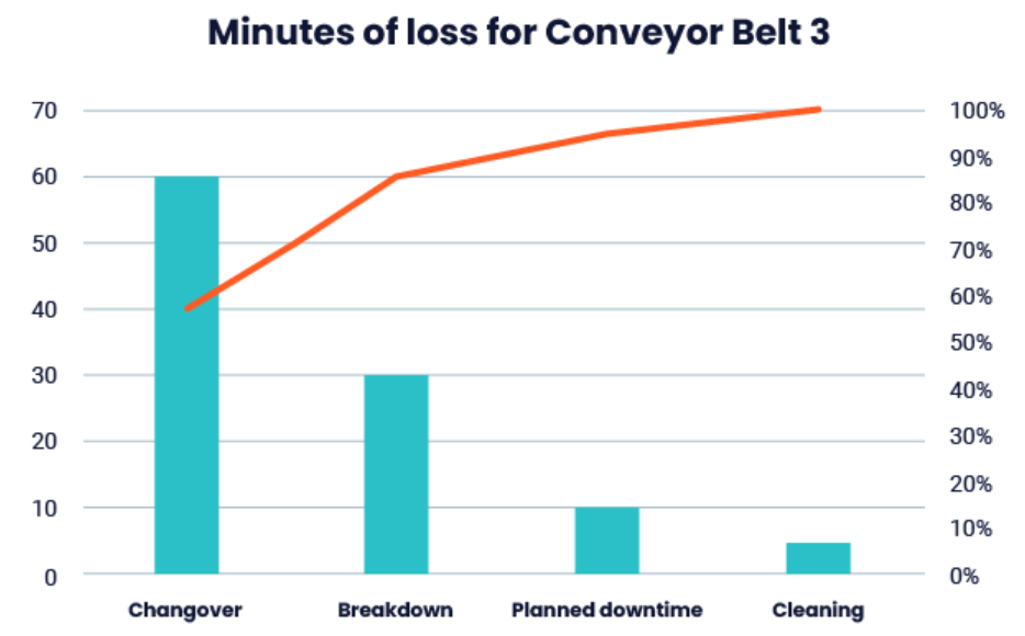
Pareto Analysis: Often, a small percentage of causes lead to most issues. Pareto charts highlight top factors, allowing teams to focus resources on the most impactful areas.
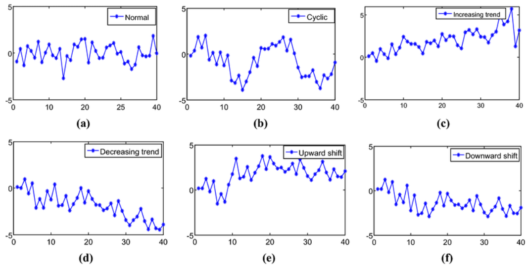
Control and Trend Charts: Control charts monitor quality over time, detecting deviations before they affect production. Trend charts reveal patterns and long-term shifts, showing if corrective actions are effective.
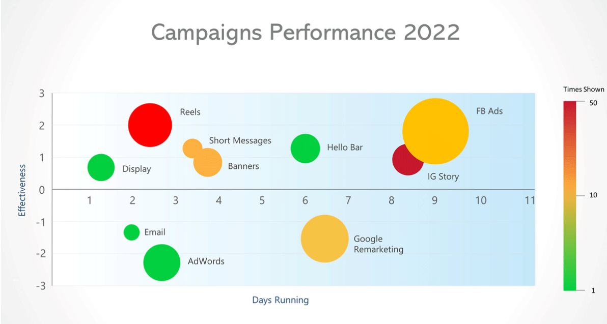
Heat Maps and Scatter Plots: Heat maps reveal patterns across departments or shifts, while scatter plots highlight relationships between variables, such as machine temperature and defect rates, helping teams identify root causes.
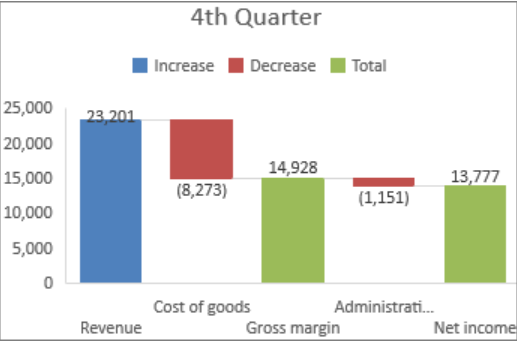
Waterfall Charts: Manufacturing processes often involve multiple stages. Waterfall charts show the cumulative impact of each stage, useful for cost analysis and production yield tracking.
Gantt Charts: Scheduling is critical in manufacturing. Gantt charts help visualise project timelines, equipment usage, and task dependencies, aiding in maintenance planning and downtime reduction.
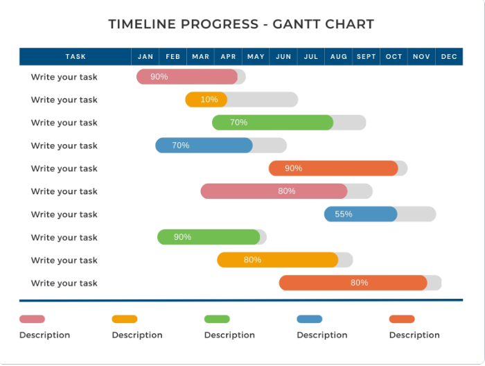
By incorporating these advanced visualisation techniques, manufacturing teams gain a comprehensive view of operations, enabling them to shift from reactive to proactive management. Each chart type translates raw data into actionable insights, driving a more informed and efficient decision-making process across departments.
The Power of Data Visualisation in Manufacturing
Data visualisation bridges the gap between data engineering and decision-making, transforming raw data into actionable insights. My journey from Excel to Power BI reflects a broader transformation in manufacturing, where Power BI has become more than a visualisation tool—it’s a strategic asset that empowers teams to make informed, proactive decisions.
In manufacturing, where data-driven decisions are crucial, Power BI’s real-time capabilities, scalability, and accessibility foster a culture of continuous improvement and accountability. Embracing this shift isn’t simply about adopting new tools; it’s about embedding a data-driven culture that supports efficiency, transparency, and collaborative decision-making as manufacturing evolves into a data-centric future.
Subscribe to my newsletter
Read articles from KAPUPA HAAMBAYI directly inside your inbox. Subscribe to the newsletter, and don't miss out.
Written by

KAPUPA HAAMBAYI
KAPUPA HAAMBAYI
A data engineer passionate about amplifying the role of data engineering in business operations, with a particular focus on the manufacturing sector. While I specialize in maximizing value from data engineering solutions in manufacturing, my insights and methods benefit businesses across all industries, driving efficiency and performance improvements.