ML classification model selection
 Fatima Jannet
Welcome to the final section of Part Three: Classification.
Classification model selection
One common question in data science is which classification model to choose for a dataset. This section will show you how to quickly and efficiently select the best model, no matter the number of features. Make sure you have this Model Selection folder ready
https://drive.google.com/drive/folders/1Xq53HUZosw2_E0iBzmGW0CgmHBwWXTLK
[ In this folder, we have all the classification models from Part Three. I've slightly modified them by removing print statements to simplify the implementation. I also removed the cells for visualizing the training and test set results, as these only work with two features. Here, we have a dataset with many features. Hence we can’t visualize them ]
Now, let me explain the dataset. This is a classic dataset from the UCIML Machine Learning Repository about breast cancer. In this dataset, each row represents a patient.
For each patient, the following data is collected:
Sample code number
Clump thickness
Uniformity of cell size
Uniformity of cell shape
Marginal adhesion
Single epithelial cell size
Bare nuclei
Bland chromatin
Normal nucleoli
Mitoses
All these variables are the features, from sample code number, even if that's not really the feature up to mitoses. And with all these features we are predicting the class, which tells for each patient:
If the tumor is benign, the class value is two.
If the tumor is malignant, the class value is four.
So that's what the dataset is about.
Demo
I'll keep it brief.
Make a copy of each template, change the name, and upload the Data.csv file to each one. Compare their accuracy to find your best regression model. If your data needs preprocessing, you can use one-hot encoding. You also have the data preprocessing template, so use that.
Confusion matrix and accuracy ratio
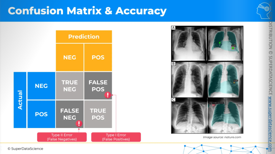
Let's imagine we are building a model to predict, using X-ray images of lungs, whether there is cancer or not. We'll create a matrix here. On the left, we'll have the actual results, and on the top, we'll have our model's predictions, which can be either negative (no cancer) or positive (cancer). So, and once we cross these rows and columns we'll have four different cells.
The cross between negative and negative is a true negative:
- The model predicted no cancer, and in reality, there is no cancer.
The bottom right is a true positive:
- The model predicted cancer, and in reality, there is cancer.
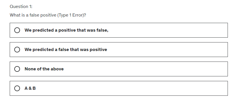
The top right is a false positive (Type I error):
- The model predicts cancer, but in reality, there is no cancer.
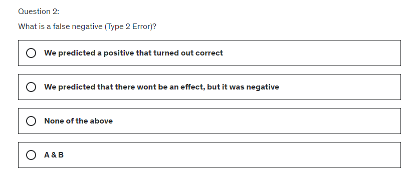
The bottom left is a false negative (Type II error):
The person actually has cancer, but the model says they don't.
This is a dangerous error because doctors might not treat the person, allowing the cancer to grow and worsen.
Both errors are undesirable, and we want to avoid them.
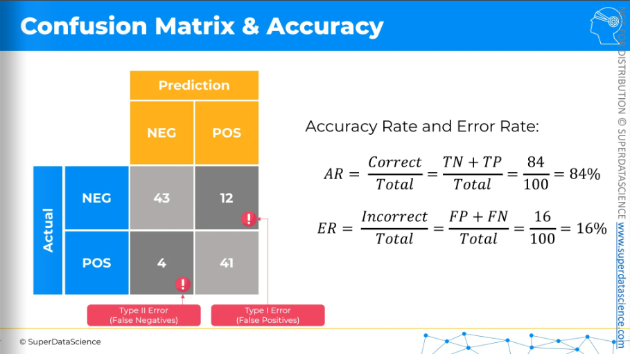
Now let's populate this matrix with actual figures. Let's say we have hundred patients, out of them our model made some predictions
43 true negatives
41 true positives
12 type one errors or false positives
4 type two errors or false negatives
From this confusion matrix, we can calculate the following rates or ratios:
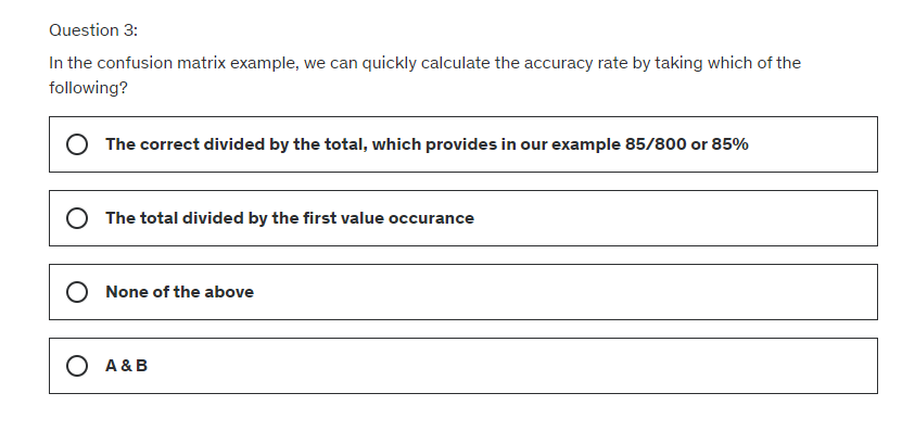
Accuracy rate: The total number of correct predictions (true negatives plus true positives) divided by the total number of patients in this sample.
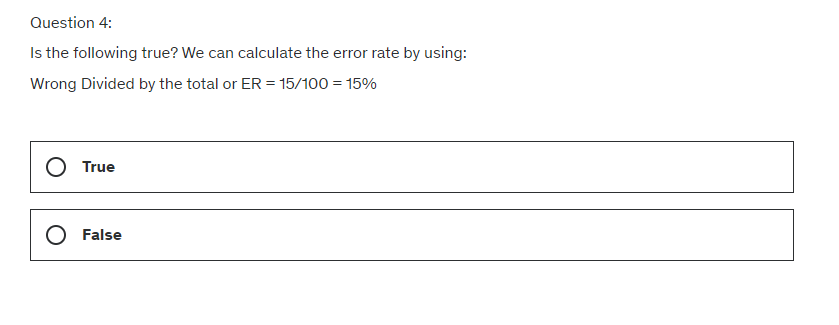
Error rate: The total number of incorrect predictions (type one errors plus type two errors).
So that's how the confusion matrix works.
For further reading, I highly recommend checking out this article to keep it handy for future use.
Additional Reading: Understanding the Confusion Matrix from Scikit learn
Accuracy Paradox
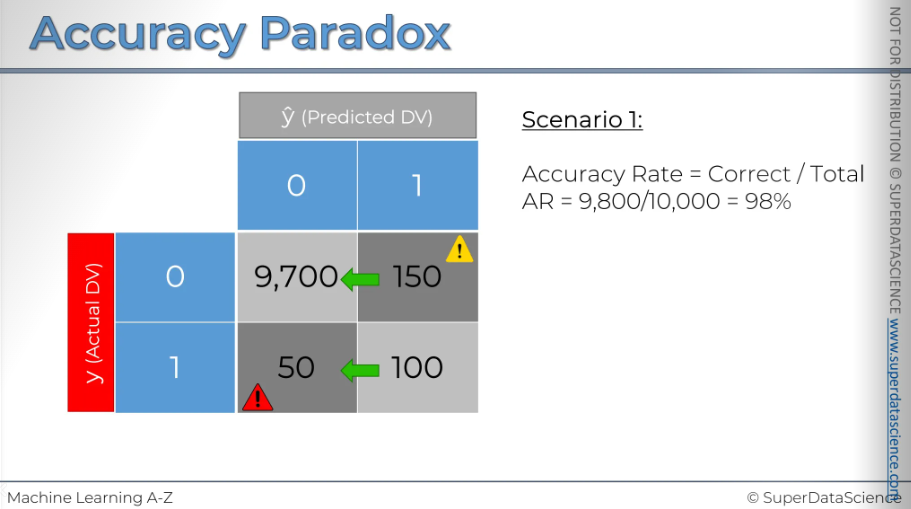
Here, I have a confusion matrix with 10,000 records. It represents scenario number one, which we'll be examining. As you can see, this model has made 150 type i errors and 50 type ii errors. However, overall, it has made many correct predictions. The accuracy rate is pretty good too.
Now we'll instruct our model to stop making predictions entirely and always predict zero, meaning the event won't occur. In the confusion matrix, all records will shift from the right cell to the left cell.
And this will look something like this. Now after calculating the accuracy rate, it went up by 0.5%. we just completely stopped predicting and the accuracy rate went up.
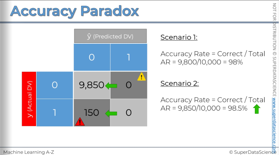
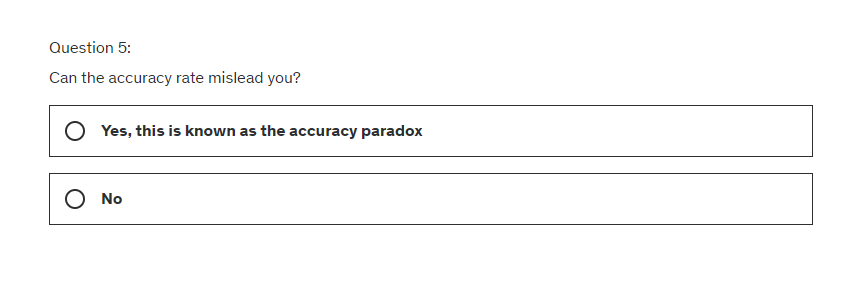
That's why you shouldn't rely solely on accuracy for judgment. Situations like this can occur, and even though you're no longer using a model, meaning you're not applying any logic to your decision-making process, your accuracy rate increases. This can mislead you into the wrong conclusion that you should stop using models. This effect is known as the accuracy paradox.
CAP Curve
[CAP - cumulative accuracy profile]Let's say you're a scientist at a clothing store with 100,000 customers. From experience, you know that when you send an offer to all or a random sample of customers, about 10% respond and buy the product. So, 10,000 is on the vertical axis.
If you send the offer to 20,000 customers, about 2,000 will respond. For 40,000 customers, about 4,000 will respond. This pattern continues: 60,000 customers yield 6,000 responses, 8,0000 yield 8,000, and 100,000 yield 10,000 responses. This random selection can be represented by a line with a slope of 10%, showing the average response rate.
Now, the question is, can we improve this and get more customers to respond to offers? Can we target our customers better to increase the response rate? Instead of sending offers randomly to 20,000 customers, how do we choose who to send them to? It's a very simple process actually.
We can analyze customer data before sending offers to identify patterns, like gender, country, age, and device used. By using logistic regression, we create a model to predict which customers are likely to buy based on these traits. We then use this model to choose who receives the offer. For example, it might show that male customers in a certain age group using mobile devices are more likely to purchase and female who loves bags might not purchase a dress that often. This helps us rank customers by purchase probability, allowing us to contact those most likely to respond, increasing our response rate. We know from the behavior of similar customers that they have a 90% or 80% chance of buying the product, so we target them first. We prioritize them on our contact list. If we contact 40,000 instead of 20,000, our response rate will exceed 4,000 if our model is effective. By the time we reach around 60,000, we approach the 10,000 response mark, ensuring 10,000 people will respond in total.
No we can use this probability to actually contact our customers. If we contact zero customers we will get a zero response rate. Then if you contact 20,000 customers we’ll get a much higher response than 20k cause we are contacting the customers which are in a position to accept the offer. Then when we contact 40,000 - our response rate will increase even more higher cause we are putting the people first who are likely to accept the offer. There's no way to exceed that response rate because if we contact everyone, it'll be 10,000. At 60,000 contacts, we're already at 9,500 responses. We could stop here, as we've nearly contacted everyone. If we reach out to 80,000, we get closer to 10,000 responses. Contacting 100,000 will still result in 10,000 responses. Draw a line through these points.
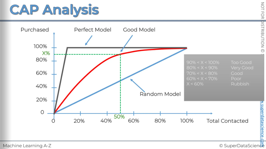
This line here s called the cumulative accuracy profile of your model. As you might guess, the better your model, the area between the blue line and the red line increases and the vice versa.
The next step we want to do is convert these axes from absolute values to percentages. This is how the cap curve is normally represented.
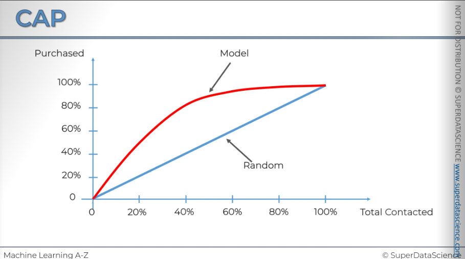
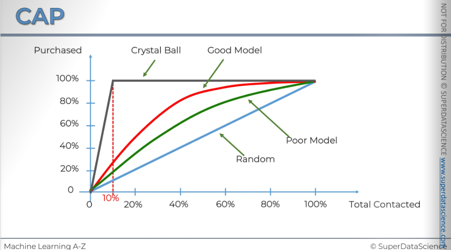
Now, let's say we ran another regression model with fewer variables due to limited access. The model will be worse, and its CAP curve will look like the green one. By comparing them, you can see your gain, which is why it's sometimes called the gain chart. Let’s name them:
Blue: random selection. Picking out random selections and sending offer emails
Green: Poor model. Better than random but not that good
Red: Good model. We are getting around 50% of the mark with 80% responses.
And there are one more line you can draw - The grey line. This line is considered as the ideal line. This is what would happen if you had a crystal ball (haha!) and could predict exactly who is going to make a purchase and contact only those people. This is what it would look like. If you look at the point where the spline occurs, you'll see it's exactly at 10 percent and 10 percent, as you may recall. We know that only 10 percent of our customers ever make a purchase.
If you ever see a model that goes under the blue line ( I didn’t even draw it here) that’s a really, really bad model. The model is doing a disservice to you. We’ll talk about model deterioration later.
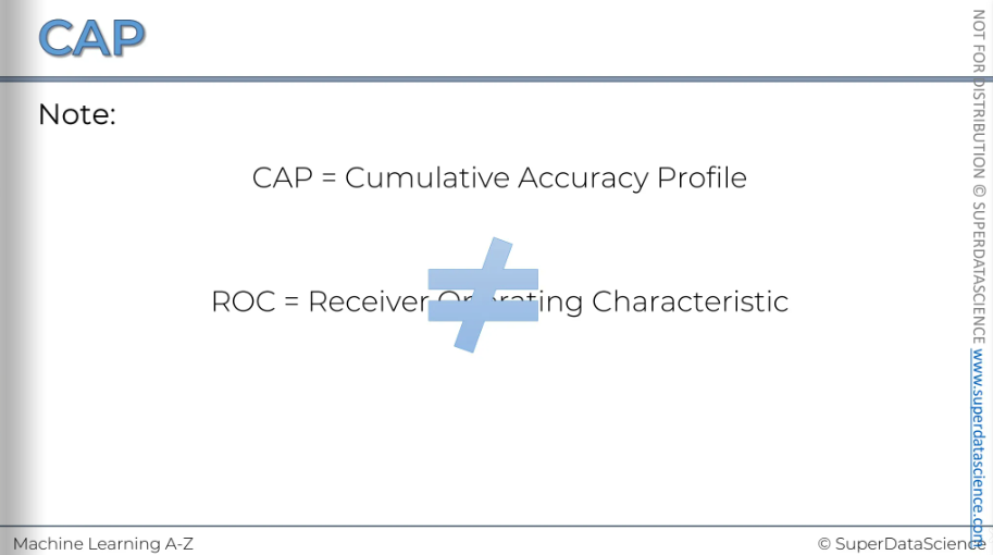
One last thing I wanted to mention is that we have the CAP, which stands for cumulative accuracy profile, and the ROC, which is the receiver operating characteristic. Many people, including myself, often mix these up because they look so similar.
CAP analysis
There are three important lines in our CAP model: the red line, the blue line, and the grey line. Let's see what we can learn from them. It's intuitive that the closer the red line is to the grey line, the better the model is, and the closer it is to the blue line, the worse it is. So, how can we measure this effect? There is a standard way to do this. First, take the area under the perfect model, shown in grey (ap), and the area under the good model, shown in red here (ar). Then, divide one by the other. The ratio you get is always between [0,1], and the closer the result is to 1, the better. However, calculating this area under the curve can be quite complicated. Statistical data can help, but it's not as easy as it seems. So, we will consider a second approach.
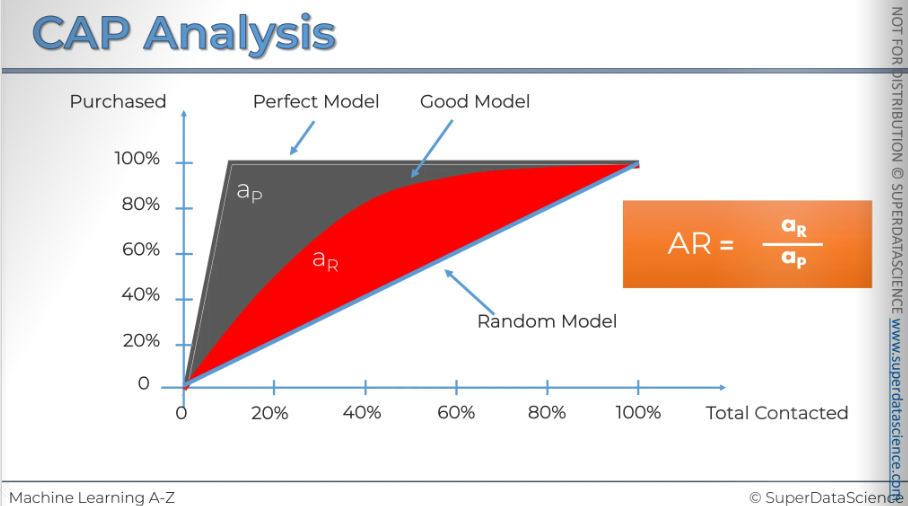
Instead of focusing on areas, let's look at the 50% line on the horizontal axis. Check where it intersects with your model and then see where it crosses the vertical axis. Essentially, this tells you how many positive outcomes or action-takers this model has taken if you select 50% of your population. In this case, we can see it's around 90% or so.
By observing this, there's a simple rule of thumb to assess your model based on that X number. Now focus on the grey chart (this is my rule of thumb)
If X < 60%: It's a rubbish model. Not useful at all.
If X is between 60% and 70%: The model is considered poor or average.
If X is between 70% and 80%: That's a good model. Aim for anything above 70% to deliver good quality insights and value to the business.
Anything between 80% and 90%: Very good. It's extremely good. That is just too good.
But there's a factor you should be very careful about, which is overfitting. If your model shows results like 90% or even 100%, it's clear that there's a variable in your independent set acting as a post facto variable. This means it shouldn't be in your database because it's looking into the future. So, if you have 100% accuracy, or even between 90% and 100%, you need to check for any forward-looking variables.
Another important issue is overfitting. This happens when your model fits the specific data set you provided so well that it relies too much on the anomalies in that data set. When you give it a new data set, like one from a month later, it may not perform well because it's not the data it was trained on. We'll discuss this more in upcoming tutorials, but if you use this model to make predictions on new data, it might not work well, possibly performing around the 60% mark. This indicates the model is overfitted, so be cautious about that.
Conclusion of Part 3 - Classification
In this Part 3 you learned about 7 classification models. Like for Part 2 - Regression, that's quite a lot so you might be asking yourself the same questions as before:
What are the pros and cons of each model ?
How do I know which model to choose for my problem ?
How can I improve each of these models ?
Again, let's answer each of these questions one by one:
What are the pros and cons of each model ?
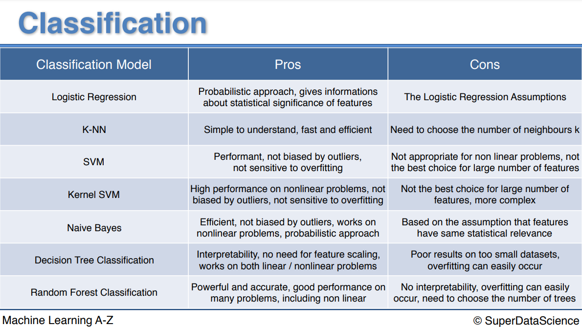
Please have a look on the chart below.
How do I know which model to choose for my problem ?
Same as for regression models, you first need to figure out whether your problem is linear or non linear. You will learn how to do that in Part 10 - Model Selection. Then:
If your problem is linear, you should go for Logistic Regression or SVM.
If your problem is non linear, you should go for K-NN, Naive Bayes, Decision Tree or Random Forest.
Then which one should you choose in each case ? You will learn that in Part 10 - Model Selection with k-Fold Cross Validation.
Then from a business point of view, you would rather use:
Logistic Regression or Naive Bayes when you want to rank your predictions by their probability. For example if you want to rank your customers from the highest probability that they buy a certain product, to the lowest probability. Eventually that allows you to target your marketing campaigns. And of course for this type of business problem, you should use Logistic Regression if your problem is linear, and Naive Bayes if your problem is non linear.
SVM when you want to predict to which segment your customers belong to. Segments can be any kind of segments, for example some market segments you identified earlier with clustering.
Decision Tree when you want to have clear interpretation of your model results,
Random Forest when you are just looking for high performance with less need for interpretation.
3. How can I improve each of these models ?
Same answer as in Part 2:
In Part 10 - Model Selection, you will find the second section dedicated to Parameter Tuning, that will allow you to improve the performance of your models, by tuning them. You probably already noticed that each model is composed of two types of parameters:
the parameters that are learnt, for example the coefficients in Linear Regression,
the hyperparameters.
The hyperparameters are the parameters that are not learnt and that are fixed values inside the model equations. For example, the regularization parameter lambda or the penalty parameter C are hyperparameters. So far we used the default value of these hyperparameters, and we haven't searched for their optimal value so that your model reaches even higher performance. Finding their optimal value is exactly what Parameter Tuning is about. So for those of you already interested in improving your model performance and doing some parameter tuning, feel free to jump directly to Part 10 - Model Selection.
Pros and cons of each model
Evaluating Classification Model Performance Quiz
Answer
We predicted a positive that was false.
We predicted that there wont be an effect, but it was negative
The correct divided by the total, which provides in our example 85/100 or 85%
True
Yes
Now congratulations for having completed Part 3. Next part of the journey: Part 4 - Clustering
Subscribe to my newsletter
Read articles from Fatima Jannet directly inside your inbox. Subscribe to the newsletter, and don't miss out.
Written by
