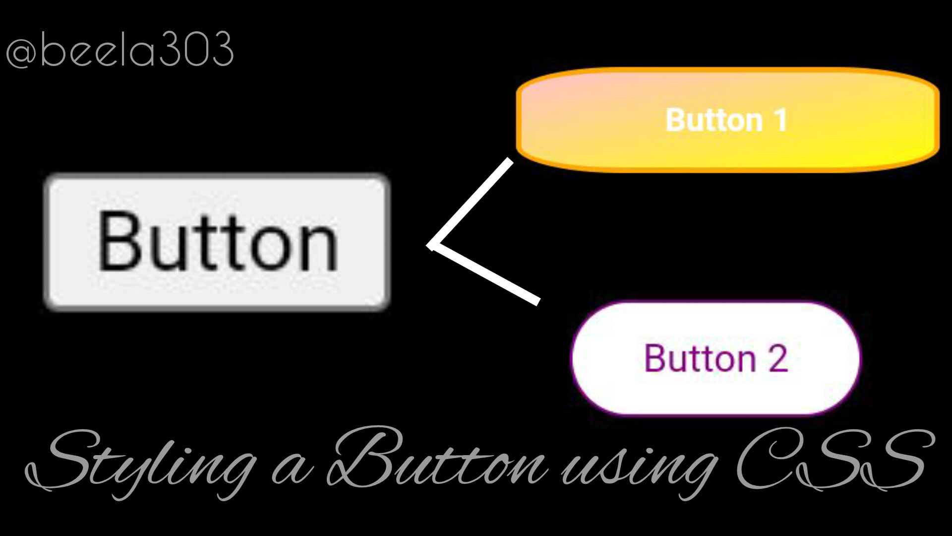
Styling a button with CSS
 Nabila Abubakar
Table of contents

There are several ways to style a button with CSS, you can add an animation, shadows, curves and more, you just need to know the right code to use.
HTML
Firstly, we'll start with HTML, so our button can be displayed.
<button type="button">Button 1</button>
You can add a class (for a group) or id (used only for one element) to select it in CSS. For example :
CLASS
HTML:
<button type="button" class="button1" >Style Me!</button>
CSS:
.button1{
Code
}
ID
HTML:
<button type="button" id="button1" >Style Me!</button>
CSS:
#button1{
Code
}
CSS
PROPERTIES
Let's get to know a little bit more about some CSS properties.
Color: the color of the text.
Background-image: it is for using an image as the background or making a gradient.
Background-color: the background color of an element, in this case a button.
Margin: it is the space outside the box.
Padding: the space around anything in the box.
Border: it is the space outside the padding, immediately after.
Border-radius: this makes the edges curved or circular.
Box-shadow: adds a shadow.
Font-size: the size of text.
Font-weight: the weight of text.
Font-family: the font family of the text.
Letter-spacing: the space between each letter.
Text-align: the position of the text (for example; left, right or center).
Transform: moves or changes an element (in this case, the button).
Transition: determines the smoothness of change.
Transition-duration: determines the duration of a transition.
Note: there are different units of measurement, for example px, in and rem.
Now that we've gotten the basics down, let's proceed to styling using the above properties!
CODE
#button1 {
color: white;
background-image: linear-gradient(to bottom right, pink, yellow);
width: 2in;
height: .5in;
margin : 5px;
padding: 5px;
border-radius: 25%;
border: 2.5px solid orange;
box-shadow: 0 12px 16px 0 rgba(0,0,0,0.24), 0 17px 50px 0 rgba(0,0,0,0.19);
font-size: 15px;
font-weight: bold;
font-family: monospace:
letter-spacing: .1em;
transition-duration: 2s;
}
#button1:hover{
/* when the mouse is over the button */
background-image: linear-gradient(to bottom right, yellow, pink);
transform: translateY(-5px);
transition: transform 0.5s ease;
}
#button2{
color: purple;
background: white;
width: 100px;
height: 40px;
padding: 3px;
margin: 3px;
border: 1px solid purple;
border-
radius: 30px;
}
#button2:hover{
color: white;
background: purple;
transition: 1s;
}
Thanks for reading!
If you have any question, feel free to comment.
Subscribe to my newsletter
Read articles from Nabila Abubakar directly inside your inbox. Subscribe to the newsletter, and don't miss out.
Written by

Nabila Abubakar
Nabila Abubakar
I'm a self-taught front-end web developer on my way to full-stack. Currently learning Django and ionic.