Individual Scores in Choice Models, Part 3: Respondent Segments
 Chris Chapman
This is Part 3 of a series examining how to work in R with individual-level estimates for preferences. We’re using real data from a MaxDiff survey on the preferences of N=308 respondents interested to take classes from the Quant UX Association.
If you haven’t read Posts 1 and 2, you’ll want to catch up on the background and basic data in Post 1, and on the question of correlational patterns of interest in Post 2. As usual, I illustrate everything with R code and will discuss the code as we go, with all of the code compiled at the end.
The topic of this Part 3 is this: are there clusters (segments) of respondents who have similar patterns in their interest in classes? As my coauthors and I discuss in the R book and the Python book, the process of finding segments in real data is complex and there is no magic answer. Segmentation is an iterative process of finding some number of segments and seeing whether those segments are useful and interpretable for your business need.
In this post, I discuss one way to find the number of segments and to visualize the results … with a big caveat: there is much more to say! This is one illustration and is not a prescription. No blog post can give a complete recipe for clustering. For comprehensive discussion and learning, see “Learning More” at the end of this post. Also stay tuned for a future “Segmentation FAQ” blog post soon!
Warning: long post! I like talking about segmentation (both pro and con) :) Like many posts in this blog, this is intended to complement other writings. It complements the R book and Python book for conjoint, and the Quant UX book for MaxDiff.
First, Get the Data
You can read Posts 1 and 2 for background. But if you’re jumping in here, the following R code will load the data. These are N=308 responses estimating researchers’ levels of interest in Quant UX classes, from a MaxDiff survey.
You can get the data with:
# get the data; repeating here for blog post 3, see post 1 for details
library(openxlsx) # install if needed
md.dat <- read.xlsx("https://quantuxbook.com/misc/QUX%20Survey%202024%20-%20Future%20Classes%20-%20MaxDiff%20Individual%20raw%20scores.xlsx")   #
md.dat$Anchor <- NULL
names(md.dat)[3:16] <- c("Choice Models",  "Surveys",       "Log Sequences",    "Psychometrics",
                         "R Programming",  "Pricing",       "UX Metrics",       "Bayes Stats",
                         "Text Analytics", "Causal Models", "Interviewer-ing",  "Advanced Choice",
                         "Segmentation",   "Metrics Sprints")
classCols <- 3:ncol(md.dat)    # generally, Sawtooth exported utilities start in column 3
I recommend to follow along live in R, installing packages as needed. All the R code is given as I go, and also compiled at the end of the post.
Background: General Clustering vs Latent Class Analysis
At a high level, there are two approaches to clustering/segmenting data from choice surveys.
One approach is to estimate respondents' preferences first as a whole sample, and then apply general clustering methods later to those estimates to find segments. My experience suggests that a majority of analysts use this approach for several reasons. First, it is easiest because it divides analysis into tidy stages. Second, you can use the widest range of tools and methods. Third, it does not require specialized software for the clustering portion, but uses general methods from R, Python, or wherever. Fourth, the approach can be used with any kind of data and with mixed types of data.
The second approach is to model segments at the same time that you estimate individuals’ preferences. This is the approach taken by latent class analysis (LCA), as applied to choice surveys. The primary advantage of LCA is that, by doing both steps together (estimation + segmentation), it is more robust to sparse data and noise in the data. On the other hand, LCA requires more specific assumptions about the data, along with specialized tools.
In the choice modeling community, the most common tools used for choice model LCA are Statistical Innovation’s Latent Gold, Sawtooth Software’s Lighthouse Studio, and proprietary code bases within analytics firms. These may add cost and complexity to analyses, while limiting the generality of what you can do. By contrast, general clustering methods are widely available in R and other platforms. (Note that choice model LCA is possible in R … but the effort is beyond reasonable levels for general practitioners. FWIW, I personally avoid doing choice model LCA in R.)
In this article, I demonstrate use the general clustering approach … with one note: if you frequently need to cluster choice model data, you should check out Sawtooth Software’s Lighthouse Studio and/or Statistical Innovations’s Latent Gold. Their tailored functionality can be helpful, efficient, and more precise for practitioners. For my part, I often use LCA in Sawtooth’s Lighthouse Studio. However, I also often use general clustering as this post illustrates.
In short, although I use choice survey data to demonstrate the methods here, the methods here are general. You can apply the tools and code in this post to a wide variety of data sources.
Finding a Number of Segments: Part 1
The first question in segmentation is this: are there segments at all? And if so, how many?
A reasonable assumption — especially in high dimensional space, i.e., in data with many variables — is that people do not cluster together, and that instead, they differ from one another in unstructured (“random”) ways. Some jargon for that is that the data exhibit a multivariate normal distribution (MVN) with one component. In other words, there is a single “segment” and every respondent is a member!
My take — see the “clustering” chapters in the R book and the Python book — is that MVN data with 1 cluster is quite often the “best” statistical answer … but the number of segments is not primarily a statistical question. There are hundreds of methods to cluster data and they typically give different answers. The question is whether we can find segments that are useful and informative for a business question, while secondarily optimizing statistically.
There are several ways we might inspect the data to see whether it appears to have clusters. One way is a model-based approach to determines how many clusters may underlie the data. The mclust library is one of my favorites. In R we can fit a clustering (segmentation) model to the MaxDiff data as follows:
# mclust uses model-based fit estimates to determine best number of latent clusters
library(mclust)    # install if needed
md.mc <- Mclust(md.dat[ , classCols])
summary(md.mc)
The result is:
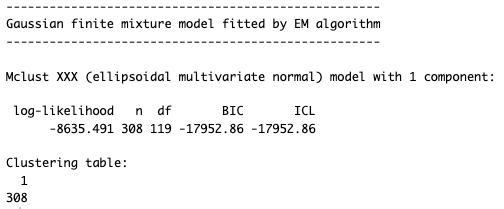
It found a multivariate normal distribution with one component. In other words, the best fit is 1 segment.
Another approach is visual. We could use a dimensional reduction approach to represent the data in a visually suitable number of dimensions — 2 or 3 dimensions — and then inspect it to see whether there is some obvious clustering.
There are many dimensional reduction models but a modern starting point is UMAP (uniform manifold approximation and projection). UMAP attempts to “project” (i.e., re-estimate) data in a lower number of nonlinear dimensions (“uniform manifold”) while also preserving (“approximating”) the structure of the complete data. (For an introduction, see Coenen and Pearce on “Understanding UMAP” here.)
We can visualize the MaxDiff class interest data with UMAP as follows. First we fit a UMAP projection to the data, setting a random seed to make it reproducible:
library(umap)
# get umap representation of the individual interest data
umap.config <- umap.defaults
umap.config$random_state <- 98101

umap.sol <- umap(md.dat[ , classCols], config = umap.config)
umap.dat <- data.frame(umap.sol$layout)
# review the kind of data we have
str(umap.dat)
Using str() we see that the data now has 308 observations reduced to 2 dimensions, X1 and X2. The particular values don’t really matter in themselves; it is the relationships among the values that reproduce the relative structure of the observations vs. one another:

Now we can plot the UMAP points just like any other X / Y data using a simple scatterplot of the points:
# plot it
ggplot(umap.dat, aes(x = X1, y = X2)) +
  geom_point() +
  xlab("High order dimension 1") + ylab("High order dimension 2") +
  theme_minimal()
Here’s the chart:
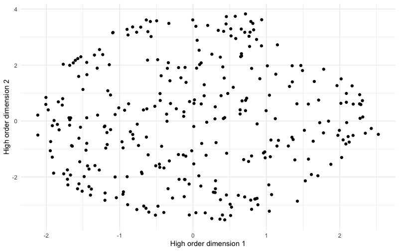
This chart shows no obvious “clusters” of respondents. It is slightly denser in some areas than others but overall has an appearance of being smoothly round without separation among groups. This appearance is not a statistical test, but it is congruent with the idea that there are not multiple obvious segments but 1 segment of everyone.
So far we are striking out on finding segments. The data set strongly appears to come from a single multivariate normal population (i.e., from one segment).
But remember I mentioned that there are hundreds of clustering methods? Let’s keep prodding and see if we can find something else that is useful!
Finding a Number of Segments: Part 2
Another R library that suggests the number of clusters in data is NbClust. It implements 8 clustering methods with a choice of 6 different distance (dissimilarity) metrics applicable to each one. After you select a distance metric and clustering method, it reports 30 heuristics (sometimes fewer, for reasons I’ll skip) that each suggest the number of clusters.
That’s easier to understand from an example:
library(NbClust)
md.nbc <- NbClust(md.dat[ , classCols],
                  min.nc = 2, max.nc = 10,
                  method = "ward.D",
                  distance = "euclidean")
In this code, I ask it to consider anywhere from 2 to 10 clusters (min.nc, max.nc). For a distance metric, I use the classic Euclidean metric (i.e., triangular hypotenuse, except extended to many dimensions), and cluster them with the “Ward’s D” method (see ?NbClust for details).
Here are the results, first for 24 methods that give textual results, and then for 2 methods that give graphical results:
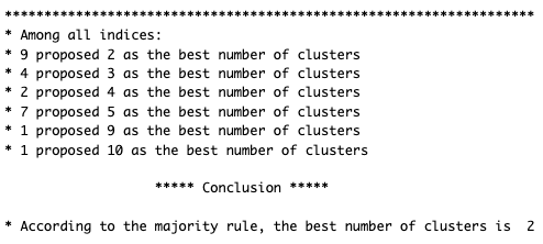
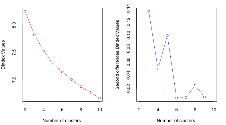
The textual results say that a “winner takes all” vote by the methods indicates 2 clusters (as chosen by 9 out of 24 methods). However, almost as many methods (7 out of 24) suggest 5 clusters. In the graphical results, both charts suggest 2 clusters as the best fit; and one of them suggests 5 clusters as a secondary possibility.
So, should we choose 2 clusters? In practice, I believe it is rarely useful or desired (by stakeholders) to discuss only 2 clusters — unless we are strictly speaking of likelihood of a binary outcome (such as purchase behavior). For purposes of understanding customers and users, binary options are rarely illuminating.
Thus, instead of 2 clusters, let’s look at the “second best” option of 5 clusters. What would that solution tell us?
To begin with, we’ll impose a 5 cluster solution. There are many ways to do that, but in this case we can simply run NbClust() again, setting the minimum number to 5:
# we'll try a 5 cluster solution instead of 2
md.nbc <- NbClust(md.dat[ , classCols],
                  min.nc = 5, max.nc = 10,
                  method = "ward.D",
                  distance = "euclidean")

md.segs <- md.nbc$Best.partition
table(md.segs)
proportions(table(md.segs))
This code runs NbClust again, with a minimum solution of 5 clusters (which is then found to be the best option with that limitation). We extract the segment assignment for each respondents ($Best.partition) and save them as md.segs. The final two lines show the counts of segment assignments and their relative proportions:
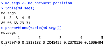
The smallest segment (segment 5) has 10% of respondents, while the largest (segment 1) has 28% of respondents. That is a reasonable spread. It does not suffer the common problem where one or two segments have a very small proportion of respondents such as only 2% or 5% of respondents.
Next we’ll see whether the segments differ in interpretable ways.
Visualizing Segments in Dimensional Space
Remember the UMAP chart above? Now that we have segment assignments, we can add those to the chart. Are there visual patterns when the segments are plotted in the higher order dimensions found by UMAP?
Here’s the code. It’s the same as above, except it now colors the points according to which segment each respondent is in (md.segs):
# add the 5-segment membership to the UMAP data
umap.dat$Segment <- factor(paste0("S", md.segs))

# plot it with segments
ggplot(umap.dat, aes(x = X1, y = X2, colour = Segment)) +
  geom_point() +
  xlab("High order dimension 1") + ylab("High order dimension 2") +
  theme_minimal() +
  ggtitle("Dimensional map with 5 segments")
Here’s the result:
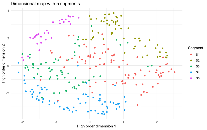
Whoa! This is a chart to make a Quant UXer very happy! In it, there are five extremely clear slices of the plot. Almost all of the members of each segment are close to others in the same segment — which is to say that the segments map very cleanly to the higher order dimensions of the data. That suggests that we may see real differences when we examine those dimensions (interest in different classes).
But first, I hope you’re thinking to yourself, “Wait, am I fooling myself? Maybe the colors being close together doesn’t mean much.” Good question!
Let’s double-check ourselves by comparing what the UMAP chart would look like if the segments were randomly assigned. To do that, we shuffle the same set of assigned segment memberships (using sample()) such that they are randomly assigned to different rows of the UMAP data, and plot them again:
# make sure we're not fooling ourselves ...
# what would it look like if the segments were random?
set.seed(98107)
# the same segments but in random order
umap.dat$RndSeg <- sample(umap.dat$Segment)
# plot those
ggplot(umap.dat, aes(x = X1, y = X2, colour = RndSeg)) +
  geom_point() +
  xlab("High order dimension 1") + ylab("High order dimension 2") +
  theme_minimal()+
  ggtitle("Dimensional map with RANDOM segments")
The result:
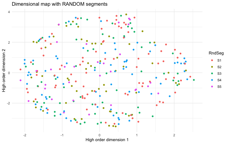
In this chart, there is no pattern to the colors for segment assignment. This tells us that the extremely clear pattern shown in the previous chart reflects real structure of the segments, relative to the data; the appearance was not simply an accident.
In short, the five segments align strongly with real properties of the data. Now the question becomes: is that alignment interpretable and useful? I look at that question next.
Visualize Segments with a Heat Map
In the above analyses, we found — or, if you prefer, “imposed” — segment assignments that show statistical differentiation (the assessment heuristics in NbClust) and that align with the high dimensional data (the segment visual differences in UMAP). But are those results merely statistical or are they strong enough to be meaningful as a practical matter?
To find out, I’ll plot a heat map for class interest, broken out by segment. And, as you’ve probably guessed from my previous posts, I’ll make it a function :) With nothing more than minor tweaks (at most), this function will work for segmentation cross-tabs from many different kinds of data sets.
Here’s the function, with comments following below:
seg.heat <- function(dat, segs) {
  library(superheat)   # install if needed
  # aggregate mean value by segment
  heat.sum <- data.frame(t(aggregate(. ~ segs, data = dat, mean))[-1, ])
  # make the column names reflect the segment number and size (%)
  names(heat.sum) <- paste0("S", 1:max(segs), " (",
                            round(prop.table(table(segs)), 2)*100, "%)")
  # draw it with superheat
  superheat(heat.sum,
            heat.pal = c("red3", "white", "green3"),
            grid.hline.col = "white", grid.vline.col = "white",
            pretty.order.rows = TRUE,
            clustering.method = "hierarchical",
            X.text = round(as.matrix(heat.sum), 2),
            X.text.size = 4,
            left.label.size = 0.3,
            left.label.text.size = 4,
            bottom.label.text.size = 4,
            legend = FALSE)
}
In this function, I use the superheat package to draw a heat map. There are many alternatives but superheat is straightforward while offering many options. The first step is to use aggregate() to get the cross-tabs of item means broken out by segment. That single line of code also converts the result to a data frame as superheat expects. (FYI, I drop the initial row using [-1, ] in the conversion because that row contains column names rather than data.)
In the next line, I change the names() of the data frame so they start with “S” for segment, followed by the nominal segment “number”. I add a label for the relative percentage of each. That gives nice labels in superheat with the segment name and its size, such as “S1 (28%)”. BTW, if you had friendly names for the segments — such as “R Pirates” or “UX Mavens” — you could add them here.
After that, the final step is to call superheat to draw the heat map. I won’t explain all of the options in that call, but will mention the three most important ones: (1) I set a color palette that avoids extreme color intensity. (2) I use “pretty rows” and clustering to reorder the results to be grouped by similarity, making it easier to read and interpret the segments. (3) I add the mean values themselves — rounded off to 2 decimal places — to the cells using X.text. Without that, it would draw the heat colors but not label the values (which is also a perfectly appropriate choice).
We call the seg.heat() function with the MaxDiff estimates and assigned segments:
seg.heat(md.dat[ , classCols], md.segs)
Here’s the result:
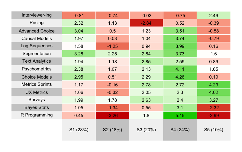
What do we see? The five segments are strongly differentiated. I suggest you take a minute to interpret the results … before reading further!
What did you find? Here are a few reflections on each segment from my perspective. I tend to interpret segments according to strongest positive interest first.
Segment 4 stands out strongly for its interest in R and statistical/data analyses. With roughly 25% of the sample, we can consider it to be a “hardcore Quant” or “data science in UX” segment.
After that, Segment 5 stands out as a “Core UX” segment, strongly interested in classic mixed-methods UX issues, and not very interested in the stats topics.
Segments 1 and 3 are quite similar, where both are interested in survey methods and choice models. The difference is that Segment 3 is also interested in core UX topics whereas Segment 1 is interested in pricing methods and more advanced choice models. Without looking at the data, my guess is that Segment 1 reflects quant researchers working in marketing, whereas Segment 3 has folks with similar skills and interests but working in UX.
Finally, Segment 2 is not interested in much … except a segmentation class. That’s fine and is a common pattern — respondents who take the chance to communicate strongly about the one thing they want the most.
I will comment about one thing I almost always see in segmentation projects … but do NOT see in these data: there is often a segment that shows almost no differentiation of interest in anything. Such a segment is common in consumer data, and quite likely reflects low quality respondents, speeders, and/or those for whom the survey is inappropriate. It often gives a segment with 30% or more of the sample (I’ve seen as high as 60%). However, the present data come from an especially engaged and high quality panel (Quant UX conference attendees!) so they do not have that problem.
Now, is it actionable? What would we do from a business perspective with these data? From the point of view of the Quant UX Association offering classes, here are some thoughts:
The results reinforce the idea (from Post 1) that — although the average interest in (for example) an R class is low, there is a core group of people (Segment 4) who are strongly interested. Now we have a good estimate for that interest, as a segment: 24%
The results also reinforce the interest in a Segmentation class. It has strong interest for every segment except Segment 5 … adding up to 90% of the sample.
After that, there is clear interest in Choice Models and related topics — in roughly 2nd or 3rd place for three segments — adding up to more than 70% of the sample.
Although the size of Segment 5 is small (10%), its interest in UX metrics topics is extremely clear and crisp. That makes a nice possibility for a clear offering … if the Quant UX Association is able to reach the smallish group in a reasonable way.
Visualizing Individual Distributions within a Segment
Did you read post 1 in this series? Do you recall the chart of the individual distribution of interest for each class? (That was a density chart for each item.)
We can reuse that plot function now, and ask a similar question: within a particular segment, what is the distribution of interest? Is everyone in the segment alike, or are there strong differences?
Why would we ask that? For two reasons: to understand the details of the segment better, and to gain additional insight before we take action. For example, suppose we want to offer an R class and we believe that would target the 24% of respondents who fall into Segment 4. We might design the class or message it using insight about the other classes of interest to that segment (such as choice models and psychometrics).
However, if we design or message the class in that way, we would be well-advised not to choose something polarizing. It could be that some topic scores high on average with the segment and yet that is driven by a small group. We might be served better by choosing something that is lower on average but is more broadly acceptable. The distribution plot can help us to evaluate such questions.
As presented in Post #1 in this series, here is the function to make an individual-level distribution chart. This is just a repeat from that post (see there for explanation):
cbc.plot <- function(dat, itemCols=3:ncol(dat),
                     title = "Preference estimates: Overall + Individual level",
                     meanOrder=TRUE) {

  # get the mean points so we can plot those over the density plot
  mean.df <- lapply(dat[ , itemCols], mean)

  # melt the data for ggplot
  library(reshape2)
  #                       vvvv  assumes Sawtooth order;       vvv  (ID in col 1, remove RLH in col 2)
  plot.df <- melt(dat[, c(1, itemCols)], id.vars=names(dat)[1])

  # get the N of respondents so we can set an appropriate level of point transparency
  p.resp  <- length(unique(plot.df[ , 1]))

  # optionally and by default order the results not by column but by mean value
  # because ggplot builds from the bottom, we'll reverse them to put max value at the top
  # we could use fct_reorder but manually setting the order is straightforward in this case
  if (meanOrder) {
    plot.df$variable <- factor(plot.df$variable, levels = rev(names(mean.df)[order(unlist(mean.df))]))
  }

  #### Now : Build the plot
  # set.seed(ran.seed)   # optional; points are jittered; setting a seed would make them exactly reproducible
  library(ggplot2)
  library(ggridges)

  # build the first layer with the individual distributions
  p <- ggplot(data=plot.df, aes(x=value, y=variable, group=variable)) +
    geom_density_ridges(scale=0.9, alpha=0, jittered_points=TRUE,
                        rel_min_height=0.005,
                        position="points_sina",
                        # set individual point alphas in inverse proportion to sample size
                        point_color = "blue", point_alpha=1/sqrt(p.resp),
                        point_size=2.5) +
    # reverse y axis to match attribute order from top
    scale_y_discrete(limits=rev) +
    ylab("Level") + xlab("Relative preference (blue=individuals, red=average)") +
    ggtitle(title) +
    theme_minimal()

  # now add second layer to plot with the means of each item distribution
  for (i in 1:length(mean.df)) {
    if (meanOrder) {
      # if we're drawing them in mean order, get the right one same as above
      p <- p + geom_point(x=mean.df[[rev(order(unlist(mean.df)))[i]]],
                          y=length(mean.df)-i+1, colour="tomato",      # adjust y axis because axis is reversed above
                          alpha=0.5, size=2.0, shape=0, inherit.aes=FALSE)

    } else {
      p <- p + geom_point(x=mean.df[[i]],
                          y=length(mean.df)-i+1, colour="tomato",      # adjust y axis because axis is reversed above
                          alpha=0.5, size=2.0, shape=0, inherit.aes=FALSE)
    }
  }
  p
}
We can reuse that function exactly as is, except we plot only the respondents in Segment 4 by subsetting the data appropriately (md.segs == 4):
cbc.plot(md.dat[md.segs == 4, ], itemCols = classCols) +
  ylab("Quant Course Offering") +
  ggtitle("Class interest: Segment 4 Only (R)")
The result:
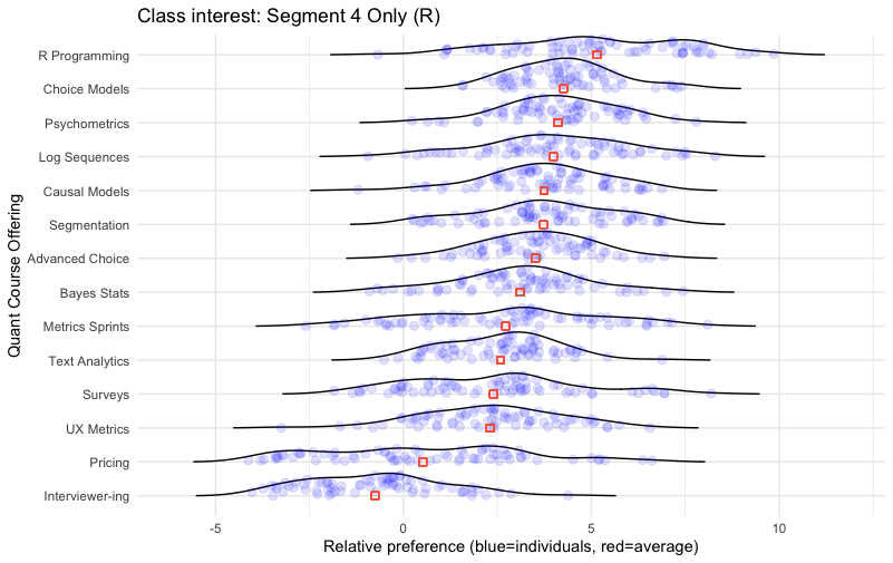
In this chart we see the strong cluster for the R programming interest again, not only as the #1 item on average but showing a strong group of individuals with exceptional interest on the right hand side of the distribution.
After that, Choice Modeling appears to be a good secondary emphasis — not only is it #2 in position, but the distribution is tightly grouped and non-polarizing. Every respondent had interest greater than 0 (the “anchor” position for positive interest). Psychometrics, Causal Models, and Advanced Choice are all similar.
Farther down, we see that Metrics Sprints, Surveys, and Pricing are fairly highly polarizing within this segment: there are a few people with strong interest but also those with strong disinterest.
From a business perspective, that reinforces the idea that we might offer an R class with a secondary emphasis on choice modeling (like this post!) or psychometrics. And it suggests to avoid a few topics that are polarizing; they would lack appeal to too many participants (assuming our strategy is to go after the general audience).
Again, the key point of such deep dives is to understand the preference structure in more detail, we we can consider actions in design and/or promotion of our offerings. In this case, it could help with constructing the content of a class, with targeting respondents for interest in it, and describing it.
This is a good time to add one important caveat to all of this, an obvious point to researchers and yet one that is easy to forget: such results come from a particular sample, and we have to limit our interpretation to that sample (or its implied population). In this case, the results come from attendees of Quant UX Con … and Quant UX Con promoted many of the same topics (R, choice models, metrics, and the like). So to some extent it is no surprise that this sample would have these patterns of interest! Yet, at the same time, the data deepen our understanding of the sample, and our confidence in potential strategic actions.
But Again: There is no Magic Segmentation
Let’s take a look again at a fact I mentioned earlier: that there are hundreds of clustering methods — multiplied by dozens or even hundreds of ways to apply each of them. For example, with each one we might select among multiple distance metrics for observation similarity or multiple way to choose a number of clusters.
To take one example, we have already seen the mclust package that finds model-based multivariate normal mixtures (i.e., clusters). As we saw above, it suggests that the data represent 1 cluster. However, we can force it to fit a 5 cluster model, by setting the parameter G:
# we could force a 5-segment solution (for example) in Mclust
library(mclust)
md.mc <- Mclust(md.dat[ , classCols], G=5)
Now we can compare the solution from mclust to the solution from NbClust above:
# compare the mclust solution to the previous NbClust solution
table(md.mc$classification, md.segs)
Here is the comparison table, which presents NbClust segment assignments in the columns, cross-tabbed by mclust assignments in the rows:
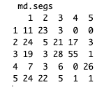
We can’t compare the segment numbers — such as Segment 1 in each solution — because the assignment labels are nominal and have no order or meaning in themselves. For example, most of the respondents (26/31) who are labeled as “Segment 5” in NbClust fall into the group called “Segment 4” in the mclust solution.
However, if it were the case that only the labels were different, then all of the respondents in one column would fall into a single row. When they don’t, then it says that respondents assigned to one group in NbClust fall into multiple groups in mclust. In other words, the two methods find different groupings of respondents.
With that perspective, we can easily see signs of substantial disagreement between the two 5-cluster solutions. In Segments 1, 2, and 3 from NbClust — and segments 2, 3, and 5 from mclust — fewer than 50% of the observations from any segment are assigned to any single group in the other solution. In other words, the solutions disagree on a majority of segment assignments.
We might compute agreement by hand. Here’s one way. Column 4 maps best to the label of “3” in the other solution, capturing 55 respondents. Column 5 maps to “4” (26 respondents). Column 3 would map to “3” but that is already taken by Column 4, so we’ll map it to the second best assignment, “2” (N=21). That leaves Column 1 mapping to “5” (N=24) and Column 2 mapping to “1” (N=23). Adding them up, (55+26+21+24+23) / 308 = 48% raw agreement. That tells us something, but it would be better to adjust that with respect to chance (for example, if one cluster is large, then agreement could be “high” just by assigning all 100% of respondents to it!)
The adjusted Rand index is one method to determine congruence between cluster solutions, relative to base rate. We check that:
# Rand index for the degree of agreement between them
adjustedRandIndex(md.mc$classification, md.segs)
The answer is ARI = 0.186 … which means that the 5-segment solutions from NbClust and mclust agree only slightly better than random chance (about “18% better than random” to use a heuristic explanation of the index). Put differently, the two statistical models often assign respondents to quite different segments.
We can also draw a UMAP plot with the new mclust segment assignments:
# UMAP plot of the mclust assignments
set.seed(98107)
# the same segments but in random order
umap.dat$mclustSeg <- factor(md.mc$classification)
# plot those
ggplot(umap.dat, aes(x = X1, y = X2, colour = mclustSeg)) +
  geom_point() +
  xlab("High order dimension 1") + ylab("High order dimension 2") +
  theme_minimal()+
  ggtitle("Dimensional map with mclust segments")
Here’s the new plot:
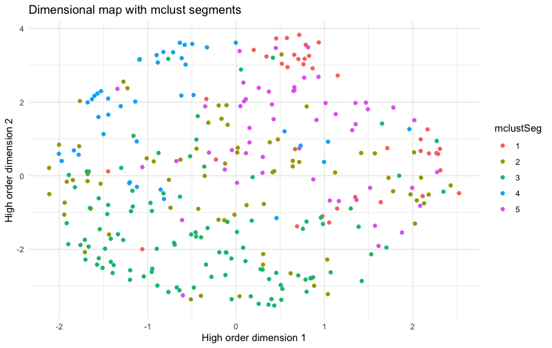
The result shows segments that are much less cleanly separated than the NbClust segments, with respect to the UMAP dimensions that we plotted above. It has clear clusters, but not as clear as the chart above. Segment 3 is relatively separate from the others, but segments 1, 2, 4, and 5 have a lot of mixing with near neighbors assigned to other segments.
That doesn’t mean that NbClust is better than mclust … because UMAP dimensions are not the only method to assess segment clarity or utility. It only shows that the two solutions are different … because there is no single, canonical, or “best” segmentation method.
That’s not the end of the story, however! We need to look at the implications.
And Yet It May Be Useful
Beyond individual respondent assignment, there is a more important question: do the strategic implications differ between the two solutions? Let’s look at a heat map for the new mclust segments; our reusable function above makes it easy; we just pass those segment assignments to it (md.mc$classification):
# plot the 5-segment mclust solution as a heat map
seg.heat(md.dat[ , classCols], md.mc$classification)
Here’s the plot:
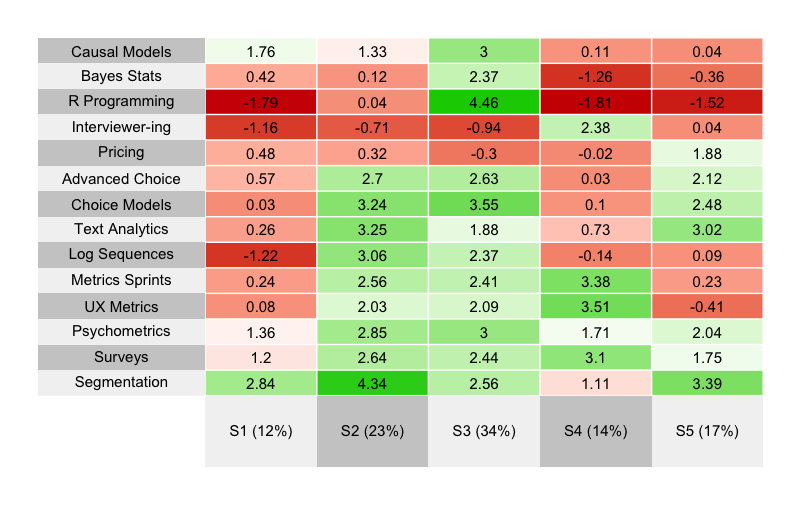
To interpret it, I have copied below the comments I made above about the NbClust segments … and added commentary that compares each segment to the new, and — on an individual level — substantially different mclust segment:
Segment 4 [NbClust] stands out strongly for its interest in R and statistical/data analyses. With roughly 25% of the sample, we can consider it to be a “hardcore Quant” or “data science in UX” segment. \===> That aligns with Segment 3 in the new solution, although the segment is somewhat larger (34%)
After that, Segment 5 [NbClust] stands out as a “Core UX” segment, strongly interested in classic mixed-methods UX issues, and not very interested in the stats topics. \===> That aligns with Segment 4 in the new solution, similarly sized.
Segments 1 and 3 [NbClust] are quite similar, where both are interested in survey methods and choice models. Segment 3 is interested in core UX topics whereas Segment 1 is interested in pricing methods and more advanced choice models. \===> These are generally similar to Segments 2 and 5 in the new solution.
Finally, Segment 2 [NbClust] is not interested in much … except a segmentation class. That’s fine and is a common pattern — respondents who take the chance to communicate strongly about the one thing they want the most. \===> That looks a lot like Segment 1 in the new solution.
In short, although the segmentation solutions differ substantially according to which respondents they places into each segment, the two methods ended up finding quite similar segments from a strategic point of view! The business implications — e.g., for R/stats classes, high interest in segmentation, a core UX segment, and so forth — appear to be nearly identical between the two solutions. That happy result reassures us about the plausibility and statistical stability of the solutions.
Put differently, although the assignment of each respondent to a segment is uncertain here and often disagrees, the segment averages end up being quite similar between the two methods. That is a general observation in choice model data (and TBH it also elates to a bedrock principle of statistics: we do stats to understand a population better by sampling and averaging! [among other ways])
However, I will add a caution: the strong similarity of the results here is an N=1 occurrence. There is no guarantee that two segmentation methods will give such similar results. In fact, given the low agreement we see for individual respondent assignment, my general presumption is that any two clustering solutions are somewhat likely to disagree in their strategic implications. We must do work to get beyond that, through careful interpretation and iteration, and by confirming and triangulating results!
Conclusion and a Final Warning
One point I have not yet made is this: an extremely common problem in cluster analysis is using far too many variables. In this post, I used 14 variables and I think that’s a perfectly reasonable size. It helps that they come from the same kind of observation (choice model) and estimation method (HB utilities). Yet many analysts attempt to cluster data sets with 50, 100, or 300 variables per respondent.
The problem with that is that clustering works by evaluating how similar respondents are to one another … and with so many variables, no one is similar! It is crucial to prune down the set of “basis variables” to be both few and of known importance. That’s a topic for more extended discussion.
Meanwhile, I hope this post demonstrates that:
It is quite possible to find useful segments in data
… even when a statistical model claims there are “no segments”
… while using general methods that work across many kinds of data
… and that provide good opportunities to cross-check our work as we go
… while building reusable functions along the way
… as long as we are cautious and avoid common pitfalls.
I hope you’ve found this interesting and helpful for your own analyses!
Learning More
If you’d like to learn more about segmentation, here are some places to start:
For general segmentation, see the chapters on clustering and classification in the R book and the Python book.
… or sign up for a class! In January 2025 there will be an online Segmentation Class from the Quant UX Association taught by surveys expert Keith Chrzan
To learn about choice models in general, see discussion of conjoint analysis in the R book and the Python book, and of MaxDiff in the Quant UX book.
… or join me for an upcoming offering of the Choice Modeling Master Class!
For latent class models specific to conjoint analysis and MaxDiff, check out many papers over the years in the archives of the Sawtooth Software Conference (scroll down for the PDF archives by year).
All the Code
As always, here is all of the R code from this post compiled in one place. You can grab it with the copy icon and paste into your favorite R code editor.
##### Post 3 - Segmentation (clustering)

# get the data; repeating here for blog post 3, see post 1 for details
library(openxlsx)
md.dat <- read.xlsx("https://quantuxbook.com/misc/QUX%20Survey%202024%20-%20Future%20Classes%20-%20MaxDiff%20Individual%20raw%20scores.xlsx")   #
md.dat$Anchor <- NULL
names(md.dat)[3:16] <- c("Choice Models",  "Surveys",       "Log Sequences",    "Psychometrics",
                         "R Programming",  "Pricing",       "UX Metrics",       "Bayes Stats",
                         "Text Analytics", "Causal Models", "Interviewer-ing",  "Advanced Choice",
                         "Segmentation",   "Metrics Sprints")
classCols <- 3:ncol(md.dat)    # generally, Sawtooth exported utilities start in column 3


##### 5. Number of segments?

# mclust uses model-based fit estimates to determine best number of latent clusters
library(mclust)
md.mc <- Mclust(md.dat[ , classCols])
summary(md.mc)     # best answer is only 1 "segment", multivariate normal within it

# initial visualization with UMAP

library(umap)
# get umap representation of the individual interest data
umap.config <- umap.defaults
umap.config$random_state <- 98101

umap.sol <- umap(md.dat[ , classCols], config = umap.config)
umap.dat <- data.frame(umap.sol$layout)
# review the kind of data we have
str(umap.dat)

# plot it
ggplot(umap.dat, aes(x = X1, y = X2)) +
  geom_point() +
  xlab("High order dimension 1") + ylab("High order dimension 2") +
  theme_minimal()


##### 6. Find number of clusters and initial solution

library(NbClust)
md.nbc <- NbClust(md.dat[ , classCols],
                  min.nc = 2, max.nc = 10,
                  method = "ward.D",
                  distance = "euclidean")

# we'll try a 5 cluster solution instead of 2
md.nbc <- NbClust(md.dat[ , classCols],
                  min.nc = 5, max.nc = 10,
                  method = "ward.D",
                  distance = "euclidean")

md.segs <- md.nbc$Best.partition
table(md.segs)
proportions(table(md.segs))


##### 7. Plot umap with segment membership coded

# add the 5-segment membership to the UMAP data
umap.dat$Segment <- factor(paste0("S", md.segs))

# plot it with segments
ggplot(umap.dat, aes(x = X1, y = X2, colour = Segment)) +
  geom_point() +
  xlab("High order dimension 1") + ylab("High order dimension 2") +
  theme_minimal() +
  ggtitle("Dimensional map with 5 segments")

# make sure we're not fooling ourselves ...
# what would it look like if the segments were random?
set.seed(98107)
# the same segments but in random order
umap.dat$RndSeg <- sample(umap.dat$Segment)
# plot those
ggplot(umap.dat, aes(x = X1, y = X2, colour = RndSeg)) +
  geom_point() +
  xlab("High order dimension 1") + ylab("High order dimension 2") +
  theme_minimal()+
  ggtitle("Dimensional map with RANDOM segments")


##### 8. Plot heat map for segments

# function to plot average values by segment
seg.heat <- function(dat, segs) {
  library(superheat)
  # aggregate mean value by segment
  heat.sum <- data.frame(t(aggregate(. ~ segs, data=dat, mean))[-1, ])
  # make the column names reflect the segment number and size (%)
  names(heat.sum) <- paste0("S", 1:max(segs), " (",
                            round(prop.table(table(segs)), 2)*100, "%)")
  # draw it with superheat
  superheat(heat.sum,
            heat.pal = c("red3", "white", "green3"),
            grid.hline.col = "white", grid.vline.col = "white",
            pretty.order.rows = TRUE,
            clustering.method = "hierarchical",
            X.text = round(as.matrix(heat.sum), 2),
            X.text.size = 4,
            left.label.size = 0.3,
            left.label.text.size = 4,
            bottom.label.text.size = 4,
            legend = FALSE)
}

# plot the segmentation solution
seg.heat(md.dat[ , classCols], md.segs)


##### 9. Plot distribution of interest *within* a segment
# check the data briefly ; not discussed in the blog post
summary(md.dat[md.segs==4, ])

# reuse our plot function -- copied here from the part 1 post
# see the part 1 blog post for an explanation of this function
cbc.plot <- function(dat, itemCols=3:ncol(dat),
                     title = "Preference estimates: Overall + Individual level",
                     meanOrder=TRUE) {

  # get the mean points so we can plot those over the density plot
  mean.df <- lapply(dat[ , itemCols], mean)

  # melt the data for ggplot
  library(reshape2)
  #                       vvvv  assumes Sawtooth order;       vvv  (ID in col 1, remove RLH in col 2)
  plot.df <- melt(dat[, c(1, itemCols)], id.vars=names(dat)[1])

  # get the N of respondents so we can set an appropriate level of point transparency
  p.resp  <- length(unique(plot.df[ , 1]))

  # optionally and by default order the results not by column but by mean value
  # because ggplot builds from the bottom, we'll reverse them to put max value at the top
  # we could use fct_reorder but manually setting the order is straightforward in this case
  if (meanOrder) {
    plot.df$variable <- factor(plot.df$variable, levels = rev(names(mean.df)[order(unlist(mean.df))]))
  }

  #### Now : Build the plot
  # set.seed(ran.seed)   # optional; points are jittered; setting a seed would make them exactly reproducible
  library(ggplot2)
  library(ggridges)

  # build the first layer with the individual distributions
  p <- ggplot(data=plot.df, aes(x=value, y=variable, group=variable)) +
    geom_density_ridges(scale=0.9, alpha=0, jittered_points=TRUE,
                        rel_min_height=0.005,
                        position="points_sina",
                        # set individual point alphas in inverse proportion to sample size
                        point_color = "blue", point_alpha=1/sqrt(p.resp),
                        point_size=2.5) +
    # reverse y axis to match attribute order from top
    scale_y_discrete(limits=rev) +
    ylab("Level") + xlab("Relative preference (blue=individuals, red=average)") +
    ggtitle(title) +
    theme_minimal()

  # now add second layer to plot with the means of each item distribution
  for (i in 1:length(mean.df)) {
    if (meanOrder) {
      # if we're drawing them in mean order, get the right one same as above
      p <- p + geom_point(x=mean.df[[rev(order(unlist(mean.df)))[i]]],
                          y=length(mean.df)-i+1, colour="tomato",      # adjust y axis because axis is reversed above
                          alpha=0.5, size=2.0, shape=0, inherit.aes=FALSE)

    } else {
      p <- p + geom_point(x=mean.df[[i]],
                          y=length(mean.df)-i+1, colour="tomato",      # adjust y axis because axis is reversed above
                          alpha=0.5, size=2.0, shape=0, inherit.aes=FALSE)
    }
  }
  p
}

# use our plot function with only the Segment 4 data
cbc.plot(md.dat[md.segs==4, ], itemCols=classCols) +
  ylab("Quant Course Offering") +
  ggtitle("Class interest: Segment 4 Only (R)")

##### 10. There is no magic answer in clustering

# we could force a 5-segment solution (for example) in Mclust
library(mclust)
md.mc <- Mclust(md.dat[ , classCols], G=5)

# compare the mclust solution to the previous NbClust solution
table(md.mc$classification, md.segs)
# Rand index for the degree of agreement between them
adjustedRandIndex(md.mc$classification, md.segs)

# UMAP plot of the mclust assignments
set.seed(98107)
# the same segments but in random order
umap.dat$mclustSeg <- factor(md.mc$classification)
# plot those
ggplot(umap.dat, aes(x = X1, y = X2, colour = mclustSeg)) +
  geom_point() +
  xlab("High order dimension 1") + ylab("High order dimension 2") +
  theme_minimal()+
  ggtitle("Dimensional map with mclust segments")

# plot the 5-segment mclust solution as a heat map
seg.heat(md.dat[ , classCols], md.mc$classification)

# and plot the individual distributions for the "R" segment, similar to above
# not discussed in the post; just illustrating the reusable plot function :)
cbc.plot(md.dat[md.mc$classification==3, ], itemCols=classCols) +
  ylab("Quant Course Offering") +
  ggtitle("Class interest: Mclust R Segment Only")
Subscribe to my newsletter
Read articles from Chris Chapman directly inside your inbox. Subscribe to the newsletter, and don't miss out.
Written by

Chris Chapman
Chris Chapman
President + Executive Director, Quant UX Association. Previously: Principal UX Researcher @ Google; Amazon Lab 126; Microsoft. Author of "Quantitative User Experience Research" and "[R | Python] for Marketing Research and Analytics".
