Flexbox vs Grid: A Guide to Choosing the Best Layout with Examples
 Eleftheria Batsou
Hello, amazing developers! 👋
Introduction
Today, we're exploring two powerful CSS layout tools: Flexbox and Grid. Understanding these can transform how you design web layouts. By the end of this article, you'll not only understand the fundamental differences between these two systems but also:
Grasp the basics of Flexbox and Grid, including when to use each.
Explore practical examples of how both can be applied in real-world scenarios.
Learn how to combine Flexbox and Grid for even more complex layouts.
Discover common pitfalls to avoid and tips for mastering these tools.
Gain insights into resources for further learning.
Below, you’ll also find a short introduction to what Flexbox and Grid are, but if you want more details, don’t forget to check these articles:
What is Flexbox?
Flexbox, or Flexible Box Layout, is your one-dimensional organizer. Imagine it as a single line where items can align either horizontally or vertically.
Example:
.container {
  display: flex;
  flex-direction: row; /* or column */
  justify-content: center; /* align items horizontally */
  align-items: center; /* align items vertically */
}

.item {
  margin: 10px;
}
<div class="container">
  <div class="item">Item 1</div>
  <div class="item">Item 2</div>
  <div class="item">Item 3</div>
</div>
Result:

Flexbox in Action
Here's how you might use Flexbox to create a simple navigation bar:
.nav {
  display: flex;
  justify-content: space-between; /* space items evenly */
  background-color: #333;
  padding: 10px;
}

.nav a {
  color: white;
  text-decoration: none;
  padding: 15px;
}
<nav class="nav">
  <a href="#">Home</a>
  <a href="#">About</a>
  <a href="#">Contact</a>
</nav>
Result:

💡Note*: For more details, check out this* article.
Introducing Grid
CSS Grid is like a two-dimensional chessboard. It lets you place items in rows and columns at the same time, giving you more control over your layout.
Example:
.grid-container {
  display: grid;
  grid-template-columns: 1fr 1fr 1fr; /* three equal columns */
  grid-gap: 10px;
}

.grid-item {
  background-color: #f0f0f0;
  border: 1px solid #ccc;
  padding: 20px;
  text-align: center;
}
<div class="grid-container">
  <div class="grid-item">1</div>
  <div class="grid-item">2</div>
  <div class="grid-item">3</div>
  <div class="grid-item">4</div>
  <div class="grid-item">5</div>
  <div class="grid-item">6</div>
</div>
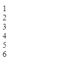
Result:

Grid Layout Examples
Let's create a simple gallery layout using Grid:
.gallery {
  display: grid;
  grid-template-columns: repeat(3, 1fr); /* three equal columns */
  gap: 1rem;
}

.gallery img {
  width: 100%;
  height: 100%;
  object-fit: cover;
}
<div class="gallery">
  <img src="img1.jpg" alt="Image 1">
  <img src="img2.jpg" alt="Image 2">
  <img src="img3.jpg" alt="Image 3">
  <img src="img4.jpg" alt="Image 4">
  <img src="img5.jpg" alt="Image 5">
  <img src="img6.jpg" alt="Image 6">
</div>
Result:

💡Note*: For more details, check out this* article.
When to Use Flexbox vs Grid
Use Flexbox for:
Simple layouts where items are in one direction.
Menus, navigation bars, or form layouts.
Use Grid for:
Complex layouts where you need precise control over rows and columns.
Responsive designs where you might change the grid structure based on screen size.
Combining Flexbox and Grid
Sometimes, the magic happens when you combine both! Here's how you can nest Flexbox within Grid:
.layout {
  display: grid;
  grid-template-columns: 2fr 1fr; /* Main content and sidebar */
  gap: 20px;
}

.main-content {
  display: flex;
  flex-wrap: wrap; /* Allow items to wrap if needed */
  gap: 10px;
}

.sidebar {
  display: flex;
  flex-direction: column; /* Stack items vertically */
}

.main-content div {
  flex: 1 1 calc(50% - 10px); /* Responsive flex items */
}
<div class="layout">
  <div class="main-content">
    <div>Content 1</div>
    <div>Content 2</div>
    <div>Content 3</div>
    <div>Content 4</div>
  </div>
  <aside class="sidebar">
    <div>Sidebar Item 1</div>
    <div>Sidebar Item 2</div>
  </aside>
</div>
Result:

💡Note*: To test the results on your own, or to make some practice feel free to copy-paste the code (HTML and CSS) to Codepen!*
Common Pitfalls and Tips
Order of Flex Items: Remember, order property in Flexbox can disrupt the natural flow. Use with caution!
Grid Template Areas: For complex layouts, grid-template-areas can be your friend but might confuse if overused.
Tips: 🚀
Start simple. Don't use Grid for every layout just because it's powerful.
Always test your layouts across different screen sizes.
Use browser developer tools to tweak and visualize your layouts in real-time.
Resources for Further Learning
For those eager to learn more:
MDN Web Docs for detailed documentation on Flexbox and Grid.
CSS Tricks has amazing articles and guides.
Practice on sites like CodePen or JSFiddle.
Conclusion
In wrapping up, Flexbox and Grid complement each other, offering flexibility and precision in creating robust, responsive layouts. Whether you're aligning a simple navigation bar or crafting an intricate dashboard, understanding when to use each will elevate your web development skills. Keep practicing, keep exploring, and most importantly, have fun creating!
👋 Hello, I'm Eleftheria, Community Manager, developer, public speaker, and content creator.
🥰 If you liked this article, consider sharing it.
Subscribe to my newsletter
Read articles from Eleftheria Batsou directly inside your inbox. Subscribe to the newsletter, and don't miss out.
Written by

Eleftheria Batsou
Eleftheria Batsou
Hi there 🙆♀️, I'm Eleftheria, Community Manager with a coding background and a passion for UX. Do you have any questions? Don't hesitate to contact me. I can talk about front-end development, design, job hunting/freelancing/internships.