Salesforce LWC: Phone Input Field with Country Flag
 Ranjith Raja Mathiyalagan
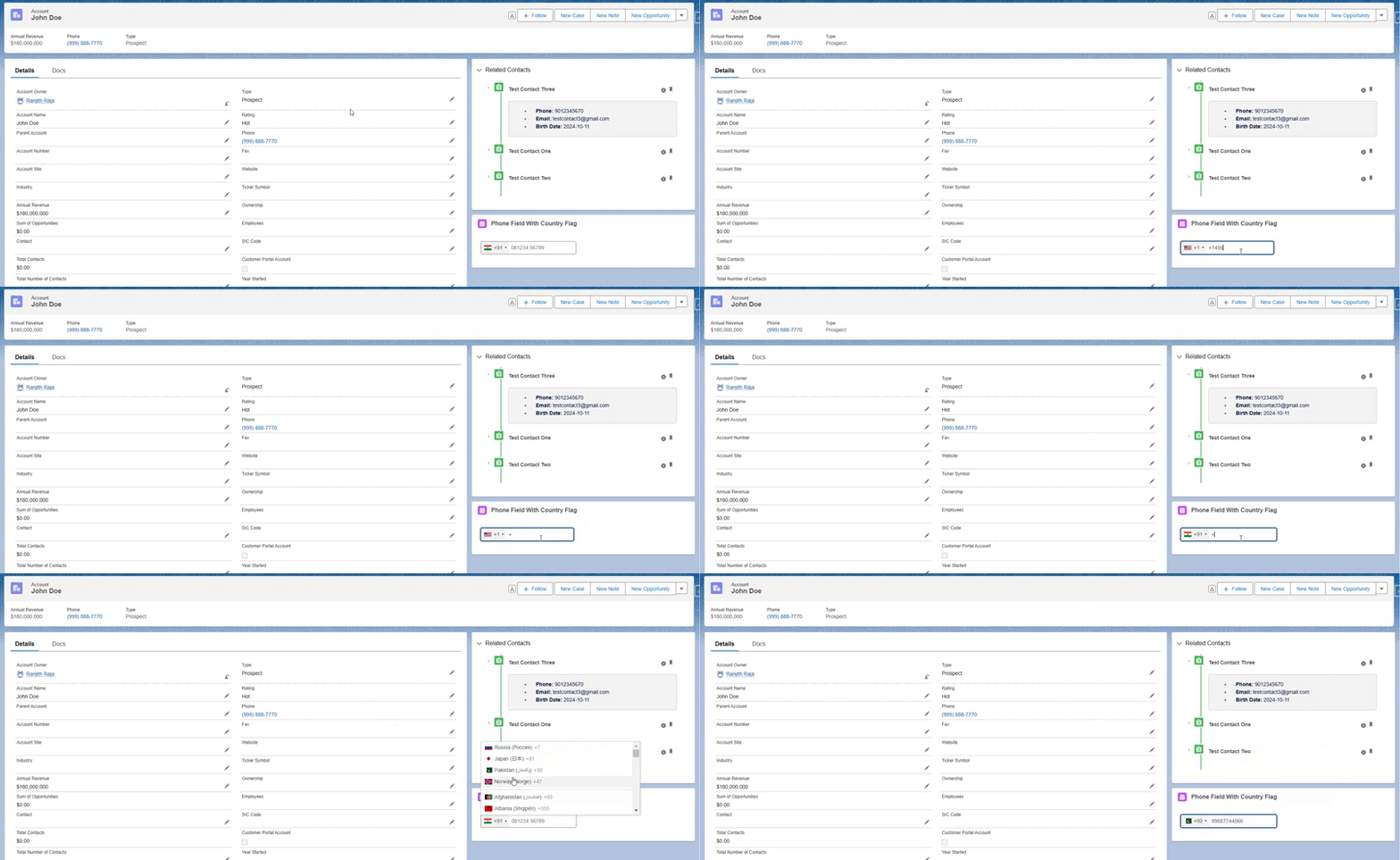
In this blog, we will create a custom phone input field with a country flag selector in a Salesforce Lightning Web Component (LWC). This feature enhances user experience by allowing users to easily identify the country code they are selecting, and it automatically updates the flag based on the entered phone number.
Goal: Create a phone input field that displays the country flag alongside the country code, and automatically updates the flag when the phone number is entered.
Steps to Implement
Step 1: Upload Static Resource
Download the zip file containing the necessary country flag styles from this link.
Navigate to Salesforce Setup → Static Resources.
Click on New, upload the zip file, and name it phoneCountryFlag.
Step 2: Create LWC Component
In Salesforce, create a new LWC component with the necessary files:
HTML File: Contains the input field for the phone number.
JS File: Includes the logic to load the static resource and initialize the phone input with country flags.
CSS File: (Optional) For any custom styles.
Step 3: Load Static Resource in LWC
- Use the
renderedCallbackmethod to load the static resource in your LWC. This ensures the country flag script is initialized correctly.
HTML
<template>
    <lightning-card title="Phone Field With Country Flag" icon-name="standard:event">
        <div class="slds-p-around_large">
            <div class="slds-form-element__control">
                <input type="tel" class="slds-input" data-id="phone" name="phone" onkeyup={handleFieldChange}></input>
            </div>
        </div>
    </lightning-card>
</template>
JS
import { LightningElement } from 'lwc';
import phoneCountryFlag from '@salesforce/resourceUrl/phoneCountryFlag';
import { loadScript, loadStyle } from 'lightning/platformResourceLoader';

export default class PhoneFieldWithCountryFlag extends LightningElement {
    datePickerReady = false;

    renderedCallback() {
        if (this.datePickerReady) {
            return;
        }
        this.datePickerReady = true;

        Promise.all([
            loadStyle(this, phoneCountryFlag + '/css/demo.css'),
            loadStyle(this, phoneCountryFlag + '/css/intlTelInput.css'),
            loadScript(this, phoneCountryFlag + '/js/utils.js'),
            loadScript(this, phoneCountryFlag + '/js/intlTelInput.js')
        ]).then(() => {
            this.countryFlagSelector();
        }).catch(error => {
            console.log(error);
        });
    }

    countryFlagSelector() {
        const input = this.template.querySelector("[data-id=phone]");
        window.intlTelInput(input, {
            separateDialCode: true,
            excludeCountries: ["il"],
            preferredCountries: ["ru", "jp", "pk", "no"],
            initialCountry: "IN",
        });
    }

    handleFieldChange(event) {
        console.log(event.target.value);
    }
}
Step 5: Customize Phone Field Options
You can customize the input field options using
window.intlTelInput.For more configuration options like excluding certain countries or setting preferred countries, refer to the Intl Tel Input documentation.
Benefits
Improved User Experience: Users can easily select their country or see the flag auto-populate as they type.
Enhanced Data Entry: Reduces the likelihood of input errors by standardizing phone number formats.
This LWC component is a simple yet effective way to enhance the phone number input field, making it user-friendly and visually appealing.
Final Screen:

Use Case Video:

Thank you for reading! Feel free to reach out with any questions or feedback. Stay tuned for more Salesforce insights!
Subscribe to my newsletter
Read articles from Ranjith Raja Mathiyalagan directly inside your inbox. Subscribe to the newsletter, and don't miss out.
Written by

Ranjith Raja Mathiyalagan
Ranjith Raja Mathiyalagan
Passionate Salesforce Developer with 6.5 years of experience in building scalable CRM solutions and delivering innovative Salesforce applications. Sharing knowledge and insights on Salesforce development, best practices, and real-world use cases. Follow for expert tips, use case documentation, and project success stories.