Architectural Handwriting: Evolution and Importance of Lettering
 Astrokit
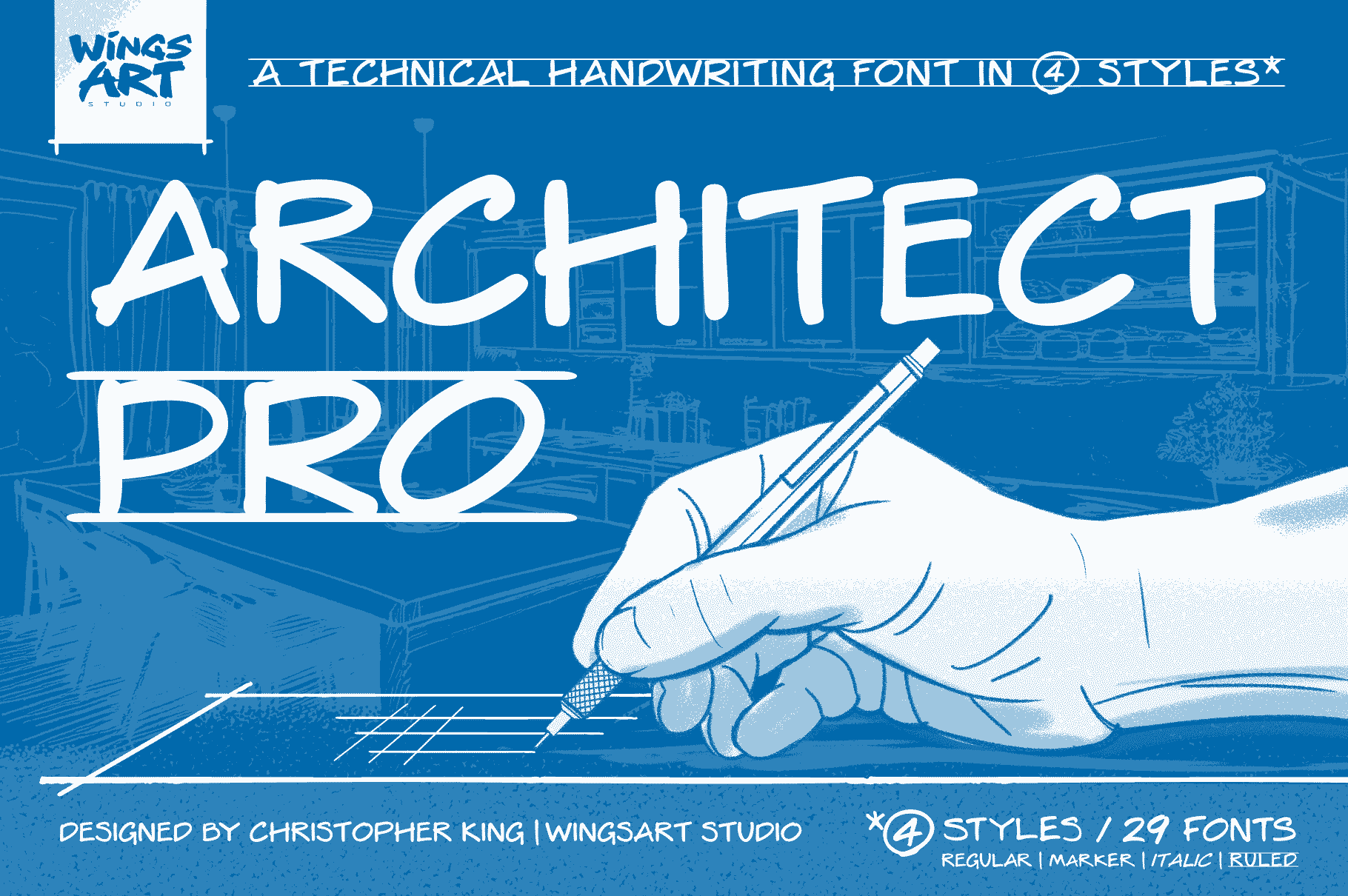
Understanding Architectural Handwriting: The Evolution and Importance of Architectural-Style Lettering
In the field of architecture, clarity and precision are paramount. This is especially true when it comes to architectural drawings, where every detail counts. One of the most essential aspects of these blueprints is the handwriting or lettering used. The development of architectural-style lettering emerged from the necessity for clearly legible text that could convey critical information within a limited space. In this article, we delve deeper into the history, significance, and modern applications of architectural handwriting, as well as how you can elevate your own designs with the right font.

The Historical Context of Architectural Lettering
The unique style of handwriting we recognize today in architectural drawings can be traced back to the early 20th century. Before computers revolutionized the drafting process, architects and engineers relied entirely on hand-drawn blueprints. Producing legible, uniform text was a skill that every draftsman needed to master. Whether it was labels, dimensions, or notes, every letter needed to be readable at small sizes yet still maintain a formal aesthetic.
The transition to a more stylized, block-like text helped to mitigate errors during construction and ensured that all involved parties could interpret the designs correctly. Misreading a single letter could lead to costly mishaps on-site, making the development of architectural lettering critically important.
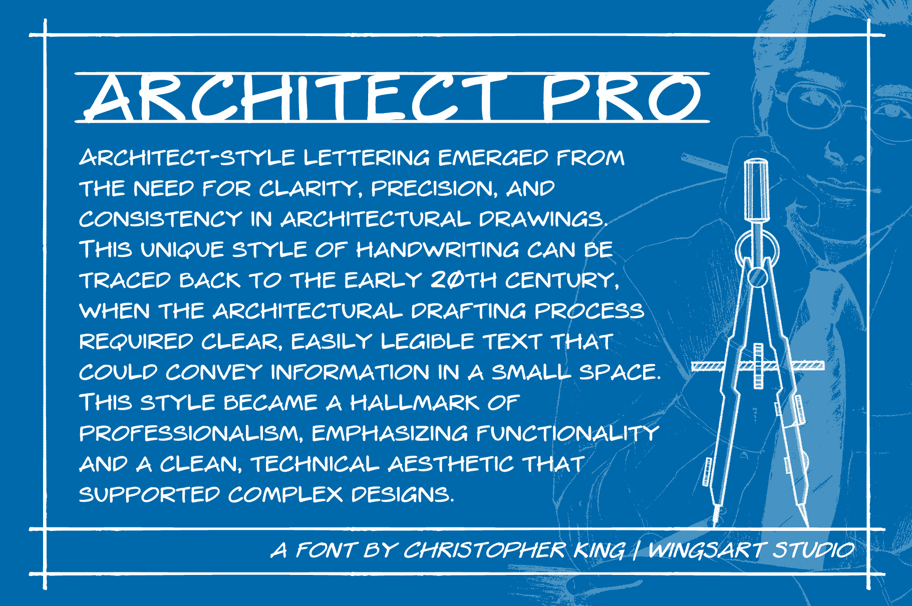
The Design Characteristics of Architectural Lettering
The architectural writing style is marked by its minimalistic traits, which foster simplicity without sacrificing elegance. This lettering style often features consistent heights and widths, creating a visually cohesive look that reinforces professionalism.
Key characteristics include:
- Clarity: Text is designed to be quickly read and comprehended.
- Precision: Each letter's formation allows for uniformity, vital for complex designs.
- Functionality: The democratic design ensures that every reader, from the draftsman to the builder, can interpret the drawing accurately.
As architectural techniques have evolved, so too has the need for lettering in architectural drawings. Today, we have digital fonts that mimic this traditional style, providing the personal touch of hand-lettering with the precision and consistency digitally designed fonts can offer.
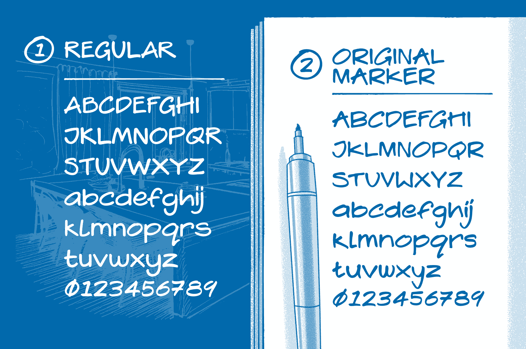
Introducing the Architect Pro Font
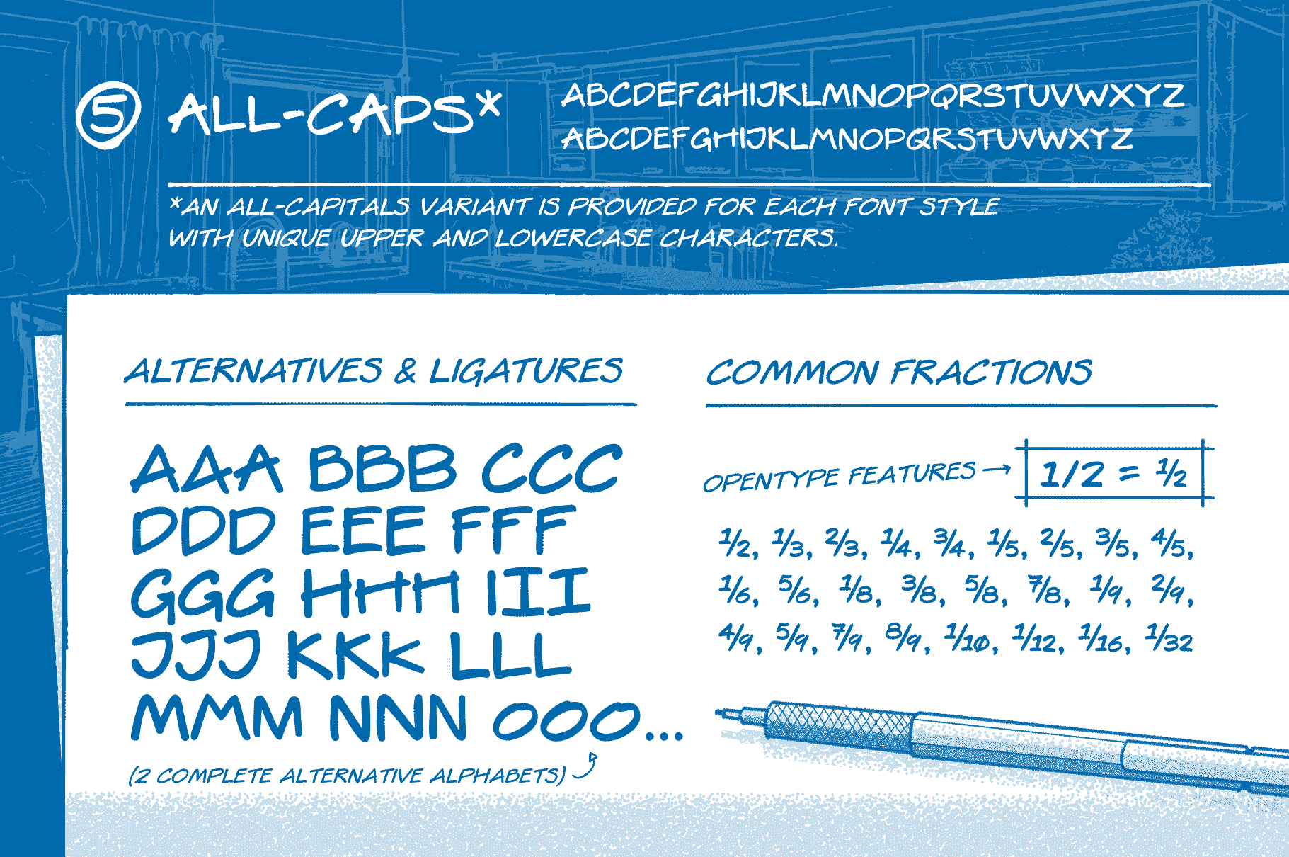
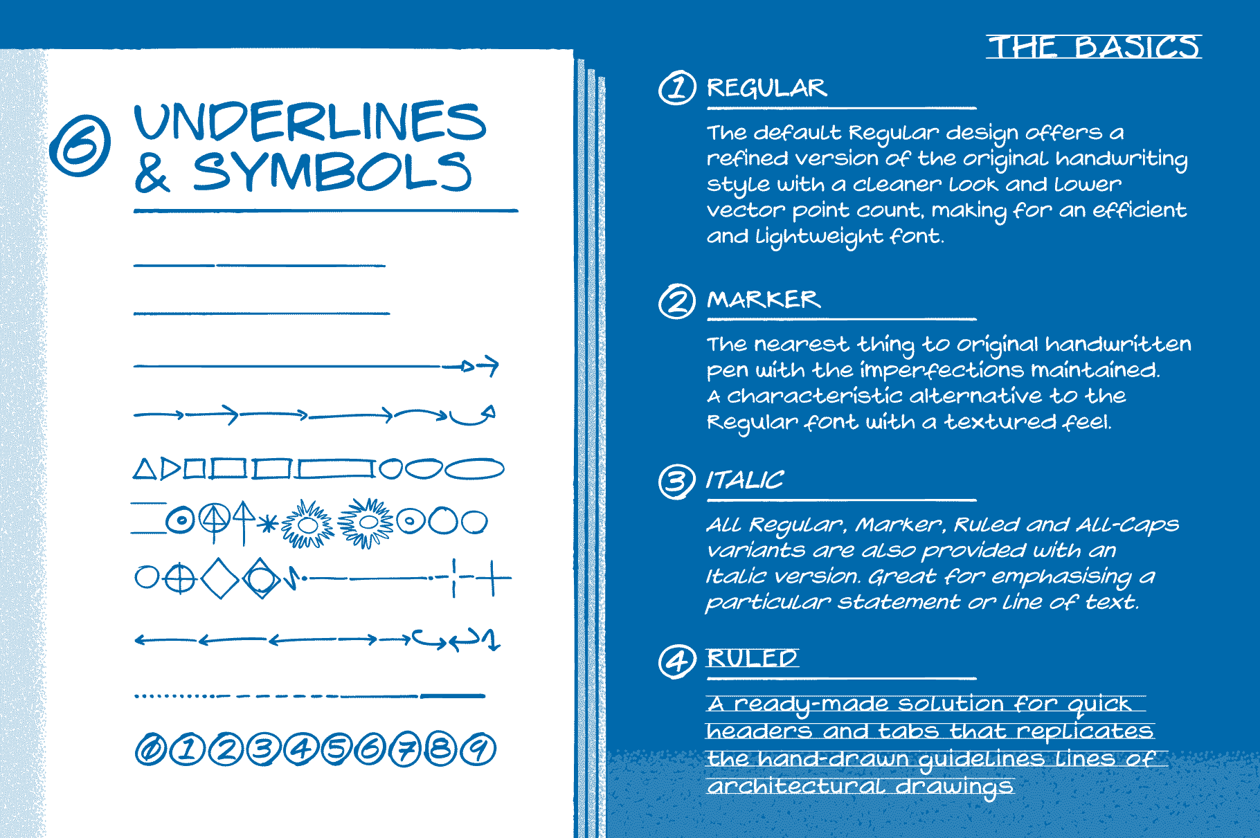
For architects, designers, and illustrators looking to incorporate this unique style into their work, finding the right font is vital. The Architect Pro font available at Creative Fabrica is an excellent choice.
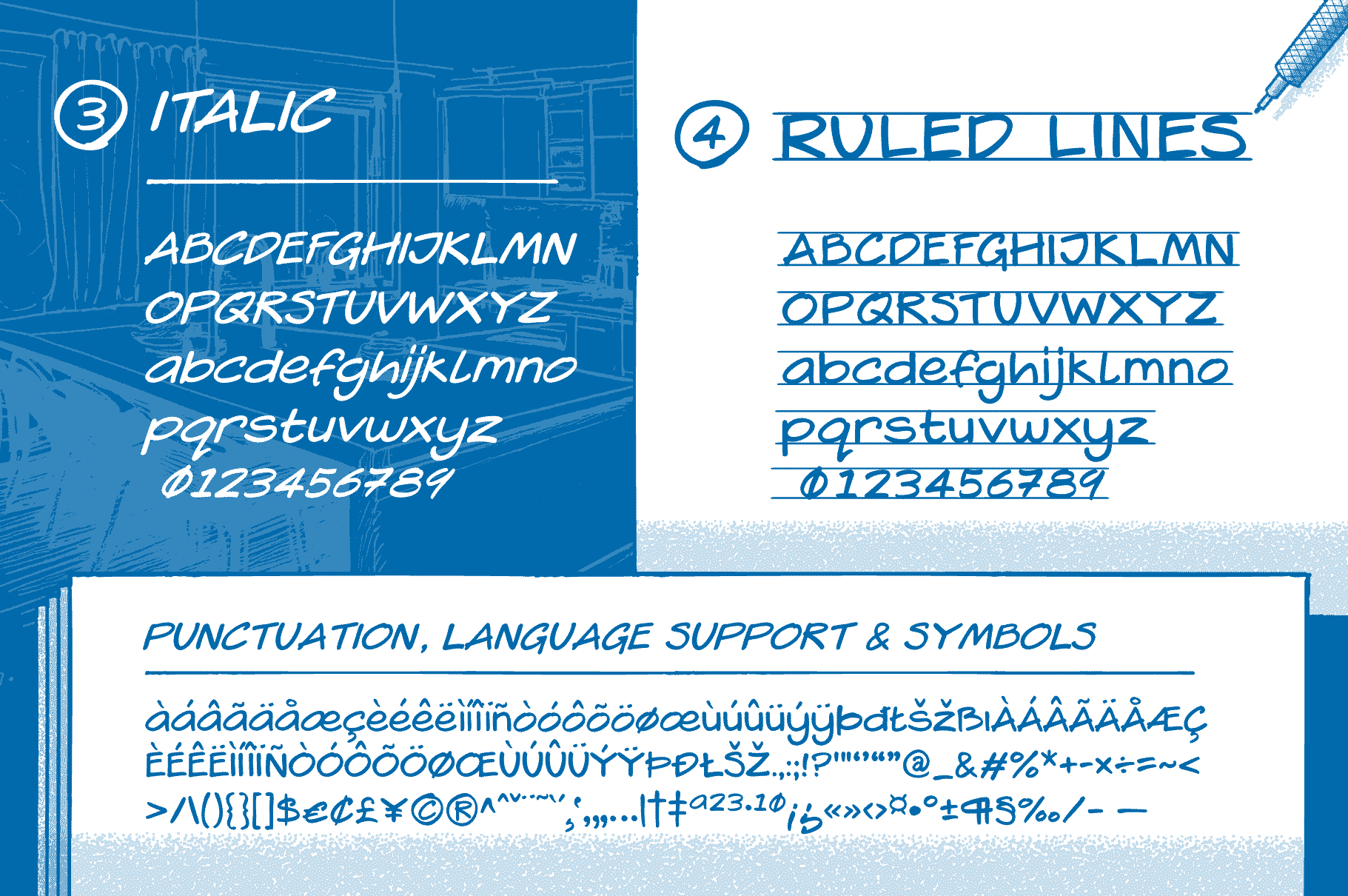
With its professional yet approachable design, Architect Pro captures the essence of traditional architectural handwriting while offering the benefits of a modern digital font. It’s perfect for portraying a personal touch in your designs while ensuring clarity and consistency throughout your work.
Application of Architectural Lettering in Modern Design
Architectural lettering is not merely a relic of the past; its applications extend into various modern design elements, from branding to user interface design. Using professional level fonts can enhance the legibility and aesthetic quality of any project.
Here are some areas of application:
- Blueprints and Technical Drawings: Maintain professionalism and reduce miscommunication.
- Presentations and Portfolio Materials: Showcase your work effectively with clear and stylish text.
- Architectural Branding: Create compelling logos and marketing materials that reflect the precision of your designs.
Conclusion
Architectural handwriting has a rich history filled with significance and purpose. Its evolution from hand-drawn styles to modern digital fonts illustrates the ongoing commitment to clarity, precision, and professionalism in architectural design. For individuals seeking to enhance their work, choosing an appropriate font like Architect Pro can bridge the gap between traditional aesthetics and modern functionality.
Remember, in architecture, every detail matters — including your choice of lettering.
Affiliate Disclosure: This article includes links to products that may earn us a commission. We only promote products we believe will be beneficial to our readers.
Subscribe to my newsletter
Read articles from Astrokit directly inside your inbox. Subscribe to the newsletter, and don't miss out.
Written by

Astrokit
Astrokit
AstroKit offers a galaxy of digital assets crafted to elevate your creative projects. From stellar fonts to cosmic graphics, explore a world where your imagination can truly shine. Step into the cosmos with AstroKit and let your designs take flight!