ML Chapter 4 : Clustering
 Fatima Jannet
Table of contents
Congrats for completing regression and classification. I’m so proud of you. In this blog we will learn clustering. Clustering is similar to classification but the basis is different. In clustering we don’t know what we are looking for but we are trying to look for clusters in our data.
In this blog, you will learn the following:
K-Means clustering
Hierarchical Clustering
This going to be our first encounter with unsupervised data.. Let’s start!
K-Means Clustering
Clustering (Supervised vs unsupervised learning)
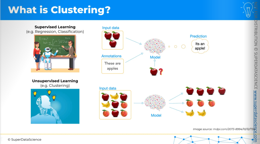
Clustering involves gathering unlabeled data. So far in this blog, we've worked with supervised data. This means the materials I provided during regression and classification already included some training data and answers. For example, you give images of apples with labels, then train your model to recognize them. When you provide a new image and ask what it is, the model can tell you it's an apple.
Unsupervised learning is different. Here, we don't provide data with answers, and the model has to figure it out on its own. For example, we might have input data for images without any labels. We supply them to the model and ask it to group these fruits into different categories. Even though we don't know the categories and don't provide them, the machine can identify certain similarities and differences in the data. From this, it can draw conclusions and create its own groups.
So this is the difference between supervised and unsupervised learning.
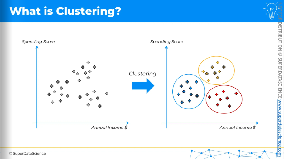
Let’s take a look. Here, we have the annual income of a store and the spending score. You don't have any preexisting categories; you just plot your customers. You want to create a group so that’s where you apply clustering By applying clustering, it will show you the likely groups of customers. Then, you can explore what made them form a group. It could be their spending ranges, likelihood to buy, or repeat customer status—you can figure it out using your business sense and serve your customer the best way possible.
So clustering basically is a model that thinks for itself and comes with a suggestion of it’s own.
K-Means Clustering
K-means is a simple algorithm. The best way to show it is visually. Here, we have a scatter plot of data points and want K-means clustering to create clusters. We don't have predefined classes, categories, or training data, just the data to form clusters.
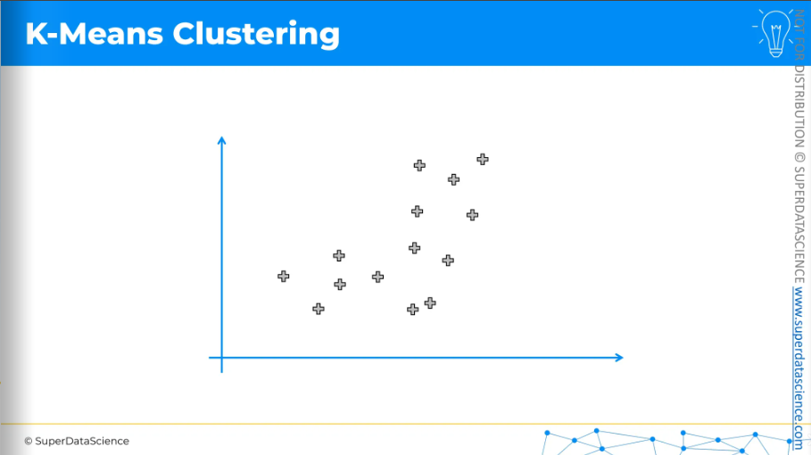
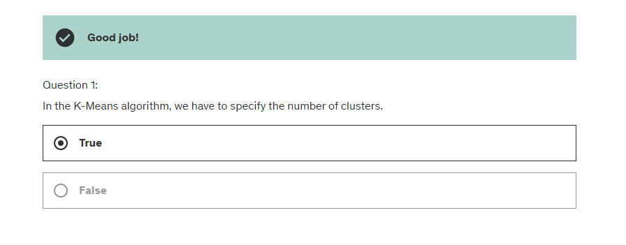
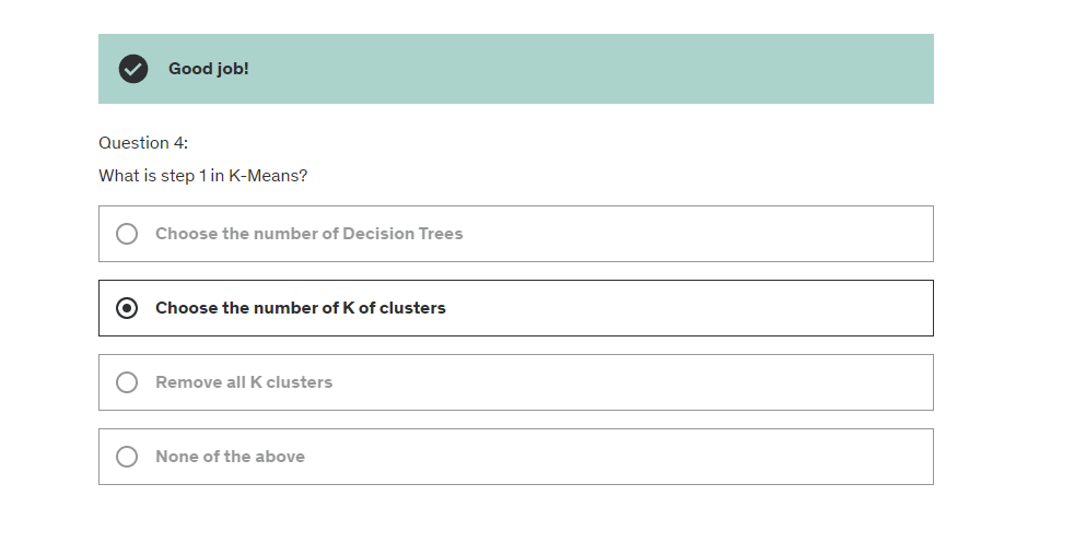
The first step is to decide how many clusters you want. For now, I have decided on two clusters. Then, for each cluster, you need to place a randomly positioned centroid on this scatter plot, wherever you like. It doesn't have to be one of the existing points.
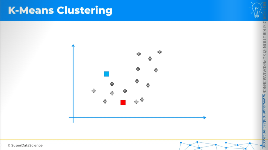
Now, K-Means will assign each data point to the nearest centroid. In this case, it's easiest to do by drawing an equidistant line.
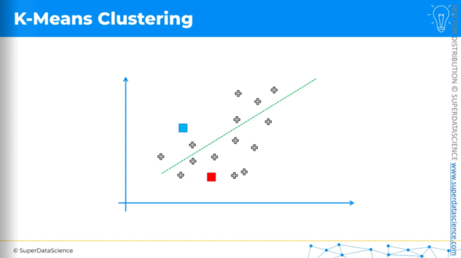
Anything above the line is assigned to the blue centroid, and anything below is assigned to the red centroid.
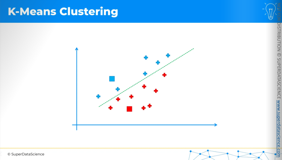
Now, the next step is quite interesting.
We need to calculate the center of mass, or center of gravity, for each of the clusters we've identified. The centroid is not included in this calculation. For example, for the blue cluster,
Take all the X coordinates of the cluster.
Find the average of these X coordinates.
Do the same for all the Y coordinates.
This gives the position of the center of mass.
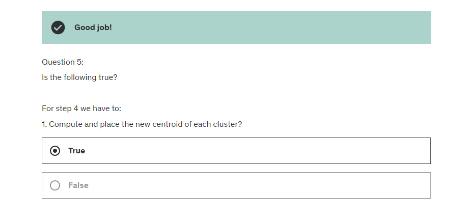
Move the centroid to these new positions.
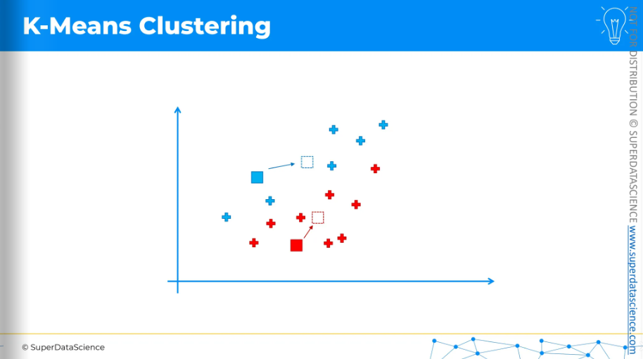
Once the centroids have moved, we repeat the process by reassigning data points to the nearest centroid.
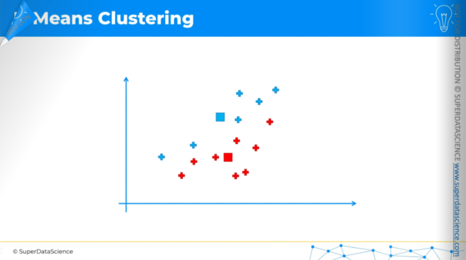
So again, the equidistant line.
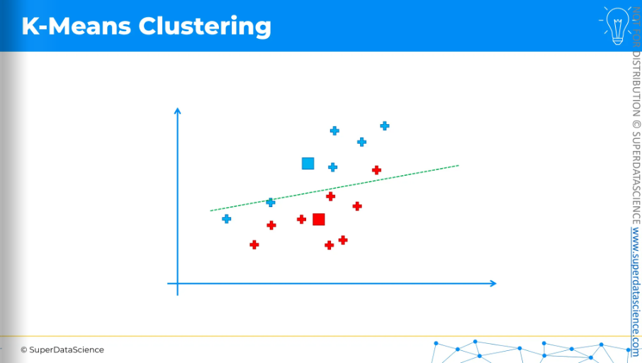
Change the colors of the data points and assign.
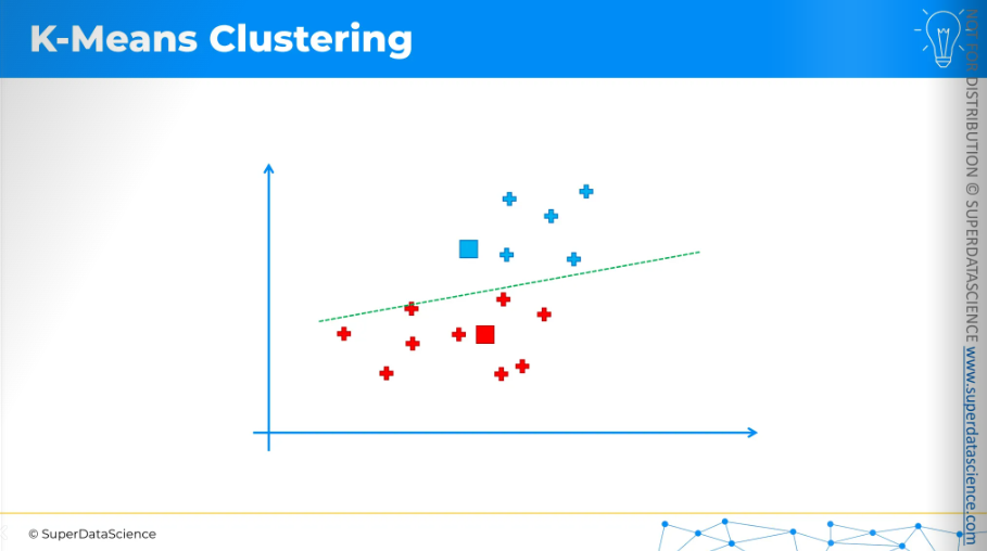
And again, we calculate the center of gravity,
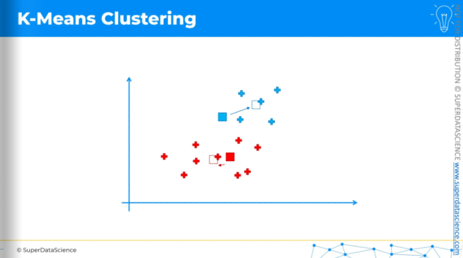
move the centroids,
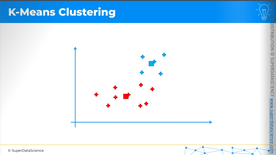
do the process again.
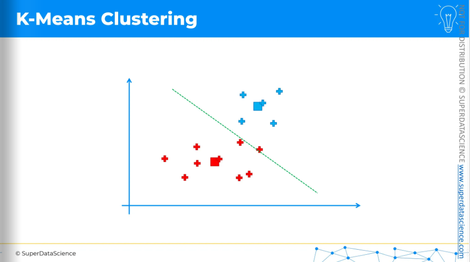
Reassign, calculate the center of mass,

move the centroids,
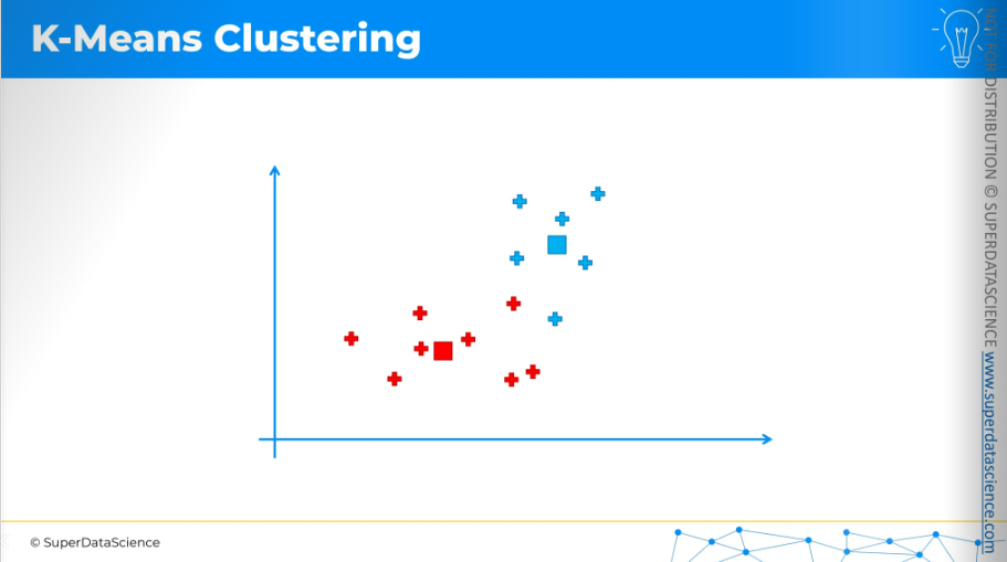
equidistant line,

and reassign. We keep doing this until we arrive at a situation where moving the centroids no longer brings any changes to the points.

Again center of mass,
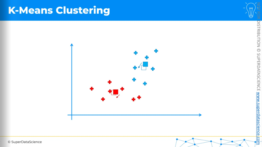
move the centroids,
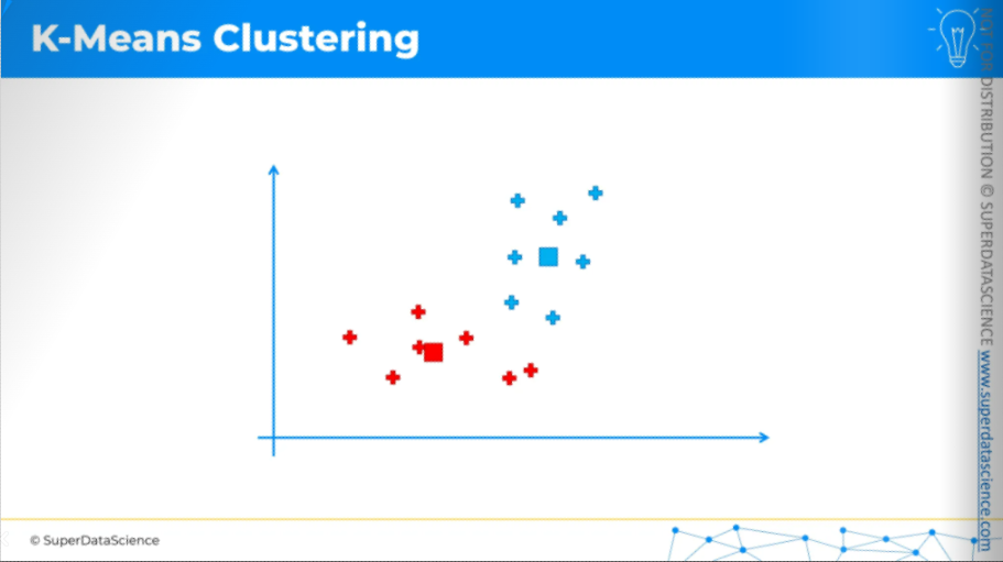
draw a line. We've drawn the equidistant line, with all blue points above and red points below. This means we have come to an end of our process.

So these are our final centroids.
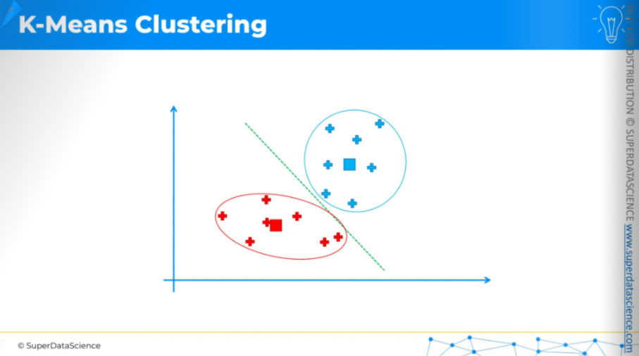
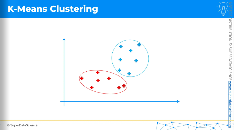
That's how K-means clustering works. It's very simple, as you can see, but also very effective.
Now, we have our two clusters, and we can move forward to interpret what they mean from both a business perspective and a domain knowledge perspective.
The Elbow Method
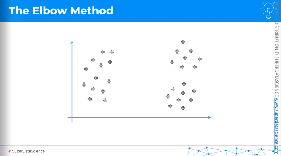
Now we will learn the elbow method. Here we have our 2D data points. By the way, K-Means clustering isn’t bound to 2D only, it can be applied on any dimensions. However, we know how K-Means clustering works. But the question is how do we decide how many clusters we need to select? The elbow method is one of the approaches to help you make this decision.
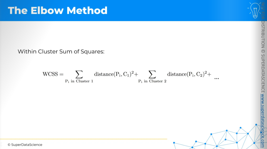
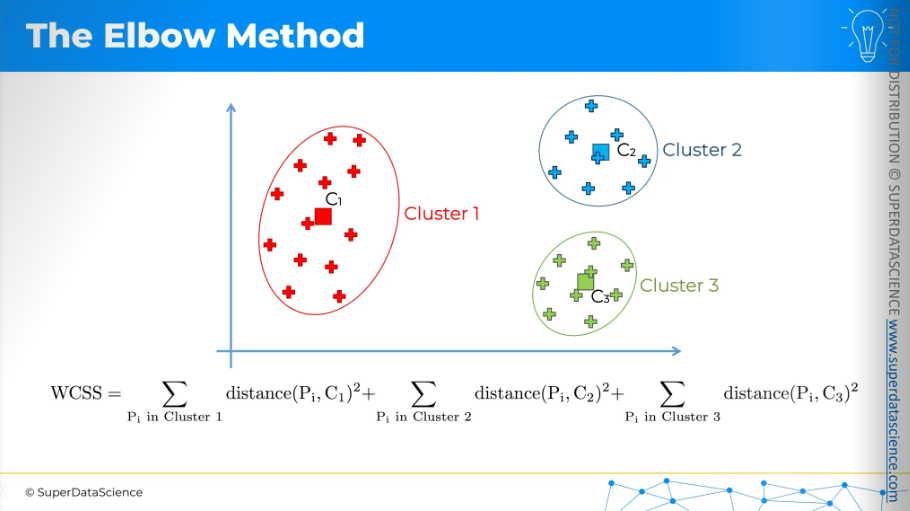
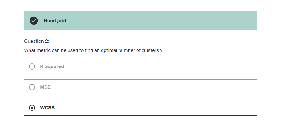
The elbow method involves using an equation for the Within Cluster Sum of Squares, or WCSS. Don't worry if it seems complex at first; it's actually quite simple.
It measures the distance between each point and its cluster's centroid, then squares that distance.
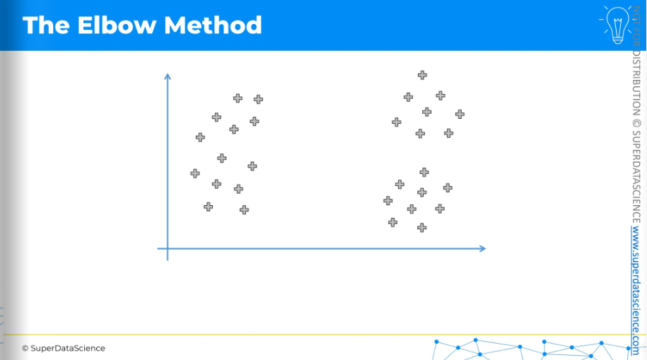
This is the scatter plot. If those are our data points and we have one cluster,
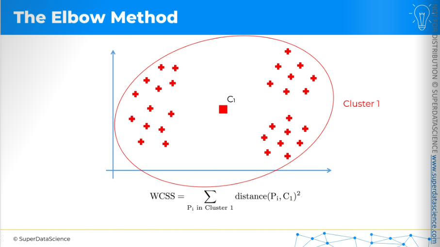
then we just need to measure the distance between each point and that centroid and square it and add them up.
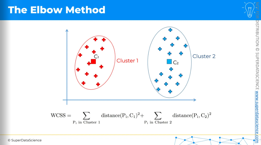
If we have two clusters, we need to do this for the red points separately: calculate the distance between each point and the centroid, square those distances, and add them up. Then, we do the same for the blue points and add those up as well.
And same thing for three clusters. So each time, we first run the k-means clustering algorithm and then calculate the WCSS. It's a bit of a backward process. We perform k-means multiple times to find the WCSS for each setup, whether it's 1, 2, 3, 4, 5 clusters, and so on. One thing to note is that the more clusters we have, the smaller the WCSS will be, resulting to zero untimely.
The chart we can create from this data looks like this:
On the y-axis, we have the WCSS, and on the x-axis, we have the number of clusters. As you can see, the WCSS decreases all the way down to zero.
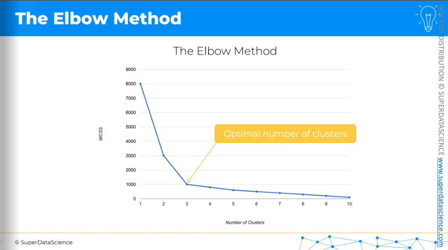
And so 3 is your optimal number of clusters. It's actually a visual method. When you look at this chart, you search for the kink or the elbow. The optimal number of clusters is basically where the WCSS stops dropping quickly.
Sometimes, it might not be clear. There could be two or more possible choices for the best number of clusters. In those cases, it's up to you, as the data scientist, to decide. That's how the elbow method works.
K-Means++
Now we're going to explore K-Means++ and understand how it works and why it's used.
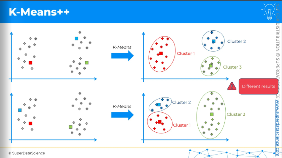
Here, we have our dataset, and let's say we want to apply k-means. Suppose the centroids are initialized in the following way (see the upper plot). After applying k-means and completing all the steps, we end up with these three clusters. It's quite straightforward.
Now, let's consider the same dataset and apply k-means again, but this time with a different initialization of centroids. After applying k-means, we get a different set of three clusters. This is not ideal. The results differ in these two runs of the same k-means model, and the only reason for the difference is the different initialization of the centroids. We didn't change anything else. This is called the Random Initialization Trap.
Why is this a problem?
There are two main reasons.
First, when you run a machine learning model like clustering, you want it to be consistent. You don't want different results just because of some random setup at the start of the algorithm. This model is supposed to give you insights about your business or the problem you're dealing with, like how your customers or data points are grouped. These insights shouldn't depend on random initialization, which is a major concern.
Second, if you look at the dataset before applying clusters, you can often intuitively see what the clusters should be. The k-means result at the top seems to show the correct clusters, while the one at the bottom does not. This is what we want to avoid, and K-Means++ is designed to address this issue.
It's basically the same as K-Means but adds some steps at the beginning to initialize centroids in a specific way.
Let’s look at these steps. These might seem a lot of things at once. But let’s look at this visually.
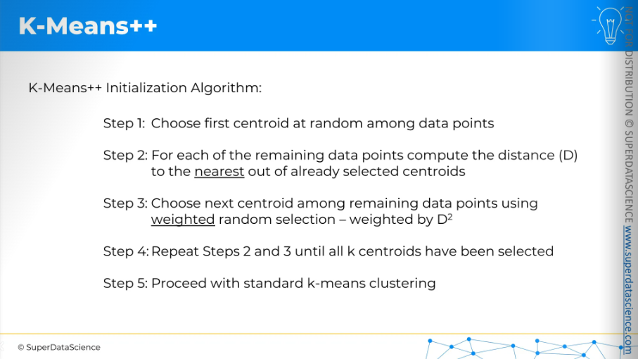
Let’s say, we put a random centroid on this scatter plot. Now K-Means++ will measure the distance from every remaining data point to this centroid. It will square the distances. Now we will choose next centroid but it will be an weighted random selection.
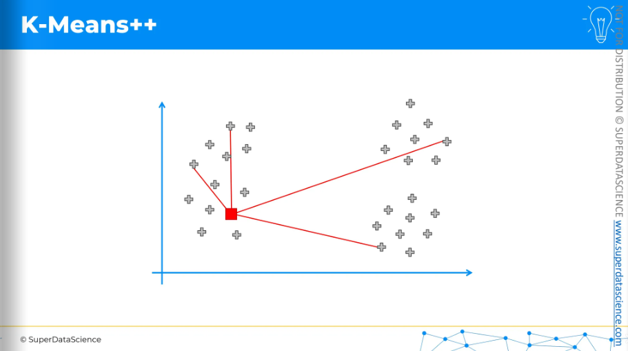
So, the selection will be weighted by the squared distance.
The centroid in the top right, which is the furthest away, has the highest chance of being picked.
For the sake of argument, let's say it was selected.
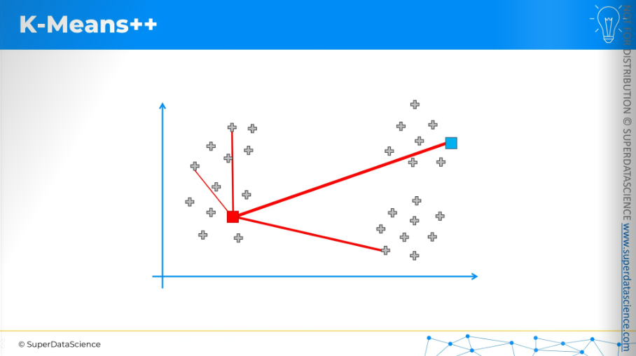
Now, we repeat the process. For each data point, we measure the distance to the nearest centroid. Again, we square these distances, and the chance of a data point being chosen as the next centroid is based on that squared distance.
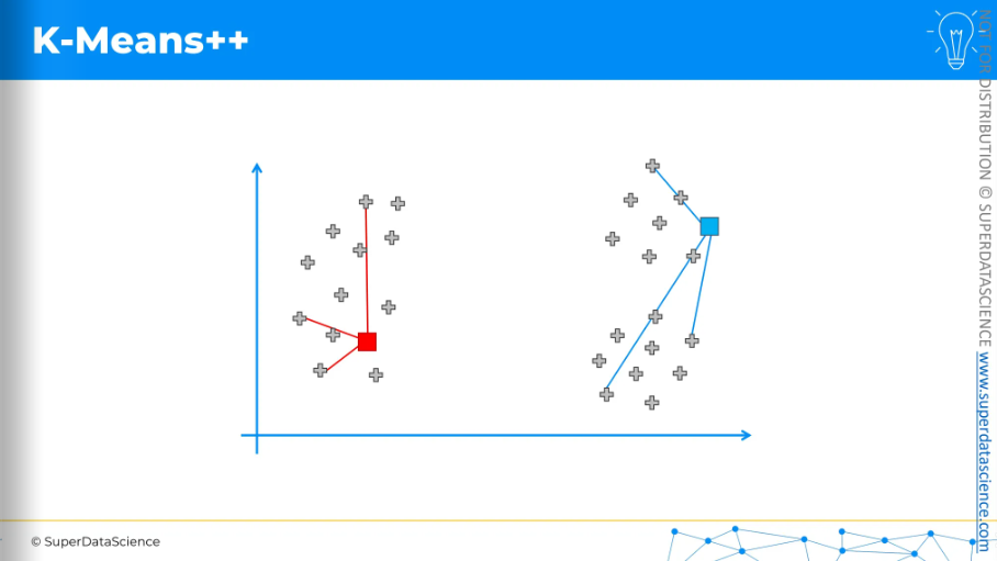
For the sake of argument, let's say the bottom one was selected because it had the highest probability.
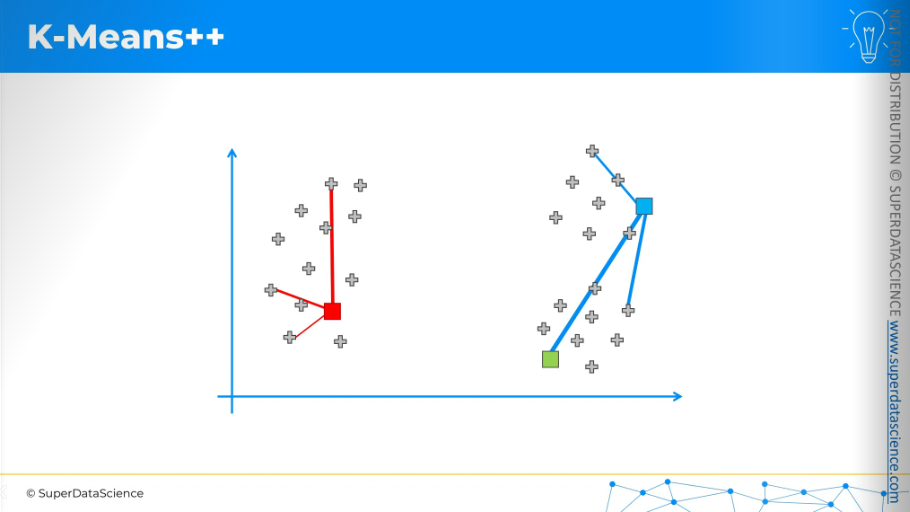
That's how centroids would be initialized.
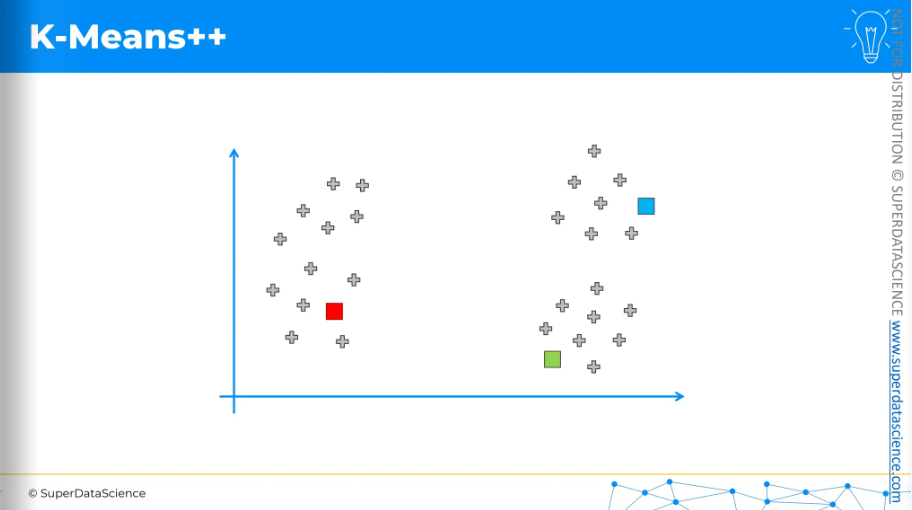
And as a result, we would get these three clusters.
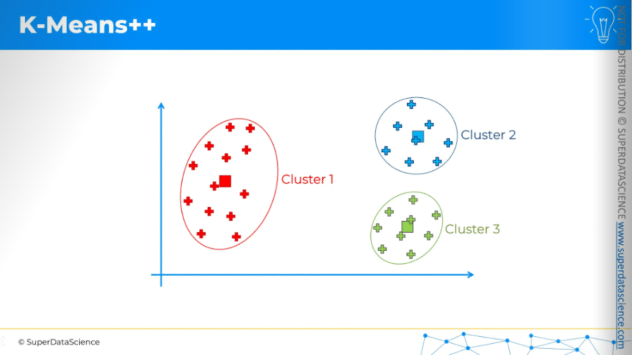
K-Means++ doesn't guarantee perfect initialization since it's random, but the weighted random method reduces the chances of issues. This approach helps with the problems seen in the random initialization trap.
K-Means clustering in Python
Study Materials
Mall_Customers.csv (download and upload in your copy)
k_means_clustering.ipynb (save a copy in drive)
About the data set: Well, as you can see by the title of this data set, It’s actually made by a strategic team of a mall. In their data they have collected customer’s ID, genre, age, annual salary and annual spending score like how much they have spend in a year in that mall. The data analytics team basically wants to learn their customers from a business perspective. Previously with regression and classification, we used knew what to predict but this time we have no idea what to predict. Rather we are trying to learn something, looking for possible patterns.
To identify patterns, we will create dependent variables. Each value will be a class of this dependent variable we are creating. This is what clustering means. To clearly explain how to identify these patterns in the data, we are building a dependent variable. We are creating it so that each value of this future dependent variable becomes a class of this dependent variable.
Procedure:
First, we will import the libraries. This is the classic first step of the data pre-processing phase.
Then, we'll import the dataset, which is inevitable.
Next, we will use the elbow method to find the optimal number of clusters, so we don't have to build the K-Means model several times.
Knowing the optimal number of clusters, we will train the K-Means model on the dataset with that optimal number.
Finally, we will visualize the clusters.
Importing the dataset
What did you do with the two entities? X, the matrix of features, and Y, the dependent variable vector.According to the template, the matrix of features includes all columns except the last one. But let's review our dataset. Do we need to change anything when creating that matrix of features?
As we explained in the Intuition Lecture of the previous tutorial, there isn't a dependent variable when doing clustering, especially with K-Means. So, in this dataset, the last column, the spending score, is not the dependent variable. It is actually a feature we will use along with other features to find patterns in the data.
The first step is to remove the -1 to include all columns. However, the Customer ID won't help much in identifying these patterns, so we’ll exclude it. The rest, like genre, age, annual income, and spending score, are relevant for identifying patterns.
For the matrix of features, the columns I want to keep to identify these patterns will be annual income and spending score. This choice is mainly for teaching purposes. At the end of this implementation, I want to visualize the clusters identified by the K-Means algorithm. To do this, we need a two-dimensional plot. Otherwise, it will be hard to visualize. Therefore we are only going to keep annual income and annual score.

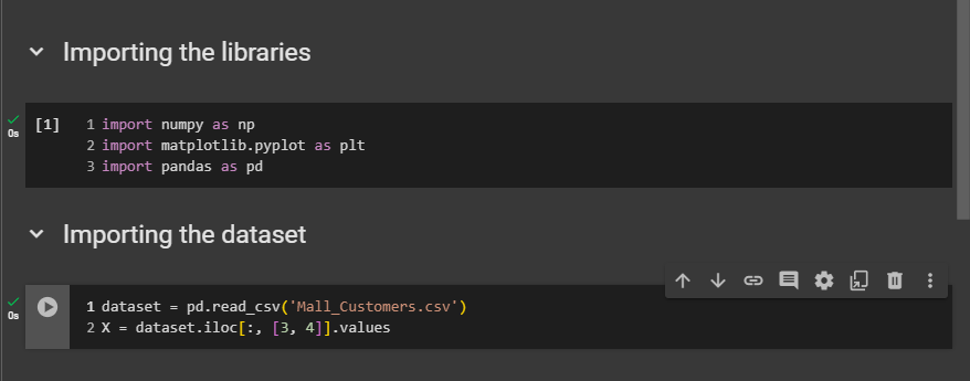
dataset = pd.read_csv('Mall_Customers.csv')
X = dataset.iloc[:, [3,4]].values
Using the elbow method to find the optimal number of clusters
Let's use the elbow method to find optimal number of clusters. So we're gonna use of course, the WCSS.
Description:
from sklearn.cluster import KMeans

# Initialize an empty list to store the Within-Cluster-Sum-of-Squares (WCSS) for each number of clusters
wcss = []

# Loop over a range of cluster numbers from 1 to 10
for i in range(1, 11):
    # Create a KMeans object with 'i' clusters
    # 'init' parameter is set to 'k-means++' to optimize the centroid initialization process and avoid the "random initialization trap"
    # 'random_state' is set to 42 for reproducibility of the results
    kmeans = KMeans(n_clusters=i, init="k-means++", random_state=42)

    # Fit the KMeans model on the dataset X
    kmeans.fit(X)

    # Append the WCSS (inertia) for the current number of clusters to the list
    # WCSS represents the sum of squared distances between each point and its assigned cluster center
    wcss.append(kmeans.inertia_)
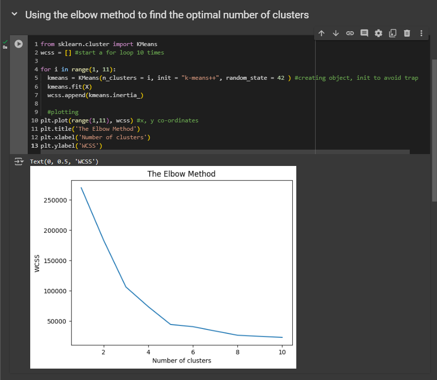
So now, based on your understanding from the intuition section, what is the optimal number of clusters we should choose here? Remember, this is the number of clusters where the WCSS value starts to slow down in its reduction. And here, that number is five.
From the five clusters, the decrease slows down. So, the best number of clusters is clearly five. Therefore, in our next step, when using the K-means model on the dataset, we will build, train, and run it to identify five clusters.
Training the K-Means model on the dataset
Copy the 5-6th line and paste it here. Exchange the i with 5 (number of clusters).
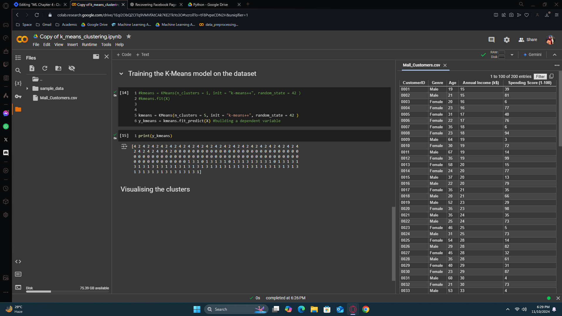
y_kmeans result refers to which cluster the person should be in. From the output result, the first customer belongs to the 3rd cluster. The 2nd customer belongs to the 3rd cluster. The last customer belongs to the 2nd cluster. This is how it works.
Visualizing the clusters
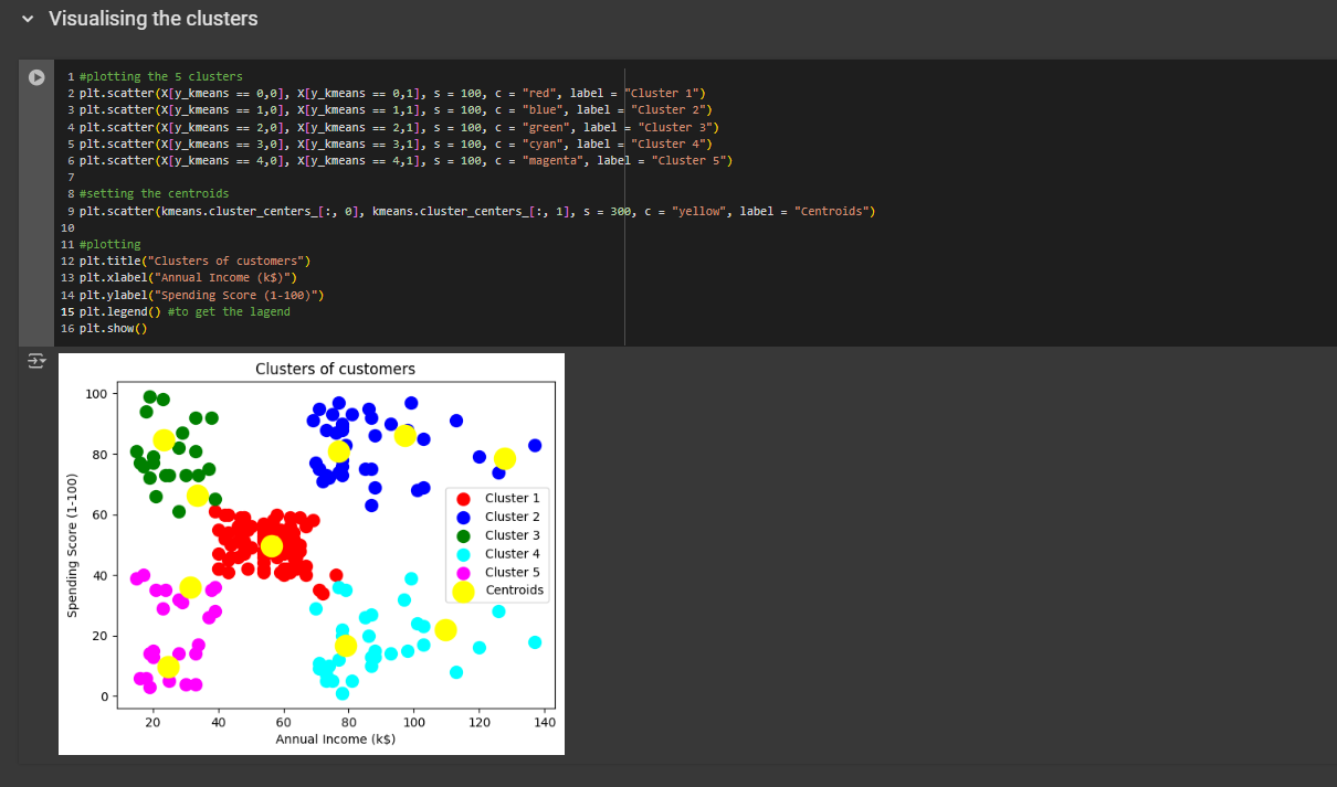
X contains the different customers (column 0: annual income, column 1: spending score) and each row is a different customer. For each customer, x axis will be the annual income and y axis will be the spending score. Now, for cluster 1, we want to select all the customers that belong to cluster 1. For cluster 3, we want to select all the customer that belongs to 3rd cluster. So how can we specify them here? The trick to assign them is using y_kmeans variable. By using this variable, we are assigning it to the row [0,0].
Explanation:
Each
plt.scatter()call plots the points for one cluster.X[y_kmeans == n, 0]selects the x-coordinates of the points in the nth cluster. 0 means the 1st column.X[y_kmeans == n, 1]selects the y-coordinates of the points in the nth cluster. 1 means the 2nd column.s=100sets the size of the points.c="color"sets the color of the cluster points (e.g.,"red"for Cluster 1).label="Cluster n"provides a label for each cluster for use in the legend.
Business Strategies based on the clusters
From the clusters:
Cluster 1: RED; People with average annual income and spends not normal time in the mall.
Cluster 2: BLUE; People who has high annual income plus spends quite a lot of time in the mall
Cluster 3: GREEN; People with low annual income but spends high time in the mall.
Cluster 4: CYAN; This represents the group of people who has a high annual income but spends less time in the mall.
Cluster 5: MAGENTA; this cluster represents people with low annual income also who spends low time in the mall.
Business strategies: Well the people here with the high annual income and who spends the most time in the mall should be our main targeted customers. With the blue customers, you have the highest chance to sell your products. Also, if you look from business ethics, you can see the green group of people has low annual income but still they spend a lot of time in the mall. So you can do them a favor by not sending new deals and irresistible offer to them. You are indeed boosting your business but at the same time you are being socially responsible. With the magenta group, you don’t have to protect them or do anything. If i were the boss, i would leave them as they are. The cyan group is very interesting. They have high income but they spend less time so maybe we are missing out a lot of potential customers. So i would target them. I would try to improve my advertising with them. And with the middle one, I wouldn’t target them a lot, but maybe would advertise little bit, 50/50.
Well this is the magic of clustering. We have deployed different marketing strategies based on different clusters
Hierarchical Clustering
Welcome to Hierarchical Clustering.
When you apply hierarchical clustering, or H.C. for short, to your scatterplot or data points in a two-dimensional space, you will get clusters that are very similar to those from K-Means. In fact, sometimes the results can be exactly the same as K-Means clustering.
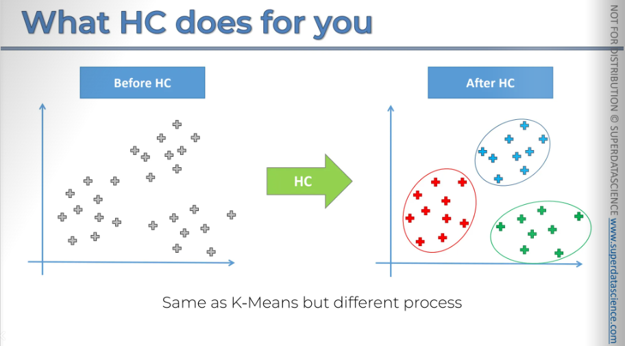
However, the process is a bit different.
Let's discuss it in more detail.
So the first thing that we need to note is that there's two types of hierarchical clustering
agglomerative
divisive
Agglomerated is the bottom up approach. In this blog we’ll be focusing on agglomerated approach. Divisive is the reverse of agglomerated that’s it.
Agglomerative Hierarchical Clustering
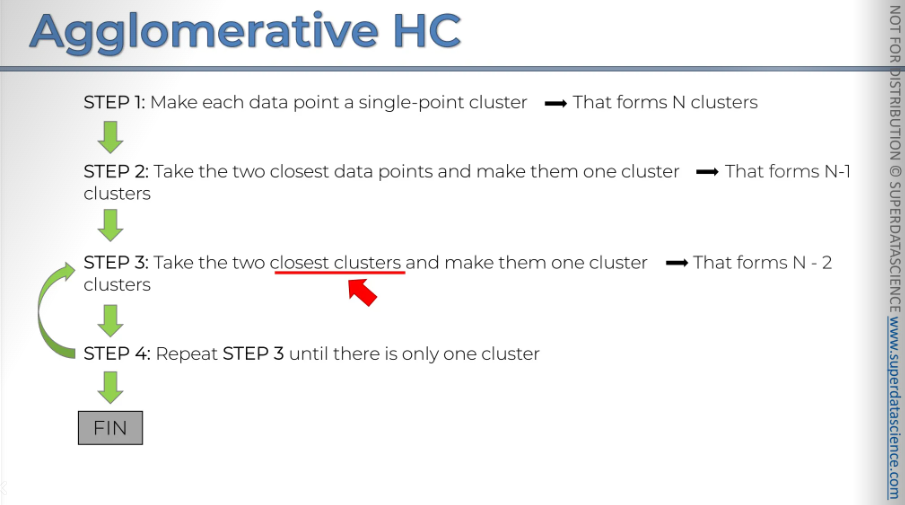
At the end, you will have a big cluster. One important point here is the concept of the closest clusters.
We've already discussed distances and mentioned that you can use Euclidean distances or other types, which work well for individual points. However, here we are taking it a step further by considering not just the proximity of points, but the proximity of clusters.
This is significant, so I want to discuss how to measure the distance between clusters, as it can greatly impact your algorithm when using hierarchical clustering.
Let's explore this first.
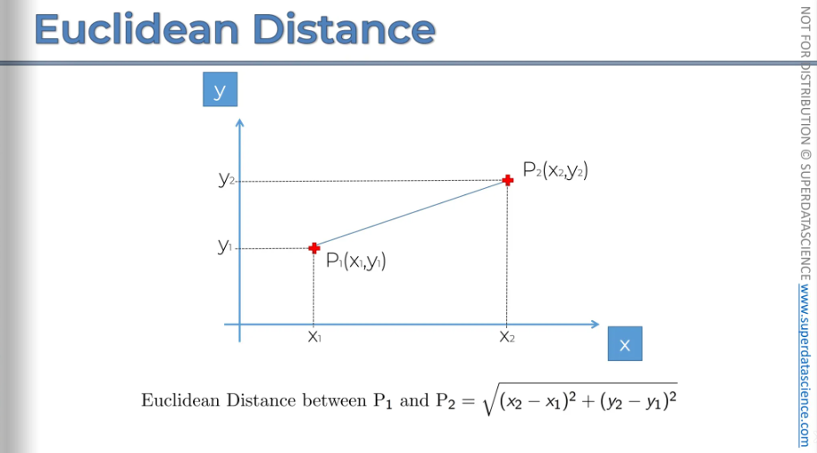
Euclidean Distance
I hope you all know how Euclidian distance is measured. This is a high school geometry. We're going to be working with Euclidean distances because they're more natural type of distance.
Now let's talk about the distance between two clusters. Let's say you have two clusters: the red and the blue. How do you measure the distance between them? What is the definition of the distance between two clusters?.
There are several options available:
Option one is to take the two closest points, measure that, and call that the distance between the two clusters.
Option two is to take the two furthest points and call that the distance between the two clusters, which is also a valid approach.
Option three is to take the average of all the distances between the different points in the clusters, considering all combinations of points, and use the average of those distances.
Option four is to find the centroids and measure the distance between the centroids, calling that the distance between the two clusters.
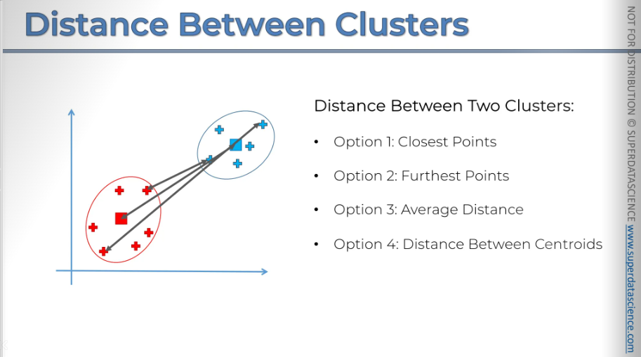
Choosing the right distance option is very important because it will significantly affect your algorithm's results. We won't go into more detail here, but it's something to keep in mind.
Depending on your specific situation, whether it's a business problem or another type of data science issue, you'll need to decide on the best approach for your algorithm. Remember, in hierarchical clustering, the distance between clusters is a crucial factor. You need to be clear about how you define it in your approach.
Okay, we've covered that. Now, let's return to our example.
Here we have our data set.
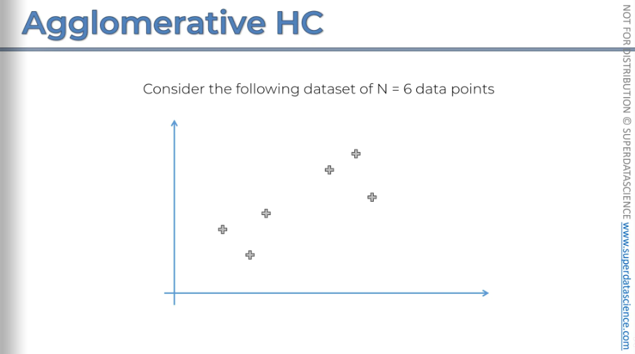
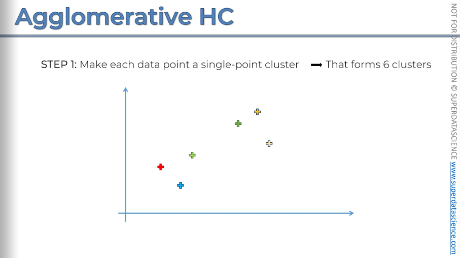
So, in step one, make each data point its own single-point cluster, forming six clusters. Let's take a look at that.
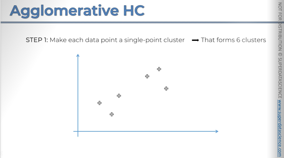
You can see that every single point is a separate cluster.
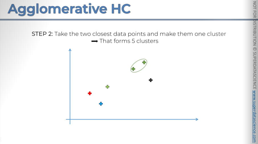
Next take the two closest data points and make them one cluster. Now we have 5 clusters (n-1)
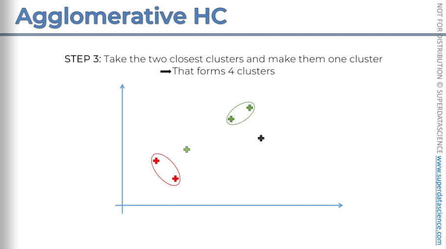
Step three: take the two closest clusters are the ones we had and turn them into one cluster.
Next you repeat step three
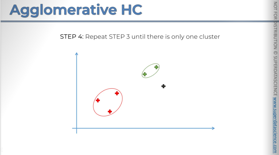
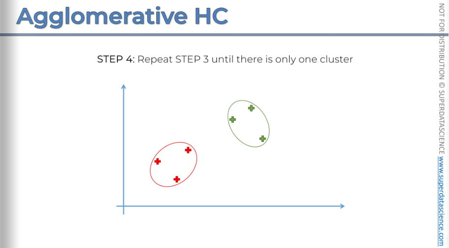
Now we have only two clusters left, so the final step is to combine them, as they will naturally be the closest.
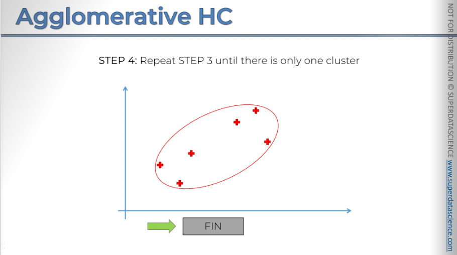
So, there you have it. And that concludes our algorithm. That's how it comes together.
How Dendrogram works
Here, I have a chart on the left with six points. On the right, there's another chart we'll use to create a Dendrogram. It might seem confusing since we haven't discussed these diagrams, but by creating one, we'll understand them.
So to start off with every single point is an individual cluster. Next we're going to find the two closest points (which are these two) and put them into one cluster.
Now, in the diagram on the right, we want to show that p2 and p3 are indeed a cluster because the dendrogram acts like the memory of the HC algorithm. To indicate that we've connected them and that they were the closest, we use a horizontal line. The height of this line has a meaning; it represents the Euclidean distance between them. And it also represents the computed dissimilarity between the two points are the two clusters. The point is, the further the two points are the more dissimilar they are.
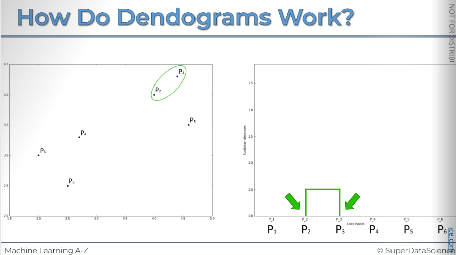
Now we will perform step 3. Let's say, or based on what we see, these two are the closest. So, let's outline them, and now they form their own cluster.
We also want to show this in the dendrogram. (The y axis represents the Euclidian distance between two points)
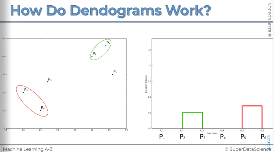
The next step is to repeat step 3. We will look at these points and find which one is the closest, which is p1. After combining them, we have one cluster. Now, we need to represent them in our dendrogram. The distance from p1 to the top here shows the dissimilarity within that cluster we had.
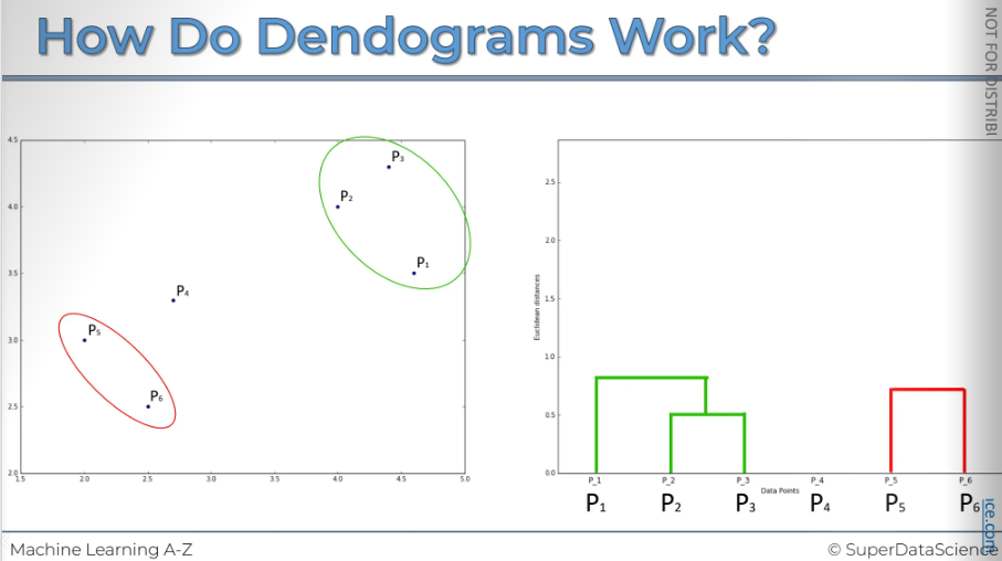
[Same procedure as before]
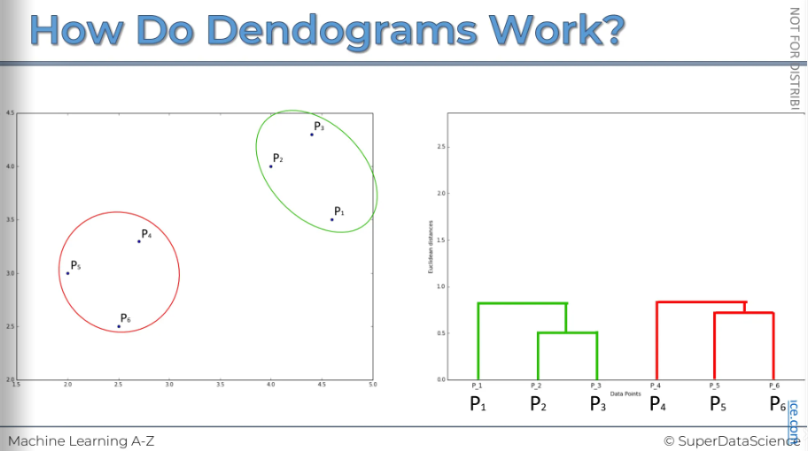
Final step is to combine the two clusters into one single cluster and represent them on our dendrogram.
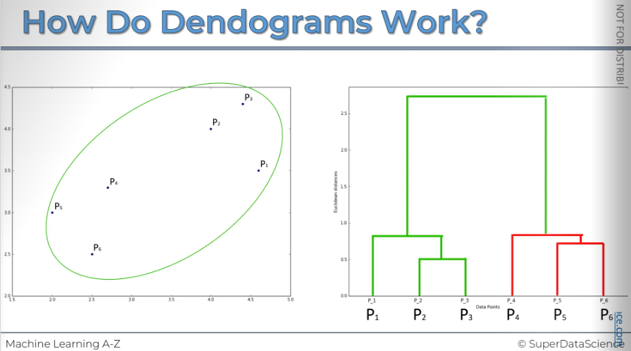
Now you can really understand why I said that dendrogram is like the memory of a HC.
This is the actual image generated by a computer.
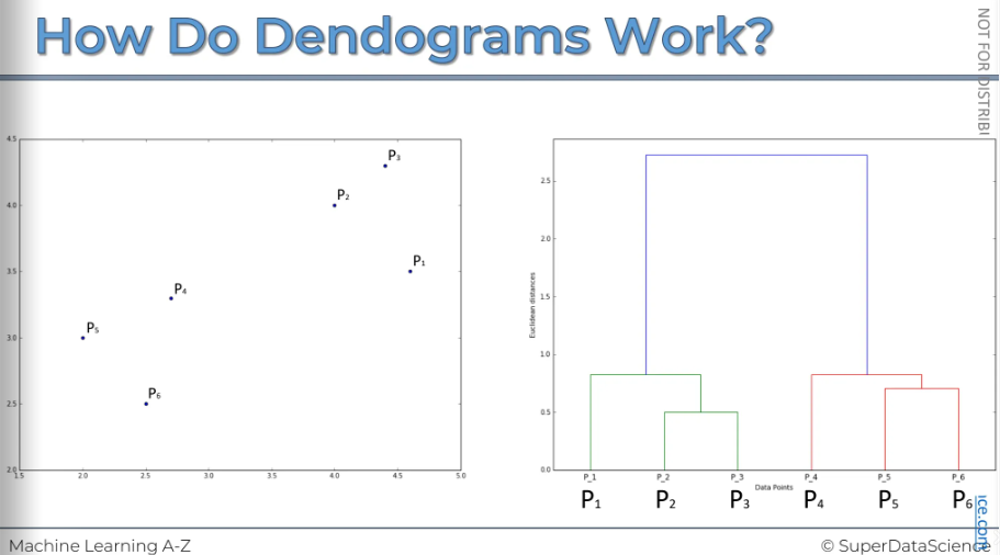
Hierarchical Clustering using Dendrogram
We looked at this just now. On the left is our scatterplot and the right is our memory aka dendrogram of HC. So how do we use this then diagram to understand how to best execute or get the most value out of the HC. So let's have a look.
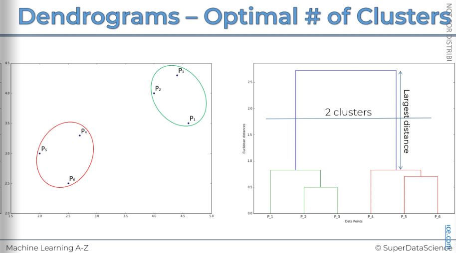
What we can do is examine the horizontal levels and set thresholds. We can set height thresholds or, more accurately, distance thresholds, which are also known as dissimilarity thresholds. This is because the vertical axis measures the Euclidean distance between points, representing the dissimilarity between them or between clusters.
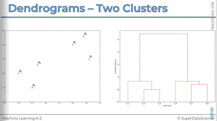
We can set a threshold for dissimilarity, deciding that we don't want it to be greater than a certain level. The exact value doesn't matter as much as how it appears on the image.
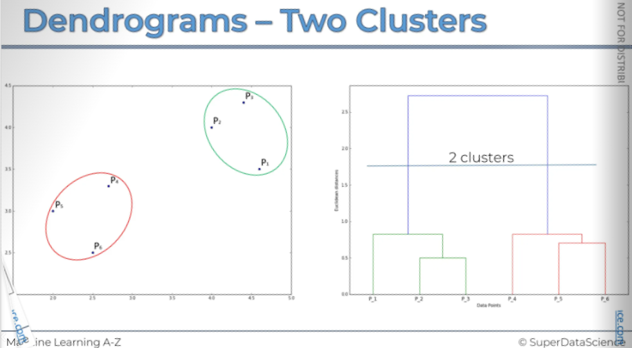
By setting this dissimilarity threshold, we're saying that if clusters exceed this level, we don't want them to have dissimilarity above it within a cluster. This will result in two clusters.
- Let's take a look: here's our first cluster, and here's our second cluster. And that's it! It's telling us that within each one of these clusters, the dissimilarity is always less than the threshold.
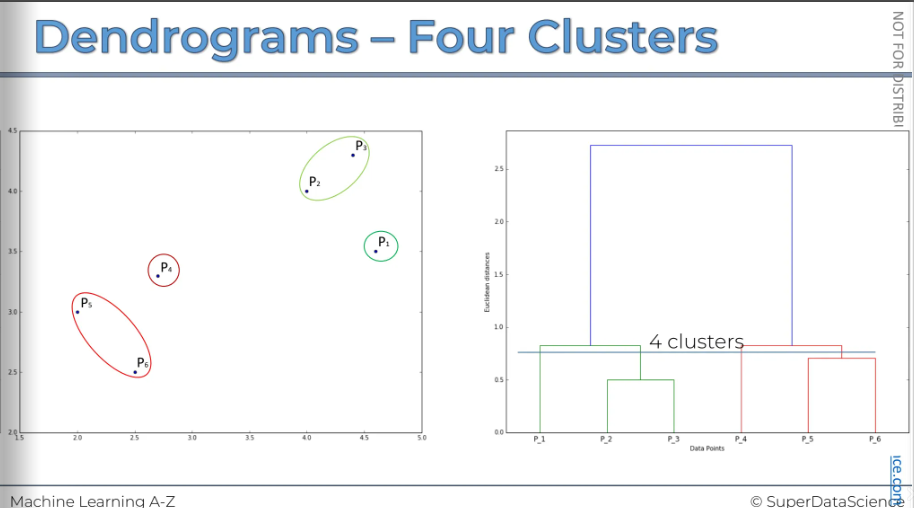
You can easily determine how many clusters you will have at a certain threshold by counting how many vertical lines the horizontal threshold crosses.
Here, you can see it crosses two vertical lines. This means we will have two clusters.
All right let’s look at another example where we have put a threshold on a lower level. We can have four clusters because it crosses 4 lines.
Let's take a look. That's what we get if we set the dissimilarity or distance threshold at that level. So that is what we're going to get if we set that dissimilarity or distance threshold at that level
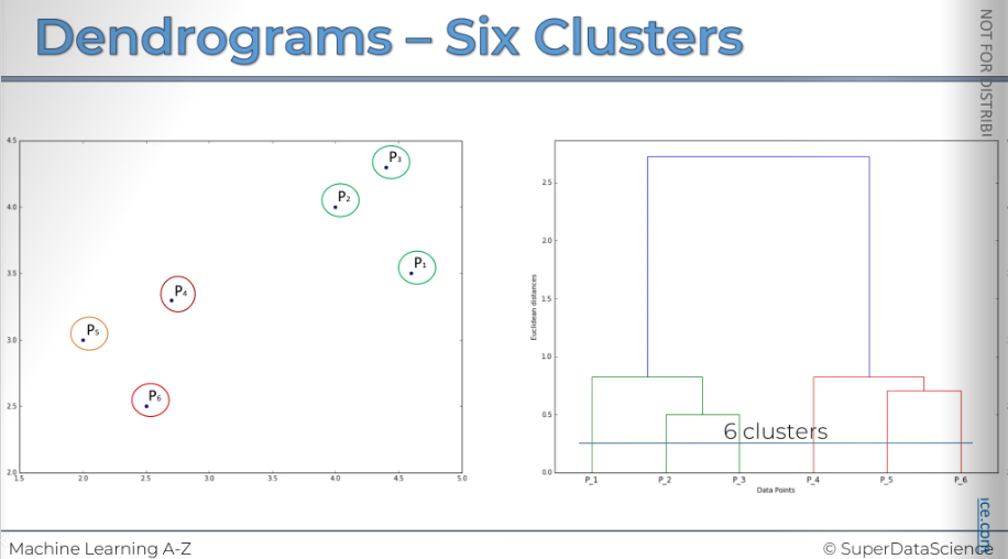
Let's say we want to set our dissimilarity threshold very low, meaning we don't want clusters with any noise that exceeds this threshold. We will decide that if the dissimilarity level, or distance between them, is too high, then based on our business knowledge or other research, we believe that any points with dissimilarity greater than this level should not be combined into a cluster.
What can we learn from the dendrogram to help us choose the best number of clusters?
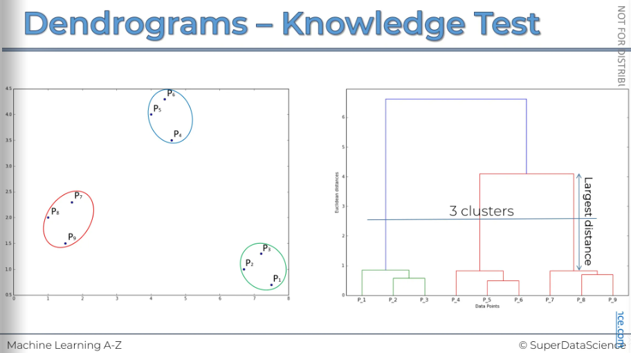
A key indicator is the vertical distance, as it measures dissimilarity. One common method is to look for the longest vertical distance on the dendrogram. This means finding any line that doesn't cross any horizontal lines. In our example, it's the purple line. This represents the largest distance and is therefore the recommended approach.
Keep in mind, this isn't a fixed rule. One option is to set a threshold that crosses this largest distance and use that threshold to determine and find the optimal number of clusters.
HC clustering in python
Study Resources
Mall_Customers.csv (download and upload in your copy)
hierarchical_clustering.ipynb (save a copy in drive)
The data sheet is same. Here, we will apply Hierarchical Clustering Algorithm.
Importing
These are same as before so we won’t reimplement them.
Using the dendrogram to find the optimal number of clusters
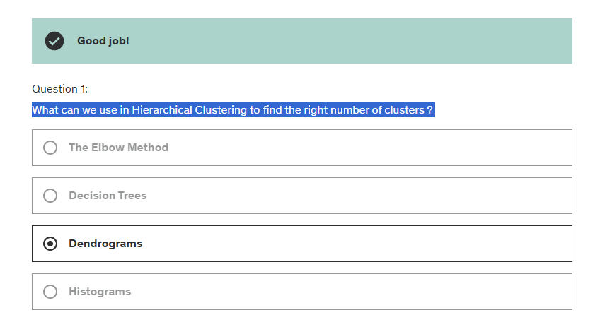
This time, instead of using the elbow method, we will use the dendrogram to find the optimal number of clusters.
In this case, we won't import the function from scikit-learn. Instead, we'll use another popular library in data science. While I usually mention scikit-learn first, along with TensorFlow for deep learning, this time we'll use SciPy.
SciPy offers many great tools for building machine learning models and, specifically for hierarchical clustering, it includes a function called dendrogram, which will generate the dendrogram itself.
# Import the hierarchical clustering module from the SciPy library
import scipy.cluster.hierarchy as sch

# Create a dendrogram plot to visualize the hierarchical clustering
# 'ward' method minimizes the variance of clusters being merged
dendrogram = sch.dendrogram(sch.linkage(X, method='ward'))

plt.title('Dendrogram')
plt.xlabel('Customers')
plt.ylabel('Euclidean distances')
plt.show()
About the arguments: First, we need to call sch again. Then, we'll use another function called linkage. This function takes two arguments as input.
First, it needs your matrix of features where you want to find the clusters, which is
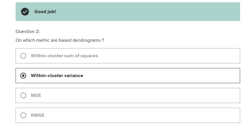
X.The second argument is the clustering technique. In hierarchical clustering, the recommended method is the minimum variance method, known as "ward." This technique minimizes the variance within clusters, leading to more consistent clusters. The parameter name for this method in the linkage function is "method," and you can find more details about "ward" on Wikipedia.
So now for the diagram:
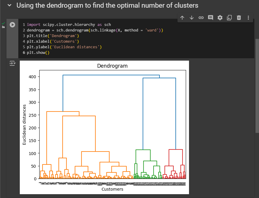
On the X-axis, we have the customers listed from 1 to 200, as there are 200 customers in the dataset. On the Y-axis, we display the Euclidean distances. The optimal number is 3 (using threshold that crosses this largest distance and use that threshold to determine and find the optimal number of clusters)
Training the Hierarchical Clustering model on the dataset
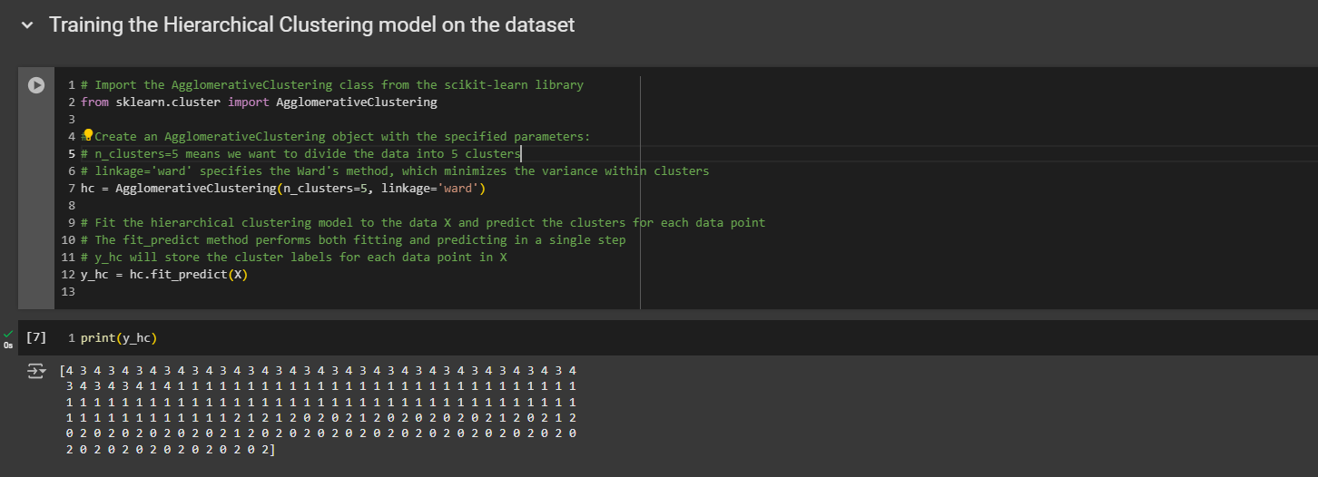
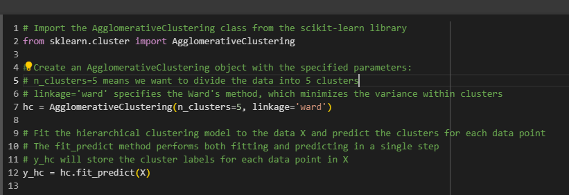
Remember that the cluster numbers don't range from one to five, but from zero to four, because indexes in Python start at zero.
The first customer, with customer ID number one, belongs to the last cluster, which is cluster number five. The second customer belongs to cluster number four. The third customer belongs to cluster number five. This is how you should read it.
Visualizing the clusters
You know how to read it. This are the same result we got with K-Means.
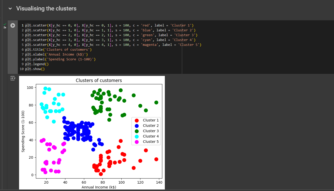
But we our optimal cluster number was 3. So let’s see what outputs we get if we use 3.
First, change n from 5 to 3.
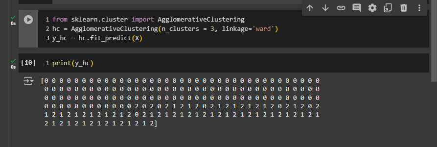
Then we need to remove two lines from the visualization.
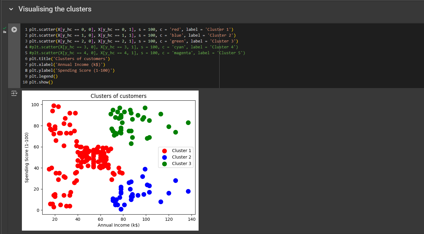
All right this is what we got!
The model grouped all these customers—those with low income and either a low or high spending score—into the same cluster, including the average ones. This still makes sense because the clusters we really want to target are the green and blue ones. So, it actually still makes sense, and we end up focusing on these two important customer groups that can indeed boost sales.
All right, that was very interesting.
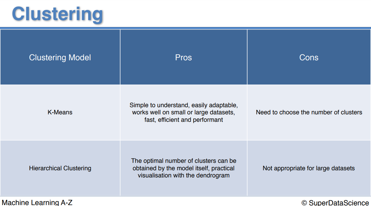
Pros and the cons
Congratulations for completing Part 4. Next part of the journey: Part 5 - Association Rule Learning
Quiz
Subscribe to my newsletter
Read articles from Fatima Jannet directly inside your inbox. Subscribe to the newsletter, and don't miss out.
Written by
