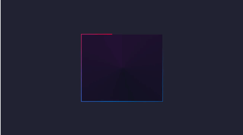
Adding Life to Your Borders: CSS Border Animations
 Nehal Fathema
Animating borders in CSS can bring your website elements to life, adding a subtle, interactive touch that enhances the user experience. In this article, we’ll explore the essentials of CSS border animations and see how to make them fun and accessible for beginners.
Why Use Border Animations?
Border animations can highlight elements, add visual interest, and enhance the aesthetic appeal of a webpage. They are particularly useful in buttons, cards, or navigation items.
Getting Started
To animate borders, CSS properties like border, border-radius, and border-color are combined with transitions and animations. Let’s begin with a simple example.
Example 1: Hover Border Animation
This is a popular effect where the border animates in when a user hovers over an element, such as a button.
HTML:
<div class="hover-border">Hover over me!</div>
CSS:
.hover-border {
  display: inline-block;
  padding: 10px 20px;
  border: 2px solid transparent;
  border-radius: 4px;
  transition: border-color 0.3s ease;
}

.hover-border:hover {
  border-color: #3498db; /* changes to blue on hover */
}
Explanation:
- Transition: This smoothens the color change, creating a simple animation effect when hovering over the element.
Example 2: Border Expansion Animation
In this example, the border starts from the center of each side and "expands" outwards. We achieve this using ::before pseudo-elements.
HTML:
<div class="expand-border">Hover over me!</div>
CSS:
.expand-border {
  position: relative;
  padding: 10px 20px;
  color: #fff;
  background-color: #3498db;
  overflow: hidden;
}

.expand-border::before {
  content: '';
  position: absolute;
  top: 0; left: 0;
  width: 100%;
  height: 100%;
  border: 2px solid #fff;
  box-sizing: border-box;
  transition: transform 0.5s;
  transform: scale(0.5); /* initially smaller */
}

.expand-border:hover::before {
  transform: scale(1); /* expands on hover */
}
Explanation:
- Pseudo-element
::before: Creates a "border layer" that scales on hover to create an expanding effect.
Example 3: Glowing Border Animation
This effect makes a border glow with a pulsing effect. We’ll use @keyframes for continuous animation.
HTML:
<div class="glow-border">Look, I Glow!</div>
CSS:
.glow-border {
  padding: 10px 20px;
  border: 2px solid #3498db;
  border-radius: 8px;
  animation: glowing 1.5s infinite alternate;
}

@keyframes glowing {
  from { border-color: #3498db; }
  to { border-color: #f39c12; }
}
Explanation:
@keyframes: This rule allows the color to alternate between two shades, creating a glowing pulse effect.
Wrapping Up
These examples are a foundation for exploring more complex CSS animations. Play with border thickness, radius, and colors to create your unique designs. Experiment, customize, and let your creativity flow!
Subscribe to my newsletter
Read articles from Nehal Fathema directly inside your inbox. Subscribe to the newsletter, and don't miss out.
Written by
