How to use Tailwind CSS Grid
 Devwares
Tailwind Grid
Tailwind Grid is a powerful and flexible system for building responsive and customizable grid layouts. With Tailwind Grid, you can easily create complex grid structures and layouts without writing custom CSS. In this article, we will explore how to use Tailwind Grid, including the basics, advanced techniques, and best practices.
Table of content
What is Tailwind Grid System
Getting Started with Tailwind CSS Grid
Basic Grid Structure in Tailwind CSS
Tailwind Grid Template Columns
Tailwind Grid Column Start/End
Tailwind Grid Template Rows
Tailwind Grid Row Start/End
Tailwind Grid Auto Flow
Tailwind CSS Gap
Responsive Tailwind Grid
Customizing the Tailwind CSS Theme
Conclusion
Resources
What is Tailwind Grid System
First, it’s essential to understand that Tailwind’s grid system is built on the CSS Grid Layout. If you’re familiar with CSS Grid, Tailwind’s system will feel like a more intuitive extension. Tailwind’s grid utilities offer a straightforward way to implement complex layouts without needing to write custom CSS. You get a lot of control with minimal code.
Tailwind grid System is a two-dimensional layout that is made up of rows and columns of horizontal and vertical lines. It is a collection of classes and utilities that can create complex layouts quickly and easily.
Getting Started with Tailwind CSS Grid
Before you can start using the Tailwind grid, you need to install Tailwind to your project. This can be done with a package manager such as NPM or Yarn. You can check out how to install Tailwind on your project using the Tailwind docs. Once you have installed Tailwind, you need to include it in your project. You can do this by adding the following line of code to your HTML file:
<link rel=" stylesheet" href="tailwind.css" />
Basic Grid Structure in Tailwind CSS
The default Tailwind grid is based on the 12-column grid system. This means that you can divide your page into 12 columns, each with a specific width. You can also divide your page into rows, with each row having its own set of columns.
Tailwind Grid Template Columns
Specifying the Columns in Grid
The basic grid structure in Tailwind consists of a container element with the grid class, and child elements with the grid-cols-(n) class. The Tailwind CSS grid template columns are the alternative to CSS grid template columns. This property is used to set the number of columns and the size of the grid layout. Below are the different classes and properties of the Tailwind grid Template columns.
| Class | Properties |
| grid-cols-1 | grid-template-columns: repeat(1, minmax(0, 1fr)) |
| grid-cols-2 | grid-cols-2 grid-template-columns: repeat(2, minmax(0, 1fr)) |
| grid-cols-3 | grid-template-columns: repeat(3, minmax(0, 1fr)); |
| grid-cols-4 | grid-template-columns: repeat(4, minmax(0, 1fr)); |
| grid-cols-5 | grid-template-columns: repeat(5, minmax(0, 1fr)); |
| grid-cols-6 | grid-template-columns: repeat(6, minmax(0, 1fr)); |
| grid-cols-7 | grid-template-columns: repeat(7, minmax(0, 1fr)); |
| grid-cols-8 | grid-template-columns: repeat(8, minmax(0, 1fr)); |
| grid-cols-9 | grid-template-columns: repeat(9, minmax(0, 1fr)); |
| grid-cols-10 | grid-template-columns: repeat(10, minmax(0, 1fr)); |
| grid-cols-11 | grid-template-columns: repeat(11, minmax(0, 1fr)); |
| grid-cols-12 | grid-template-columns: repeat(12, minmax(0, 1fr)); |
| grid-cols-none | grid-template-columns: none; |
| grid-cols-subgrid | grid-template-columns: subgrid; |
<div class="grid grid-cols-3 gap-4 text-center m-10 text-white font-extrabold ">
    <div class="bg-blue-500 p-4 rounded-lg ">Item 1</div>
    <div class="bg-blue-500 p-4 rounded-lg ">Item 2</div>
    <div class="bg-blue-500 p-4 rounded-lg ">Item 3</div>
    <div class="bg-blue-500 p-4 rounded-lg">Item 4</div>
    <div class="bg-blue-500 p-4 rounded-lg">Item 5</div>
    <div class="bg-blue-500 p-4 rounded-lg">Item 6</div>
    <div class="bg-blue-500 p-4 rounded-lg">Item 7</div>
     <div class="bg-blue-500 p-4 rounded-lg">Item 8</div>
</div>
The code above shows the Tailwind grid class
Preview

Tailwind Grid Column Start/End
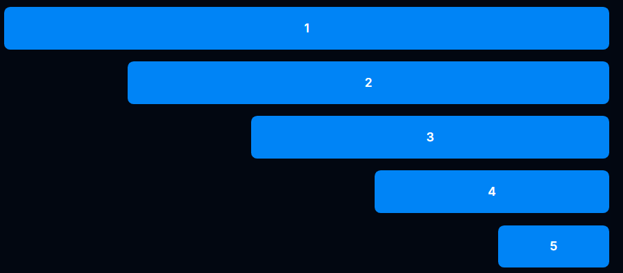
You can control where an item starts and ends within the grid using col-start-{n} and col-end-{n}.
<div class="grid grid-cols-12 gap-4 text-center text-white font-semibold">
    <div class="bg-blue-500 rounded-md col-start-2 col-end-12">1</div>
    <div class="bg-blue-500 rounded-md col-start-4 col-end-12">2</div>
    <div class="bg-blue-500 rounded-md col-start-6 col-end-12">3</div>
    <div class="bg-blue-500 rounded-md col-start-8 col-end-12">4</div>
    <div class="bg-blue-500 rounded-md col-start-10 col-end-12">5</div>
</div>

Spanning Columns
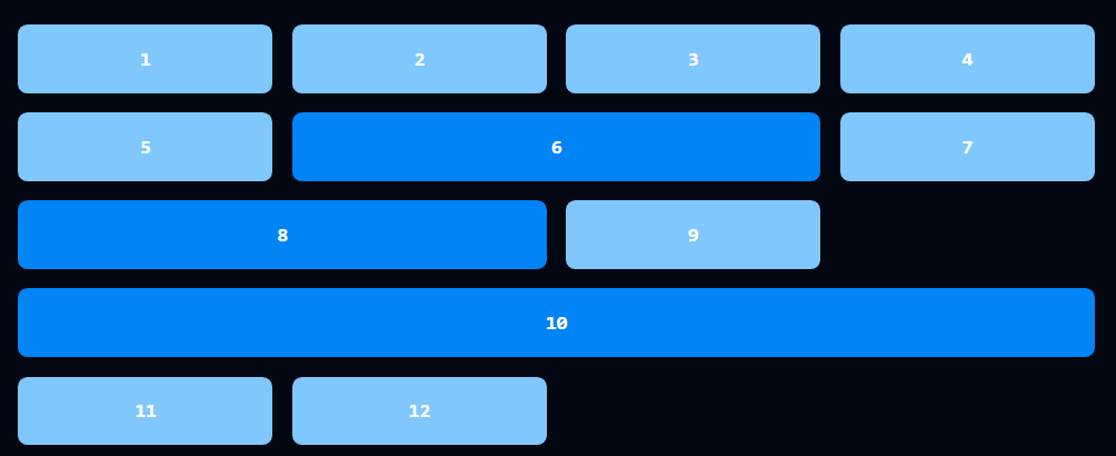
To make an item span multiple columns, use the col-span-{n} class.
<div
    class="grid grid-cols-4 gap-4 font-mono text-center text-white font-bold m-10"
>
    <div class="bg-blue-300 p-4 rounded-lg ">1</div>
    <div class="bg-blue-300 p-4 rounded-lg">2</div>
    <div class="bg-blue-300 p-4 rounded-lg">3</div>
    <div class="bg-blue-300 p-4 rounded-lg">4</div>
    <div class="bg-blue-300 p-4 rounded-lg">5</div>
    <div class="bg-blue-500 p-4 rounded-lg col-span-2">6</div>
    <div class="bg-blue-300 p-4 rounded-lg">7</div>
    <div class="bg-blue-500 p-4 rounded-lg col-span-2">8</div>
    <div class="bg-blue-300 p-4 rounded-lg ">9</div>
    <div class="bg-blue-500 p-4 rounded-lg col-span-4">10</div>
    <div class="bg-blue-300 p-4 rounded-lg">11</div>
    <div class="bg-blue-300 p-4 rounded-lg">12</div>
</div>
Preview

Equal Width
Creating equal-width columns is straightforward with Tailwind. Just set the same fraction for each column.
<div
    class="grid grid-cols-3 gap-4 font-mono text-center text-white font-bold m-10"
>
    <div class="bg-blue-500 p-4 rounded-lg">1</div>
    <div class="bg-blue-500 p-4 rounded-lg">2</div>
    <div class="bg-blue-500 p-4 rounded-lg">3</div>
</div>
Preview

Tailwind Grid Template Rows
Specifying the Rows in a Grid
Similar to columns, you define rows with grid-rows-{n}. Tailwind grid Template rows are a class used to accept multiple values in tailwind CSS. Below are the different classes and properties of the Tailwind grid Template rows.
| Class | Properties |
| grid-rows-1 | grid-template-rows: repeat(1, minmax(0, 1fr)); |
| grid-rows-2 | grid-template-rows: repeat(2, minmax(0, 1fr)); |
| grid-rows-3 | grid-template-rows: repeat(3, minmax(0, 1fr)); |
| grid-rows-4 | grid-template-rows: repeat(4, minmax(0, 1fr)); |
| grid-rows-5 | grid-template-rows: repeat(5, minmax(0, 1fr)); |
| grid-rows-6 | grid-template-rows: repeat(6, minmax(0, 1fr)); |
| grid-rows-none | grid-template-rows: none; |
<div
    class="grid grid-rows-3 grid-flow-col gap-4 font-mono text-center text-white font-bold m-10"
>
    <div class="bg-blue-500 p-3 rounded-lg">1</div>
    <div class="bg-blue-500 p-3 rounded-lg">2</div>
    <div class="bg-blue-500 p-3 rounded-lg">3</div>
    <div class="bg-blue-500 p-3 rounded-lg">4</div>
    <div class="bg-blue-500  p-3 rounded-lg">5</div>
    <div class="bg-blue-500 p-3 rounded-lg">6</div>
    <div class="bg-blue-500  p-3 rounded-lg">7</div>
    <div class="bg-blue-500 p-3 rounded-lg">8</div>
</div>
Preview

Tailwind Grid Row Start/End
Control where an item starts and ends within rows using row-start-{n} and row-end-{n}.
<div
    class="grid grid-rows-3 gap-3 grid-flow-col font-mono text-center text-white font-bold m-10"
>
    <div
        class="bg-blue-500 p-3 rounded-lg place-content-center row-start-3 row-end-4"
    >
        1
    </div>
    <div
        class="bg-blue-500 p-3 rounded-lg row-start-2 row-end-4 place-content-center"
    >
        2
    </div>
    <div
        class="bg-blue-500 p-3 rounded-lg row-start-1 row-end-4 place-content-center"
    >
        3
    </div>
</div>
Preview

Spanning Rows
To span multiple rows, use the row-span-{n} class.
<div
    class="grid grid-rows-4 gap-3 grid-flow-col font-mono text-center text-white font-bold m-10"
>
    <div class="bg-blue-500 p-3 rounded-lg row-span-3 place-content-center">
        1
    </div>
    <div class="bg-blue-500 p-3 rounded-lg row-span-2 place-content-center">
        2
    </div>
    <div class="bg-blue-500 p-3 rounded-lg ">3</div>
</div>
Preview

Tailwind Grid Auto Flow
Controlling Grid Element Placement The grid-flow-{value} class controls how items are placed in the grid. Options include row, col, dense, and row-dense. For finer control over element placement, you can combine the various start, end, and span classes.
<div
    class="grid grid-cols-4 gap-3 grid-flow-col font-mono text-center text-white font-bold m-10"
>
    <div
        class="bg-blue-500 col-start-1 col-span-2 row-start-1 row-span-2 p-3 rounded-md place-content-center"
    >
        1
    </div>
    <div class="bg-blue-500 p-3 rounded-md">2</div>
    <div class="bg-blue-500 p-3 rounded-md">3</div>
    <div
        class="bg-blue-500 p-3 rounded-md col-span-4 row-start-1 row-span-2 place-content-center"
    >
        4
    </div>
</div>
Preview

Tailwind Gap
Setting the Gap Between Elements The gap-{size} class sets the gap between grid items. Use gap-x-{size} and gap-y-{size} for independent control. Setting a uniform gap is as simple as using the gap-{size} class.
<div
    class="grid gap-4 grid-cols-3 text-center text-white font-bold font-mono  "
>
    <div class="bg-blue-500 p-3 rounded-md ">1</div>
    <div class="bg-blue-500 p-3 rounded-md">2</div>
    <div class="bg-blue-500 p-3 rounded-md">3</div>
    <div class="bg-blue-500 p-3 rounded-md">4</div>
    <div class="bg-blue-500 p-3 rounded-md">5</div>
    <div class="bg-blue-500 p-3 rounded-md">6</div>
</div>
Preview

Changing Row and Column Gaps Independently For different row and column gaps, use gap-x-{size} and gap-y-{size}.
Preview

Responsive Tailwind Grid
Tailwind CSS Grid also allows you to add responsive breakpoints to your grid layout. This is useful when you want your grid to change its layout based on the screen size. Here is an example:
<div class="m-10">
    <div
        class="grid grid-cols-2 gap-4 md:grid-cols-3 lg:grid-cols-4 text-center text-white font-mono font-bold"
    >
        <div
            class="w-26 flex h-12 items-center justify-center rounded-md bg-blue-500"
        >
            1
        </div>
        <div
            class="w-26 flex h-12 items-center justify-center rounded-md bg-blue-500"
        >
            2
        </div>
        <div
            class="w-26 flex h-12 items-center justify-center rounded-md bg-blue-500"
        >
            3
        </div>
        <div
            class="w-26 flex h-12 items-center justify-center rounded-md bg-blue-500"
        >
            4
        </div>
        <div
            class="w-26 flex h-12 items-center justify-center rounded-md bg-blue-500"
        >
            5
        </div>
        <div
            class="w-26 flex h-12 items-center justify-center rounded-md bg-blue-500"
        >
            6
        </div>
        <div
            class="w-26 flex h-12 items-center justify-center rounded-md bg-blue-500"
        >
            7
        </div>
        <div
            class="w-26 flex h-12 items-center justify-center rounded-md bg-blue-500"
        >
            8
        </div>
    </div>
</div>
Preview

Customizing the Tailwind CSS Theme
Tailwind CSS is highly customizable. You can extend or modify the default grid settings in the tailwind.config.js file. For example, to increase the maximum number of columns to 16:
Example configuration:
Copy code
// tailwind.config.js
module.exports = {
  theme: {
    extend: {
      gridTemplateColumns: {
        '16': 'repeat(16, minmax(0, 1fr))',
      },
    },
  },
}
This adds the grid-cols-16 class, allowing you to create grids with up to 16 columns.
Tailwind CSS Grid provides a flexible and powerful way to create responsive layouts. With its utility-first approach, you can easily define grid structures, manage spacing, and customize your design to fit your needs.
Conclusion
Tailwind CSS Grid is versatile and powerful, making complex layouts easier to manage. By mastering these classes, you can create responsive, flexible designs that are easy to maintain. With practice, Tailwind’s grid system will become an indispensable part of your web development toolkit.
Resources
Subscribe to my newsletter
Read articles from Devwares directly inside your inbox. Subscribe to the newsletter, and don't miss out.
Written by
