How to build Tailwind Progress Bar.
 Devwares
Tailwind Progress Bar
A progress bar is a graphical element that visually represents the completion status of a task or process. It is commonly used to provide feedback to users on the progress of a task, such as file uploads, form submissions, or page loading.
In this guide, we will walk you through the process of building a progress bar using Tailwind CSS, a popular utility-first CSS framework. With Tailwind CSS's extensive set of utility classes, creating a progress bar becomes a breeze.
Prerequisites
To follow along with this tutorial, you should have a basic understanding of HTML, CSS, and JavaScript. Additionally, make sure you have Tailwind CSS installed in your project.
Step 1: Set Up the HTML Structure
First, let's set up the HTML structure for our progress bar. Open your preferred code editor and create a new HTML file called index.html. Add the following code:
<!DOCTYPE html>
<html lang="en">
    <head>
        <meta charset="UTF-8" />
        <meta name="viewport" content="width=device-width, initial-scale=1.0" />
        <link
            href="<https://cdn.jsdelivr.net/npm/tailwindcss@2.0.2/dist/tailwind.min.css>"
            rel="stylesheet"
        />
        <title>Tailwind Progress Bar</title>
    </head>
    <body>
        <div class="h-4 bg-gray-200 rounded">
            <div class="h-full bg-indigo-500 rounded"></div>
        </div>
    </body>
</html>
In this code snippet, we start by including the necessary <meta> tags for character set and viewport settings. We then link to the Tailwind CSS CDN to access the framework's utility classes. Inside the <body> tag, we create a <div> element with the classes h-4 bg-gray-200 rounded, which sets the background color and border radius for the progress bar. Inside this div, we add another <div> element with the classes h-full bg-blue-500 rounded, which represents the progress itself.
Step 2: Apply Tailwind CSS Utility Classes
Now that we have set up the HTML structure, let's apply Tailwind CSS utility classes to style our progress bar. Open your HTML file in a web browser or run a local development server, and you will see a basic progress bar with a gray background. However, it doesn't show any progress yet.
To make the progress bar dynamic, we need to add inline styles using Tailwind CSS utility classes. Update the inner <div> element as follows:
<div class="h-full bg-indigo-500 rounded" style="width: 30%;"></div>
In this example, we added the style attribute to the inner <div> element and set the width property to 30%. This will make the progress bar fill 60% of the outer container.
Step 3: Make the Progress Bar Responsive
By default, Tailwind CSS provides responsive utility classes that allow you to adjust the width of the progress bar based on different screen sizes. To make our progress bar responsive, we can use the w-1/2 class, which sets the width to 50% on small screens and 100% on larger screens.
Update the inner <div> element's style attribute as follows:
<div class="h-full bg-indigo-500 rounded w-1/2 sm:w-full"></div>
In this code snippet, we added the w-1/2 class, which sets the width to 50% on small screens. We also added the sm:w-full class, which sets the width to 100% on screens larger than the small breakpoint.
Step 4: Add Animation to the Progress Bar
To make our progress bar visually appealing, we can add a smooth animation that provides a visual representation of progress. Tailwind CSS provides utility classes for animation, making it easy to add animation effects to our progress bar.
Update the inner <div> element as follows:
<div class="m-10"> <div class="h-4 w-full bg-gray-300 dark:bg-neutral-600 overflow-hidden"> <div class="flex flex-col justify-center h-full bg-indigo-500 rounded transition-width duration-500 ease-in-out leading-none" style="width: 30%" ></div> </div></div>
In this example, we added the transition-width class, which specifies that the width transition should be animated. We also added the duration-500 class, which sets the animation duration to 500 milliseconds, and the ease-in-out class, which applies a smooth easing effect to the animation.
Preview

Progress bar with label inside
Progress bar with label inside.
<div class="flex flex-col gap-5">
    <div class="flex w-full h-4 bg-gray-200 rounded-full overflow-hidden dark:bg-gray-700">
        <div
            class="flex flex-col justify-center rounded-full overflow-hidden bg-indigo-600 text-xs text-white text-center whitespace-nowrap dark:bg-indigo-500 transition duration-500"
            style={{width: "25%"}}
        >
            25%
        </div>
    </div>
    <div class="flex w-full h-4 bg-gray-200 rounded-full overflow-hidden dark:bg-gray-700">
        <div
            class="flex flex-col justify-center rounded-full overflow-hidden bg-indigo-600 text-xs text-white text-center whitespace-nowrap dark:bg-indigo-500 transition duration-500"
            style={{width: "50%"}}
        >
            50%
        </div>
    </div>
    <div class="flex w-full h-4 bg-gray-200 rounded-full overflow-hidden dark:bg-gray-700">
        <div
            class="flex flex-col justify-center rounded-full overflow-hidden bg-indigo-600 text-xs text-white text-center whitespace-nowrap dark:bg-indigo-500 transition duration-500"
            style={{width: "75%"}}
        >
            75%
        </div>
    </div>
    <div class="flex w-full h-4 bg-gray-200 rounded-full overflow-hidden dark:bg-gray-700">
        <div
            class="flex flex-col justify-center rounded-full overflow-hidden bg-indigo-600 text-xs text-white text-center whitespace-nowrap dark:bg-indigo-500 transition duration-500"
            style={{width: "100%"}}
        >
            100%
        </div>
    </div>
</div>
Preview

Multi-color Progress bar
Multicolor progress bar
<div class="m-10">
    <div class="mb-6 rounded h-3 w-full bg-gray-200 dark:bg-neutral-600">
        <div class="h-3 rounded bg-green-500" style={{width: "15%"}}></div>
    </div>
    <div class="mb-6 rounded h-3 w-full bg-gray-200 dark:bg-neutral-600">
        <div class="h-3 rounded bg-yellow-500" style={{width: "25%"}}></div>
    </div>
    <div class="mb-6 rounded h-3 w-full bg-gray-200 dark:bg-neutral-600">
        <div class="h-3 rounded bg-black" style={{width: "50%"}}></div>
    </div>
    <div class="mb-6 h-3 w-full bg-gray-200 dark:bg-neutral-600">
        <div class="h-3 rounded bg-blue-400" style={{width: "75%"}}></div>
    </div>
    <div class="mb-6 h-3 rounded w-full bg-gray-200 dark:bg-neutral-600">
        <div class="h-3 rounded bg-purple-500" style={{width: "90%"}}></div>
    </div>
    <div class="h-3 rounded w-full bg-gray-200 dark:bg-neutral-600">
        <div class="h-3 rounded bg-red-600" style={{width: "100%"}}></div>
    </div>
</div>
Preview

Floating label Progress bar
Floating label progress bar
<div>
    <div class="inline-block mb-2 ms-[calc(25%-1.25rem)] py-0.5 px-1.5 bg-indigo-50 border border-indigo-200 text-xs font-medium text-indigo-600 rounded-lg dark:bg-indigo-800/30 dark:border-indigo-800 dark:text-indigo-500">
        25%
    </div>
    <div class="flex w-full h-2 bg-gray-200 rounded-full overflow-hidden dark:bg-gray-700">
        <div
            class="flex flex-col justify-center rounded-full overflow-hidden bg-indigo-600 text-xs text-white text-center whitespace-nowrap transition duration-500 dark:bg-indigo-500"
            style={{width: "25%"}}
        ></div>
    </div>
</div>
<div>
    <div class="inline-block mb-2 ms-[calc(50%-1.25rem)] py-0.5 px-1.5 bg-indigo-50 border border-indigo-200 text-xs font-medium text-indigo-600 rounded-lg dark:bg-indigo-800/30 dark:border-indigo-800 dark:text-indigo-500">
        50%
    </div>
    <div class="flex w-full h-2 bg-gray-200 rounded-full overflow-hidden dark:bg-gray-700">
        <div
            class="flex flex-col justify-center rounded-full overflow-hidden bg-indigo-600 text-xs text-white text-center whitespace-nowrap transition duration-500 dark:bg-indigo-500"
            style={{width: "50%"}}
        ></div>
    </div>
</div>
<div>
    <div class="inline-block mb-2 ms-[calc(75%-1.25rem)] py-0.5 px-1.5 bg-indigo-50 border border-indigo-200 text-xs font-medium text-indigo-600 rounded-lg dark:bg-indigo-800/30 dark:border-indigo-800 dark:text-indigo-500">
        75%
    </div>
    <div class="flex w-full h-2 bg-gray-200 rounded-full overflow-hidden dark:bg-gray-700">
        <div
            class="flex flex-col justify-center rounded-full overflow-hidden bg-indigo-600 text-xs text-white text-center whitespace-nowrap transition duration-500 dark:bg-indigo-500"
            style={{width: "75%"}}
        ></div>
    </div>
</div>
<div>
    <div class="inline-block mb-2 ms-[calc(100%-1.25rem)] py-0.5 px-1.5 bg-blue-50 border border-blue-200 text-xs font-medium text-indigo-600 rounded-lg dark:bg-indigo-800/30 dark:border-indigo-800 dark:text-indigo-500">
        100%
    </div>
    <div class="flex w-full h-2 bg-gray-200 rounded-full overflow-hidden dark:bg-gray-700">
        <div
            class="flex flex-col justify-center rounded-full overflow-hidden bg-indigo-600 text-xs text-white text-center whitespace-nowrap transition duration-500 dark:bg-indigo-500"
            style={{width: "100%"}}
        ></div>
    </div>
</div>
Preview

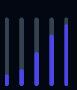
Vertical progress Bar
This shows a vertical Tailwind progress bar.
<div class="flex justify-center gap-5 m-10 items-center">
    <div
        class="flex flex-col flex-nowrap justify-end w-2 h-32 bg-gray-200 rounded-full overflow-hidden dark:bg-gray-700"
        role="progressbar"
        aria-valuenow="17"
        aria-valuemin="0"
        aria-valuemax="100"
    >
        <div
            class="rounded-full overflow-hidden bg-indigo-600"
            style={{height: "17%"}}
        ></div>
    </div>
    <div class="flex flex-col flex-nowrap justify-end w-2 h-32 bg-gray-200 rounded-full overflow-hidden dark:bg-gray-700">
        <div
            class="rounded-full overflow-hidden bg-indigo-600"
            style={{height: "25%"}}
        ></div>
    </div>
    <div class="flex flex-col flex-nowrap justify-end w-2 h-32 bg-gray-200 rounded-full overflow-hidden dark:bg-gray-700">
        <div
            class="rounded-full overflow-hidden bg-indigo-600"
            style={{height: "50%"}}
        ></div>
    </div>
    <div class="flex flex-col flex-nowrap justify-end w-2 h-32 bg-gray-200 rounded-full overflow-hidden dark:bg-gray-700">
        <div
            class="rounded-full overflow-hidden bg-indigo-600"
            style={{height: "75%"}}
        ></div>
    </div>
    <div class="flex flex-col flex-nowrap justify-end w-2 h-32 bg-gray-200 rounded-full overflow-hidden dark:bg-gray-700">
        <div
            class="rounded-full overflow-hidden bg-indigo-600"
            style={{height: "90%"}}
        ></div>
    </div>
</div>
Preview

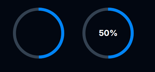
Circular Progress bar
Circular Progress bar without label and with label
<div class="mx-10 inline-block">
    <div class="relative h-40 w-40">
        <svg
            class="h-full w-full"
            width="36"
            height="36"
            viewBox="0 0 36 36"
            xmlns="http://www.w3.org/2000/svg"
        >
            <circle
                cx="18"
                cy="18"
                r="16"
                fill="none"
                class="stroke-current text-gray-200 dark:text-gray-700"
                stroke-width="2"
            ></circle>
            <g class="origin-center -rotate-90 transform">
                <circle
                    cx="18"
                    cy="18"
                    r="16"
                    fill="none"
                    class="stroke-current text-indigo-600 dark:text-blue-500"
                    stroke-width="2"
                    stroke-dasharray="100"
                    stroke-dashoffset="50"
                ></circle>
            </g>
        </svg>
    </div>
</div>

<div class="relative h-40 w-40 inline-block">
  <svg class="h-full w-full" width="36" height="36" viewBox="0 0 36 36" xmlns="http://www.w3.org/2000/svg"><circle cx="18" cy="18" r="16" fill="none" class="stroke-current text-gray-200 dark:text-gray-700" stroke-width="2"></circle><g class="origin-center -rotate-90 transform"> <circle cx="18" cy="18" r="16" fill="none" class="stroke-current text-indigo-600 dark:text-blue-500" stroke-width="2" stroke-dasharray="100" stroke-dashoffset="50"></circle></g></svg>

  <div class="absolute top-1/2 start-1/2 transform -translate-y-1/2 -translate-x-1/2">
    <span class="text-center text-2xl font-bold text-gray-800 dark:text-white">50%</span>
  </div>
</div>
Preview

Conclusion
Congratulations! You have successfully built a Tailwind progress bar. In this tutorial, we covered the steps of setting up the HTML structure, applying Tailwind CSS utility classes, making the progress bar responsive, adding animation and displaying different variant of Tailwind progress bar.
Resources
Subscribe to my newsletter
Read articles from Devwares directly inside your inbox. Subscribe to the newsletter, and don't miss out.
Written by
