[DH] Keeping an organised inventory of annotated screenshots
 Bernice Choy
Background Context
A common knowledge management platform I used at work is Confluence. It’s a web based wiki that allows you to manage your documentations in the form of pages.
A work buddy once shared with me how disorganised the content was in a single page, **an endless scroll of doom**😵💫. He suggested using slides to do knowledge sharing instead, as each slide would represent one step.
Today
I am grateful my work buddy shared this tip with me 😌
Not only am I using it to manage the screenshots I used for my Hashnode articles, it also assisted me when creating documentations at work.
In the perspective of managing screenshots, it allows you to
Group related screenshots together
Identify each step in the walkthrough
In the perspective of creating documentations, it forces you to
Think granular as to what would constitute as 1 step
Identify nuances and potential tact knowledge gaps that only maintainers with context will know about an implementation
Put yourself into the shoes of operators
So brilliant, so unoriginal
Once I share the key elements of creating slide deck, the idea lacks originality - so easy that anyone can do it!
I will be using WPS Office on MacOS. It should be applicable for anyone using Microsoft Word. You may have to find the equivalent for the software you are using.
Slide Deck Outline
Default Layout
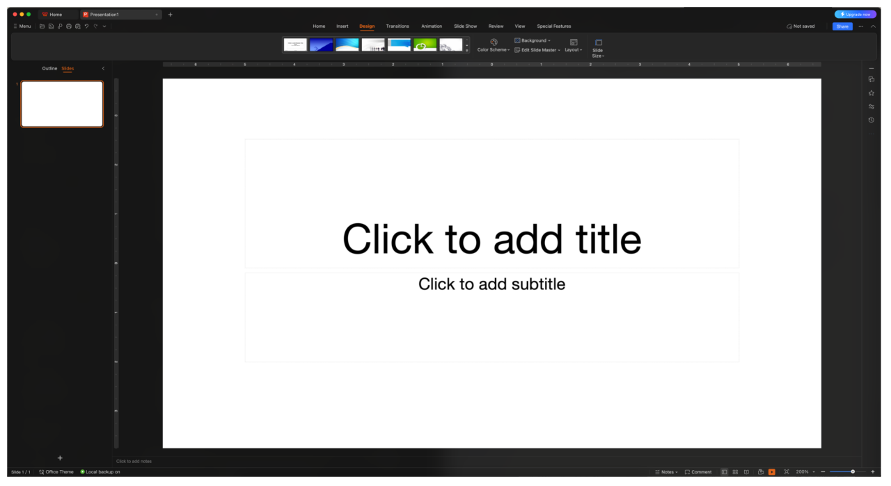
Using WPS Presentation, I create a new presentation file which will always start with the Title Slide layout.
Other Layout to Use
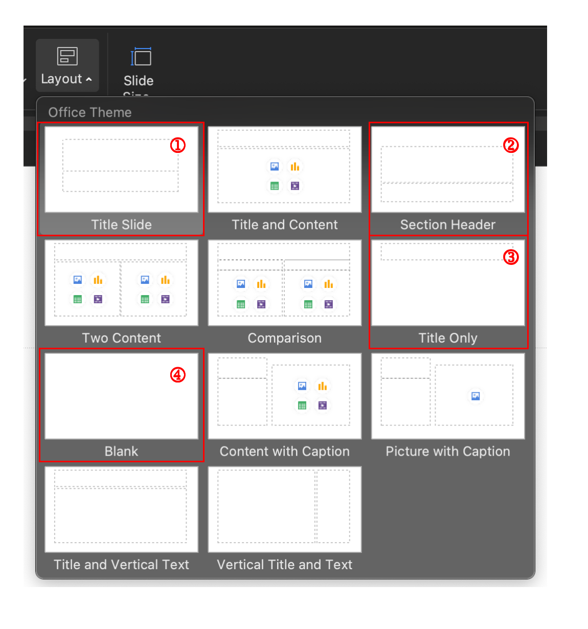
For our context, we will be using the following layouts
Title Slide: Main cover page for the slide deck
- E.g. Project Name for the title, along with general description for the subtitle
Section Header: For the sub sections in the slide deck
- E.g. A feature of the project for the title, along with description about the feature and what will be covered in the section for the subtitle
Title Only: Useful for when focusing into a specific section
- E.g. Indicating a workflow or general purpose, the slide would show screenshot(s) with other information
Blank: Useful for when working solely with screenshots to annotate and/or other information
- E.g. The screenshot is the key focus, and want to include annotations (border, numbers) and/or textbox(es)
Annotations
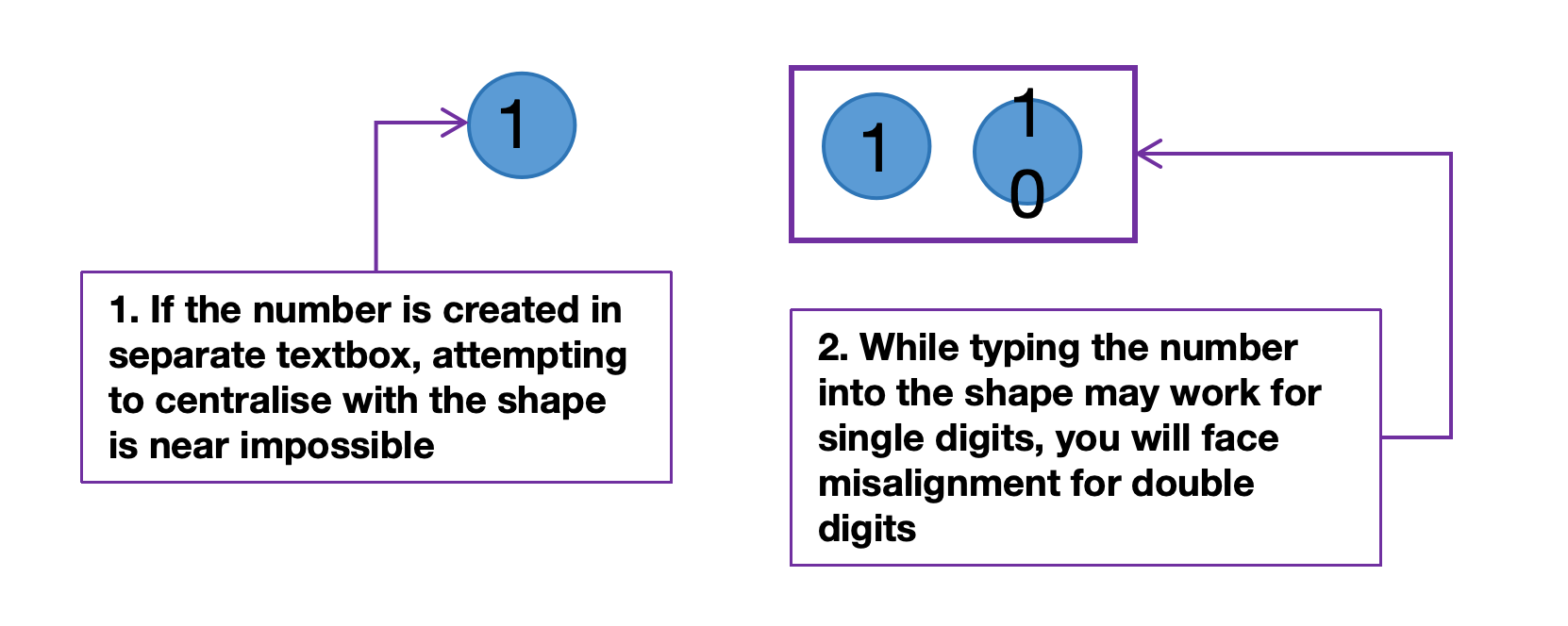
When helping another team with their technical documentations, I observed how the team was struggling to centralise the number in a circle.
If the number is created as text in a separate textbox, attempting to centralise with the shape is near impossible
While typing the number as text in the shape may work for single digits, you will face misalignment for double digits
It led me to wonder if there are fonts that provide circled letters and numbers.
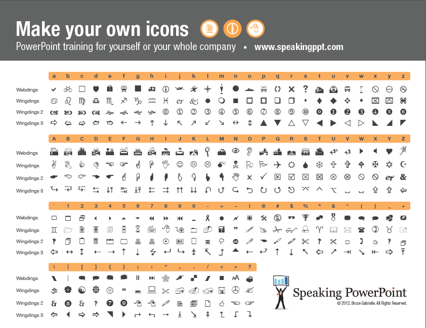
For Microsoft PowerPoint, the circled letters and numbers can be found in the special symbols in the Enclosed Alphanumerics subset.
As WPS Office doesn’t have this option, there are alternatives! I use a font named Wingdings 2 for circled numbers. And for circled letters, I found LingoJam Circled Text Generator that helps generate that.
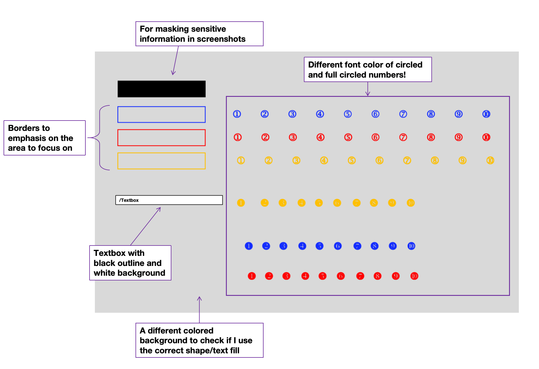
For my convenience, I consolidate the elements I frequently used in 1 slide so that I can copy and paste them easily from a single location as shown in the screenshot below.
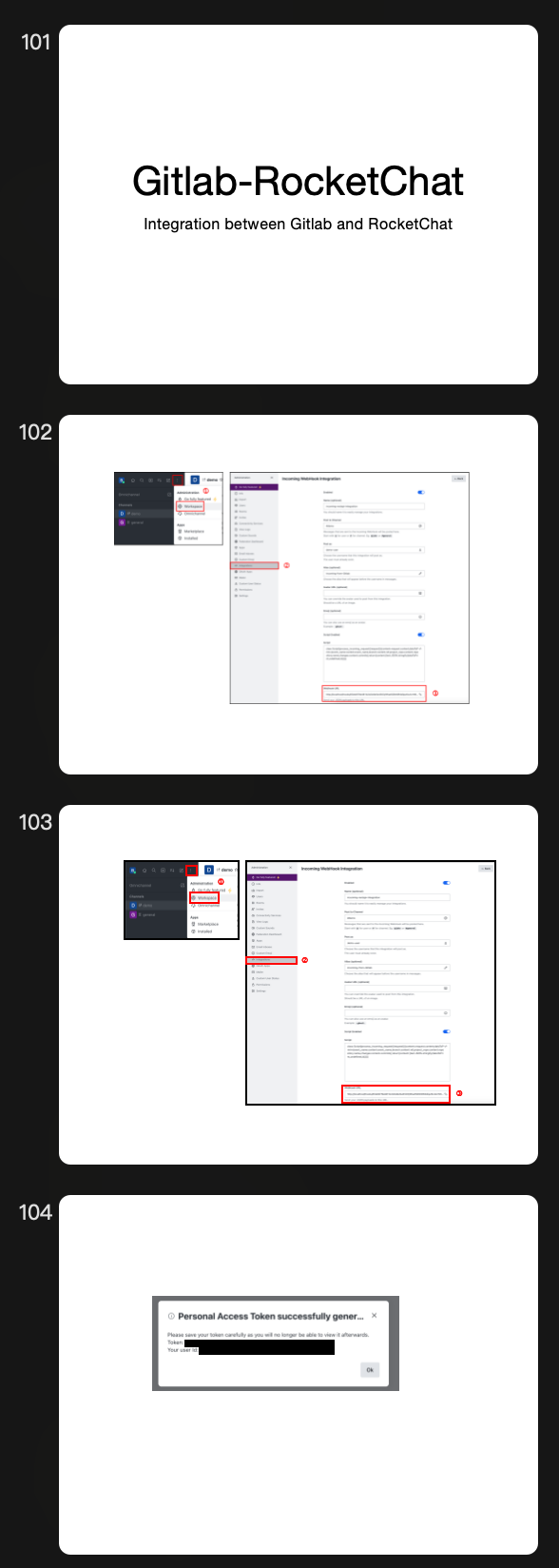
Here’s a small preview of slides that I have created to manage my screenshots for one of my earlier Hashnode article
Other useful resources
Since I frequently create cloud diagrams and workflows, leveraging architecture icons from cloud providers has become a major advantage.
Azure: https://learn.microsoft.com/en-us/azure/architecture/icons/
A beautiful library with SVG logos: https://svgl.app/
With that, you can find the sample template in my Github repository to use for managing your screenshots or creating your documentation with clarity, 1 slide at a time!
Cheers!🥂

Subscribe to my newsletter
Read articles from Bernice Choy directly inside your inbox. Subscribe to the newsletter, and don't miss out.
Written by

Bernice Choy
Bernice Choy
A fledgling engineer dabbling into areas of DevOps, AWS and automation. I enjoy tinkering with technology frameworks and tools to understand and gain visibility in the underlying mechanisms of the "magic" in them. In the progress of accumulating nuggets of wisdom in the different software engineering disciplines!