Pedalling Through Montreal's BIXI Data
 Mathieu Torchia
In our previous article, we discussed the risks of oversimplification and showed how common statistics like the average and standard deviation can be misleading if the raw data is not properly examined first. We’d like to continue this discussion by using a practical example, while also learning more about a Montreal staple: our BIXI bikes. In this article, we will analyze the demand for BIXI bikes per hour of the day. This work will lay the foundation for a future blog, where we will construct some basic models to forecast the future hourly demand of BIXI depending on multiple factors.
The Big Picture: What Does Hourly Demand Look Like?
Let’s start by looking at the bigger picture: how many rides commence within each hour of the day? We can aggregate our data to find the total number of rides that occurred at 5AM, at 1PM, at 8PM, or at any time of the day. This gives us a very clean looking graph:
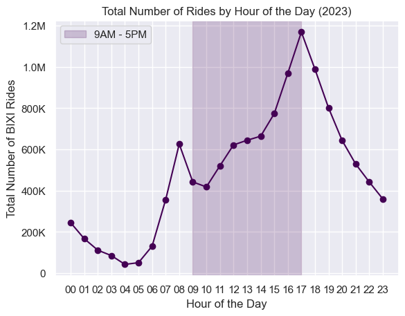
We can get a good sense of the demand behaviour by looking at this line chart. There are a few things to point out:
Peak demand is between 5PM and 6PM, with almost 1,200,000 rides starting between those times.
There seems to be a “local” peak in the morning before 9AM
Very little demand occurs in the middle of the night (<100,000 rides)
While this is a good start, there is a lot of missing or misleading information coming from this graph. We lack details on how this trend changes with the seasons, weather, day of the week, BIXI station, and probably many other important features. It can also be misleading since there is no concept of how representative this trend is of a normal day in Montreal. For example, we stated that the peak was between 5 PM and 6 PM, but what if this is true for weekdays and completely wrong for weekends? The graph above does not allow us to understand the more nuanced aspects. Let’s dive a bit deeper!
A Closer Look: Weekdays vs. Weekends
Out of the missing features enumerated above, we will start by diving deeper into the difference in demand patterns depending on the day of week. Specifically, how does the demand for BIXIs differ between weekdays and weekends?
Let’s rerun the same graph as before, while changing two important parts:
Graph two lines, one representing the week (purple), and another representing the weekend (green)
Instead of showing the total BIXI rides across the entire year, show the average rides per day, as this produces numbers that are easier to digest and more relevant for the reader
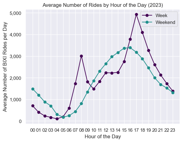
While the weekday trend looks similar to the first graph, the weekend trend clearly differs. Here are some characteristics of the weekend trend that differ from the weekday trend:
There is only one peak, a little earlier than the weekday peak
The peak is much lower than the weekday peak (3,500 vs 5,000)
There are more riders riding throughout the night
While the first graph gave a good indication of the general demand for BIXIs, it definitely failed at showing this divergence between week and weekend. We can go even further to see how this relationship would change at the day of week level, which we can do with a simple heat map:
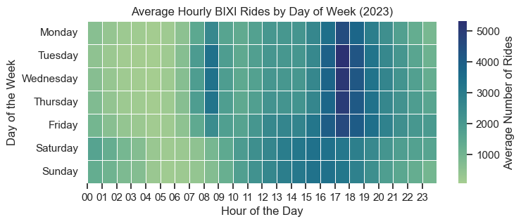
We can see many of the characteristics that we saw in the previous graphs, such as weekday peaks around 8AM and 5PM, gradual weekend peaks around 3PM, and low ridership during the middle of the night. There are also some additional insights to gain from this illustration:
As we move from Monday to Friday, we tend to see a bit more users later at night (from 10PM to 3AM), and then a clear increase in late night rides on Saturday and Sunday
Tuesdays, Wednesday, and Thursdays have the highest peaks, which can be shown by the darker squares at 8AM and 5PM
Overall, while there are differences between the days, all weekdays tend to follow a similar pattern, and all weekends show a consistent behaviour as well.
The Limitations of Averages: Are These Numbers Representative?
While these visualizations allow for a deeper understanding of the demand for BIXIs, there are always ways to improve them. One of those ways can be to add some insights into meaningful are these averages? For example, consider these two sets of numbers:
| First Set | Second Set |
| 234 | 555 |
| 1014 | 556 |
| 3142 | 558 |
| 4522 | 559 |
While these two sets of numbers look like they have nothing alike, they have one thing in common: they have the same average of 557. However, everyone can agree that the average is much more meaningful and representative of the second set because the values are much closer to it than in the first set, e.g. the variance is lower. How can we introduce this type of analysis in our previous illustration?
Understanding Percentiles: What Do Percentiles Tell Us?
To better understand how well our average curves represent the demand for BIXIs in Montreal, we can add visuals for the 5th and 95th percentiles.
If the 5th and 95th percentiles are close to the average, it suggests that the demand curves are fairly consistent throughout the year, regardless of other factors. Let’s add these curves to the weekday and weekend charts.
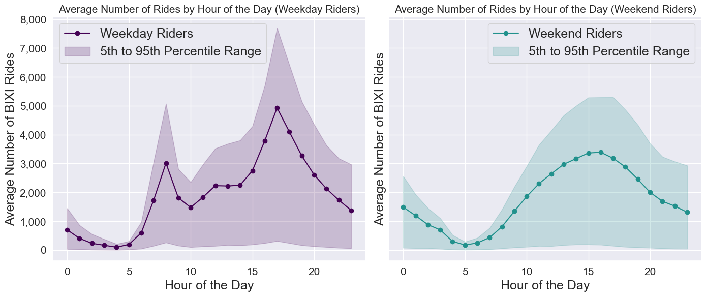
Ouf. These lower and upper bounds are quite large. For example, if we look at the left graph, there is an average of ~5,000 riders at 5 PM on weekdays. However, if we take the number of riders for all the weekdays at 5PM, the middle 90% of those observations ranges from 300 to almost 8,000… This large range means that for the majority of the days, the demand for rides at 5PM can vary wildly: potentially due to other factors such as the weather and the season.
While the average still gives a great indication as to the general trend over the day, it does not necessarily mean that it is an accurate representation of any random day in Montreal.
Another interesting way to view this is by drawing a line for every single day in 2023, and overlaying it in one graph, which can be shown below.
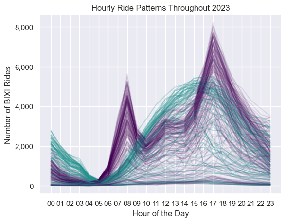
The advantage of this type of graph is that it avoids averages entirely! We can see the raw number of rides for every single day, represented in a purple line for the weekday and a green line for the weekend. Here, while we do see a lot of the rides following the average trends as we showed before, there are still many other purple and green lines that seem to be going in a completely different direction.
Bringing it All Together: What’s Next for BIXI Demand Analysis?
This dive into BIXI ridership data really shows why raw data matters—averages and totals only scratch the surface. By looking at hourly trends and splitting weekdays from weekends, we found patterns that would’ve stayed hidden otherwise. It’s clear that weekdays and weekends tell completely different stories, with weekday patterns varying a bit depending on the day. It all reflects how people use BIXIs for everything from commuting to leisure.
The percentiles added another layer to the story, showing just how much demand can swing depending on things like weather or season. For example, the weekday 5 PM peak might average around 5,000 riders, but on some days, it’s as low as 300 or as high as 8,000. It’s a great reminder that averages don’t always show the whole picture. The graph with daily lines made this even clearer—most days follow the general trend, but some are total outliers, going in completely different directions.
In our next blog, we’ll take this analysis and build on it to create a predictive model. We’ll go step-by-step to explore how a model can help us forecast demand and, more importantly, how diving into the details of modelling shows just how powerful it can be. By considering factors like weather and season, we'll see how accurately we can predict BIXI demand and learn a lot about modelling in the process.
Subscribe to my newsletter
Read articles from Mathieu Torchia directly inside your inbox. Subscribe to the newsletter, and don't miss out.
Written by

Mathieu Torchia
Mathieu Torchia
With a Master's degree in Economics from McGill University, I currently serve as a Business Analyst in the Revenue Management department at Air Canada. I am eager to learn more about answering tough questions with the help of data analysis, data science, and machine learning. I aspire to become an expert in the field and eventually spend the rest of my days teaching others about math, stats, and data science.