Scoring the Hat-Trick: Milestones at Hashnode
 Lakshya Thakur
Introduction

Alright, alright, alright !!! I have officially completed three years at Hashnode now. If you have been following my blog for a while, I have this ritual of documenting what all went in the past year at my job.
My general process for documenting is :-
Go through my commits across different projects and social media interactions.
Note down high level headings in Apple notes.
Frame an article out of what I can remember.
You can catchup to all my previous experiences here :-
Blog dashboard revamp
I think this is the largest bit of work that I undertook at Hashnode. Another one that comes close to this is the WYSIWYG editor but yes probably the longest I have worked on the project from start to finish and I am excited to share all the tidbits about it here.
Since I joined Hashnode, I have seen our design language evolve into something great overtime. We have worked on bringing consistency to the whole experience and we are still pushing for it everyday here. The main site has gone through good amount of design changes in my tenure. The major change started with our feeds and then there was an editor design revamp.
But we knew that our blog dashboard felt inconsistent with our new design language. There were so many times we wanted to priortize revamping it but also knew that it’s not a small job and required dedicated engineers to always work on it irrespective of other bugs or features that might be requested.
A high level overview for the work :-
Creating 23 UI screens from scratch for the whole dashboard in the new codebase.
Creating new GQL APIs to power this new dashboard
That needs a good amount of PLANNING!!!

The plan
Our usage of Discord forums have increased quite a lot over the last 2 years. For every major feature, we open up a forum and tag in the respective people involved in the decision making. This has worked good so far in practice and we also opened one just called Blog Dashboard for this project.
Our CTO Sandeep shared some interesting insights on why this revamp is necessary for us right now based on conversations with users and the usage analytics. The team also felt aligned with the premise. Our designers already had the first iterations of few screens ready for us based on their convo with the founders.
We use Linear for the project management purposes and man this might be the most PM style breakdown of stuff I might have done in my career till now. Our project was called Rebuilding blog dashboard and the first ticket I created there was to do a small POC to ascertain how to divide the whole project into a bunch of independent tasks that can be picked up.

This POC involved creating the the General page of blog dashboard without adhering to new design for now and integrating it with a temporary UpdatePublication mutation. Doing the POC was helpful in ascertaining the efforts required per screen and also grouping screens together which follow the same pattern.
This exercise resulted in creation of a big Notion doc with projected efforts and doubts which were resolved with help of Jannik Wempe and Sandro Volpicella for all API efforts. The clarifications further helped in creating individual tasks and further bifurcated subtasks for each screen in the blog dashboard. What this meant is that we had figured out close to 60% unknowns and were ready to tackle the remaining 40% as we progressed with the revamp.
We divided the screens in three sets and started with Set-1 of 6 screens. Also everything was featured flag from the start. Only hashnode team members could see the new blog dashboard. Our first set of feedback came from founders and the designers.
The execution
I got to work with Ayodele Samuel Adebayo for the whole revamp of blog dashboard and it was a great collaborative experience. We closely worked on the UI revamp of things. I undertook some of the initial GQL mutations work until Vamsi Rao joined us to speed things up there.
During this work, a lot of components like InputField, TextArea, Select, Breadcumb, Colorpicker and much more were created for our in-house component library. Good amount of work went into translating the design in functioning components that can be reused throughout not just dashboard but also future screens (and it paid off!!).
We completed our first 6 screens of Set-1 before mid of January.
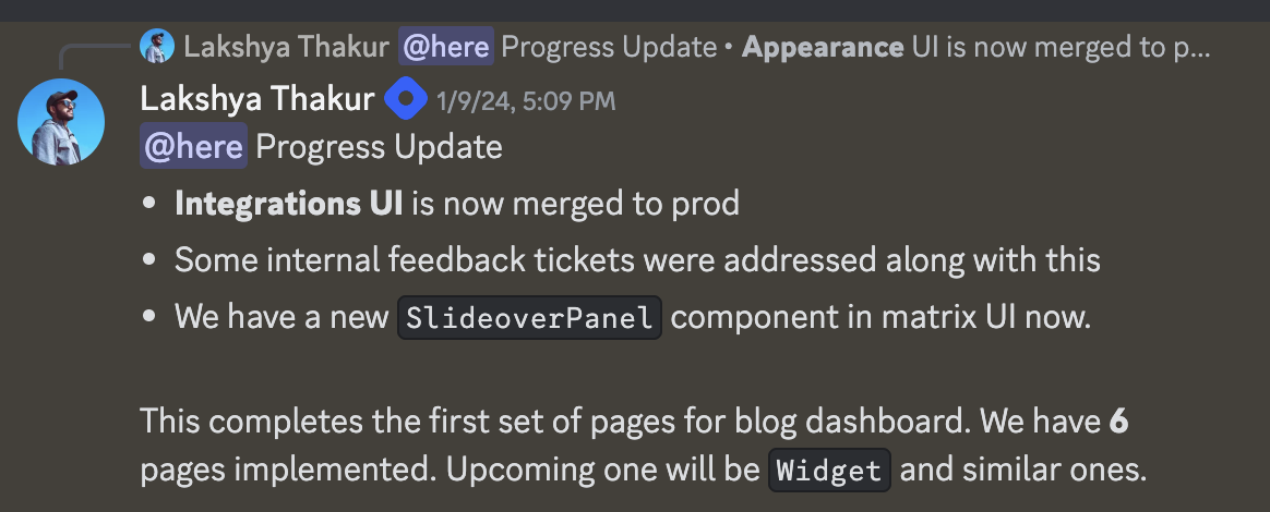
As things were progressing, we realized that the whole revamp will be longer than anticipated and instead of a big-bang release, we will release it in phases on a /beta prefixed route until we can totally replace the existing dashboard. Shad Mirza also joined us to fast track the API efforts here. The feedback from real users is necessary to validate the new experience even if it’s just a set of screens that they can try. So we decided to ship 13 screens in the Phase-1 of the release by Feb end to the end users and boy did we do this with two more days in hand 😎

Okay now I had to take some break off from the blog dashboard work to focus on Docs, specifically the new docs editor and build it along with Rajat Kapoor and Dev Shekhawat . Post that I can jump back to the project again. So before leaving, had a good discussion with team on future milestones of Phase-2. I was only now involved in code reviews of blog dashboard.
I kept a close eye on the blog dashboard progress nevertheless. In Phase-2, the new screens were going on to prod directly to users post a design review and code review. But this also meant that until both reviews are done the thing can’t be shipped to prod. This started to look like a bottleneck to me because sometimes reviews are bound to take time and if hurried just for the sake of shipping to real users, we might compromise quality. So we took inspiration from Phase-1 again and started shipping bits behind feature flag to prod directly. The design review can then happen on prod without the new users getting effected and code review can happen in multiple phases as per the bandwidth.
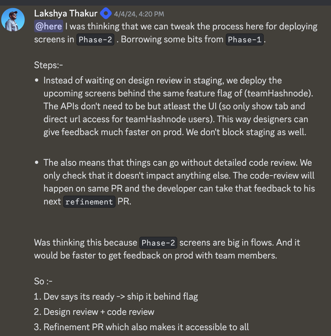
And this worked well. We have been following this model now for big features at Hashnode.
So after giving almost 2.5 months to the Docs which would be post mid May, I jumped back to blog dashboard and by now we are in the end stage of Phase-2 screens. I worked along with Sam on Domain screen for some final touches and also worked on revamping the Members page Role based Invite system based on user feedback.
We had now 18 screens done and 5 remaining. It was time to gear up for the

We had a good discussion around this again and decided to move old dashboard to a /legacy route and make the /beta one default. Since most of the screens were ready it felt like the right time to make them default for all users and go more aggressive on user feedback. The remaining 5 will get redirected to old dashboard until one by one they land up in the new one. And finally after 2 more months of work and multiple discussions, we finally shipped the remaining screens with the last one being GitHub. And I didn’t plan it but it took exactly 9 months to get to this stage. It’s almost like a baby 👶.
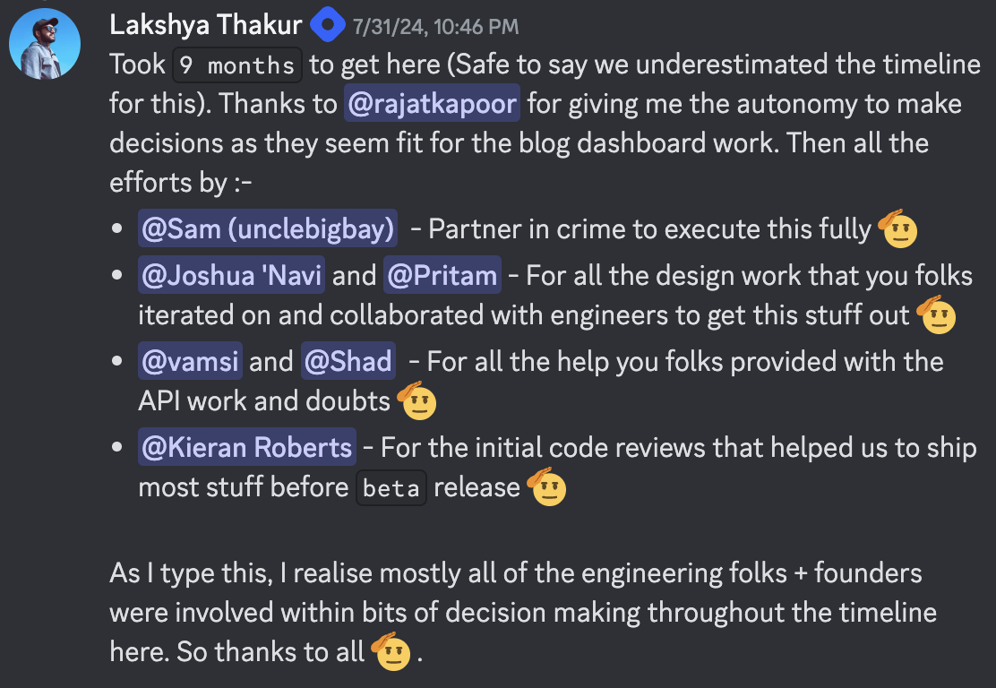
Taking lead on this was a learning in itself. I realized that besides the technical bits of a long project, how effectively you organize and communicate the progress is equally important. We did more than 50 progress update messages in this forum over the course of 9 months. That averages out to at least 1 update/week which kept us going and pushing forward more and more.
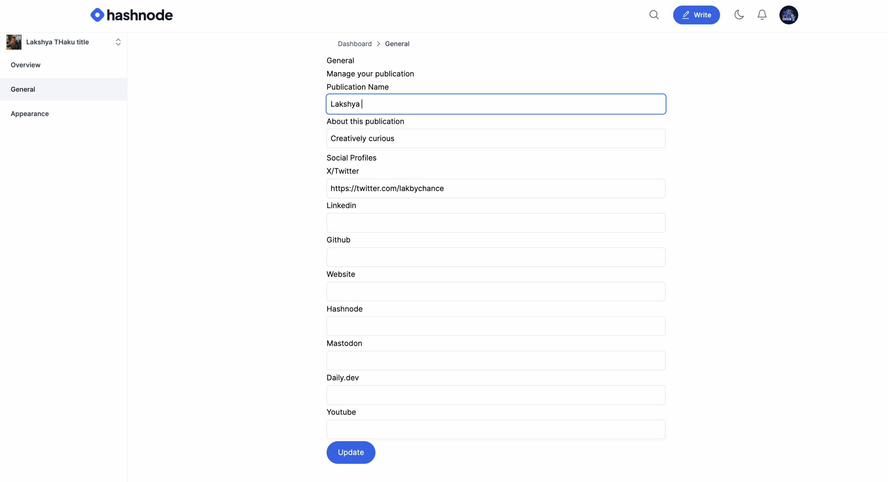
Btw, this is what very first push to prod looked like for Blog dashboard :-
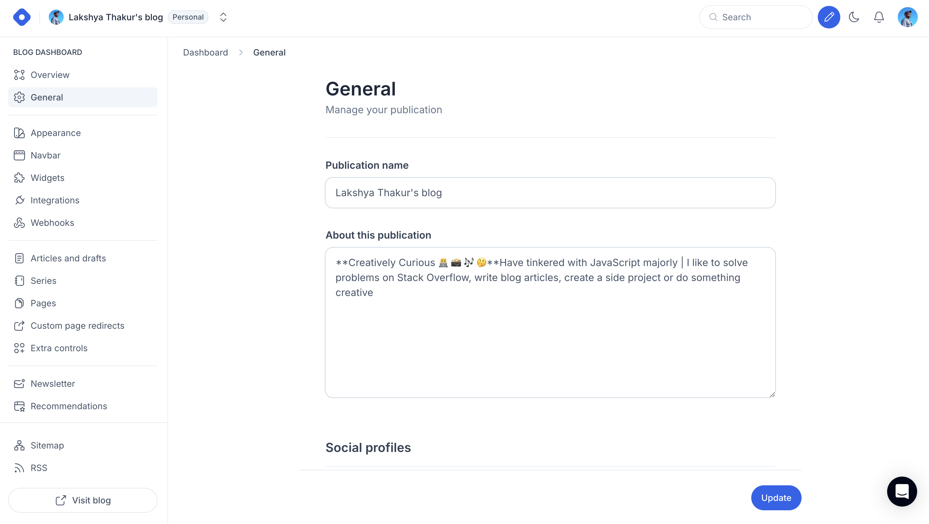
This is what it looks like now :-
Docs editor
Now when I took a break from implementation of blog dashboard, I was building stuff on the editor forefront of our new docs offering.
Btw, this is the undisclosed POC that I teased here in my last year end experience post. Though we redid all of the stuff from there in terms of UI and backend, I am glad this took shape in a released product for users.
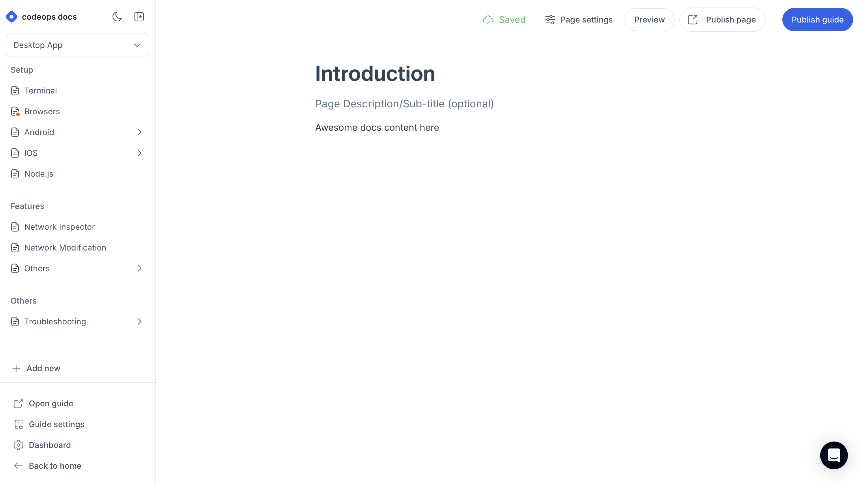
When I was brought in we were just starting in with editor progress. My role was to figure out everything related to the left sidebar which involved :-
A guide selector to navigate through diff guides + creating a new guide
Create, Update, delete and move (drag and drop) all sorts of documentation items (section, page or link).
Update existing Guide settings
The most interesting bit out of this was the drag and drop experience. I went through different libraries here and experimented with them. We finally went with react-complex-tree. It’s a nice accessible headless tree library needed to build experiences like so. But there was an issue with DND experience where the drag line didn’t appear at the expected position when dragging the items. The reason was that not all items within our UI were equally spaced and had padding or margins around them. The library needed fixed height of each item which I got to know as I dug up existing issues and discussions. So this was an essential problem to fix.
That’s when I started looking into the core code responsible for the logic and pair programmed with Claude 3 sonnet for 2-3 days to figure out a solution where we can patch the library and make our requirement work. And we did it !!!.
I shared the solution on the OSS discussion as well if someone is interested. Though I think the latest versions of the library might have solved it (haven’t gone through that yet). We also wanted to choose an existing solution to not invest a lot of time in building it from scratch but I would now recommend to look at Pragmatic drag and drop if you have good time to build a fully controllable solution. I am yet to actually dig in it but it comes from the creators of react-beautiful-dnd and is a successor to that.
So after building the left sidebar for docs editor, there were couple more stuff that I got involved in from bringing editor as close as to the design possible which involved refactoring some existing implementations. And also integrating the editor with the published view.
I also started getting involved again in blogs dashboard implementation work again after 2.5 months of docs work.
Now I was context switching between blogs and docs since both had their launch priorties.

Docs client
This time the work was on the published view of your docs or what end users will actually see. This was primarily being handled by Rajat and Harsh at the moment. A lot of stuff over here was built in a quick POC fashion so it needed some good amount of refactoring to evolve into a product.
Layouts, layouts and layouts
This might be the 100th time I am working on layout related UI stuff at Hashnode. My first stint was the feed layout and here we are again.
I worked on bringing the header and left sidebar closer to our intended design along with functionality. The sidebar was built from scratch using learnings from the docs editor.
Preview mode
Then I worked on to support preview mode here. So just like your blogs, you want to preview how the thing will look when published, you also want to do same for your docs.
This was done in collaboration with Florian Fuchs. Fun fact, I also worked on supporting the preview mode on blogs during my first year at Hashnode.

A good amount of reusable code was written when supporting this. Building on top of it has made things predictable now.
Performance improvements
We wanted to improve the first interaction experience for our users when they click on a documentation page. To do this we tapped into browser prefetching . I got to learn about Speculation Rules API while working on it. We built a hook that relies on speculation rules if a browser supports it or fallbacks to <link rel=”prefetch”>.
These are the top three that come into my mind when writing this article but a lot of work went on the whole docs product from editor to dashboard to the published client view with close collaboration between different team members. I think we also benefitted a lot from using the same patterns & components that were created during our blog dashboard work to fast-track development of docs features.
Onboarding revamp
Just before launching our docs offering, we also wanted to simplify the experience of creating a blog or documentation. For this, we discussed internally a lot and came up with the final decision of having a new home screen where users will see their existing blog and docs project as well as can create new ones from there. We moved the feed to /community route. This was a big move since most of our users are used to the feed when they open HN.
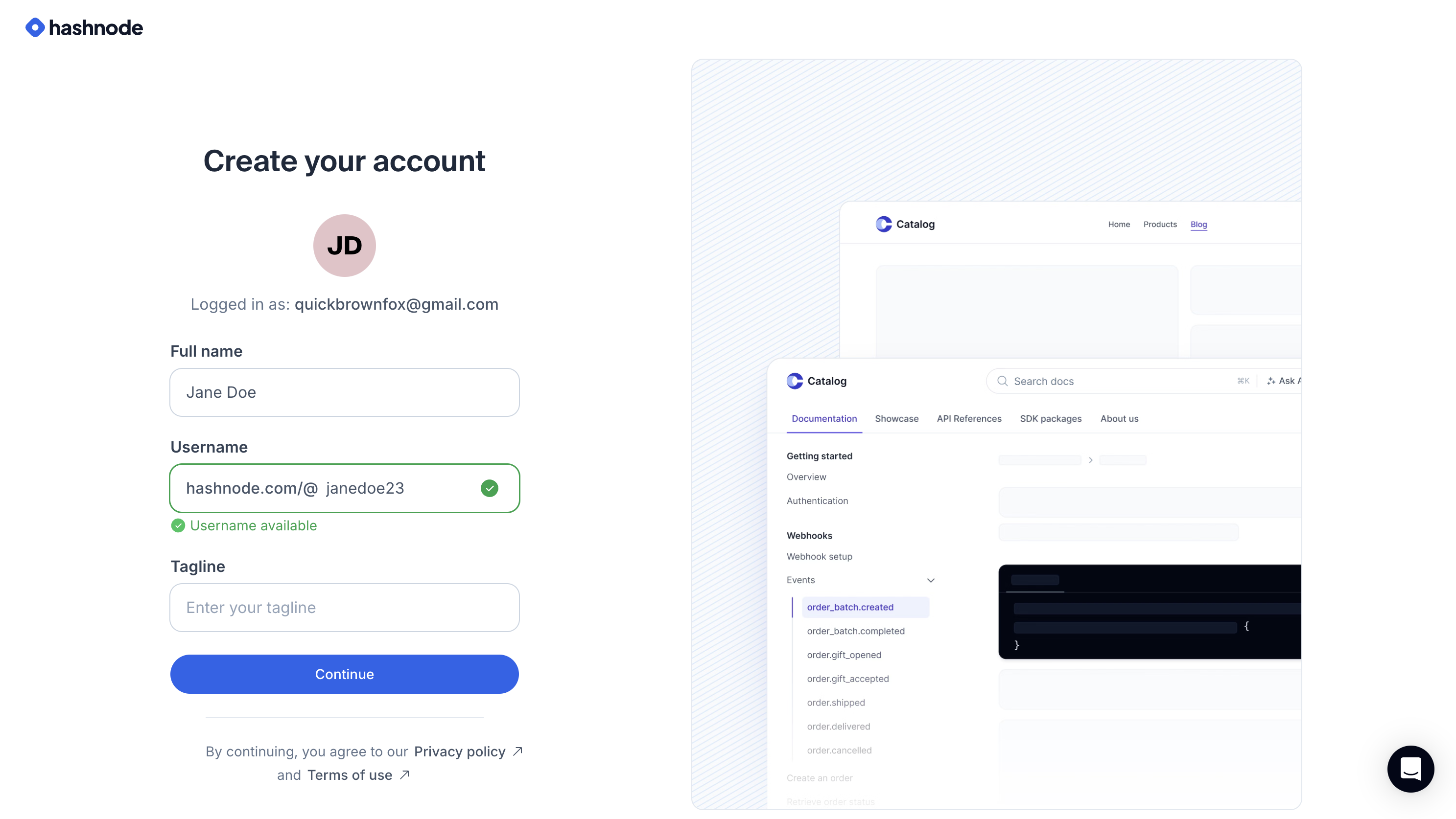
Simplification also meant that our onboarding experience doesn’t differentiate between a blogs and docs user. Our onboarding was fined tuned for blogs but the time was here to simplify it further and just have one screen to let a user quickly create their account and get started with their first blogs or docs project.
I remember working on Onboarding UI revamp when I joined Hashnode. This was the second time I was touching the bits around here.
Since this was a crucial entry point for new users, we implemented this in a featured flag way so that existing users still see the old onboarding until we were ready to ship both new home page and onboarding together.
Here is how the new onboarding screen looks like :-
Mermaid support for Docs and Blogs
Well the good news is that both our offerings now support mermaid diagrams 🎉.
Actually the first efforts here dated back to our Internal Hackathon last year where I tried to support it for blogs but wasn’t happy with the solution that I came up during the hackathon week. So I discarded it.
This year Sandeep reached out to me if we can do it for Docs. Now Docs has a mdx renderer pipeline which makes creation of custom react components easy and with initial POC efforts the last year + some more digging to make it work with mdx, I was able to validate it that it will work here. So we first shipped Mermaid support for our Docs. Here is how it looks in practice :-
Then few days later, I was reached out again to see if we can make it work for Blogs. I knew I wasn’t happy with the old solution there but having worked on Docs, I got a new idea of tackling this problem and that solution worked well. The editor abstractions are same in both docs and blogs. Only efforts that went for blogs were regarding the render flow in published view.
It’s funny how a product (docs) that was created after blogs got a feature first and some inspiration from work over there helped us bring the same feature to the blogs product.
Quality of life improvements
Graphql Eslint plugin to catch caching issues
As we got into using GraphQL queries and mutations to build features at Hashnode, we ran into a bunch of bugs. The main problem was that the id was missing in the queries and mutation responses. This becomes a real headache when you do a mutation and expect the next query to give you updated results.
Telling developers to always remember to grab the id field wasn't a long-term fix, especially with our fast-paced development and how easy it is to miss things.
So I worked on implementing a eslint plugin which can solve this problem for us and wrote my second engineering article here.
Deploying In-house Avatar generation service
As part of new onboarding, we also shipped in-house avatar generation service. Earlier we relied on ui-avatars.com to generate avatar for each user but wanted to use our own font for the new ones to match with our design. Fazle Rahman worked on this avatar service and I got looped in to bring it to deployable state along with UI integration. Locally, the service needed a puppeteer instance to convert svg to png which wasn’t going to work in a serverless world where the service had to be deployed without some extra deployment work. So I looked for alternatives there and came across sharp first which worked in practice but didn’t allow use of custom fonts which defeated the purpose. Ultimately , resvg-js lib came to the rescue to solve this problem in serverless environment.
Feature flagging + design/code review optimization
I think this was one of the major learning that has worked well for stuff you see being created at Hashnode for more than a year now.
I personally advocate a lot for feature flagging (FF) stuff and getting it to production fast using this approach. This doesn’t mean that we will just ship bare bone to production on a FF. But it means that after the developer themselves have thoroughly tested the feature in their local dev along with ensuring quality metrics, it’s time to get it to production for internal team members.
I have already spoken about it’s advantage in the blog dashboard section but to reiterate:-
This helps in validating design with production data.
This enables the code reviewer to take their time to review the code properly.
The quality of product that you can ship to the end user with this approach will be higher because of the confidence you have with how it looked in production when the internal team tested it. Again, our scale of team and product is different so experiment with what works best for your team and product.
Hacking a side project that converted articles to songs
I was able to hack a side project called Hasunode over one of the weekends this year which would convert a Hashnode article to a song 🎶. And it was well received by the users. In fact, it actually won the first place in one of the Peerlist project weeks ✨.
Hashnode workation in Bangalore
Almost our whole team assembled in Bangalore, India to work together under the same roof for a week during the month of October. We also created a one week of roadmap items that we want to target only in this week. This included stuff other than our ongoing feature work. It could be any quality of life improvement, a small feature etc which you can wrap up in a week. This is when I actually shipped the Mermaid support on Blogs.
We also had some interesting conversations regarding our future roadmap and how things are looking for us right now.
We celebrated Jannik’s birthday together and had great food and drinks at different places. I also got to play Badminton with the German folks and had intense matches with them. Got to meet and have interesting talks with our ex-shippers at Hashnode - Girish Patil and Rajat.
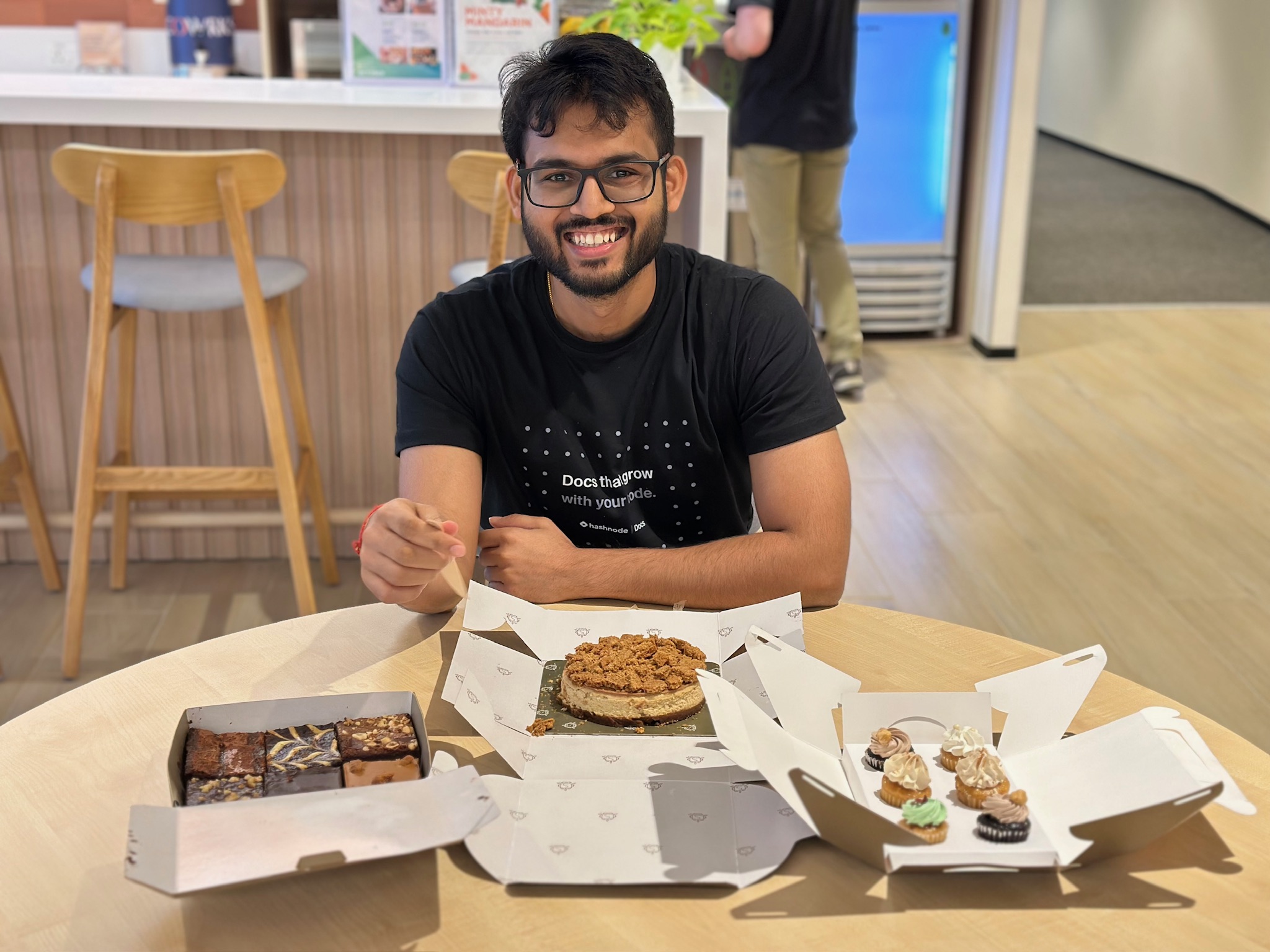
Also, I was going to complete my 3 years in the next week of the workation so the team surprised me with the early celebration with my favourite Lotus biscoff cheescake 😋
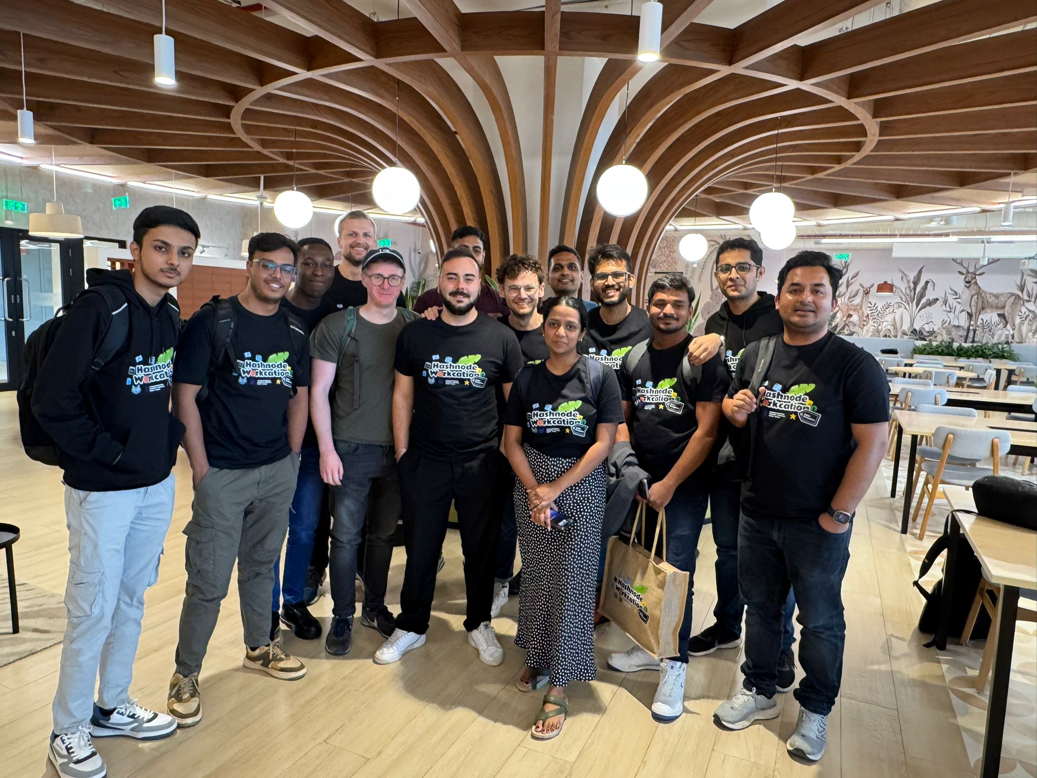
We worked out of this Coworks in Bellandur for a week 👇
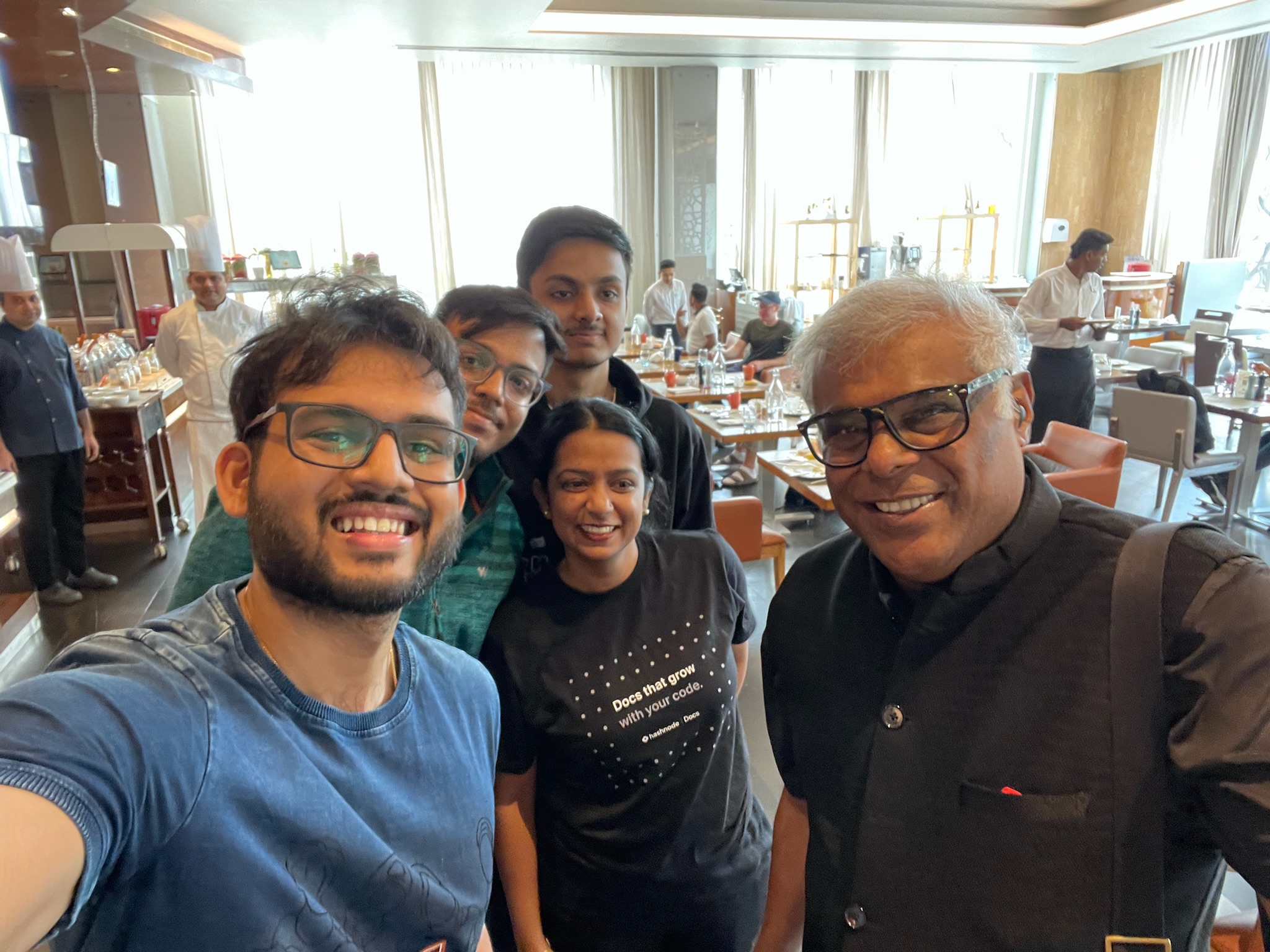
Running into Ashish Vidyarthi at our Hotel was not something I had in my list but great to interact with him for those few seconds
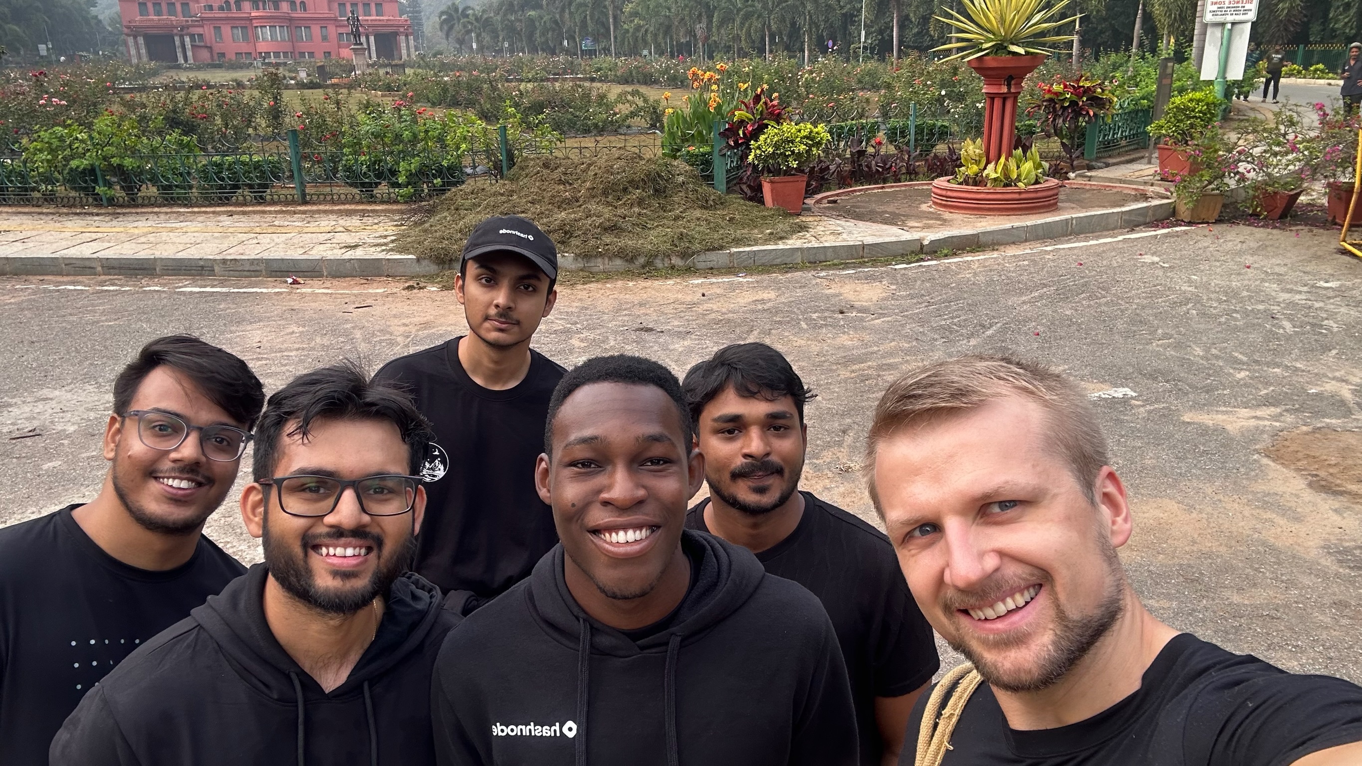
Some of us went to Cubbon park in early morning of our last day. Jogged 2km along with Jannik to be out of breath and ending up having a 160 bpm heartbeat while him being at 130 bpm and me questioning all of my life choices. But it’s super fun to be competitive with him.
Also on the last day, enjoyed spending time with the team doing Go-karting, Laser tag and Bowling. Overall it was a great experience from stay to all goodies we got 😉 and obviously getting much more familiar with in person thoughts and culture of the team members.
What’s cooking now ?
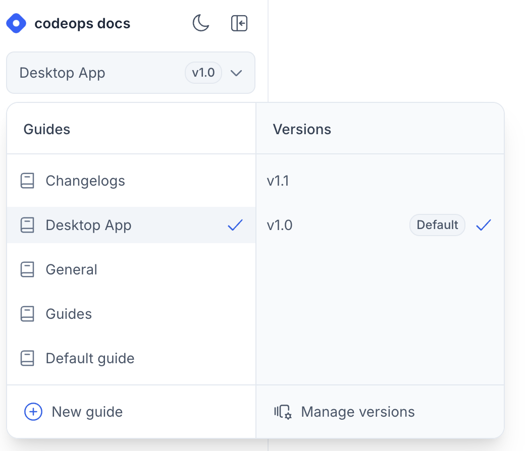
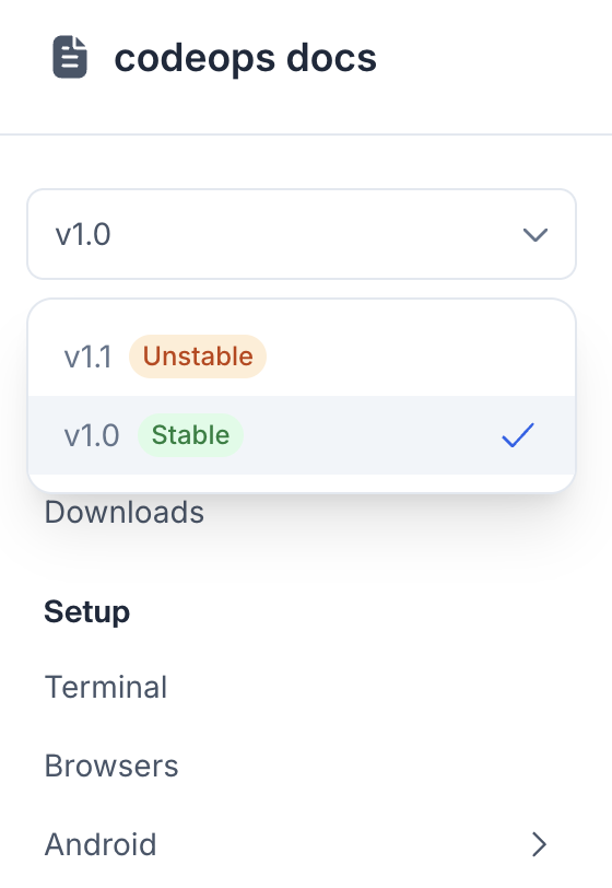
Well as some of you might know that post our launch of Docs by Hashnode, we have been actively listening to customer feedback and improving the offering. Since then a lot of things have been shipped already and one the major feature that cater to our Startup and Enterprise plan users is going to be released very soon. It’s bringing versioning support to the docs.
This again required some good amount of discussions and planning to execute to ensure everything works well for existing users while we build this in a iterative fashion.
In fact, we have been shipping it incrementally over feature flags and it’s almost there. I got to collaborate with Kieran Roberts and Jannik for building this.
Excited to bring it live for all users !
Here is a sneak peak of the editor and published view :-
What else ?
Well this is a long article already than what I had in mind. If I go on rambling about some interesting bug fixes and more things that I got to ship, it’s gonna take more words and probably bore out the readers. Also I have realized that I can actually share this kind of stuff in set of posts on X or Linkedin. Here is a list of misc interesting bits I shared over social media which touches aspects of my work at Hashnode :-
Wrapping up
Well it’s been another interesting year at Hashnode. Besides the technical bits, I got to interact with almost all team members to work on one or the other aspects of the products. This probably was the year of collaboration for me. Also leading one of the longest running projects of my career till now in a startup is something great to think about personally. We are collectively figuring out stuff at Hashnode on a daily basis but I am proud of all that we have done till now as a team 🚀.
Subscribe to my newsletter
Read articles from Lakshya Thakur directly inside your inbox. Subscribe to the newsletter, and don't miss out.
Written by

Lakshya Thakur
Lakshya Thakur
Have tinkered with JavaScript majorly | I like to solve problems on Stack Overflow, write blog articles, create a side project or do something creative.