A Curated Collection of 100+ Beautiful OpenGraph (OG) Images
 anhphong
Hey developers! 👋 As someone who's been building gleam.so (an OG image generator), I've spent countless hours researching and analyzing how successful companies and developers craft their Open Graph images. Today, I'm excited to share a curated gallery of 100+ beautiful OG images from real websites, along with insights on what makes them effective.
Why OG Images Matter
Before diving into the examples, let's quickly understand why OG images are crucial:
They increase social media engagement by up to 40%
They help your content stand out in crowded feeds
They provide instant visual context for your content
They improve brand recognition
Common Patterns from Top Websites
After analyzing these 100 OG images, here are the key patterns that emerged:
1. Typography-Driven Designs
The most effective OG images often rely on strong typography:
Clear hierarchy with 2-3 font sizes
High contrast for readability
Limited text (5-7 words maximum)
Sans-serif fonts dominate (~78% of samples)
2. Color Usage
Successful OG images typically follow these color patterns:
2-3 primary colors
Brand colors as accents
Dark text on light backgrounds (65% of samples)
Subtle gradients for depth (42% of samples)
3. Layout Patterns
Common layouts that work well:
+-----------------+
|  Logo     Title |
|  Main Message   |
|  Visual/Graphic |
+-----------------+

+-----------------+
|  Visual  | Text |
|         >| Area |
+-----------------+
4. Content Types & Examples
Blog Posts
<!-- Common meta structure -->
<meta property="og:title" content="Title: Subtitle | Brand" />
<meta property="og:image" content="https://example.com/og.png" />
<meta property="og:image:width" content="1200" />
<meta property="og:image:height" content="630" />
Example dimensions and ratios:
Most popular: 1200×630px (Facebook/Twitter)
Alternative: 1200×600px (LinkedIn)
Product Pages
Common elements:
Product hero shot
Brand logo
Clear value proposition
Price/CTA (in 15% of samples)
The Gallery
You can explore all 100+ OG images in our curated gallery: gleam.so/gallery
Some standout examples:
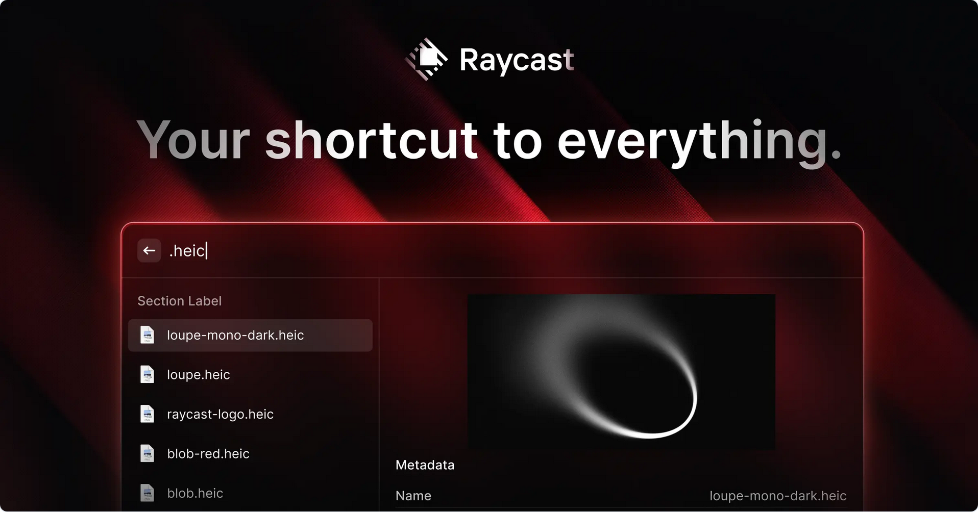
Raycast
Dark mode excellence
Product UI integration
Animated grain texture
Brutalist typography

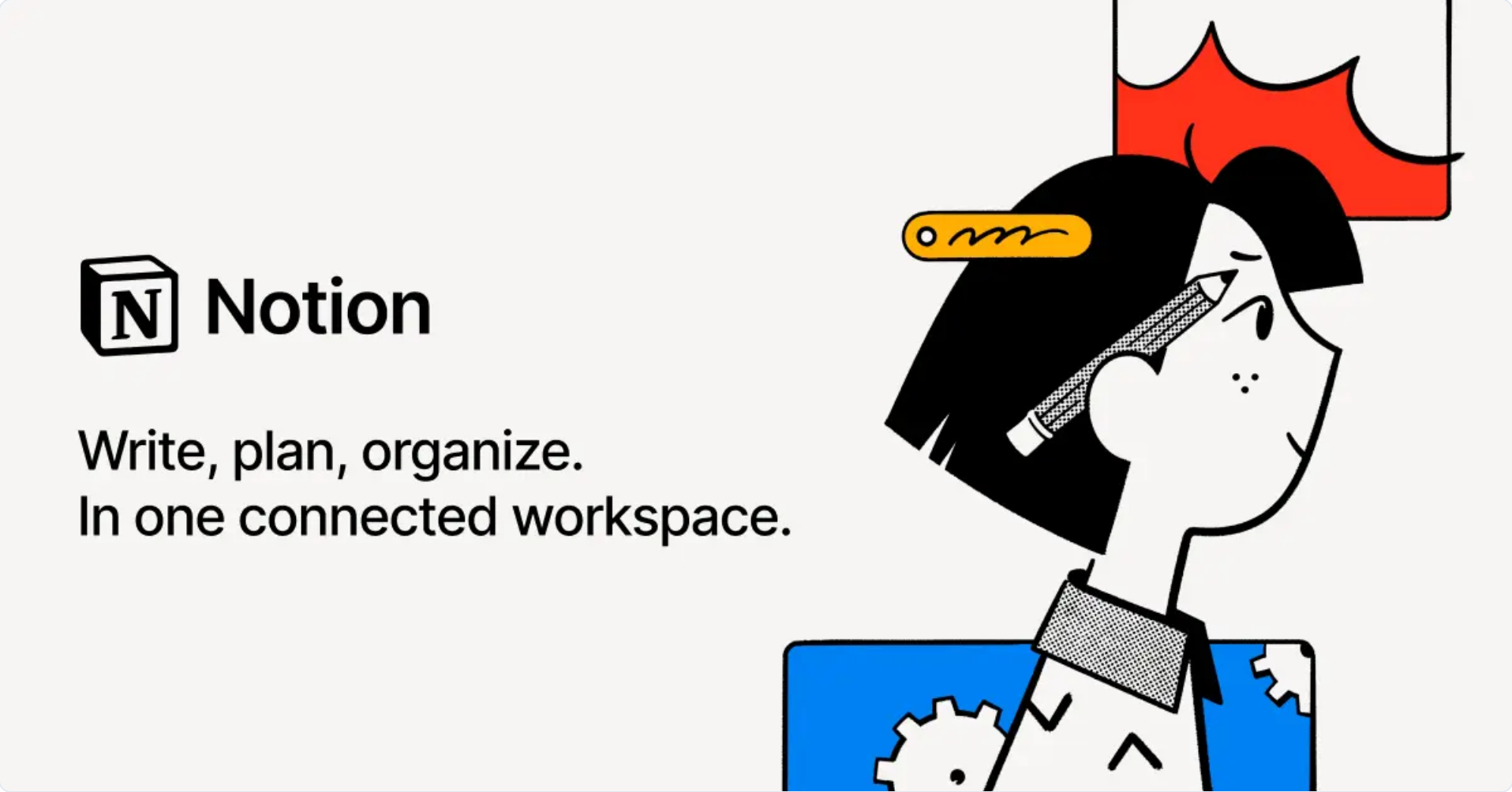
Notion
Clean, minimal composition
Perfect balance of light and dark elements

Linear
Bold gradient backgrounds
Minimal copy
Strong visual hierarchy
Product screenshots integration

Technical Implementation Tips
For those looking to implement similar OG images, here's a starting point using Next.js 14:
// app/api/og/route.tsx
import { ImageResponse } from 'next/server'

export async function GET(request: Request) {
  try {
    // Font loading
    const inter = await fetch(
      new URL('./Inter-Bold.ttf', import.meta.url)
    ).then((res) => res.arrayBuffer())

    return new ImageResponse(
      (
        <div
          style={{
            height: '100%',
            width: '100%',
            display: 'flex',
            flexDirection: 'column',
            alignItems: 'center',
            justifyContent: 'center',
            backgroundColor: 'white',
            fontFamily: 'Inter',
          }}
        >
          <div tw="bg-white flex p-10">
            <div tw="flex flex-col flex-1 pr-4">
              <h1 tw="text-[48px] font-bold text-gray-900 leading-tight">
                Your Awesome Title
              </h1>
              <p tw="text-2xl text-gray-600 mt-4">
                Subtitle or description here
              </p>
            </div>
            <div tw="flex items-center justify-center">
              {/* Your logo or visual element */}
            </div>
          </div>
        </div>
      ),
      {
        width: 1200,
        height: 630,
        fonts: [
          {
            name: 'Inter',
            data: inter,
            style: 'normal',
            weight: 700,
          },
        ],
      },
    )
  } catch (e) {
    console.log(`${e.message}`)
    return new Response(`Failed to generate the image`, {
      status: 500,
    })
  }
}
Best Practices from the Gallery
Keep it Simple
One main message
Clear visual hierarchy
Adequate white space
Brand consistency
Optimize for Small Sizes
Test at thumbnail size
High contrast for readability
Large enough text
Clear focal point
Technical Considerations
Proper meta tags
Correct dimensions
Compressed images
Fast loading times
Tools & Resources
To help you create similar OG images:
Design Tools
gleam.so - OG image generator
Figma templates
Canva Pro
Development Tools
@vercel/og
Satori
Next.js Image Generation API
Conclusion
Creating effective OG images doesn't have to be complicated. Use these examples as inspiration, follow the patterns that work, and remember that simplicity often wins. Whether you're a developer, designer, or content creator, I hope this collection helps you create better OG images for your projects.
Have a favorite OG image design? Share it in the comments below! And if you found this helpful, consider checking out gleam.so for your OG image needs.
Subscribe to my newsletter
Read articles from anhphong directly inside your inbox. Subscribe to the newsletter, and don't miss out.
Written by
