Advanced Data Visualization in Oracle BI Publisher
 Veronica Orciuoli
Introduction
Oracle Analytics Publisher is an essential tool for creating complex reports and distributing data at large scale. However, in its use, some limitations and challenges for developers and users may emerge, especially in customizing data visualization. A significant example concerns conditional formatting in graphs, useful for making specific variations within them more evident. This experience illustrates the difficulties that can arise in trying to obtain an optimal and adaptable data representation, prompting reflection on how Oracle Analytics Publisher can be further improved to facilitate more intuitive and functional use.
Customer request and encountered problems
In the customer database, there are some performance metrics such as OEE, Rs, Availability, Quality and Performance.
In particular, we will focus on the first: OEE, acronym for Overall Equipment Effectiveness. This is a metric used in the context of industrial manufacturing to evaluate the overall efficiency of a machine or plant. A high OEE value (typically around 85%-90%) indicates a highly efficient plant, while lower values may suggest inefficiencies due to machine downtime problems, poor quality or slowdowns in the production process.
The customer requested the inclusion of a donut chart within a pixel-perfect report, which displayed the OEE (Overall Equipment Effectiveness) metric. The graph had to respect a simple conditional coloring rule: green if the metric value was equal to or above the predefined threshold of 90%, and red if it was below. Although such conditional formatting is readily supported in other Oracle Analytics Cloud tools, implementing it in Oracle BI Publisher proved to be less straightforward.
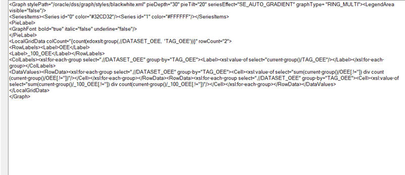
A significant hurdle arose when attempting to apply this conditional formatting directly in Oracle BI Publisher. Unlike other Oracle tools, BI Publisher does not support conditional formatting in donut charts without advanced XML coding, a feature typically out of reach for most users due to limited documentation and examples. Although theoretically possible through the "Advanced" settings, the sparse documentation made it impractical to rely solely on XML syntax for this specific requirement (Figure 1).

Figure 1. XML code for the donut chart in the RTF report, where a user can define the graph’s parameters.
Below, I describe the alternative method I used to get around the syntax problem, while still ensuring compliance with the specifications requested by the customer.
A possible solution
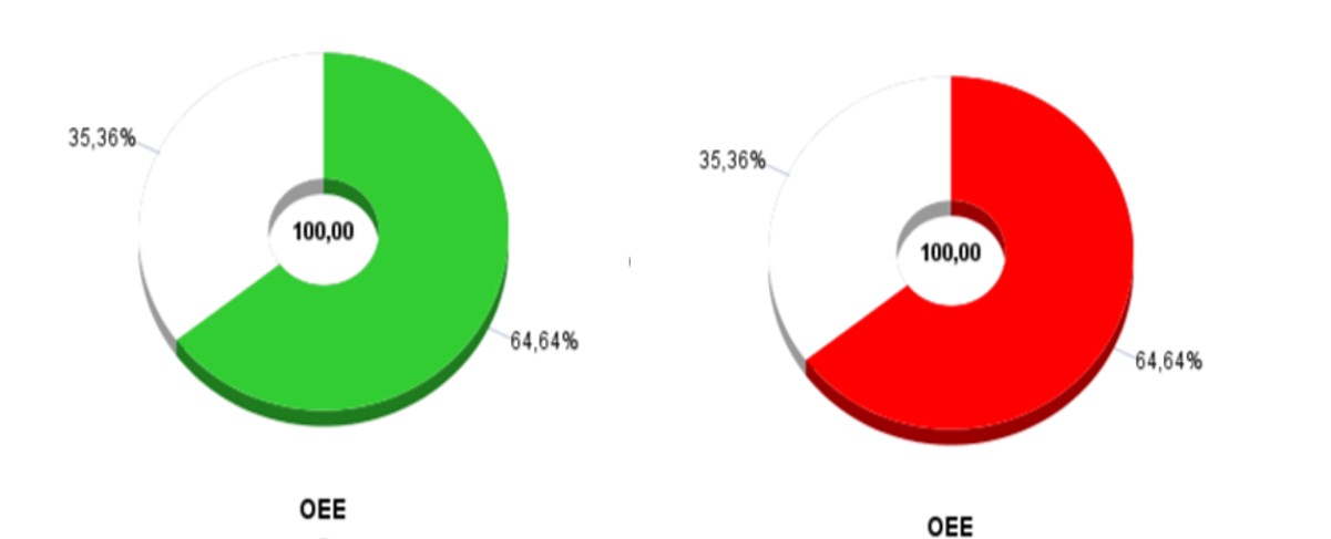
I created two donut charts (Figure 2) with different color logic, in order to simulate conditional formatting:
First graph: Shows the OEE value together with its complement on a base of 100. The OEE value has been colored green, while the complement has been colored white.
Second graph: here too, the graph displays the OEE value and its complementary on a base of 100. In this case, the OEE value has been colored in red, with the complementary in white.

Figure 2. The donuts chart created in the RTF report, in which it can be seen the conditional formatting.
Next, I set up a conditional area on both charts:
First graph: the <?if:number(OEE)>=90?> graph <?end if?> condition has been added, which allows this graph to be displayed only when the OEE value is greater than or equal to 90%.
Second graph: the condition <?if:number(OEE)<90?> graph <?end if?> has been set, to display it only when the OEE value is less than 90%. This way, the report will automatically show one of the two graphs based on the value of the OEE metric. In the example case, the second graph will be displayed.
Through this approach, I ensured the report dynamically displays the correct chart based on OEE, providing a clear visual representation that meets the customer’s needs.
Conclusion
In conclusion, implementing a donut chart in Oracle BI Publisher to represent the OEE metric required a creative approach due to limitations with conditional formatting. Through the creation of two distinct graphs and the application of conditional areas, I was able to satisfy the customer's specifications, ensuring a clear and intuitive display of the data.
Subscribe to my newsletter
Read articles from Veronica Orciuoli directly inside your inbox. Subscribe to the newsletter, and don't miss out.
Written by

Veronica Orciuoli
Veronica Orciuoli
Hello! I am a consultant specializing in Oracle Analytics Cloud, where I assist my company in transforming data into meaningful insights. My passion for data analysis complements my curiosity for discovering new stories. When I'm not immersed in the data world, you can find me binge-watching the latest shows or discussing my favorites with friends and colleagues.