QR-Code
 IO
IO
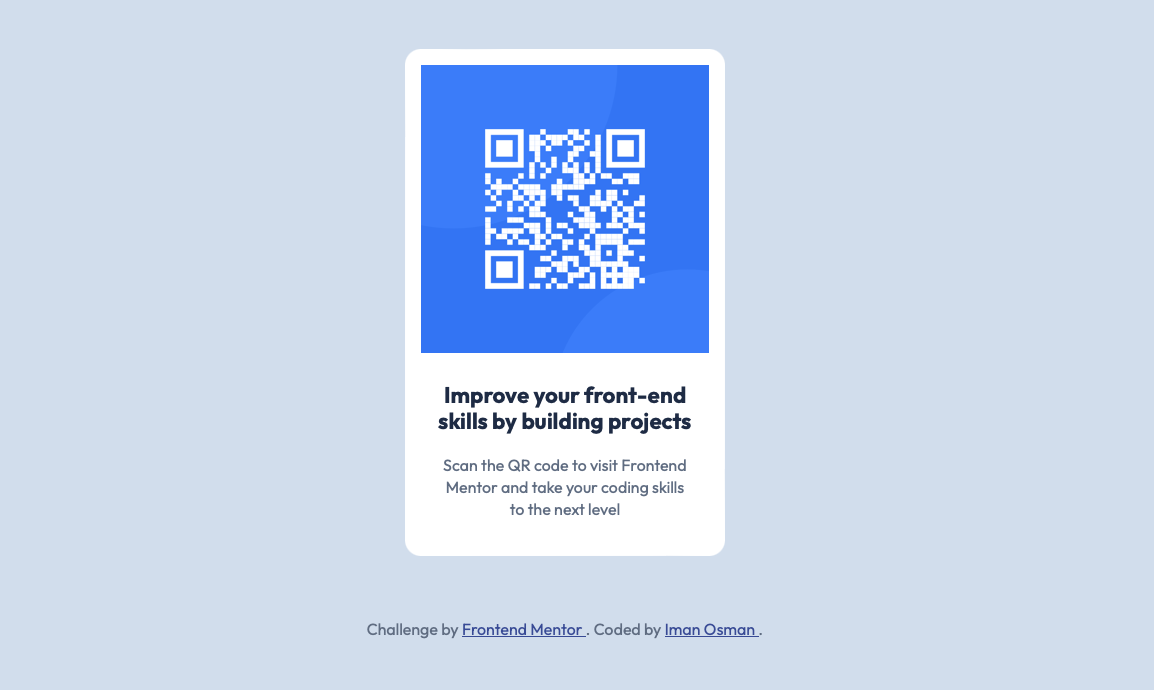
For my first Frontend Mentor project, I had to design a static web page with a QR-code.
The task
I was provided the design, a Figma file and the content. I was required to write the HTML and style the CSS, as well as optimise for mobile, too.
Approach
To start, I wrote down every HTML element I could see in the design and pre-empted the rough structure in my mind before I begun. Then, I wrote up the HTML.
Then, I began to style piece by piece.
I designed with a Desktop-First Workflow which I learnt is atypical compared to Mobile-First.
Outcome
I came up with a design that was just like the one provided, which I was satisfied with. I enjoyed finding ways to code design aspects like a border-radius and other small details that catch my eye quickly as a designer.
🧩 Live Site - https://i000o.github.io/fem-qr-challenge/
✏️ Frontend Mentor Solution - https://www.frontendmentor.io/solutions/responsive-qr-code-for-desktop-and-mobile-PELngEEDvJ
👾 GitHub Repository - https://github.com/i000o/fem-qr-challenge.git
Feedback
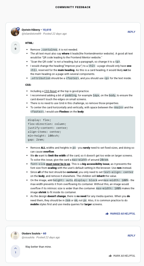
I got positive and really helpful feedback on this project which I integrated on reflection after sharing. This included how to center content in Flexbox and style font-sizes with relative units. See below:

Source: https://www.frontendmentor.io/solutions/responsive-qr-code-for-desktop-and-mobile-PELngEEDvJ
Lessons
I designed with Grid instead of Flex due to not understanding layouts well yet
I wrote up media queries when I didn’t need to
Extra to be aware of
- Accessibility Law requires that every page must have a h1 on it somewhere. What do we do when there isn’t an obvious one?
Take forward…
❕Do the simplest thing. Don’t overdo things and give yourself unnecessary, time-consuming work.
❕Your design-eye comes in handy here… You notice things that others don’t.
Subscribe to my newsletter
Read articles from IO directly inside your inbox. Subscribe to the newsletter, and don't miss out.
Written by
