Design Smarter with Figma Auto Layout
 Apoorva V
Figma's auto layout is pretty neat. If you've used it, you know it's a game-changer.
If you haven't, you're in for a treat. It's one of those features that once you start using, you'll wonder how you ever designed without it.
Let's break down what auto layout is, why it's such a powerful feature, and how to use it effectively — especially when you're converting Figma designs to code with Visual Copilot.
What is auto layout in Figma?
Basic concepts
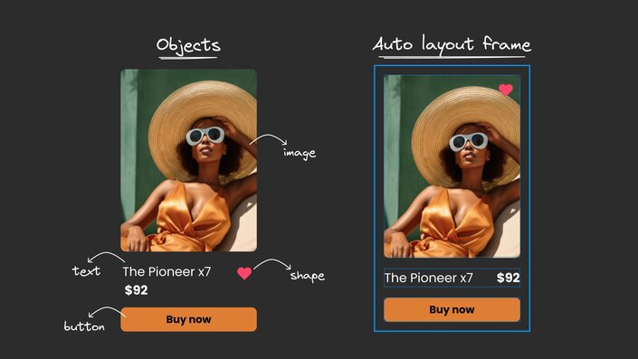
If you're new to Figma, let's start with the basics: Figma is a design tool where you create interfaces using various elements like buttons, text, images, and shapes. These elements are what Figma calls "objects" — basically anything you can create or work with on your design canvas.
Now, imagine you're arranging these elements (like a button, some text, and an icon) to create a navigation menu. Traditionally, you'd need to manually position each element and readjust everything when you make changes. This is where auto layout comes in.
At its core, auto layout is Figma's way of automatically organizing elements within a special container (called an auto layout frame). Think of it like a smart container that follows rules you set for arranging its contents.
How it works
When you put elements inside this container, they automatically maintain their spacing and arrangement, even when you make changes.
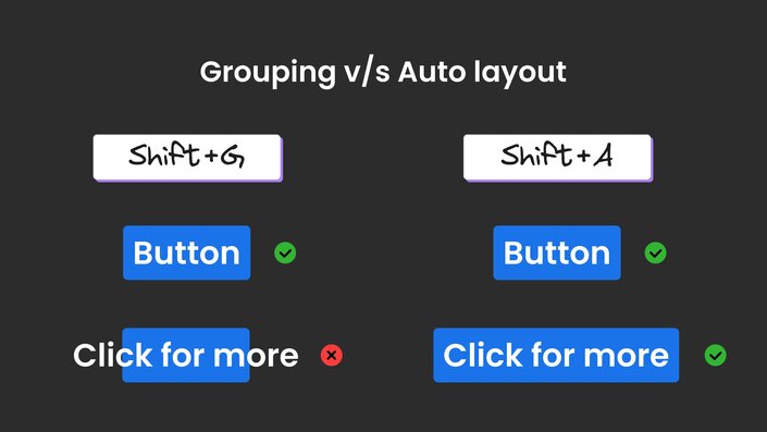
You just select the elements you want to organize together, press Shift+A, and Figma transforms them into an auto layout frame, automatically determining the best way to space and align everything.
It's like giving your design elements a set of rules to follow so they behave predictably when you resize or rearrange them.
Auto layout also introduces a parent-child relationship between elements. The container (parent) determines how elements inside it (children) behave, while these elements can have their own auto layout properties. This hierarchical structure gives you more control and flexibility in your designs.
Why auto layout is a game-changer
Auto layout isn't just another fancy feature — it's a powerhouse that can seriously level up your design game. Here's why it's so cool:
Responsive sizing
Auto layout gives you flexible options for how elements behave:
- Fill available space
- Hug their contents
- Maintain fixed dimensions
- Set maximum and minimum sizes
This resizing ability makes creating responsive designs a breeze, allowing your layouts to adapt to different screen sizes without breaking.
Smart spacing and alignment
Auto layout lets you arrange elements with powerful spacing controls:
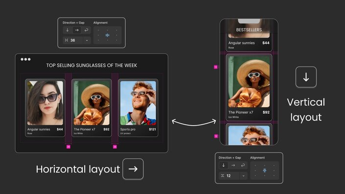
- Horizontal or vertical arrangement with consistent spacing
- Negative spacing for creative overlaps
- 'Auto' spacing to push elements apart
- Precise alignment controls separate from text alignment
Think of it like having an invisible grid that maintains perfect spacing, even when you make changes.
Responsive grids with wrap
The wrap feature is particularly useful when elements need to adapt to different screen sizes. When elements run out of space, they automatically flow to the next row or column — perfect for:
- Image galleries
- Product grids
- Tag clouds
- Card layouts
Flexible Styling
Auto layout frames work just like any other design element. You can:
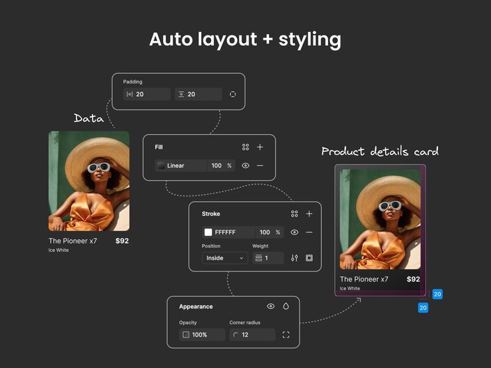
- Add backgrounds, borders, and effects
- Control opacity and other visual properties
- Set padding (space inside the frame) with precise control
- Create consistent, polished components
Each of these features builds on the others, giving you a complete system for creating flexible, maintainable designs.
How to add auto layout
Here's how to get started:
- Select a group of objects.
- Press
Shift+Ato apply auto layout. - Play with properties like alignment, constraints, and styles in the right panel.
But here's a pro tip: don't just Shift+A everything and call it a day. Think of auto layout as a super-powered group. Start with the smallest components and work your way up. This approach helps you create more complex layouts with nested auto layout frames.
A real-world example: Building an e-commerce card
Let's say you're creating a product card for an e-commerce website. Here's how you might approach it using auto layout:
- Start with the button. Apply auto layout to your CTA text to create a button, then style it.
- Add your product image and apply styling (like border radius).
- Select the title and price text, then click
Shift+Aor click the+next to auto layout in the right panel. Figma will automatically create a horizontal layout since these elements are placed side by side. Figma is smart that way. - Want different spacing between the image and text? Select all text layers and create another auto layout frame (this creates a nested auto layout).
- Combine all your auto layout frames by placing them in a vertical auto layout container.
- Style your card by adding a background, adjusting padding, and applying any other visual properties.
- Now you can copy-paste the card, update the content for different products, and they'll all maintain consistent spacing. Group these cards in another auto layout frame and you've got a responsive product listing!
This example shows how auto layout works to create responsive, editable designs. As the contents change, the layout adapts automatically.
Common auto layout pitfalls and how to avoid them:
- Over-nesting layouts: creating too many nested auto layout frames (frames within frames within frames), leading to performance issues and hard-to-maintain designs. Keep nesting to 2-3 levels max. Break complex components into smaller, reusable pieces. Think in sections rather than infinite nesting.
- Overusing auto layout: adding auto layout to every element, even when it's not the best solution. Regular frames work better for certain cases — like overlapping elements (stacked cards with depth), absolutely positioned elements (floating notifications or badges), and decorative elements (background patterns).
- Text handling issues: not accounting for how text will grow or shrink, especially in buttons or cards. Always test your components with different text lengths, implement text truncation when needed, and set proper constraints to handle varying content.
- Inconsistent sizing strategy: mixing fixed-width and flexible elements without proper planning can cause layouts to break at different screen sizes. Be intentional about choosing between Fill container, Hug contents, or fixed sizes. Create a consistent system and stick to it throughout your design.
Converting Figma designs to code with Visual Copilot
Now that you understand the power of auto layout, let's talk about something exciting: turning these well-structured designs into production-ready code automatically. This is where
Visual Copilot, our AI-powered Figma plugin, comes into play.
When you use auto layout effectively, you're not just making your designs more maintainable — you're also creating a clear structural hierarchy that AI can understand and translate into code.
Visual Copilot excels at recognizing these auto layout patterns and converting them into appropriate code constructs:
- Vertical auto layout frames become flex containers with column direction
- Horizontal layouts translate to row-based flex layouts
- Spacing between elements is preserved with proper margins or gap properties
- Responsive behaviors are maintained through appropriate CSS properties
- Nested auto layouts become nested component structures in your framework of choice
The best part? Visual Copilot handles this conversion with a single click, supporting multiple frameworks (React, Vue, Svelte, Angular, Qwik, Solid, React Native) and styling solutions (CSS, Tailwind, Emotion, Styled Components).
It's particularly effective when your designs use auto layout consistently, as this creates a clear component hierarchy that translates naturally to code.
Conclusion
Auto layout in Figma represents a fundamental shift in how we create designs. Whether you're working with simple buttons or complex layouts, this awesome feature helps you determine the perfect spacing and alignment for every object in your design.
When structured thoughtfully, your auto layout components become the perfect blueprint for Visual Copilot to transform your designs into clean, efficient code. No more lost details in translation, no more back-and-forth about implementation.
Like any tool, it takes some practice to master, but once you get the hang of it, you'll wonder how you ever designed without it. The ability to quickly create and edit responsive layouts will significantly speed up your design workflow.
So go ahead, give auto layout a spin in your next project. Start small, think about the structure of your design, and before you know it, you'll be creating complex, responsive layouts with ease.
Play with different properties, experiment with nested frames, and see how auto layout inside your designs can transform your UI design process.
More Figma to code resources
Subscribe to my newsletter
Read articles from Apoorva V directly inside your inbox. Subscribe to the newsletter, and don't miss out.
Written by

