Getting Started with CSS Grid
 Oshini Nawarathna
CSS Grid is a modern tool for building flexible and responsive web layouts. It allows you to organize your webpage into rows and columns, making it easier to align and arrange content.
What is CSS Grid?
CSS Grid is a layout system that divides your page into a grid of rows and columns. It’s an essential tool for creating responsive designs that adapt to different screen sizes—perfect for modern web development.
How to Create a Basic Grid Layout
Here’s how you can create a simple grid layout with HTML and CSS:
HTML Structure:
<div class="grid-container">
  <div>Item 1</div>
  <div>Item 2</div>
  <div>Item 3</div>
  <div>Item 4</div>
  <div>Item 5</div>
  <div>Item 6</div>
</div>
The .grid-container holds the grid items inside, and the items themselves are the <div> elements
CSS Styling:
.grid-container {
  display: grid;
  grid-template-columns: repeat(3, 1fr);
  gap: 10px;
}

.grid-container div {
  background-color: lightblue;
  padding: 20px;
  text-align: center;
}
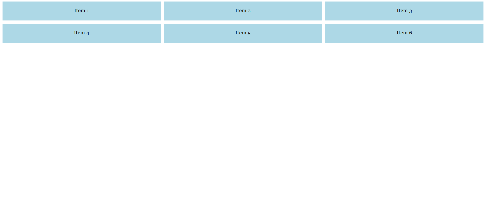
display: grid;: This makes the.grid-containera grid.grid-template-columns: repeat(3, 1fr);: Creates 3 equal-width columns.1frmeans one fraction of the available space.gap: 10px;: Adds space between grid items, preventing them from being too close.Desktop View: A Grid with Three Columns
The grid is divided into three columns, allowing multiple items to be displayed side by side in a row.

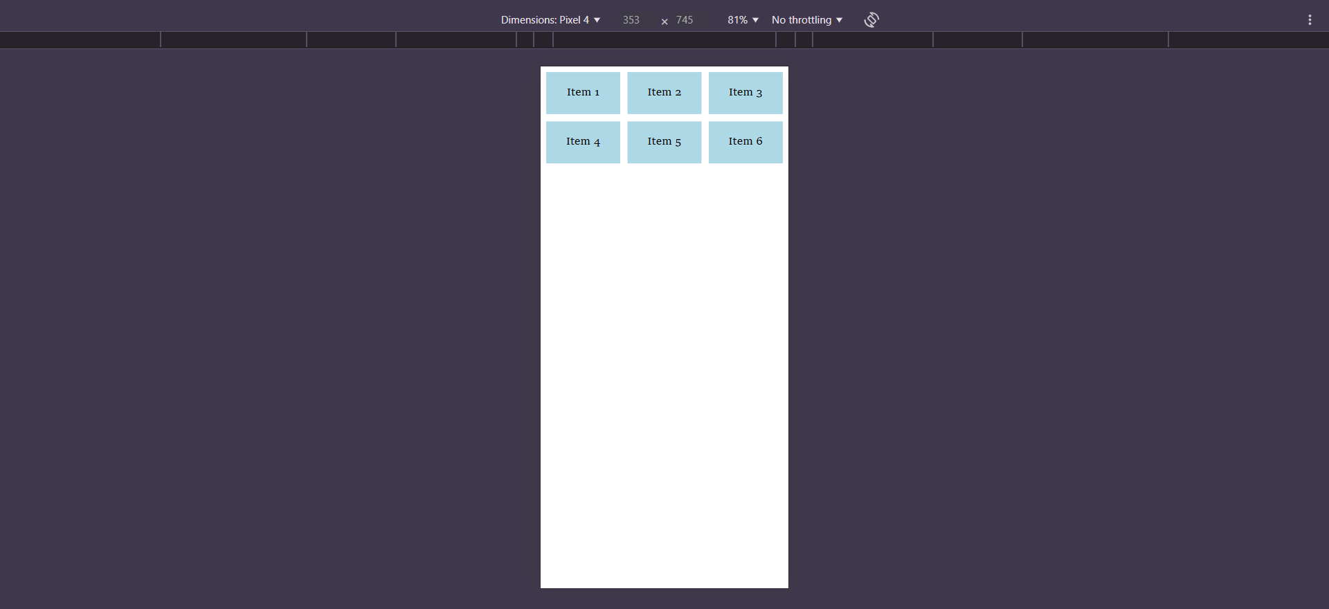
Mobile View: A Grid with a Single Column
In mobile view, all items stack vertically in a single column.

Responsive Grid Layout
One of the great things about CSS Grid is how easy it is to create responsive designs. A responsive grid often uses 12 columns that span the full width of the screen, adjusting dynamically as the browser window is resized.
Here’s how you can create a responsive grid layout using CSS:
  .grid-container {
    display: grid;
    grid-template-columns: repeat(12, 1fr);
    gap: 10px;
  }

  @media (max-width: 600px) {
    .grid-container {
      grid-template-columns: 1fr;
    }
  }
This CSS code creates a grid with 12 equal columns by default, with 10px of space between each item.
A media query is used to apply specific styles based on the screen size or other device features. For example,
@media (max-width: 600px)targets screens that are 600px or smaller, like phones. It changes the layout to a single column when the screen is small, making it more suitable for mobile devices.Why is the 12-Column Grid Used?
The 12-column grid is commonly used in web design because it's flexible and easy to divide into different layouts:
3 columns on desktops (4 each): For wider screens.
2 columns on tablets (6 each): For medium-sized screens.
1 column on mobile phones (12 each): For smaller screens.
This makes it simple to create responsive designs that look great on all devices. The number 12 is easy to divide, making it versatile for many types of layouts.
CSS Grid makes creating responsive layouts easy and flexible. With just a few lines of code, you can create beautiful, organized grids that look great on any screen.
It’s a beginner-friendly tool . Have fun experimenting with different grid settings and start building your own layouts.
Happy Coding! 😊
Subscribe to my newsletter
Read articles from Oshini Nawarathna directly inside your inbox. Subscribe to the newsletter, and don't miss out.
Written by
