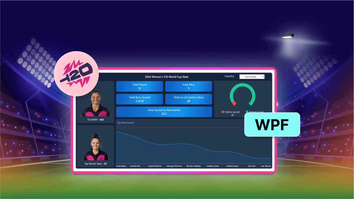
Creating a Dynamic WPF Chart Dashboard to Showcase 2024 Women’s T20 World Cup Statistics
 syncfusion
TL;DR: Let’s build an interactive dashboard to showcase stats from the 2024 Women’s T20 World Cup using Syncfusion WPF Charts. Learn to structure cricket data, implement dynamic charts, and create a UI for filtering by team or player. Visualize runs, wickets, boundaries, and more with real-time stats, bringing cricket stories to life through engaging visuals.
Welcome to the Chart of the Week blog series!
Analyzing raw data often feels like a complex puzzle. But with the power of visual tools like charts and graphs, transforming data into clear and actionable insights becomes much simpler. Interactive chart features elevate this experience, making even the most complex data easy to understand and engaging.
The Women’s T20 World Cup recently captured global attention, delivering moments of pure joy. Cricket has a unique way of evoking strong emotions—excitement, pride, and sometimes heartbreak—creating unforgettable memories for fans and players alike. With teams and players that spark endless discussions and passionate opinions, there’s a story behind every statistic.
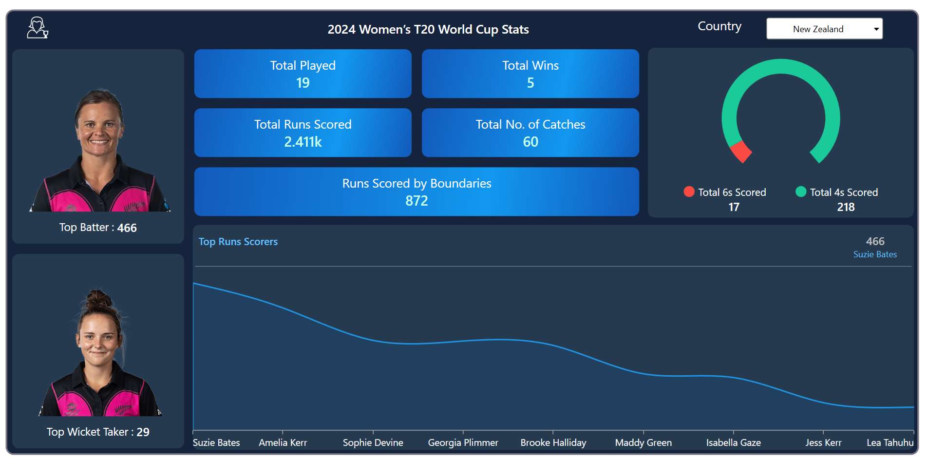
In this article, we’ll create a dynamic dashboard to visualize Women’s T20 World Cup 2024 data using Syncfusion WPF Charts control. This dashboard goes beyond traditional displays, turning raw data into visually appealing and instantly understandable charts. You’ll learn how to showcase team and player data with the ability to filter by country through an interactive combo box, allowing for targeted insights.
Refer to the following image.

In this section, we’ll visualize the runs scored by players in the 2024 Women’s T20 World Cup tournament. Let’s get started!
Step 1: Gathering the T20 data
Before developing the chart dashboard, it’s essential to collect data regarding the 2024 Women’s T20 World Cup from ESPN Sports Media Ltd.
Step 2: Populating the data
To effectively manage and visualize cricket statistics, we’ll define three classes: PlayersData, ScoreInfo, and CountryData. These classes will hold the necessary properties to represent individual player statistics and country-wide performance data, respectively.
PlayersData class properties
Name: Represents the individual player’s name.
Score: Stores the run values of the individual player.
ScoreInfo class properties
Category: Represents the category of team scores, such as sixes and fours.
Value: Represents the count of sixes and fours scored by the team.
CountryData class properties
Play: Stores the overall number of matches played by each country.
Wins: Represents the number of matches won by each country.
Runs: Stores the run values scored by players by countries.
CatchValue: Demonstrates the number of catches taken by the team.
Score6s: Represents the count of sixes scored by the team.
Score4s: Represents the count of fours scored by the team.
Boundaries: Represents the runs scored by the team through boundaries.
Batter: Represents the top run count data from the team on a country-wise basis.
BatterImage: Stores the image of the best batter.
WicketTaker: Represents the top wicket count from the team on a country-wise basis.
WicketTakerImage: Stores the image of the best wicket-taker.
These classes will provide a structured way to manage and visualize cricket statistics, enabling us to create rich and interactive charting apps.
public class PlayersData
{
    public string? Name { get; set; }
    public int Score { get; set; }
}

public class ScoreInfo
{
    public string? Category { get; set; }
    public int Value { get; set; }
}

public class CountryData
{
    public int Play { get; set; }
    public int Wins { get; set; }
    public string? Runs { get; set; }
    public int CatchValue { get; set; }
    public int Boundaries { get; set; }
    public int Batter { get; set; }
    public string? BatterImage { get; set; }
    public int WicketTaker { get; set; }
    public string? WicketTakerImage { get; set; }
    public int Score6s { get; set; }
    public int Score4s { get; set; }
}
Next, the data collection will be generated using the T20_Data class, which has the following properties that demonstrate the details of the women’s T20 match.
public class T20_Data : INotifyPropertyChanged
{
    #region Fields

    private int play;
    private int wins;
    private string? runs;
    private int catchValue;
    private int score6s;
    private int score4s;
    private int boundaries;
    private int batter;
    private string? batterImage;
    private int wicketTaker;
    private string? wicketTakerImage;
    private string? name;
    private int score;
    private Dictionary<string, CountryData>? countryData;
    private Dictionary<string, List<PlayersData>>? playersData;
    private ObservableCollection<PlayersData>? data;
    private ObservableCollection<ScoreInfo>? scoreData;

    #endregion

    #region Properties

    public ObservableCollection<string> CountryOption { get; set; }

    public int Play
    {
        get => play;
        set { play = value; OnPropertyChanged(nameof(Play)); }
    }

    public int Wins
    {
        get => wins;
        set { wins = value; OnPropertyChanged(nameof(Wins)); }
    }

    public string? Runs
    {
        get => runs;
        set { runs = value; OnPropertyChanged(nameof(Runs)); }
    }

    public int CatchValue
    {
        get => catchValue;
        set { catchValue = value; OnPropertyChanged(nameof(CatchValue)); }
    }

    public int Score6s
    {
        get => score6s;
        set { score6s = value; OnPropertyChanged(nameof(Score6s)); }
    }

    public int Score4s
    {
        get => score4s;
        set { score4s = value; OnPropertyChanged(nameof(Score4s)); }
    }

    public int Boundaries
    {
        get => boundaries;
        set { boundaries = value; OnPropertyChanged(nameof(Boundaries)); }
    }

    public int Batter
    {
        get => batter;
        set { batter = value; OnPropertyChanged(nameof(Batter)); }
    }

    public string? BatterImage
    {
        get => batterImage;
        set { batterImage = value; OnPropertyChanged(nameof(BatterImage)); }
    }

    public int WicketTaker
    {
        get => wicketTaker;
        set { wicketTaker = value; OnPropertyChanged(nameof(WicketTaker)); }
    }

    public string? WicketTakerImage
    {
        get => wicketTakerImage;
        set { wicketTakerImage = value; OnPropertyChanged(nameof(WicketTakerImage)); }
    }

    public string? Name
    {
        get => name;
        set { name = value; OnPropertyChanged(nameof(Name)); }
    }

    public int Score
    {
        get => score;
        set { score = value; OnPropertyChanged(nameof(Score)); }
    }

    public ObservableCollection<PlayersData>? Data
    {
        get => data;
        set { data = value; OnPropertyChanged(nameof(Data)); }
    }

    public ObservableCollection<ScoreInfo>? ScoreData
    {
        get => scoreData;
        set { scoreData = value; OnPropertyChanged(nameof(ScoreData)); }
    }

    #endregion

    #region Constructor

    public T20_Data()
    {
        CountryOption = new ObservableCollection<string>
        {
            "New Zealand", "Australia", "India", "Pakistan", "Sri Lanka",
            "West Indies", "South Africa", "England", "Bangladesh", "Scotland"
        };

        var executingAssembly = typeof(App).GetTypeInfo().Assembly;

        using (var stream = executingAssembly.GetManifestResourceStream("Women_T20_2024.Resources.country_data.json"))
        if (stream != null)
        {
            using (var textStream = new StreamReader(stream))
            {
               countryData = JsonConvert.DeserializeObject<Dictionary<string, CountryData>>(textStream.ReadToEnd().Trim());
            }
        }

        using (var stream = executingAssembly.GetManifestResourceStream("Women_T20_2024.Resources.players_data.json"))
        if (stream != null)
        {
           using (var textStream = new StreamReader(stream))
           {
               playersData = JsonConvert.DeserializeObject<Dictionary<string, List>>(textStream.ReadToEnd().Trim());
           }
        }
    }

    #endregion

    #region INotifyPropertyChanged

    public event PropertyChangedEventHandler? PropertyChanged;
    protected void OnPropertyChanged([CallerMemberName] string name = "")
    {
        PropertyChanged?.Invoke(this, new PropertyChangedEventArgs(name));
    }

    #endregion
}
In the above code example, we’ve converted the JSON data to a collection using StreamReader and JsonConvert.DeserializeObject methods from the Newtonsoft.Json package. Then, we stored the converted data in the appropriate properties.
Step 3: Defining the layout
Establishing the layout is a key step in building an effective dashboard. The layout shapes the overall visual appeal and usability, making the dashboard attractive and easy to interpret. A thoughtfully organized layout ensures that data is displayed clearly and intuitively.
To create this layout, we’ll use a Border and a Grid to arrange elements in an orderly manner. Refer to the following code example.
<Border Margin="15,25,15,15" BorderThickness="2" CornerRadius="10" BorderBrush="#79747E"  Background="#15233D">

 <Grid>
  <Grid.RowDefinitions>
   <RowDefinition Height="0.75*"/>
   <RowDefinition Height="4*"/>
   <RowDefinition Height="5.25*"/>
  </Grid.RowDefinitions>

  <Grid.ColumnDefinitions>
   <ColumnDefinition Width="2*"/>
   <ColumnDefinition Width="5*"/>
   <ColumnDefinition Width="3*"/>
  </Grid.ColumnDefinitions>
 </Grid>

</Border>
Step 4: Arranging the elements in the layout
Once the layout is defined, we can arrange the essential components of our app to create an engaging user interface. Our focus will be on developing the following three key elements:
ComboBox: This control allows users to select and view T20 data for different countries.
Labels: Positioned within the bordered views, these labels will display country-specific data based on the selected index of the ComboBox.
Chart: This element will visualize player scores and the number of sixes and fours for the country selected in the ComboBox.
Step 5: Configuring the WPF ComboBox and header view
The Syncfusion WPF ComboBox control offers a flexible dropdown list that allows for single and multiple selections, using delimiters to separate the selected items.
In this context, we’ll use the ComboBox to display and select the country participating in the Women’s T20 match. Additionally, incorporating a header with an associated icon enhances the readability and visual appeal of the dashboard.
Refer to the following code example.
<Grid Grid.Row="0" Grid.ColumnSpan="3" Margin="3,3,3,0" Background="#15233D">

 <Grid.ColumnDefinitions>
  <ColumnDefinition Width="2*"/>
  <ColumnDefinition Width="5.25*"/>
  <ColumnDefinition Width="0.75*"/>
  <ColumnDefinition Width="2*"/>
 </Grid.ColumnDefinitions>

 <Path Grid.Column="0" Data="{StaticResource PathData}" Stroke="#FFFFFF" StrokeThickness="1.25" Margin="25,5,0,0">
  <Path.RenderTransform>
   <ScaleTransform ScaleX="0.9" ScaleY="0.9"/>
  </Path.RenderTransform>
 </Path>

 <TextBlock Grid.Column="1" Text="2024 Women’s T20 World Cup Stats" Foreground="#FFFFFF" FontSize="17" FontWeight="SemiBold" Margin="0,0,0,0" HorizontalAlignment="Center" VerticalAlignment="Center"/>

 <TextBlock Grid.Column="2" Text="Country" HorizontalAlignment="Right" Foreground="#FFFFFF" Margin="0,5,-10,0" FontSize="17"/>

 <editors:ComboBoxAdv Grid.Column="3" Name="comboBox" Background="#FFFFFF" HorizontalAlignment="Center" VerticalAlignment="Center" SelectedIndex="{Binding SelectedIndex, Mode=TwoWay}" Height="30" Width="160" HorizontalContentAlignment="Center" ItemsSource="{Binding CountryOption}">
  </editors:ComboBoxAdv>
</Grid>
Step 6: Arranging country-wise Women’s T20 content with WPF Doughnut Chart integration
Next, we will organize the statistics by country, including play counts, winning records, total runs, catches, sixes, fours, runs scored from boundaries, and details of each team’s top batter and wicket-taker. This will be accomplished using labels and borders and a Syncfusion WPF Doughnut Chart to provide a visually engaging representation of the data.
Refer to this documentation to configure the Syncfusion WPF Charts.
<Grid Grid.Row="1" Grid.RowSpan="2" Grid.Column="0">

 <Grid.RowDefinitions>
  <RowDefinition Height="*"/>
  <RowDefinition Height="*"/>
 </Grid.RowDefinitions>

 <Border Grid.Row="0" BorderThickness="2" CornerRadius="10" Margin="5" Background="#253A4F">

  <StackPanel VerticalAlignment="Center">
   <Image Grid.Column="0" Source="{Binding BatterImage, Converter={StaticResource ImagePathConverter}}" Width="240" Height="210"/>

   <StackPanel Orientation="Horizontal" HorizontalAlignment="Center" Margin="0,10,0,0">
    <TextBlock Text="Top Batter : "  FontSize="15" Foreground="#FFFFFF"/>
    <TextBlock Text="{Binding Batter}" FontSize="16" FontWeight="SemiBold" HorizontalAlignment="Center" Foreground="#FFFFFF"/>
   </StackPanel>
  </StackPanel>
 </Border>

 <Border Grid.Row="1" BorderThickness="2" CornerRadius="10" Margin="5" Background="#253A4F">

  <StackPanel VerticalAlignment="Center">
   <Image Grid.Column="0" Source="{Binding WicketTakerImage, Converter={StaticResource ImagePathConverter}}" Width="240" Height="210"/>

   <StackPanel Orientation="Horizontal" HorizontalAlignment="Center" Margin="0,10,0,0">
    <TextBlock Text="Top Wicket Taker : "  FontSize="15" Foreground="#FFFFFF"/>
    <TextBlock Text="{Binding WicketTaker}" FontSize="16" FontWeight="SemiBold" HorizontalAlignment="Center" Foreground="#FFFFFF"/>
   </StackPanel>
  </StackPanel>

 </Border>

</Grid>

<Grid Grid.Row="1" Grid.Column="1">

 <Grid.RowDefinitions>
  <RowDefinition Height="*"/>
  <RowDefinition Height="*"/>
  <RowDefinition Height="*"/>
 </Grid.RowDefinitions>

 <Grid.ColumnDefinitions>
  <ColumnDefinition Width="*"/>
  <ColumnDefinition Width="*"/>
 </Grid.ColumnDefinitions>

 <Border Grid.Row="0" Grid.Column="0" BorderThickness="2" CornerRadius="10" Margin="5">

  <Border.Background>
   <LinearGradientBrush StartPoint="0,0" EndPoint="1,1">
    <GradientStop Color="#125ABC" Offset="0.0"/>
    <GradientStop Color="#1298EF" Offset="0.66"/>
    <GradientStop Color="#125ABC" Offset="1.0"/>
   </LinearGradientBrush>
  </Border.Background>

  <StackPanel HorizontalAlignment="Center" VerticalAlignment="Center" Orientation="Vertical">
   <TextBlock Text="Total Played"  FontSize="17" Foreground="#FFFFFF"/>
   <TextBlock Text="{Binding Play}" FontSize="19" FontWeight="SemiBold" HorizontalAlignment="Center" Foreground="#c9ffe9"/>
  </StackPanel>

 </Border>

 <Border Grid.Row="0" Grid.Column="1" BorderThickness="2" CornerRadius="10" Margin="5">

  <Border.Background>
   <LinearGradientBrush StartPoint="0,0" EndPoint="1,1">
    <GradientStop Color="#125ABC" Offset="0.0"/>
    <GradientStop Color="#1298EF" Offset="0.66"/>
    <GradientStop Color="#125ABC" Offset="1.0"/>
   </LinearGradientBrush>
  </Border.Background>

  <StackPanel HorizontalAlignment="Center" VerticalAlignment="Center" Orientation="Vertical">
   <TextBlock Text="Total Wins"  FontSize="17" Foreground="#FFFFFF"/>
   <TextBlock Text="{Binding Wins}" FontSize="19" FontWeight="SemiBold" HorizontalAlignment="Center" Foreground="#c9ffe9"/>
  </StackPanel>

 </Border>

 <Border Grid.Row="1" Grid.Column="0" BorderThickness="2" CornerRadius="10" Margin="5">

  <Border.Background>
   <LinearGradientBrush StartPoint="0,0" EndPoint="1,1">
    <GradientStop Color="#125ABC" Offset="0.0"/>
    <GradientStop Color="#1298EF" Offset="0.66"/>
    <GradientStop Color="#125ABC" Offset="1.0"/>
   </LinearGradientBrush>
  </Border.Background>

  <StackPanel HorizontalAlignment="Center" VerticalAlignment="Center" Orientation="Vertical">
   <TextBlock Text="Total Runs Scored" FontSize="17" Foreground="#FFFFFF"/>
   <TextBlock Text="{Binding Runs}" FontSize="19" FontWeight="SemiBold" HorizontalAlignment="Center" Foreground="#c9ffe9"/>
  </StackPanel>

 </Border>

 <Border Grid.Row="1" Grid.Column="1" BorderThickness="2" CornerRadius="10" Margin="5">

  <Border.Background>
   <LinearGradientBrush StartPoint="0,0" EndPoint="1,1">
    <GradientStop Color="#125ABC" Offset="0.0"/>
    <GradientStop Color="#1298EF" Offset="0.66"/>
    <GradientStop Color="#125ABC" Offset="1.0"/>
   </LinearGradientBrush>
  </Border.Background>

  <StackPanel HorizontalAlignment="Center" VerticalAlignment="Center" Orientation="Vertical">
   <TextBlock Text="Total No. of Catches"  FontSize="17" Foreground="#FFFFFF"/>
   <TextBlock Text="{Binding CatchValue}" FontSize="19" FontWeight="SemiBold" HorizontalAlignment="Center" Foreground="#c9ffe9"/>
  </StackPanel>

 </Border>

 <Border Grid.Row="2" Grid.ColumnSpan="2" BorderThickness="2" CornerRadius="10" Margin="5">

  <Border.Background>
   <LinearGradientBrush StartPoint="0,0" EndPoint="1,1">
    <GradientStop Color="#125ABC" Offset="0.0"/>
    <GradientStop Color="#1298EF" Offset="0.66"/>
    <GradientStop Color="#125ABC" Offset="1.0"/>
   </LinearGradientBrush>
  </Border.Background>

  <StackPanel HorizontalAlignment="Center" VerticalAlignment="Center" Orientation="Vertical">
   <TextBlock Text="Runs Scored by Boundaries" FontSize="17" Foreground="#FFFFFF"/>
   <TextBlock Text="{Binding Boundaries}" FontSize="19" FontWeight="SemiBold" HorizontalAlignment="Center" Foreground="#c9ffe9"/>
  </StackPanel>

 </Border>

</Grid>

<Border Grid.Row="1" Grid.Column="2" Margin="3" Padding="0,10,0,0" BorderThickness="2" CornerRadius="10" Background="#253A4F">

 <chart:SfChart>

 </chart:SfChart>

</Border>
Step 7: Binding data to the WPF Doughnut Chart
To visualize the number of sixes and fours scored by each country’s team, we’ll use the Syncfusion WPF DoughnutSeries.
Refer to the following code example. In this example, we’ve bound the ItemSource, XBindingPath, and YBindingPath properties to the ScoreData, Category, and Value properties, respectively.
<chart:DoughnutSeries ItemsSource="{Binding ScoreData}" XBindingPath="Category" YBindingPath="Value">
</chart:DoughnutSeries>
Step 8: Customizing the doughnut chart appearance
Let’s improve the visual appeal of the WPF Doughnut Chart by customizing its elements, including the series colors, doughnut size, and legend.
Customizing the chart color, angle, and size
Let’s customize the chart’s size, angle, and color using the DoughnutCoefficient, DoughnutSize, StartAngle, EndAngle, and Palette properties.
<chart:SfChart.Series>
 <chart:DoughnutSeries DoughnutSize="1"
                          DoughnutCoefficient="0.5"
                          StartAngle="130"
                          EndAngle="410"
                          Palette="Custom">

  <chart:DoughnutSeries.ColorModel>
   <chart:ChartColorModel>
    <chart:ChartColorModel.CustomBrushes>
     <SolidColorBrush Color="#FB4944"/>
     <SolidColorBrush Color="#1ACA99"/>
    </chart:ChartColorModel.CustomBrushes>
   </chart:ChartColorModel>

  </chart:DoughnutSeries.ColorModel>

 </chart:DoughnutSeries>
</chart:SfChart.Series>
Enabling and customizing the chart legend
Refer to the following code example to enable and customize the WPF Charts legend.
<chart:SfChart.Legend>
 <chart:ChartLegend DockPosition="Bottom">
  <chart:ChartLegend.ItemTemplate>
   <DataTemplate>
    <StackPanel Margin="20,0,20,0">
     <StackPanel Orientation="Horizontal">
      <Ellipse Height="15" Width="15" Fill="{Binding Interior}" Margin="0,0,5,0"/>
      <TextBlock HorizontalAlignment="Center" FontSize="14"Foreground="White" Text="{Binding Item.Category}"/>
     </StackPanel>
     <TextBlock Margin="25,0,0,0" FontSize="16" Foreground="White" FontWeight="SemiBold"
                Text="{Binding Item.Value}" HorizontalAlignment="Center"/>
    </StackPanel>
   </DataTemplate>
  </chart:ChartLegend.ItemTemplate>
 </chart:ChartLegend>
</chart:SfChart.Legend>
Step 9: Configuring the Syncfusion WPF Spline Area Chart
Let’s configure the Syncfusion WPF Spline Area Chart using this documentation.
<Border Grid.Row="2" Grid.Column="1" Grid.ColumnSpan="2" Margin="3" BorderThickness="2" CornerRadius="10" Background="#253A4F">
 <Grid>
  <Grid.RowDefinitions>
   <RowDefinition Height="60"/>
   <RowDefinition Height="*"/>
  </Grid.RowDefinitions>

  <chart:SfChart Grid.Row="1">
   <chart:SfChart.PrimaryAxis>
    <chart:CategoryAxis />
   </chart:SfChart.PrimaryAxis>

   <chart:SfChart.SecondaryAxis>
    <chart:NumericalAxis/>
   </chart:SfChart.SecondaryAxis>
  </chart:SfChart>

 </Grid>
</Border>
Step 10: Binding data to the WPF Spline Area Chart
To visualize the runs scored by each player in the 2024 Women’s T20 data, we’ll use the Syncfusion WPF SplineAreaSeries.
<chart:SplineAreaSeries ItemsSource="{Binding Data}" XBindingPath="Name" YBindingPath="Score">
</chart:SplineAreaSeries>
In the above code example, we’ve bound the ItemsSource, XBindingPath, and YBindingPath properties to the Data, Name, and Score properties, respectively.
Step 11: Customizing the Spline Area Chart appearance
Let’s enhance the appearance of our WPF spline area chart by customizing its elements, such as the axes, series colors, and strokes.
Customize the chart axis
You can customize the chart axis using the following properties to enhance both its appearance and functionality:
ShowGridLines: Controls the visibility of major grid lines on the axis.
TickLineSize: Allows you to adjust the tick size along the chart axis for finer visual control.
Visibility: Use the IsVisible property to control the visibility of the axis.
EdgeLabelsVisibilityMode: Controls the visibility of the labels at the axis’s extreme ends.
These properties offer flexibility in tailoring the chart axis to better suit the design and readability of our WPF chart.
<chart:SfChart.PrimaryAxis>
 <chart:CategoryAxis ShowGridLines="False"  FontSize="13" Foreground="White" TickLineSize="5"         EdgeLabelsDrawingMode="Shift"/>
</chart:SfChart.PrimaryAxis>

<chart:SfChart.SecondaryAxis>
 <chart:NumericalAxis ShowGridLines="False" Visibility="Collapsed"/>
</chart:SfChart.SecondaryAxis>
Customize the chart color
The following code example demonstrates how to customize the appearance of chart elements using the Stroke, StrokeThickness, and Interior properties to modify colors, outline thickness, and fill styles.
<chart:SplineAreaSeries StrokeThickness="2" Stroke="#2093E1" Interior="#213F5E">
</chart:SplineAreaSeries>
Incorporating panning and trackball
To enhance readability, we can enable the trackball feature to display detailed information and add panning to allow smooth scrolling through data within a specified range. This can be achieved using the ChartTrackBallBehavior, ChartZoomPanBehavior, and AutoScrollingDelta properties.
Additionally, we’ll customize the trackball using the TrackBallLabelTemplate and ChartTrackBallStyle properties to display player score details dynamically. The label is positioned within a bordered view above the chart, updating with the trackball’s movements to easily view specific data points.
<Border Grid.Row="2" Grid.Column="1" Grid.ColumnSpan="2" Margin="3" BorderThickness="2" CornerRadius="10" Background="#253A4F">

 <Grid>
  <Grid.RowDefinitions>
   <RowDefinition Height="60"/>
   <RowDefinition Height="*"/>
  </Grid.RowDefinitions>

  <Border Grid.Row="0" Margin="3" BorderThickness="0,0,0,0.5" BorderBrush="#AAAAAF">

  <StackPanel>
   <TextBlock Text="Top Runs Scorers" FontSize="14" HorizontalAlignment="Left"
              Margin="5,10,0,0" Foreground="65C1FF" FontWeight="SemiBold"/>

   <StackPanel HorizontalAlignment="Right" Margin="0,-20,20,0">
    <TextBlock Text="{Binding Score}" FontSize="15" Foreground="#BEBEBE" FontWeight="SemiBold" HorizontalAlignment="Center"/>
    <TextBlock Text="{Binding Name}" FontSize="12" Foreground="65C1FF" />
   </StackPanel>

  </StackPanel>

 </Border>

 <chart:SfChart Grid.Row="1">

  <chart:SfChart.PrimaryAxis>
   <chart:CategoryAxis AutoScrollingDelta="8" AutoScrollingMode="Start"/>
  </chart:SfChart.PrimaryAxis>

  <chart:SfChart.SecondaryAxis>
   <chart:NumericalAxis/>
  </chart:SfChart.SecondaryAxis>

  <chart:SfChart.Behaviors>

   <chart:ChartTrackBallBehavior ShowLine="False" PositionChanged="ChartTrackBallBehavior_PositionChanged">
    <chart:ChartTrackBallBehavior.ChartTrackBallStyle>
     <Style TargetType="chart:ChartTrackBallControl">
      <Setter Property="Background" Value="Transparent"/>
      <Setter Property="StrokeThickness" Value="0"/>
     </Style>
    </chart:ChartTrackBallBehavior.ChartTrackBallStyle>
   </chart:ChartTrackBallBehavior>

   <chart:ChartZoomPanBehavior EnableMouseWheelZooming="False"  EnablePinchZooming="False" ResetOnDoubleTap="False" EnablePanning="True">
   </chart:ChartZoomPanBehavior>

   </chart:SfChart.Behaviors>

   <chart:SplineAreaSeries>

    <chart:SplineAreaSeries.TrackBallLabelTemplate>
     <DataTemplate>
      <Ellipse Height="15" Width="15" Fill="#213F5E" Stroke="White" StrokeThickness="2"           StrokeDashArray="2,1"/>
     </DataTemplate>
    </chart:SplineAreaSeries.TrackBallLabelTemplate>

   </chart:SplineAreaSeries>

  </chart:SfChart>

 </Grid>

</Border>
The PositionChanged event can be used to dynamically update the trackball value in real-time. This event is triggered whenever the trackball’s position changes, allowing you to refresh the displayed information for improved user interaction as follows.
private void ChartTrackBallBehavior_PositionChanged(object sender, PositionChangedEventArgs e)
{
    if (viewModel != null && e.CurrentPointInfos.Count > 0)
    {
        var dataPointInfo = e.CurrentPointInfos.First();
        var dataPoint = dataPointInfo.Item as PlayersData;

        if (dataPoint != null)
        {
            viewModel.Name = dataPoint.Name;
            viewModel.Score = dataPoint.Score;
        }
    }
}
Step 12: Enabling interactivity for the entire dashboard
To enhance our chart dashboard’s interactivity, we’ll leverage the ComboBox to allow a dynamic selection of countries participating in the 2024 Women’s T20 matches.
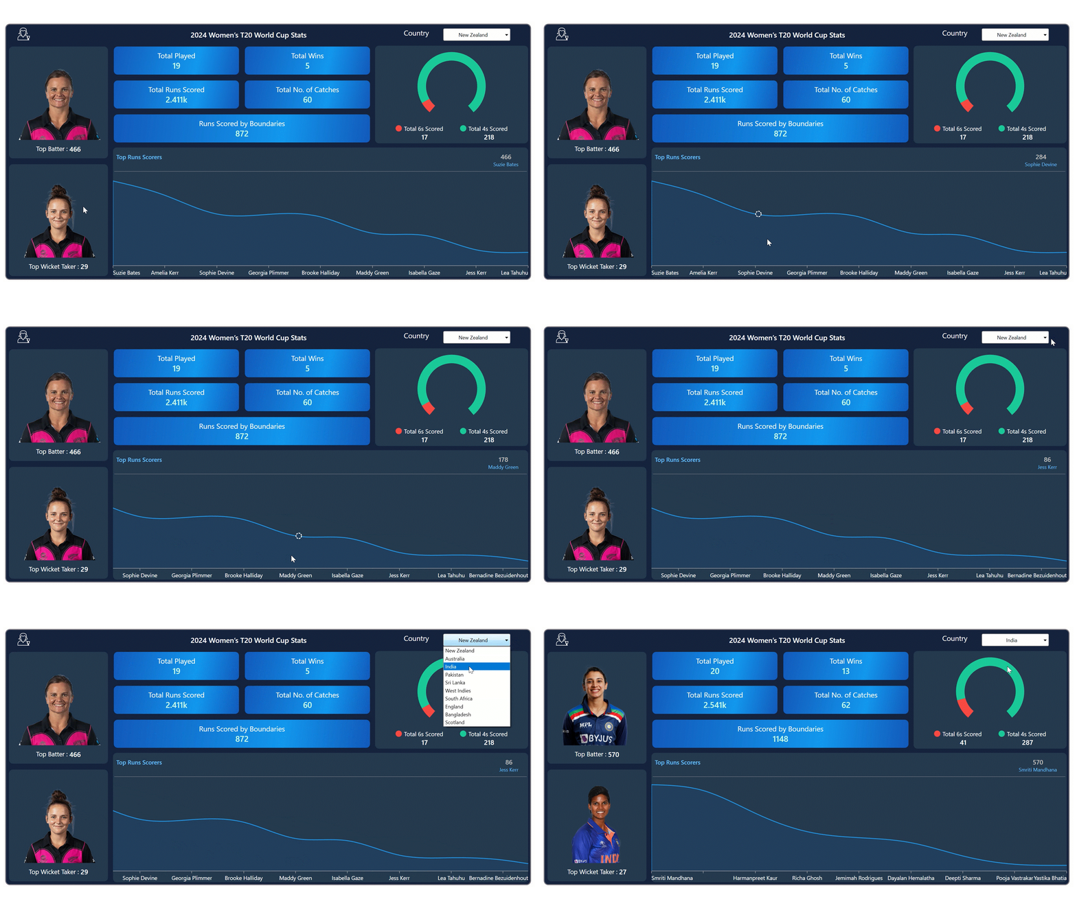
By using the ComboBox’s SelectedIndex property, we can refresh the entire dashboard in real time to display country-specific data and player details based on the selected country. This approach enables users to seamlessly explore and analyze performance data for each participating country, providing a more engaging and customizable experience.
<editors:ComboBoxAdv SelectedIndex="{Binding SelectedIndex, Mode=TwoWay>
</editors:ComboBoxAdv>
In the following code example, we have created the SelectedIndex property to store the T20 data.
public class T20_Data : INotifyPropertyChanged
{
    private int selectedIndex;

    public int SelectedIndex
    {
        get => selectedIndex;
        set
        {
            selectedIndex = value;
            UpdateIndex(value);
            OnPropertyChanged(nameof(SelectedIndex));
        }
    }

    public T20_Data()
    {
        SelectedIndex = 0;
    }

    private void UpdateIndex(int value)
    {
        if (value >= 0 && value < CountryOption.Count)
        {
            string selectedCountry = CountryOption[value];

            if (countryData != null)
            {
                if (countryData.ContainsKey(selectedCountry))
                {
                    var data = countryData[selectedCountry];
                    Play = data.Play;
                    Wins = data.Wins;
                    Runs = data.Runs;
                    CatchValue = data.CatchValue;
                    Boundaries = data.Boundaries;
                    Batter = data.Batter;
                    BatterImage = data.BatterImage;
                    WicketTaker = data.WicketTaker;
                    WicketTakerImage = data.WicketTakerImage;
                    Score6s = data.Score6s;
                    Score4s = data.Score4s;

                    ScoreData = new ObservableCollection<ScoreInfo>
                    {
                        new ScoreInfo { Category = "Total 6s Scored", Value = Score6s },
                        new ScoreInfo { Category = "Total 4s Scored", Value = Score4s }
                    };
                }
            }

            if (playersData != null)
            {
                if (playersData.ContainsKey(selectedCountry))
                {
                    Data = new ObservableCollection<PlayerData>(playersData[selectedCountry]);

                    if (Data.Count > 0)
                    {
                        Name = Data[0].Name;
                        Score = Data[0].Score;
                    }
                }
            }
        }
    }
}
After executing the previous code examples, the output will look like the following image.

Visualizing 2024 Women’s T20 World Cup stats using WPF Charts
GitHub reference
For more details, please refer to the project on GitHub.
Conclusion
Thank you for reading! In this blog, we’ve explored how to visualize the data for the 2024 Women’s T20 World Cup tournament using the Syncfusion WPF Charts. We highly recommend following the steps outlined in this blog and sharing your feedback in the comments section below.
If you need assistance, please do not hesitate to contact us through our support forum, support portal, or feedback portal. We are always eager to help you!
Related Blogs
Subscribe to my newsletter
Read articles from syncfusion directly inside your inbox. Subscribe to the newsletter, and don't miss out.
Written by

syncfusion
syncfusion
Syncfusion provides third-party UI components for React, Vue, Angular, JavaScript, Blazor, .NET MAUI, ASP.NET MVC, Core, WinForms, WPF, UWP and Xamarin.