Activity 31: Angular Ecommerce Product List
 Danilo Buenafe Jr
Table of contents
- Step-by-Step Documentation
- Creating Product Service (product.service.ts)
- Creating Product Model (product.model.ts)
- Creating Product Component Logic (product.component.ts)
- Creating Product Component Template (product.component.html)
- BEM CSS for Layout and Styling (product.component.css)
- OUTPUT:
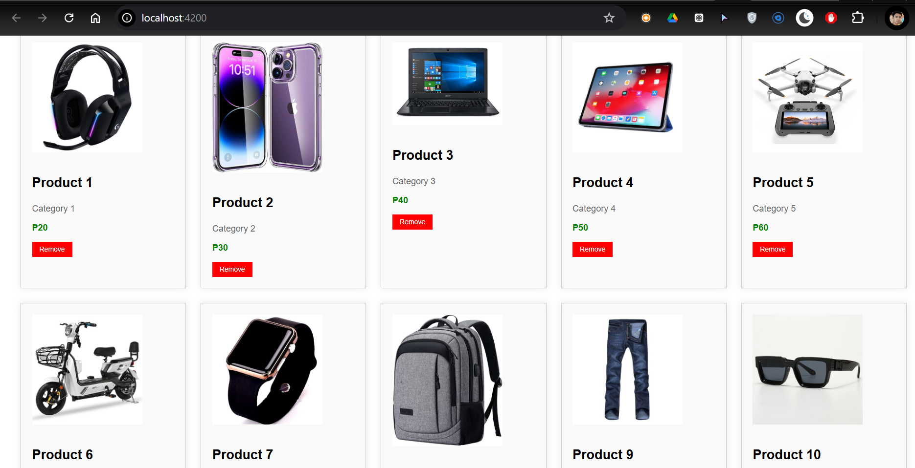
- 3 COLUMNS:
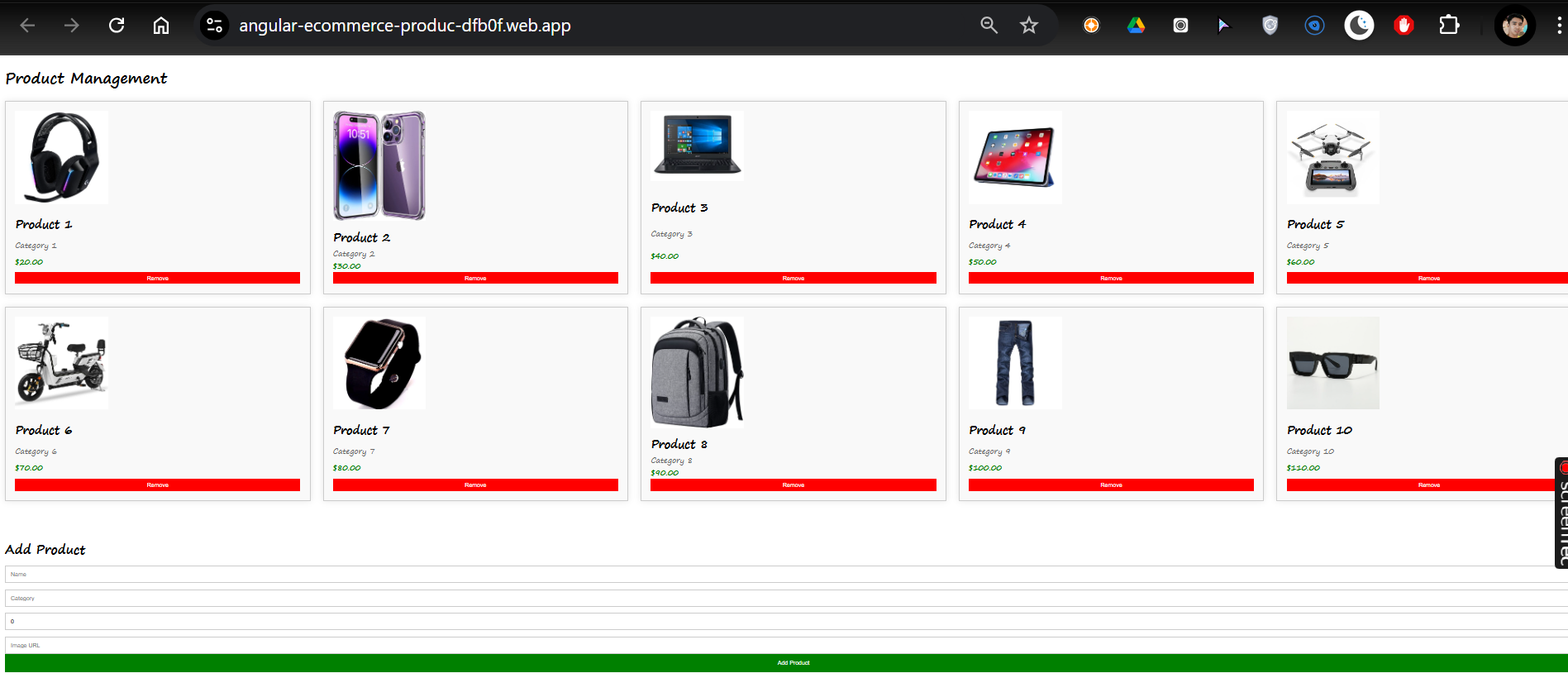
- 5 COLUMNS:
- Angular-Ecommerce-Product-List
- angular-ecommerce-produc-dtb0f.web.app
Step-by-Step Documentation
Create a List of Object Data Structures
Product Service: To manage product data.
Product Model: To define the structure of the product data.
Product Component: To display and interact with the product list.
Product Component Template: For HTML structure and user interaction.
CSS Layout: Using Grid and Flexbox with BEM (Block Element Modifier) CSS architecture.
Responsive Design: Mobile, tablet, and desktop layouts using Grid and Flex.
Firebase Hosting: Deployment of the app on Firebase.
Creating Product Service (product.service.ts)
The product service manages the data and logic related to products. It provides methods to get, add, and remove products.
import { Injectable } from '@angular/core';
import { Product } from '../models/product.model'; // Import the Product model from the model file

@Injectable({
  providedIn: 'root'
})
export class ProductService {

  private products: Product[] = [
    { id: 1, name: 'Product 1', category: 'Category 1', price: 20, image: 'https://i.pinimg.com/474x/55/63/2e/55632ecba23e99b820a2f57e5a99787c.jpg' },
    { id: 2, name: 'Product 2', category: 'Category 2', price: 30, image: 'https://i.pinimg.com/474x/ca/43/a1/ca43a11d6672b910f1c19b2c537ba2da.jpg' },
    { id: 3, name: 'Product 3', category: 'Category 3', price: 40, image: 'https://i.pinimg.com/736x/5a/e7/10/5ae7100921e1723558468d6fc8c76ee0.jpg' },
    { id: 4, name: 'Product 4', category: 'Category 4', price: 50, image: 'https://i.pinimg.com/474x/a3/22/cf/a322cf6818888e34e89902d472d9d8e9.jpg' },
    { id: 5, name: 'Product 5', category: 'Category 5', price: 60, image: 'https://i.pinimg.com/474x/19/c1/a5/19c1a5a0912e2ff12c58260bdaa2cd4b.jpg' },
    { id: 6, name: 'Product 6', category: 'Category 6', price: 70, image: 'https://i.pinimg.com/474x/f0/88/de/f088de710ee39fc4a22b168993f8a054.jpg' },
    { id: 7, name: 'Product 7', category: 'Category 7', price: 80, image: 'https://i.pinimg.com/474x/24/5f/4e/245f4e5989039c9807c7291c5c412042.jpg' },
    { id: 8, name: 'Product 8', category: 'Category 8', price: 90, image: 'https://i.pinimg.com/474x/15/50/43/155043ebee51838b69ab0122d46e4d01.jpg' },
    { id: 9, name: 'Product 9', category: 'Category 9', price: 100, image: 'https://i.pinimg.com/474x/73/0f/d7/730fd7d6184a9147f0d08a78f7ee1af9.jpg' },
    { id: 10, name: 'Product 10', category: 'Category 10', price: 110, image: 'https://i.pinimg.com/474x/5f/41/9d/5f419ddbbf75d98176783987e3439465.jpg' },
  ];

  constructor() { }

  getProducts(): Product[] {
    return this.products;
  }

  addProduct(newProduct: Product): void {
    this.products.push(newProduct);
  }

  removeProduct(productId: number): void {
    this.products = this.products.filter(product => product.id !== productId);
  }
}
Explanation:
getProducts(): Returns a list of products.addProduct(newProduct): Adds a new product to the list.removeProduct(productId): Removes a product by its ID.
Creating Product Model (product.model.ts)
The product model defines the structure of the product object that is used throughout the application.
export interface Product {
  id: number;
  name: string;
  category: string;
  price: number;
  image: string;  // Ensure this is here
}
Explanation:
id: Unique identifier for the product.
name: Name of the product.
category: Category to which the product belongs.
price: Price of the product.
image: URL of the product image.
Creating Product Component Logic (product.component.ts)
The product component handles the display and manipulation of the product list. It interacts with the ProductService to fetch, add, and remove products.
import { Component, OnInit } from '@angular/core';
import { ProductService } from '../../services/product.service'; // Import the product service
import { Product } from '../../models/product.model'; // Import the Product model from the model file

@Component({
  selector: 'app-product',
  templateUrl: './product.component.html',
  styleUrls: ['./product.component.css']
})
export class ProductComponent implements OnInit {
  products: Product[] = []; // Explicitly define the type as an array of Product
  newProduct: Product = { id: 0, name: '', category: '', price: 0, image: '' };

  constructor(private productService: ProductService) { }

  ngOnInit(): void {
    this.products = this.productService.getProducts();
  }

  addProduct(): void {
    this.newProduct.id = this.products.length + 1; // Assign a unique ID
    this.products.push({ ...this.newProduct });
    this.newProduct = { id: 0, name: '', category: '', price: 0, image: '' };
  }

  removeProduct(productId: number): void {
    this.products = this.products.filter(product => product.id !== productId);
  }
}
Explanation:
ngOnInit(): Fetches the list of products when the component initializes.addProduct(): Adds a new product via the service.removeProduct(): Removes a product from the list using its ID.
Creating Product Component Template (product.component.html)
This template provides the HTML structure to display products and a form for adding new products. It uses Grid and Flex for responsive layout.
<!-- Example of Product List -->
<div class="product__list">
    <div class="product__item" *ngFor="let product of products">
        <img class="product__item-image" [src]="product.image" alt="Product Image" />
        <div class="product__item-name">{{ product.name }}</div>
        <div class="product__item-category">{{ product.category }}</div>
        <div class="product__item-price">{{ product.price | currency }}</div>
        <button class="product__item-remove" (click)="removeProduct(product.id)">Remove</button>
    </div>
</div>

<!-- Form to Add Product -->
<div class="product__form">
    <h3 class="product__form-title">Add Product</h3>
    <div class="product__form-inputs">
        <input class="product__form-input" [(ngModel)]="newProduct.name" placeholder="Name" />
        <input class="product__form-input" [(ngModel)]="newProduct.category" placeholder="Category" />
        <input class="product__form-input" [(ngModel)]="newProduct.price" type="number" placeholder="Price" />
        <input class="product__form-input" [(ngModel)]="newProduct.image" placeholder="Image URL" />
    </div>
    <button class="product__form-button" (click)="addProduct()">Add Product</button>
</div>
Explanation:
Product Grid: Displays the list of products using Flexbox.
Product Card: Each product is displayed within a card that includes an image, name, category, price, and a remove button.
Add Product Form: A form for adding a new product with fields for name, category, price, and image URL.
BEM CSS for Layout and Styling (product.component.css)
The styling uses BEM (Block Element Modifier) to structure the CSS and follows a responsive layout using Grid and Flexbox.
/* General product container styling */

.product {
    font-family: Arial, sans-serif;
    margin: 20px;
}


/* Title styling */

.product__title {
    font-size: 24px;
    margin-bottom: 20px;
}


/* Grid layout for product list */

.product__list {
    display: grid;
    grid-template-columns: repeat(2, 1fr);
    /* 2 columns for mobile by default */
    gap: 20px;
}


/* Product item styling */

.product__item {
    background-color: #f9f9f9;
    border: 1px solid #ccc;
    padding: 15px;
    box-shadow: 0 0 10px rgba(0, 0, 0, 0.1);
    display: flex;
    flex-direction: column;
    justify-content: space-between;
}


/* Image styling to make it smaller */

.product__item-image {
    width: 100%;
    /* Adjust width to be responsive */
    max-width: 150px;
    /* Limit the maximum width of the image */
    height: auto;
    /* Maintain the aspect ratio */
    margin-bottom: 10px;
    /* Space between image and other content */
}

.product__item-name {
    font-size: 18px;
    font-weight: bold;
}

.product__item-category {
    color: #666;
}

.product__item-price {
    color: green;
    font-weight: bold;
}

.product__item-remove {
    background-color: red;
    color: white;
    border: none;
    padding: 5px 10px;
    cursor: pointer;
}

.product__item-remove:hover {
    background-color: darkred;
}


/* Media Queries for responsiveness */


/* Tablet (3 columns) */

@media (min-width: 600px) {
    .product__list {
        grid-template-columns: repeat(3, 1fr);
    }
}


/* Desktop (5 columns) */

@media (min-width: 1024px) {
    .product__list {
        grid-template-columns: repeat(5, 1fr);
    }
}


/* Form styling with Flexbox */

.product__form {
    margin-top: 40px;
    display: flex;
    flex-direction: column;
    align-items: flex-start;
}

.product__form-title {
    font-size: 20px;
    margin-bottom: 10px;
}

.product__form-inputs {
    display: flex;
    flex-direction: column;
    gap: 10px;
    width: 100%;
}

.product__form-input {
    padding: 8px;
    width: 100%;
    border: 1px solid #ccc;
}

.product__form-button {
    padding: 10px;
    background-color: green;
    color: white;
    border: none;
    cursor: pointer;
    width: 100%;
}

.product__form-button:hover {
    background-color: darkgreen;
}
Explanation:
Grid Layout: The
product-gridclass uses CSS Grid to create a flexible layout with responsive columns.Flex for Cards:
product-cardis styled with Flexbox properties for layout within the grid.BEM Naming Convention: The classes follow the BEM architecture to ensure a clean and maintainable code structure.
OUTPUT:
2 COLUMNS:
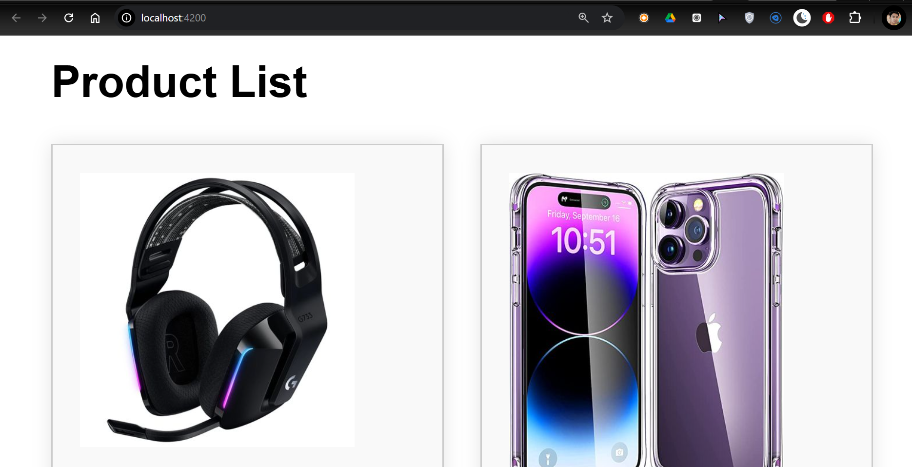
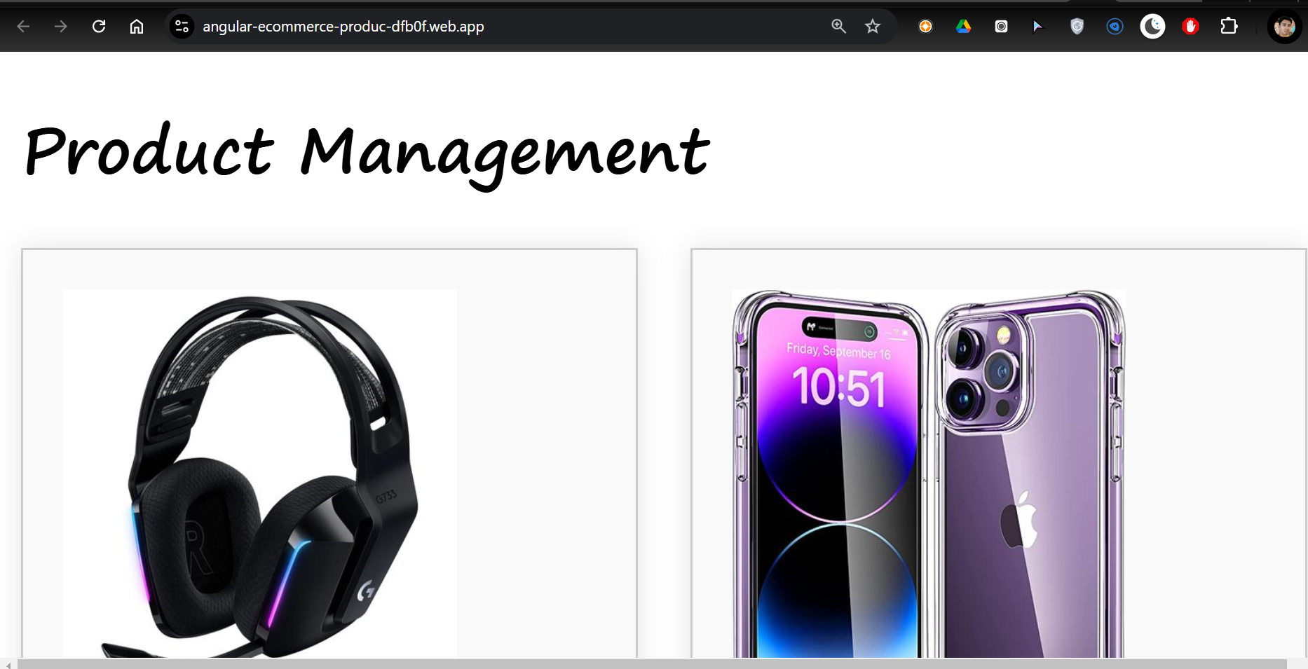
3 COLUMNS:
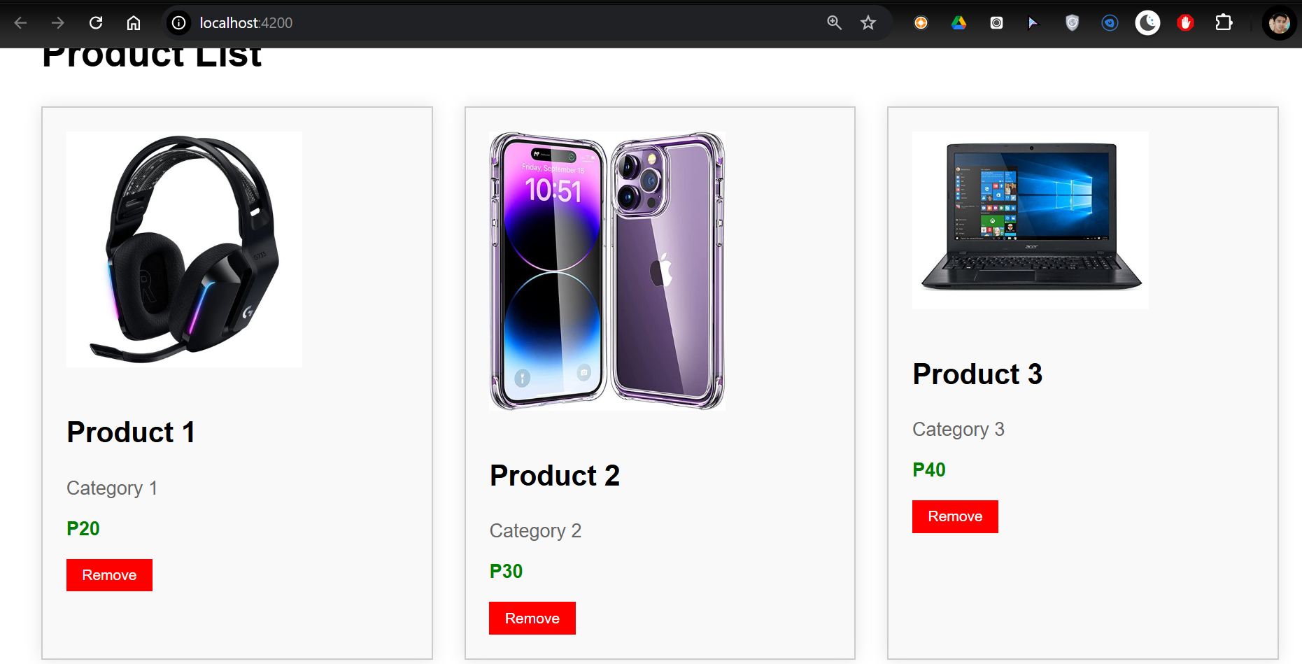
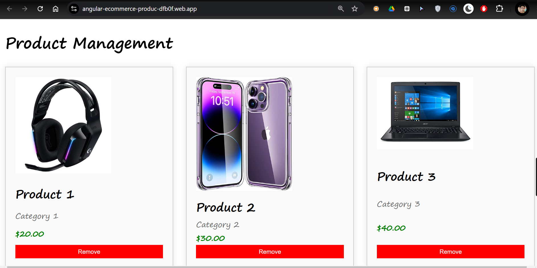
5 COLUMNS:
Angular-Ecommerce-Product-List
angular-ecommerce-produc-dtb0f.web.app
Subscribe to my newsletter
Read articles from Danilo Buenafe Jr directly inside your inbox. Subscribe to the newsletter, and don't miss out.
Written by
