How to Create a 3D Revolving Carousel with CSS and SCSS
 Chris jr Nwaije
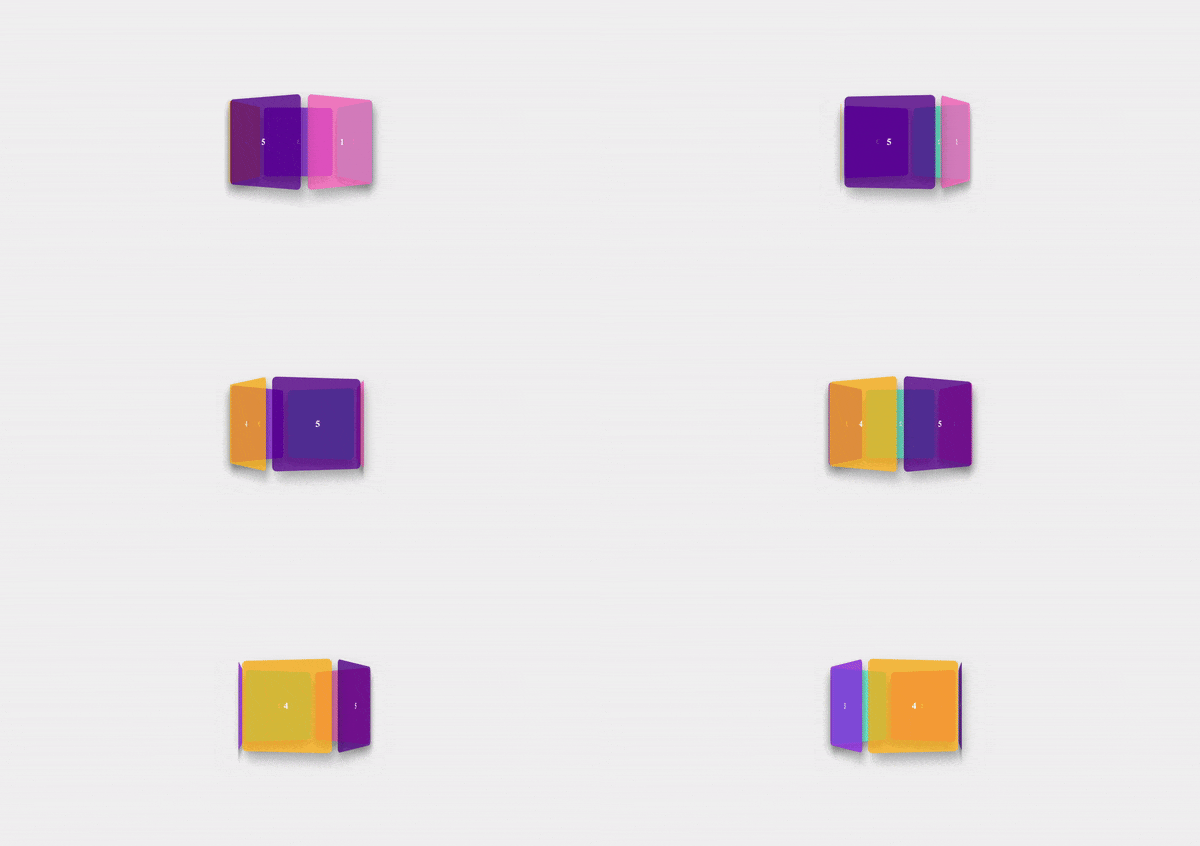
In this tutorial, I’m going to show you how I built a 3D revolving carousel using only CSS and SCSS. This interactive element is perfect for adding a dynamic touch to your websites and can be used for showcasing images, products, or other content in a visually appealing way.
We'll also walk through how to use SCSS and convert it to regular CSS for use in your projects.
What You'll Learn:
How to create a 3D rotating effect using CSS.
How to use SCSS for clean and organized styles.
How to compile SCSS into CSS.
Making the carousel responsive for smaller screens.
Step 1: HTML Structure
First, let’s set up the basic structure of the carousel. The carousel itself will contain multiple elements, each representing a "side" of the carousel. In the HTML, we’ll use a simple div container for the carousel and individual child elements representing each carousel item.
<!DOCTYPE html>
<html lang="en">
<head>
    <meta charset="UTF-8">
    <meta name="viewport" content="width=device-width, initial-scale=1.0">
    <link rel="stylesheet" href="styles.css">
    <title>3D Revolving Carousel</title>
</head>
<body>
    <div class="carousel">
        <div class="rectangle">1</div>
        <div class="rectangle">2</div>
        <div class="rectangle">3</div>
        <div class="rectangle">4</div>
        <div class="rectangle">5</div>
    </div>
</body>
</html>
Step 2: SCSS Styling
Now we get to the fun part—styling with SCSS. SCSS allows you to write cleaner, more modular CSS with variables, nested rules, and mixins. Let’s see how we can style the carousel with SCSS.
$box-shadow: 10px 15px 25px rgba(0, 0, 0, 0.3);
$colors: (
  rgba(255, 105, 180, 0.75),  // Hot Pink
  rgba(64, 224, 208, 0.75),   // Turquoise
  rgba(138, 43, 226, 0.75),   // Blue Violet
  rgba(255, 165, 0, 0.75),    // Orange
  rgba(75, 0, 130, 0.75)      // Indigo
);

* {
  margin: 0;
  padding: 0;
  box-sizing: border-box;
}

body {
  display: flex;
  align-items: center;
  justify-content: center;
  height: 100vh;
  margin: 0;
  background: #f0f0f0;
  perspective: 1000px; /* This defines the 3D perspective */
}

/* Responsive styling for smaller screens */
@media (max-width: 768px) {
  .carousel {
    width: 200px;
    height: 200px;
  }
}

.carousel {
  position: relative;
  width: 300px;  /* Width of the carousel */
  height: 300px; /* Height of the carousel */
  transform-style: preserve-3d; /* Preserve 3D transformations */
  animation: spin 15s infinite linear; /* Infinite rotating animation */
  transform-origin: center center; /* Ensure rotation occurs from the center */
  display: flex;
  align-items: center;
  justify-content: center;

  .rectangle {
    position: absolute;
    width: 200px;
    height: 200px;
    border-radius: 10px;
    color: white;
    display: flex;
    align-items: center;
    justify-content: center;
    font-size: 20px;
    font-weight: bold;
    box-shadow: $box-shadow;

    @for $i from 1 through length($colors) {
      $angle: (360deg / length($colors)) * ($i - 1); /* Calculate angle for each rectangle */

      &:nth-child(#{$i}) {
        background-color: nth($colors, $i); /* Assign background color */
        transform: rotateY($angle) translateZ(150px); /* Positioning in 3D space */
      }
    }
  }
}

/* Keyframe for the continuous rotating animation */
@keyframes spin {
  from {
    transform: rotateY(0deg); /* Starts from 0 degrees */
  }
  to {
    transform: rotateY(360deg); /* Rotates to 360 degrees */
  }
}
Step 3: Compiling SCSS to CSS
Since browsers don’t understand SCSS directly, we need to compile SCSS into regular CSS. This is where Sass (Syntactically Awesome Stylesheets) comes in. Sass is a preprocessor that extends CSS with additional features, like variables and mixins.
To compile SCSS to CSS, follow these steps:
- Install Sass: If you don’t already have Sass installed, you can install it globally using npm (Node Package Manager):
npm install -g sass
- Compile SCSS: After you’ve written your SCSS file (e.g.,
styles.scss), you can compile it into CSS by running the following command:
sass styles.scss styles.css
- This command will convert
styles.scssintostyles.css, which you can then link to your HTML file.
Step 4: How It Works
3D Effect: The key to this carousel’s 3D effect is the
transform: rotateY()property. We apply a rotation on the Y-axis to each carousel item, spreading them evenly around the center. ThetranslateZ(150px)ensures that the items are positioned along the Z-axis, creating the 3D effect.Infinite Animation: The
@keyframesrule spins the carousel continuously usingrotateY(360deg), creating the revolving effect.Responsiveness: We use a media query to make the carousel responsive. When the screen width is smaller than 768px, the carousel’s size will adjust to
200pxby200px.
In conclusion, creating a 3D revolving carousel using CSS and SCSS is a rewarding project that enhances the visual appeal of your website. By leveraging the power of SCSS for cleaner and more organized styling, and compiling it into CSS, you can achieve a dynamic and interactive element that is both functional and aesthetically pleasing. The use of transform: rotateY() and translateZ() properties allows for a stunning 3D effect, while keyframe animations ensure a smooth, continuous rotation. Additionally, incorporating media queries ensures that the carousel remains responsive and accessible on various screen sizes. This tutorial provides a solid foundation for implementing advanced CSS techniques in your web development projects.
Subscribe to my newsletter
Read articles from Chris jr Nwaije directly inside your inbox. Subscribe to the newsletter, and don't miss out.
Written by

Chris jr Nwaije
Chris jr Nwaije
Hi, I’m Chris.