Hands-On Exploratory Data Analysis with KNIME
 Vijaykrishna
Table of contents
- Downloading the dataset and workflow
- Reading and transforming the CSV-based dataset
- Practical data analysis using KNIME
- Total number of pedestrians for every sensor across the years
- Visualize the number of active sensors across each year
- Top 10 sensors by traffic in 2022
- Visualizing total pedestrian counts over time
- Pedestrian count over time for sensors active across all years
- Monthly pedestrian count for sensors active in 2019, 2020, and 2021
- Creating time series plots of sensor readings
- Comparing time series plots of three sensor readings
- Visualizing the distribution of daily pedestrian traffic for a sensor
- Summary
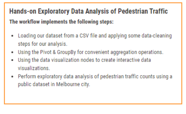
KNIME is particularly well-suited to data analysis workflows due to its versatility and highly optimized performance. It allows practitioners to scale data analysis workflows beyond what they would otherwise achieve on their local machine. This article will use the data analysis workflow to perform some hands-on exploratory dataset analysis, allowing us to explore different approaches for performing practical data analysis with KNIME.
More specifically, in this article, we will cover the following topics:
Loading our dataset from a CSV file and applying data-cleaning steps for our analysis.
Using the Pivot & GroupBy for convenient aggregation operations.
Using the data visualization nodes to create interactive data visualizations.
Perform exploratory data analysis of pedestrian traffic counts using a public dataset in Melbourne City.
By the end of this article, you will be able to assemble workflows for practical data analysis with KNIME that work for your needs.
Downloading the dataset and workflow
We will be working with one of the pedestrian counting-system datasets produced and made public by the city of Melbourne. This dataset contains hourly pedestrian counts from sensors in and around Melbourne. We will use a historical snapshot of this dataset covering May 2009 to December 2022.

You are ready once you have extracted the CSV file from the ZIP archive.
You can download the Melbourne Pedestrian Sensor Data Analysis workflow from the KNIME Community Hub.
Reading and transforming the CSV-based dataset
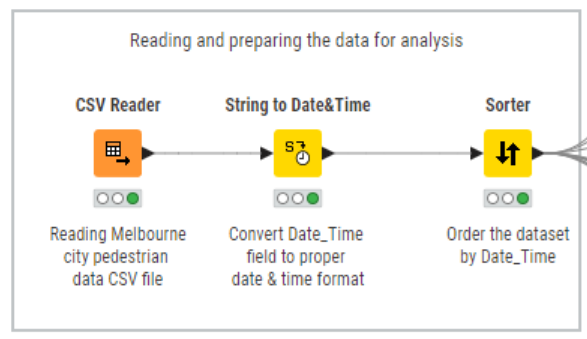
The first step in our analysis will be to identify the data loading and transformation steps we will use to prepare the data for our exploratory analyses. We will do this first step using the CSV Reader node before we persist our transformation in a KNIME table.
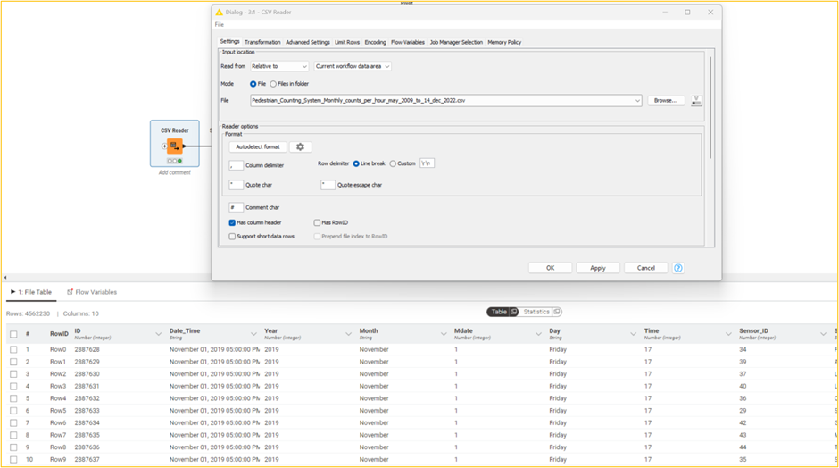
The KNIME table is created by loading the pedestrian CSV dataset without cleaning.
As we can see, each record in this dataset (4,562,230 rows & 10 columns) contains the number of pedestrian counts passing through a given sensor for a specific hour, along with other information about the hourly reading, such as the sensor name and timestamp of the record and date and time components extracted from the timestamp.
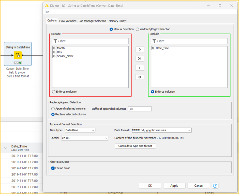
The primary data issue you might have noticed is that the Date_Time field is of the String type. We must convert this column to a Date&Time type for some time series analysis and visualizations. Let us address this by using the String to Date&Time node. We can see that the Date_Time column now has the correct date & time format.
Given that we will be performing a range of time series analyses, we will almost certainly need these records ordered by Date, so the other transformation we will perform involves sorting the records by the Date_Time column.

The KNIME table that is produced after applying the transformations
Our data format is now suitable for performing our analysis. Of course, the nature of data analysis is iterative, and we may need to come back to tune our data processing steps after working with the dataset. But for now, we are ready to proceed with the data analysis.
Practical data analysis using KNIME
We will briefly cover two sets of tools that will assist us in performing our data analysis. The first is aggregation nodes like GroupBy and Pivot, which provide a convenient way to perform aggregate operations on the data. The second is comprehensive data visualization nodes (Views and JavaScript) that produce interactive visualizations. Let us get started.
Total number of pedestrians for every sensor across the years
Say we wanted to count the total number of pedestrian readings for every sensor aggregated across all years. We can use the Pivot node to perform this aggregation using the following column settings: group by Sensor_Name, pivot by Year, and sum by Hourly_Counts.
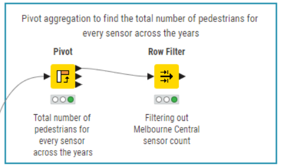

The resulting pivot table is produced after performing the aggregation. Note that some sensors have not captured data for some years, which are aptly represented as missing values.
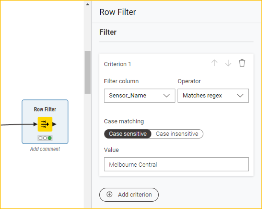
Taking it further, say we wanted to count the total number of pedestrian readings for the Melbourne Central sensor alone. We can use the Row Filter node to filter out the aggregated count for this sensor.
Visualize the number of active sensors across each year
First, we will use the GroupBy node to get the distinct number of sensor names seen across each year (group by Year and unique count by Sensor_Name). Before we proceed with the visualization, we will convert the Year column from Number to String. Subsequently, we will use the Line Plot node to plot the unique count of sensors across each year.
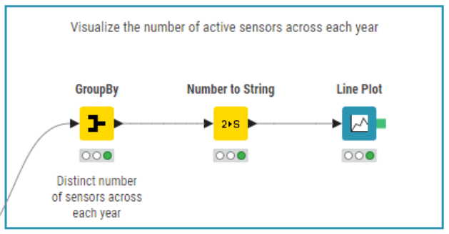
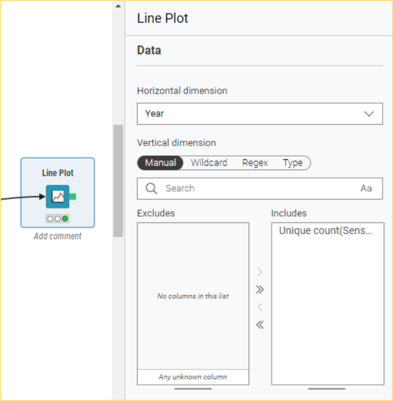
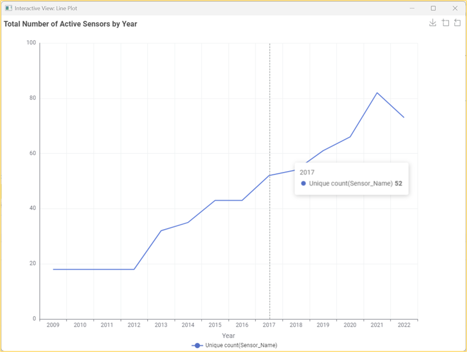
The resultant interactive line plot shows the number of active sensors each year.
Top 10 sensors by traffic in 2022
First, we will use the Row Filter node to filter out the dataset for the year 2022. Then, we will use the GroupBy node on the resultant dataset to get the total number of pedestrians across each sensor (group by Sensor_Name and sum of Hourly_Counts). Before the visualization, we will use the Top k-row Filter node to find the top 10 sensors. Subsequently, we will use the Bar Chart node to get an interactive bar chart of the top 10 sensors by traffic in 2022.
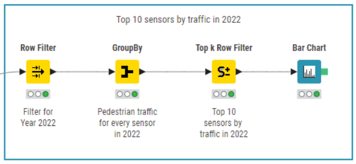
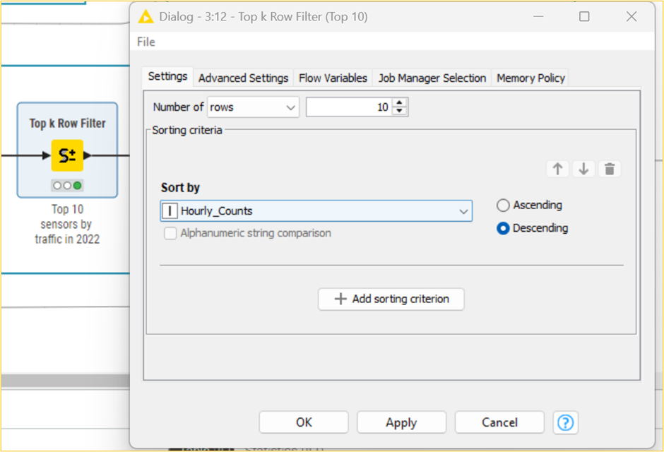
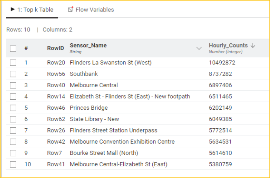
Table with the top 10 sensors by total pedestrian counts for 2022
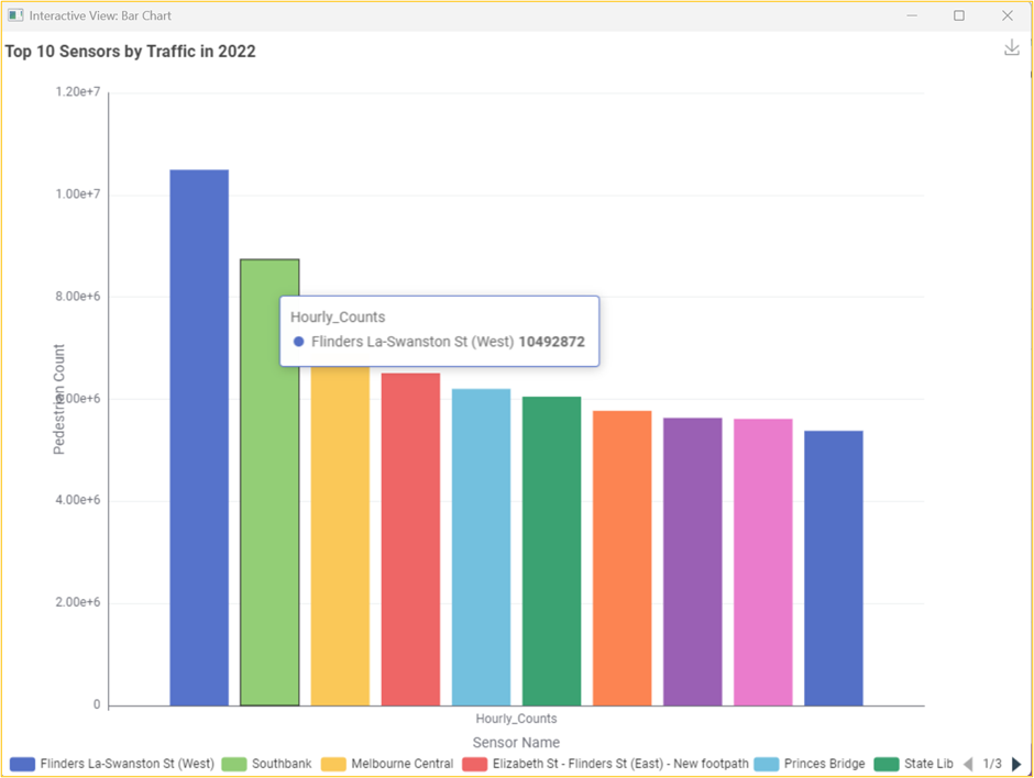
The resultant interactive bar chart shows the top 10 sensors by traffic in 2022.
Visualizing total pedestrian counts over time
Let us understand how the dataset's total number of pedestrian counts registered by the sensor network has changed over the years. We will use the GroupBy node to get the total number of pedestrians across all sensors by year (group by Year and sum by Hourly_Counts). Before we proceed with the visualization, we will convert the Year column from Number to String. Subsequently, we will use the Line Plot node to plot the total number of pedestrians yearly.
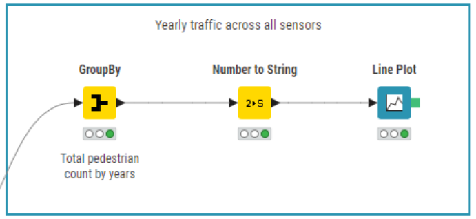
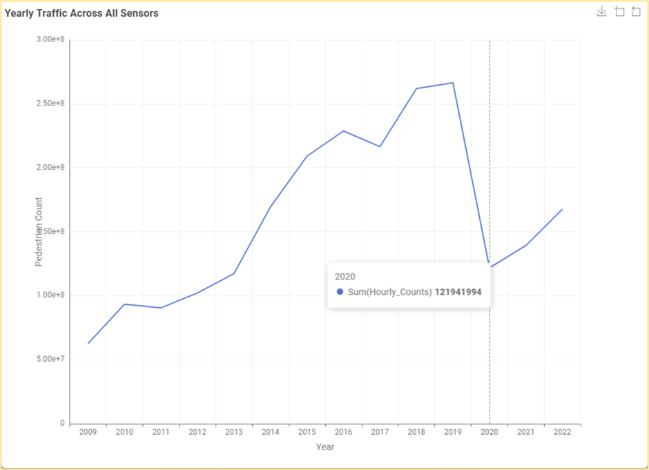
The resultant line chart shows the total pedestrian counts recorded annually across the entire pedestrian counting system.
This plot shows a steady increase over the years in the number of total pedestrians recorded moving across Melbourne city, with a rather pronounced crash in 2020, which is almost certainly due to the impact that COVID-19 lockdown restrictions had on the number of people walking through the city. However, we must be careful about the conclusions we draw from this plot. As we saw in the previous section, the number of active sensors in the system has increased, resulting in some pedestrians being counted more times over the same route than in previous years.
Pedestrian count over time for sensors active across all years
To address the confounding impact of the changing number of sensors over the years, let us filter down our dataset to only records from sensors that have readings across every year before repeating the same analysis. We will do this in two steps:
Extract the sensor names with readings for every year in the dataset.
Repeat our sum aggregation of pedestrian counts by year while retaining only those rows with sensor names in the above table (#1).
We can achieve the first step by grouping our dataset by sensor name and selecting only sensor names whose group of records includes at least one record for each year that our dataset covers. Our dataset contains data from 2009 to 2022, covering 14 years. We will use the GroupBy node (unique count by Year) to confirm that this is the distinct number of years seen in our dataset.
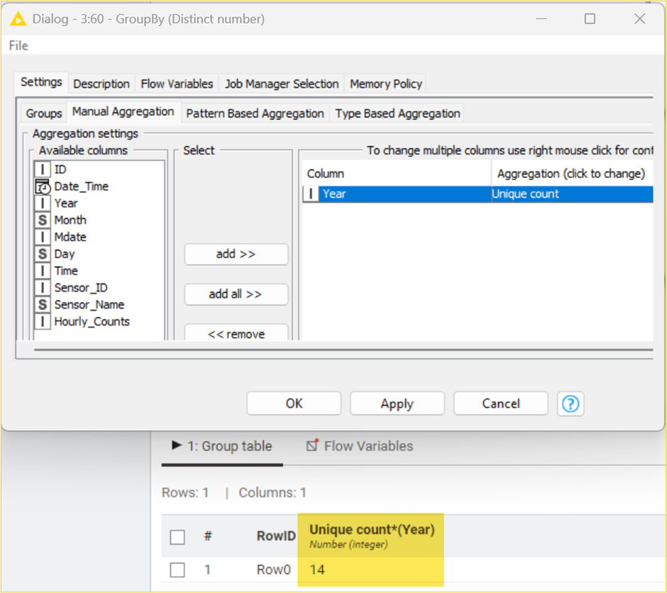
We will leverage the observation that each sensor needs to have 14 distinct Year values across its readings to be considered. We will use the GroupBy node to get the number of distinct years for every sensor (group by Sensor_Name and unique count by Year). Using the Table Row to Variable node, we will pass the distinct count value 14 as a flow variable for the Row Filter node. This gives us the list of 15 sensors with readings for all 14 years.
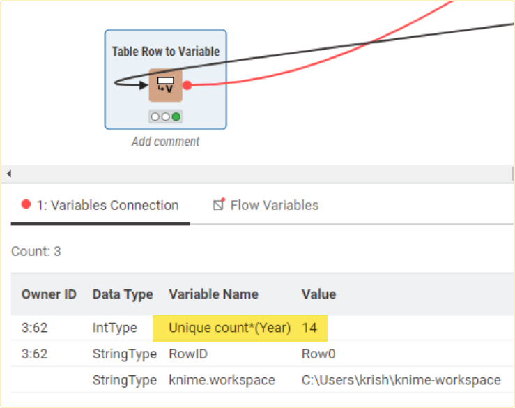
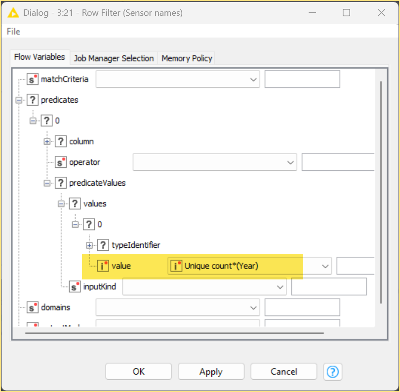
A distinct year count is passed to the row filter node as a flow variable.
We can perform the next step now that we know which sensors were active across all years in the dataset. Here, we will replicate the previous set of nodes we used to plot the total number of pedestrian counts for each year (yearly traffic across all sensors). However, this time, we will restrict pedestrian counts to only those active sensors for all years. We will use the Reference Row Filter node for this purpose.
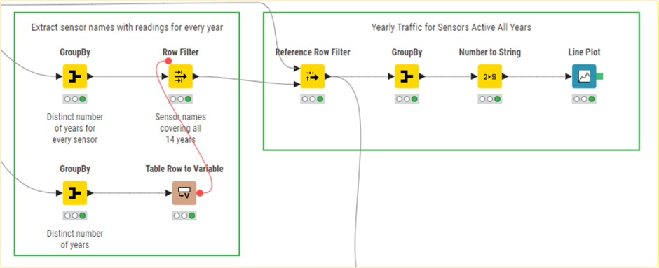
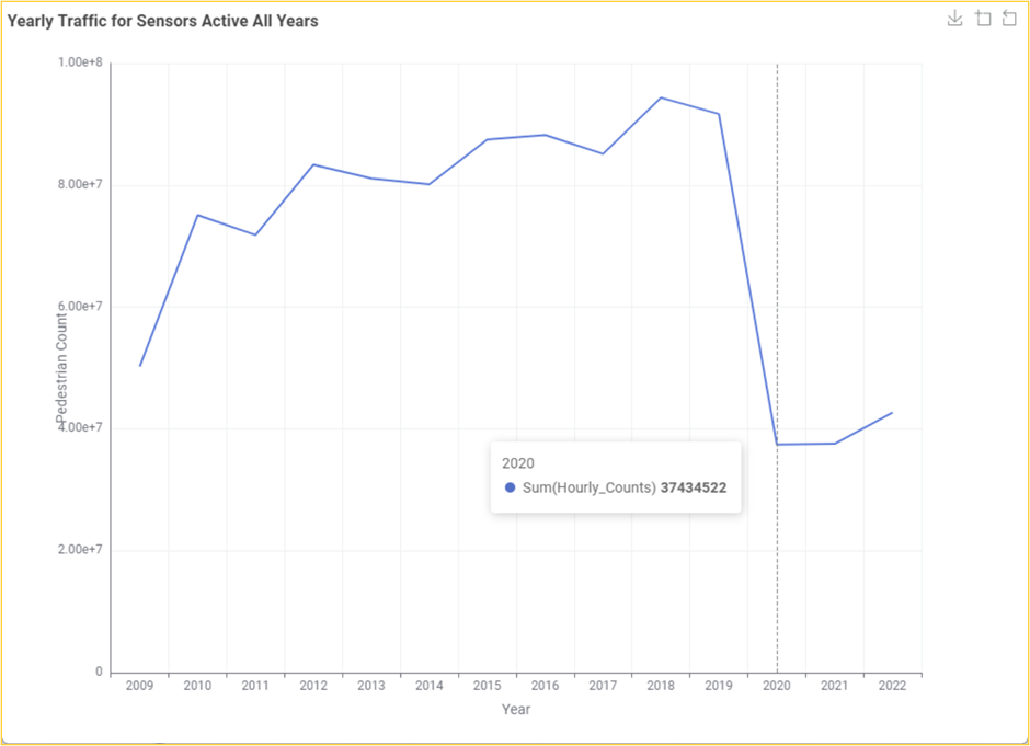
A resultant line chart shows the total pedestrian counts by year across only active sensors yearly.
Comparing this with the previous plot, we can see that the trend regarding the increasing number of pedestrian counts over the years is less pronounced. This is what we expect to see when controlling the growing number of sensors. We can still see the dramatic drop in sensor counts due to the COVID-19 lockdowns, which, if anything, now looks even more pronounced compared to the previous years.
Monthly pedestrian count for sensors active in 2019, 2020, and 2021
To finish our investigation into pedestrian counts through the city over time, let us drill down a bit deeper into the impact of the lockdowns on Melbourne pedestrian traffic by looking at the month-to-month changes for 2019, 2020, and 2021. For this, we will need a new data extract, which we group by years and months and then aggregate the total counts for each combination of year and month. Continuing our previous analysis, we will filter this down to only readings from active sensors across all years.
First, we will convert the Year column from Number to String and use the Nominal Value Row Filter node to restrict the dataset for 2019, 2020, and 2021. We can then use the Pivot node to perform the monthly aggregation using the following column settings: group by Num_Month, pivot by Year, and sum by Hourly_Counts.

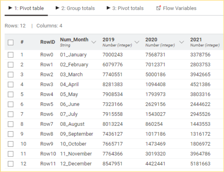
The resulting pivot table contains the aggregated pedestrian counts for each month and year combination.
Subsequently, we will use the Line Plot node to plot the monthly total number of pedestrians for sensors active in 2019, 2020, and 2021.
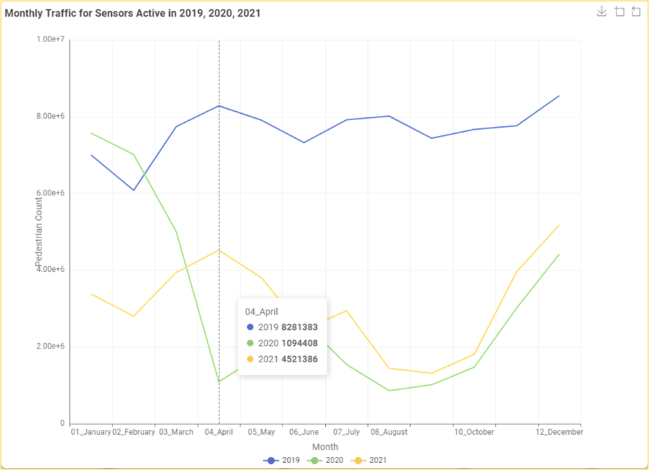
A resultant line chart shows the monthly traffic for sensors active in 2019, 2020, and 2021.
This visualization allows us to compare the month-by-month total counts for each target year readily. By hovering over the markers of different lines, we can gather that in April 2019, there were 8.2 million pedestrian counts, which dropped to 1.1 million for the same month in 2020, when the initial lockdown was in full effect.
Creating time series plots of sensor readings
We will now move on to a finer level of analysis and explore how the hourly pedestrian traffic changes over a range of days for specific sensors. Let us start by creating a plot of hourly traffic for the Flinders La-Swanston St (West) sensor across all of 2020. First, we will use the Row Filter node to extract only the records corresponding to our target sensor and year. Then, we will use the Line Plot node to plot the hourly pedestrian count.
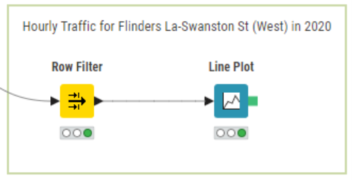
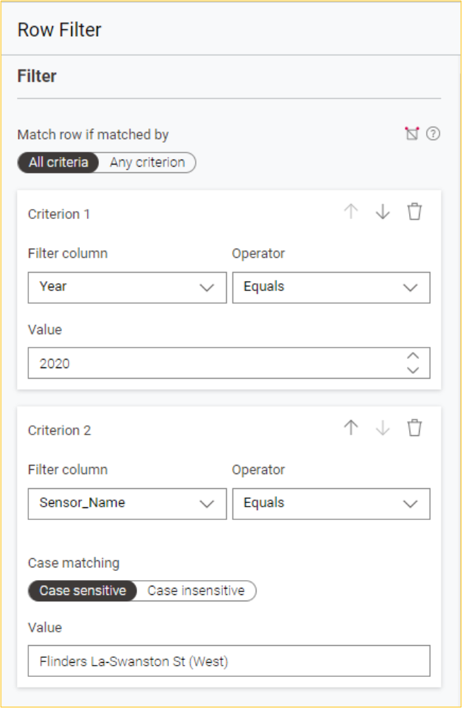
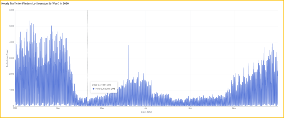
A resultant line chart shows the hourly pedestrian counts for the Flinders La-Swanston St (West) sensor for 2020.
This is a very dense line plot since we have visualized every hour throughout the year. It provides a striking visualization of the impact the COVID-19 lockdowns had on pedestrian traffic across this sensor:
Traffic dropped around the middle of March as restrictions were applied, leading up to the first complete lockdown on March 31.
Traffic starts to increase in mid-May as restrictions are relaxed.
A massive spike on June 6 coincided with a protest close to the central business district.
Traffic drops off again, with a second lockdown being put in place on July 7
We start seeing traffic increase again from October through to the end of the year, corresponding to the ongoing lifting of restrictions, which began in mid-September
This is a perfect time to take advantage of another of the interactive features the Line Plot node visualizations offer. We can zoom in on specific regions of the x and y axes by left-clicking and dragging over the desired area. Selecting the region from January 16 to 31 gives us the following time series:
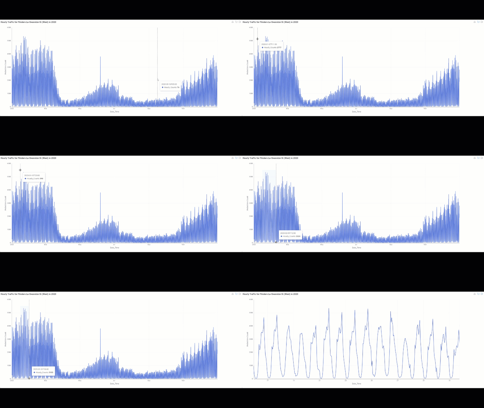
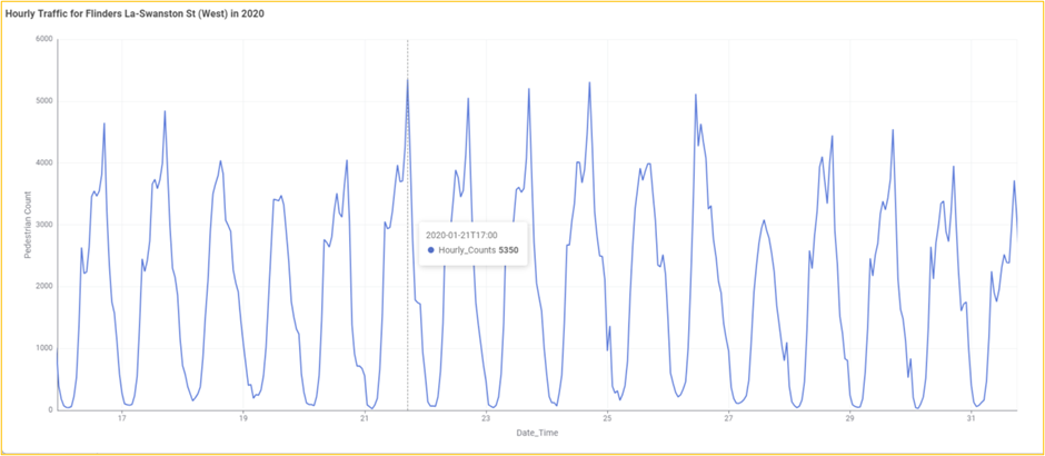
A zoomed-in view of the same time series plot
We can now easily discern the periodic changes in pedestrian traffic for this sensor, corresponding to the daily rhythm of people’s activities. You can click on the zoom reset icon to reset the zoom level.
Comparing time series plots of three sensor readings
It might be interesting to compare the daily traffic rhythms across three different sensors to see whether there are variations. We can use a combination of Row Filter (for September 2019), and Rule-based Row Filter (for Sensor_Name in "Flinders St-Spark La", "Bourke Street Mall (North)", "Southern Cross Station"). We can thenuse the Pivot node to perform the aggregation using the following column settings: group by Date_Time, pivot by Sensor_Name, and sum by Hourly_Counts). Subsequently, we will use the Line Plot node to plot the hourly pedestrian count for the chosen three sensors in September 2019.
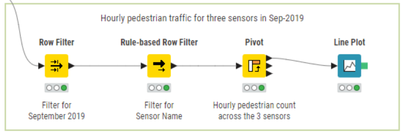
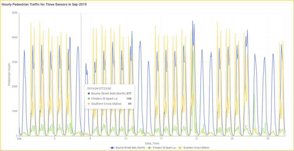
A resultant line chart shows the hourly pedestrian counts for three different sensors in Sep 2019.
By plotting the hourly traffic of these three sensors, we can readily compare pedestrian traffic patterns across them for September 2019. Comparing these three sensors, we can see that while they all have daily peaks and troughs, there is a noticeable variation:
The Southern Cross Station sensor time series plot is striking. It reveals a pronounced difference in weekday traffic versus weekend traffic, with the weekend daytime peaks being much lower than those on the weekdays. This suggests that much pedestrian traffic comes from commuting to and from work.
The daily peaks for the Bourke Street Mall (North) sensor look similar in range but with less pronounced variation between weekday and weekend traffic.
Lastly, the Flinders St-Spark La sensor has a much lower range of daily traffic counts, with discernible drops over the weekend. We can also see a significant spike in pedestrian traffic on September 20.
In the context of exploratory data analysis, the particularly convenient interactive feature of these plots allows us to easily compare traffic through these sensors across narrower time windows using the zoom function without modifying the configuration.
Visualizing the distribution of daily pedestrian traffic for a sensor
To gain deeper insights into how pedestrian traffic varies across a particular sensor location, we must move away from visualizing individual data points (time series plots) and instead visualize aggregated statistics (box plots) across multiple data points. Let us create a box plot set that compares the distributions of daily pedestrian count for a single sensor across various years. We will look at traffic across the Bourke Street Mall (North) sensor, comparing 2019, 2020, and 2021 distributions.
We start by using a Rule-based Row Filter (for Sensor_Name in "Bourke Street Mall (North)" and Year in 2019, 2020, 2021). We will then use the GroupBy node to get the daily pedestrian count across each year (group by Year and Date and sum by Hourly_Counts) and convert the Year column from Number to String. After that, we will use the Box Plot node to plot the daily pedestrian count distribution across the Year dimension (Condition column).
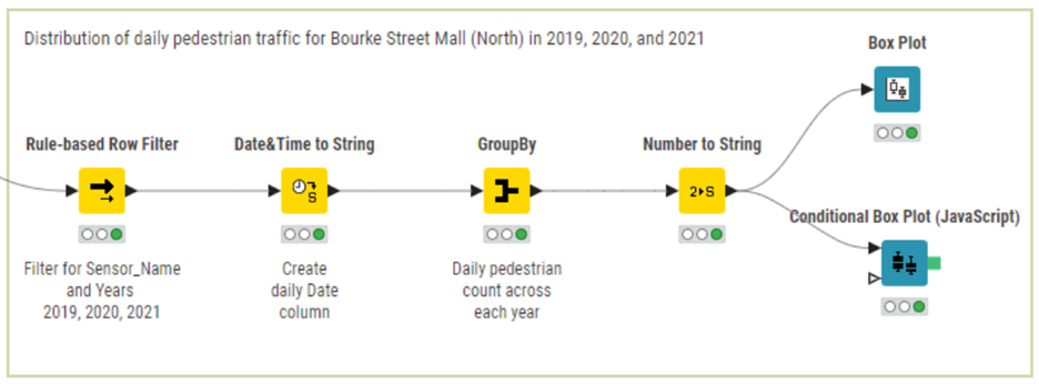
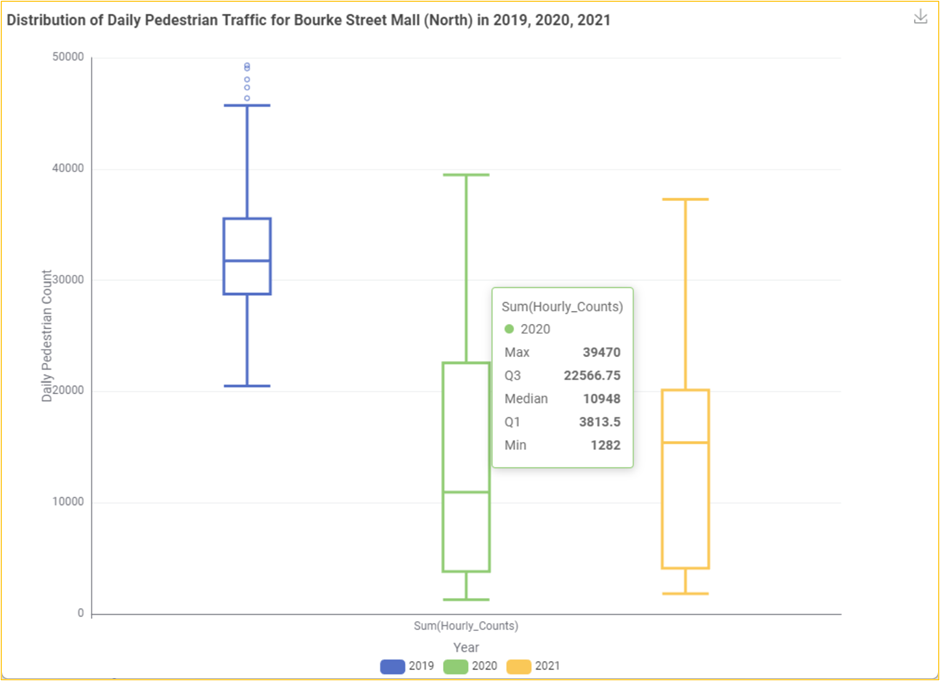
A resultant interactive box plot with three box plots comparing the distributions of daily pedestrian counts from 2019 to 2021 for the Bourke Street Mall (North) sensor.
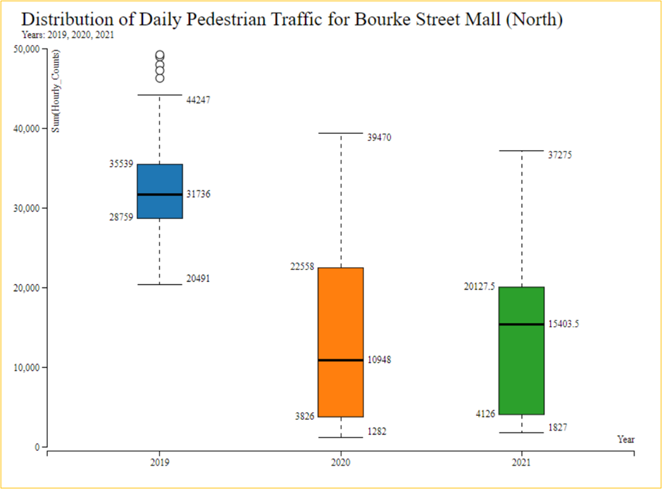
A resultant conditional box plot (JavaScript) with three box plots comparing the distributions of daily pedestrian counts from 2019 to 2021 for the Bourke Street Mall (North) sensor.
These three box plots provide us with a rich set of information about the distribution of daily pedestrian counts across the three years. Hovering over each box plot informs us of the value of key summary statistics, including that they include the median daily count (the horizontal line inside the box), the first and third quartiles (the bottom and top of the boxes, enclosing 50% of the data points), and the lower and upper fence values (the horizontal lines bounding the whiskers extending from the box), which indicate sentinel data points, below or above which any data points are considered outliers.
Unsurprisingly, the pre-COVID-19 distribution of daily counts for 2019 sits much higher than the next two years. We can also see that this year has a lower degree of spread than the other years, with the shorter box indicating a lower interquartile range – within which 50% of all the daily counts occur. 2020 and 2021 saw a greater spread of values, consistent with alternative lockdown periods in both years. We can also see that 2020 has a slight skew toward lower values, and 2021 has a more significant skew toward higher numbers. This, as well as the slightly lower interquartile range for 2021, is consistent with 2021 having fewer days of lockdown than 2020.
As you can see, this dataset provides a wealth of possible insights into changes and variability in pedestrian traffic through Melbourne. We will have to leave our exploratory analysis of the dataset here. Still, while going through these analyses, you might have thought about different lines of exploration and questions that we could have pursued. You can continue the analysis now that you have all the necessary ingredients.
Summary
In this example, we explored how to use KNIME in the context of hands-on data analysis. Working with the Melbourne Pedestrian Counting System dataset, various KNIME data manipulation and visualization features enabled us to perform exploratory data analysis, in which we uncovered a range of insights into pedestrian traffic through Melbourne City.
Subscribe to my newsletter
Read articles from Vijaykrishna directly inside your inbox. Subscribe to the newsletter, and don't miss out.
Written by

Vijaykrishna
Vijaykrishna
I’m a data science enthusiast who loves to build projects in KNIME and share valuable tips on this blog.