Whispers Between the Hovers: The Magic of Micro-Interactions
 Nishtha Aggarwal
Enter the Realm of Micro-Interactions
You get the impression that you've entered a tiny, private coffee shop where every little detail has been carefully considered thanks to the comfortable seats, pleasant lighting, and background sound of cups clinking. Every component has been thoughtfully crafted to ensure your comfort and a seamless experience that extends beyond just a cup of coffee.
"Feels familiar, doesn't it?"
Imagine a world in which each tap, click, and scroll is meant to be as purposeful as possible in order to guide, instruct, and entertain. This is the area of micro-interactions, the small elements that turn a simple interface into one that is genuinely engaging.
The Magic Unveiled
Even though micro-interactions may appear minor or incidental, they give digital experiences flavor, much like spices do in cooking. These are what give an interface life—subtle vibrations, animations, or visual clues. Micro-interactions, which provide immediate feedback, walk users through activities, and add charming details that leave an interface memorable, are essential to the user experience even though they are frequently disregarded. With these careful touches, a decent UI can become a genuinely delightful and fulfilling experience.
Dan Saffer, a leading voice in the world of UX, encapsulates this approach with insightful simplicity:
“Micro-interactions are an exercise in restraint, in doing as much as possible with as little as possible. Embrace the constraints and focus your attention on doing one thing well. Mies van der Rohe’s mantra of ‘less is more’ should be the micro interaction designer’s mantra as well.”
Micro-interactions are the little but powerful components that allow users to interact with an interface in a natural, human way in the digital age. They are much more than just bells and whistles. These little details give the digital world a somewhat livelier feel, whether it's the joyful bouncing of an app icon when it's opened or a faint glow that indicates a button is ready to be touched. They provide us with constructive criticism, lead us through tasks, and even inject some humor into the process

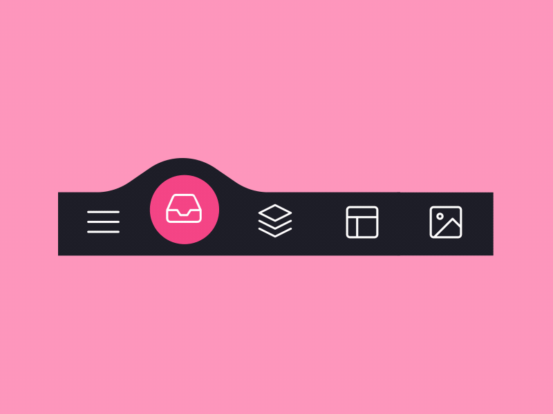
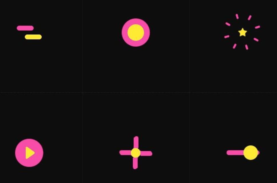
The Four Elements of Micro-Interactions
Micro-interactions are made up of four main components: Triggers, Rules, Feedback, and Loops & Modes. Each part plays a role in creating a seamless, enjoyable user experience. Let's explore each one with visual analogies to bring them to life.
1. Trigger
The trigger is the starting point of a micro-interaction, activated either by the user or the system. User-triggered actions may involve clicking, swiping, tapping, or scrolling, while system-triggered actions happen automatically under certain conditions.
Picture a chef preparing a meal. The moment they chop the first ingredient is a trigger, setting off a series of actions: sautéing, seasoning, and plating. Similarly, in digital design, a user’s initial click, refreshing a page or swipe initiates a series of responses that guide them through their task.
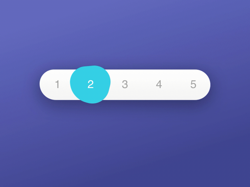
2. Rule
The rule defines the next steps once a micro-interaction is triggered; it’s the interaction’s "instruction manual." The rule responds to the user or system’s trigger,
Imagine tapping the theme icon on your device. The rule here is simple: tapping the icon should switch between light and dark modes. This principle applies to both user- and system-triggered interactions, ensuring that each response aligns with the user’s journey and expectations.
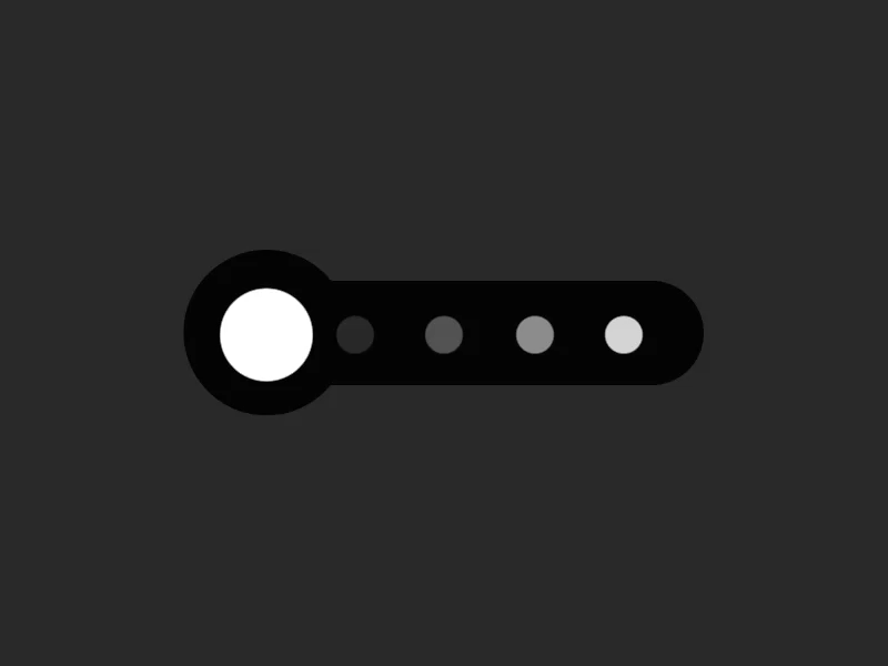
3. Feedback
Feedback lets users know what’s happening during a micro-interaction. It’s the visual or audio response to an action, providing users with real-time updates.
During a payment process, a red border might appear around a card number field if it’s incorrect, while a green border signals correctness. Users are energised and gain confidence as they navigate the experience thanks to this instant feedback, which is similar to an audience applauding an actor's performance. These answers improve user satisfaction and add interest to the interface.
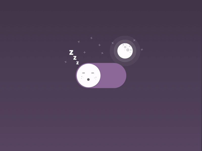
4. Loops and Modes
The behaviors and length of a micro-interaction are determined by loops and modes. The current configuration that remains in effect until it is altered is called a mode. For instance, unless the user selects a different project, the default project in a time-tracking app stays selected. Conversely, loops control the duration of an interaction.
The timer loop in a time-tracking app keeps counting until the user stops it. Users are kept interested by the dynamic flow and constantly shifting performance created by this continuous motion.
Why Micro-Interactions Steal the Show
Technology's capacity to empower and engage individuals is one of its biggest benefits. Beyond simple usefulness, a truly great experience should be captivating and unforgettable. In order to do this, micro-interactions are essential since they improve a product or service's appearance, feel, and general usability.
Micro-interactions improve the user experience in the following significant ways:
Promoting Engagement: Users are encouraged to interact with the UI through interactive touchpoints.
Status Indication: Users' expectations are managed with subtle animations that notify them of loading times.
Error Prevention: Quick feedback and direction cut down on errors and frustration, which lowers churn rates.
Brand Identity: Distinct animations add character to a brand and leave a lasting impact.
Human Touch: Fun and relatability are enhanced by whimsical nuances.
Real-Time Feedback: Users feel reassured that their actions are acknowledged by prompt responses.
Improved user interface: Delicate animations produce a natural, enjoyable experience.
Faster Adoption: New users might adjust more rapidly when they have friendly interactions.
Task Simplification: Micro-interactions simplify difficult tasks by dividing them into smaller, more manageable steps.
Iconic Micro-Interactions on the UX Stage
Micro-interactions have been effectively included into a number of well-known platforms to improve user experience, increase engagement, and communicate important information. Here are a few noteworthy instances:
Instagram’s Pull-to-Refresh

By letting users pull down a list, Loren Brichter's Pull-to-Refresh feature, which was first used in the Tweetie app (2010), makes it easier to refresh material. Since then, mobile platforms have widely embraced this user-friendly design.
Instagram's approach is commended for its fluid and captivating experience, which includes smooth transitions that produce fluid motion from pull to refresh, progressive feedback as the animation changes during the pull, and subtle physics for realistic bounce effects.
- Basic Animation Flow
Pull Gesture Detection: The pull-to-refresh animation is triggered by a downward swipe.
Progressive Animation: As the user pulls, icons—like a spinning arrow—animate proportionately.
Release and Load State: The animation changes to a loading spinner and the content refreshes when the threshold is reached.
Finalization: The animation seamlessly resets after loading.
2. Smooth Transition Elements
Easing Routines: Personalized easing functions offer a spring effect upon release and produce responsive, flowing animations.
Physics-Based Animations: The pull to refresh experience is improved with realistic effects like bounce-back upon release.
3*. Implementation Techniques*
UIRefreshControl is used for pull-to-refresh in iOS (UI Kit/Swift UI). For distinctive animations, subclass it and add new views.
Android: Customize SwipeRefreshLayout in Recycler View with animations.
Web: To animate SVGs and icons, use JavaScript touch events, CSS animations, or frameworks like GSAP.
The responsiveness and tasteful micro-interactions of Instagram's pull-to-refresh animation make it stand out. It provides a user experience that is both intuitive and visually captivating by combining subtle physics, progressive feedback, and smooth transitions.
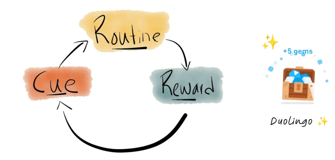
Duolingo’s reward animations
A key component of Duolingo's entertaining and captivating app are its reward animations, which employ interactive graphics, audio, and behavioral psychology to strengthen users' feelings of achievement. Here's a thorough explanation of how they operate:
- Instantaneous gratification and progressive rewards
Gems, Badges, and XP: Duolingo provides users with immediate satisfaction by rewarding them with animated gems, badges, or XP for finishing lessons or streaks.
Instant Feedback: Users are inspired to continue learning when they receive incentives right away, which gives them a sense of accomplishment.
2*. Visual and Audio Feedback*
Confetti Effects & Animations: Pop-ups and colorful bursts generate excitement and visually celebrate victory.
Music & Sound Effects: Chimes, fanfare, and lively music add to the festive atmosphere.
Responsive animations: To maintain the interface's vibrancy, components such as jewels and streak counters respond with nuanced movements or lighting effects.

- Gamified Elements
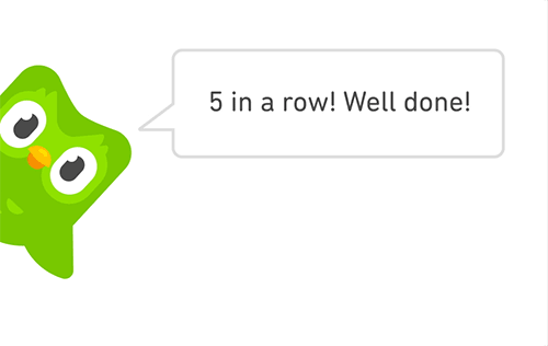
Leaderboard Animations: These dynamic animations encourage users to keep up their activity and create a sense of rivalry by showing them moving up or down in the rankings.
Achievements & Badges: Duolingo gives out badges for reaching milestones like streaks or finishing lessons. When a badge is acquired, it flashes or glows, which motivates users to get more.
- Psychological Impact of Reward Animations
Positive Reinforcement: To encourage learning and user retention, Duolingo employs immediate, visible rewards.
Sense of Progress: Users are kept interested by animations that clearly convey their progress through achievements, levels, and streaks.
Dopamine-Driven Engagement: Through anticipation and reward, reward animations cause dopamine to be released, which in turn creates a potent engagement cycle.
The reward animations on Duolingo combine gamification, instant gratification, and multisensory input to make learning a language fun and interesting. Duolingo's success can be attributed to the way it uses sound, animations, and character-driven interactions to turn a potentially boring activity into an enjoyable and rewarding experience.
Impact of Poorly Designed Micro-Interactions
The "undo send" feature in Gmail's original version is a well-known example of a failure caused by missing or poorly designed micro-interactions. When users pushed "send," there was initially no apparent indication that the email was being sent, and there was no real-time indication of how long they had to "undo" the action.
Consequences of Poor Micro-Interactions in This Case:
Uncertainty and Panic: When someone realizes they made a mistake in their email too soon, they may become anxious because they don't know how long they have to reverse the send. They were unable to determine how long it took for the email to be permanently delivered because there was no visible countdown or progress animation.
Missed Correctional Opportunity: Users may become agitated and regret their acts if they are unable to undo them in the brief amount of time provided by a clear feedback loop or animation showing the "undo" button.
Decreased Trust: Users were less confident in the feature's functionality in the lack of clear feedback, such as a countdown or a notification. The purpose of the feature is to serve as a safety net.
This example demonstrates how crucial micro-interactions are for users to understand and safely interact with features, especially when those features call for quick actions. Real-time feedback and visual cues are two examples of this. Without these small but important interactions, users may feel lost, unsatisfied, or uncertain, which can lead to negative experiences.
Encore: A Designer’s Epilogue
Micro-interactions are the small but important details that make the difference between usefulness and enjoyment. As I researched this subject, I discovered how frequently little things like animations or feedback cues might have a significant impact on how people view a website or app. Apps that provide instant, clear feedback or smoothly walk you through a job using animations, for example, don't just work—they feel correct. These encounters build relationships and leave a lasting impression.
When I discovered that sometimes the most memorable app experiences are the ones that appear invisible, like an animation that rewards you when you complete a task or a subtle visual cue that leads you through the interface, the idea of designing for these tiny but significant moments first caught my attention. A user-centered approach is promoted by this design philosophy, which holds that paying attention to small things has a big influence.
As you refine your own designs, always remember to ask yourself:
Is the action intuitive and does it make the user feel confident about what to do next?
Does the user know right away whether their action was successful, or should there be a clearer visual or auditory cue?
Whether playful, elegant, or professional, do the animations and transitions match the overall tone of the brand?
Does it feel fast and fluid, or does it cause delay and frustration?
Does it enrich the user experience, or is it distracting or too complex for its purpose?
By consistently incorporating deliberate elements into each click, hover, and scroll, designers may leave a little magic in their wake, transforming the commonplace into the remarkable and adding a little more fun and significance to each user experience. These minor adjustments have the power to transform a simple interface into something genuinely unique, making consumers want to use it repeatedly.
Through deliberate attention to these micro-details, designers transform functional apps into delightful experiences, ultimately bridging the gap between technology and human emotion.
Subscribe to my newsletter
Read articles from Nishtha Aggarwal directly inside your inbox. Subscribe to the newsletter, and don't miss out.
Written by