How to Fill Text with Gradients and Images (It's Easier Than You Think)
 Samir Shuman
Remember learning about linear-gradients and background-images in CSS? Pretty basic stuff, right? But here's a question: did you know you can apply these same properties to actual text? I've created a collection of eye-catching typography to share with you. Let me show you how they work!
One of the key techniques we'll be using throughout these examples is the combination of background-clip: text and color: transparent. This is the magic that lets us fill our text with gradients, images, and animations. When we set color: transparent, we're essentially making the text invisible. Then, by setting background-clip: text, we're telling CSS to only show the background within the shape of our text characters.
Think of it like a cookie cutter. The text is the cookie cutter shape, and the background is the dough we can see through that shape. The chocolate chips are up to you and your imagination!
The Rainbow Gradient
Let’s start with a simple but striking rainbow gradient effect:
.gradient-text {
    background: linear-gradient(45deg,
        #ff0000,
        #ff8700,
        #ffd300,
        #00ff00,
        #0094ff,
        #6b00ff
    );
    -webkit-background-clip: text;
    background-clip: text;
    color: transparent;
    font-family: "Bagel Fat One", sans-serif;
    font-size: 10rem;
    background-size: contain;
}

[Rainbow Gradient]
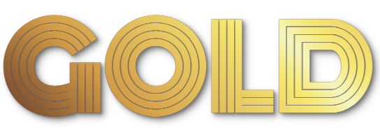
The Metallic Gold Effect
Here's where things get interesting. We can create a realistic metallic gold effect using a carefully crafted gradient and some depth:
.depth-text {
    position: relative;
    background: linear-gradient(45deg,
        #462523 0%,
        #cb9b51 22%,
        #f6e27a 45%,
        #f6f2c0 50%,
        #f6e27a 55%,
        #cb9b51 78%,
        #462523 100%
    );
    -webkit-background-clip: text;
    background-clip: text;
    color: transparent;
    font-family: "Monoton", sans-serif;
    font-size: 10rem;
}

.depth-text::before {
    content: attr(data-text);
    position: absolute;
    left: 0;
    top: 0;
    z-index: -1;
    color: rgba(26, 26, 26, 0.8);
    text-shadow:
        2px 2px 3px rgba(0, 0, 0, 0.2),
        4px 4px 6px rgba(0, 0, 0, 0.3),
        6px 6px 12px rgba(0, 0, 0, 0.2);
}
Adding a text-shadow directly to text with background-clip: text can be a bit of a disaster. The shadow color will basically flood the text, completely covering it up. To avoid this messy situation, we need to use a pseudo-element like ::before or ::after. This lets us apply the text-shadow to the element containing the text, keeping the shadow separate and looking sharp.
In your HTML, you'll need:
<div class="depth-text" data-text="GOLD">GOLD</div>

[Gold Gradient]
Image-Filled Text
Now, here's where you can really start to use your imagination. You can use actual images as text fill. Think about that for a second - your text can be filled with textures, patterns, or even photos. I chose to use an ooey gooey pizza as my background, because, well, who doesn’t like pizza?!
(I wrapped each individual letter in a span element with the image-text class this time)
    .image-text {
        background: url('./pizza.png');
        -webkit-background-clip: text;
        background-clip: text;
        color: transparent;
        font-family: "Nosifer", sans-serif;
        font-size: 10rem;
        background-size: cover;
    }

[Pizza Background]
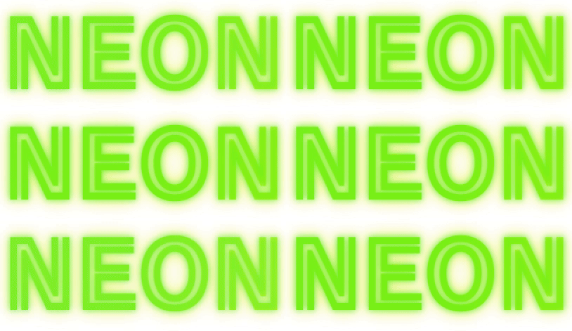
Animated Neon Effect
Want something more dynamic? Check out this flickering neon effect:
.neon-pulse {
    position: relative;
    background: linear-gradient(90deg,
        #39ff14,
        #d4ff00,
        #fee715,
        #d4ff00,
        #39ff14
    );
    background-size: 200% auto;
    -webkit-background-clip: text;
    background-clip: text;
    color: transparent;
    font-family: "Train One", sans-serif;
    font-size: 10rem;
    animation: neon-flicker 1.5s infinite;
    text-shadow:
        0 0 10px rgba(57, 255, 20, 0.7),
        0 0 20px rgba(212, 255, 0, 0.5),
        0 0 30px rgba(254, 231, 21, 0.3);
}

@keyframes neon-flicker {
    0%, 100% {
        opacity: 1;
        text-shadow:
            0 0 10px rgba(57, 255, 20, 0.7),
            0 0 20px rgba(212, 255, 0, 0.5),
            0 0 30px rgba(254, 231, 21, 0.3);
    }
    10% {
        opacity: 0.9;
        text-shadow: none;
    }
    10.1% {
        opacity: 1;
        text-shadow:
            0 0 10px rgba(57, 255, 20, 0.7),
            0 0 20px rgba(212, 255, 0, 0.5),
            0 0 30px rgba(254, 231, 21, 0.3);
    }
    20% { opacity: 0.8; }
    30% { opacity: 1; }
    30.1% { opacity: 0.95; }
    30.5% { opacity: 1; }
    85% { opacity: 1; }
    85.1% { opacity: 0.8; }
    85.2% { opacity: 1; }
}

[Neon Pulse]
Holographic Wave Effect
Here's a smooth, wave-like holographic effect:
.holo-text {
    background: linear-gradient(90deg,
        #003973 0%,
        #0085c7 20%,
        #00d4ff 40%,
        #4dd0e1 60%,
        #0085c7 80%,
        #003973 100%
    );
    background-size: 200% auto;
    -webkit-background-clip: text;
    background-clip: text;
    color: transparent;
    font-family: "Aladin", sans-serif;
    font-size: 10rem;
    animation: wave 4s linear infinite;
}

@keyframes wave {
    to { background-position: 200% center; }
}

[Holographic Wave Effect]
Sunset Gradient Effect
Finally, here's a beautiful sunset-inspired gradient:
.sunset-text {
    background: linear-gradient(180deg,
        #ffef00 0%,
        #ffd700 15%,
        #ffa500 30%,
        #ff8c00 45%,
        #ff6b6b 60%,
        #ff4500 75%,
        #4b0082 100%
    );
    -webkit-background-clip: text;
    background-clip: text;
    color: transparent;
    font-family: "Climate Crisis", sans-serif;
    font-size: 10rem;
}

[Sunset Gradient]
Key Insights
The text transparency trick: Setting
color: transparentis crucial but can be confusing at first. You might wonder "why make the text invisible?" But this is exactly what allows our backgrounds to show through. Without this step, the text color would sit on top of our beautiful gradients and images.Background clipping: The
background-clip: textproperty (and its webkit prefix version) is what creates the "mask" effect. It tells the browser "only show the background where there are text characters." This is different from a regular background that would fill the whole container. This relationship between transparent text and background clipping is what makes everything come together.Layering and depth considerations:
Positioning and z-index: Use
position: relativewhen working with pseudo-elements, and pay attention to yourz-indexvalues. The main text element should have a higherz-indexthan any shadows or effects created with pseudo-elements (that's why we usedz-index: -1on the::beforeelement in our gold effect). This layering ensures our effects appear in the correct order and don't accidentally cover up our main text.Text shadow pitfalls: When applying
background-clip: text, directly adding atext-shadowcan lead to unexpected color flooding. To avoid this, use a pseudo-element (like::beforeor::after) and apply thetext-shadowto that element. This keeps the shadow effect separate and prevents the text from being obscured.Text matching is critical: When using the depth effect, the
data-textattribute must match your text verbatim.
Animation considerations: For animated effects, experiment with different durations and timing functions. This becomes especially important when creating effects like our neon flicker or holographic wave, where the timing can make or break the visual impact.
Making It Responsive
All these effects work with responsive units. Just adjust the font-size using viewport units or clamp():
.responsive-effect {
    font-size: clamp(2rem, 10vw, 10rem);
}
The Complete HTML
Here's the complete HTML structure you'll need:
<!DOCTYPE html>
<html lang="en">
<head>
    <meta charset="UTF-8">
    <meta name="viewport" content="width=device-width, initial-scale=1.0">
    <link rel="preconnect" href="https://fonts.googleapis.com">
    <link rel="preconnect" href="https://fonts.gstatic.com" crossorigin>
    <link href="https://fonts.googleapis.com/css2?family=Aladin&family=Bagel+Fat+One&family=Climate+Crisis&family=Moirai+One&family=Monoton&family=Nosifer&family=Train+One&display=swap" rel="stylesheet">
    <link rel="stylesheet" href="style.css">
    <title>Text Effects Demo</title>
</head>
<body>
    <div class="gradient-text">RAINBOW</div>

    <div class="depth-text" data-text="GOLD">GOLD</div>

    <div>
        <span class="image-text">P</span>
        <span class="image-text">I</span>
        <span class="image-text">Z</span>
        <span class="image-text">Z</span>
        <span class="image-text">A</span>
    </div>

    <div class="neon-pulse">NEON</div>

    <div class="holo-text">OCEAN</div>

    <div class="sunset-text">SUNSET</div>
</body>
</html>
Let's See What You Create!
Now it's your turn! Try combining these effects or creating your own variations. Here are some ideas to get you started:
Mix different gradient angles
Try different animation timing patterns
Experiment with various font combinations
Create theme-specific gradients
Drop a comment below with your creations! You can also hit me up on BlueSky, X/Twitter, or on my website, devmansam.net, if you come up with something cool!
(you can also contact me at linktr.ee/devmansam)
If you would like to show your support, please consider donating to the United Nations Relief and Works Agency for Palestinian Refugees unrwa.org.
Thanks for stopping by. 😎🤙🏽
P.S. All of the typefaces used are available free of charge at https://fonts.google.com .
Subscribe to my newsletter
Read articles from Samir Shuman directly inside your inbox. Subscribe to the newsletter, and don't miss out.
Written by

Samir Shuman
Samir Shuman
Welcome to my blog! My name is Samir. I'm a full-stack software engineer specializing in web development. I'm based in the San Francisco Bay Area, but can deliver digital solutions globally. When I'm not coding, I love experimenting in the kitchen, watching basketball, and spending time with my cat, Fuzzy. Let's connect!