Flex Box! All Variations Covered!
 Ram Bhardwaj
This tutorial will walk you through all the operations and properties you need to master Flexbox.
FlexBox Basics:
FlexBox Levels:
Flex container - The parent element
Flex items - The child elements inside the parent element
Flex Container Property:
2. Flex Container Properties
2.1 flex-direction
Determines the direction of the main axis (the axis along which items are placed).
Values:
row(default): Items are placed horizontally.row-reverse: Items are placed horizontally in reverse order.column: Items are placed vertically.column-reverse: Items are placed vertically in reverse order.
.container {
  flex-direction: row;
}
2.2 justify-content
Aligns items along the main axis.
Values:
flex-start(default): Items are aligned to the start of the main axis.flex-end: Items are aligned to the end.center: Items are centered.space-between: Equal space between items.space-around: Equal space around items.space-evenly: Equal space between and around items.
.container {
  justify-content: space-between;
}
2.3 align-items
Aligns items along the cross axis (perpendicular to the main axis).
Values:
stretch(default): Items stretch to fill the container.flex-start: Items align to the start of the cross axis.flex-end: Items align to the end.center: Items are centered.baseline: Items align to the baseline of the text.
.container {
  align-items: center;
}
2.4 align-content
Aligns multiple lines of items along the cross axis (only applicable when items wrap).
Values:
stretch(default): Lines stretch to fill the container.flex-start: Lines align to the start.flex-end: Lines align to the end.center: Lines are centered.space-between: Equal space between lines.space-around: Equal space around lines.
.container {
  align-content: space-around;
}
2.5 flex-wrap
Specifies whether items should wrap onto multiple lines.
Values:
nowrap(default): All items are on one line.wrap: Items wrap onto multiple lines.wrap-reverse: Items wrap onto multiple lines in reverse order.
.container {
  flex-wrap: wrap;
}
2.6 gap
Specifies spacing between items.
- Values: Any length unit (e.g.,
10px,1rem,5%).
.container {
  gap: 20px;
}
3. Flex Item Properties
3.1 flex
A shorthand for flex-grow, flex-shrink, and flex-basis.
.item {
  flex: 1; /* Equivalent to flex-grow: 1; flex-shrink: 1; flex-basis: 0%; */
}
3.2 align-self
Overrides align-items for individual items.
- Values: Same as
align-items.
.item {
  align-self: flex-end;
}
Practical Examples
Scenarios: Place the subject to the Destination.
Scenario 1: See the diagram
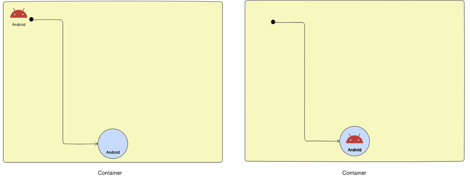
Solution
  .container {
    display: flex;
    justify-content: center;
    align-items: end;
  }
Scenario 2: See the Diagram
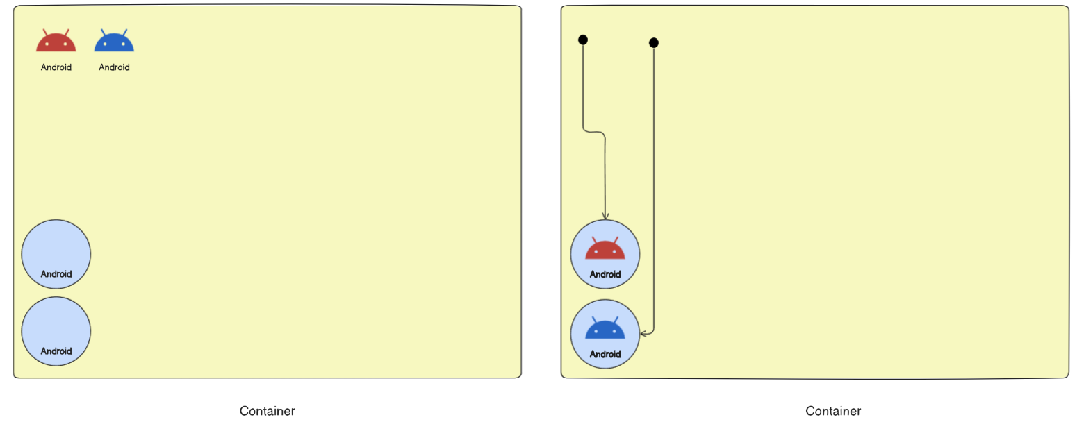
Solution
  .container {
    display: flex;
    flex-direction: column;
    justify-content: end;
  }
Scenario 3: See the diagram
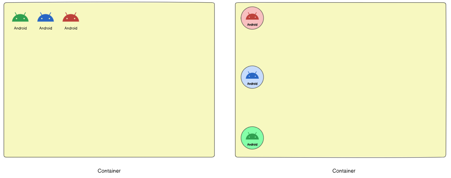
Solution
  .container {
    display: flex;
    flex-direction: column-reverse;
    justify-content: space-between;
  }
Scenario 3: See the diagram
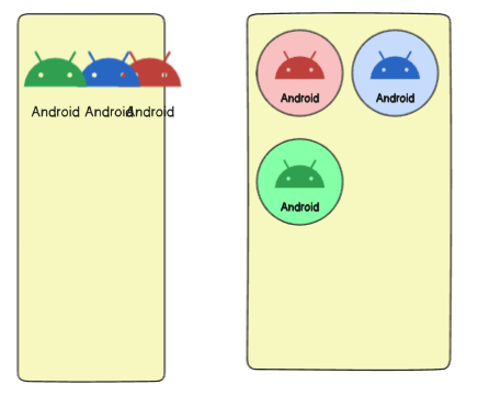
Solution
  .container {
    display: flex;
    flex-wrap:wrap;
  }
Scenario 4: See the diagram
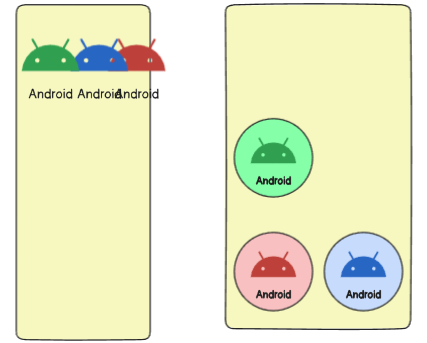
Solution
  .container {
    display: flex;
    flex-wrap: wrap-reverse;
  }
Scenario 5: See the diagram
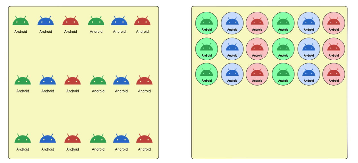
Solution
  .container {
    display: flex;
    flex-wrap: wrap;
    align-content:start;
  }
Scenario 6: See the diagram
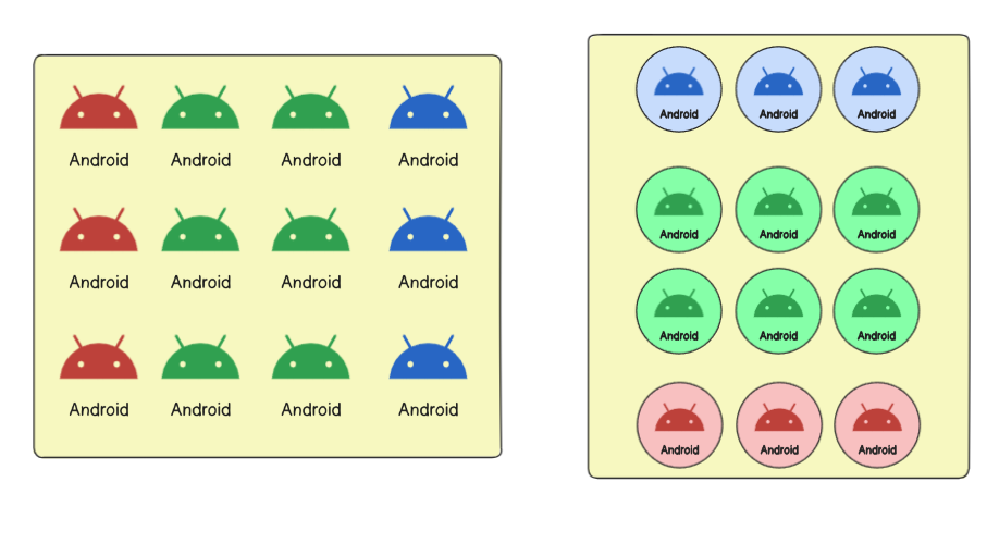
Solution
  .container {
    display: flex;
    flex-wrap: wrap;
    flex-direction: column-reverse;
    align-content:center
  }
Scenario 7: See the diagram
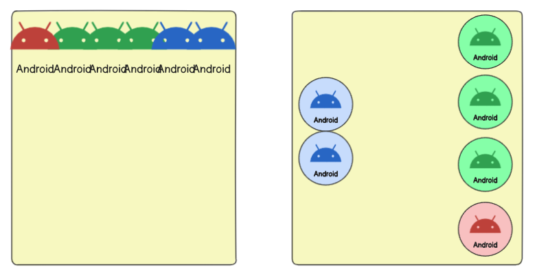
Solution
.container {
  display: flex;
  justify-content:center;
  align-content:space-between;
  flex-flow:column-reverse wrap-reverse;
}
Scenario 8: See the diagram
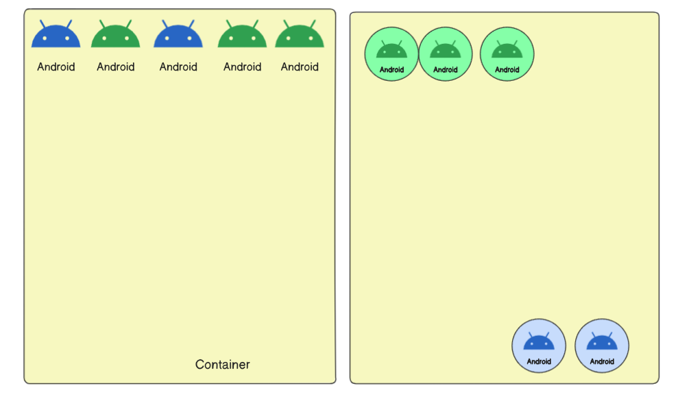
Solution
.container {
   display: flex;
   align-items: flex-start;
}
#blue{
   order:1;
   align-self:end;
}
Thankyou for visiting
Subscribe to my newsletter
Read articles from Ram Bhardwaj directly inside your inbox. Subscribe to the newsletter, and don't miss out.
Written by

Ram Bhardwaj
Ram Bhardwaj
Engineer @Ciena | Software Engineering | Full Stack Development | Typescript , Java, React Node | DSA LeetCode (600+) | System Design |