Day 4: Exploratory Data Analysis (EDA)
 Saket Khopkar
Exploratory Data Analysis (EDA) is the process of visually and statistically examining your data to understand its structure, patterns, and potential issues. EDA is very quintessential in answering questions such as “Are there trends or patterns in the data?“ or “Do outliers or anomalies exist?“ or “How are different variables related?“.
Imagine you’re a chef creating a new dish. Before cooking, you:
Taste individual ingredients.
Smell spices.
Plan combinations.
EDA in simple words means that “smelling and tasting“ of the dish. This ensures you should know your dish (model) well before cooking in order to avoid wrong predictions. Without this step, you risk applying models blindly and making poor predictions.
Techniques of EDA
Univariate Analysis :
In Univariate analysis we focus on only one variable at a time so as to study the variable and understand its characteristics. It helps us analyze metrics like mean, median, range, variance, and standard deviation. Unvariate Analysis help us finding relevant patterns within a single feature.
An Example case study of Univariate Analysis is that : If you're studying a bakery’s sales, the average sales per day gives an overview of performance.
The most commonly used tools for Univariate Analysis are Histograms and Box-Plots.
Bivariate Analysis :
As the name suggests for this we focus on two variables; to understand realationships between them by understanding their characteristics. In simple words it basically does is explore relationships between two variables.
For Example, here we can compare sales (which is a numerical value) across different bakery items (categorical differentiation) OR Check if temperature (numerical value) affects daily sales (also numerical).
Now you might be wondering what could possibly be the key difference between the above 2 examples; (specifically the reason I have hightlighted “OR“ just in case). Well for the example of Numerical Versus Categorical parameter comparison, we use a bar plot or box plot. For the second example after the highlightd word, we use a scatter plot to see correlations.
Multivariate Analysis:
This looks at multiple variables simultaneously to uncover even more deeper insights.
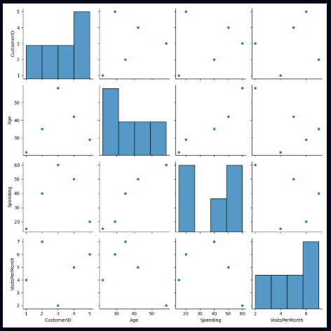
The most common example of this analysis is Heatmap; which highlights how strongly variables are related.
The Need to Visualize Data
Humans process visuals faster than numbers. A good chart or plot can reveal trends that raw numbers hide.
Before diving deeper practically into Exploratory Data Analysis (EDA), let’s explore two essential Python libraries for data visualization: Seaborn and Matplotlib. These libraries will help you create informative and beautiful plots effortlessly.
Matplotlib is a versatile library for creating static, animated, and interactive visualizations in Python. It provides low-level control over every aspect of a plot, making it powerful for customization.
Key Features include:
Supports line, scatter, bar, histogram, and pie charts.
Offers detailed customization of titles, axes, labels, and colors.
Seaborn is built on top of Matplotlib and simplifies the process of creating attractive statistical visualizations. It’s especially useful for exploratory data analysis (EDA) because it works seamlessly with Pandas DataFrames.
Key Features include:
Automatically handles aesthetics like color and style.
Includes high-level abstractions for creating complex visualizations (e.g., pairplots, heatmaps).
Designed for statistical visualization, such as distribution and regression plots.
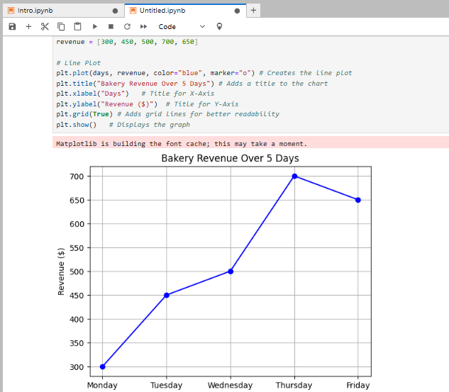
An Example of Matplotlib:
import matplotlib.pyplot as plt

# Data
days = ["Monday", "Tuesday", "Wednesday", "Thursday", "Friday"]
revenue = [300, 450, 500, 700, 650]

# Line Plot
plt.plot(days, revenue, color="blue", marker="o") # Creates the line plot
plt.title("Bakery Revenue Over 5 Days") # Adds a title to the chart
plt.xlabel("Days")   # Title for X-Axis
plt.ylabel("Revenue ($)")  # Title for Y-Axis
plt.grid(True) # Adds grid lines for better readability
plt.show()   # Displays the graph
An Example of Seaborn:
import seaborn as sns
import matplotlib.pyplot as plt

# Define the data
days = [1, 2, 3, 4, 5]  # Example days
revenue = [100, 150, 200, 250, 300]  # Example revenue for each day

# Data
data = {"Days": days, "Revenue": revenue}
sns.lineplot(x="Days", y="Revenue", data=data, marker="o", color="blue") # Automatically styles the line plot
plt.title("Bakery Revenue Over 5 Days")
plt.show()
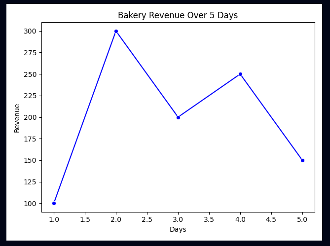
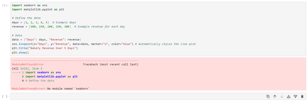
I have used this website to run the ‘seaborn‘ code. Website Link :- https://python-fiddle.com/examples/seaborn?checkpoint=1738820399
Bottom line:
Use Matplotlib whenever you are creating custom plots. But whenever there are DataFrames from Pandas (or core EDA tasks), use Seaborn.
Practical Examples
Let us have a look at practical examples by having a visual look at each plot.
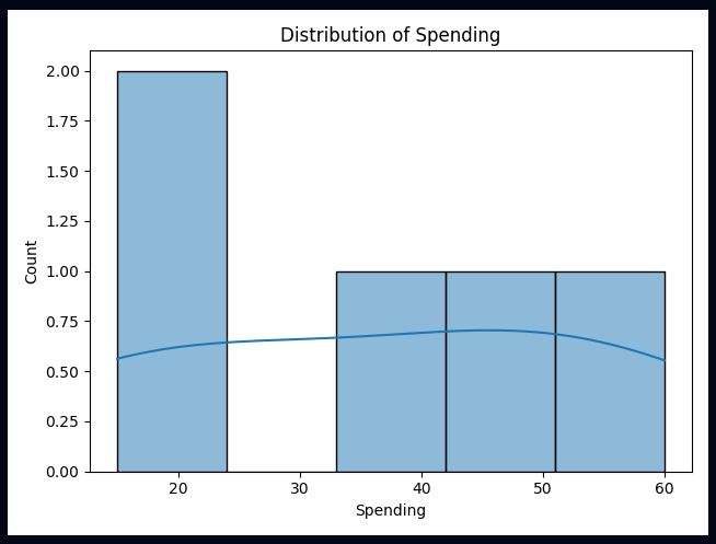
Histogram:
# Descriptive Statistics
import pandas as pd
import seaborn as sns
import matplotlib.pyplot as plt

data = {
    "CustomerID": [1, 2, 3, 4, 5],
    "Age": [22, 35, 58, 42, 29],
    "Spending": [15, 40, 60, 50, 20],
    "VisitsPerMonth": [4, 7, 2, 5, 6],
    "DayType": ["Weekday", "Weekend", "Weekday", "Weekday", "Weekend"]
}
df = pd.DataFrame(data)
print(df["Spending"].describe())

# Histogram
sns.histplot(df["Spending"], kde=True, bins=5)
plt.title("Distribution of Spending")
plt.show()
Scatterplot:
# Just Replace the part of "# Histogram" with his chunk of code
# Scatter Plot
sns.scatterplot(x="VisitsPerMonth", y="Spending", data=df)
plt.title("Spending vs. Visits Per Month")
plt.show()
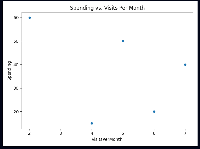
Basic Interpretation from this Scatterplot : Frequent visitors tend to spend more, but there’s one exception.
For Multivariate Analysis:
Pairplot:
# Pairplot
sns.pairplot(df)
plt.show()
Heatmaps:
# Correlation Heatmap
corr_matrix = df.select_dtypes(include='number').corr()  # Only include numeric columns
sns.heatmap(corr_matrix, annot=True, cmap="coolwarm")
plt.title("Correlation Heatmap")
plt.show()
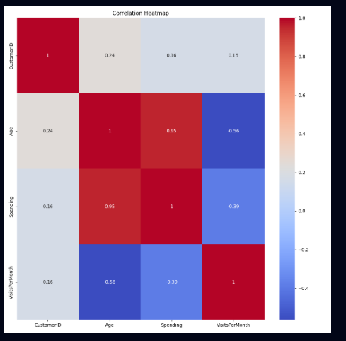
The Heatmap provides us with insights such as Age and Spending are positively correlated (which effetively means that older customers tend to spend more). Also, VisitsPerMonth correlates with Spending, suggesting frequent customers spend more.
Time to take notes
✅ EDA helps us understand data before applying models – just like a chef tastes ingredients before cooking.
✅ Univariate Analysis examines single variables using histograms and box plots.
✅ Bivariate Analysis explores relationships between two variables, often using scatter plots.
✅ Multivariate Analysis looks at complex interactions, using pairplots and heatmaps.
✅ Matplotlib and Seaborn are essential libraries for creating beautiful and informative plots.
I believe thats everything for the day. I hope you have gained a substantial foothold on the concepts we are going to learn in upcomming days. EDA is extremely imprtant for that case. Keep practicing with different examples, play with data; that’s how you wll find this intriguing.
Until then Ciao!!
Subscribe to my newsletter
Read articles from Saket Khopkar directly inside your inbox. Subscribe to the newsletter, and don't miss out.
Written by

Saket Khopkar
Saket Khopkar
Developer based in India. Passionate learner and blogger. All blogs are basically Notes of Tech Learning Journey.