🔥 My CSS Handbook
 Tuan Tran Van
Table of contents
- Modern CSS One-Line Upgrades
- CSS Flexbox
- CSS Grid
- The CSS Revolution is Here
- CSS Content Values: Master min-content, max-content, and fit-content for Better Layouts
- Propover API
- Field-Sizing for Inputs and Textareas
- Units
- Control Element’s Height and Width
- Centering without Flexbox or Grid
- The Masonry Layout with just one line
- Universal box sizing
- The math gets an upgrade
- Forms with New Pseudo-Classes
- Animating Sizes with the Interpolate-Size Property
- Remove Image Backgrounds With One Line Of CSS
- Pseudo-Classes
- Logical Properties
- Empty Element
- Responsive Styling based on orientation
- Dynamic Sibling Influence
- A practical migration handbook from SASS/SCSS to modern native CSS
- : vs:: in CSS3
- Conditions
- The Difference Between width: 100% and width: auto
- These 3 CSS breakpoints handle 95% of your layouts
- Responsive Tables are Hard - Here’s a Pattern That Works
- Next-Gen Web Animations: 15 CSS and JavaScript Techniques That Will Make Your Website 300% More Engaging
- CSS DevTools Secrets Every Developer Should Master
- The CSS property that’s making every website feel slow
- Top 10 CSS Mistakes Even Experienced Devs Still Make
- Tailwind CSS
- References
Are you ready to advance your CSS skills? Whether you are a seasoned pro or just starting out, you have all experienced those moments when your style sheets seem to have a mind of their own. This article will introduce you to some advanced CSS concepts, tips, and hacks that are sure to make your life easier and your designs impressive.
In this blog post, we are going to explore some awesome CSS hacks that will help you solve common challenges, improve your workflow, and add some extra pizzazz to your projects. These aren’t just any old tricks - they are practical, powerful, and perfect for UI developers like us who want to create stunning web experiences.
So, grab your favorite beverage, get comfy, and let’s dive into the world of CSS hacks!
Modern CSS One-Line Upgrades
CSS Flexbox

Check out this article to explore the details.
https://www.joshwcomeau.com/css/interactive-guide-to-flexbox/
CSS Grid

Check out this handbook to explore everything about Grid CSS.
https://www.joshwcomeau.com/css/interactive-guide-to-grid/?ref=dailydev#grid-flow-2
The CSS Revolution is Here
I will admit it — CSS used to feel like a quiet kid in the room. Useful, essential, but not exactly surprising. Then 2025 hit, and everything changed.
Over the past few months, I have been implementing some of these new features in a real-world freelance project, and I can tell you: We are living through a real CSS revolution.
If you are a Front-end developer, a no-code designer, or a freelance pro looking to deliver clean, modern, accessible interfaces, this is the moment to uplevel your toolkit.
Want to stick a header that just works without JavaScript?
Need to animate a button only when it’s inside a specific block?
Or maybe style elements differently depending on what’s inside them?
All of that is now possible — with CSS alone.
aspect-ratio
Have you ever used a “padding hack“ to force an aspect ratio such as 16:9 video embeds? As of September 2021, the aspect-ratio property is stable in evergreen browsers and is the only property needed to define an aspect ratio.
For an HD video, you can just use an aspect-ratio: 16/9. For a perfect square, only aspect-ratio: 1 is required since the implied second value is also 1;

Of note, an applied aspect-ratio is forgiving and will allow context to take precedence. This means that when content causes the element to exceed the ratio in at least one dimension, the element will still grow or change shape to accommodate the content. To prevent or control this behavior, you can add additional dimension properties, like max-width, which may be necessary to avoid expanding out the flex or grid container.

object-fit
This is actually the oldest property on this list, but it solves an important issue and definitely fits the sentiment of a one-line upgrade.
The use of object-fit causes an image or other replaced elements to act as the container for its content, and have those contents adopt resizing behavior similar to background-size.
While there are a few values available for object-fit, the following are the ones you are most likely to use:
cover- The image is resized to cover the element and maintain its aspect ratio so that the content is not distorted.scale-down: The image resizes (if needed) within the element so that it is fully visible without being clipped and maintains its aspect ratio, which may lead to extra space (“letterboxing”) around the image if the image has a different rendered aspect ratio.
In either case, object-fit is an excellent property pairing with aspect-ratio to ensure images are not distorted when you apply a custom aspect ratio.

margin-inline
One of many logical properties, margin-inline functions as a shorthand for setting the margin inline (left and right in horizontal writing modes).
The replacement here is simple:
/* Before */
margin-left: auto;
margin-right: auto;

/* After */
margin-inline: auto;
Logical properties have been available for a couple of years and now have support upwards of 98% (with occasional prefixing). Review the article by Ahmad Shadeed to learn more about using logical properties and their importance for sites with international audiences.
text-underline-offset
The use of text-underline-offset allows you to control the distance between the text baseline and the underline. This property has become a part of my standard reset, applied as follows:
a:not([class]) {
    text-underline-offset: 0.25em;
}
This offset can clear descenders and (subjectively) improve legibility, particularly when links are grouped in close proximity, such as in a bulleted list.
This upgrade may replace older hacks like a border or pseudo-element or give a gradient background, especially when used with its friend:
text-decoration-color: to change the underlying colort
ext-decoration-thickness: to change the underlined stroke thickness
outline-offset
Have you been using box-shadow or perhaps a pseudo-element to supply a custom outline when you wanted distance between the element and outline on focus?
Good news! The long-available outline-offset property may be the one you missed, and it enables pushing the outline away from the element with the positive value or pulling it into the element with the negative value.
In the demo, the gray solid line is the element border, and the blue dashed line is the outline being positioned via outline-offset.

Reminder: Outlines are not computed as parts of the element’s box size, so increasing the distance will not increase the amount of space an element occupies. This is similar to how box-shadow is rendered without impacting the element size as well.
scroll-margin-top/bottom
The scroll-margin set of properties (and corresponding scroll-padding) allows adding an offset to an element in the context of the scroll position. In other words, adding scroll-padding-top can increase the scroll offset above the element but doesn’t affect its layout position within the document.
Why is this useful? Well, it can alleviate issues caused by a sticky nav element covering content when an anchor link is activated. Using scroll-margin-top we can increase the space above the element when it is scrolled via navigation to account for the space occupied by the sticky nav.
If you have a navigation bar and an anchor link, the bar might obscure the target element. You can use scroll-margin-top to account for the height of the sticky header.
<nav class="sticky-header">Header</nav>
<div id="section1" class="scroll-target">Section 1</div>
.sticky-header {
  position: sticky;
  top: 0;
  height: 50px;
  background: #333;
  color: white;
}

.scroll-target {
  scroll-margin-top: 50px; /* Adds space equal to the sticky header's height */
}
When navigating to #section1, it will appear 50px below the top of the viewport, leaving space for the sticky header.
color-scheme
You may be familiar with the prefers-color-scheme media query to customize dark and light themes. The CSS property color-scheme is an opt-in to adapting browser UI elements, including form controls, scrollbars, and CSS system colors. The adaptation asks the browser to render those items with either a light or dark scheme, and the property allows defining a preference order.
If you’re enabling the adaptation of your entire application, set the following :root, which says to preference a dark theme (or flip the order to preference a light theme).
:root {
    color-scheme: dark light;
}
You can also define color-scheme on individual elements, such as adjusting form controls within an element with a dark background to improve contrast.
.dark-background {
    color-scheme: dark;
}
width: fit-content
One of my favorite CSS hidden gems is the use of fit-content to “shrink wrap“ an element to its content.
Whereas you may have used an inline display value such as display: inline-block to reduce an element’s width to the content size, an upgrade to width: fit-content will achieve the same effect. The advantage of width: fit-content is that it leaves the display value available, thereby not changing the position of the element in the layout unless you adjust that as well. The computed box size will adjust to the dimensions created by fit-content.

Consider the secondary upgrade for this technique to the logical property equivalent of inline-size: fit-content.
overscroll-behavior
The default behavior of contained scroll regions - areas with limited dimensions where overflow is allowed to be scrolled - is that when the scroll runs out in the element, the scroll interaction passes to the background page. This can be jarring at best and frustrating at worst for your users.
Use of overscroll-behavior: contain will isolate the scrolling to the contained region, preventing the scroll by moving it to the parent page once the scroll boundary is reached. This is useful in contexts such as a sidebar of navigation links, which may have an independent scroll from the main page content, which may be a long article or documentation page.

object-position
When you apply it to the image object-fit - It will crop the image to the specified height & width in order to look sharp:

However, we can’t control which part of the image will be cropped, so the object position is crucial.
.test {
  height: 350px;
  width: 500px;
  object-fit: cover;
  object-position: bottom;
}

object-position: top;

As well as we can add: left or right. We can even be more precise when we specify two parameters like object-position: center bottom;
supports
The @supports rule in CSS is a feature-detection mechanism that allows developers to apply styles conditionally based on whether a specific CSS property is supported by the browser. This enables graceful degradation and progressive enhancement, ensuring that modern features are used when available while providing fallback styles for older browsers.
How it works: The @supports rule checks if a given CSS property or feature is supported by the browser. If the condition evaluates to true, the enclosed styles are applied.
@supports (display: flex) {
  .flex-container > * {
    text-shadow: 0 0 2px blue;
    float: none;
  }
}
In this example, the styles inside @supports will only apply if the browser supports display: flex, ensuring a modern layout while avoiding issues in unsupported environments.
Use Cases:
Progressive Enhancement: Apply modern styles while ensuring compatibility with older browsers.
Failure Detection for New CSS Properties: Check support for advanced CSS properties like content-visibility or aspect-ratio.
CSS Grid and Flexbox Fallbacks: Use @supports to apply grid or flexbox styles only when they are available while providing float-based fallbacks for older browsers.
Ensuring Browser Compatibility: This helps maintain a consistent design experience across different user environments.
content-visibility
The content-visibility property is a game-changer for performance optimization in CSS. It enables browsers to skip the rendering work for an element until it’s needed, significantly improving the loading and rendering performance of complex or large layouts.
How it works: When set to ‘auto’, content-visibility tells the browser that it can skip the rendering of the element’s content if they are not currently visible in the viewport. The browser still does the initial layout, but it doesn’t render the content until it’s needed.
section {
  content-visibility: auto;
  contain-intrinsic-size: auto 500px;
}
In this example, sections that are not in the viewport will not have their contents rendered, speeding up the initial page load. The contain-intrinsic-size property provides an estimated size for the content, helping to prevent layout shifts as the content is loaded.
Use Cases:
Long Lists and Feeds: Optimize the performance of infinite scrolling lists or news feeds by only rendering the items currently visible in the viewport.
Complex layouts: Improved the initial load time of pages with complex layouts by deferring the rendering of off-screen sections until they are needed
Tabs and Accordions: Prevent the browser from rendering the hidden tab panels or accordion sections until they are activated, improving initial page load and interactivity.
Image-Heavy Pages: Combine
content-visibility: autowith lazy-loading techniques to further optimize image loading and improve perceived performance.
keyframes
The @keyframes rule is a cornerstone of CSS animations, allowing developers to define the intermediate steps in a CSS animation sequence. This powerful feature enables the creation of complex, multi-step animations without relying on JavaScript.
How it works: @keyframes defines a series of style changes that should occur at specified points during an animation. These keyframes can be defined using percentages of the animation duration or the keywords ‘from‘ and ‘to’.
@keyframes slide-in {
  from {
    transform: translateX(-100%);
    opacity: 0;
  }

  50% {
    opacity: 0.5;
  }

  to {
    transform: translateX(0);
    opacity: 1;
  }
}

.animated-element {
  animation: slide-in 2s ease-in-out;
}
This example defines a ‘slide-in‘ animation where an element moves from left to right while fading in. The animation is then applied to .animated-element.
Use cases:
UI Transitions: Create smooth transitions for UI elements like modals, dropdowns, or navigation menus.
Looping Animations: Design perpetual animations for loading indicators, background effects, or decorative elements.
Interactive Feedback: Use animations triggered by user actions to provide user feedback and enhance user experience.
Storytelling and Engagement: Develop complex, multi-step animations to guide users through the narrative or highlight key information on the page.
image-set()
The image-set() CSS functional notation is a powerful tool for responsive image management. It allows the browser to choose the most appropriate image from a set of options, primarily based on the device’s pixel density.
How it works: image-set() provides a list of image sources along with their resolution descriptors. The browser then selects the most suitable image based on the device’s characteristics.
.box {
  width: 400px;
  height: 200px;
  background-repeat: no-repeat;
  background-size: cover;

  background-image: image-set(
    url("https://image1.jpg") 1x,
    url("https://image2.jpg") 2x
  );
In this example, devices with standard resolution will load image1.jpg, while high-resolution devices (like Retina displays) will load image2.jpg.
Use Cases:
Responsive Images: Provide different image resolutions for various device pixel ratios, ensuring crisp images on high-DPI screens without unnecessarily large downloads on standard screens
Art Direction: Use
image-set()in combination with media queries to serve different images based on both screen resolution and size, allowing for more nuanced art direction on responsive designs.Performance Optimization: By serving appropriately sized images, you can significantly reduce bandwidth usage and improve load times, especially on mobile devices.
Future-Proofing: As new screen resolutions emerge,
image-set()allows you to easily add support for these without changing your existing markup.
white-space-collapse
The white-space-collapse property offers precise control over how a whitespace is handled in text, allowing for collapsing, preserving, or other custom behaviors. This property provides more granular control than the traditional white-space property, enabling developers to fine-tune text presentation.
How it works: white-space-collapse determines how sequences of white spaces are handled within an element. It offers several values:
collapse: Collapses sequences of white space into a single space (default behavior)
preserve: Preserves all while space characters
preserve-breaks: Preserves line breaks but collapses other white spaces.
breaks-space: Similar to preserve but allows breaking at any white space character.
.collapsed-spaces {
  white-space-collapse: collapse;
}

.preserved-spaces {
  white-space-collapse: preserve;
}

.preserved-breaks {
  white-space-collapse: preserve-breaks;
}

.break-spaces {
  white-space-collapse: break-spaces;
}
These examples demonstrate different ways of handling white space within text elements.
Use Cases:
Code Examples: Use preserve or preserve-breaks to display code snippets with accurate spacing and indentation.
Preformatted Text: Maintain precise
whitespacein preformatted text blocks, ensuring the layout matches the original formatting.Controlling Wrapping in Long Strings: Use
break-spacesto allow wrapping within long strings that lack natural word breaks, such as URLs or database keys.Fine-Tuning Text Layout: Use collapse to control spacing between words and lines, creating more precise typographic adjustments.
Min, Max, and Clamp
min()
/* Keeps buttons from getting too wide on large screens */
.pricing-button {
  width: min(300px, 90%);
}
Think of min() as setting an upper limit. It will pick the smaller of the values. Handy for keeping elements from getting too big while still being responsive. So as long as 90% calculates to be less than 300px 90% is used; once it gets beyond 300px that, the value is used.
max()
/* Ensures text stays readable even on tiny screens */
.terms-container {
  font-size: max(16px, 1.2vw);
}
max() is like setting a minimum value, but it picks the larger option. Perfect for preventing elements from shrinking too much on mobile devices.
clamp()
clamp() is like having min() and max() combined! It takes three values:
body {
  max-width: clamp(320px, 90%, 1000px);
  /* additional recommendation */
  margin: auto;
}
Adding this one line will reduce the content size to occupy 90% of the viewport and limit its width between 320 and 1000 pixels (feel free to update the minimum and maximum values)
This change will automatically make your content look much nicer. It will no longer be a vast text block but something that looks more structured and organized. And if you also add margin: auto to the body, the content will be centered on the page. Two lines of code make the content look so much better.

The :has() pseudo-class
.hero:has(.hero-button) {
  background-color: var(--accent-50);
}
This CSS pseudo-class :has() provides a powerful way to select an element based on its descendants, similar to the application of conditional styles.
:is() & :where() – Cleaner, DRY selectors
Writing complex combinations of selectors has always been a pain. With :is() and :where(), we can group rules and make the code cleaner and more readable.
:is(h1, h2, h3, h4) {
  font-family: "Inter", sans-serif;
}
:is() applies the highest specificity of any selector inside.:where() has zero specificity: perfect for resets or design systems.
💡 Example with a custom reset:
:where(h1, h2, h3, p) {
  margin-block: 0.5em;
}
🛠️Use-case:
When working with WordPress themes or CSS builders, these help you maintain style control without fighting the cascade.
::backdrop – Style native modal backgrounds
Using <dialog> (HTML5), You can now style the background behind the modal, creating modern effects like blur or gradients.
::backdrop {
  background: rgba(0, 0, 0, 0.5);
  backdrop-filter: blur(6px);
}
Elegant and accessible native effect
🛠️Use-case:
Perfect for portfolio sites, contact modals, GDPR, or newsletter popups — without heavy plugins.
::target-text – Automatically highlight linked text
This new pseudo-class lets you style the text targeted by internal links (#anchor), improving navigation in long documents or FAQ sections.
::target-text {
  background: yellow;
}
🛠️Use-case:
Great for documentation, anchor menu links, or e-commerce with expandable FAQ blocks.
Container Queries
CSS container queries introduced a new approach to responsiveness. Previously, we used media queries to create UIs that adapted to different screen sizes. But it wasn’t as easy as it sounds. There were issues in maintenance, performance, flexibility, and style overlapping.
Container queries resolve these issues by allowing developers to customize elements depending on their parent container size. Since this method doesn’t depend on the viewport size, it makes the HTML components fully modular and self-contained.
The following is a simple example of how container queries work:
.wrapper {
  display: grid;
  grid-template-columns: 2fr 1fr;
  gap: 20px;
}
@container (min-width: 500px) {
  .profile-card {
    grid-template-columns: 150px 1fr;
    grid-template-rows: auto 1fr;
    align-items: start;
    gap: 20px;
  }

  .profile-card header,
  .profile-card .bio {
    grid-column: 2;
  }

  .profile-card .profile-image {
    grid-row: 1 / 3;
    grid-column: 1;
  }
}
This container query adjusts the layout of the profile card when its width reaches 500px or more. It changes the card from a stacked layout (with the image on top) to a two-column layout when the image appears on the left and the text content aligns on the right.

Container queries are very useful in design systems where components need to adapt based on their immediate environment rather than the entire viewport. However, container queries still lack full browser support. If your users are using unsupported browsers or older versions, they might face styling issues.
Subgrid
Subgrid is an exciting addition to the CSS grid layout model. It allows you to inherit the grid structure of the parent grid container in child grid items. In other words, a subgrid allows you to align child elements according to the rows or columns of the parent grid. This method allows you to easily create complex nested grids without using nested grid overrides.
In the following code example, the layout uses the subgrid approach within a list:
.product-wrapper {
  display: grid;
  grid-template-columns: repeat(auto-fit, minmax(300px, 1fr));
}
.product-card {
  display: grid;
  grid-template-rows: subgrid; /* Allows the nested grid to align directly with the parent grid */
}
In the example, the product-wrapper creates a flexible grid layout to control the number of columns based on the container width. Then, each product-card aligns its rows directly with the grids defined by the product-wrapper .

@layer
If you have used Tailwind CSS, this might look familiar. @layer manages specificity conflicts by explicitly ordering style groups. Later layers always “win” regardless of specificity, solving the cascade that confuses (and annoys!) so many developers.
/* Define layer order - order here determines priority */
@layer reset, components, utilities;

/* Reset layer: lowest priority */
@layer reset {
  * {
    margin: 0;
    padding: 0;
    box-sizing: border-box;
  }
}

/* Components layer: middle priority */
@layer components {
  .button {
    /* Even if utilities have lower specificity,
       they'll still override these styles */
    padding: .5rem 1rem;
    background: blue;
  }
}

/* Utilities layer: highest priority */
@layer utilities {
  .p-4 {
    /* This wins over component padding */
    padding: 1.25rem;
  }

  .bg-red {
    /* This wins over component background */
    background: red;
  }
}
scope
The @scope at-rule introduces a revolutionary way to manage CSS specificity and encapsulation. It allows developers to define a specific scope for CSS selectors, making it easier to target elements within particular DOM subtrees without affecting elements outside the scope.
How it works: The @scope rule defines a boundary within which certain styles apply. This boundary is determined by a selector, and the styles within the @scope block only affect elements that match the selector and are descendants of the scoped element.
<div id="my-component">
  <p>This paragraph is inside the scope.</p>
</div>
<p>This paragraph is outside the scope.</p>
<style>
@scope (#my-component) {
  p {
    color: blue;
  }
}
</style>
In this example, only the paragraph inside the #my-component div will be colored blue. The paragraph outside remains unaffected.
Use cases:
Component-Based Architectures:
@scopeis the idea of styling components independently. Each component can have its own encapsulated styles, preventing conflicts between components and promoting code reuse.Third-party Libraries: Control the styling of third-party libraries or embedded widgets without worrying that their styles will affect your main application’s style.
Scoped CSS Modules: While CSS Modules and other build-time solutions offer similar functionality,
@scopebrings this capability is brought natively to the browser, simplifying workflows and potentially improving performance.
anchor() – Dynamically position elements based on others
A brand-new CSS function that lets you anchor an element’s position (e.g. tooltip, menu) to another element, without JS.
.tooltip {
  position: absolute;
  top: anchor(bottom);
  left: anchor(center);
}
This changes the game for:
Tooltips
Dropdowns
Popovers
🛠️Use-case:
Complex UI interactions (e.g., e-commerce filters, admin panels) without JavaScript.
accent-color
If you have ever wanted to change the color of checkboxes or radio buttons, you have been seeking accent-color. With this property, you can modify the :checked the appearance of radio buttons or checkboxes and the filled-in states for both the progress element and range input. The browser’s default focus “halo“ may also be adjusted if you do not have another override.

Consider adding both accent-color and color-scheme to your baseline application styles for a quick win toward custom theme management.
light-dark() – Automatic theme switching, no media queries
Want your components to automatically adapt to the system’s theme?
body {
  color: light-dark(black, white);
  background-color: light-dark(white, black);
}
✨Advantage:
One color value that adapts automatically based on light or dark mode.
🛠️Use-case:
Custom themes for SaaS platforms, dashboards, or portfolio sites.
Relative color syntax & new color spaces
You can now use colors derived from other colors, creating flexible, adaptive palettes.
color: rgb(from var(--primary-color) r g b / 50%);
Supports:oklch, oklab, color-mix(), color-contrast().
💡 Example with color-mix():
color: color-mix(in srgb, red 30%, blue);
🛠️Use-case:
Variable branding, automatic dark mode themes, or accessible UIs.
@property - Variables get smarter with property
CSS variables are powerful, but the new @property at-rule takes them to the next level.
Now, you can define custom properties with specific types, inheritance rules, and default values.
Before the @property at-rule, custom properties were powerful but lacked type safety and constraints. For example:
:root {
  --rotation: 45deg;
}
div {
  transform: rotate(var(--rotation));
}
This works, but the variable is essentially unregulated.
If someone accidentally assigns an invalid value like —rotation: blue, the code breaks or behaves unpredictably.
Now, you can declare custom properties with a defined syntax, initial value, and inheritance rules.
Here’s how it works:
@property --rotation {
  syntax: '<angle>';
  inherits: false;
  initial-value: 0deg;
}
div {
  transform: rotate(var(--rotation));
}
syntax: Specifies the type of value the property can accept. For--rotation, it’s an<angle>(like45degor1turn).inherits: Determines if the property should inherit its value from its parent element. In this case, we set it tofalse.initial-value: Sets a default value if no other value is assigned. Here, it defaults to0deg.
color-contrast() – Automatic accessibility support
Want your text to always be readable no matter the background?
color: color-contrast(white vs #000, #0f62fe, #f00);
💪What it does:
Chooses the color with the best contrast ratio against a background, meeting WCAG guidelines.
🛠️Use-case:
Accessible interfaces for public agencies, corporate sites, or B2B platforms.
backdrop-filter – Elegant blur behind overlays
Want that “frosted glass” effect you see in macOS, iOS, or clean minimalist UIs? You can now create it natively with CSS.
.modal {
  background: rgba(255, 255, 255, 0.6);
  backdrop-filter: blur(12px);
}
💡 Perfect for:
Popups, sticky headers, modals, dropdowns with depth.
🛠️Use-case:
Elevates the UI in portfolios, landing pages, or SaaS interfaces.
Wrap headings in a more balanced way
h1, h2, h3, h4, h5, h6 {
  text-wrap: balance;
}
Headings are an essential part of the web structure, but due to their larger size and shorter content, they may look weird. Especially when they occupy more than one line. A solution that will help is balancing the headings with text-wrap.
Although balance seems to be the most popular value for text-wrap, it is not the only one. We could also use pretty, that moves an extra word to the last row if needed instead of balancing all the content. Unfortunately, pretty has yet to count onboard support.

Balanced wrapping can improve visibility and readability.
font-size-adjust – Better legibility with fallback fonts
Sometimes, fallback fonts have a different “x-height,” making text appear too large or too small. This property keeps visual consistency across fonts.
body {
  font-size-adjust: 0.5;
}
🎯 Great when:
You use Google Fonts with fallbacks like Helvetica or Arial.
🛠️Use-case:
Editorial sites, blogs, or documentation where text must remain clear even without the main font.
Scrollbar-Gutter & Scrollbar-Color
When a browser displays a scrollbar, the layout can shift as space is taken up. With scrollbar-gutter, you can preserve scrollbar space even before scrolling begins:
.scrollable {
  scrollbar-gutter: stable both-edges;
}
You can also style your scrollbars with scrollbar-color:
.scrollable {
  scrollbar-color: #444 #ccc;
}
This ensures a consistent look and prevents layout jumps.
What it good for ✅
scrollbar-gutterkeeps layouts stable by reserving space for a scrollbar, preventing annoying shifts when the scrollbar appears.scrollbar-colorlets you style the scrollbar’s track and thumb, enhancing design consistency, especially for dark or themed UIs.
transition-behavior
While transition-timing-function has served us well, transition-behavior introduces additional control over animations, such as reversing or pausing transitions without complex JavaScript. This paves the way for smoother UI interactions and advanced animation scenarios.
.card {
  transition-property: opacity, display;
  transition-duration: 0.25s;
  transition-behavior: allow-discrete;
}

.card.fade-out {
  opacity: 0;
  display: none;
}
What it’s good for ✅
Expands on basic transitions to offer reversible or more complex transitions without heavy scripting.
Useful for refined UI effects, interactive components, and unique animation scenarios.
starting-style — Fixing animation Start Issues
Normally, when you hide an element (
display: none), it pops up instantly when shown.@starting-styledefines its initial state so transitions work smoothly.
@starting-style {
  .modal {
    opacity: 0;
    transform: scale(0.8);
  }
}

.modal {
  transition: opacity 0.5s, transform 0.5s;
}

.modal.show {
  opacity: 1;
  transform: scale(1);
}
The modal fades in instead of appearing suddenly
✅ Chrome, Edge
❌ Not yet in Firefox or Safari
animation-composition – Layer multiple animations
This property allows you to control how multiple animations combine on a single element:
.element {
  animation: fadeIn 1s, slideIn 1s;
  animation-composition: accumulate;
}
Modes:
replace(default): one animation overrides the otheraccumulate: adds valuesadd: combines effects into a single result
🛠️Use-case:
Interactive components like dropdowns, sliders, or animated cards.
scroll-snap-type – Section-by-section scroll control
With scroll snapping, you can make sections or slides “snap” into place, providing a refined mobile UX.
.container {
  scroll-snap-type: y mandatory;
  overflow-y: scroll;
}
.section {
  scroll-snap-align: start;
}
🛠️Use-case:
Horizontal carousels, galleries, full-page scroll sections — super mobile-friendly.
prefers-reduced-motion – Respect UX accessibility
A media query that checks user settings and disables or simplifies motion effects when requested.
@media (prefers-reduced-motion: reduce) {
  * {
    animation: none !important;
    transition: none !important;
  }
}
🧠 A must-have for every modern project, ensuring inclusive and responsible design.
🛠️Use-case:
Sites for public entities, healthcare, or simply smoother UX on slower devices.
CSS Content Values: Master min-content, max-content, and fit-content for Better Layouts
You’re building a responsive layout and wrestling with width calculations. The content sometimes overflows, sometimes leaves too much whitespace, and media queries feel like duct tape holding everything together.
Most developers stick to percentages, fixed pixels, or viewport units because that’s what they learned first. But there’s a more elegant approach hiding in plain sight.
The problem: Traditional sizing methods force you to guess at content dimensions. You set width: 300px and hope the content fits, or use width: 100% and accept whatever space you get, regardless of whether it makes sense for the content.
The solution: CSS content-based sizing values (min-content, max-content, fit-content) let your layouts adapt intelligently to actual content dimensions, creating interfaces that feel naturally responsive.
These values have been supported across modern browsers for years, yet most developers never use them. Once you understand how they work, you’ll see layout opportunities everywhere — from navigation menus that size themselves perfectly, to cards that adapt to their content, to forms that feel naturally proportioned.
Today, I’ll show you how these three values work, when to use each one, and 5 production-ready patterns that will change how you approach CSS layouts.
Check out this article.
Propover API
CSS has the ability to create popovers without needing any JavaScript.
You can now build interactive popups like tooltips, models, or dropdowns using just HTML and CC. This is made possible with the Popover API.
To create a popover, you need two basic elements:
A trigger (like a button)
A popover element (like a div)
You use the new popover attribute on the popover element. And you connect the trigger to it using the popover-target attribute.
<!-- Trigger Button -->
<button popovertarget="myPopover">Follow Me</button>

<!-- Popover Element -->
<div id="myPopover" popover>
  Thank you for following me!
</div>
When you click the “Subscribe” button, the div with
id="myPopover"appears as a popover.You can close it by pressing Escape or clicking outside.
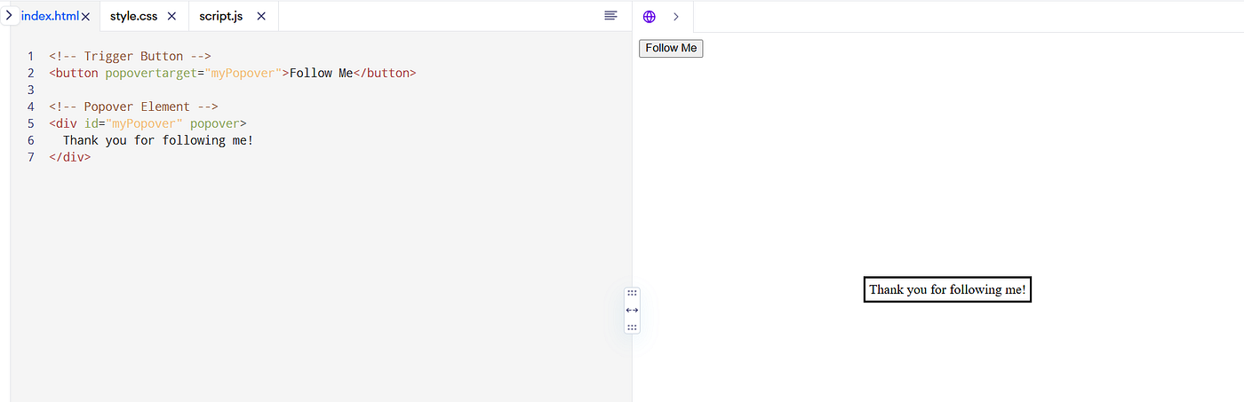
At first, the popover just appears and disappears instantly. If you want to add smooth opening and closing animations, you can combine it with CSS transitions.
#myPopover {
  transform: translateY(-2rem);
  opacity: 0;
  transition: transform 0.3s ease, opacity 0.3s ease;
}

#myPopover:open {
  transform: translateY(0);
  opacity: 1;
}
Field-Sizing for Inputs and Textareas
Another super handy update in CSS is the new field-sizing property.
It allows input fields, textareas, and select dropdowns to automatically resize based on their content.
Before this, input fields and textareas had a fixed width and height.
If the content was too big or too small, the field stayed the same size, unless you manually adjusted it with JavaScript or set a fixed size.
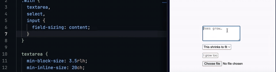
With field-sizing, the browser can adjust the size of the field automatically depending on the text inside.
You simply apply:
input, textarea, select {
  field-sizing: content;
}
Now, when users type something or select an option:
The width (and sometimes the height) will grow or shrink based on the content.
Example:
<textarea placeholder="Start typing..."></textarea>
<input type="text" placeholder="Your Name">
<select>
  <option>Short</option>
  <option>Much longer text option</option>
</select>
textarea, input, select {
  field-sizing: content;
  max-width: 100%; /* Optional: prevent it from getting too large */
}
The textarea will expand as you type more lines.
The input will grow wider if you type a long name.
The select box will resize depending on the selected option.
In short field-sizing helps your form fields grow naturally with the user’s input, creating smarter and more responsive forms with just one line of CSS.
Units
In CSS, there are two main types of units: absolute and relative. Absolute units like cm, mm, in (and others) represent fixed physical measurements and have been available since the early days of CSS. Pixels (px) are actually relative units (they scale based on the viewing device). Most other units are also relative, scaling based on fonts, viewports, or other factors. CSS1 gave us em for font-based sizing, CSS3 added viewport units like vh and vw (introduced around 2012), and recently (2022) we got dvh to handle mobile browsers better. Note that several relative units (like em, ex, ch) can compute differently based on where they’re used. Their behavior might change when used with font-size versus other properties like width or margin.
Font-based
em - Relative to the parent element’s font size
rem - Relative to the root element’s font size
ex - Represents the x-height of the current font (roughly the height of lowercase “x”) - this unit has been around since CSS1 but I only recently really learned about it
ch - Width of the “0” (zero) character in the current font - available since CSS3 but often overlooked
lh - Equal to the line-height of the element
Viewport-based
vh - 1% of the viewport height
vw - 1% of the viewport width
vmin - 1% of the viewport’s smaller dimension (height or width) - also from CSS3 but less commonly used
vmax - 1% of the viewport’s larger dimension (height or width) - also from CSS3 but less commonly used
Modern viewport
dvh - Dynamic viewport height, adjusts for mobile browser chrome/UI elements
dvw - Dynamic viewport width
svh - Small viewport height, the smallest possible height when accounting for dynamic UI elements
svw - Small viewport width
lvh - Large viewport height, the largest possible height when accounting for dynamic UI elements
lvw - Large viewport width
https://blog.stackademic.com/stop-using-100vh-on-mobile-use-these-new-css-units-instead-adf22e7a6ea9
Control Element’s Height and Width
You can use the resize property to allow users to set any element’s width, height, or both manually.

There are mainly 3 values of resize. They are horizontal, vertical and both.
resize: horizontal allows you to drag the element to increase its width.
resize: vertical allows you to drag the element to increase its height.
resize: both allows you to drag the element to increase both its width and height.
But wait. It does not work for every element.
Those are — inline elements and block elements having the overflow property is set to visible .
Centering without Flexbox or Grid
Remember the struggle of centering elements with CSS?
You would reach for a flexbox or grid just to center one thing.
Not anymore!
The new align-content property makes entering elements - no extra containers.
.my-element {
  display: block;
  align-content: center;
}
✅ Supported in Chrome, Edge, and Firefox
❌ Not yet available in Safari
The Masonry Layout with just one line
We all loved the Pinterest-inspired masonry layout, where elements with varying heights stack in a neat, gap-free way. While many developers think you need a Javascript or external libraries to archive it, the solution is surprisingly simple:
Use the columns property.
Instead of struggling with Grid or Flexbox (which both leave awkward gap), you can define columns directly with CSS:
columns: 300px;
Want to set the max number of columns for responsiveness? Add a second parameter like this:
columns: 300px 4;
That’s it. The browser automatically adjusts the layout for you. No fuss, no gaps, no headaches.
Universal box sizing
Probably one of the most forgotten properties to set. It simply defines how the box reacts to the border and the padding of elements within it.
By default, the box-sizing is set to content-box, which means that the width and height of an element only includes its padding and border. This can cause unexpected layout problems.
To fix this, you can simply add the following one-liner to your CSS:
*, *::before, *::after {
    box-sizing: border-box;
}
div {
  width: 200px;
  padding: 20px;
  border: 10px solid black;
}
With
box-sizing: content-box→ total width = 200 + 20×2 + 10×2 = 260pxWith
box-sizing: border-box→ total width = exactly 200px
The math gets an upgrade
CSS has always allowed simple calculations with the calc() function.
However, its capabilities were somewhat limited.
The latest update brings a suite of new math functions, including round(), mod(), and rem().
The old way: Limited Math with calc():
.element {
  width: calc(100% - 50px);
}
The new ways with advanced math functions
.box {
  margin: round(2.5px); /* Rounds to 3px */
}
.stripe:nth-child(odd) {
  left: calc(var(--index) * 50px mod 200px);
}
.circle {
  width: rem(10px, 3px); /* Outputs 1px */
}
Forms with New Pseudo-Classes
Forms are the backbone of user interaction on the web, but ensuring users input the right data can be very tricky.
While CSS provided some basic pseudo-classes like :valid and :invalid for form validation, they weren’t always intuitive or flexible.
The new :user-valid and :user-invalid pseudo-classes refine this process by focusing on user interaction.
The old way: Static validation with :valid and :invalid
Previously, you could validate form fields with :valid and :invalid.
However, these pseudo-classes are triggered as soon as the page is loaded, leading to premature styling changes.
input:valid {
  border-color: green;
}

input:invalid {
  border-color: red;
}
The New Way with :user-valid and :user-invalid
The :user-valid and :user-invalid pseudo-classes only apply styles after the user interacts with the field, avoiding premature validation styles.
input:user-valid {
  border-color: green;
}

input:user-invalid {
  border-color: red;
}
Animating Sizes with the Interpolate-Size Property
Animating size changes like height, width, or padding has always been tricky in CSS.
The new interpolate-size property transforms how size animations work.
The old way: Using max-value or JavaScript:
.collapsible {
  overflow: hidden;
  max-height: 0;
  transition: max-height 0.3s ease-out;
}
.collapsible.open {
  max-height: 500px; /* Assumes a fixed maximum height */
}
const element = document.querySelector('.collapsible');
element.style.height = `${element.scrollHeight}px`;
The new way with interpolate-size
.collapsible {
  interpolate-size: height ease-in-out 0.3s;
}
.collapsible.open {
  height: auto;
}
The browser calculates the starting and ending sizes dynamically, even for
autovalues.Transitions are seamless, no matter how much content is inside the element.
Remove Image Backgrounds With One Line Of CSS
There are a few images whose background does not match the website’s background, like the image below:

The background color of the image is completely different from your expected color.
The most common option you might think is to change your design.
Change the background color to the product’s background color.
Not really…
There is a property in CSS called mix-blend-mode where all the magic happens.
Your image is contained inside an individual div element. Each div has its own background color and each image has its own.
How the mix-blend-mode really work?
When you apply mix-blend-mode for the image element, the browser starts a color comparison between the image and the div element.
Here, the style will be mix-blend-mode: darken
The color comparison will be done on a pixel-by-pixel basis. In a certain position, two pixels are compared with each other.
If the mix-blend-mode property is darken, the darker pixel between the two will be kept.

Look like the image’s background has been removed, but actually it blends with the background.
Pseudo-Classes
Pseudo-classes such as :hover, :focus, and :first-child are options that select HTML elements based on their state rather than their hierarchy or sequence in the document. These selectors allow developers to create more interactive and responsive UIs without using Javascript.
The following code example demonstrates several pseudo-classes in action:
// HTML
...
.hover-section:hover {
  background-color: rgb(82, 11, 145); /* Changes the background color on hover */
  color: white;
}
.input-section input[type="text"]:focus {
  border-color: orange; /* Highlights the input field when focused */
  background-color: lightyellow;
}
.list-section li:first-child {
  color: green; /* Styles the first item in a list */
}
.list-section li:last-child {
  color: red; /* Styles the last item in a list */
}
This CSS code example shows how to enhance user interaction by changing styles based on user actions, such as hovering or focusing on elements, and how to style the specific children of a container.
These pseudo-classes are pretty useful when developing forms, navigation menus, or interactive content that requires visual cues to guide user interactions.

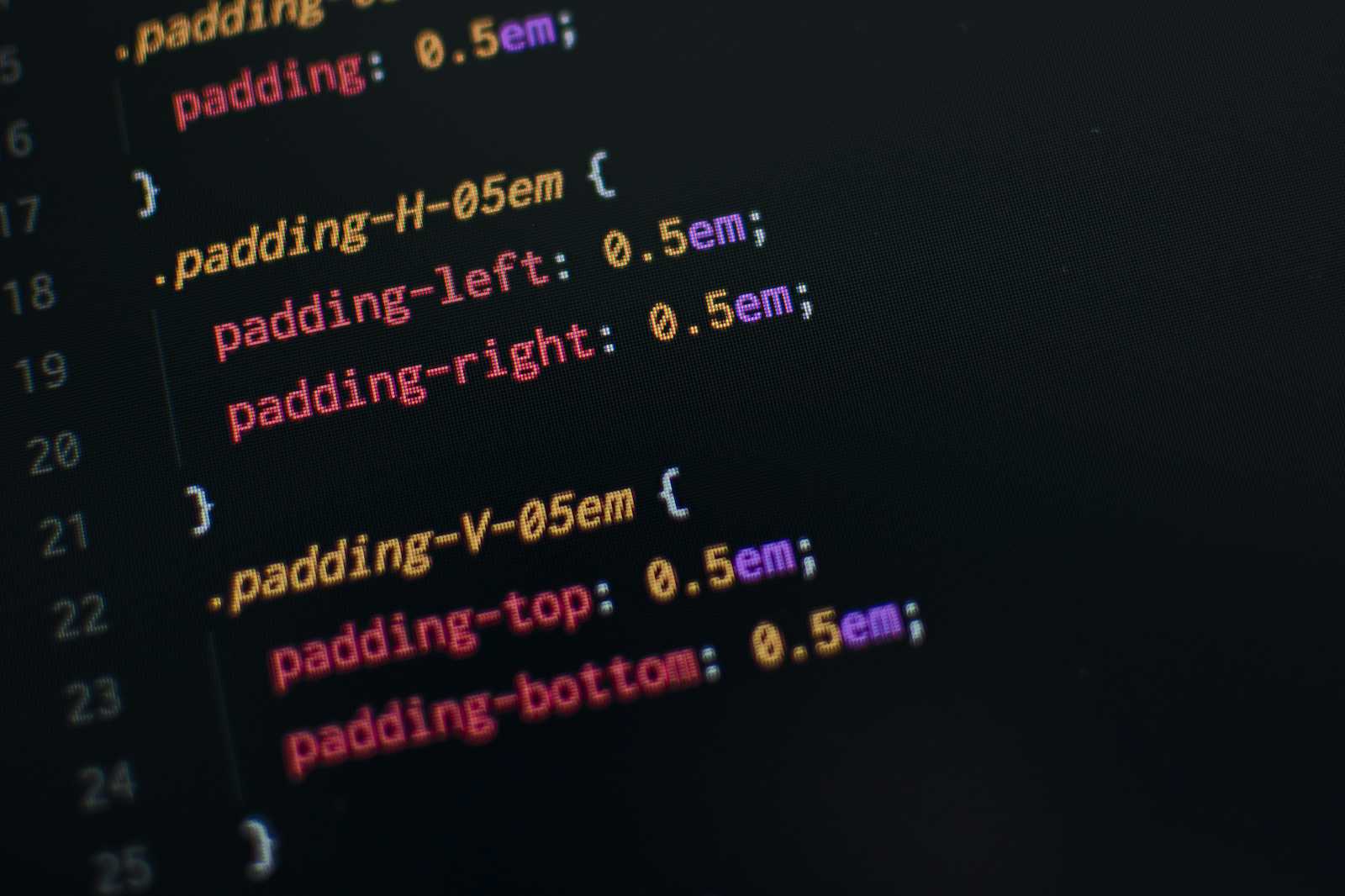
Logical Properties
Tired of using margin-left, margin-right, margin-top, and margin-bottom?
Here’s an example that uses logical properties for layout adjustments:
.box {
  margin-block: 5px 10px;    /* 5px top margin, 10px bottom margin */
  margin-inline: 20px 30px;  /* 20px left margin, 30px right margin */
}
The same method works for padding as well.
.box {
  padding-block: 10px 20px; /* 10px top/bottom padding, 20px bottom padding */
  padding-inline: 15px 25px; /* 15px left padding, 25px right padding */
}
These properties adjust automatically based on the text direction (e.g., left-to-right or right-to-left), making your code more readable, shorter, flexible, and international-friendly.
Empty Element
No more empty space or unwanted margins from empty elements! This CSS trick automatically hides any elements that have no content. It’s incredibly useful for dynamic content that might not always be present, ensuring your content stays clean and tight.
.element:empty { display: none }
Consider combining this with pseudo-elements such as ::before or ::after for placeholders or default states when the element is empty. This can add a nice touch of detail to your design without any clutter.
Responsive Styling based on orientation
Adjust your site’s background color (or any other style) based on the design orientation with this simple media query. It’s perfect for ensuring your design looks great in both portraits or landscape modes, especially on mobile devices where users might frequently change orientation.
@media (orientation: landscape) {
  body {
    background-color: #333
  }
}
Dynamic Sibling Influence
Create an interactive element on your page without JavaScript! This CSS one-liner changes the style of a target element when you hover over its sibling. It’s great for highlighting related elements or showing hidden information when another element is interacted with.
.sibling:hover ~ .target { color: #007bff }
.sibling:hover + .target { color: #007bff }
The ~ the selector in CSS targets all subsequent siblings that match the selector, allowing you to style multiple elements that follow other specific elements within the same parent.
On the other hand, the + selector targets only the directly adjacent sibling that immediately follows the specified element, limiting the effect to just one next sibling.
A practical migration handbook from SASS/SCSS to modern native CSS
Modern CSS has rapidly evolved, integrating many features that were once exclusive to Sass/SCSS. Features like CSS variables, native nesting, color functions, and cascade layers are now built into the language, eliminating the need for a preprocessor in most cases.
This article provides a practical guide for developers looking to migrate their codebase from SCSS/Sass to modern native CSS.
The :target Pseudo Class
CSS offers several pseudo-classes that let you style elements based on different states (:hover, :focus, :checked).
But there’s one you might not have used before — :target
The :target pseudo-class applies styles to an element when its ID matches the Fragment identifier in the URL (the part after #).
This behavior is commonly seen when clicking on an anchor link that jumps to a section on the same page.
Here’s a simple example:
<a href="#contact">Go to Contact</a>
<section id="contact">
  <p>Welcome to the contact section!</p>
</section>
When clicked, the URL changes to yourwebsite.com/#contact, and the section becomes the target. That’s where the power of :target comes in.
: vs:: in CSS3
Have you always used trial and error to style elements when it involves either a colon : or a pair of colon ::?
: precedes and identifies the state of an element while :: “creates” element(s). The difference between : and :: is that the former describes the state of a selected element, usually involving user interaction, while the latter is used to create elements as a part of the selected element and/or used to target elements using the selected element as a reference.
It is important to note that : creates pseudo-classes; some examples are:hover - to style an element when the user is on it, without selecting, i,e hovers over an element:active - to style an element when clicked ie, when an element is active:visited - to style anchor tags (links) when a user has clicked on them.:focus - to style an input field that the user clicked on.
While :: creates pseudo-elements. Some examples of pseudo-elements are::before - targets created an element that precedes the selected element::after - targets created an element that succeeds the selected element
Conditions
Conditions can be written in several ways, depending on where you want to use them. Selectors are scoped to their elements, while media queries are scoped globally and need their own selectors.
/* Attribite Selectors */
[data-attr='true'] {
    /* if */
}
[data-attr='false'] {
    /* elseif */
}
:not([data-attr]) {
    /* else */
}
/* Pseudo Classes */
:checked {
    /* if */
}
:not(:checked) {
    /* else */
}
/* Media queries */
:root {
    color: red; /* else */
}
@media (min-width > 600px) {
    :root {
        color: blue; /* if */
    }
}
The Difference Between width: 100% and width: auto
The width property is used to set the width of an element. By default, width sets the width of the content area, but if the box-sizing property is set to border-box, it instead sets the width of the border area.
<!DOCTYPE html>
<html lang="en">
  <head>
    <meta charset="UTF-8" />
    <meta name="viewport" content="width=device-width, initial-scale=1.0" />
    <title>Document</title>
    <style>
      div {
        color: #fff;
        font-size: 2rem;
        text-align: center;
      }
      .parent {
        width: 600px;
        height: 600px;
        background-color: #2177b8;
        border: 10px solid #21373d;
        padding: 20px;
      }
      .child {
        background-color: #ee3f4d;
        border: 10px solid #d8e3e7;
        margin: 20px;
        height: 100px;
      }
      .auto {
        width: auto;
      }
      .hundred-percent {
        width: 100%;
      }
    </style>
  </head>
  <body>
    <div class="parent">
      parent
      <div class="child auto">child1: width:auto</div>
      <div class="child hundred-percent">child2: width:100%</div>
    </div>
  </body>
</html>
In this example, we set the parent element to have padding: 20px and gave both child elements margin: 20px. child1 has a width property of auto, while child2 has a width property of 100%.
child1(width: auto): The width adapts to the content area of the parent and does not overflow. Final width calculation forchild1:
Parent width: 600px
Margin usage: 20px \ 2 = 40px*
Border usage: 10px \ 2 = 20px*
Final width = 600px — 40px — 20px = 540px
child2(width: 100%): The width equals the width of the parent and may overflow. Final width calculation forchild2:
Parent width: 600px
Final width = 600px (directly matches the parent width)
Conclusion:
width: 100%: The content area of the child element fills the content area of the parent. If the child element also haspadding,border, etc., or if the parent has margins and padding, it may cause the child element to overflow.width: auto: The child element's width is automatically adjusted based on its content,padding,border, andmarginto fit within the content area of the parent.
Therefore, in development, it’s advisable to choose width: auto, as it will better maintain the width relative to the parent element. On the other hand, using width: 100% can result in additional spacing being added to the element’s size, potentially leading to layout issues.
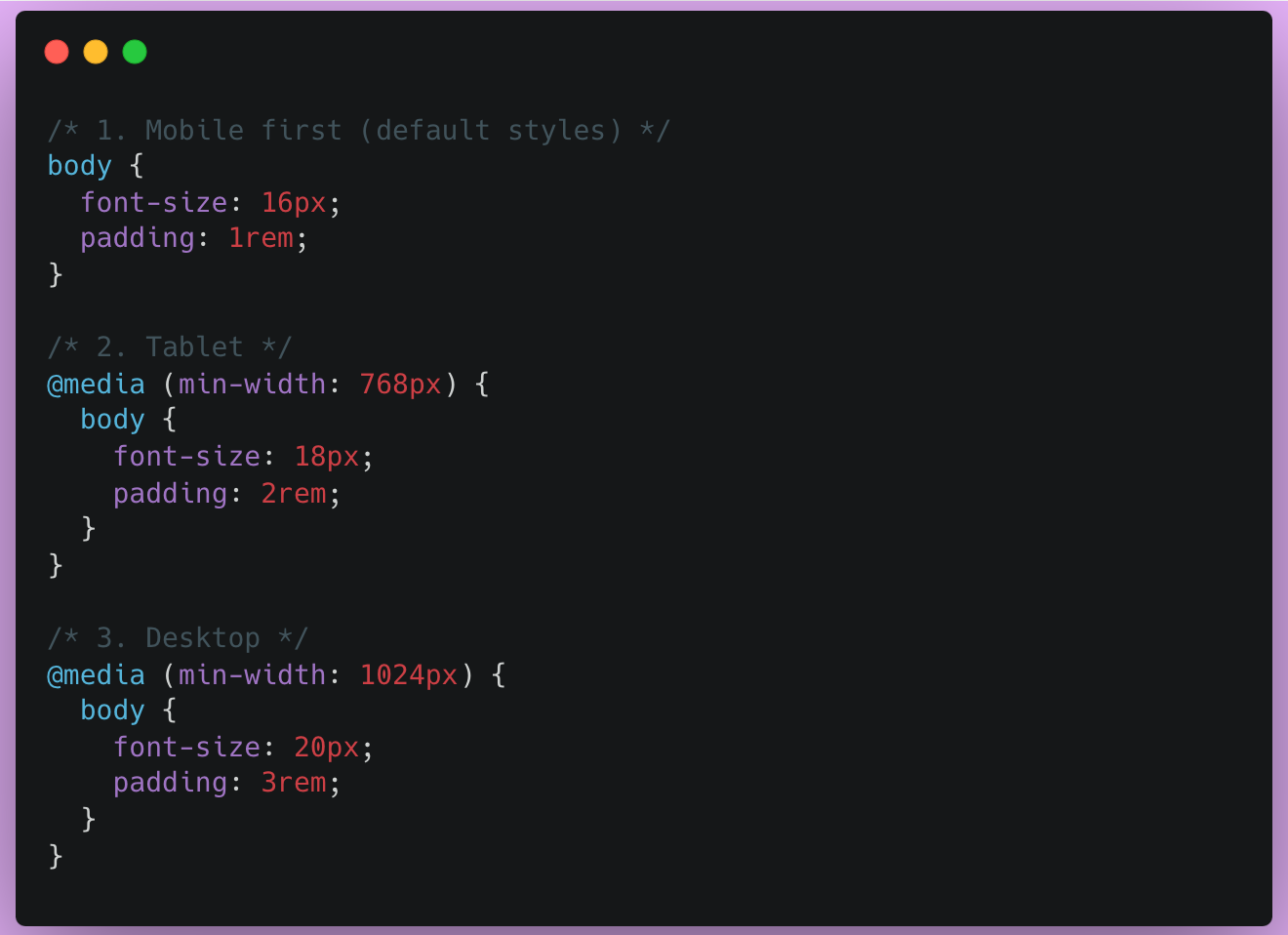
These 3 CSS breakpoints handle 95% of your layouts
Most of us aren’t designing interfaces for smart fridges, VR headsets, and a wristwatch all at once. And yet, devs (especially early career ones) spend way too much time micromanaging media queries like they are twerking the shields on the rocket lunch.
You don’t need 12 breakpoints. You only need three.
The Problem: Too many breakpoints, too little gain.
You know the drill. You start a project, install Taiwind or write a custom media query setup, and then…
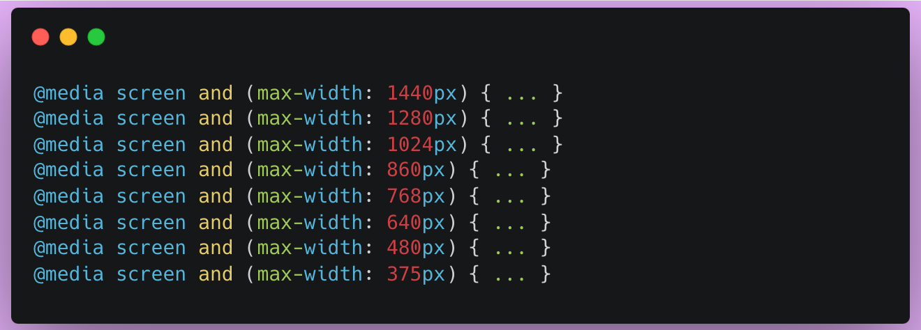
By the time you finish typing, the site is already outdated.
You are trying to catch every edge case, but you are drowning the the maintenance hell.
And guess what? Your users don’t care.
They just want the site to look good and work on their phone, tablet, and laptop.
The 3 breakpoints that work for 95% of projects
If you want a setup that’s practical, predictable, and future-proof, start here:
That’s it.
The logic behind these:
0 - 767px→ Phones (the smallest view, default)768px - 1023px→ Tablets (or awkward in-between devices)1024px and up→ Desktops, laptops, and beyond
If you really need a wider breakpoint (say for ultra-wide monitors), go ahead and add a 1280px or 1440px. But don’t start there. Wait until the design demands it, not your anxiety.
And if you’re using a framework like Tailwind, you’re already covered:
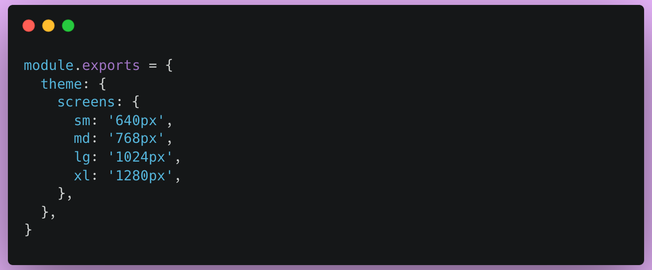
Use md, lg, and xl, and you’re done. Don’t fight the framework.
Responsive Tables are Hard - Here’s a Pattern That Works
Tables are great until you try to view them on your phone. I have broken more UIs than I can count — until I landed on this reliable pattern.
Why Responsive Tables are so Frustrating
You want:
Headers
Rows
Clean alignment
Scrollable on mobile
Sticky headers, maybe?
But what you often get:
Overflowing cells
Squashed text
Ugly horizontal scroll
Broken layouts
Responsive grids? Easy.
Responsive tables? Still awkward.
And that’s because:
Tables weren’t designed for mobiles — they were designed for data-heavy desktops.
But with the right pattern, you can make it work beautifully for any screen.
The Pattern that works: Table inside a Scrollable Container.
This is the cleanest, least hacky approach I have used — and it works 99% of the time.
- Step 1: Wrap your table in a scroll container
<div class="table-wrapper">
  <table>
    <thead>...</thead>
    <tbody>...</tbody>
  </table>
</div>

.table-wrapper {
  width: 100%;
  overflow-x: auto;
}

table {
  width: 100%;
  min-width: 600px; /* or whatever your data requires */
  border-collapse: collapse;
}
This creates horizontal scrolling on small screens, but keeps things readable and aligned.
- Step 2: Use Sticky Headers (Optional but Delightful)
thead th {
  position: sticky;
  top: 0;
  background: white;
  z-index: 1;
}
Now, when users scroll, your headers stay visible.
Bonus: Add a subtle box shadow to the sticky header for depth
- Step 3: Make it Keyboard — Tough Friendly
.table-wrapper {
  -webkit-overflow-scrolling: touch;
  scrollbar-width: thin;
  scroll-behavior: smooth;
}
This improves the mobile feel without janky scrollbars.
Responsive Table Enhancements
✅ Add
white-space: nowrapon key cells to prevent word wrap✅ Use
text-overflow: ellipsisfor long content✅ Add
titleor tooltips for truncated values✅ Highlight rows on hover for readability
✅ Use
aria-labelandscopeattributes for accessibility
Next-Gen Web Animations: 15 CSS and JavaScript Techniques That Will Make Your Website 300% More Engaging
Web animations are experiencing a renaissance. New CSS features like @scroll-timeline, animation-timeline, and the Web Animations API is revolutionizing how we create engaging user experiences. These modern techniques offer unprecedented control over timing, performance, and accessibility while maintaining smooth 60fps animations.
Studies show that well-crafted animations can increase user engagement by up to 300% and improve perceived value by 25%. But poorly implemented animations can destroy the user experience and tank your Core Web Vitals Score.
In this comprehensive guide, we will explore cutting-edge animation techniques that will transform your website into an engaging, performant experience that users love.
Why Modern Animation Techniques Beat Traditional Approaches.
This foundation section highlights the inefficiencies of traditional JavaScript-based animation methods, which often lead to problems like constant style recalculations, main thread blocking, poor battery life, and accessibility issues.
It then introduces the benefits of modern approaches, primarily GPU acceleration for smooth 60fps performance, better battery life, and built-in accessibility support, setting the stage for the subsequent techniques.
The Problem with Old Animation Methods
// Traditional approach - performance killers
function animateElement() {
  let start = null;

  function step(timestamp) {
    if (!start) start = timestamp;
    const progress = timestamp - start;

    element.style.left = Math.min(progress / 10, 200) + 'px';

    if (progress < 2000) {
      requestAnimationFrame(step);
    }
  }

  requestAnimationFrame(step);
}

// Problems:
// - Constant style recalculations
// - Main thread blocking
// - Poor battery life
// - Accessibility issues
The Modern Advantage
/* Modern approach - GPU accelerated */
@keyframes slideIn {
  from { transform: translateX(-100%); }
  to { transform: translateX(0); }
}
.element {
  animation: slideIn 0.3s ease-out;
  will-change: transform;
}
/* Benefits:
   - GPU acceleration
   - Smooth 60fps performance
   - Better battery life
   - Built-in accessibility support
*/
Performance comparison:
CPU usage: 70% reduction
Battery consumption: 50% improvement
Frame rate consistency: 95% fewer dropped frames
Accessibility: Native
prefers-reduced-motionsupport
Understanding Modern Animation Primitives
Refer to this article for more details.
CSS DevTools Secrets Every Developer Should Master
You have been staring at your CSS for 2 hours. The element should be centered, and the flexbox should work. But somehow, your “perfectly written“ code is creating a layout that looks like it was designed by a drunk toddler.
I have been there. We all have been there.
But, here’s what changed everything for me: I was using only 10% of Chrome DevTools’ power.
After years of web development, I discovered hidden features that made me feel like I had a CSS superpowers.
The Problem We All Face
Most developers use DevTools like this:
Right-click → Inspect
Change some values
Refresh and hope it works
But the pros? They use DevTools like a surgical instrument.
They debug faster, understand the layout deeper, and fix performance issues that others can’t even see.
Secret 1: The element state simulator
The hidden gem: You can simulate hover, focus, and other states without actually triggering them.
/* Instead of this painful workflow: */
.button:hover {
    background: #007bff;
    transform: scale(1.05);
}
/* → Hover manually to test → Move mouse away → Repeat 50 times */
The better way:
Right-click your element in DevTools
Select “Force State” → “:hover”
Now it stays hovered while you debug
Why this is game-changing: You can inspect hover states, focus states, and even combinations like :hover:focus without the mouse dance.
Secret 2: CSS Grid/Flexbox Overlay Visualization
This one blew my mind.
When you select a Flexbox or Grid container in Chrome DevTools, look for the tiny “grid” or “flex“ badge next to it.
Click it.
Suddenly, you see:
Grid lines overlaid on your layout
Flex direction arrows
Gap spacing visualization
Container boundaries
.container {
    display: grid;
    grid-template-columns: 1fr 2fr 1fr;
    gap: 20px;
}
With the overlay, you can literally see how your grid is dividing space. No more guessing why items aren’t aligning.
Secret 3: The Animation Inspector
Most developers miss this completely
When you have CSS animations or transitions, there is a hidden timeline view.
Go to DevTools → More tools → Animations
Trigger your animation
Watch the timeline appear
What you can do:
Slow down animations to 10% speed
Replay animations frame by frame
See exactly when properties change
Debug timing functions
.slide-in {
    transform: translateX(-100%);
    transition: transform 0.5s cubic-bezier(0.4, 0, 0.2, 1);
}
Pro tip: Use this to perfect your easing functions. The visual timeline shows you exactly how the animation flows.
Secret 4: Computed Style Search
The frustration: You have 15 CSS files, and you can’t figure out where the specific style is coming from.
The solution: In the Computed Tab, there is a search box that most people ignore.
Type any CSS property name, and it shows:
The final computed value
Every rule that affects it
Which ones are overridden
The cascade order
/* When debugging why your margin isn't working: */
.element {
    margin: 20px; /* This might be overridden */
}

.parent .element {
    margin: 10px !important; /* By this */
}
Search for “margin” in Computed styles, and you’ll see the entire inheritance chain.
Secret 5: Copy CSS Path
The time-saver: Need to target an element with CSS but can’t figure out the selector?
Right-click any element in DevTools → Copy → Copy selector.
It gives you the exact CSS selector to target that element:
/* Instead of guessing: */
.header .nav ul li:nth-child(3) a

/* DevTools gives you: */
#header > nav.main-nav > ul.nav-list > li:nth-child(3) > a.nav-link
Bonus: Use “Copy JS path” for querySelector in JavaScript.
Secret 6: CSS Coverage Analysis
The performance killer: Dead CSS bloating your stylesheets.
The solution: Coverage tab (More tools → Coverage)
Start recording
Navigate your site
Stop recording
See exactly which CSS rules are used vs unused
Red bars = unused CSS
Green bars = used CSS
I found one client had 73% unused CSS. That’s a massive performance hit that nobody noticed.
Secret 7: Device Frame Screenshots
For presentations and documentation:
Toggle device mode (Ctrl+Shift+M)
Select a device frame (iPhone, Pixel, etc.)
Open Command Palette (Ctrl+Shift+P)
Type “Capture screenshot”
Choose “Capture full size screenshot”
You get professional-looking device mockups instantly.
Secret 8: Color Picker Superpowers
Most people just click the color square and pick colors.
But there’s more:
Eyedropper tool: Sample any color from anywhere on the page
Contrast ratio checker: Ensures accessibility compliance
Color format switcher: Toggle between hex, rgb, hsl with Shift+Click
Color palette: DevTools remembers your recent colors
.text {
    color: #007bff; /* Shift+click to cycle through formats */
    /* #007bff → rgb(0, 123, 255) → hsl(211, 100%, 50%) */
}
Secret 9: CSS Changes Tracker
The workflow optimizer:
When you make changes in DevTools, they disappear on refresh. But there’s a hidden tracker:
Sources tab → Overrides
Enable local overrides
Select a folder to save changes
Now your DevTools changes persist!
Even better: Sources tab → Changes shows you a diff of everything you modified.
Secret 10: Performance Insights for CSS
The advanced move:
Performance tab → Start recording → Interact with your page → Stop
Look for:
Style recalculations (purple bars)
Layout thrashing (green bars)
Paint operations (green bars)
/* This triggers expensive reflows: */
.animation {
    animation: slideDown 0.3s ease;
}

@keyframes slideDown {
    from { height: 0; }
    to { height: 200px; }
}

/* This is much more performant: */
.animation {
    animation: slideDown 0.3s ease;
}

@keyframes slideDown {
    from { transform: translateY(-100%); }
    to { transform: translateY(0); }
}
Transform and opacity changes are cheaper than layout properties.
The CSS property that’s making every website feel slow
Last week, I was debugging why our company’s dashboard felt sluggish on mobile devices. Everything looked perfect in Chrome DevTools on my local machine, but real users were complaining about janky scrolling and laggy interactions. After hours of profiling, I found the culprit hiding in plain sight: box-shadow.
That innocent little property we all love for adding depth and polish was silently murdering our performance.
The Shadow That Haunts Performance
Box-shadow is one of the most performance-heavy CSS properties you can use. When applied to many components with large blur radius values, it can significantly slow down your webpage. Yet it’s everywhere - cards, buttons, dropdowns. We sprinkle it on like digital seasoning without thinking twice.
Here’s what I discovered: a video streaming interface with blurred backgrounds showed dramatic differences in GPU utilization solely attributed to blur effect implementation. The internal computations required for the blur effect heavily utilize the GPU, and when you multiply that over dozens of elements, you get a choppy user experience.
Why Box-Shadow murders your frame rates
Think about what happens when a browser renders the box-shadow:
Element with box-shadow renders like this:
┌─────────────────┐
│   Your Element  │ ← Original element
└─────────────────┘
    ▼ ▼ ▼ ▼ ▼     ← Shadow calculation
  ░░░░░░░░░░░░░░░   ← Blur processing
 ░░░░░░░░░░░░░░░░░  ← Color blending
░░░░░░░░░░░░░░░░░░░ ← Composite layers
The browser has to:
Create a copy of your element’s silhouette
Offset it based on your x/y values
Apply blur calculations (this is the killer)
Composite it behind your element
Repeat for every frame during animations
When used on a large number of elements or a large blur radius, it can significantly slow down your page. I have seen sites with 50+ elements using box-shadow: 0 10px 25px rgba(0,0,0,0.15) wondering why their Lighthouse performance score is in the red.
Let’s check out the real-world impact and these alternative solutions in this article.
Top 10 CSS Mistakes Even Experienced Devs Still Make
If you’ve ever spent 45 minutes adjusting a margin only to realize it was a padding issue all along, you’re not alone. CSS is deceptively simple. And even seasoned frontend engineers make the same silent missteps that later haunt QA reports, mobile views, and weird browser edge cases.
Here are 10 CSS mistakes that even experienced developers keep making…yes, even the ones who tweet confidently about CSS Grid.
1. Using z-index Without Understanding Stacking Context
Cranking up z-index: 9999 should solve it, right?
Not if you’ve unknowingly created a new stacking context.

Any transform, opacity < 1, filter, will-change, or position: fixed inside an element can create a new stacking context, which isolates z-index levels from the outside world. This one causes endless ghost-layer bugs, especially in modals or dropdowns.
2. Misusing vh Units on Mobile
Setting an element to height: 100vh used to be the go-to for fullscreen sections. But on mobile? It breaks.
iOS Safari subtracts the browser UI height differently. So what looks fine on a desktop often cuts off or overflows awkwardly on phones.
Fix: Use 100dvh (dynamic viewport height) or JS to set height dynamically if full-viewport fidelity is critical.
3. Forgetting That Flex Children Don’t Shrink by Default
Ever have a card layout break because one element is way too wide? That’s usually because flex-shrink isn’t behaving as expected.

When elements have content that doesn’t wrap or images without max-widths, the container explodes. A quick min-width: 0 or overflow: hidden can sometimes fix the unexpected growth.
4. Using position: absolute Inside a Flexbox Without a relative Parent
This is a silent killer. If you absolutely position something inside a flex container but forget to set position: relative on the flex parent, your top/right/bottom/left values don’t do what you think they do.
It works sometimes because of inherited flow…and fails just enough to make you question your skills.
5. Over-Nesting When It’s Not Needed
We’ve all done this:

Why? Just use .card-title.
Excessive nesting makes CSS harder to override, understand, and maintain. Especially when using BEM or CSS modules, keep selectors shallow and intentional.
6. Relying on !important as a First Resort
The !important tag is a crutch. Once you use it, you start a spiral where other styles need !important just to win.
If your CSS is fighting itself, chances are the problem isn’t specificity, it’s architecture. Audit your cascade.
Use
!importantonly when you absolutely must override a third-party style and cannot change the source.
7. Forgetting About box-sizing: border-box
Still using width: 100% + padding and wondering why things overflow?

This tiny rule ensures that paddings are included inside the defined width/height, not added after it. Saves layouts. Every time.
8. Missing the Power of Logical Properties
Still writing margin-left and padding-top? That works, but it breaks in right-to-left (RTL) layouts or vertical writing modes.

Logical properties make your layout direction-agnostic and future-proof.
9. Overusing display: flex When You Needed block
Sometimes, all you need is display: block and margin: auto to center something. But we’re so used to typing display: flex; align-items: center; justify-content: center that we forget the simpler tools.
Over-flexing often leads to layout bugs where child elements don’t behave like you expect.
10. Letting Your CSS Snowball
The biggest mistake? Thinking CSS doesn’t need structure.
If you’re not using a convention (BEM, SMACSS, Tailwind, CSS Modules, whatever), your styles will grow into a tangled mess.
CSS is global by default. That’s its power and its curse.
Without discipline, every new feature becomes an accidental override.
CSS might not throw runtime errors, but it can absolutely wreck your product quietly and visually.
Even senior devs mess this up. The goal isn’t to avoid mistakes entirely; it’s to recognize the traps, name them, and debug faster next time.
Tailwind CSS
Exploring the rise of the utility-first CSS framework that’s changed the game. Here’s how Tailwind became so popular and why I have refused to use any other CSS solution since the year 2022.
Best Practices for Tailwind CSS
Do not repeat the same class names for elements
Prefer to create separate components with uniform styles throughout the application instead of writing the same class names in multiple places or creating a new class name including all the Tailwind class names using @apply directive.
Doing so would offer us the flexibility of updating our styles with minimal effort, as we have to update the class names in only a single place.
Suppose we have a h1 tag that will be used in multiple places. We have two approaches to achieve it:
We can create a component
H1Headingwith Tailwind classes applied to it and reuse this component whenever it is required.const H1Heading = ({ children }) => { return ( <h1 className="text-2xl md:text-4xl lg:text-5xl xl:text-6xl font-bold text-black"> {children} </h1> ); };We can create a class in our CSS file that includes all the tailwind class names for the particular element and use the class name wherever required.
@tailwind base; @tailwind components; @tailwind utilities; .heading-1 { @apply text-2xl md:text-4xl lg:text-5xl xl:text-6xl font-bold text-black }<h1 className="heading-1"> Some random heading <h1>
Maintain an organized style guide using design tokens
Design tokens are a way to store and manage your design variables, such as color palettes, spacing scale, typography scale, or breakpoints. With design tokens, you can create consistent and reusable styles that are easy to update and maintain.
You can create the design tokens in the tailwind.config.js file. This is a good way to centralize your design tokens and make them available to all of your Tailwind CSS classes.
Suppose our application follows a particular design system. We can add these guidelines to our Tailwind configuration:
import defaultTheme from "tailwindcss/defaultTheme";

const config = {
  content: [
    "./src/**/*.{js,ts,jsx,tsx,mdx}",
  ],
  theme: {
    extend: {
      fontFamily: {
        manrope: "var(--font-manrope)",
      },
      colors: {
        ...defaultTheme.colors,
        theme: "#7743DB",
        light: {
          primary: "#FFFFFF",
          secondary: "#f1f1ef",
        },
        dark: {
          primary: "#0F0F0F",
          secondary: "#202020",
        },
        "background": "#F5F5F5",
      },
      screens: {
        ...defaultTheme.screens,
        xs: "340px",
        sm: "420px",
      },
      spacing: {
        spacing: {
          ...defaultTheme.spacing,
          1: '5px',
          2: '10px',
          3: '15px',
          4: '20px',
          5: '25px'
        }
      }
    },
  },
};
Avoid using arbitrary values
Imagine our web application follows some color scheme where we have #7743DB as our theme color and #0D0D0D as our background color.
We can add these colors to our Tailwind configuration and refer to them using class names, such as bg-background text-theme instead of using arbitrary values at multiple places, i.e. bg-[#0D0D0D] or text-[#7743DB].
Now, if we want to change our application’s color scheme, we just need to update our tailwind configuration instead of renaming the arbitrary class names in multiple places.
import defaultTheme from "tailwindcss/defaultTheme";

const config = {
  content: [
    "./src/**/*.{js,ts,jsx,tsx,mdx}",
  ],
  theme: {
    extend: {
      colors: {
        ...defaultTheme.colors,
        theme: "#7743DB",
        background: "#0D0D0D"
      },
    },
  },
};

export default config;
const ColoredText = ({ children }) => {
  return (
     <span className="text-theme">
          {children}
     </span>
  );
};
Avoid applying dynamically generated class names
You might have encountered this issue while working with dynamic classes: Whenever we apply dynamic class names based on a state or condition, the class name appears in the browser's elements panel, but its corresponding CSS does not.
const BorderBox = ({ borderColor }) => {
  return (
    <div className={`border border-solid border-[${borderColor}]`}>
      Some Random Text
    </div>
  );
};
This is because Tailwind scans your source code for classes using regular expressions to extract every string that could possibly be a class name. Hence, any broken class name string such as border-[${borderColor}] would not be recognized by Tailwind at build time, and it would not be included in the output CSS file of Tailwind.
Suppose we have to change the border color of our element based on the color code passed in props. There are two ways to it:
Defining a separate class name for each state value. This is only applicable if you know all the expected values of
borderColorat build time.const BorderBox = ({ borderColor }) => { return ( <div className={clsx("border border-solid", { "border-black": borderColor === "black", "border-red-500": borderColor === "red", "border-green-500": borderColor === "green", })} > Some Random Text </div> ); }; // Note: clsx is utility package for constructing className strings conditionally.If we do not know all the expected values of borderColor at the build time, it is better to pass the border color in the style attribute of the element to support unknown values.
 const BorderBox = ({ borderColor }) => {
   return (
     <div className="border border-solid" style={{ borderColor }}>
       Some Random Text
     </div>
   );
 };
Creating a utility to read Tailwind Configuration in JavaScript
In web applications, a situation rarely arises where you need to read some CSS design token value in JavaScript, but when it does, we generally hardcode the CSS design token value in our code while working with Tailwind. This is not a good practice, as in the future, if you change your design token value in your Tailwind configuration, your code might still refer to the old value, which can cause unwanted behavior.
Hence, we can build a custom utility function to read the Tailwind configuration in our code.
import resolveConfig from "tailwindcss/resolveConfig";
import tailwindConfig from "../tailwind.config";

const getTailwindConfiguration = () => {
  return resolveConfig(tailwindConfig).theme;
};

const config = getTailwindConfiguration();

console.log(config.colors.red[500]); // would print #ef4444
Defining Tailwind Plugins to register new/complex CSS styles
Tailwind provides us with plugins to register new styles and inject them into the user’s stylesheet using JavaScript instead of writing custom CSS styling in stylesheets.
I prefer this approach, as writing custom CSS classes means essentially rewriting CSS and sacrificing Tailwind’s organized workflow and simple maintenance.
Suppose we want to create a .btn class that has several styles attached to it. This is how we can achieve it:
import plugin from "tailwindcss/plugin";

const config = {
  content: [
    "./src/**/*.{js,ts,jsx,tsx,mdx}",
  ],
  plugins: [
    plugin(function ({ addComponents }) {
      addComponents({
        ".btn": {
          padding: ".5rem 1rem",
          borderRadius: ".25rem",
          fontWeight: "600",
        },
      });
    }),
  ],
};

export default config;
This is how the .btn class would look like when you hover over it:

Tailwind supports registering complex styles as well, along with user-provided values. You can go through the Tailwind official documentation for the plugin to know more about it.
Tailwind CSS Tips & Tricks
- Styling children from the parent element (`&_*`)
Generally, you can just put utility classes on any element to style it. But, there is a case when you don’t have control over certain elements, like when you are using external components.
In that case, you can use this class to style elements inside those components. There are 2 ways to style elements inside their parent:
Using
*:{utility-class}to style direct children, which is documented here.Using
[&_{children-selector}]:{utility-class}to style any descendant of the parent element. I don’t know why, but this way is not documented in the official documentation.
<div class='[&>p]:font-bold *:uppercase [&_.link-class]:text-teal-500'>
    <p>
        This text is styled by{' '}
        <a class='link-class' href='#'>
            its ancestor
        </a>
    </p>
</div>
The underscore in the code is a replacement for a space. You can also use id or class selectors.
- Let the DOM state style itself (data/aria,
peer, andgroup)
Skip JS for visual states you already have in the DOM.
Toggle data-* or aria-* attributes and let Tailwind variants do the heavy lifting.
Tabs with data-state:
<div class="flex gap-2" role="tablist">
  <button data-state="active" class="px-3 py-1 rounded-brand data-[state=active]:bg-brand data-[state=active]:text-white">Overview</button>
  <button class="px-3 py-1 rounded-brand data-[state=active]:bg-brand data-[state=active]:text-white">Settings</button>
</div>
Disclosure with aria-expanded + peer:
<button aria-expanded="false" id="acc-1" class="peer px-3 py-2 rounded-brand border">
  FAQ
</button>
<div class="max-h-0 overflow-hidden peer-[aria-expanded=true]:max-h-96 transition-[max-height]">
  <p>Answer goes here.</p>
</div>
Nested hover/focus with group:
<a class="group block p-4 rounded-brand border">
  <span class="underline group-hover:no-underline">Read more</span>
</a>
👉Reality: If you need complex timelines or animations, sure — write JS.
But for 80% of UI toggles, the semantics are already in the markup. Use them.
- Style based on sibling state
peer-*
You can use peer-{state}:{utility-class} to style an element based on its sibling state.
<form class='max-w-sm mx-auto'>
    <label class='block'>
        <span class='block text-sm font-medium text-slate-700'>Email</span>
        <input
            type='email'
            class='peer rounded p-3 w-full outline-none border border-solid border-slate-300'
            placeholder='Type an invalid email to see error message'
        />
        <p class='mt-2 invisible peer-invalid:visible text-pink-600 text-sm'>Please provide a valid email address.</p>
    </label>
</form>
In the demo above, you can see that the error message is only visible when the input element (sibling) has invalid state.
- Style based on descendant
has-*
There is also a way to style an element based on its children or descendants. The example use case for this is when looping a post list that the post item can contain an image or not.

In real use cases, you probably use JavaScript logic instead using has-[{element-selector}] to style based on the descendant element. But, has-* also supports for descendant state.
In the demo above, you can see that I used has-[img:hover] to changed the background when the image hovered. You can use another state like invalid, disabled, focus, etc. This is the best case where you can use has-* selector.
You can also combine has-* with another modifier like peer-has-*.
- Custom Classes with Arbitrary Values
Custom classes with Arbitrary Classes are like writing CSS directly inside the class. It looks something like text-[#09836d] or mr-[75px]. You can use a class with arbitrary as the last resort when you can’t find any predefined utility class that fulfills your use case.
You can pass any value that is valid, such as the CSS property class, to a custom class. You can even pass Tailwind CSS variables. You can find more examples of Arbitrary values in the official documentation.
One thing that usually becomes an issue when using classes with arbitrary values is when you need to pass a value with a space. For example, when you want to pass box-shadow value 0 0 2px 0 #abcdef. In this case, you can replace the space with _, so the class will be shadow-[0_0_2px_0_#abcdef].
Keep in mind that a CSS class can’t contain whitespace.
- Color Opacity
Did you know that you can apply opacity to your color classes? It works in classes that contain color value like bg-{color}, text-{color}, border-{color}. You just need to add /{opacity-value} after the class. The opacity value is 0 to 100 with an interval of 5.

- Customize / Disable Tailwind container class
Tailwind CSS comes with a built-in responsive container class. The container will adjust in xs, sm, md, and lg breakpoints. By default, the container class has no padding and center positioning. But if you want to customize it, you can add container configurations in tailwind.config.js file.
 /** @type {import('tailwindcss').Config} */
module.exports = {
 ...,
  theme: {
    container: {
      center: true,
      padding: '1rem'
 },
 },
}
You can also disable or remove the container class by setting container: false in corePlugins configuration.
/** @type {import('tailwindcss').Config} */
module.exports = {
 ...,
  corePlugins: {
    container: false
 },
}
- Space between elements (
space-*andgap-*)
When displaying a list or grid, we usually need spacing between list or grid items. We often use padding-{top/bottom/left/right} or margin-{top/bottom/left/right} and end up with excess spacing in the last item.
You can solve this by using space-* or gap-* in the list or grid container. space works for all element displays (block, flex, grid, etc), while gap-* only works for flex and grid element.
If you use space-*, you have to define the direction, whether vertical or horizontal spacing. Use space-x-* for horizontal space and space-y-* for vertical spacing.

- Replace Js
substring()withtruncateandline-clamp-*
Before I knew truncate and line-clamp-*, I usually used the JavaScript function substring(0, n) to truncate a string. However, the sentences often have inconsistent widths because each letter has a different width.
truncate and line-clamp-* solve this, because they don’t care about the number of letters; they only care about the number of lines.
You can use truncate to truncate sentences into 1 line. If you want to truncate a paragraph after, let’s say 3 lines, you can use line-clamp-3.
<div class='max-w-xs mx-auto bg-slate-100 rounded p-3 mb-3'>
    <p class='truncate'>
        This is text with `truncate`: Lorem ipsum dolor sit amet, consectetur adipiscing elit. Lorem ipsum dolor sit amet, consectetur
        adipiscing elit.
    </p>
</div>
<div class='max-w-xs mx-auto bg-slate-100 rounded p-3'>
    <p class='line-clamp-2'>
        This is text with `line-clamp-2`: Lorem ipsum dolor sit amet, consectetur adipiscing elit. Lorem ipsum dolor sit amet, consectetur
        adipiscing elit.
    </p>
</div>
backdrop-blur-*– The Frosted Glass Effect You Forgot
Everyone loves a good glassmorphism effect — until they forget how easy Tailwind makes it.
<div class="backdrop-blur-sm bg-white/30">
  <p class="text-white">Frosty content</p>
</div>
Instantly adds depth and modernity.
And no, you don’t need five layers of CSS anymore.
scroll-mt-*– Scroll-To Sections Done Right
Ever anchor to a section only to find your fixed header hiding it?
scroll-mt-* to the rescue:
<h2 id="features" class="scroll-mt-16">Features</h2>
Now, your content actually shows below the header.
UX magic, powered by one tiny utility.
prose(Typography plugin) – Markdown Never Looked So Good
Stop styling every <p> manually.
Wrap your Markdown content in a prose container:
<article class="prose lg:prose-xl">
  <!-- Markdown content here -->
</article>
Clean, beautiful typography out of the box.
Your blog posts, docs, and release notes will thank you.
isolateandisolation-auto– Z-Index Nightmares? Solved.
Ever get stuck fighting z-index wars? Adding isolate to your container creates a new stacking context, keeping your modal, dropdown, or tooltip sane.
<div class="relative isolate">
  <!-- Stacking context safe zone -->
</div>
No more random overlaps. Just clean, predictable layering.
- Use
@layer components+@applyto codify patterns (not micro-utilities)
@apply is not a religion. It’s a screwdriver.
Use it to standardize repeatable “atoms” like buttons, inputs, and cards—so you stop micromanaging 14 classes every time.
/* components.css */
@tailwind base;
@tailwind components;
@tailwind utilities;

@layer components {
  .btn { @apply inline-flex items-center justify-center font-medium rounded-brand shadow-sm transition; }
  .btn-primary { @apply btn bg-brand/100 text-white hover:bg-brand/90 active:bg-brand/80; }
  .btn-ghost { @apply btn bg-transparent text-fg hover:bg-fg/5; }
  .field { @apply w-full rounded-brand border border-fg/20 bg-white/90 px-3 py-2 shadow-sm focus:outline-none focus:ring-2 focus:ring-brand/40; }
  .card { @apply rounded-brand border border-fg/10 bg-white/70 p-4 shadow; }
}
Now your HTML stays readable:
<button class="btn-primary">Publish</button>
<input class="field" placeholder="Email"/>
<div class="card">...</div>
👉Reality: Don’t wrap every single utility in a class.
The goal is to capture patterns, not hide Tailwind. If a style is used once, keep the utilities inline.
References
https://dev.to/madza/18-github-repositories-to-become-a-css-master-lab
https://moderncss.dev/12-modern-css-one-line-upgrades/?ref=dailydev
https://dev.to/poetryofcode/5-hidden-css-properties-you-didnt-know-existed-12h8
https://dev.to/alvaromontoro/css-one-liners-to-improve-almost-every-project-18m?ref=dailydev
https://medium.com/design-bootcamp/7-new-css-features-you-dont-know-about-226dd2921cb4
https://medium.com/design-bootcamp/remove-image-backgrounds-with-one-line-of-css-181581eb05fc
https://medium.com/syncfusion/5-modern-css-styles-you-should-know-in-2024-3c2bc3ec6093
https://blog.stackademic.com/the-top-6-css-cheatsheets-that-will-save-you-hours-2e1d29ed5c24
https://matemarschalko.medium.com/20-css-one-liners-every-css-expert-needs-to-know-bef568ddc265
https://medium.com/@karstenbiedermann/goodbye-sass-welcome-back-native-css-b3beb096d2b4
https://kaderbiral26.medium.com/15-useful-css-properties-you-should-know-about-d924343d6f9c
https://dev.to/stephikebudu/-vs-in-css3-13le?ref=dailydev
https://medium.com/@imanshurathore/best-practises-for-tailwind-css-in-react-ae2f5e083980
https://devaradise.com/tailwind-css-tips-tricks/
https://medium.com/developers-corner/these-css-pro-tips-and-tricks-will-blow-your-mind-8b58a4a682e5
https://medium.com/design-bootcamp/5-css-features-you-may-not-heard-of-but-super-useful-6eec0912779b
https://railsdesigner.com/modern-css-overview/?ref=dailydev
https://cody-by-umar.medium.com/responsive-tables-are-hard-heres-a-pattern-that-works-4104af327210
https://javascript.plainenglish.io/css-devtools-secrets-every-developer-should-master-2ffee437a4fb
https://medium.com/full-stack-forge/7-tailwindcss-utilities-youre-probably-underusing-a74896c7efde
https://medium.com/full-stack-forge/this-one-css-trick-cleaned-up-my-entire-codebase-f0d3682b9a3c
https://javascript.plainenglish.io/top-10-css-mistakes-even-experienced-devs-still-make-52577991a417
Subscribe to my newsletter
Read articles from Tuan Tran Van directly inside your inbox. Subscribe to the newsletter, and don't miss out.
Written by
Tuan Tran Van
Tuan Tran Van
I am a developer creating open-source projects and writing about web development, side projects, and productivity.