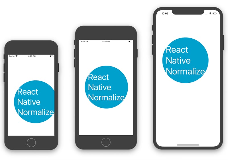
Making React Native Apps Fully Responsive with react-native-responsive-screen
 Praveen S
Introduction
Ensuring a seamless and consistent UI across different screen sizes is one of the biggest challenges in mobile app development. Hardcoding values for width and height can lead to inconsistent layouts, making the app look great on one device but broken on another.
In this blog, we will explore how to achieve true responsiveness in React Native using the react-native-responsive-screen library. This simple yet powerful library allows you to define dimensions as percentages of the screen size, making UI elements automatically adapt to different devices.
Why Use react-native-responsive-screen?
Instead of using fixed px or dp values, this library enables you to define width and height dynamically based on the screen size. It offers:
✔️ Scalability – Works across multiple screen sizes and resolutions.
✔️ Easy to Implement – Simple functions for responsive width and height.
✔️ Orientation Support – Detects screen orientation changes and adjusts layouts accordingly.
Installation and Setup
To get started, install the package using npm or yarn:
npm install react-native-responsive-screen
 #OR
yarn add react-native-responsive-screen
Then, import the required functions in your component:
import { widthPercentageToDP as wp, heightPercentageToDP as hp } from 'react-native-responsive-screen';
Using react-native-responsive-screen in Styles
Now, let's see how to use this library to create a truly responsive design.
import React from 'react';
import { View, Text, TouchableOpacity, StyleSheet } from 'react-native';
import { widthPercentageToDP as wp, heightPercentageToDP as hp } from 'react-native-responsive-screen';

const ResponsiveButton = () => {
  return (
    <View style={styles.container}>
      <TouchableOpacity style={styles.button}>
        <Text style={styles.buttonText}>Click Me</Text>
      </TouchableOpacity>
    </View>
  );
};

const styles = StyleSheet.create({
  container: {
    flex: 1,
    justifyContent: 'center',
    alignItems: 'center',
  },
  button: {
    width: wp('80%'),  // 80% of screen width
    height: hp('6%'),  // 6% of screen height
    backgroundColor: '#007bff',
    justifyContent: 'center',
    alignItems: 'center',
    borderRadius: 10,
  },
  buttonText: {
    fontSize: wp('5%'), // Adjust font size based on screen width
    color: '#fff',
  },
});

export default ResponsiveButton;
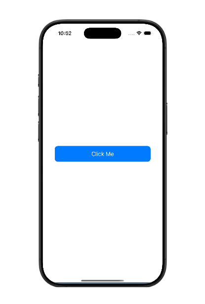
iphone 16promax :

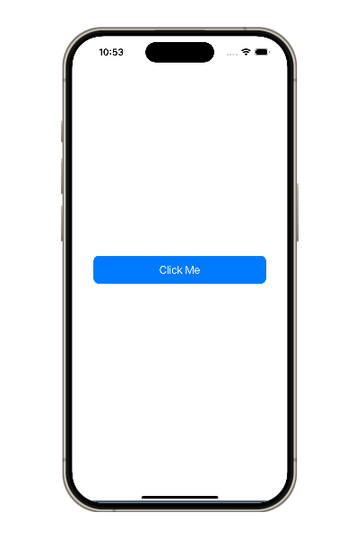
iphone 15 pro :

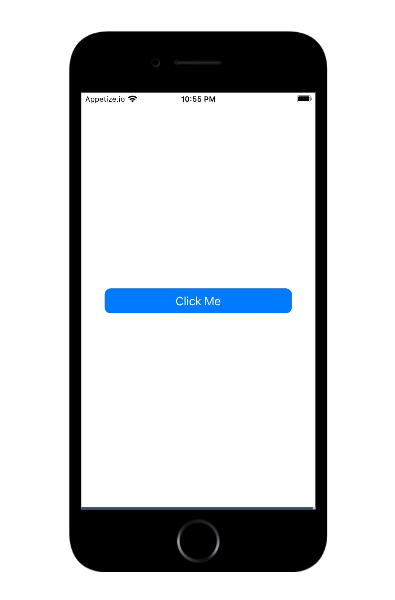
iphone 8 :

🔹 Why This Works: The widthPercentageToDP and heightPercentageToDP functions calculate the values dynamically based on the device's screen size. This ensures that the button appears correctly on any screen.
Best Practices for Responsive Design in React Native
Here are some best practices to follow when working with react-native-responsive-screen:
✅ Use Percentage-Based Width and Height: Avoid fixed values and instead use wp('%') and hp('%') for a consistent look across devices.
✅ Scale Font Sizes Dynamically: Instead of using a fixed font size like 16px, use wp('%') to scale fonts based on screen width.
✅ Test on Multiple Devices: Always test your layout on different screen sizes using emulators or real devices.
✅ Combine with Flexbox: Use flex properties along with react-native-responsive-screen for the best results.
Conclusion
Making a React Native app responsive is crucial for delivering a great user experience on all devices. The react-native-responsive-screen library simplifies this process by allowing developers to use percentage-based dimensions instead of fixed values.
With just a few lines of code, you can ensure that your app looks great on every screen size, from small mobile devices to large tablets.
Now it's your turn! 🚀 Try using react-native-responsive-screen in your project and share your experience in the comments
Subscribe to my newsletter
Read articles from Praveen S directly inside your inbox. Subscribe to the newsletter, and don't miss out.
Written by
