Von Restorff Effect ( Isolation Effect )
 Pravin Shinde
Overview
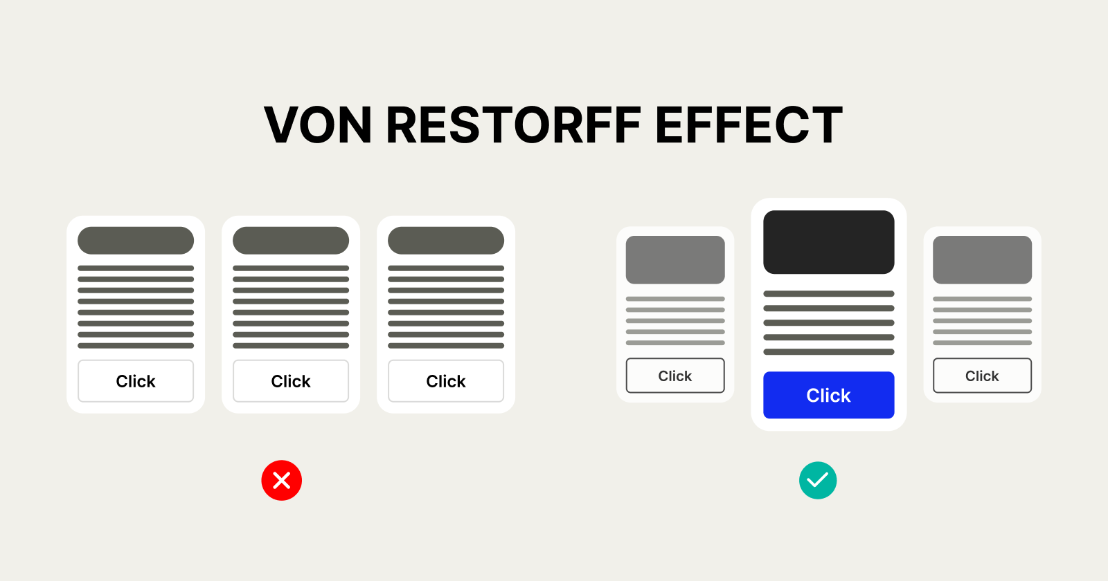
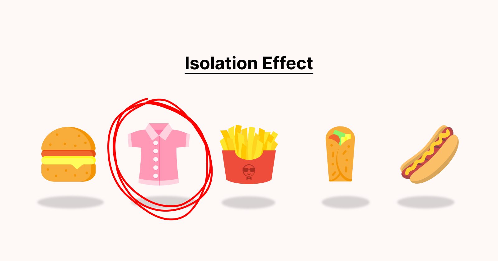
In the field of UX/UI design, grabbing and sustaining user attention is an important part of developing great digital experiences. One of the psychological factors that designers use to do this is the Von Restorff Effect. This theory, known as the Isolation Effect, asserts that when numerous comparable items are presented, the one with the greatest difference is more likely to be recalled.
Understanding and implementing the Von Restorff Effect in UX/UI design may greatly improve usability, increase user engagement, and direct people to desired activities. In this essay, we will look at the significance of this phenomenon, how it applies to digital interfaces, and practical ways for implementing it successfully.
What is the Von Restorff Effect?
Hedwig von Restorff, a German physician and researcher, initially established the Von Restorff Effect in 1933. Her research revealed that individuals remember the object that sticks out among a set of similar items.
For example, if a list has 10 black words and one red word, people are more likely to remember the red one. This technique is commonly used in marketing, branding, and UX/UI design to emphasize key components and direct user attention
Why Does the Von Restorff Effect Matter in UX/UI Design?

In digital product design, customers are frequently overloaded with information therefore, it is critical to focus their attention on crucial activities, messages, or features. Using the Von Restorff Effect, designers can:
Increase user engagement by highlighting items that naturally grab user attention.
Improve conversion rates: Highlighting essential CTAs (call-to-actions) helps increase interactions.
Improve readability: Important information becomes easier to recognise and recall.
Reduce cognitive strain: Users can recognise essential elements quickly and without effort.
Use of the Von Restorff Effect in UX/UI Design
1. Improve Call-to-Action (CTA) Buttons
CTA buttons are essential for user interactions like signing up, purchasing, and downloading content. Making the major CTA visually different boosts user engagement.
Best practices:
Use a distinct colour for CTAs that contrasts with the surrounding elements.
Increase button size to improve visibility.
Use bold typeface to make the CTA text stand out.
For example:
Amazon's "Buy Now" button is bright yellow, catching the user's attention immediately.
2. Highlighting Important Information
When developing content-heavy pages, highlighting important aspects allows readers to assimilate information more efficiently.
Best practices:
Use a separate font style or colour for crucial messaging.
To emphasise essential elements, use backdrop highlights or icons.
Use whitespace around important pieces to improve focus.
For example:
Apple's design is basic, but it accentuates crucial product characteristics with bold lettering and minor backdrop modifications.
3. Navigation and Menu Design
A cluttered or overwhelming menu might lead to user confusion. Using the Von Restorff Effect lets users swiftly navigate to crucial areas.
Best practices:
Make sure the most crucial navigation option is visually distinct.
Use hover effects or animations to distinguish between selected items.
Ensure that primary activities are consistently highlighted.
For example:
Google's navigation bar indicates the currently active tab, allowing users to immediately determine where they are.
4. Error messages and alerts.
Error messages must stand out to avoid users from missing key issues.
Best practices:
Errors and cautions should be highlighted with red or bright colours.
Add warning icons to draw attention.
Ensure that error messages are displayed near the faulty input field.
For example:
When inputting wrong credentials, login forms frequently indicate errors in red, making them immediately obvious.
5. Product Price and Discounts
In e-commerce, highlighting discounts and the greatest deals enhances conversion rates.
Best practices:
Display the discounted price in a bold or different colour.
Use strikethrough effects on the original costs to accentuate the savings.
Use a "limited time offer" tag to generate urgency.
For example:
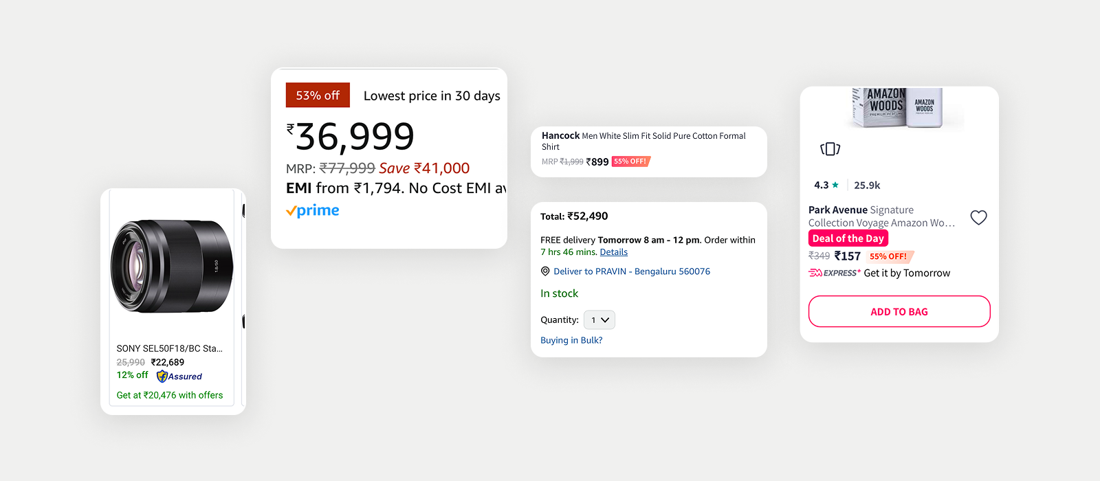
Shopping apps use the Von Restorff Effect (also known as the isolation effect) by making discounts stand out.
Like:
The original price is shown in small grey text with a strikethrough.
The discounted price is in bold or reverse colour to grab attention.
A percentage saved (e.g., "Save 53%") is highlighted in red.
This visual contrast makes the discounted price more memorable and attractive, leading to higher conversions.

Limitations and Considerations
The Von Restorff Effect is effective, but it should be used strategically. Overuse of distinct parts can create clutter and reduce effectiveness. Consider the following points:
Avoid excessive highlights. Too many contrasting features might cause visual cacophony.
Maintain brand consistency: Make sure the highlighted parts are consistent with the brand's colour scheme and design system.
Test user reactions: A/B testing different UI versions allows you to discover the most effective visual emphasis.
Conclusion
The Von Restorff Effect is an important psychological principle in UX/UI design that directs users' attention to vital areas. Designers may increase usability, engagement, and the overall user experience by carefully emphasising crucial elements.
Whether it's making CTAs stand out, emphasising vital information, or boosting error visibility, following this approach guarantees that users can traverse digital interfaces easily and intuitively.
Subscribe to my newsletter
Read articles from Pravin Shinde directly inside your inbox. Subscribe to the newsletter, and don't miss out.
Written by

Pravin Shinde
Pravin Shinde
I've been working in UX and UI design for over 20 years, solving real-world problems in fintech, tourism, and other industries by creating seamless, emotionally engaging experiences that bring in user happiness and business success.