How to Create Responsive Layouts Using Bootstrap 5.2 Grid
 John
JohnThe Bootstrap Grid system offers a fast and efficient way to create responsive, structured layouts with minimal effort, ensuring consistency, simplifying responsiveness, and handling cross-browser compatibility. The grid system is designed so that smaller less powerful devices only need to apply a bare minimum of styles and more progressive enhancements get layered on top to adjust for increasingly larger devices.
We will use the following template as a starting point for some examples shown further down. If you copy and paste the examples into this template you can view the results in a browser:
<!doctype html>
<html lang="en">
  <head>
    <meta charset="utf-8">
    <meta name="viewport" content="width=device-width, initial-scale=1">
    <title>Bootstrap Grid Demo</title>
    <link href="https://cdn.jsdelivr.net/npm/bootstrap@5.2.3/dist/css/bootstrap.min.css" rel="stylesheet" integrity="sha384-rbsA2VBKQhggwzxH7pPCaAqO46MgnOM80zW1RWuH61DGLwZJEdK2Kadq2F9CUG65" crossorigin="anonymous">
  </head>
  <body>
    <!-- EXAMPLE HTML GOES HERE -->
    <script src="https://cdn.jsdelivr.net/npm/bootstrap@5.2.3/dist/js/bootstrap.bundle.min.js" integrity="sha384-kenU1KFdBIe4zVF0s0G1M5b4hcpxyD9F7jL+jjXkk+Q2h455rYXK/7HAuoJl+0I4" crossorigin="anonymous"></script>
  </body>
</html>
Introducing Breakpoints
The Bootstrap Grid is used in combination with breakpoints which provide several viewports at which you can conditionally apply styles based on a set of browser and operating system parameters:
| Breakpoint | Class infix | Dimensions |
| Extra small | None | <576px |
| Small | sm | ≥576px |
| Medium | md | ≥768px |
| Large | lg | ≥992px |
| Extra large | xl | ≥1200px |
| Extra extra large | xxl | ≥1400px |
So by default if the grid system or a utility class is used without an infix it applies to the extra small screen size. If we add in an infix then the grid system or utility class will not be visible or active at the default size of <576px but instead will kick in at the screen size denoted by the infix.
Introducing The Grid System
The grid system actually refers to a series of container, row and col CSS classes that can be used with the above breakpoints to create a variety of different screen layouts at different screen sizes. In the simple case we can create a two column layout of equal-width columns like so:
<div class="container">
  <div class="row">
    <div class="col">
      1 of 2
    </div>
    <div class="col">
      2 of 2
    </div>
  </div>
</div>
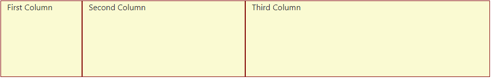
There are actually 12 template columns available per row and you can create different combinations of columns by using the appropriate column class:
<div class="container">
  <div class="row">
    <div class="col-2">
        First Column
    </div>
    <div class="col-4">
        Second Column
    </div>
    <div class="col-6">
        Third Column
    </div>
</div>
So col-2 spans two columns, col-4 spans four columns and col-6 spans six columns resulting in a layout like so:
Combining The Grid System and Breakpoints
The two grid system examples shown above did not use any breakpoints so the layouts would be the same for any screen size. If, however, we combine our col class with the breakpoint infixes shown above we can create different layouts for different screen sizes. Consider this example:
<div class="container">
  <div class="row">
    <div class="col-12 col-lg-4">
        div 1
    </div>
    <div class="col-12 col-sm-6 col-lg-4">
        div 2
    </div>
    <div class="col-12 col-sm-6 col-lg-4">
        div 3
    </div>
</div>
Here we actually have three different layouts depending on the size of the screen:
The
col-12classes make extra small screens (<576px) consist of three rows one above the other.The
col-sm-6classes make small screens (≥576px) consist of one top row and a second row split with equal-width columns:
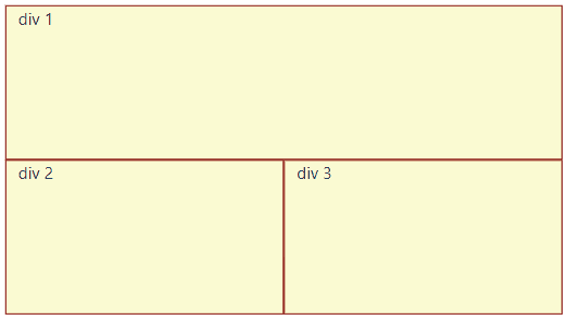
- The
col-lg-4classes make large screens (≥992px) have three equal-width columns.
If you start with a small browser window and slowly drag the edge of the window out, you will see the view starting with three rows and changing until it ends up with three columns.
Using Utility Classes
The breakpoints can also be combined with Bootstrap utility classes like Margin and Padding, Display and Float. Adding a breakpoint into a utility class in affect turns on or off that particular margin, padding, display or float property at particular screen sizes.
As an example consider the .d-none display class. When applied to a HTML element it will hide that element for all screen sizes. In the example below at the smallest screen size three rows are displayed. As you drag your browser window further out you will see the rows disappear as they pass the sm, md and lg breakpoints until eventually there are no rows displayed at greater than lg screens sizes:
<div class="row">
  <div class="d-lg-none">
    div 1
  </div>
  <div class="d-md-none">
    div 2
  </div>
  <div class="d-sm-none">
    div 3
</div>
Putting It All Together
For a more complete example, I have included a simple demonstration that combines many of the techniques we have discussed so far to show a more practical use case:
<div class="container">
<div class="row mt-md-3">
<div class="col-12 col-sm-4 col-md-3 col-lg-2 mb-3 d-flex justify-content-center">
<div>
<img src="avatar.jpg" />
</div>
</div>
<div class="col-12 col-sm-8 col-md-9 col-lg-10 d-flex flex-column justify-content-center">
<p class="lead">Lorem ipsum dolor sit amet</p>
<p>
Lorem ipsum dolor sit amet, consectetur adipiscing elit, sed do eiusmod tempor incididunt ut labore et dolore magna aliqua.
Ut enim ad minim veniam, quis nostrud exercitation ullamco laboris nisi ut aliquip ex ea commodo consequat.
Duis aute irure dolor in reprehenderit in voluptate velit esse cillum dolore eu fugiat nulla pariatur.
Excepteur sint occaecat cupidatat non proident, sunt in culpa qui officia deserunt mollit anim id est laborum.
</p>
</div>
</div>
<div class="row mt-1">
<div class="d-none d-lg-block col-lg-2"> </div>
<div class="col-12 col-md-3 mb-3">
<h3>Links</h3>
<ul>
<li><a href="www.github.com">Github</a></li>
<li><a href="www.google.com">Google</a></li>
<li><a href="www.stackoverflow.com">StackOverflow</a></li>
</ul>
</div>
<div class="col-12 col-md-9 col-lg-7">
<h3>Articles</h3>
<div class="mb-4">
<a href="#">
<h5>This is my first article</h5>
</a>
<p>
Sed ut perspiciatis unde omnis iste natus error sit voluptatem accusantium doloremque laudantium, totam rem aperiam, eaque ipsa quae ab illo inventore veritatis et quasi architecto beatae vitae dicta sunt explicabo. Nemo enim ipsam voluptatem quia voluptas sit aspernatur aut odit aut fugit, sed quia consequuntur magni dolores eos qui ratione voluptatem sequi nesciunt.
</p>
</div>
<div class="mb-4">
<a href="#">
<h5>This is my second article</h5>
</a>
<p>
Sed ut perspiciatis unde omnis iste natus error sit voluptatem accusantium doloremque laudantium, totam rem aperiam, eaque ipsa quae ab illo inventore veritatis et quasi architecto beatae vitae dicta sunt explicabo. Nemo enim ipsam voluptatem quia voluptas sit aspernatur aut odit aut fugit, sed quia consequuntur magni dolores eos qui ratione voluptatem sequi nesciunt.
</p>
</div>
<div class="mb-4">
<a href="#">
<h5>This is my third article</h5>
</a>
<p>
Sed ut perspiciatis unde omnis iste natus error sit voluptatem accusantium doloremque laudantium, totam rem aperiam, eaque ipsa quae ab illo inventore veritatis et quasi architecto beatae vitae dicta sunt explicabo. Nemo enim ipsam voluptatem quia voluptas sit aspernatur aut odit aut fugit, sed quia consequuntur magni dolores eos qui ratione voluptatem sequi nesciunt.
</p>
</div>
</div>
</div>
</div>
For this example:
Extra small screen sizes, the content is a single column down the page.
For small screens the image and text at the top join into a single row with column sizes of 4 and 8 respectively.
The top row changes the ratios of the column sizes as the screen gets bigger.
The bottom two rows are joined into a single row with a 3 space column for the links and a 9 space column for the articles at size
mdAt size
lga spacer column appears before the links column, the links column stays at 3 and the articles column is updated to be 7.
The effect of the above html can be shown in the gif below:

References
This brief introduction gets you started with some simple layouts, but for more information checkout the Bootstrap documentation:
Subscribe to my newsletter
Read articles from John directly inside your inbox. Subscribe to the newsletter, and don't miss out.
Written by