Interactive Network Map Visualization Tool
 Hemant Chimulkar
Building an Interactive Network Map Visualization Tool
Network visualization is a critical aspect of modern network management. Being able to see your network infrastructure laid out visually helps engineers identify issues, plan expansions, and explain network topology to non-technical stakeholders. In this post, I'll share how I built a comprehensive network mapping application using Leaflet.js, Flask, and MySQL.
Project Overview
The Network Map Visualization Tool is an interactive web application that provides:
Real-time visualization of network devices and connections
Customer and infrastructure mapping
Status monitoring with color-coded links
Interactive tools for editing network topology
- Filter capabilities for troubleshooting
The Technology Stack
Our solution is built on:
Backend: Flask (Python web framework)
Frontend: JavaScript, Leaflet.js mapping library
Database: MySQL for both application data and integration with LibreNMS
Authentication: Flask-Bcrypt for secure user management
Key Features
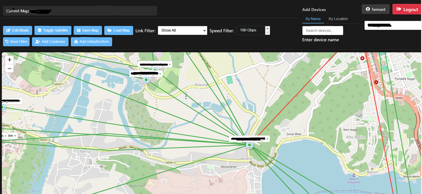
Interactive Device Mapping
Devices are displayed as interactive markers on the map. Each marker shows the device's status (up/down) with intuitive color coding - green for operational devices and red for those experiencing issues.
In edit mode, network administrators can:
Drag devices to new locations
Add new devices from a searchable inventory
Delete devices no longer needed
View detailed information about each device
This visual representation makes it much easier to understand the network topology at a glance compared to traditional table-based views.
Network Link Visualization
The connections between devices are represented as lines on the map with several smart features:
Intelligent color-coding: Links automatically change colors based on their status. Green indicates functioning links, while red shows problematic connections.
Bandwidth utilization monitoring: The system monitors traffic levels and changes the link color to orange or yellow when utilization reaches certain thresholds.
Interactive information: Hovering over a link displays a tooltip with real-time information about speed, utilization, and status.
Path customization: Network paths can be drawn with multiple waypoints to represent the actual physical path of cables.
Real-time Status Monitoring
The application doesn't just show a static view - it actively monitors your network by:
Periodically querying the LibreNMS database for device and port status
Updating the visual representation when things change
Calculating bandwidth utilization in real-time
Highlighting problematic areas automatically
This integration with existing monitoring infrastructure means you don't need to switch between tools to understand what's happening on your network.
Customer and Infrastructure Mapping
Beyond the core network devices, the tool provides a complete view of your network ecosystem:
Customer locations: Map where your customers are located with different icons for lease line and broadband customers
Infrastructure elements: Document network infrastructure components like cable trays, closures, and other physical elements
Customer connections: Visualize the path from customers to your network devices
This comprehensive view helps operations teams understand not just the network itself but also the services it delivers and who might be affected by issues.
Filtering and Troubleshooting
When troubleshooting complex networks, being able to focus on specific aspects is crucial. The application offers powerful filtering capabilities:
Speed filters: Show only links of a specific capacity (1G, 10G, 40G, 100G)
Status filters: Highlight only down links to quickly identify problems
Utilization filters: Focus on high-utilization links that might need capacity upgrades
These filters can be combined to answer specific questions like "Which 10G links are currently experiencing high utilization?" - a capability that drastically reduces troubleshooting time.
Security and Authentication
Security is a top priority for network tools. The application implements:
User authentication with secure password hashing
Session management with timeouts
Role-based access to control who can view vs. edit the network map.
Conclusion
Building a visual network map has transformed how our team manages the network. Issues that once took hours to track down can now be identified in seconds. The integration with existing monitoring systems gives us a single pane of glass view of our infrastructure.
The combination of modern web technologies with traditional network management principles has resulted in a tool that's both powerful and intuitive. If you're still managing your network through CLI and tables alone, consider how a visual representation might improve your operations.
Have you implemented network visualization in your organization? What challenges did you face? Let me know in the comments!
This project was built using open-source technologies including Leaflet.js, Flask, and MySQL, with custom integration to LibreNMS for real-time network data.
Subscribe to my newsletter
Read articles from Hemant Chimulkar directly inside your inbox. Subscribe to the newsletter, and don't miss out.
Written by