Tinkering with Job Statistics
 Chris Chapman
Introduction
I recently read comments from politicians that “college should prepare students for high paying jobs.” Without getting into politics, it left me wondering: what were the high-paying jobs when I went to college?
In this post, I detail how I found government statistics from 1985 — the year I went to college at age 17 — and used R to extract data from a PDF file and make a simple “opportunity plot.”
I’m not claiming this is a complete (nor even a good) answer to the question about what jobs someone should choose. Instead, it’s a fun way to get data from a difficult source and then look back at jobs data from 40 years ago — and develop some R skills!
As always, I share R code along the way, and I compile it again at the end.
Getting & Cleaning the Jobs Data
The data I used come from the US Bureau of Labor Statistics in a PDF here (as of this writing), published in October 1985 (Prieser, 1985). This PDF file appears to be converted from a scanned document with optical character recognition (OCR).
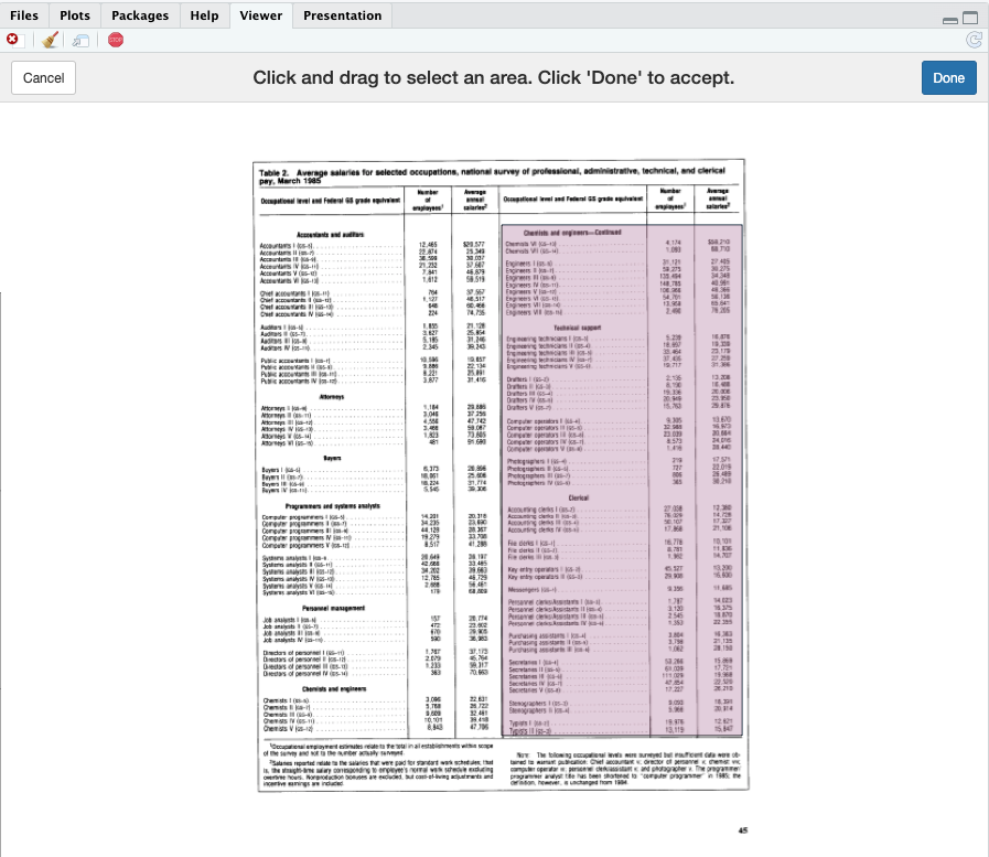
The tables of interest show job counts and salary, on Page 2. Here is an excerpt, which among other things shows a slight slant to the page reflecting its presumed origin as a scanned document:

What I will do in R is this:
Read the job names, counts, and salaries from the PDF
Clean up the data
Group the rows into higher level categories (“Accountants”, “Chemists”, etc.)
Plot a 2×2 showing job counts vs salaries
To get the data from the PDF, I’ll use the tabulapdf package in R (Sepulveda, 2024).
Installation note:
tabulapdfuses a Java library, and thus requires a local installation of Java Runtime Engine (JRE) and the Java Development Kit (JDK). That installation process is somewhat complex, so I will skip it here; but there are notes in the Appendix below on how I did it on my Macbook.
First, I download the PDF document from the BLS site and save it locally to ~/Downloads. Using tabulapdf, I extract “Table 2” from that file as two separate tables (one for each column). If you download the PDF and update the filename variable for wherever you put it and name it, then you should be able to follow along.
Here is the code:
filename <- "~/Downloads/bls-report-1985.pdf"  # update for your folder and filename
library(tabulapdf)                             # see Appendix for installation notes
tables <- extract_areas(filename, pages=c(2, 2))
tables[[1]]
In tabulapdf, there are options either to extract tables automatically (extract_tables()) or to tell it exactly where you are interested by selecting rectangular areas with extract_areas(). Our PDF has several tables with complex formatting, so I used extract_areas() to tell it exactly where to look.
In extract_areas(), the option pages=c(2, 2) tells it to look on page 2 and then to let me select 2 areas for extraction. When I run that, page 2 appears in the RStudio viewer. I click and drag to select each of the two areas in turn as shown here:
The initially-converted first column (tables[[1]]) looks like this:

Success! However, there is a lot of junk in the data such as ellipses, extra spaces, a “$” symbol, commas, etc. Next, we’ll clean that up.
To extract data from a different PDF, simply change the
filenameas above and then alter thepages=argument as needed for your file. Or see the help pages fortabulapdffor more options.
Cleaning the Data
tabulapdf gave us 2 tables, one for each “column” in the PDF. To proceed, we’ll first combine those into one data set and then clean up messy data that comes from 1980s table formatting and OCR scanning.
To combine the two column sets, I select only the columns with data we want — namely, columns 1, 11, and 12 from the left hand part of the table and 1, 7, and 8 from the right hand part. Then I set friendly names and bind them into a single data frame:
df1 <- data.frame(tables[[1]])[ , c(1, 11, 12)]
df2 <- data.frame(tables[[2]])[ , c(1,  7,  8)]
names(df1) <- names(df2) <- c("Job", "N", "Salary")
job.data <- na.omit(rbind(df1, df2))   # removes header rows from the tables
In this case, na.omit() removes rows without complete data (such as within-table header lines).
Next, I remove junk from the data and convert the numeric columns to numbers:
# clean up ellipses in the job names
job.data[ , 1]       <- gsub(" \\.", "", job.data[ , 1])
# remove nuisance spaces, etc., and convert numeric columns to numbers
job.data[ , c(2, 3)] <- lapply(job.data[ , c(2, 3)],
                                 function(x) as.numeric(gsub("[^0-9.-]", "", x)))
In this code, the first line uses gsub() to remove all instances of “ .” (the ellipses in job titles). The second line uses gsub() to remove all non-numeric characters from the 2 number columns, and then converts them to numeric data type using as.numeric(). (If you’re wondering, one could use tidyverse functions and/or base R pipes. I default to “very” base R, but everything in R has multiple solutions!)
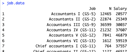
So far, our data look like this:
Next we’ll group all of the Accountants together, Chemists together, and so forth. For the first step, we split each job title where there is a spaces + parenthesis (“ (“) to separate the parenthetically noted GS scales, and keep only the text that appears before that point, such as “Accountants I”. To do that, I apply str_split() from the stringr package to each job title, using an anonymous function that retains only the first part ([1]) of each split string:
library(stringr)
# Split on "(" [job levels] and only keep the descriptive part before that
job.data$JobGroup <- sapply(job.data$Job,
                              function(x) str_split(x, " \\(", simplify = TRUE)[1])
Next I remove the Roman numerals (“I”, “IV” etc.) where they appear, and apply trimws() to strip off any left over white space (thanks to Ben Bolker for the regex in this post).
job.data$JobGroup <- trimws(gsub('([IVXLCM]+)\\.?$','', job.data$JobGroup))
While inspecting the data, I see 3 rows where OCR problems made problems for the JobGroup:

So I fix those manually:
job.data[c(96, 106, 107), "JobGroup"] <- c("Purchasing assistants", "Typists", "Typists")
Finally, I convert JobGroup to a factor (nominal) variable and review the result:
# Make the result into a factor variable
job.data$JobGroup <- factor(job.data$JobGroup)
# check the data
summary(job.data)
head(job.data, 8)
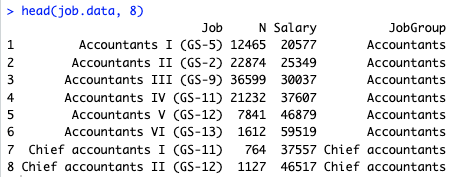
It’s working and we see that all of the Accountants are grouped (and Chief accountants are a different group — which is OK for now), and so forth:
Next we’ll compute the total employment and average salary per JobGroup.
For an important project, I’d do a deeper review to make sure I caught all of the data issues. For instance, I see some potential OCR errors like “GS-2” for "Accountants II”. For purposes of this post, I’ll simply go ahead and use the data as extracted to this point.
Grouping the Data
Now that we have assigned job groups, we need to aggregate them for total employment (sum of the N column per group) and average salary (taking the weighted average of Salary x N).
The tricky part is how to apply the weighted.mean() function in R across multiple groups. As always, there are multiple options (tidyverse, by(), a custom function, etc.) but a simple base R solution is to use an index column inside aggregate(). Here’s the code:
# tip from https://stackoverflow.com/questions/33692439/using-aggregate-to-compute-monthly-weighted-average
job.data$row  <- 1:nrow(job.data)
# get the weighted mean salaries per group
job.sum       <- aggregate(row ~ JobGroup, job.data,
                           function(i) weighted.mean(job.data$Salary[i], job.data$N[i]))
# rename the "row" column
names(job.sum)[2] <- "AvgSalary"
In this code, the current row(s) that correspond to each JobGroup are passed by aggregate() to the anonymous function, which then returns a weighted.mean() for the variables of interest in those rows.
The next step is to sum up the number of jobs in each JobGroup, which is a simple aggregate(…, sum):
# find the total number of jobs per group
job.sum$Total <- aggregate(N ~ JobGroup, job.data, sum)$N
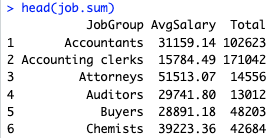
That’s it! Now we have data aggregated by job group with counts and weighted average salaries:
Next I’ll plot those.
Making an Opportunity Plot
A simple thought is that the “best jobs” are those that have the highest combination of availability and salary. (I’ll leave aside the question of future-looking availability and salary!) A 2×2 interpretation of a scatter plot is one way to examine that.
I plot average salary vs. job count in the BLS data as follows:
library(ggplot2)
library(ggrepel)
library(scales)
p <- ggplot(data=job.sum,
            aes(x=Total, y=AvgSalary, label=JobGroup)) +
  geom_point(color="red") +
  geom_text_repel() +
  scale_x_log10(labels = label_number()) +
  xlab("Total Employment (log scale)") +
  ylab("Average Salary, weighted across levels") +
  theme_minimal() +
  ggtitle("Salary vs. Employment, US Statistics for 1985")

p
Here are a couple of notes on that code. First, it uses ggrepel (Slowikowski, 2024) to place the text labels (job groups) in readable positions. Second, it puts the X axis on a log scale for compactness; otherwise the engineers group would distort it substantially. Third, it uses scales (Wickham et al, 2023) to label the X axis more legibly. Finally, theme_minimal() removes some chart junk.
Here’s the result:
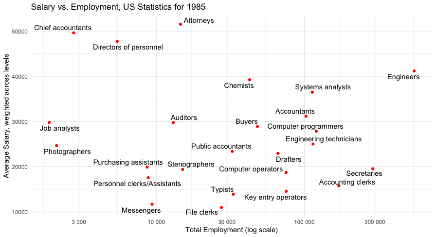
We see two particularly interesting groups. In the upper right hand side, there is a group of relatively to very common professions that are also relatively highly paid in 1985: Engineers, Systems analysts, and Chemists. In the upper left, there is a group of less common professions that are even more highly paid: Chief accountants, Directors of personnel, and Attorneys. (Those are likely all true today, as well!)
What would we do for further analysis? First, I’d want to include additional data that (presumably) is in other BLS data sets. For example, health care and education professionals, among others, are not included here. Second, we might use their data (page 1 in the PDF) on trends and changes to project forward.
Third, within the data set, we could consider some sort of implied transition among career levels to look at more of a career-spanning set of expectations. For example, the movement from one level to a higher one, within a job group, might be modeled as a Markov chain (somehow combining data across years, and/or within a data set, and/or using the change metrics — problems one would want to consider). Fourth, we could adjust salary levels to make them comparable across years, using inflation-adjusted values or the like.
Back to 1985
What about my choices in 1985? My personal college major was not influenced at all by expectation of salary or availability! I completed a double major in Psychology and Comparative Religion, and went (initially) to graduate school in Philosophy. That all reflected personal interest and a planned academic career. Eventually I changed to graduate school in Clinical Psychology. Data such as these would have been of no use or concern to 17 year old me (except as a matter of curiosity — which I still have).
What I can say, 40 years later, is this: I ended up in an uncommon profession (Quant UX Research) that is also highly paid — and was nowhere to be found in the world or data of 1985! My completely non-job-related education was perfect preparation in my case. I’ll write more about that another time.
I would, at a first approximation, do exactly the same thing again. But the data are still interesting!
Conclusion
This post demonstrated how to get data from a PDF — even a messy, slanted, older, erratically-OCR’d, scanned PDF — into R. And that let us have some fun (at least in my opinion) to look at jobs from way back when I started college.
Cheers and I hope you find it useful!
Appendix: Notes on installing tabulapdf and its Java dependencies
As I noted above, tabulapdf requires Java — both the runtime engine (aka “Java”, aka “JRE”) and the developer kit (JDK) — and the integration of those with R using rJava (Urbanek 2024). Installing those may be tricky depending on the details of your system.
On my M2 Macbook, here’s what I did. The rJavaEnv package (Kotov, 2024) was a particularly nice & helpful touch to install the JDK and get everything set up inside R. The steps:
### Appendix: setting up rJava on Mac OS X machine

# This is the sequence I used on MacBook with M2, may vary with other systems

# A1. Install Java runtime (if needed; usually is)
# ... https://www.java.com/en/download/
# ... installed relevant JRE (Java 8 Update 441, for Mac 64-bit ARM)

# A2. install the rJava library in R
install.packages("rJava")
# check that rJava is working:
library("rJava")

# A3. install Java development kit using rJavaEnv in R
#    (rJavaEnv helps get everything working correctly)
install.packages("rJavaEnv")
library(rJavaEnv)
java_quick_install()        # gets and installs the JDK, then sets system pointers
java_check_version_rjava()  # should show "21" + "21.0.6" or some similar/later version

# A4. install Tabula PDF library and dependencies needed for interactive usage in R
install.packages("tabulapdf")
install.packages(c("shiny", "miniUI"))

# A5. quit R / RStudio, reboot Mac to make sure everything is squared away and reloaded

# A6. test installation using tabulapdf data set
library(rJava)
library(tabulapdf)
# the following code is updated from tabulapdf vignette
f   <- system.file("examples", "mtcars.pdf", package = "tabulapdf")
out <- extract_tables(f)
str(out)
out[[1]]   # the "mtcars" data
If you run into issues, my main recommendations are (1) to update everything, (2) to make sure all installers (Java, R, and RStudio) are using matching CPU builds (e.g., 64-bit ARM), (3) reinstall, reboot, and (4) search for answers online.
I will note that there is not a lot of help online for debugging Java integration with R. It’s a bit of an edge case, although a highly useful one as we’ve seen.
All the Code
As always, I share all of my R code in one place for simplicity. Here it is, including the Appendix:
# Using R to parse 1985 jobs stats in a PDF
# Chris Chapman, March 2025
# for quantuxblog.com

# NOTE: the tabulapdf package requires Java; see appendix for setup notes

# 1. load BLS data for 1985
# get job data from US Bureau of Labor Statistics
# note: was working as of March 5, 2025
filename <- "~/Downloads/bls-report-1985.pdf"   # update for your folder and filename
library(tabulapdf)                              # see Appendix for installation notes
tables <- extract_areas(filename, pages=c(2, 2))
tables[[1]]

# 2. convert those to usable R format as a single data set
#    get the 3 main columns; bind them to 1 data frame
df1 <- data.frame(tables[[1]])[ , c(1, 11, 12)]
df2 <- data.frame(tables[[2]])[ , c(1,  7,  8)]
names(df1) <- names(df2) <- c("Job", "N", "Salary")
job.data <- na.omit(rbind(df1, df2))   # removes header rows from the tables

# 2.1 clean up the data to remove spaces, etc.
# clean up ellipses in the job names
job.data[ , 1]       <- gsub(" \\.", "", job.data[ , 1])
# remove nuisance spaces, etc., and convert numeric columns to numbers
job.data[ , c(2, 3)] <- lapply(job.data[ , c(2, 3)],
                                 function(x) as.numeric(gsub("[^0-9.-]", "", x)))
job.data

# 2.2 create job group factor that collapses the levels
library(stringr)
# Split on "(" [job levels] and only keep the descriptive part before that
job.data$JobGroup <- sapply(job.data$Job,
                              function(x) str_split(x, " \\(", simplify = TRUE)[1])
# Remove the Roman numerals from the descriptions (another part of job levels)
job.data$JobGroup <- trimws(gsub('([IVXLCM]+)\\.?$','', job.data$JobGroup))

# And finally, fix 3 extraction errors manually
job.data[c(96, 106, 107), ]
job.data[c(96, 106, 107), "JobGroup"] <- c("Purchasing assistants", "Typists", "Typists")
# Make the result into a factor variable
job.data$JobGroup <- factor(job.data$JobGroup)
# check the data
summary(job.data)
head(job.data, 8)

# 3. get the total employment and weighted salaries per group
# create a row counter we can use to index the data when aggregating by group
# thanks for this tip, https://stackoverflow.com/questions/33692439/using-aggregate-to-compute-monthly-weighted-average
job.data$row  <- 1:nrow(job.data)
# get the weighted mean salaries per group
job.sum       <- aggregate(row ~ JobGroup, job.data,
                           function(i) weighted.mean(job.data$Salary[i], job.data$N[i]))
# rename the "row" column
names(job.sum)[2] <- "AvgSalary"
# find the total number of jobs per group
job.sum$Total <- aggregate(N   ~ JobGroup, job.data, sum)$N

head(job.sum)


# 4. plot "opportunity" as # jobs vs average salary
library(ggplot2)
library(ggrepel)
library(scales)
p <- ggplot(data=job.sum,
            aes(x=Total, y=AvgSalary, label=JobGroup)) +
  geom_point(color="red") +
  geom_text_repel() +
  scale_x_log10(labels = label_number()) +
  xlab("Total Employment (log scale)") +
  ylab("Average Salary, weighted across levels") +
  theme_minimal() +
  ggtitle("Salary vs. Employment, US Statistics for 1985")

p

### Appendix: setting up rJava on Mac OS X machine

# This is the sequence I used on MacBook with M2, may vary with other systems

# A1. Install Java runtime (if needed; usually is)
# ... https://www.java.com/en/download/
# ... installed relevant JRE (Java 8 Update 441, for Mac 64-bit ARM)

# A2. install the rJava library in R
install.packages("rJava")
# check that rJava is working:
library("rJava")

# A3. install Java development kit using rJavaEnv in R
#    (rJavaEnv helps get everything working correctly)
install.packages("rJavaEnv")
library(rJavaEnv)
java_quick_install()        # gets and installs the JDK, then sets system pointers
java_check_version_rjava()  # should show "21" + "21.0.6" or some similar/later version

# A4. install Tabula PDF library and dependencies needed for interactive usage in R
install.packages("tabulapdf")
install.packages(c("shiny", "miniUI"))

# A5. quit R / RStudio, reboot Mac to make sure everything is squared away and reloaded

# A6. test installation using tabulapdf data set
library(rJava)
library(tabulapdf)
# the following code is updated from tabulapdf vignette
f   <- system.file("examples", "mtcars.pdf", package = "tabulapdf")
out <- extract_tables(f)
str(out)
out[[1]]   # the "mtcars" data
References
Chang W, Cheng J, Allaire J, Sievert C, Schloerke B, Xie Y, Allen J, McPherson J, Dipert A, Borges B (2024). shiny: Web Application Framework for R. R package version 1.10.0, https://CRAN.R-project.org/package=shiny.
Cheng J (2018). miniUI: Shiny UI Widgets for Small Screens. R package version 0.1.1.1, https://CRAN.R-project.org/package=miniUI.
Kotov E (2024). rJavaEnv: Java Environments for R Projects. doi:10.32614/CRAN.package.rJavaEnv https://doi.org/10.32614/CRAN.package.rJavaEnv, https://github.com/e-kotov/rJavaEnv.
Prieser C (1985). “Occupational salary levels for white-collar workers, 1985”. Monthly Labor Review, Bureau of Labor Statistics, October 1985. At https://www.bls.gov/opub/mlr/1985/10/rpt1full.pdf, retrieved March 5, 2025.
R Core Team (2025). R: A Language and Environment for Statistical Computing. R Foundation for Statistical Computing, Vienna, Austria. https://www.R-project.org/.
Sepulveda MV (2024). tabulapdf: Extract Tables from PDF Documents. https://github.com/ropensci/tabulapdf.
Slowikowski K (2024). ggrepel: Automatically Position Non-Overlapping Text Labels with 'ggplot2'. R package version 0.9.5, https://CRAN.R-project.org/package=ggrepel.
Urbanek S (2024). rJava: Low-Level R to Java Interface. R package version 1.0-11, https://CRAN.R-project.org/package=rJava.
Wickham H (2016). ggplot2: Elegant Graphics for Data Analysis. Springer-Verlag New York.
Wickham H, Pedersen T, Seidel D (2023). scales: Scale Functions for Visualization. R package version 1.3.0, https://CRAN.R-project.org/package=scales.
Wickham H (2023). stringr: Simple, Consistent Wrappers for Common String Operations. R package version 1.5.1, https://CRAN.R-project.org/package=stringr.
Subscribe to my newsletter
Read articles from Chris Chapman directly inside your inbox. Subscribe to the newsletter, and don't miss out.
Written by

Chris Chapman
Chris Chapman
President + Executive Director, Quant UX Association. Previously: Principal UX Researcher @ Google; Amazon Lab 126; Microsoft. Author of "Quantitative User Experience Research" and "[R | Python] for Marketing Research and Analytics".
