Python Data Visualization with Matplotlib and Seaborn
 Isuri Balasooriya
In our previous article, we discussed two very important Python libraries for data science: NumPy and Pandas. These libraries help data analysts in creating datasets, formatting, reading and writing to external files, but most importantly cleaning data and preparing it for analysis. Once your data is prepared, the next step that help us to analyze our data is visualization. Data visualization is not only helpful for data analysis, but also to show our data, insights and findings from our study to a wide range of audience.
There are two main libraries that I will be talking about today: Matplotlib and Seaborn. Lets start with Matplotlib and try to create a few charts to visualize our data.
The first step is to install the two libraries if you haven’t already,
pip install matplotlib seaborn
Once installed we need only call them in our code as follows,
import matplotlib.pyplot as plt
import seaborn as sns
Now, in order to visualize data, we must have a dataset first. I will be trying to create a sine wave of 100 random numbers generated between 0 to 9. We can use our NumPy knowledge to generate our dataset,
data = np.random.randint(0,9,size=100)
x=data
y=np.sin(x) #get the sine value of x
In this article, we will be learning three types of charts,
Line plot
Bar Chart
Scatter plot
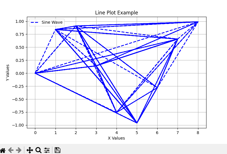
Lets create our first chart, in this case I will be trying to create a line plot for our above dataset,
plt.figure(figsize=(8,5))
plt.plot(x, y, label="Sine Wave", color="b", linestyle="--", linewidth=2)

plt.xlabel("X Values")
plt.ylabel("Y Values")
plt.title("Line Plot Example")
plt.legend()
plt.grid(True)
plt.show()
With this code we are seeing a lot of new labels, functions and variables which we haven’t seen before in our Python articles. Lets take them one by one.
plt.figure(figsize=(8,5))
This section is where you define your figure or your chart. This creates a new figure for plotting with a size of 8 inches (width) × 5 inches (height). This prevents overlapping plots when multiple plots are drawn.
plt.plot(x, y, label="Sine Wave", color="b", linestyle="--", linewidth=2)
plt.plot(x, y, ...) plots y values against x values.
Label="Sine Wave" assigns a label for the legend.
color="b" sets the line color to blue (b stands for blue).
linestyle="--" indicates dashed line style.
linewidth=2 sets line thickness to 2 pixels.
plt.xlabel("X Values")
plt.ylabel("Y Values")
plt.title("Line Plot Example")
These few lines will add the required labels or captions for the x axis, y axis and the overall chart title.
plt.legend()
plt.grid(True)
The first line displays the legend (which shows the label "Sine Wave" in the plot). It automatically places the legend in a suitable position. The second line adds a grid to the plot to make it easier to read values.
plt.show()
Once you are done with the code, this line will display the plot on the screen. Now lets see how our line plot looks like in PyCharm.
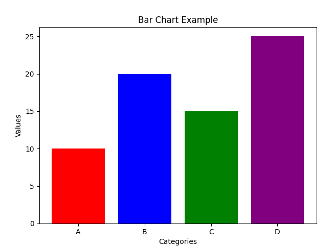
Next up we are going to be looking at bar charts. Bar charts are the most used when I work with my data analysis. But selecting which chart type to use entirely depends on your data and your visualization requirement. Line plot are good for showing trends over time, whereas bar charts are good if you want to show categorical comparisons. Because of this, I’m going to change the dataset we are going to use for bar charts.
categories = ["A", "B", "C", "D"]
values = [10, 20, 15, 25]
Now we have a very simple dataset, lets create a bar chart for this. The syntax is very similar to what we learned earlier. Instead of plt.plot we use plt.bar
plt.figure(figsize=(7, 5))
plt.bar(categories, values, color=['red', 'blue', 'green', 'purple'])

plt.xlabel("Categories")
plt.ylabel("Values")
plt.title("Bar Chart Example")
plt.show()
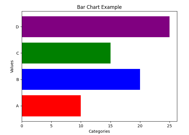
Similarly, we can create horizontal bar charts by simply putting plt.barh
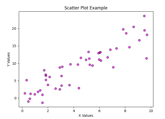
Next up we have scatter plots that are useful if you want to show relationships between two numerical variables. Let me show you the code first and then we will go line by line,
np.random.seed(42)
x = np.random.rand(50) * 10
y = x * 2 + np.random.randn(50) * 3

plt.figure(figsize=(7, 5))
plt.scatter(x, y, color="magenta", alpha=0.7, edgecolors="black")

plt.xlabel("X Values")
plt.ylabel("Y Values")
plt.title("Scatter Plot Example")
plt.show()
The part where we generate the figure is fairly straightforward with plt.scatter. Lets us talk about the dataset. Here np.random.seed(42) is quite interesting. It sets the random seed to 42, ensuring reproducibility. Meaning when you set a seed, NumPy will generate the same random numbers each time you run the code. The second line creates a random array x of size 50 with values ranging from 0 to 10. In the third line, x * 2 creates a linear relationship where y is roughly 2x. It then generates 50 random values from a normal distribution (mean = 0, std = 1) and multiplying by 3 scales the noise, adding randomness to the linear relationship. Therefore y= 2x+noise, which gives some scatter to the dataset. Lets see how this chart look,
That is all the basics about Matplotlib. Its very easy and straightforward. Lets move on to Seaborn. Seaborn is built on top of Matplotlib. It provides a high-level interface for creating beautiful and informative statistical graphics with just a few lines of code. The main difference I see is that Seaborn provides data visualizations that are typically more aesthetic and statistically sophisticated.
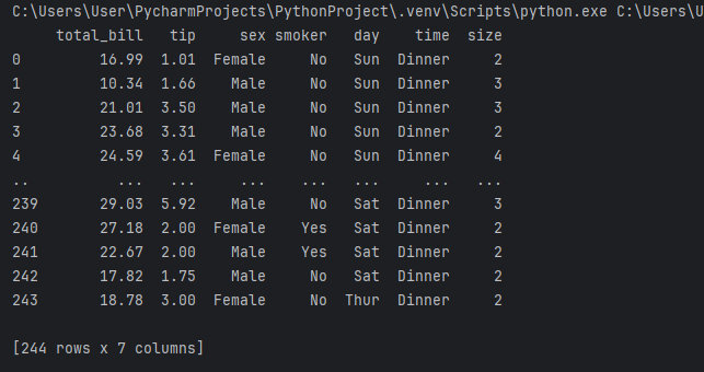
Seaborn comes with 17 built-in datasets that you can readily access and use for data visualization purposes. For this lesson I’m going to be using the tips dataset. Lets see how we can access that and how the dataset looks like,
import seaborn as sns

tips = sns.load_dataset("tips")
print(tips)
There are different types of plots we can create with Seaborn. In this lesson we will be looking at,
Scatter plot
Line plot
Bar plot
Violin plot
Heatmaps
Pair plot
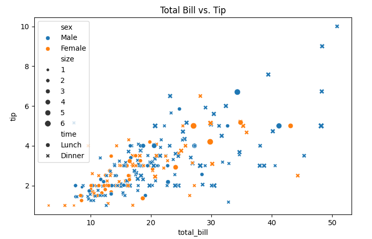
Lets look at basic scatter plot first. In this plot we aim to find the relationship between the total bill and the tip,
plt.figure(figsize=(8,5))
sns.scatterplot(x="total_bill", y="tip", data=tips, hue="sex", style="time", size="size")
plt.title("Total Bill vs. Tip")
plt.show()
As you can see plt.plot has been replaced by sns.scatterplot when using Seaborn. Here we see a few new arguements, hue="sex" will assign different colors for male & female. style="time" will indicate different markers for lunch & dinner and size="size" will show bigger dots for larger groups. Lets see how our scatter plot looks like,
See how absolutely easy it is to generate nice charts using Seaborn with very minimal coding. Lets look at a line plot next. Lets say we want to see the relationship between the total bill and the party size,
plt.figure(figsize=(8,5))
sns.lineplot(x="size", y="total_bill", data=tips, hue="sex", marker="o")
plt.title("Total Bill vs. Party Size")
plt.show()
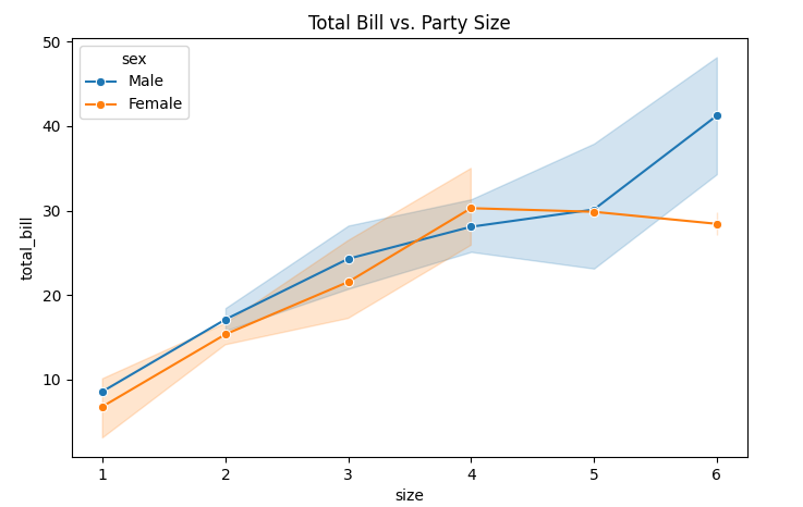
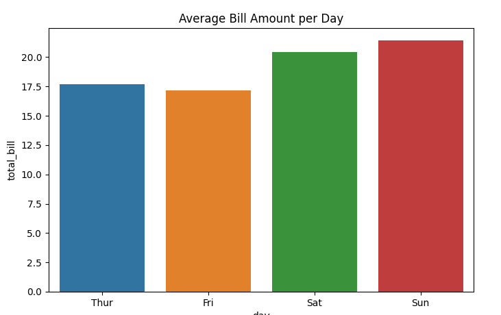
These plots are mainly used for trends over a numerical sequence. Lets move on to categorical data visualization, starting with bar plots. Lets say we want to compare the average bill value against the date.
plt.figure(figsize=(8,5))
sns.barplot(x="day", y="total_bill", data=tips, hue="day", ci=None)
plt.title("Average Bill Amount per Day")
plt.show()
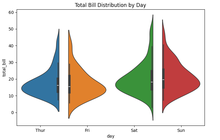
Another interesting chart is the violin plot, which is used to show density and distribution,
plt.figure(figsize=(8,5))
sns.violinplot(x="day", y="total_bill", data=tips, hue="day", split=True)
plt.title("Total Bill Distribution by Day")
plt.show()
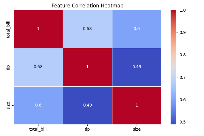
The next type of chart we are going to talk about is heatmaps. A heat map is a 2D data visualization technique that represents the magnitude of individual values within a dataset as a color. The variation in color may be by hue or intensity. Lets try a basic heatmap with our tips dataset,
plt.figure(figsize=(8,5))
sns.heatmap(tips.corr(numeric_only=True),annot=True, cmap="coolwarm", linewidths=0.5)
plt.title("Feature Correlation Heatmap")
plt.show()
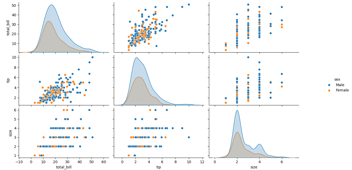
Next up is pairplots, which is used to display relationships between multiple features. Lets take the same dataset and the variable tip,
sns.pairplot(tips, hue="sex")
plt.show()
In summary,
We can use scatter plots and line plots to map our relationships
Bar plot, violin plot to compare categories
Heatmaps for correlation
Pairplots for multivariable comparison
Matplotlib and Seaborn are two very important libraries for data analysts in data visualization. They are both very easy to use, while Matplotlib offers basic level visualization, Seaborn builds on it to provide more sophisticated and aesthetic visualization of your data. This article only covers the very basic and introductory knowledge of data visualization using Python. In my next article about exploratory data analysis, we will be looking at more advanced application of Matplotlib and Seaborn and what more you can do with these libraries.
Subscribe to my newsletter
Read articles from Isuri Balasooriya directly inside your inbox. Subscribe to the newsletter, and don't miss out.
Written by

Isuri Balasooriya
Isuri Balasooriya
👋 Hi, I'm Isuri!🚀 Aspiring Data Analyst | Future AI Expert | Passionate about Space & Tech📊 Learning Data Science, Data Analytics, and AI📚 Exploring Machine Learning & Data Analytics Projects🌍 Dream: To work in Space Tech & AI📬 Let's connect!