How to Perform Exploratory Data Analysis Using Python
 Isuri Balasooriya
The aim of this article is to understand EDA, its role in data science, and master key techniques for statistical analysis, feature selection, and visualization. EDA is a crucial step in data analytics. Once you have collected your data, the next step is to clean and prepare your data and identify its validity before doing complex analysis. Therefore, EDA is the first and most crucial step in data analytics. It helps us to,
Understand the dataset’s structure and characteristics.
Detect missing values, outliers, and anomalies.
Identify patterns, relationships, and distributions.
Decide on feature selection and engineering for ML models.
Understanding Your Data
The first step in data analysis is understanding your data. Lets start by loading our dataset and checking its data structure. For the purpose of this article I will be using PyCharm, and my dataset is the Titanic dataset from Kaggle - https://www.kaggle.com/datasets/yasserh/titanic-dataset
import pandas as pd

df = pd.read_csv("Titanic-Dataset.csv")
Please note that the csv file I’m working with is located in the project folder. If your file is located elsewhere, please enter the full file path instead. Once we have loaded our dataset, lets print it out to see if its loaded correctly.
print(df.head())
I’m using head() to print only the first 5 rows of the dataset, from that I can see if the dataset has been loaded correctly and what type of column I have in my dataset.
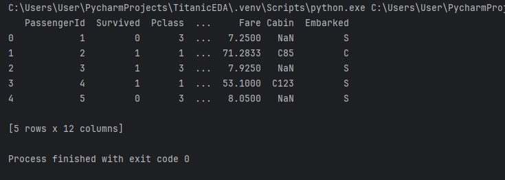
As you can see, the above output does say it has 12 columns but doesn’t specify what they are in detail. To find out we can run the below code,
print(df.info())
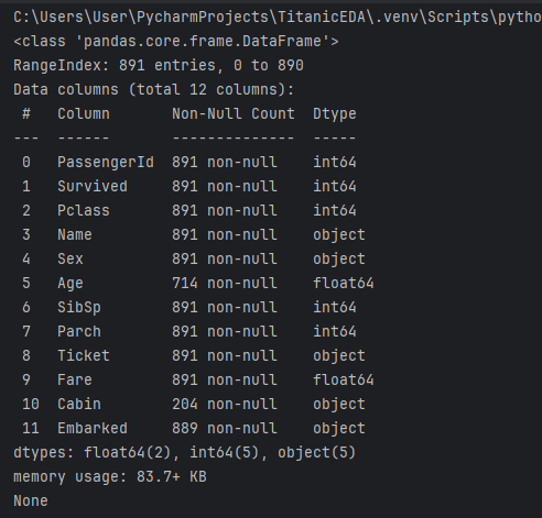
We can see the columns, their data types and also how many entries of each column is not null. For example, in the above dataset out of 891 entries, the cabin column only has 204 rows of data. As an analyst you can make a decision whether to consider those data or not. Pandas has another function called describe() which is very useful to get a broader idea of your data at a glance.
print(df.describe())
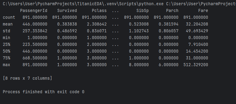
Here you can see each column with its count, mean value, standard deviation, min and max values etc. Once you have a basic understanding of your data, the next step is to clean the dataset.
Data Cleaning - Handling Missing Values
Earlier we identified that the dataset has missing values, which is common in most datasets. In this section we will focus on how to find and handle missing data.
print(df.isnull().sum())
This is the best way to find out the total number of empty entries in each column. This is the output for our Titanic dataset.
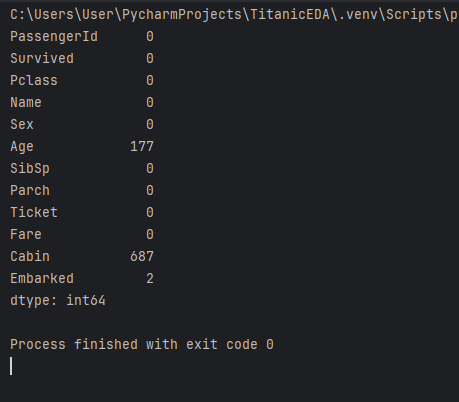
We can see that most columns don’t have null values. This doesn’t mean that all the data in those columns are valid or useful, this just means that the columns don’t have null values. However, Age, Cabin and Embarked columns have null values. There are several way you can handle this. You can drop the rows containing empty values altogether if it makes small impact, or you can fill the empty values if the data is important. For example, in our dataset if we remove the 687 rows containing null for the Cabin column, we will be left with only 204 rows of data. But if our data set had 50,000 entries maybe the impact would be smaller? It all depends on your dataset, its size, the type of data we want to remove and its overall impact to our analysis. As data analysts, these are crucial decisions that you need to take which will ultimately decide if your analysis is valid or not.
For demonstration purposes, lets assume we decided to drop the values where Embarked column contains null values,
df = df.dropna(subset=['Embarked'])
For the other two columns, I’m going to fill the missing values with a default value. For Age, which is a numerical value, I will be filling the missing values with the average age of the dataset, which is the mean value.
df['Age'].fillna(df['Age'].mean(), inplace=True)
Cabin is an alphanumeric column. For this I’m going to use the default value “Unknown”.
df['Cabin'].fillna('Unknown', inplace=True)
Lets run df.isnull().sum() again to see if our work has been successful.
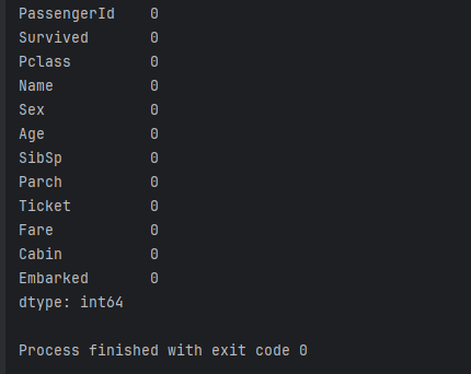
We don’t have any missing values in our dataset now.
Data Cleaning - Detecting and Handing Outliers
In statistics, an outlier is a data point that differs significantly from other observations. Outliers can happen due to many reasons such as novel data, variability in the measurement and experimental errors. If indeed it is identified as experimental error, then such data should be removed from analysis. But it is very important to first identify if your dataset has outliers and then to handle them.
One method of identifying outliers is to use box plots. If you are familiar with statistics, it will be easy to use and interpret box plots. Lets create a very simple one first.
sns.boxplot(x=df["Survived"])
plt.show()
The “Survived” column should have only two values, either 1 or 0. Lets check the box plot now,
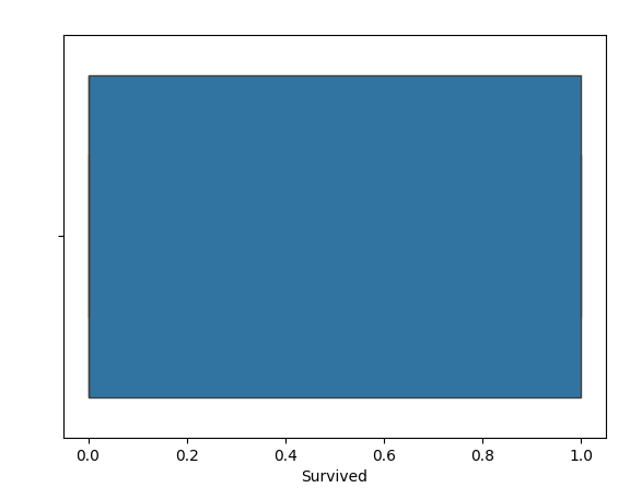
We can see from this chart, that there are no outliers. If they existed they would be indicated as dots outside the box. Lets take the Fare column as an example,
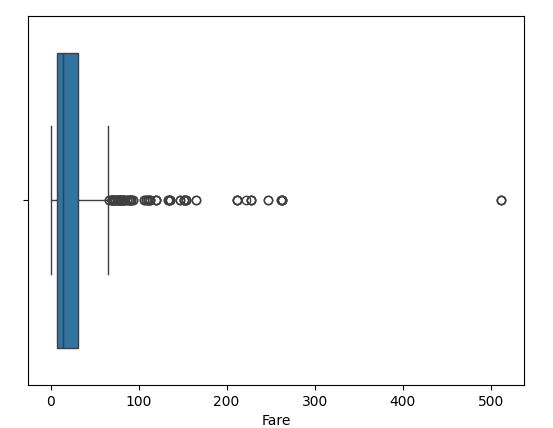
We can see a few outliers in this chart, and one extreme outlier as well. The decision to keep or remove outliers depend on the data analysts needs, and it is very important not blindly remove outliers as they could be genuine data points. Once you have identified outliers and decided if you want to remove them, you can do that using IQR (Interquartile Range). Of course you can always manually remove them as well.
In statistics IQR is defined as the difference between the 75th and 25th percentiles of the data.
Q1 = df["Fare"].quantile(0.25)
Q3 = df["Fare"].quantile(0.75)
IQR = Q3 - Q1
df_filtered = df[(df["Fare"] >= (Q1 - 1.5 * IQR)) & (df["Fare"] <= (Q3 + 1.5 * IQR))]
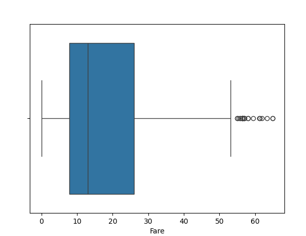
You can see how different the box plot looks now. Therefore, its very important to think before you remove outliers, identify if these could be experimental errors or genuine data points.
Understanding Data Distributions
In addition to outliers, understanding data distribution offers a glimpse of how data is spread, which helps decide transformations, normalizations, etc. First I’m going to be using histogram to visualize data distribution.
sns.histplot(df["Fare"], bins=30, kde=True)
plt.show()
Please note that I’m using my original dataframe before applying IQR to the Fare column, so I can show you a much bigger distribution.
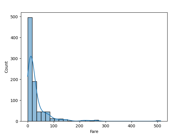
We can see highest number of records are between 0-100 with a few outliers around 200-500. Another way of identifying data distribution is to check for skewness.
print(df["Fare"].skew())
If the value you get is >1 or < -1, then the data is skewed. So the ideal value should be between -1 and 1. The value I get for the above dataset is 4.801440211044194. That means my dataset is skewed.
Remember our df_filtered dataset after applying IQR? I applied the skew() function to that dataset I the value I got was 1.4306715336945985. The dataset indicated its still skew, but compared to the previous version, it is not extremely skewed anymore.
You can use log transformation to fix skewed data. It fixes skewness by taking the logarithm of a value which essentially shrinks large values while stretching smaller ones, which helps to even out the distribution. Now these entirely depends on the type of data you are working with, as it is not suitable for all types of data.
df["Fare"] = np.log1p(df["Fare"])
After this when I run df["Fare"].skew(), I got the value 0.40010918935230094 which means now our dataset is moderately skewed.
Feature Relationships and Correlation
An important part of EDA is feature engineering. Lets first see what are feature relationships and correlation in data. A feature relationship in data refers to the connection or association between different variables within a dataset, essentially describing how changes in one feature might influence or correlate with changes in another feature. It's often measured using statistical methods like correlation analysis to understand the strength and direction of this relationship between variables. A basic example would be a dataset with hours studies and marks obtained.
| Hours Studied per Day | Exam Marks out of 100 |
| 1 | 50 |
| 3.5 | 75 |
| 5 | 98 |
| 0.5 | 35 |
| 4 | 90 |
According to our dataset, we can see that the more hours a student has studied, the more marks they have obtained in the test. That means there’s a relationship between hours studies and marks obtained. This is what we mean by feature relationships and correlation.
We can use heatmaps to identify correlation between numerical values in your dataset.
print(df.corr(numeric_only=True))
sns.heatmap(df.corr(), annot=True, cmap="coolwarm")
plt.show()
The correlation matrix returned the following output for our dataset. I have used the dataset before applying any IQR or log transformation.

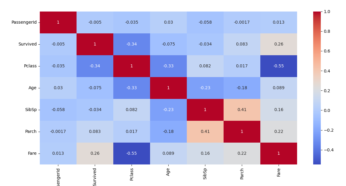
Now lets interpret these results. The value for correlation ranges from -1 to 1.
+1 indicates perfect positive correlation (as one increases, the other increases)
-1 indicated perfect negative correlation (as one increases, the other decreases)
0 indicated no correlation (features are independent)
In our previous example with student exam scores, now we can say that the hours studied has a positive correlation with exam scores, whereas number of absent days can have a negative correlation with exam score. With that knowledge, if we observe the above heatmap we can try to identify any feature relationships in our dataset.
Lets further try to understand feature relationships with the use of scatter plots. From the above heatmap I can identify there is a relationship between the fare and the passenger class.
sns.scatterplot(x=df["Fare"], y=df["Pclass"])
plt.show()
If you want to check multiple features then we can use pair plots.
sns.pairplot(df)
plt.show()
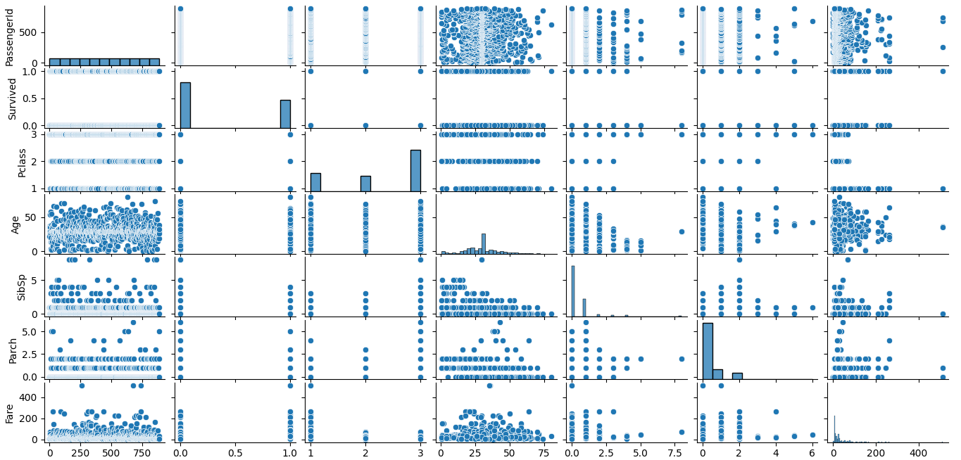
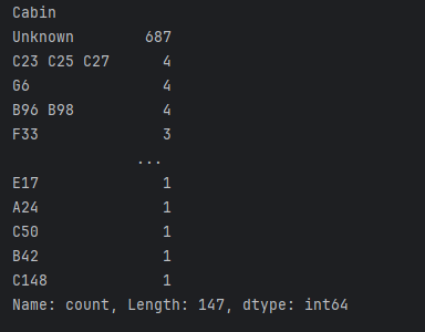
So far we have looked at feature relationships between numerical values. Lets take a look at categorical values now. Since categorical features are not numeric, so we analyze them differently. We can count the unique values of a categorical feature as follows,
print(df["Cabin"].value_counts())
This will tell us the unique cabin names on the ship.
As we have discussed earlier, we usually use bar charts to visualize categorical data. Lets say we want to find out how many males and how many females were on the ship.
sns.countplot(x=df["Sex"])
plt.show()
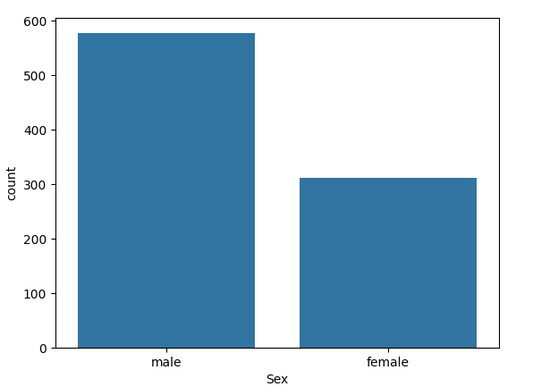
At a glance we can see that there were more male passengers onboard than female passengers.
If we wanted to explore more, we can get into further Python libraries in machine learning such as sklearn to learn feature selection and engineering. We can pick the most important features for analysis, convert categorical variables to numeric for machine learning models. I am going to wrap up this article from here, with the hope of writing more on data analysis using Python focusing on more advanced Python libraries and machine learning techniques.
Subscribe to my newsletter
Read articles from Isuri Balasooriya directly inside your inbox. Subscribe to the newsletter, and don't miss out.
Written by

Isuri Balasooriya
Isuri Balasooriya
👋 Hi, I'm Isuri!🚀 Aspiring Data Analyst | Future AI Expert | Passionate about Space & Tech📊 Learning Data Science, Data Analytics, and AI📚 Exploring Machine Learning & Data Analytics Projects🌍 Dream: To work in Space Tech & AI📬 Let's connect!