How to Create Responsive Image Gallery with Filter Buttons in Just 10 Minutes!
 ravindra kamble
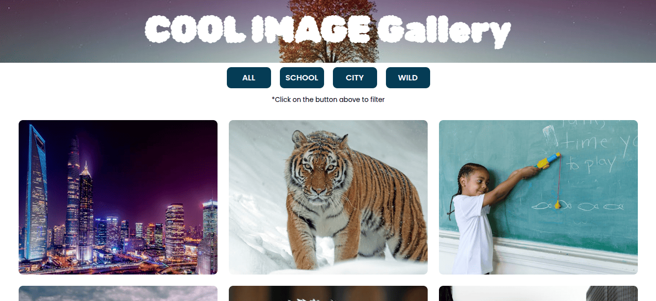
The front end plays a crucial role in making a website visually appealing, and when you create an image gallery, it adds even more charm to your web page. As a front-end developer, you’ll often need to showcase digital items in a well-structured gallery. Adding filter buttons enhances the user experience by allowing visitors to easily find and select the most relevant items.
In just 10 minutes, you can create an image gallery that is both simple and visually appealing, complete with filter buttons to enhance user experience.
Getting Started
Tech stack used - HTML, CSS, Javascript, VScode, pexels.com(for royalty free images)
Image Gallery contains below mentioned componants:
Banner Image / Banner Title
Filter buttons
Note for the user to use filter buttons
Image gallery
After created the gallery it will looks something like as mentioned image below.

Write HTML code to create an image gallery
As mentioned in the image above I have wrapped all the html inside container, by creating div with class container. The container consist of two parts.
Banner - Contains the banner at top of the page and Title of the web page "COOL IMAGE GALLERY"
Gallery - This part contains the filter buttons and image gallery.
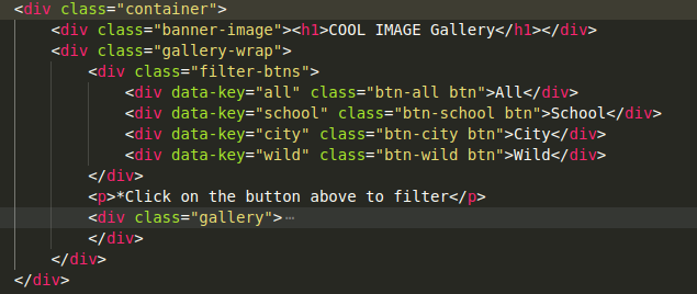
Buttons and Data-Key attributes
As mentioned in above example all filter buttons wrapped into the div with class name = fiter-btns. I have created 4 buttons as mentioned below to fliter the images from the image gallery.
All - Shows all images in Gallery
School - Shows only School related images in Gallery
City - Shows all images which looks like city, roads or buildings
Wild - Display all images which are related to wild animals
While creating buttons, I have provided the data-key attributes to every button to carry the values when button pressed. I will map this value with Images provided data-key attributes value and it will help filter the images.
Let's see how gallery section will look. 👇
Image Gallery HTML code
As shown in the VS Code snippet, right after the filter buttons, I have included a <p> tag with the message: "Click on the button above to filter." This label helps guide users on how to use the filter buttons effectively to refine the images displayed in the image gallery.
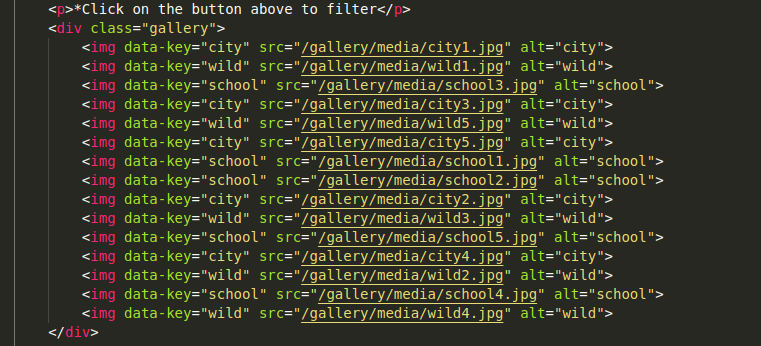
In the example above, I have wrapped all images inside a <div> with the class "gallery" and included multiple <img> tags. Each <img> tag is assigned a data-key attribute with one of three values: "city", "school", or "wild". These values serve as the basis for filtering the images when users interact with the filter buttons, making the image gallery more organized and user-friendly.
CSS Styles for Image Gallery
The CSS for this image gallery is quite simple, but there are a few key highlights to keep in mind to ensure it functions correctly and looks just like the one I created.
Follow along with me and check out the important styling points below! 🤩
Importing Fonts
To make my image gallery visually appealing, I have imported two different fonts from Google Fonts. I have applied a unique font to the main heading to enhance its attractiveness and create a striking first impression.
Universal style, body, html selector
It is essential to set padding: 0 and margin: 0, along with box-sizing: border-box using the universal * selector to ensure consistent spacing. Since I want 1rem to equal 10px, I have applied font-size: 62.5% to the <html> selector. Additionally, I have set the <body> element to width: 100% and height: 100%, while also defining the font-family to maintain a uniform text style across the image gallery.
Banner styling
Placing the banner at the top enhances the visual appeal of the image gallery. I created a banner with 100% width and 150px height, applied a background image using the background-image property, and used display: flex to center the inner <h1> tag. To make the heading stand out, I applied a unique font family, customized the color, and adjusted the font size to make it look bold, large, and eye-catching.
.banner-image{
    width: 100%;
    height: 15rem;
    background:url("https://images.pexels.com/photos/268533/pexels-    photo-268533.jpeg?auto=compress&cs=tinysrgb&w=1260&h=750&dpr=1")
            center / cover no-repeat;
    display: flex;
    align-items: center;
    justify-content: center;
}

h1{
    color: #fafafa;
    font-size: 8rem;
    font-family: "Rubik Bubbles", system-ui;
}
FIlter Buttons and swapper
By applying display: flex to the filter buttons wrapper, I aligned all four filter buttons in a row with a 20px gap for proper spacing. Additionally, I used the :hover pseudo-class to change the background color when a user hovers over a button, enhancing interactivity and UI appeal. Each button is customized with:
Background color
Font size
Width & padding
Border-radius for smooth edges
Transition for a smooth effect
Cursor: pointer for better UX
.filter-btns{
    display: flex;
    align-items: center;
    width:100%;
    justify-content: center;
    margin-top: 1rem;
    gap: 2rem;
}

.btn{
    padding:1rem;
    background-color: rgb(5, 60, 85);
    font-size: 1.8rem;
    cursor: pointer;
    width: 10rem;
    display: flex;
    align-items: center;
    justify-content: center;
    color:#fafafa;
    border-radius: 1rem;
    text-transform: uppercase;
    font-weight: 600;
    transition: all 0.3s;
}

.btn:hover{
    background-color: #1a5875;
}
CSS of Image gallery
While creating the image gallery, I wrapped all images inside a <div> with the class "gallery". The gallery class has:
100% width with inline padding of 5rem
display: gridwith 3 equal columns (grid-template-columns: repeat(3, 1fr))25px gap between images for proper spacing
For the <img> tags:
Width: 100% to ensure images fit within the wrapper without overflowing
Height: 350px to maintain consistency across all images
object-fit: coverto ensure images display properly within their assigned space without distortion
.gallery{
    width:100%;
    padding-inline:5rem;
    display: grid;
    grid-template-columns: repeat(3, 1fr);
    gap: 2.5rem;
    margin-top: 2rem;
}

img{
    width:100%;
    height: 350px;
    object-fit: cover;
    border-radius: 1rem;
    transition: all 0.8s cubic-bezier(0.075, 0.82, 0.165, 1);
}
I also created two supportive classes, .hide and .show, to control the visibility of images dynamically. These classes are used to filter images by adding or removing them from the <img> tags when a filter button is clicked:
.hide→ Appliesdisplay: none;to hide images that do not match the selected filter..show→ Ensures filtered images remain visible by resetting theirdisplayproperty.
This approach allows smooth filtering functionality in the image gallery, making it interactive and user-friendly.
Javascript code of image Gallery
In the JavaScript code, I created two element variables:
One to capture all filter buttons.
Another to capture all images in the gallery.
How the Filtering Works:
Used a
forEachloop on the buttons variable to listen for the click event on each button.When a button is clicked, retrieved its
data-keyattribute and stored it in a variable calledbtn_data_key.Applied another
forEachloop on the images variable to check each image'sdata-keyattribute, storing it inimg_data_key.Used conditions to filter images:
If
btn_data_key === "all"andimg_data_key === btn_data_keyboth condition true then added theshowclass to all images.Else, added the
hideclass and removed theshowclass to ensure proper filtering.
This approach ensures that only relevant images remain visible when a filter button is clicked, making the image gallery dynamic and interactive.
const btns = document.querySelectorAll(".btn");
const allImg = document.querySelectorAll("img");
btns.forEach((btn)=>{
   btn.addEventListener("click", function(){
    let btn_data_key =  btn.getAttribute("data-key");
    allImg.forEach((img)=>{
        let img_data_key =  img.getAttribute("data-key");
        if(btn_data_key ==="all" || img_data_key === btn_data_key)
        {
            img.classList.add("show");
        }
         else{
            img.classList.add("hide");
            img.classList.remove("show");
         }
    })
   })
})
Creating a responsive image gallery in just 10 minutes is absolutely possible, and the data-key attribute makes filtering with filter buttons incredibly simple!
📥 Download the Source Code & Images:
👉 GitHub Repository
🚀 Follow me on Twitter for more tips and updates: @ravindra5k
💡 Check out my other articles:
Subscribe to my newsletter
Read articles from ravindra kamble directly inside your inbox. Subscribe to the newsletter, and don't miss out.
Written by