Building iOS Control Widgets in React Native Expo
 AKSHAY JADHAV
Ever wished you could swap out the Lock Screen’s flashlight and camera shortcuts for something more useful like a quick toggle for smart home controls or an instant app action? With iOS 18, that’s finally possible! Apple has introduced Control Widgets, allowing apps to integrate directly into places like Control Center, the Lock Screen, and the Action button for even faster access to key features
These new widgets focus on quick actions rather than just displaying information. They come in two forms buttons that trigger specific tasks and toggles that switch settings on or off. Powered by app intents, they make interacting with your apps more seamless than ever.
In this post, we’ll break down how Control Widgets work, where they can be used, and how you can add them to your react-native apps. Let’s dive in!
Setting Up the Project
Requirements
As we are using the @bacons/apple-targets plugin to create widgets, we need to ensure our environment meets the following requirements:
CocoaPods 1.16.2 (with Ruby 3.2.0)
Xcode 16 (running on macOS 15 Sequoia)
Expo SDK 52+
Ensure your setup meets these requirements before proceeding.
To get started, we need an Expo project. If you don’t have one, create a new Expo project using the following command:
npx create-expo-app --template
Adding a Widget Target
Run the following command from project root.
npx create-target
It will install the @bacons/apple-targets and prompt for selecting target. Select Widget as target.

After running the above command, in app.json you can see @bacons/apple-targets added in plugins.
"plugins": ["expo-router", "@bacons/apple-targets"]
Also target folder will be generated with the following structure:
.
└── widget
    ├── AppIntent.swift
    ├── Info.plist
    ├── WidgetControl.swift // Control example
    ├── WidgetLiveActivity.swift // LiveActivity example
    ├── expo-target.config.js // target settings
    ├── index.swift // Widget Bundle
    └── widgets.swift // widget example
Once the target folder is generated, it will contain the necessary files for setting up control widget. Now, before we proceed with implementing the control widget, we need to ensure our iOS project is properly set up by running the following command:
npx expo prebuild -p ios
Running this command will generate the iOS app and also add the necessary entitlements file in the target folder. If you check the terminal, you may notice some warnings—let’s address those first before moving forward.
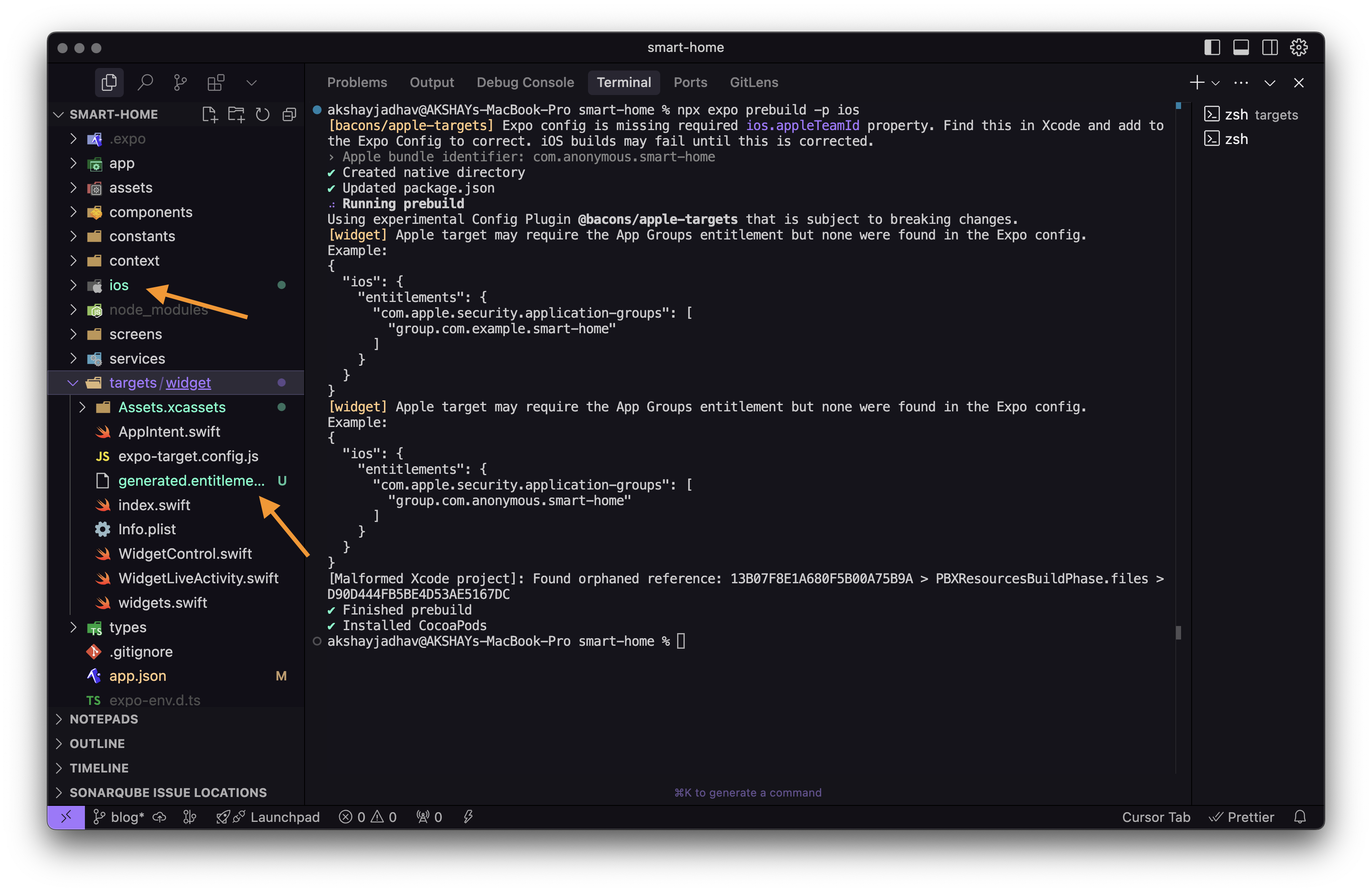
Expo config is missing required ios.appleTeamId property
Run the command
xed iosin project root to open project in XcodeWe need to setup Team for both Main App and Widget Target. Go to Signing & Capabilities and select team for both targets.
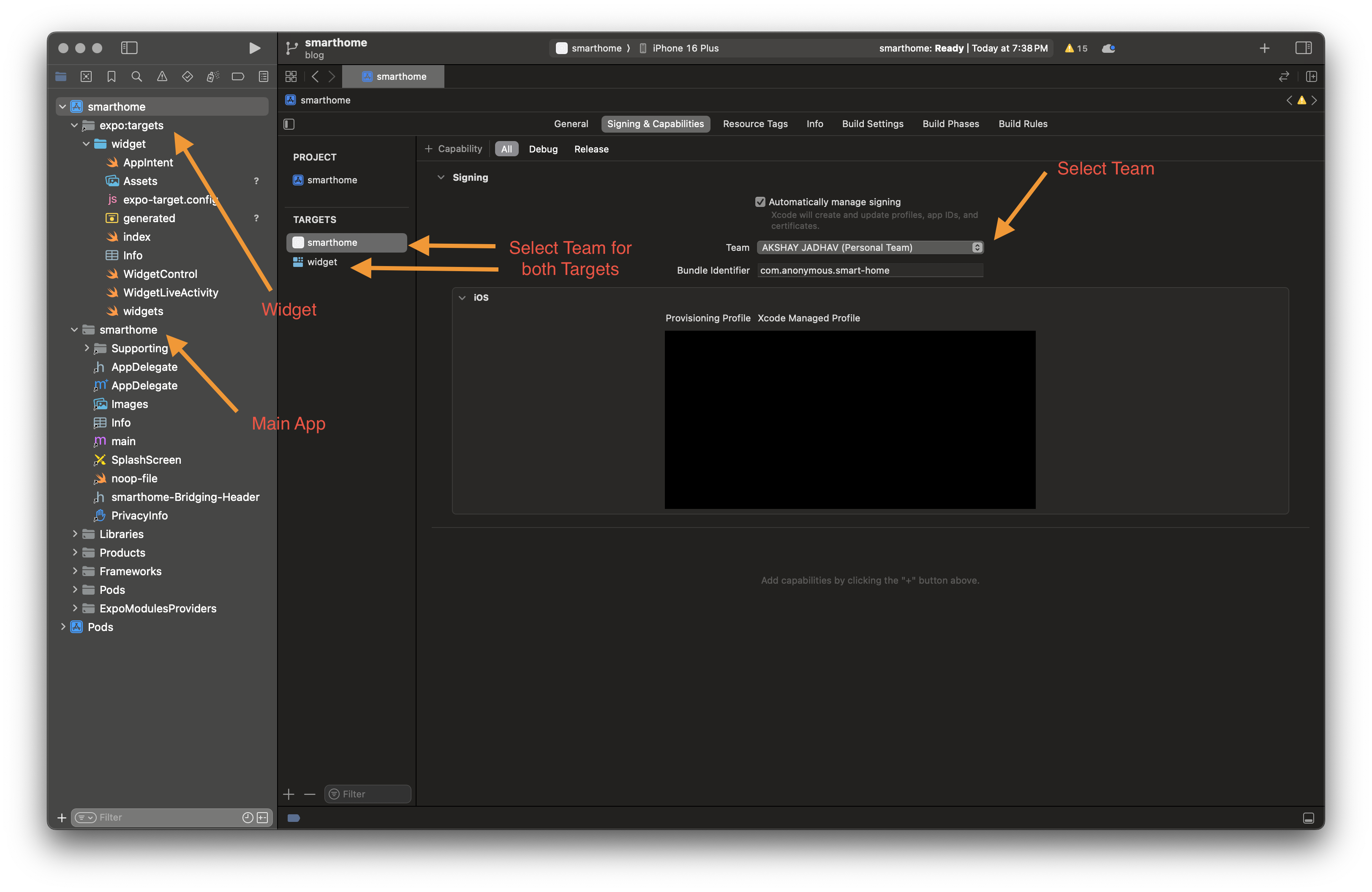
After selecting your team, open the
project.pbxprojfile located at (ios/your_app_name.xcodeproj/project.pbxproj). Search for DEVELOPMENT_TEAM the value next to it is your Apple Team ID.Now, open the app.json file of your Expo app and add the appleTeamId property inside the ios configuration.
  {
    "ios": {
      ....
      ..
      "appleTeamId": "YOUR_TEAM_ID"
    }
  }
Apple target may require the App Groups entitlement but none were found in the Expo config
App Groups allow multiple targets (such as your main app and its widgets) to share data. Since iOS widgets often need to communicate with the main app, they require this entitlement.
Open
app.jsonand Locate the bundleIdentifier under the ios property.{ "ios": { "supportsTablet": true, "appleTeamId": "YOUR_TEAM_ID", "bundleIdentifier": "your_bundle_identifier", "entitlements": { "com.apple.security.application-groups": [ "group.your_bundle_identifier" ] } } }
Run the following command to ensure everything is in sync:
npx expo prebuild -p ios
After this, you should see the targets/widget/generated.entitlements file updated with the correct App Groups entitlement.
Project setup is complete! ✅
Now, let’s dive into actually creating the Control Widget and integrating it into our React Native Expo app. 🚀
Implementing iOS Control Widget
🧹 Cleaning Up Unnecessary Files
Before we start implementing our own Control Widgets, let’s remove the example widgets that were pre-generated. Delete the following files:
@bacons/apple-targets but won’t be needed for our Control Widgets. Let’s remove them to keep our project clean.”rm targets/widget/AppIntent.swift
rm targets/widget/WidgetLiveActivity.swift
rm targets/widget/widgets.swift
rm targets/widget/WidgetControl.swift
This ensures we have a clean slate to work with before adding our custom widgets. 🚀
🛠 Target Configuration (Optional)
@bacons/apple-targets provide a Target Configuration file expo-target.config.js or expo-target.config.json which allows us to define properties like colors, images, icons, entitlements etc. that can be used in the widget. While not required, it provides an easy way to share config with widget target.
Example usage:
/** @type {import('@bacons/apple-targets/app.plugin').ConfigFunction} */
module.exports = (config) => ({
  type: "widget",
  icon: "https://github.com/expo.png",
  entitlements: {
    /* Add entitlements */
  },
  colors: {
    primary: {
      light: "#4A90E2",
      dark: "#2E6AB2",
    },
    secondary: {
      light: "#FFC107",
      dark: "#FF8F00",
    },
  },
});
For more details, check the official documentation.
Remember to run the following command whenever you update the Target Configuration to apply the changes:
npx expo prebuild -p ios
The ControlWidget Protocol
The ControlWidget protocol in iOS 18 allows apps to create Control Widgets, which can be added to the Control Center, Lock Screen, and Action Button for quick access to app features.
This protocol defines how widgets behave, including their actions, appearance, and configuration.
Key Components of ControlWidget
Action Type – Defines if the widget is a toggle (on/off) or a button (performs an action).
Configuration – Can be static (predefined settings) or user-configurable via AppIntent.
Integration Points – Works in Control Center, Lock Screen, and Action Button.
We can create two types of Control Widgets:
ControlWidgetButton – Executes an action when tapped.
ControlWidgetToggle – Toggles a setting on/off.
Now that we understand the ControlWidget protocol, let’s start implementing ControlWidgetToggle that simulates turning a light on/off it in our project!
Creating a Toggle Control Widget for Smart Lights
Inside the targets/widget/ folder, create a new file: LightsControl.swift and define the Control Widget Structure
import SwiftUI
import WidgetKit
import AppIntents

@available(iOS 18.0, *)
struct LightsToggle: ControlWidget {

  static let kind: String = "com.anonymous.smarthome.lightstoggle"

  var body: some ControlWidgetConfiguration {
    StaticControlConfiguration(
      kind: Self.kind,
      provider: Provider()
    ) { value in
      ControlWidgetToggle("Lights", isOn: value, action: LightsToggleIntent()) { isOn in
        Label(value ? "ON" : "OFF", systemImage: value ? "lightbulb.fill" : "lightbulb")
          .controlWidgetActionHint(value ? "ON" : "OFF")
      }
      .tint(Color("primary"))
    }
    .displayName("Smart Home Lights")
    .description("Toggle your smart home lights.")
  }
}
In this code:
We define a LightsToggle struct conforming to ControlWidget.
We use StaticControlConfiguration to create a static widget that doesn’t allow user customization.
ControlWidgetToggle creates a toggle switch labeled “Lights” and triggers the LightsToggleIntent action.
The label dynamically updates, showing “ON” with a filled lightbulb and “OFF” with a regular lightbulb.
.tint(Color("primary")) applies a theme color, while .displayName and .description provide metadata for the widget.
Handling the Action
Now that we have defined our LightsToggle widget, we need to handle its action. When the user toggles the control, we need an intent that processes this action.
We achieve this using SetValueIntent, which allows our widget to modify a value when interacted with.
@available(iOS 18.0, *)
struct LightsToggleIntent: SetValueIntent {
  static var title: LocalizedStringResource = "Smart Home Lights"

  @Parameter(title: "Light Status")
  var value: Bool

  func perform() async throws -> some IntentResult {
    // Save toggle state to UserDefaults
    guard let userDefaults = UserDefaults(suiteName: "group.com.anonymous.smarthome") else {
        return .result()
    }
    userDefaults.set(value ? 1 : 0, forKey: "lightStatus")
    return .result()
  }
}
LightsToggleIntent struct: Defines an action that updates the light’s status.
SetValueIntent: A protocol used for setting a value in response to user interaction.
@Parameter: Defines value as a parameter that holds the light’s state (ON/OFF).- The system automatically populates this value with the new state of the toggle when the user interacts with the widget.
perform() function: Handles the action when the toggle is pressed.
Providing the Current State
Now that we have handled the action, we need a way for the widget to retrieve the current state of the lights. We achieve this using the ControlValueProvider protocol, which supplies the widget with its state.
@available(iOS 18.0, *)
extension LightsToggle {
  struct Provider: ControlValueProvider {
    var previewValue: Bool {
      false
    }

    func currentValue() async throws -> Bool {
      guard let userDefaults = UserDefaults(suiteName: "group.com.anonymous.smarthome") else { return false }
      let isOn = userDefaults.integer(forKey: "lightStatus")
      return isOn == 1
    }
  }
}
previewValue
Provides a default state when the widget is displayed in the widget gallery.
Here, we set it to false, meaning the light is off in the preview.
currentValue()
- Retrieves the latest state from UserDefaults.
Integrating Control Widget in Widget Bundles
Now that we have created our Control Widget, we need to register it within a Widget Bundle so iOS can recognize and display it.
Open targets/widget/index.swift and Add below code
import WidgetKit
import SwiftUI

@main
struct exportWidgets: WidgetBundle {
    var body: some Widget {
        // Export widgets here
        if #available(iOSApplicationExtension 18, *) {
            LightsToggle()
        }
    }
}
The
@mainattribute marks exportWidgets as the entry point for widgets.WidgetBundle allows us to group multiple widgets together.
The body property returns a collection of widgets—in this case, LightsToggle.
The if #available(iOSApplicationExtension 18, *) check ensures that the widget only runs on iOS 18 or later.
Running the App & Seeing It in Action 🚀
Now that we’ve integrated the Control Widget, let’s run the app and test it on a real device or simulator.
Build and Run the iOS Project
Since we made changes to the widget setup, we need to rebuild the iOS project:
npx expo prebuild -p ios
then run the app
npx expo run:ios
Add a Control
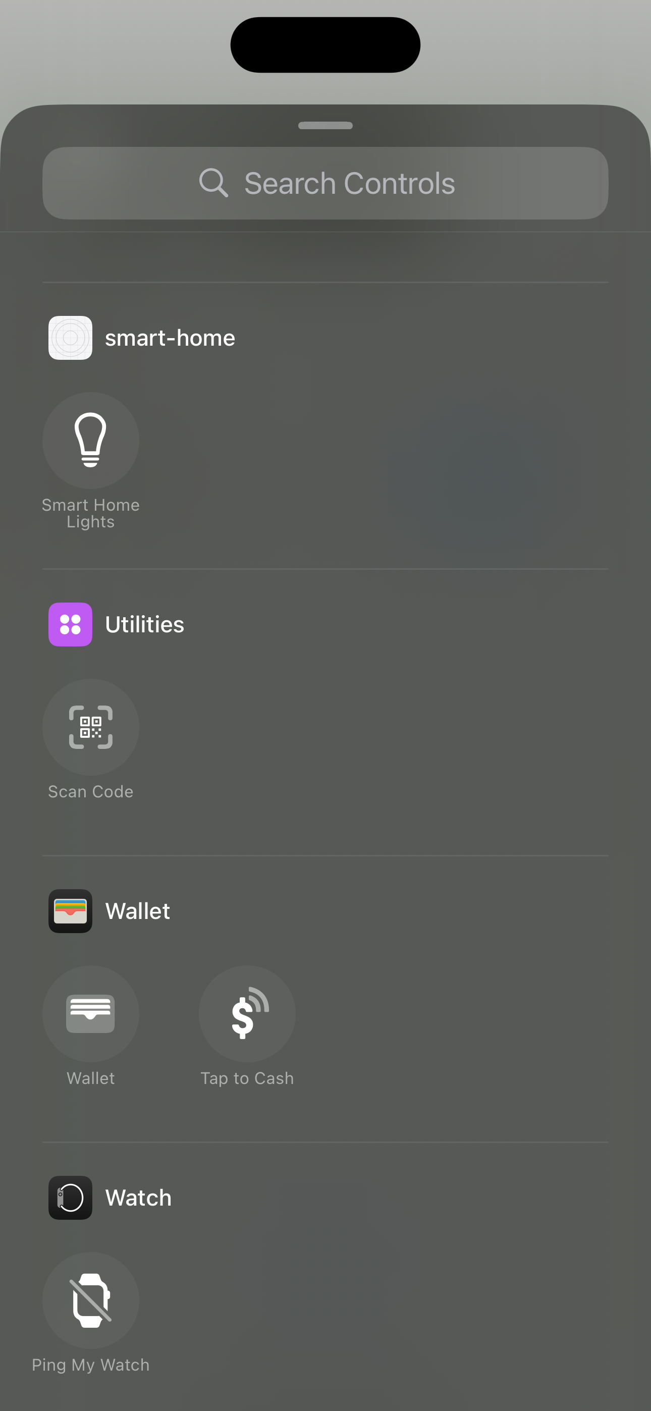
Here is how the Control Widget looks
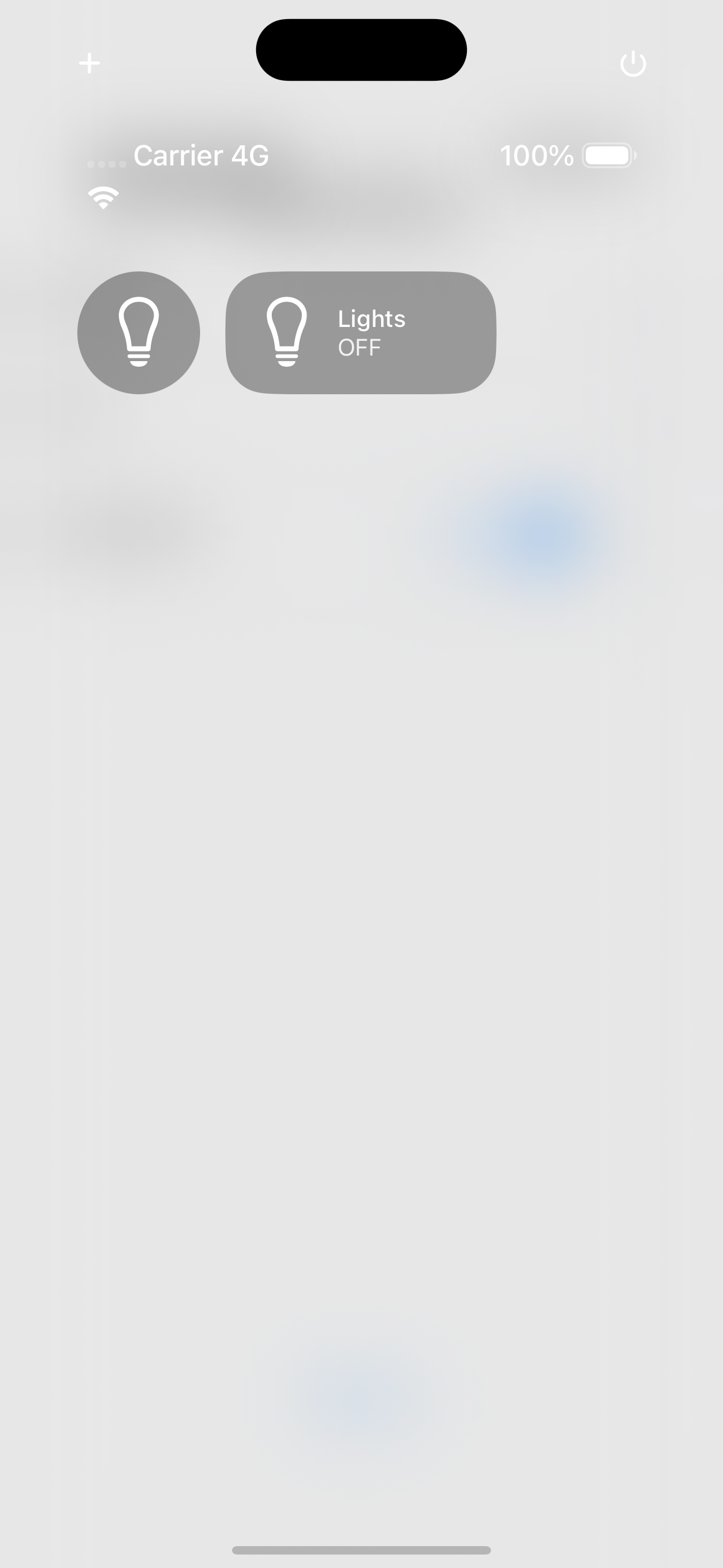
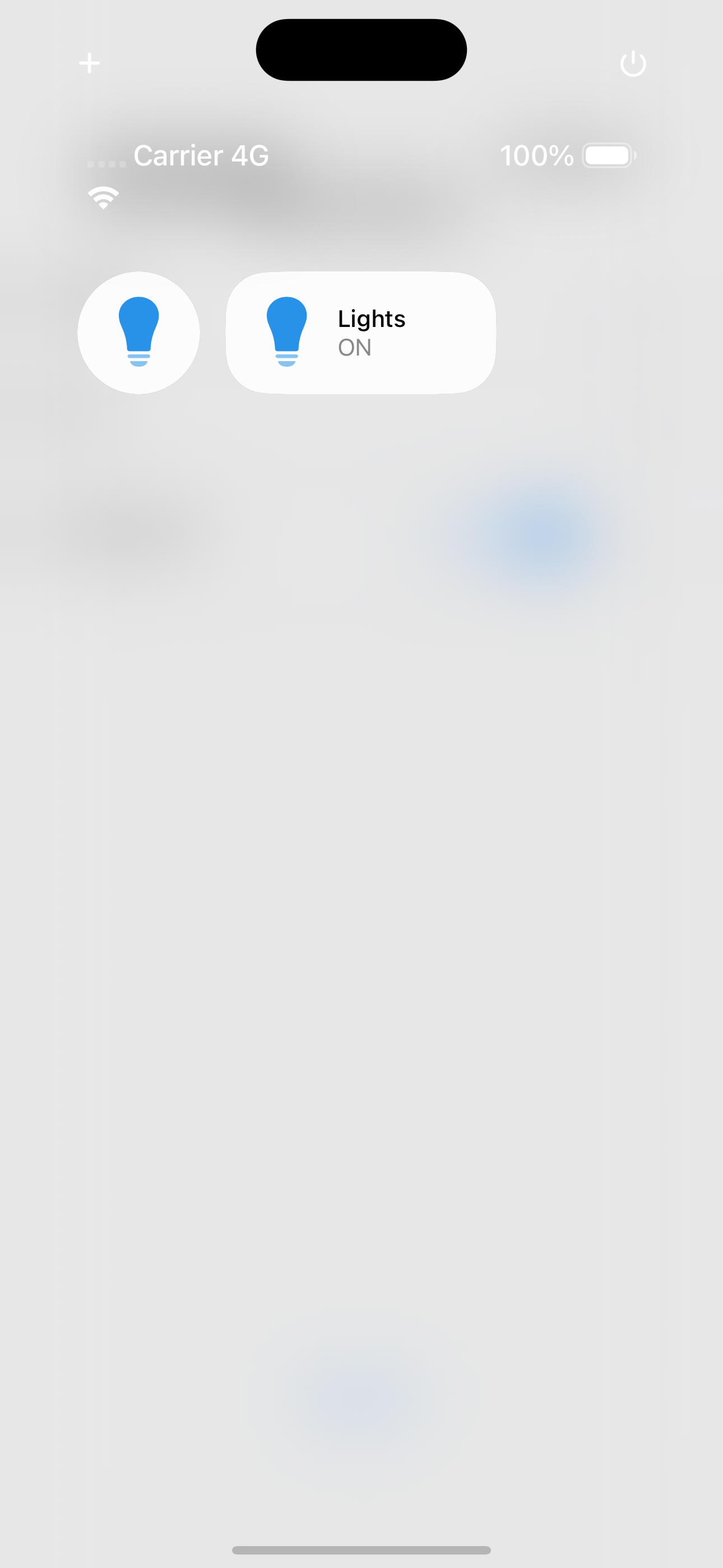
🎉 That’s it! You now have a working iOS Control Widget inside your Expo app!
🎯 Bonus: Adding a Quick Action Button
So far, we’ve built a toggle widget. But what if you need a one-tap action instead of a toggle?
iOS 18 also supports ControlWidgetButton, which allows you to execute an action instantly perfect for triggering a smart home scene, sending a command, or launching an app.
Here’s a simple example that launches a specific screen with just one tap:
// targets/widget/_shared/OpenSettings.swift

import SwiftUI
import WidgetKit
import AppIntents

@available(iOS 18.0, *)
struct OpenSettings: ControlWidget {
  var body: some ControlWidgetConfiguration {
    StaticControlConfiguration(
      kind: "com.anonymous.smarthome.opensettings"
    ) {
      ControlWidgetButton(action: OpenSettingsIntent()) {
        Label("Open Settings", systemImage: "gearshape")
      }
    }
    .displayName("Settings")
    .description("Open the app settings")
  }
}

@available(iOS 18.0, *)
struct OpenSettingsIntent: ControlConfigurationIntent {
  static let title: LocalizedStringResource = "Open Settings"
  static let isDiscoverable = true
  static let openAppWhenRun: Bool = true

  @MainActor
  func perform() async throws -> some IntentResult & OpensIntent {
    return .result(opensIntent: OpenURLIntent(URL(string: "myapp://settings")!))
  }
}
This follows the same structure as our toggle widget but executes an action instead of switching states. You can add this to your widget bundle just like the toggle.
🎉 Wrapping Up
That’s it! You’ve successfully integrated iOS Control Widgets into your React Native Expo app. 🚀
With this setup, you can:
Add quick actions directly to the Control Center, Lock Screen, or Action Button.
Use ControlWidgetToggle for toggling features and ControlWidgetButton for launching actions.
Customize your widgets with icons, colors, and assets from your app.
Subscribe to my newsletter
Read articles from AKSHAY JADHAV directly inside your inbox. Subscribe to the newsletter, and don't miss out.
Written by

AKSHAY JADHAV
AKSHAY JADHAV
Software Engineer